2. 2
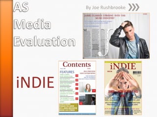
iNDIE
The style model I used and took inspiration from was the music magazine NME. The other
magazine I used throughout this project was Q magazine. They were the perfect style
model for indie bands and culture. It would have been a sin not to use this magazine. The
arrows are my annotations of where I have used common conventions on NME front
covers and incorporated it into my own magazine.
Front Cover
3. 3
Contents PageiNDIE
I based my Contents Page on the music magazine Q. It has a lot of consistent
conventions which I have used in my own magazine. However my magazine has its
own conventions too to show my creative side to the document.
4. 4
iNDIE Double Page Spread
I based my Double Page Spread
on Q and NME and my own
Double Page Spread has a lot of
conventions which match those
of Q and NME. The arrow
annotations show this.
5. 5
My magazine represents individuals of the ages 16 -25, these are
the ages at which indie music peaks. Even though there are some
anomalies, which are people who are outside the age boundary,
the ages 16-25 are the most consistent listeners. iNDIE
represents this age bracket because of the modern content that
is involved within the magazine. It welcomes all readers but this
age bracket is a majority of readers ages.
It has no gender dominance regarding who reads it. iNDIE is a
unisex music magazine.
iNDIE
6. 6
iNDIE
As iNDIE was inspired by the style models of ‘Q’ and ‘NME’, the
media institution(s) that I think would distribute my magazine
would be between either, IPC and Bauer.
IPC is a consumer magazine and digital publisher in the United Kingdom,
with a large portfolio selling over 350 million copies each year. It
distributes NME which is one of my main inspirations.
IPC Magazines
IPC Trade and Technical
IPC Printing
IPC New Products
IPC Newspapers
IPC Books
The different segments of the company could be a massive help
for my magazine as the magazine department are all
professionals in the business and could easily distribute my
magazine due to the fact that it is like NME.
7. 7
iNDIE
The other option of distributor is ‘Q’. This was my second
style model that helped me create iNDIE.
Bauer Media Group is a multinational media company
headquartered in Hamburg, Germany which operates in 15
countries worldwide. The worldwide circulation of Bauer
Media Group's magazine titles amounts to 38 million
magazines a week.
‘Q’ started out being distributed by an English distributor,
then Bauer Media Group spotted the magazines potential
and made an offer to distribute the magazines to a bigger
audience globally.
8. 8
I have reached the decision to choose IPC Media as my
distributor for iNDIE. This is because iNDIE is more like
NME than Q. This matters as IPC Media won’t have to go
out of their way to produce a type of magazine they have
not distributed before. IPC Media knows the conventions
of my type of magazine more than Bauer Media Group do.
It was a hard decision to come to because the prospect of
iNDIE going worldwide and being one of the best
magazines around was just breath taking. However I would
prefer to have iNDIE distributed in one country and know
that I will have consistent issues sold.
iNDIE
9. 9
iNDIE
The ideal target audience for iNDIE would be 16-25
year olds. The start age (16) is for the more mature
content that could be included in further issues in the
future. The 25 year old age bracket the age just after
the peak of readers. So the actual peak age of
someone who was to read iNDIE consistently would
be 23 years of age . This has came from audience
feedback.
15. 15
iNDIE
I attracted my audience by putting well known artists on
the front cover such as, Noel Gallagher, The Jam, Arctic
Monkeys and Jake Bugg. I intentionally put a mixture of
recent artists and not so recent artists so that the front
cover of my magazine suits the needs of my target
audience by just looking at the front cover. I also
attracted them with the solo picture of my model which
makes a bold statement on the audiences eyes straight
away. Also staying on the topic of bold, I made the title
really big to make it eye catching but this was not the
only thing that I did with the title. I put the title behind
the models head a tiny bit so that the word ‘iNDIE’ is
blocked off. This makes the audience pick up the
magazine and look at the title which well then draw
their attention to the stories on the front which will lead
them to turn the page.
16. 16
iNDIE
Throughout the process of making my music magazine I used
and unbelievable amount of technology. I used two different
programmes on the computer which were Adobe Photoshop
and Adobe InDesign. I also used the SLR cameras to take my
own images and also the working of the umbrella flashes for
the canvas. I had lessons on which were about the use of
Adobe Photoshop and Adobe InDesign before the preliminary
task so that I was able to gain an understanding of the
different tools and their separate functions. The new software
and all the possibilities of what the tools can do was a bit
overwhelming at the start but then I realised I was only going
to be using a select few tools to create my magazine and not
all of them.
17. 17
iNDIE
I also had to learn about the use of the SLR cameras. I had
barely any previous experience with an SLR camera and I used
to think that it just took pictures, but now I have used the
cameras for a certain amount of time to create my product I
have learnt so much more than it just taking pictures. I learnt
about all the different parts of the camera and I also learnt
about the interior as well.
I learnt all about the aperture setting which is all about the
amount of light that gets let in to the image sensor which then
determines the brightness of the final image.
There were other areas of the camera that I had to explore
such as the shutter speed and all the settings on the wheel of
the camera. (left)
19. 19
iNDIE
The change of quality from my preliminary task to my final music
magazine is absolutely unbelievable! I used to think that my
preliminary task was good until I compared them to my music
magazine. My preliminary task show that I used block colours and
didn’t take full advantage of the tools that were on offer to me.
My contents page was especially very empty and basic. There is
one picture on it and a few lines of text which use the same
colours all the time and it’s very repetitive and shows no real
creativity.
I am so glad that I have been able to learn about even more tools
Photoshop and InDesign so that I could utilise my creative skills
and put these into my final cuts. The difference of the documents
is astounding and it has given me real confidence that my work is
of a real high quality. I would recommend this task for anyone in
the future as you learn about a lot about technology and a lot
about yourself as a person.