Powerpoint exploring the locations used in television show Time Clash
Artifact 1 allen
1. Thomas Allen
11/5/13
MATE 4001
Dr. Adu-Gyamfi
Artifact 1: Exploring the statistics of Soccer’s World Cup using Fathom Scatterplots and
Box Plots
Statement of Mathematical Exploration:
Throughout this exploration I used the Fathom software to compare relationships of
different aspects of soccer such as wins, losses, games played, and points scored for and against
that team etc..I firstly created an assortment of scatterplots that may determine whether there
exists a correlation between 3 sets of data. Secondly, I proposed questions relating to the various
scatterplots to determine what conclusions if any could be stated given the sets of data.
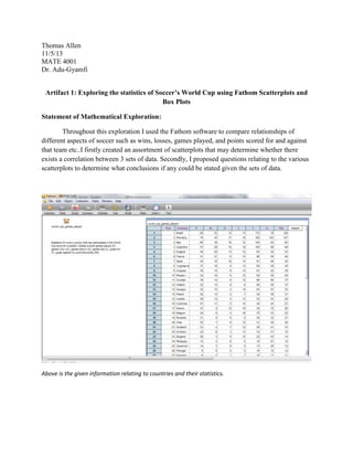
Above is the given information relating to countries and their statistics.
2. 1) What can be said about the number of wins a team achieved and their respective points scored
for and against that team?
It is obvious that the number of wins a team accrued increased as the number of points a team
scored for their team was greater than the points scored against them.
2) What characteristics of this scatterplot helped you to draw this conclusion?
It is clear that the blue dots represent the points scored against a team and the gray representing
the points scored for that team. It is present in the graph that the teams who have gray dots above
that teams blue dots. If this relationship is reversed then that team had a losing record.
3) There seems to be a gradual increase in the difference between number of points that team
scored for themselves and the points that were scored against them that varies directly with the
number of wins that team accrued, why is this?
It shows that the teams who were consistently successful in winning games their ratio of points
scored for their team to points scored against them were larger than those with fewer wins.
Showing a direct relationship between the number of wins earned and increasing ratio of gray:blue
dots.
3. 1) What is the range of points scored against the teams, what does this reveal in regards to the
variance?
The range is from 3 to 103, the plot illustrates a large variation due to the span of the fourth quartile and
value of the outlier.
2) Does the outlier of the graph have an effect on the median or the mean? Explain why box plots
use the median instead of mean?
It has an effect on the mean of the entries; because the mean is the average of the sum of the entries of
the data set causing it to be susceptible to a large outlier causing the graphs information to be skewed
or untrue. Whereas a median splits the data into two sets illustrating that doesn’t deviate unless large
amounts of entries are added to the data set.
3) What are the pros of using this type of graph help organize and present the large data set?
The plot allows the observer to quickly organize large sets of data into four compact sets of data. The
plot allows you to find the value of a median that isn’t affected by outliers of large or small value.
4. 1) How do you suppose the histogram can provide potential insight into the given data set?
Explain.
The histogram displays the range of pts the teams received and groups the teams within 10 pt
intervals. The histogram explicitly shows how many teams accumulated the amount of pts and
grouped them within their respective 10 pt interval located on the x-axis. This histogram
provides insight to which teams will potentially perform the best.
2) How can this histogram help evaluate a team’s efficiency? Explain.
Yes, It clearly separates the teams by their success on the field by distributing the teams according
to the number of points they have gained by winning, tying and losing matches and as well as
explicitly showing the frequency of teams with similar success.
3) What do you suppose the relationship between the standard deviation, mean and outliers is?
Explain
The mean is the average of in this case cumulative points earned or the “central tendency” and
the standard deviation measures the spread of elements of the data set around the mean. Since
the standard deviation is a measure of the mean and the mean is affected by extreme large or
small values the standard deviation becomes an insight to the presence of outliers and loses or
makes it difficult to accurately quantify the spread of the data set.
5. IDP TPACK TEMPLATE (INSTRUCTIONAL DESIGN PROJECT TEMPLATE)
NAME: __Thomas Allen__________ DATE:_____11/5/13___________
Content.
Pedagogy.
Pedagogy includes
both what the teacher does and what
the student does. It includes where,
what, and how learning takes place.
It is about what works best for a
particular content with the needs of
the learner.
Describe:
CCSS.Math.Content.HSS-ID.B.6 Represent data on two quantitative
variables on a scatter plot, and describe how the variables are
related.
Describe: Standards of mathematical Practice
Make sense of problems and persevere in solving them. (derive
meaning of a problem)
Reason abstractly and quantitatively. (reason and construct viable
arguments)
Construct variable arguments and critique the reasoning of others.
Model with mathematics. (mathematical structure)
Use appropriate tools strategically. (derive meaning of a problem
and/or mathematical structure)
Look for and make use of structure. (reason and construct viable
arguments)
Look for and express regularity in repeated reasoning.
1. Describe instructional strategy (method) appropriate for the content, the
learning environment, and students. This is what the teacher will plan and
implement.
Teacher will give students the scatterplots and the respective
questions for the students to study and critically think and draw
conclusions using inferential statistics.
2. Describe what learner will be able to do, say, write, calculate, or solve as
the learning objective. This is what the student does.
Students will be able to accurately create scatterplots boxplots and
Students will work in groups of three to communicate ideas and
facilitate the learning objective and concepts.
Students will come to a unanimous conclusion that all three agree
states what they believe each scatterplot illustrates using correct
logic.
3. Describe how creative thinking--or, critical thinking, --or innovative
problem solving is reflected in the content.
Students will be compelled to use prior knowledge of various graphs
and plots to help them critically think and make well educated
inferences about large data sets.
Students will have to contemplate the logic behind each graph or
plot they create to represent their correlations thereby being required
to explain their logical conclusions and defend.
6. Technology.
1. Describe the technology
Fathom helps organize and construct a multitude of plots using complex sets
of data.
It allows users to plot information in various ways that may infer a
correlation or causation relationship between the two or three sets of
data.
2.
3.
Reflect—how did the lesson
activity fit the content? How did the
technology enhance both the content
and the lesson activity?
Describe how the technology enhances the lesson, transforms
content, and/or supports pedagogy.
The technology enhances the lesson by making it faster to graph and
plot the data.It also makes it easier to isolate specific sections of the
sets of data allowing users to further breakdown large scale sets of
information.
Describe how the technology affects student’s thinking processes.
The technology helps students make correlations quicker and allows
them to make inferences about the data that may have otherwise
been too problematic or complex.
Reflection
7. Title: Using scatterplots to analyze statistics and make inferences.
Subject: Mathematics
Grades: 9-12
Concepts: Analyzing statistical information and drawing appropriate conclusions.
Standards addressed:
Common core state mathematics standards
CCSS.Math.Content.HSS-ID.B.6 Represent data on two quantitative variables on a scatter plot,
and describe how the variables are related.
Common Core state standards of mathematics practices
Make sense of problems and persevere in solving them. (derive meaning of a
problem)
Reason abstractly and quantitatively. (reason and construct viable arguments)
Construct variable arguments and critique the reasoning of others.
Model with mathematics. (mathematical structure)
Use appropriate tools strategically. (derive meaning of a problem and/or mathematical structure)
Look for and make use of structure. (reason and construct viable arguments)
Look for and express regularity in repeated reasoning.
Technology standards
Sources of Information
o Evaluate resources needed to solve a given problem
HS.S.1 - Evaluate resources for reliability. (Reliability can be determined by
currency, credibility, authority, etc. depending on the curriculum topic).
HS.SI.1.2 - Evaluate resources for point of view, bias, values, or intent of
information.
HS.SI.1.3 - Evaluate content for relevance to the assigned task.
General Goal:
Students will analyze each scatterplot and draw conclusions according to each question specified.
Content objective:
Students will become more efficient at using inferential statistics to draw logical conclusions and
make educated responses in regards to scatterplots and the relationships they can depict.
Pedagogy objective:
Students will collaborate educated ideas and assumptions to reach plausible conclusions based of
the evidence given using fathom produced scatterplots.
21st Century skill (communication, collaboration, and critical thinking):
8. Students will communicate and collaborate with one another and use each other to gain a deeper
insight into the concept of using technology such as fathom to create organized visual
representations of difficult sets of data.
Required Materials:
Computer
Fathom software
Notebook and pencil
Questions students will answer during exploration:
1) What can be said about the number of wins a team achieved and their respective points scored for and
against that team?
2) What characteristics of this scatterplot helped you to draw this conclusion?
3) There seems to be a gradual increase in the difference between number of points that team scored for
themselves and the points that were scored against them that varies directly with the number of wins that
team accrued, why is this?
4) Is there a positive correlation between the number of games played (P) and the number of wins a team
accumulated? Explain.
5) Is there a correlation between the number of games played (P) and the number of losses a team
accumulated? Explain.
6) What other relationships can you interpret from the given scatterplot? Explain.
7) How do you suppose this scatterplot can be misleading? Explain.
8) How can this scatterplot help evaluate a team’s efficiency? Explain.
9) Does the information and the form that it is given help determine which teams have a more positive
likelihood of succeeding in upcoming World cup tournaments? Explain.
9. Four phase plan
Phase 1: Problem Posing
Students will be given a set of data in regards to the world cup and each countries statistics. Students will
be asked by their instructor to construct a visual representation that appropriately distinguishes variations or
relationships within the given data set using fathom. Which they will in the end of the period present as a group their
findings.
Teacher will be:
Giving the instructions
Introducing the problem and expectations
Grouping students into groups of 3
Students will be:
Writing down what is expected
Communicating with their group peers about how they should meet the requirements.
Phase 2: Small group instruction
Students will be directed to fathom and given the problem and the instructions through means of a
worksheet. Students will illustrate their answers as well as give an explanation within fathom. Each student will be
responsible for contributing equally to the groupsfindings.
Teachers will be:
Circulating the room and asking probing questions to get the students to think more critically
about the assignment
Students will be:
Working together in their groups and collaboratively creating their unique solution to the problem
posed.
Phase 3: Whole class discussion
The class as a whole will evaluate each groups representation and ask educated problems as well as give
constructive criticism on how might they can make improvements if any can be.
Teacher will be:
Evaluating each groups findings and how well they defend their answers using concepts and skills
learned.
Writing notes on how each groups presentation of their findings can be improved as well how
much effort they put forth to completing the assignment and meeting his/hers expectations.
Students will be:
10. As a group presenting and defending their method or approach as well as their findings using
appropriate mathematical vocabulary and logic.
After presenting sending their findings they found using fathom to thei instructor for further
evaluation.
Phase 4: Summarizing and Extending
The teacher will review each group’s work they submitted and ask further questions for the students to think about
and make changes were they as a group agree should be made to make their methods and findings more accurate.
Teacher will be:
Reviewing over groups submitted presentations and correcting as well as asking questions that
may require students to think about the problem more critically.
Students will be:
Revising their presentations if necessary as a group and resubmitting their refined presentations.