
Recommended
More Related Content
Similar to ARCHITECTURAL WORKS OF TADAO ANDO & MINORU YAMASAK
Similar to ARCHITECTURAL WORKS OF TADAO ANDO & MINORU YAMASAK (20)
Recently uploaded
Recently uploaded (20)
ARCHITECTURAL WORKS OF TADAO ANDO & MINORU YAMASAK
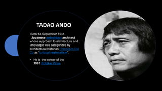
- 1. TADAO ANDO Born:13 September 1941. Japanese autodidact architect whose approach to architecture and landscape was categorized by architectural historian Francesco Dal Co as "critical regionalism". • He is the winner of the 1995 Pritzker Prize.
- 2. DESIGN PHILOSOPHY : the concept of sensation and physical experiences, mainly influenced by Japanese culture. The religious term ZEN focuses on the concept of simplicity and concentrates ON INNER FEELING RATHER THAN OUTWARD APPEARANCE. Zen influences vividly show in Ando's work and became its distinguishing mark. To practice the IDEA OF SIMPLICITY MATERIALS: Glass and Concrete, provides a sense of cleanliness and weightlessness (even though concrete is a heavy material) simultaneously. Due to the simplicity of the exterior, construction, and organization of the space are relatively potential to represent the aesthetic of sensation. ZEN SYMBOL
- 3. As an architect, he believes that architecture can change society, that "to change the dwelling is to change the city and to reform society". Ando’s ARCHITECTURAL STYLE is said to create A HAIKU EFFECT, emphasizing nothingness and empty space to represent space to represent the beauty of simplicity. He favours designing complex spatial circulation while maintaining the appearance of simplicity and absolute minimalism.
- 9. CHURCH OF LIGHT Location: Ibaraki, Osaka, Japan Year: 1989 Area: 113 m2 This building is a replacement for existing wooden wooden chapel. This church is seen as a place of retreat where the outside world is forgotten and the natural world is emphasized in a rater abstract manner by light . CONCEPT The church of the light embraces the Ando’s philosophical framework between nature and architecture through way in which light can define and create new spatial perceptions equally,if not more so,as that of his concrete structures. The DUAL NATURAL OF EXISTANCE – solid/void, light/dark, stark/serene.
- 10. The coexisting differences leave the church void of any, and all ornament creating a pure, unadorned space. The intersection of light solid raises the occupant’s awareness of the spiritual and secular within themselves. The budget was relatively low, about $250.000 US in construction costs.. BUILDING FORM ANALYSIS The Chapel consists of a rectangular volume of three cubes that are punctured by a wall at a fifteen-degree angle that never actually touches the other walls or ceiling of the chapel. Circulation into space is controlled by the angled wall.
- 11. The Sunday School addition is intended to complement the chapel. Functionally it serves as a support space consisting of a gathering area, kitchen, office, and storage. Compared to the chapel, this building is less symbolic and stresses a home- like character. Like the chapel, it is a rectangular volume penetrated by a freestanding wall. The overall similarity in form creates a strong tension between the two buildings. The interior of the building is composed of tight spaces girded with Japanese Linden Plywood resulting in a very warm and inviting atmosphere.
- 12. A second story allows for a kitchen and balcony above and office and storage space below. Adjacent to these rooms the gathering area occupies a double-height space. Consisting of only six walls and a ceiling, it is a testament to the phrase “less is more”. The abstract nature of the architecture glorifies itself with small moves and ideas that have a big impact on the success of this design. This building has a sort of timeless quality that is reinforced by its modest character.
- 13. The chapel rejects the surrounding high-tech metropolis with surreal introversion of the relationship between light and Christianity. It serves as a physical connection between the congregation and the religion because the outside world is forgotten and the spiritual is seen inside this place. The careful attention to detail and celebration of the purity of form is evident in this building the same way they are in many other buildings, but do not compromise the functional purpose of the religion.
- 15. KOSINO HOUSE LOCATION: Ashiya, Hyogo, Japan YEAR : 1984 In 1979, the famous fashion designer Hiroko Koshino commissioned the Japanese architect Tadao Ando to design a single-family house on a large plot located on a wooded slope of the Setonaikai National Park, in the city of Ashiya. CONCEPT • The house is organized into two parallel bodies, joined by an underground passage that defines a central courtyard. • The body contains a shorter living room of double height, while the longest wing houses several bedrooms. • The study is in the form of a crescent, adjacent to the living room, was added later, in sharp contrast with the composite bodies already in existence.
- 16. A house composed of two parallel volumes of reinforced concrete although they are joined inside through an underground corridor, on the outside they are separated by a patio partially sunken in the ground. The entire house is structured as a Japanese garden around a series of scenic backgrounds, designed to boost the awareness of nature. The two big openings in the living room offer views of the steep slopes, with trees and hills in the distance.
- 17. This large staircase receives the sunlight that passes through the trees and reflects it, creating a space that extends to the exterior the daily life of the interior of the house. Ando himself considers this patio as a natural and autonomous space that man appropriates. In addition, in the walls that order that patio, grooves are created where light and shadow intersect, breaking the exterior monotony The patio serves as a transition space between the exterior of the house and its interior, which it opens through large sliding glass doors. Its functional approach is so simple, one of the volumes contains the public spaces and the other the private ones. The shortest volume has two floors and contains public rooms, such as the living room, the dining room, or the kitchen. The longest and narrowest block houses the bedrooms, divided between those solved in a western way and those solved in an eastern way,
- 18. All the walls are made of smooth concrete and are free of ornamentation and in their natural form. . Ando used this material because it is a way to admit light and wind within the walls and create a sense of serenity and wide open spaces MATERIALS
- 19. STRUCTURE
- 21. MINORU YAMASAKI Born : December 1, 1912 Seattle, Washington,US Yamasaki was a Japanese- American architect. Yamasaki was one of the most prominent architects of the 20th century. During his three-decade career, he and his firm designed over 250 buildings.[7] His firm, Yamasaki & Associates, closed on December 31, 2009.
- 22. DESIGN PHILOSOPHY : He was known for his philosophy, "BEAUTY OVER FUNCTION." He criticised tasteless and identical glassy buildings that were characteristic of the modern architecture of his time and was determined to incorporate elements that brought delight and comfort to people's eyes and minds. the AUSTERITY AND PRACTICALITY OF THE MODERN AND INTERNATIONAL STYLE MOVEMENT influenced Yamasaki’s early training and experience Every design he created from the strove on He was inspired by Gothic architecture and the usage of narrow and vertical windows. surprise serenity delight Architecture from the university of Washington in 1932 Started practice in suburban Detroit, Michigan in 1945 Became the chief of design at Smith Hinchmn and Gryllis company Established a company with George Hellmuth and Joseph Leinweber in 1949
- 24. DESIGN ELEMENTS AND FEATURES Use of traditionally rich materials, such as travertine, marble, and granite or man materials that mimic their luxurious qualities Buildings are usually set on a podium. Designed to achieve modern monumentality Embraces classical precedents, such as arches, colonnades, classical columns and entablatures Smooth wall surfaces. Delicacy of details. Formal landscape, use of pools, fountains, sculpture within a central plaza,
- 30. TORRE PICASSO Location: Madrid, Spain Year: 1974-1978 Area: 121.000m2 The architecture of the Torre Picasso is influenced by oriental art and simple but sculptural forms that distinguish the architect in his works. Meeting the demands of the program in terms of form and function, Yamasaki displayed on the facade the elements that would make his work, not only the highest of modern Madrid but a beautiful and elegant building, an icon of the Spanish capital for nearly two decades This draws on history, clean façade sight, is crowned with a cornice like a Doric column and reminds Adolf Loos of the external design of the Chicago Tribune.
- 31. Notable feature wide entrance arch, which supports the entire facade above it, with an underground steel reinforcement. The space under the arch is covered by a special type of safety glass called STADIP. SPACES : The tower was built on a plot of 10,000 square meters, with 45 floors above ground rectangular, 38×50 feet, 5 basements and a total height of 157 meters from the street level or 171 if measured from the last basement. The tower has an official postal courier, loading and unloading and internal messaging. From the upper floors, 42 are for offices and the ground floor serves as the main entrance, where 18 elevators are located in three groups of six. All plants loos feature for use by the occupants of said plant. •Total area: 121,000 m² •In office space: 71,700 m² •Dimensions for floor: 38×50 meters •Height above ground: 157 meters •Height from the 5th basement: 171 meters FLOOR PLANS FROM 2- 18 FLOOR
- 32. •ELEVATORS The plant climbing 1 to 18 displayed a speed of 2.5 meters per second, the plants serving 18-32 have a speed of 4 meters per second which will plant 32 to 43 is considered the battery faster elevators installed in Spain, 6 meters per second. •PLANTS Plants generally rectangular in shape and with a surface of 1900 m², are completely diaphanous, having occupied the central part of the block of 18 lifts, 4 ladders, technical rooms, bathrooms and a space of 120m ² destined for a fireplace rise to emissions from the ventilation network of underground roads AZCA, financial complex that owns the tower. •ROOF On deck, the 44th floor, are the cooling towers and distribution of the hydraulic system of air conditioning. In the plant 45 is the machinery of one of the blocks has elevators whose upper forged using a heliport.
- 33. FOUNDATION: The foundation was executed based on 120 piles with a of 1.80 m and a length of 16 m. The building structure core of a perimeter of the floor and act as the diaphragm, The core is a metal structure with 38 pillars, double formed by hand from the basement to the second floor wall and from the 2nd floor to the coronation, with 56 The floors are freestanding metal and concrete with aggregate, which gives a density of 1800 kg / m 3 Materials Façade: The facade of the building offers a high coefficient of thermal and acoustic insulation due to the combination of an aluminum frame and a vertically disposed thermal glazing and leaving small windows between the pillars of the facade.
- 34. WORLD TRADE CENTRE Location: Lower Manhattan, New York, U.S. Year: 1973 -11 September 2001 Area: 400,000 m² • The project was developed by the Port Authority of New York and New Jersey. . • The idea for the World Trade Center arose after World War -2 as a way to supplement existing avenues of international commerce in the United States. • The Port Authority hired architect Minoru Yamasaki, who came up with the specific idea for twin towers. The towers were designed as framed tube structures, which provided tenants with open floor plans, uninterrupted by columns or walls. • The towers were the world's tallest buildings when they opened in 1973.
- 35. • The towers had a square plan, approximately 207 feet (63 m) in dimension on each side.[ The buildings were designed with narrow office windows, only 18 inches (45 cm) wide, which reflected on Yamasaki's fear of heights and desire to make building occupants feel secure. • The windows only covered 30% of the buildings' exteriors, making them look like solid metal slabs from a distance. • The building's core housed the elevator and utility shafts, restrooms, three stairwells, and other support spaces. The core of each tower was a rectangular area 87 by 135 feet (27 by 41 m), and contained 47 steel columns running from the bedrock to the top of the tower. • The large, column-free space between the perimeter and core was bridged by prefabricated floor trusses. The floors supported their own weight, as well as live loads, provided lateral stability to the exterior walls, and distributed wind loads among the exterior walls. DESIGN:
- 36. Core Typical Twin Tower floor framing
- 37. CONSTRUCTION: • The site of the World Trade Center was located on landfill , with the bedrock located 65 feet (20 m) below grade. In order to construct the World Trade Center, it was necessary to build "The Bathtub", with the slurry wall along the West Street side of the site, to keep water from the Hudson River out. • Construction work on the North Tower began in August 1968 with construction beginning on the South Tower by January 1969. • Extensive use of prefabricated parts for the perimeter framing and floor truss systems helped speed up the construction process and reduce costs, while providing greater quality control.
- 38. • Bathtub refers to the underground foundation area at the site of the World Trade Center and accompanying buildings in New York City. The term bathtub is something of a misnomer, as the area does not hold any water; rather the purpose of its design is to keep water out. The name is more so used to describe its shape of a deep basin with high walls, like a bathtub.