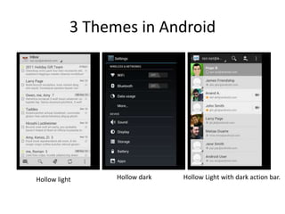
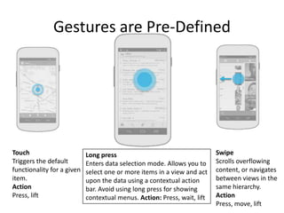
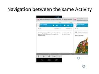
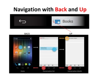
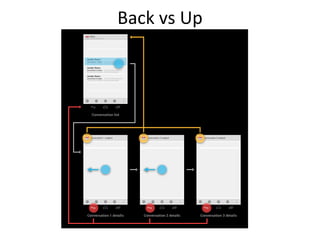
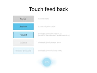
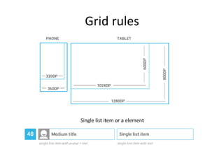
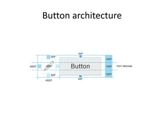
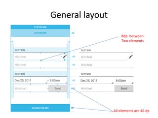
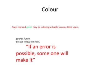
Android Styles and Design
        Patterns


                                          易舒华
                                        Eashwar Raghunathan
                                           www.eashwar.in


   “If an error is possible, some one will make it”
3 Themes in Android


Hollow light     Hollow dark   Hollow Light with dark action bar.
Gestures are Pre-Defined


Touch                       Long press                                    Swipe
Triggers the default        Enters data selection mode. Allows you to     Scrolls overflowing
functionality for a given   select one or more items in a view and act    content, or navigates
item.                       upon the data using a contextual action       between views in the
Action                      bar. Avoid using long press for showing       same hierarchy.
Press, lift                 contextual menus. Action: Press, wait, lift   Action
                                                                          Press, move, lift
Navigation between the same Activity
Navigation with Back and Up


    BACK            UP
Back vs Up
Touch feed back
Grid rules


Single list item or a element
Button architecture
General layout

                     8dp between
                     Two elements


                 All elements are 48 dp
Colour

Note: red and green may be indistinguishable to color-blind users.


    Sounds funny,
    But we follow the rules,

        “If an error is
    possible, some one will
    make it”
Help notes
Keep it brief -- character limit (including spaces

Keep it simple -- short words, active verbs, and common nouns.

Be friendly -- Talk directly to the reader using second person ("you"). Make the user feel
safe, happy and energized.

Put the most important thing first -- The first two words (around 11 characters, including
spaces) should include at least a taste of the most important information in the string. If
they don't, start over.
Describe only what's necessary, and no more. Don't try to explain subtle differences.
They will be lost on most users.
Avoid repetition. If a significant term gets repeated within a screen or block of text, find a
way to use it just once.
谢谢
         Thank you
Usability and Design Lab, Beijing
                      We know user better…


           易舒华
          Eashwar Raghunathan
             www.eashwar.in

Android design style(Google)

  • 1.
    Android Styles andDesign Patterns 易舒华 Eashwar Raghunathan www.eashwar.in “If an error is possible, some one will make it”
  • 2.
    3 Themes inAndroid Hollow light Hollow dark Hollow Light with dark action bar.
  • 3.
    Gestures are Pre-Defined Touch Long press Swipe Triggers the default Enters data selection mode. Allows you to Scrolls overflowing functionality for a given select one or more items in a view and act content, or navigates item. upon the data using a contextual action between views in the Action bar. Avoid using long press for showing same hierarchy. Press, lift contextual menus. Action: Press, wait, lift Action Press, move, lift
  • 4.
  • 5.
    Navigation with Backand Up BACK UP
  • 6.
  • 7.
  • 8.
    Grid rules Single listitem or a element
  • 9.
  • 10.
    General layout 8dp between Two elements All elements are 48 dp
  • 11.
    Colour Note: red andgreen may be indistinguishable to color-blind users. Sounds funny, But we follow the rules, “If an error is possible, some one will make it”
  • 12.
    Help notes Keep itbrief -- character limit (including spaces Keep it simple -- short words, active verbs, and common nouns. Be friendly -- Talk directly to the reader using second person ("you"). Make the user feel safe, happy and energized. Put the most important thing first -- The first two words (around 11 characters, including spaces) should include at least a taste of the most important information in the string. If they don't, start over. Describe only what's necessary, and no more. Don't try to explain subtle differences. They will be lost on most users. Avoid repetition. If a significant term gets repeated within a screen or block of text, find a way to use it just once.
  • 13.
    谢谢 Thank you Usability and Design Lab, Beijing We know user better… 易舒华 Eashwar Raghunathan www.eashwar.in