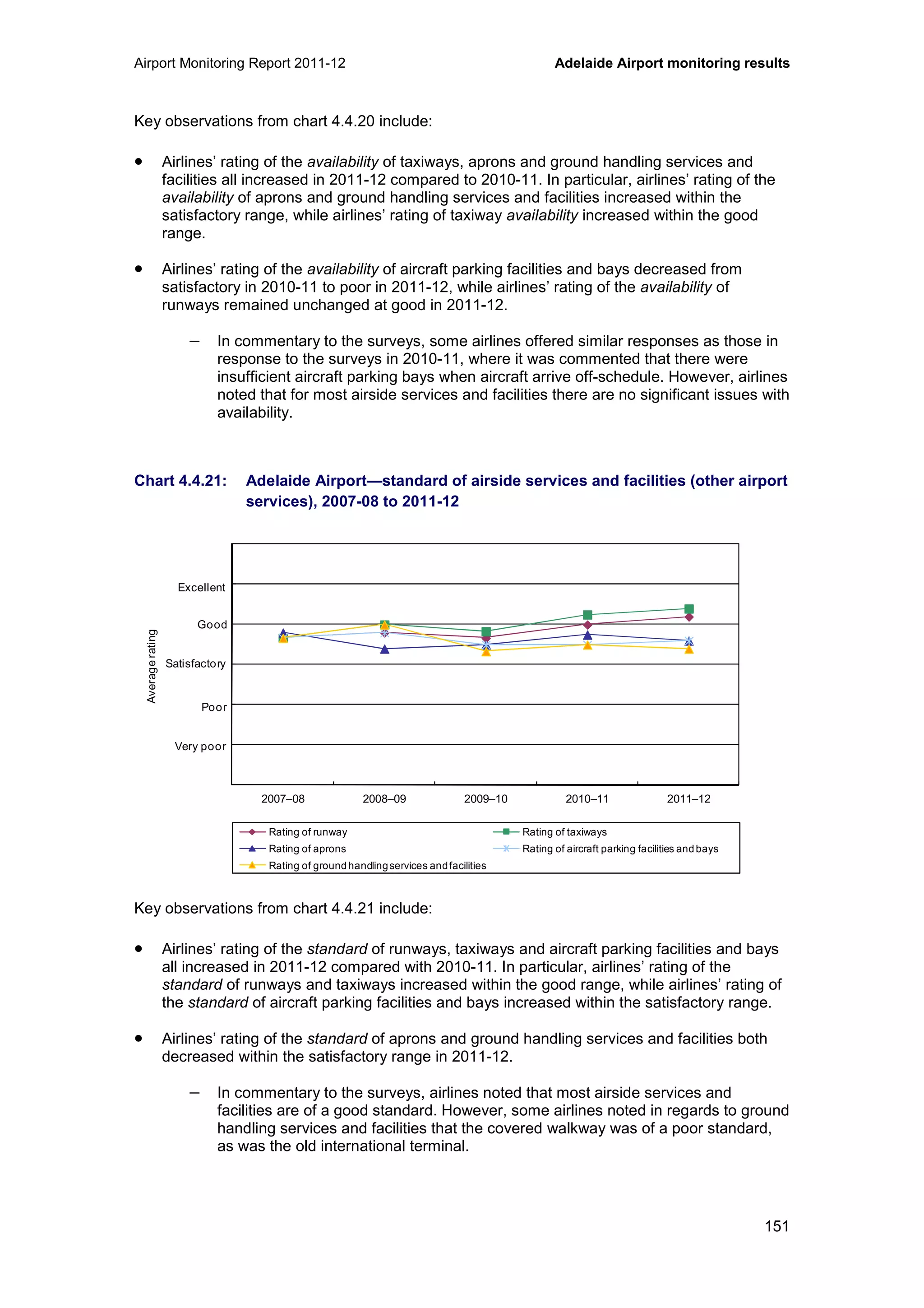
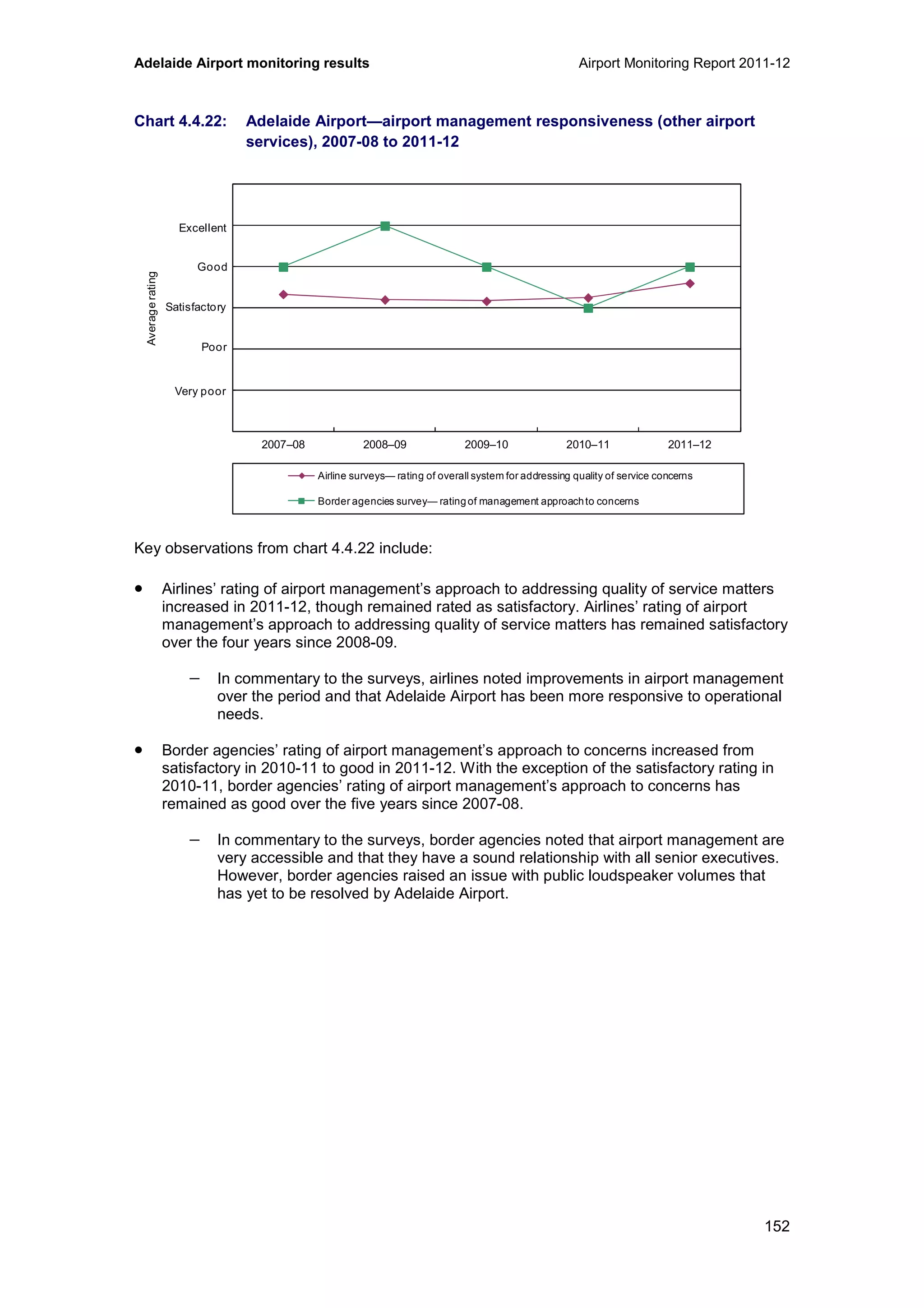
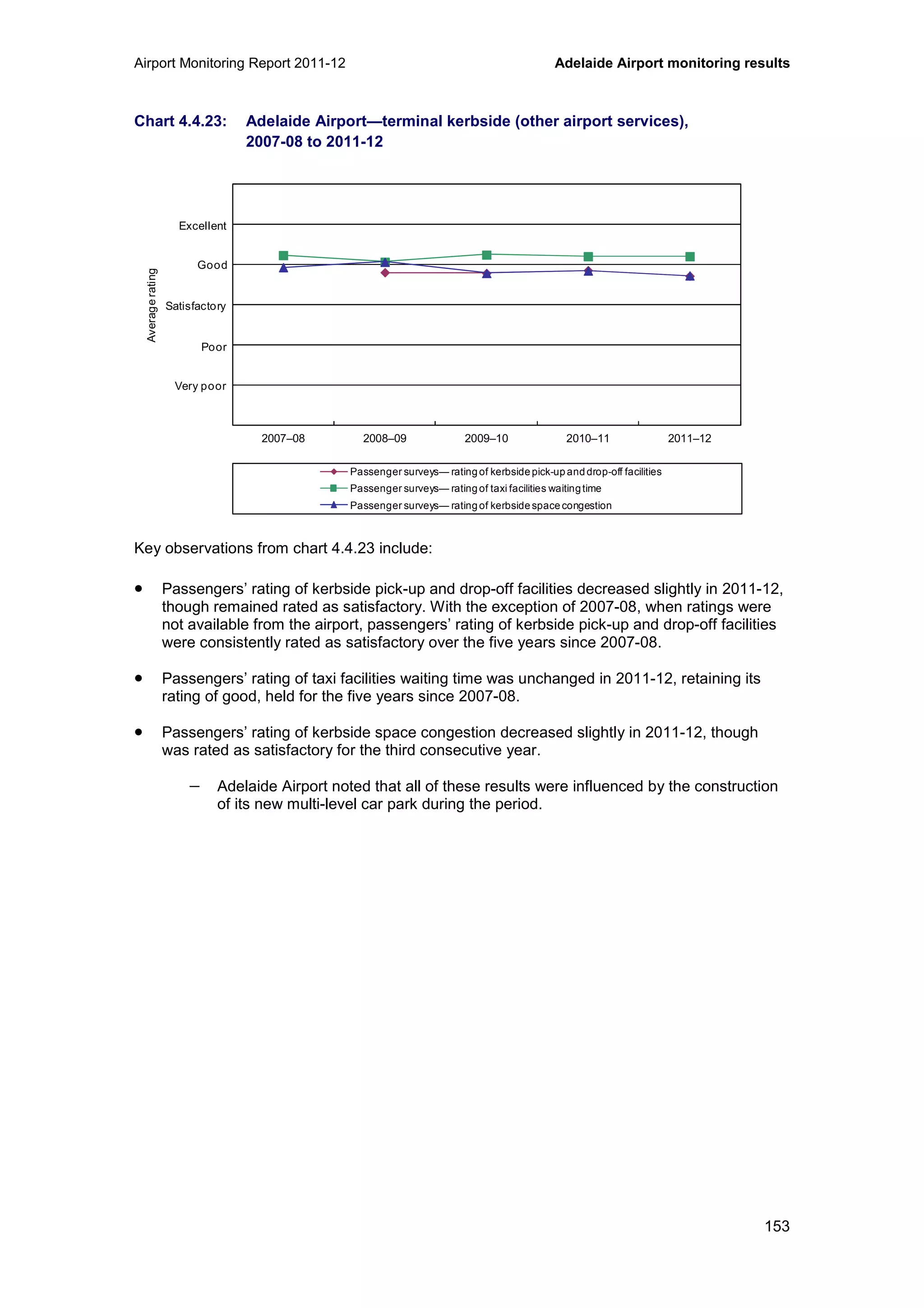
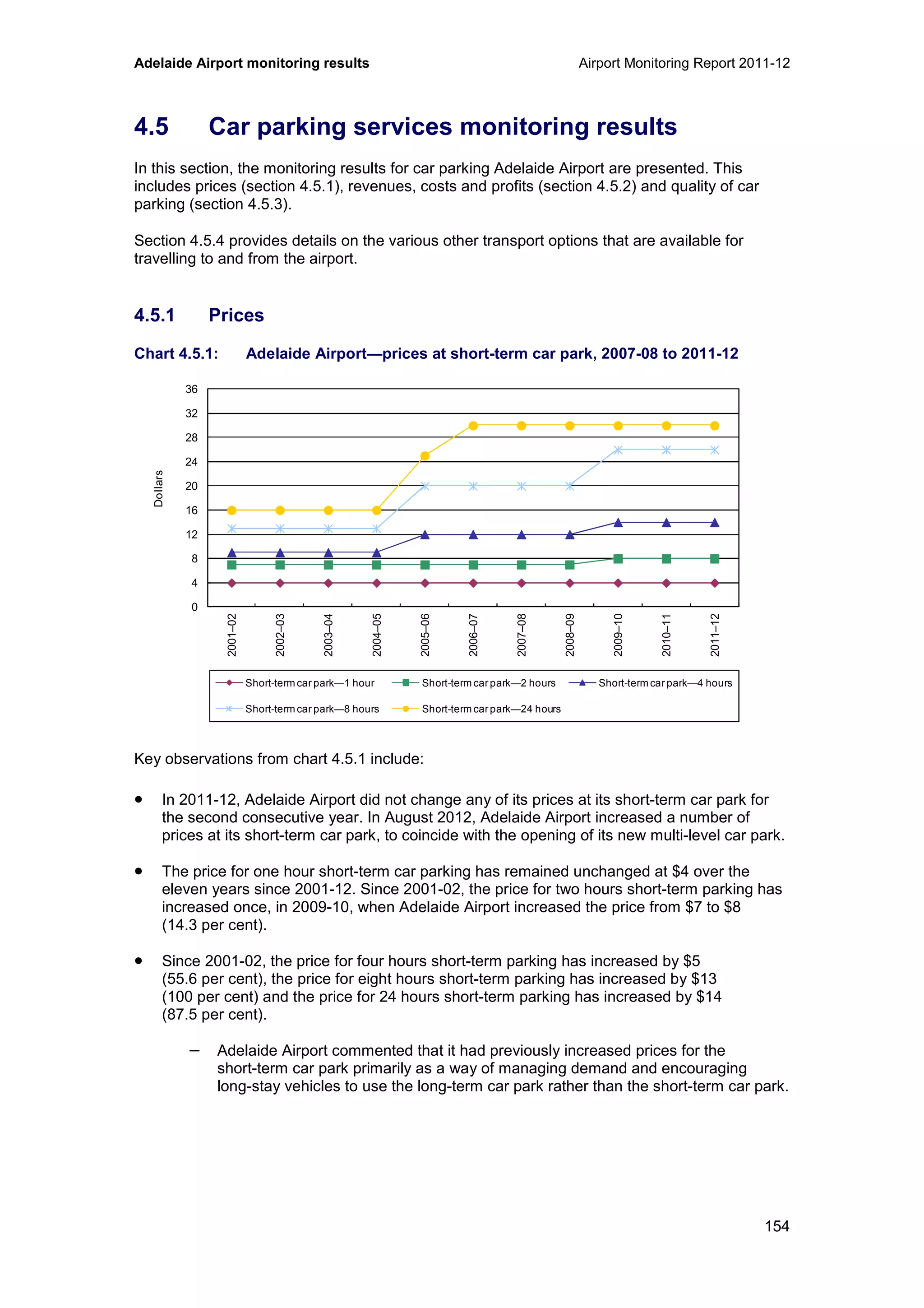
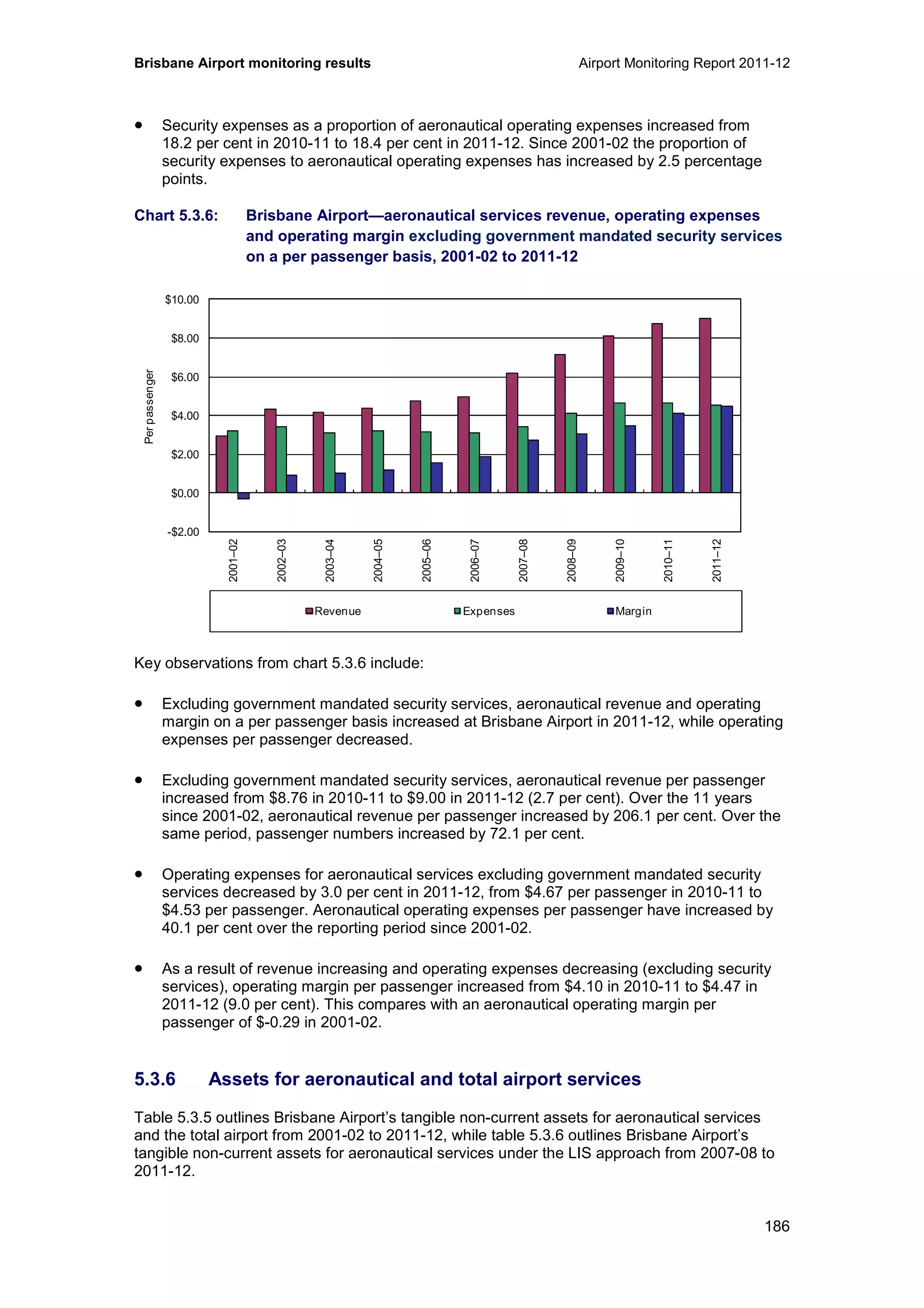
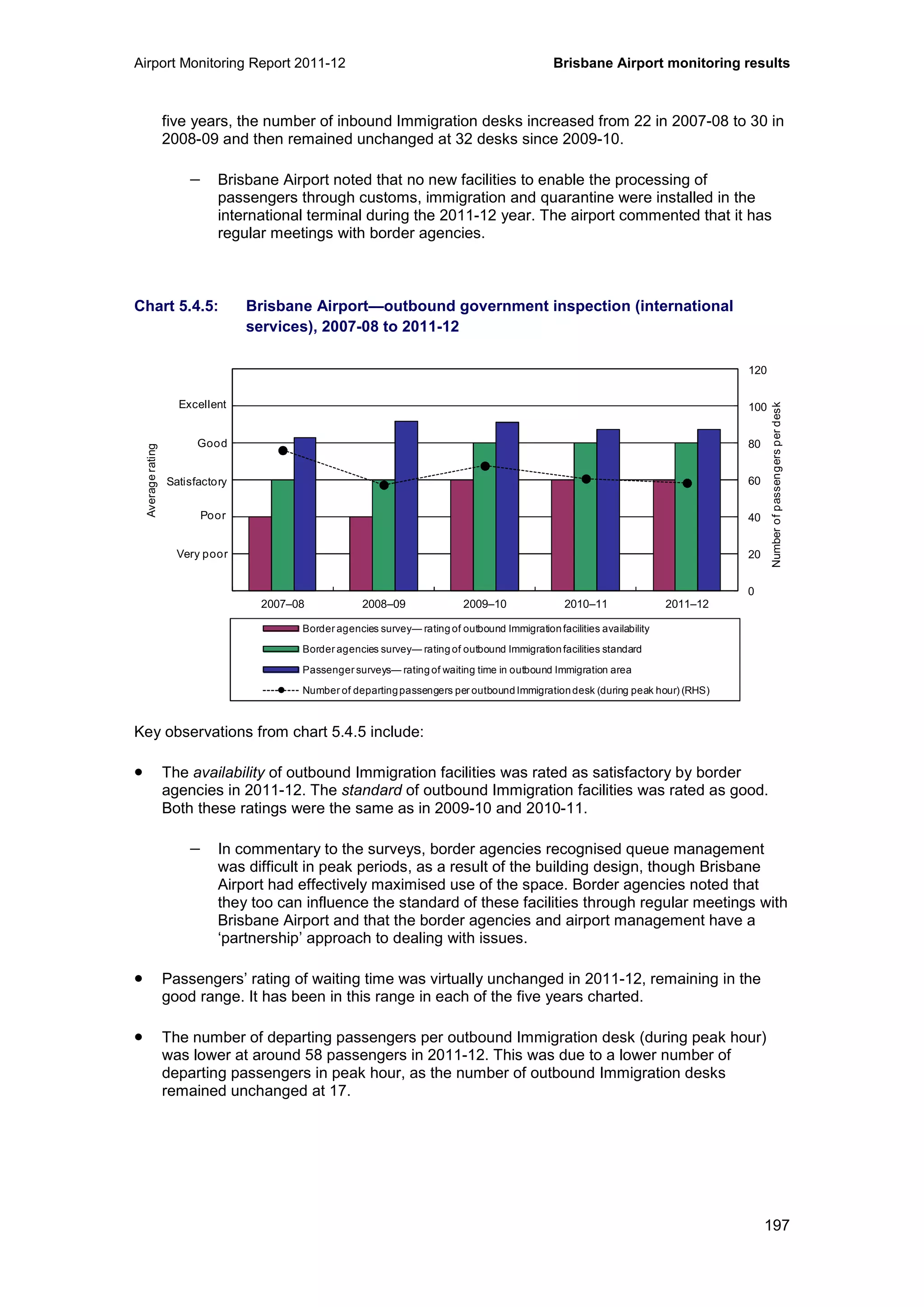
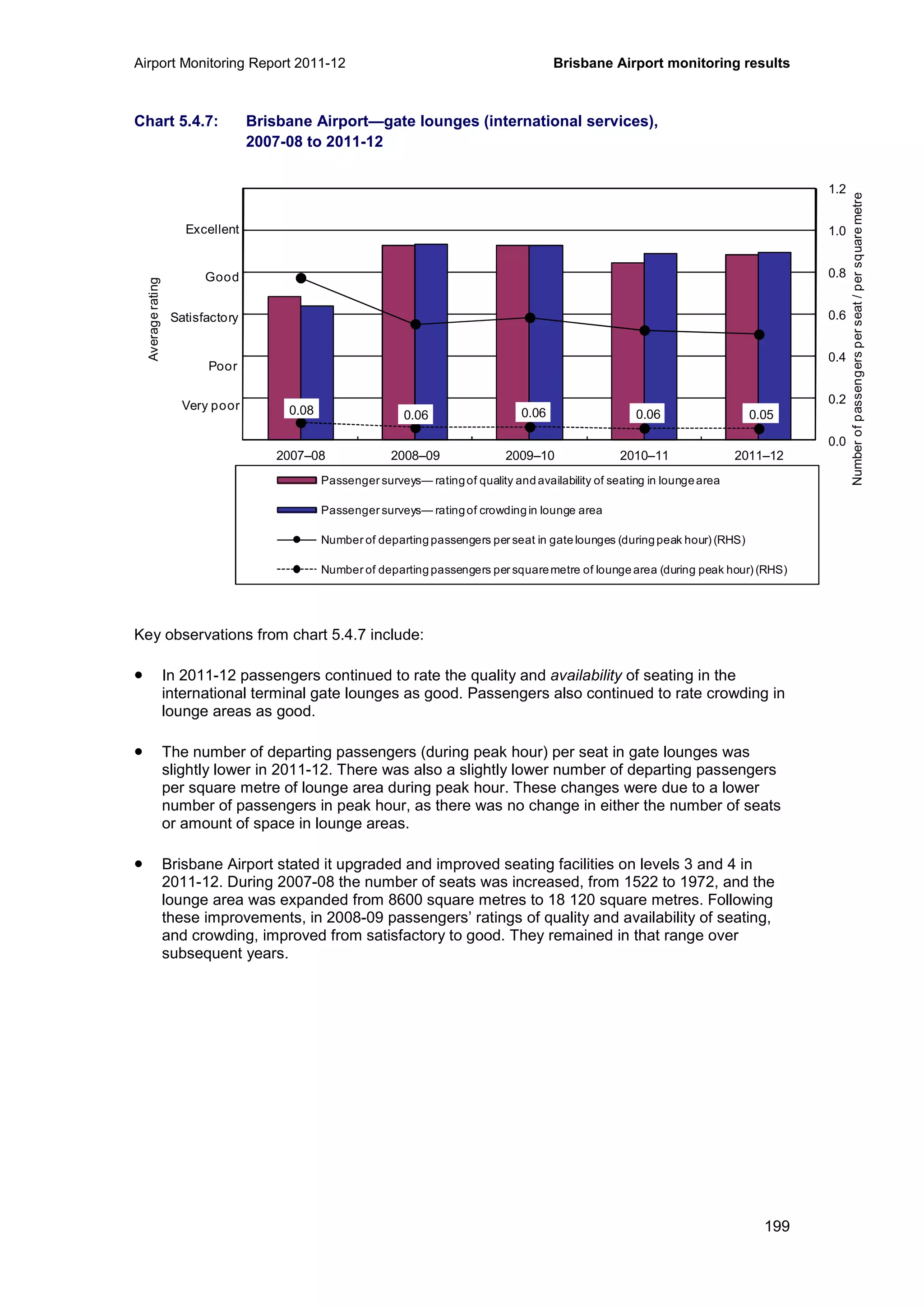
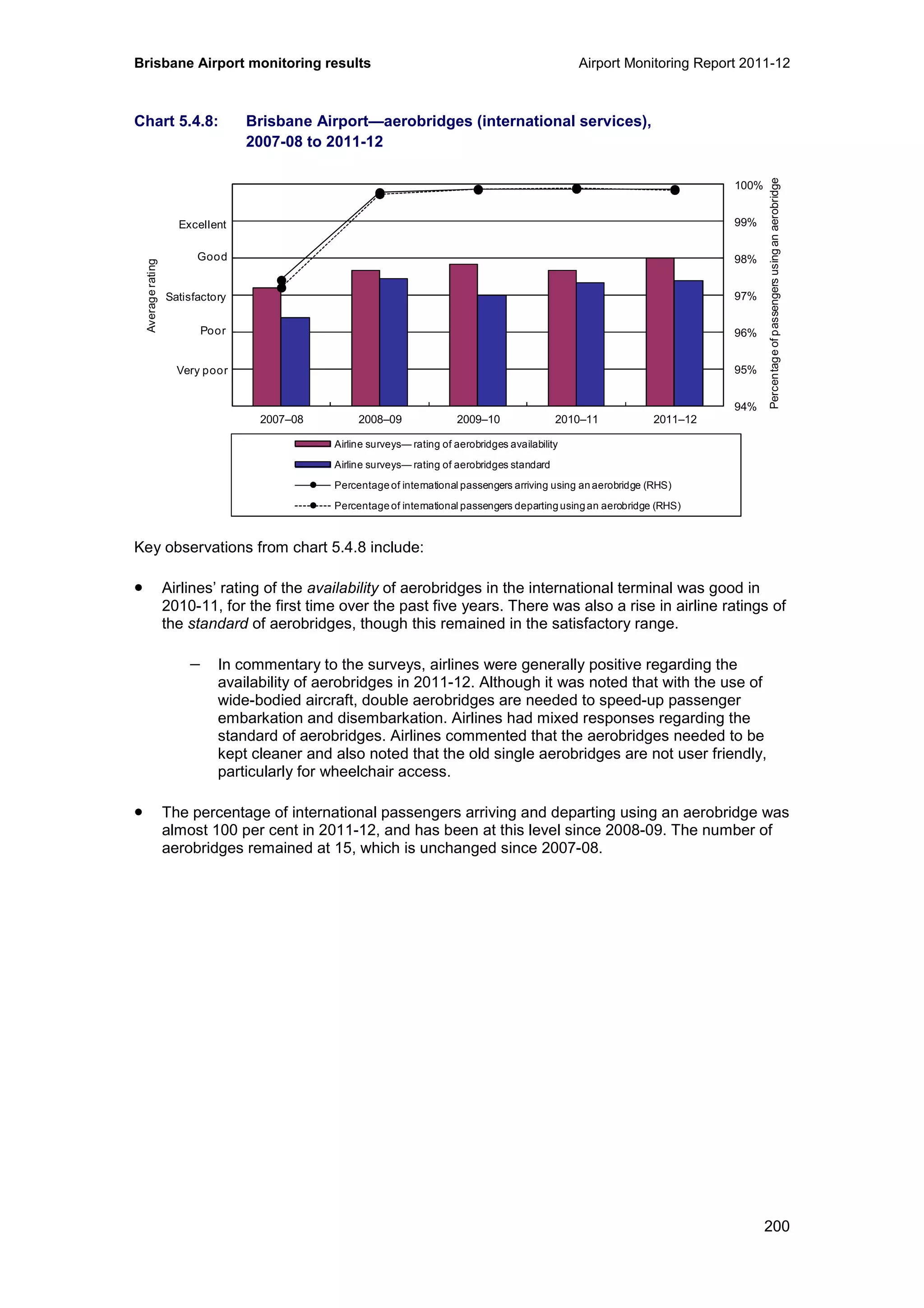
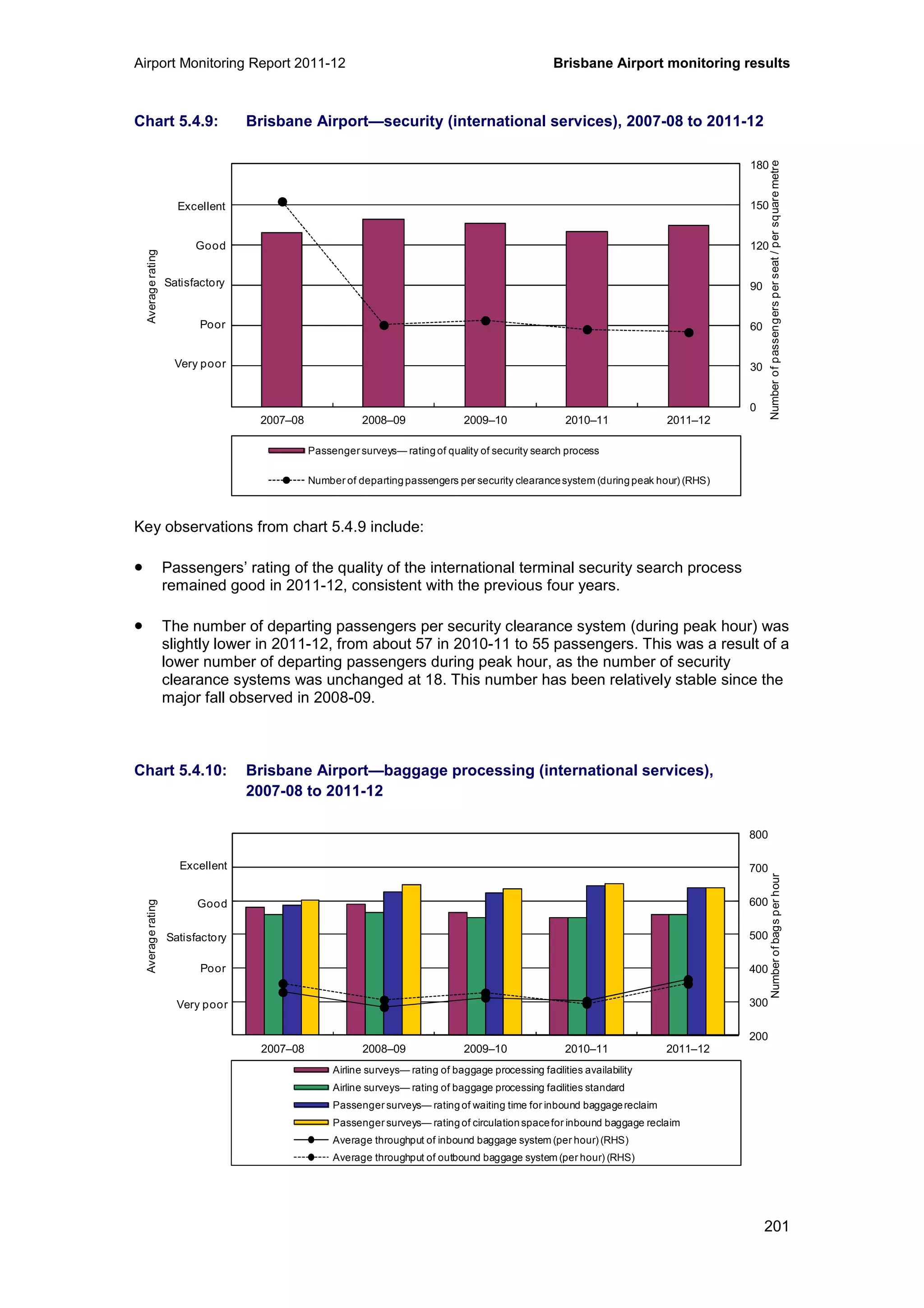
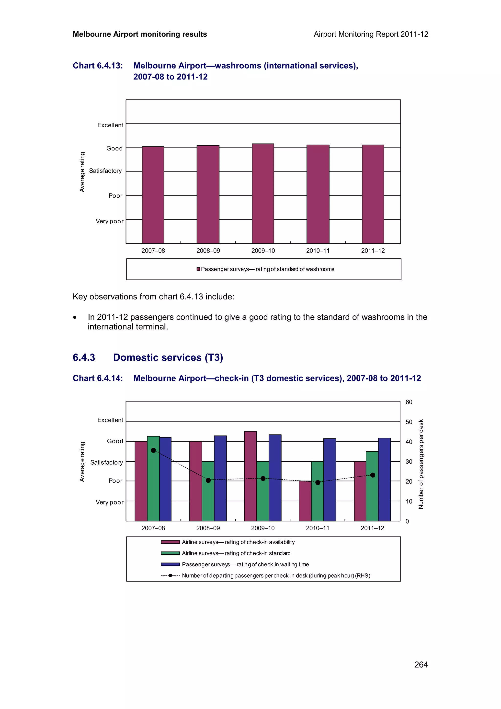
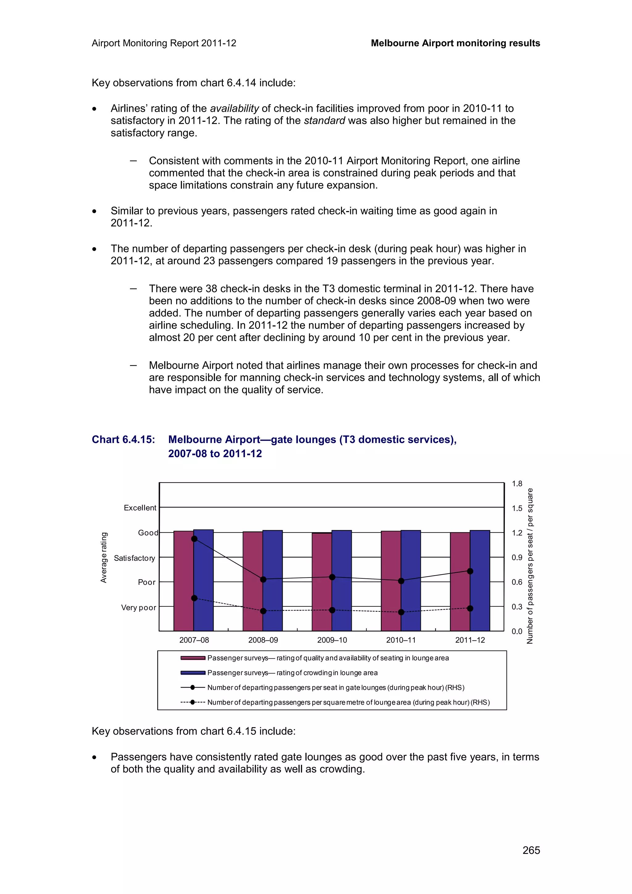
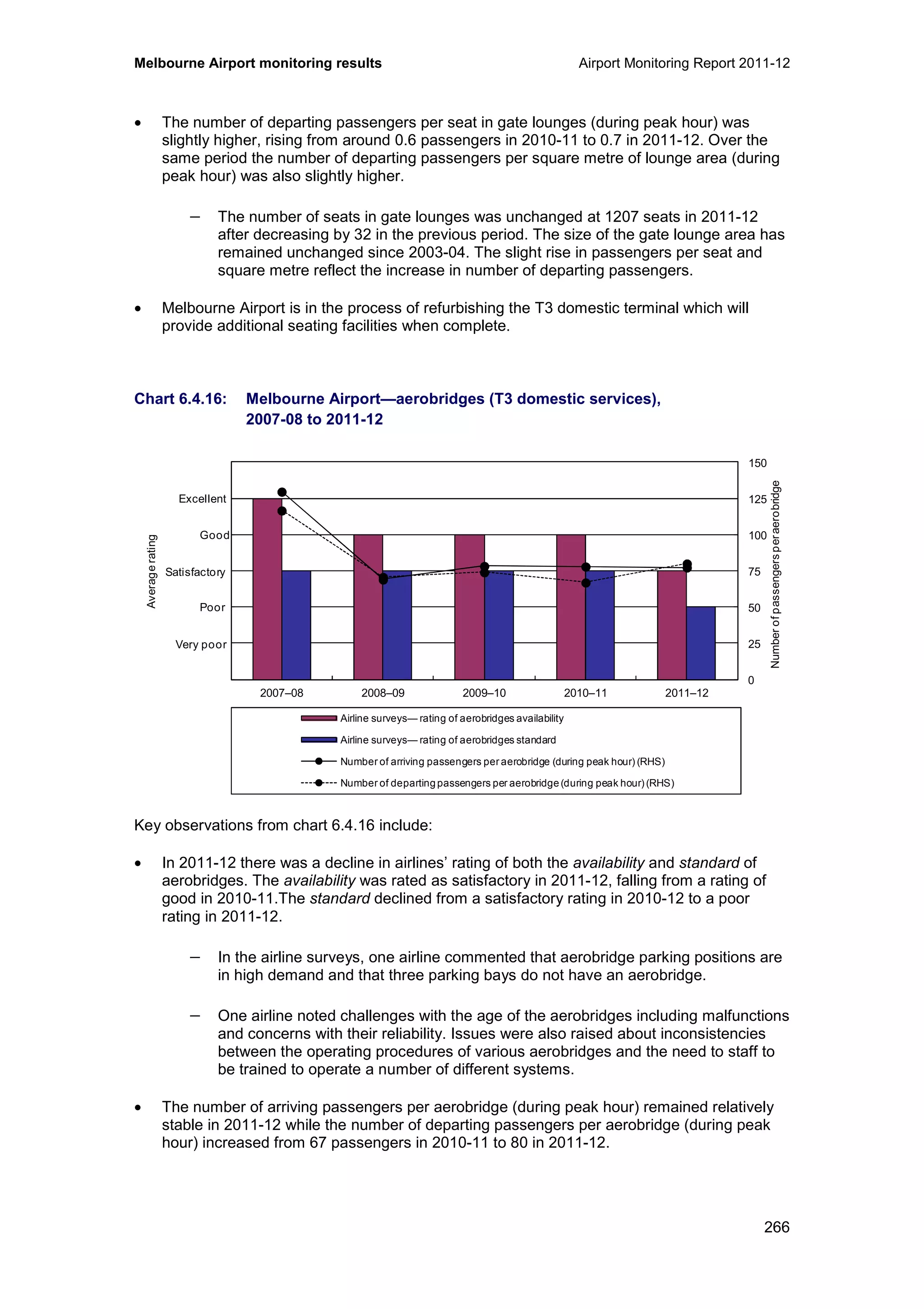
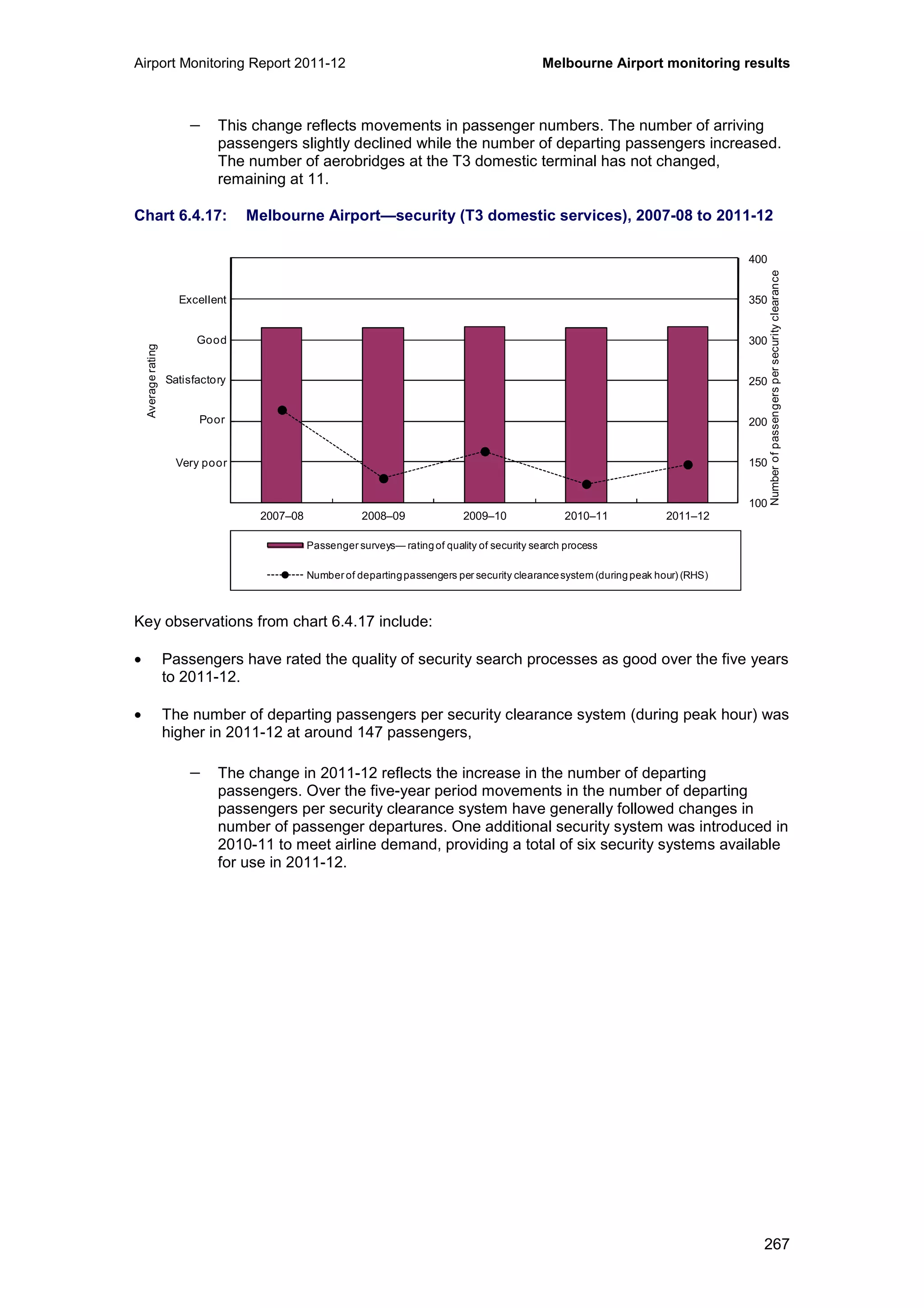
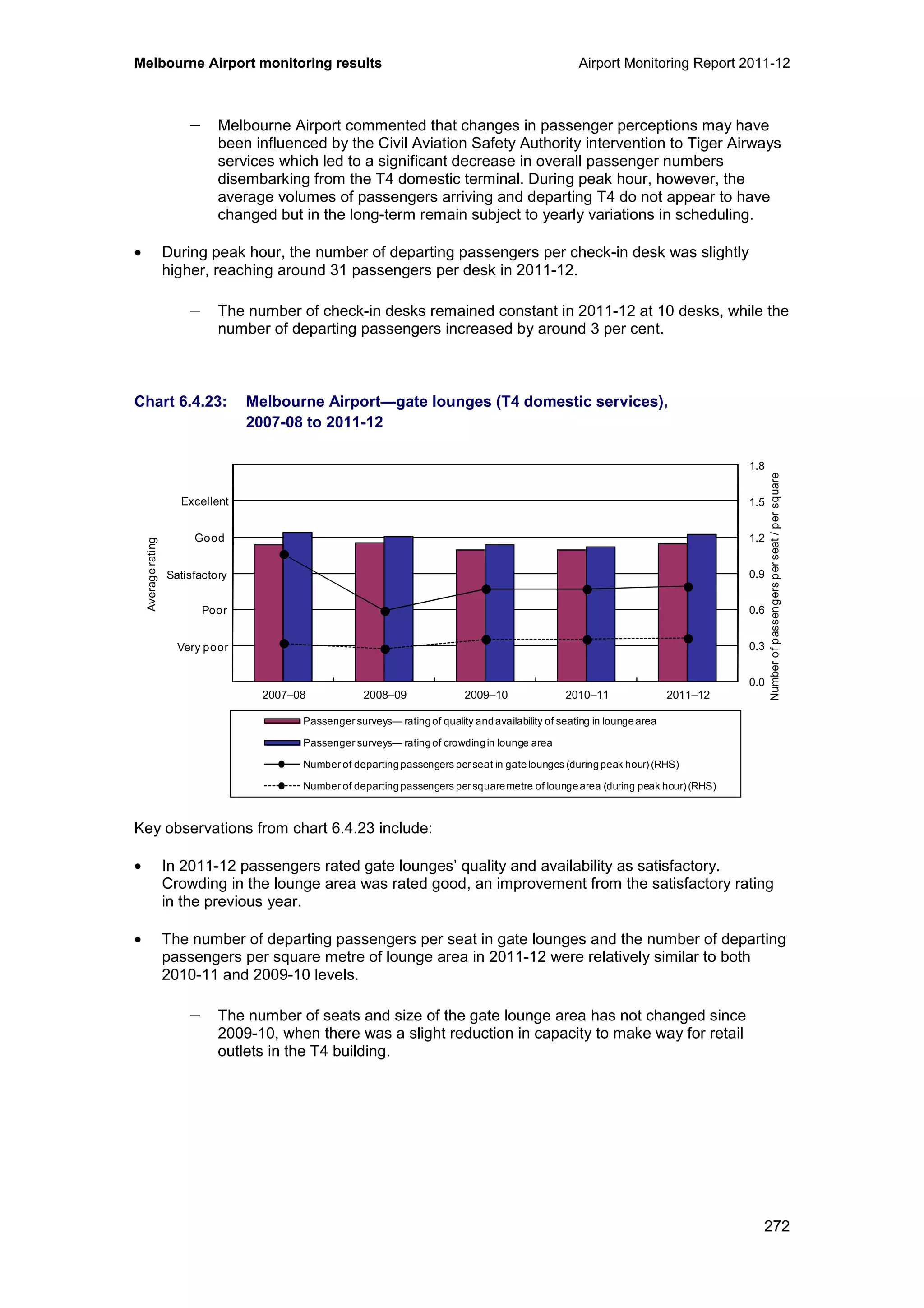
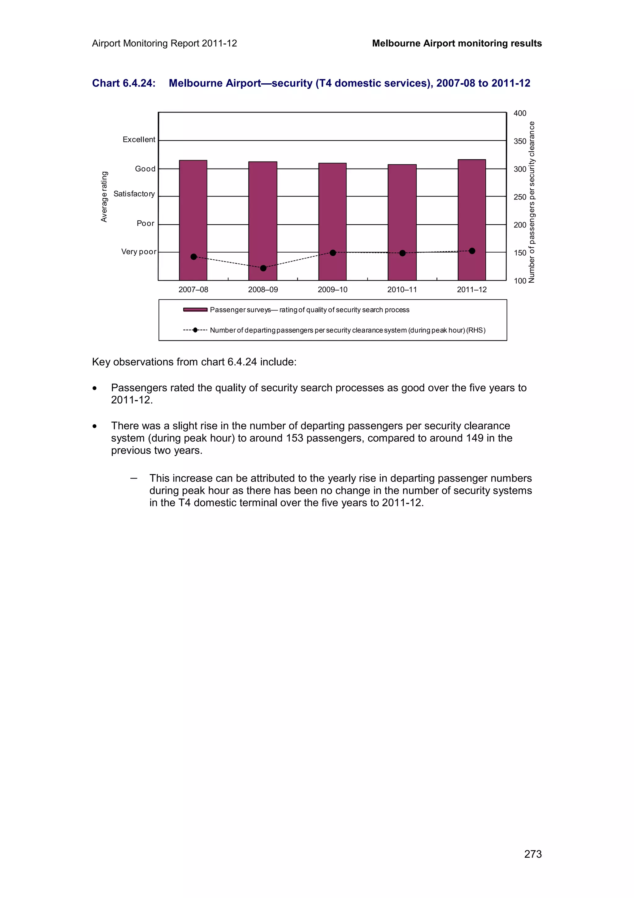
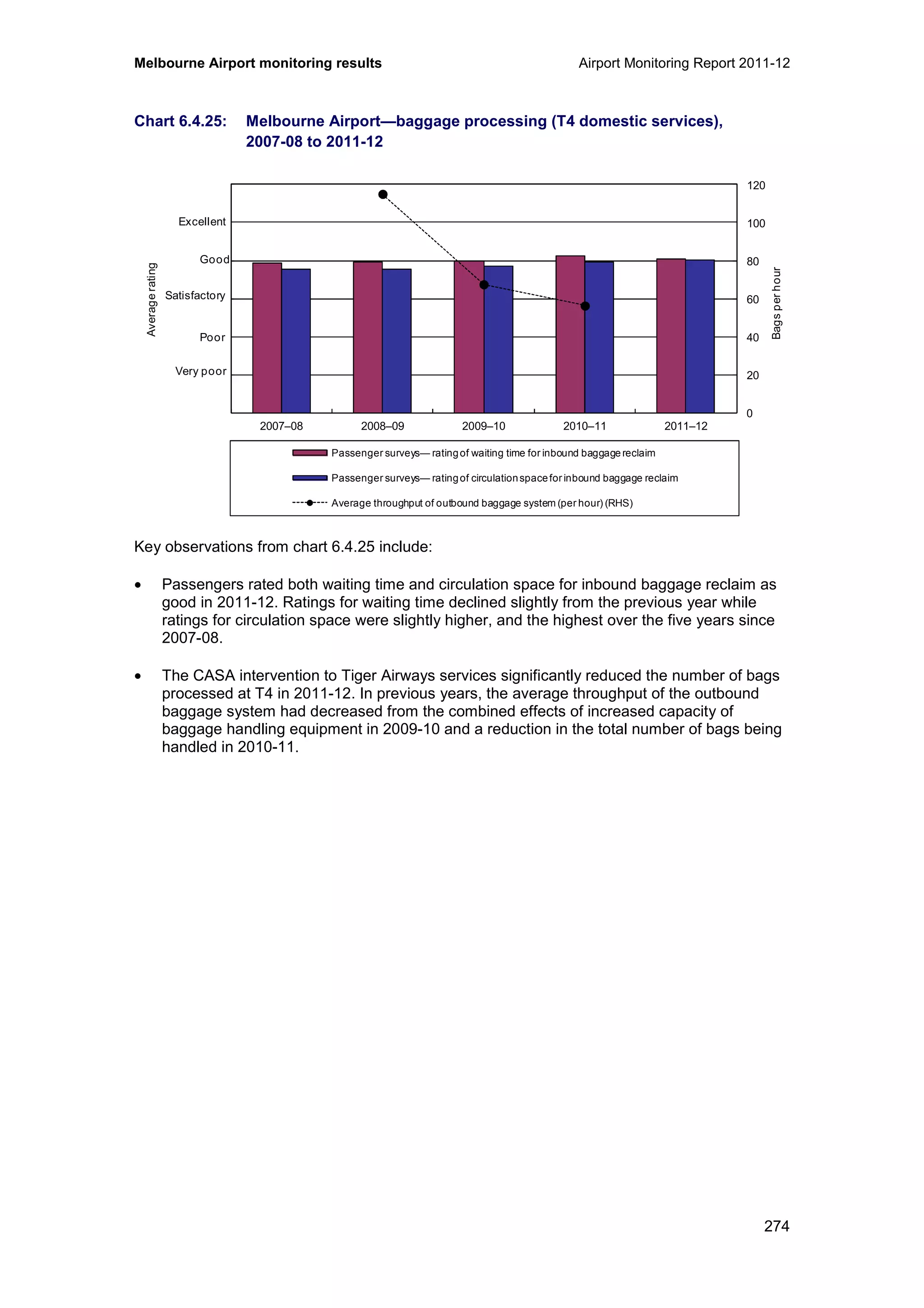
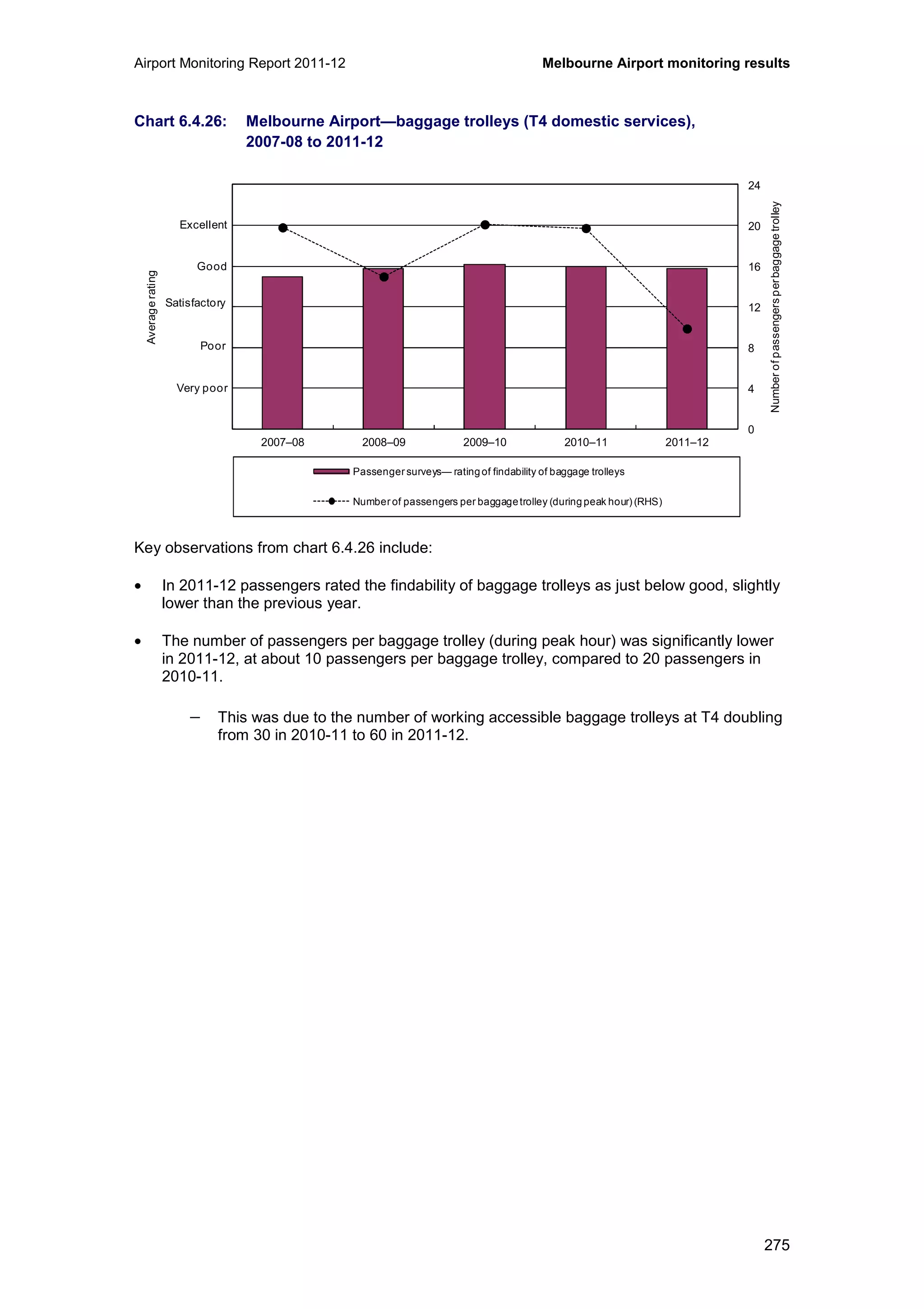
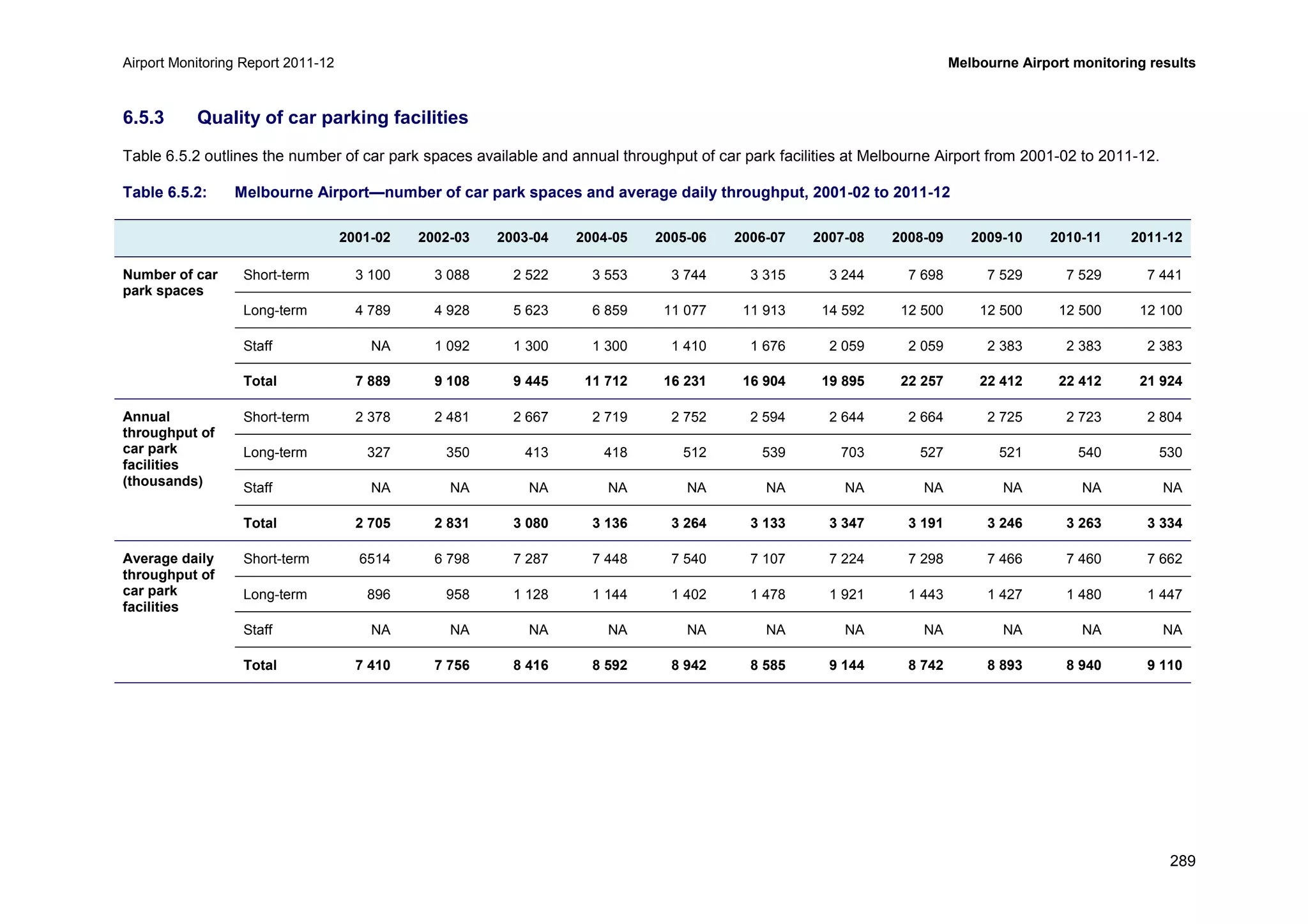
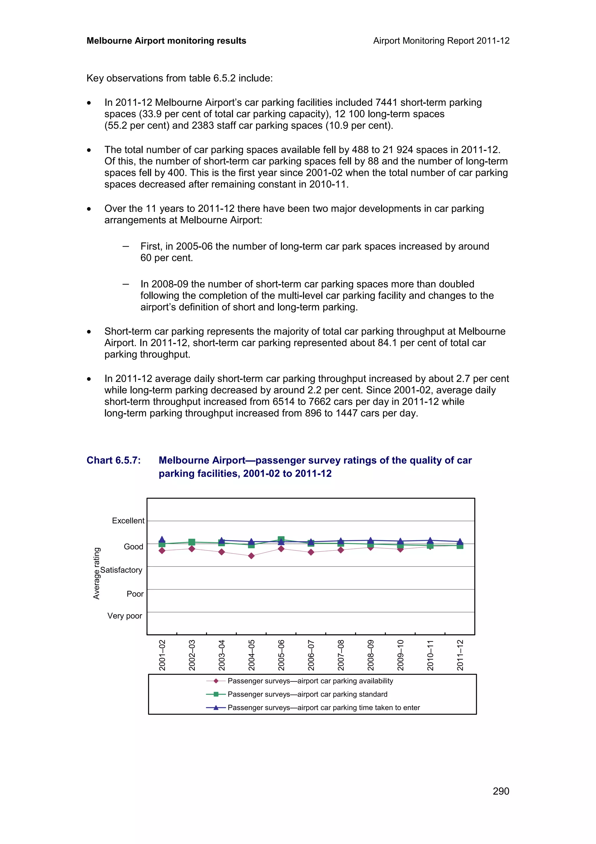
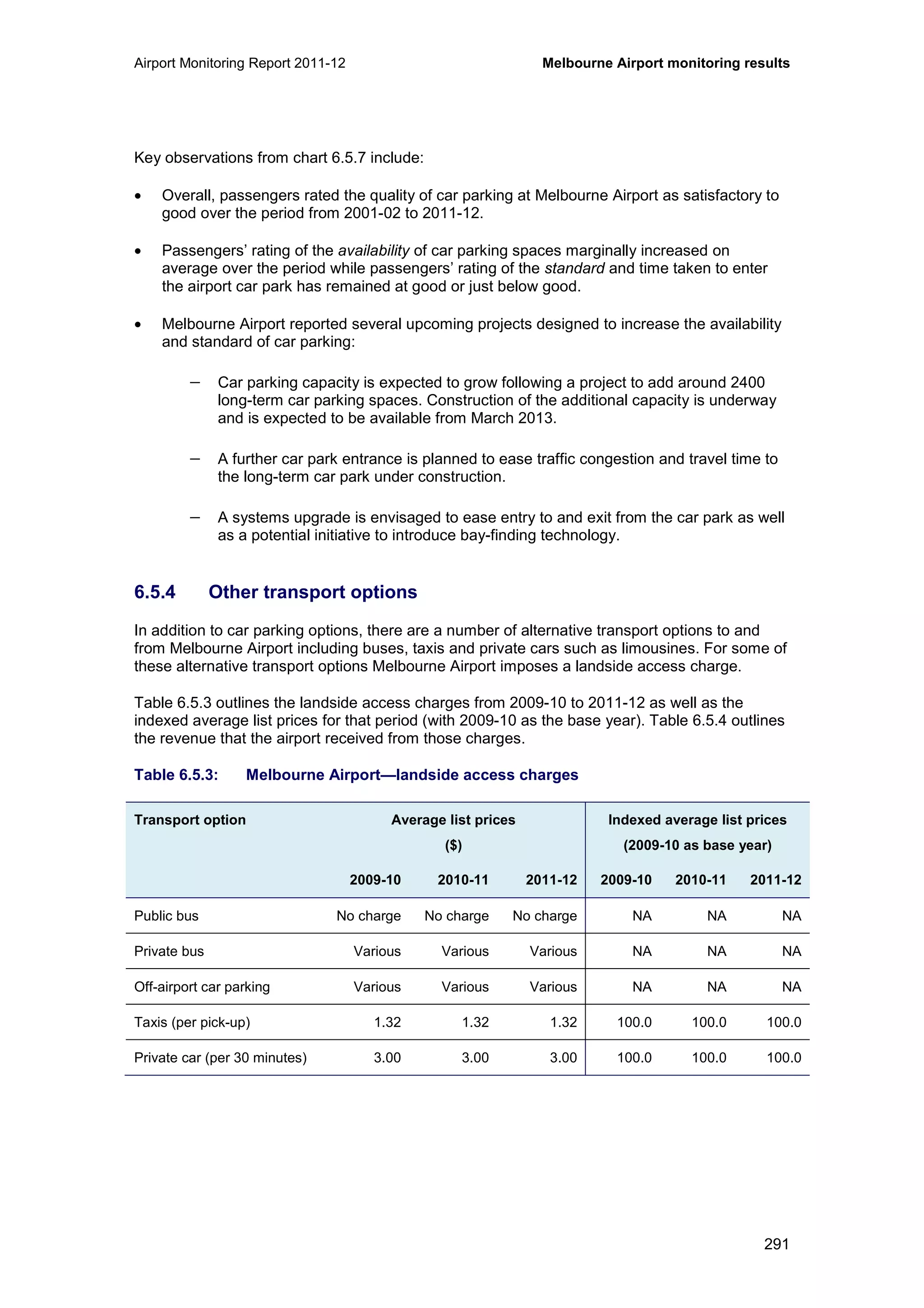
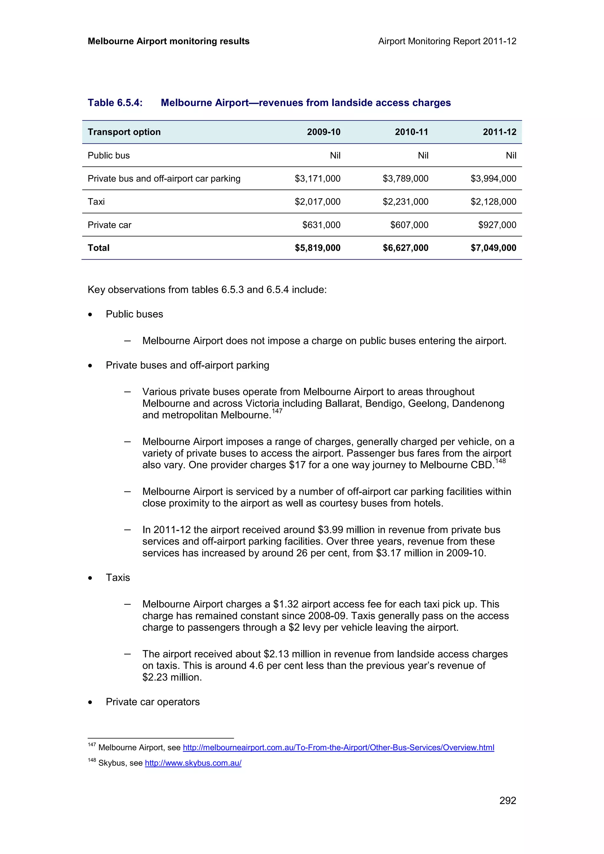
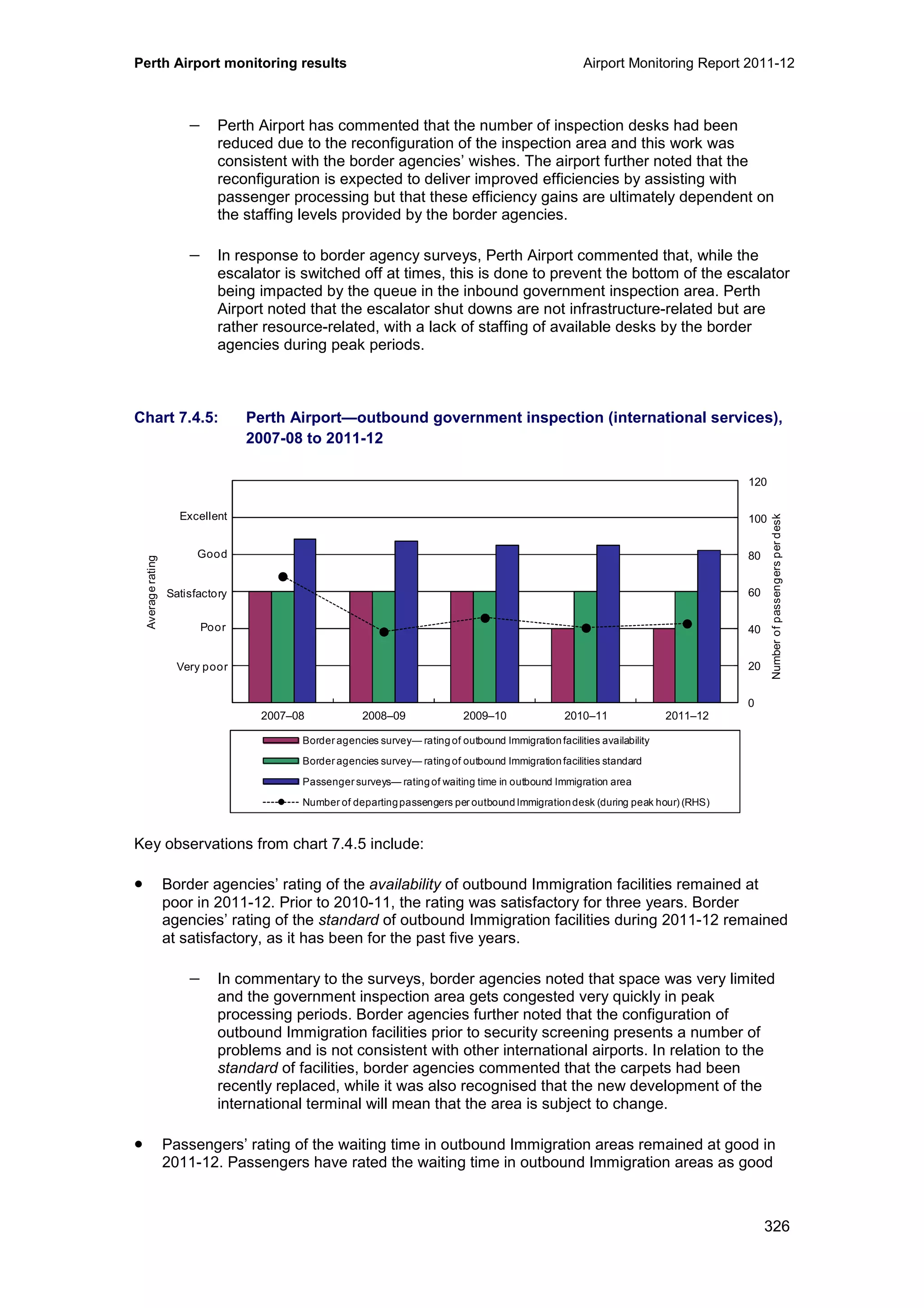
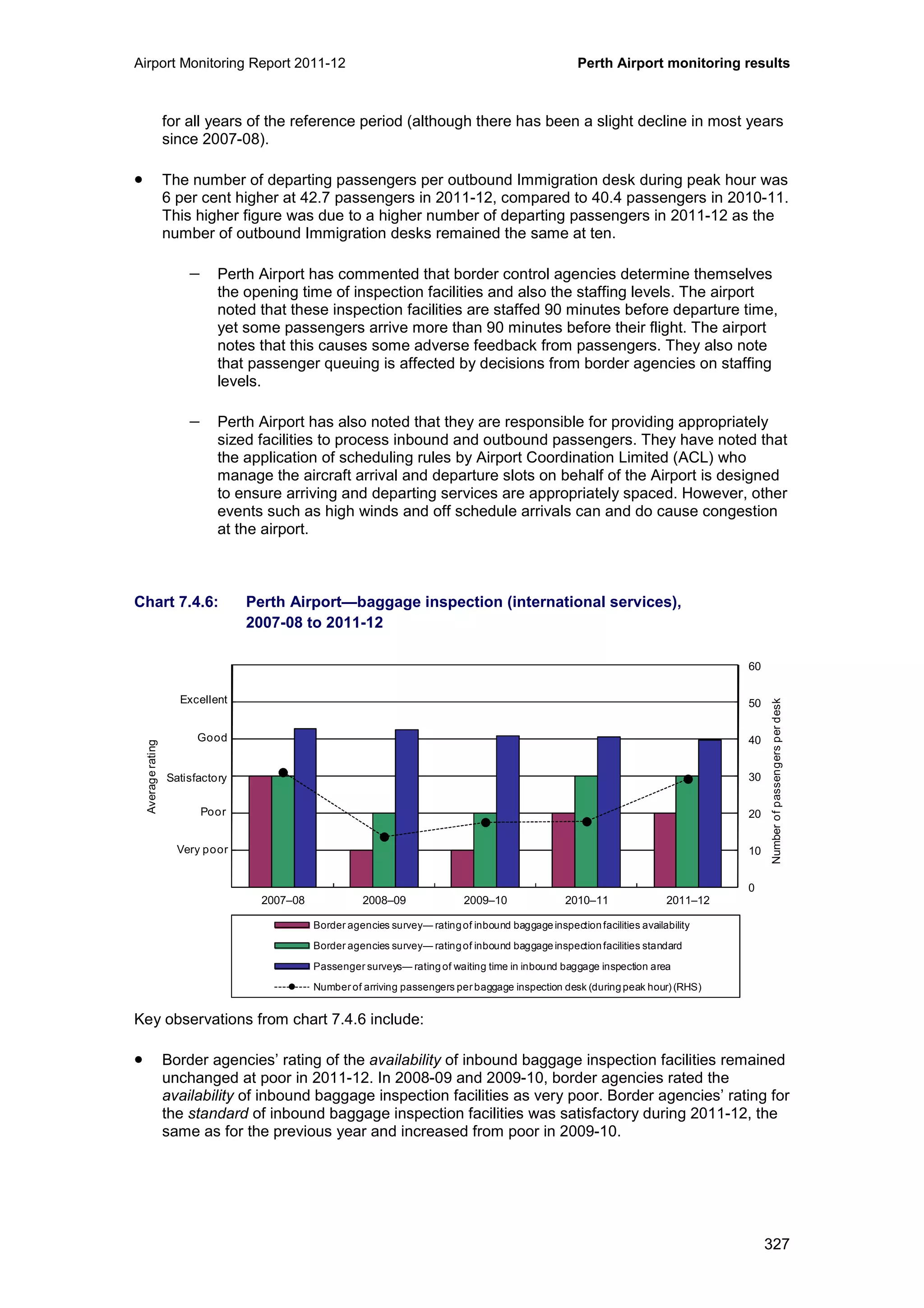
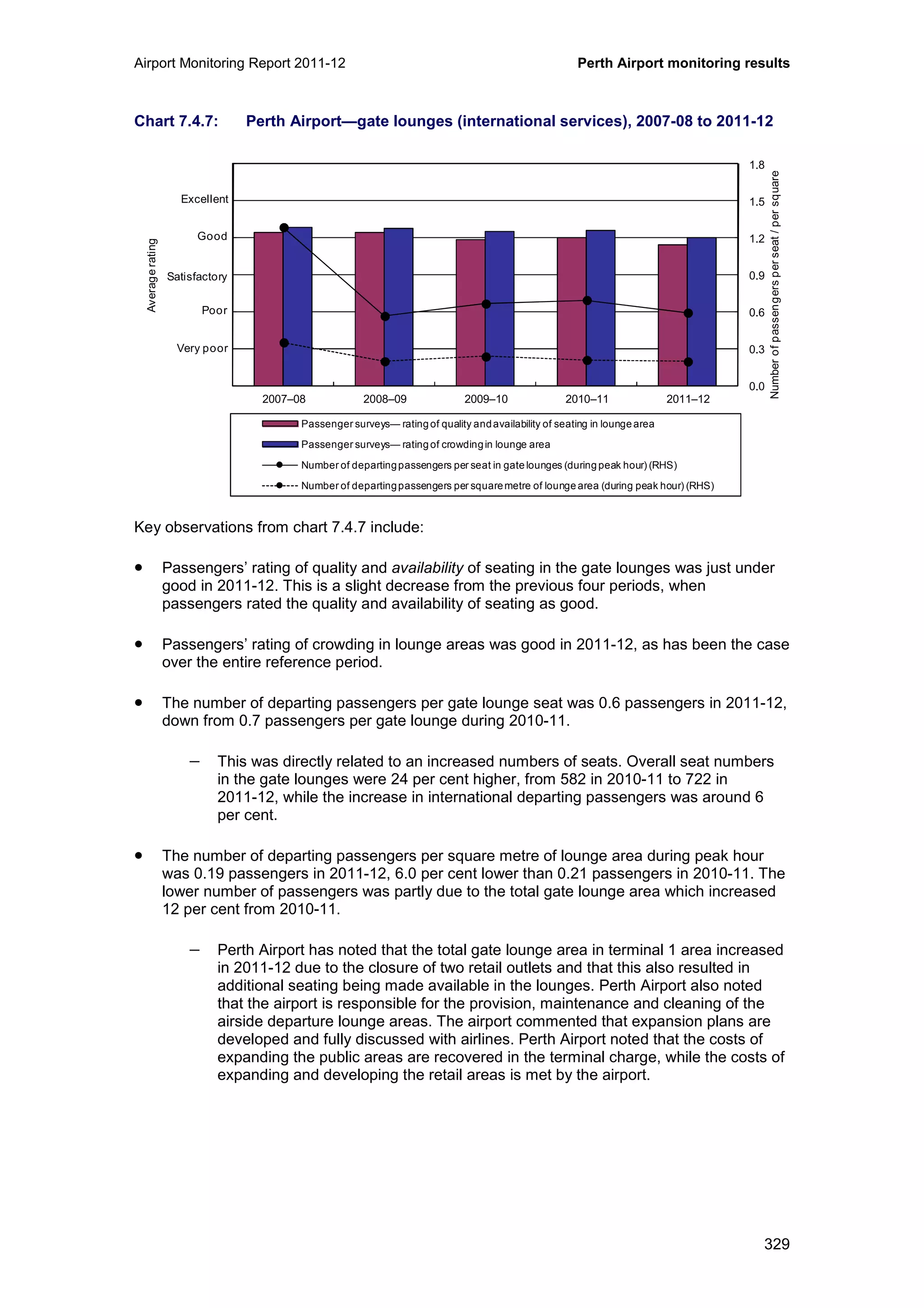
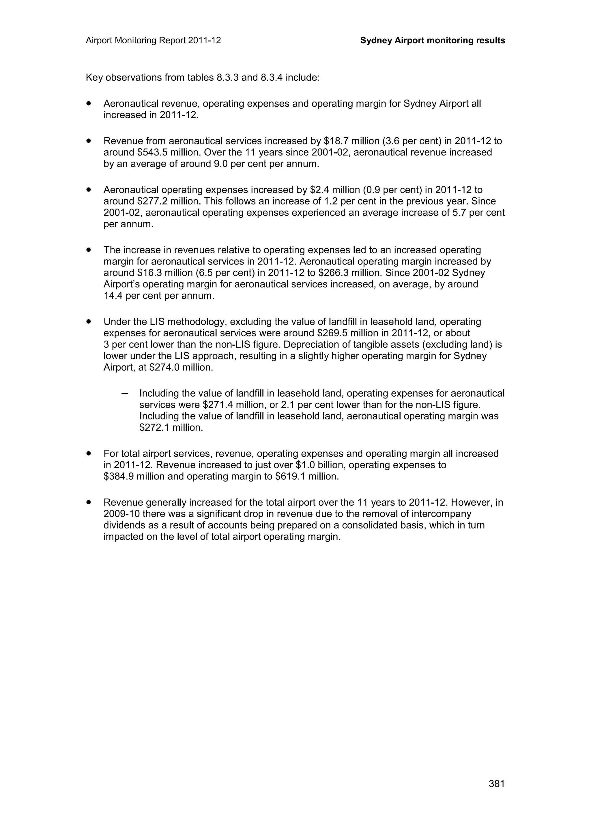
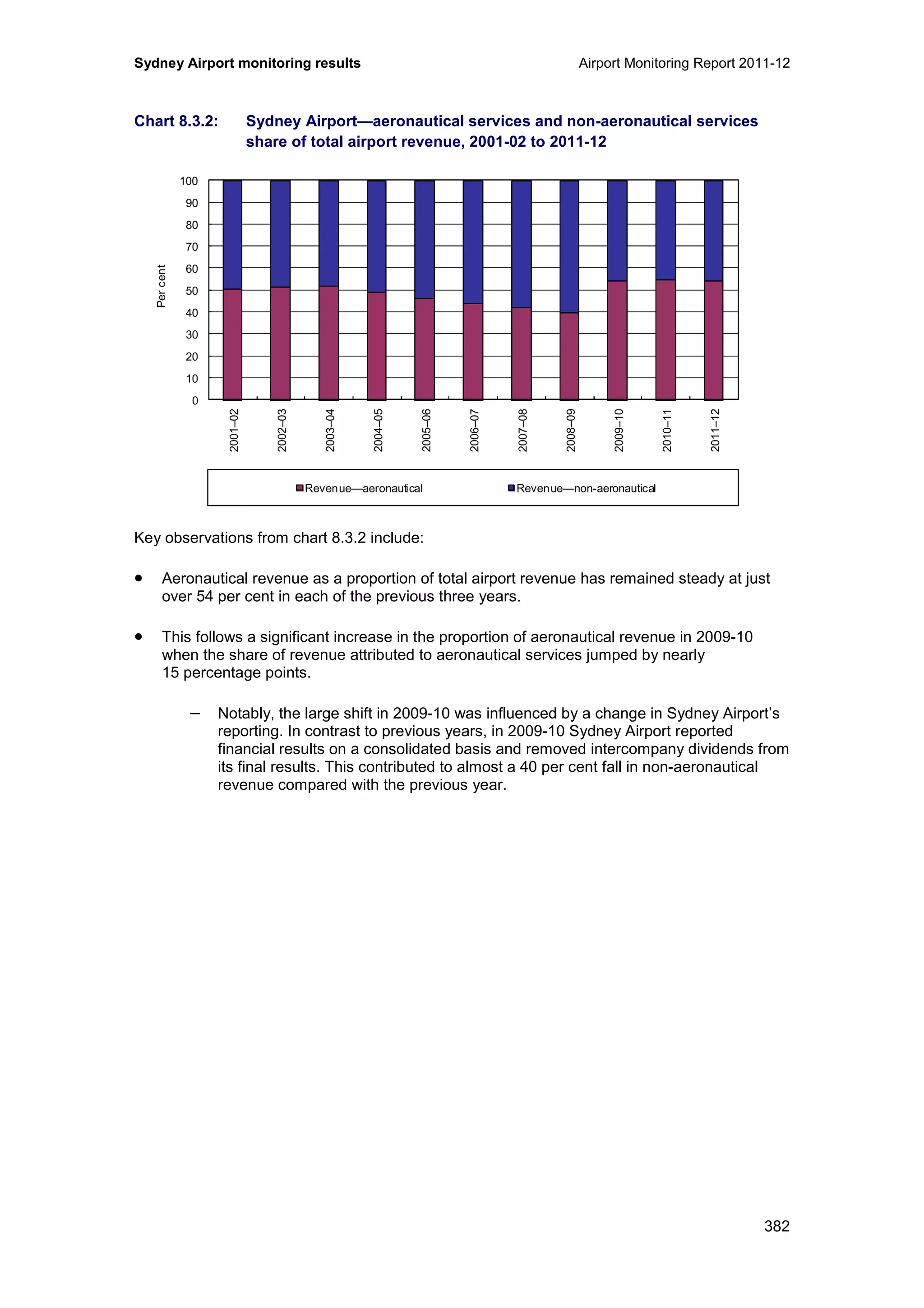
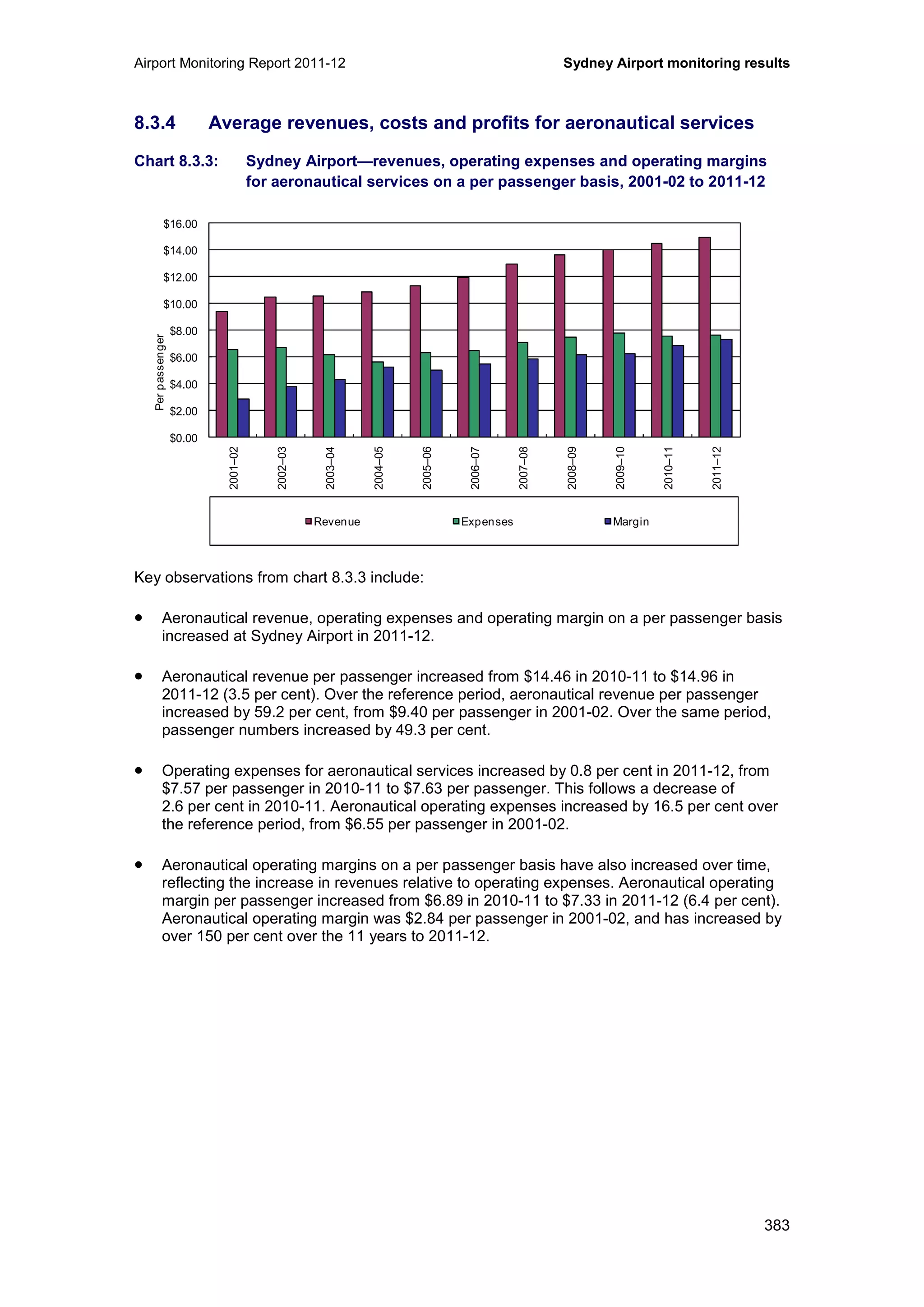
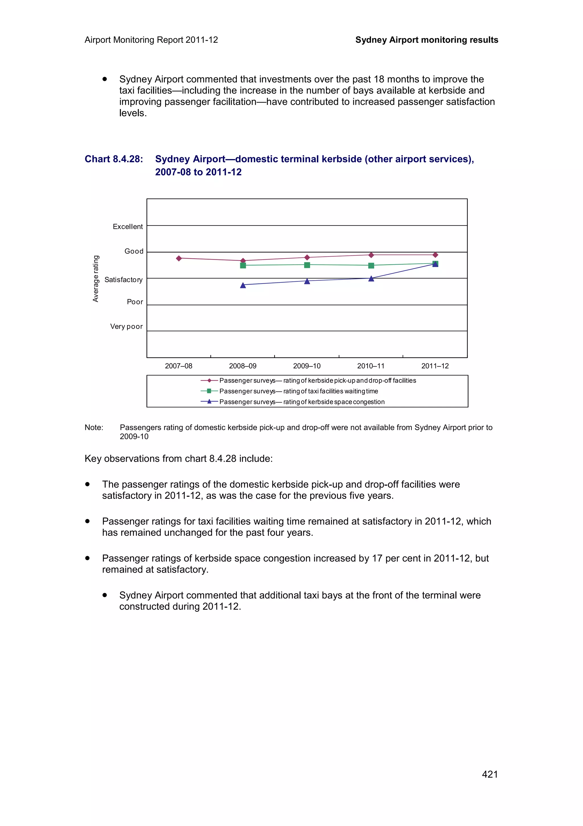
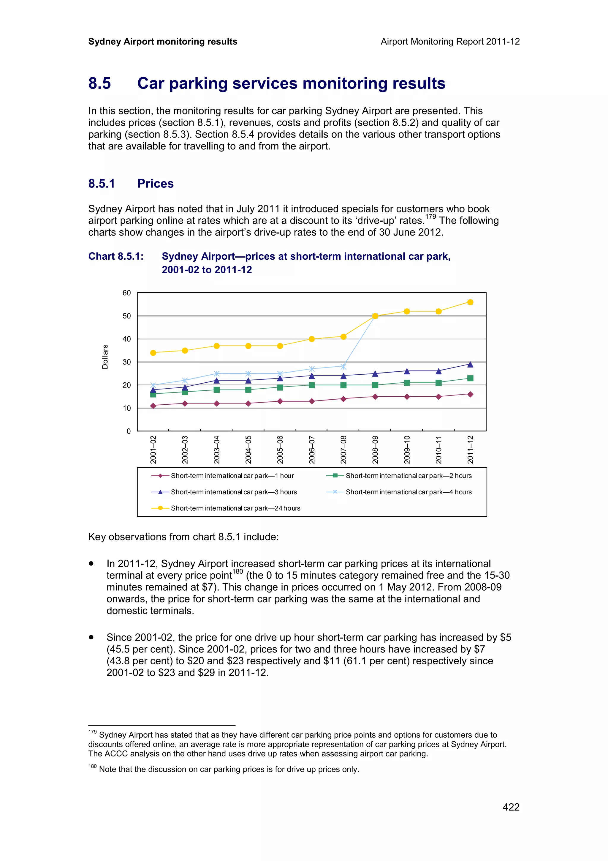
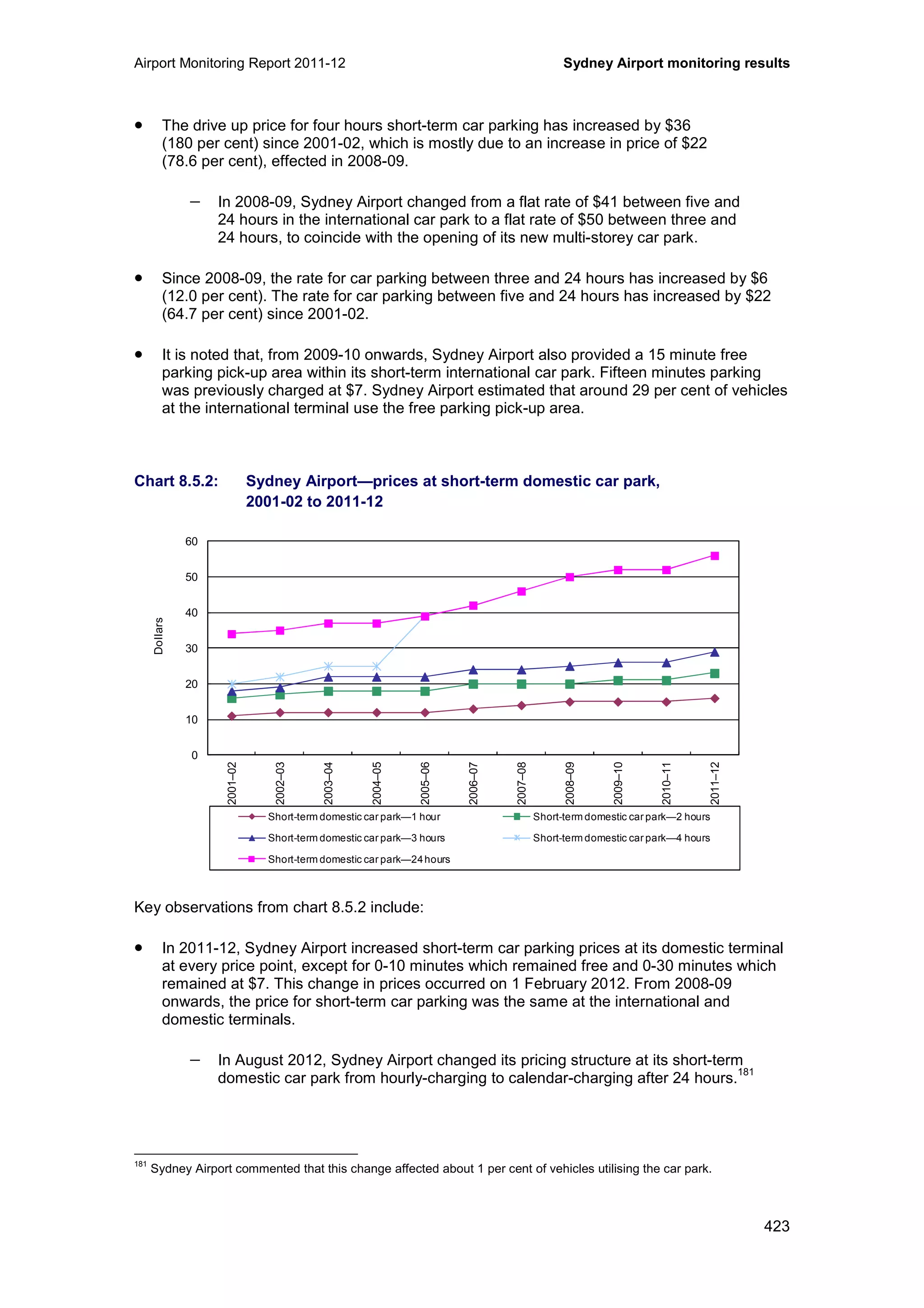
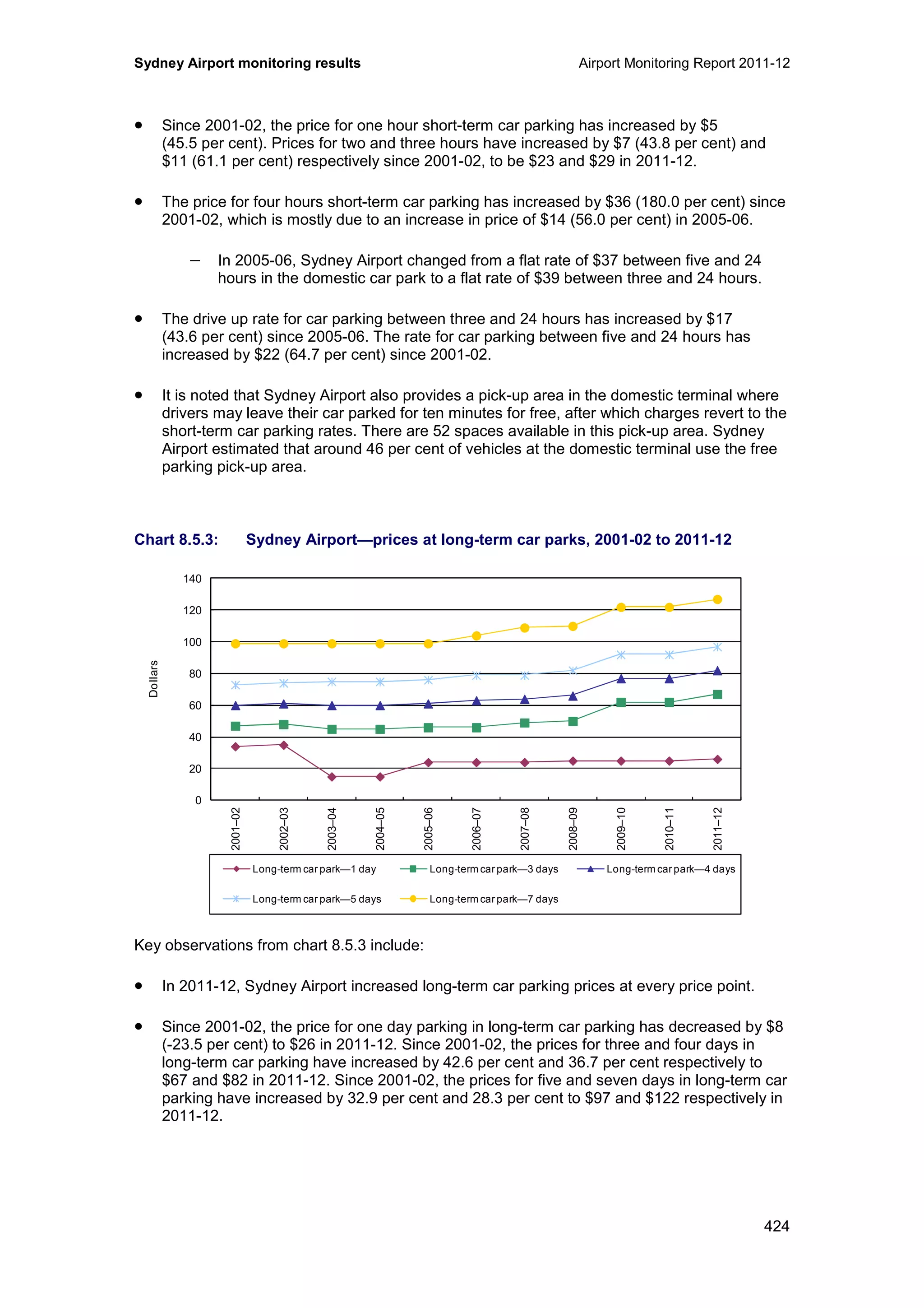
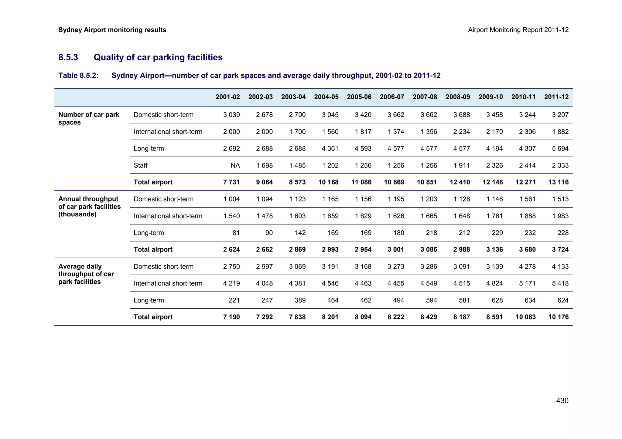
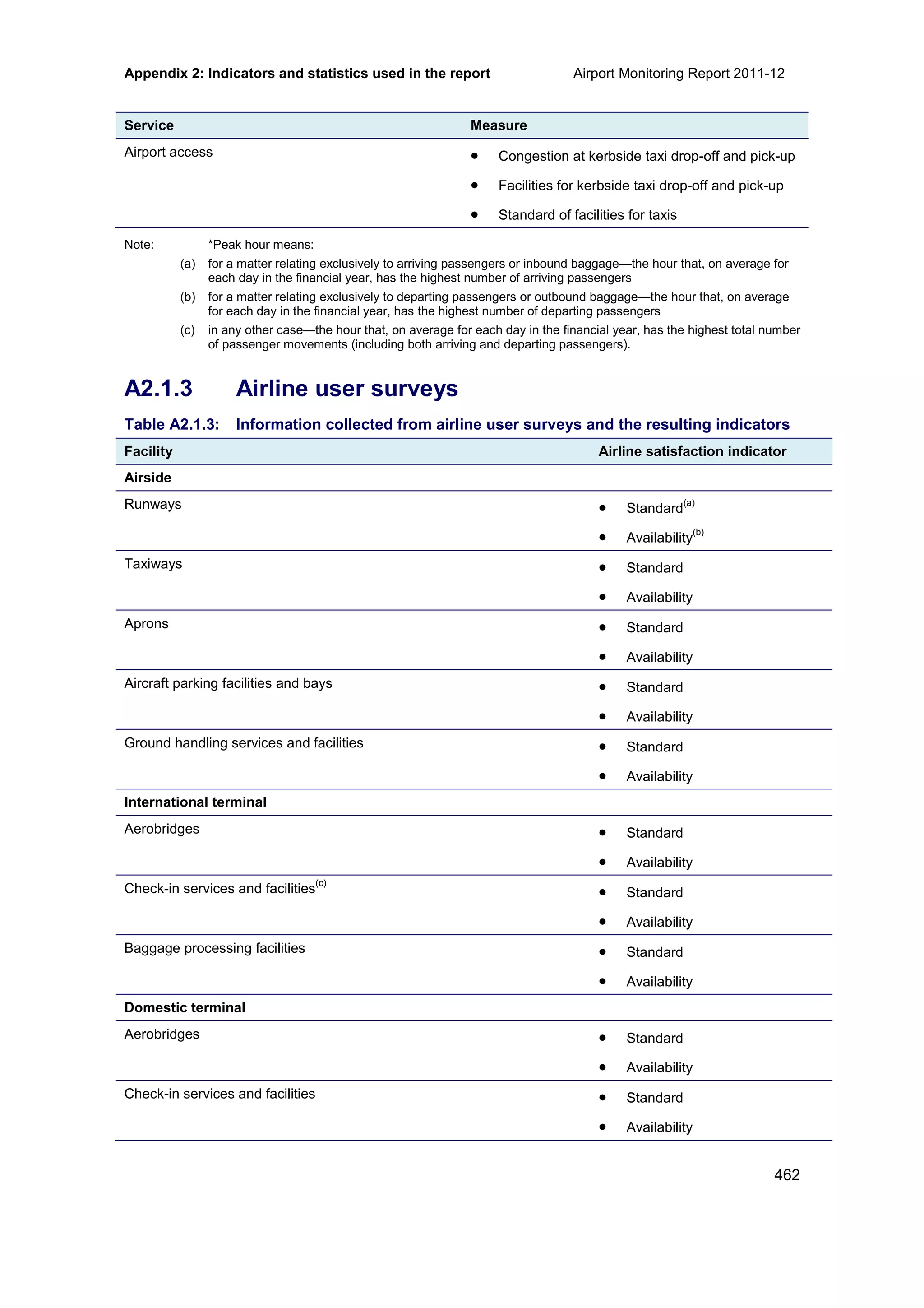
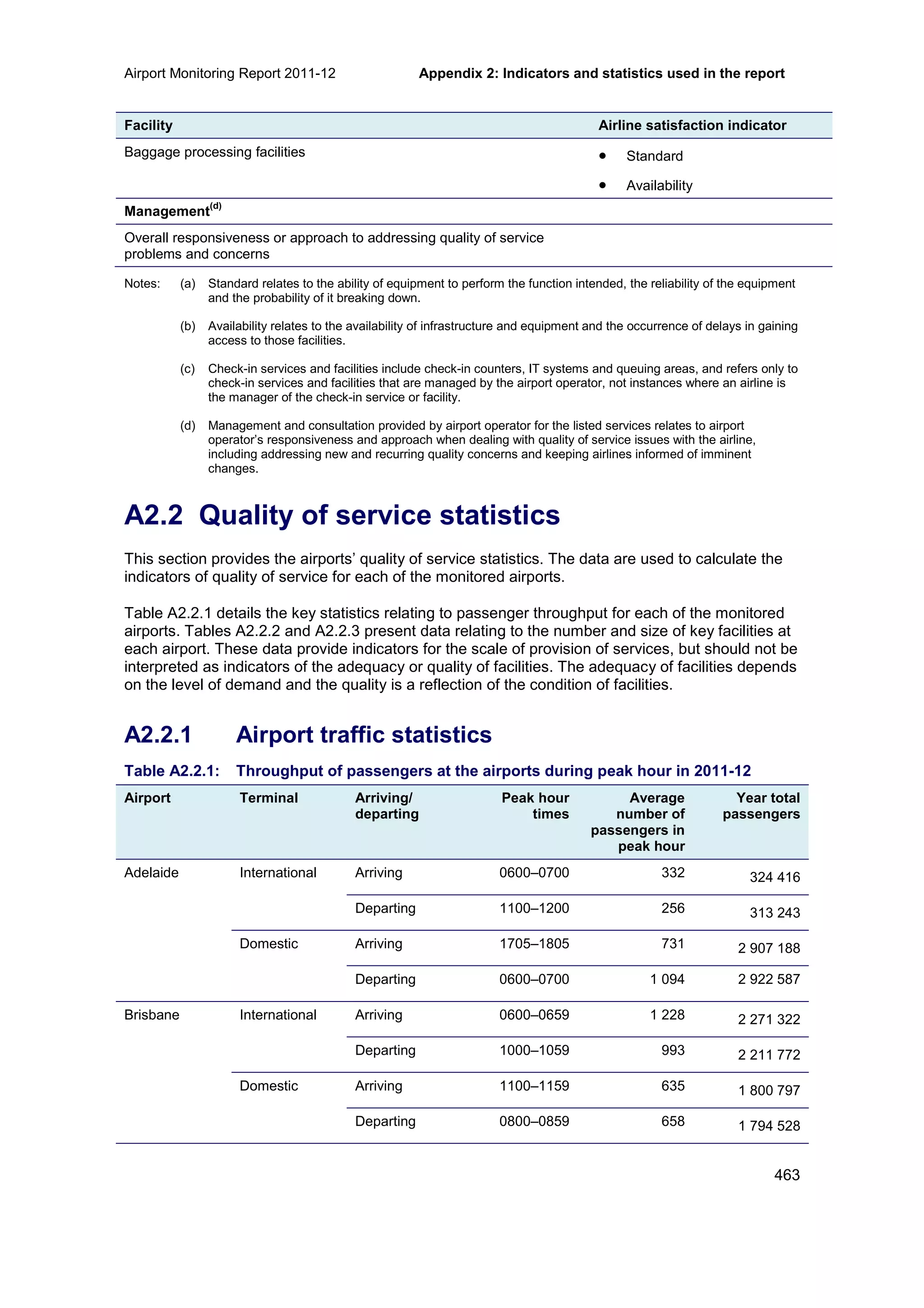
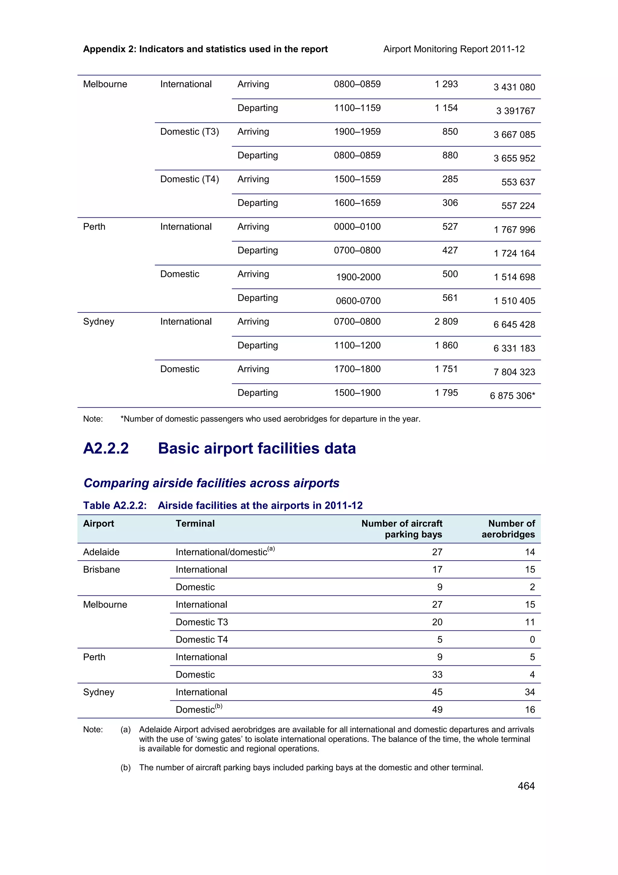
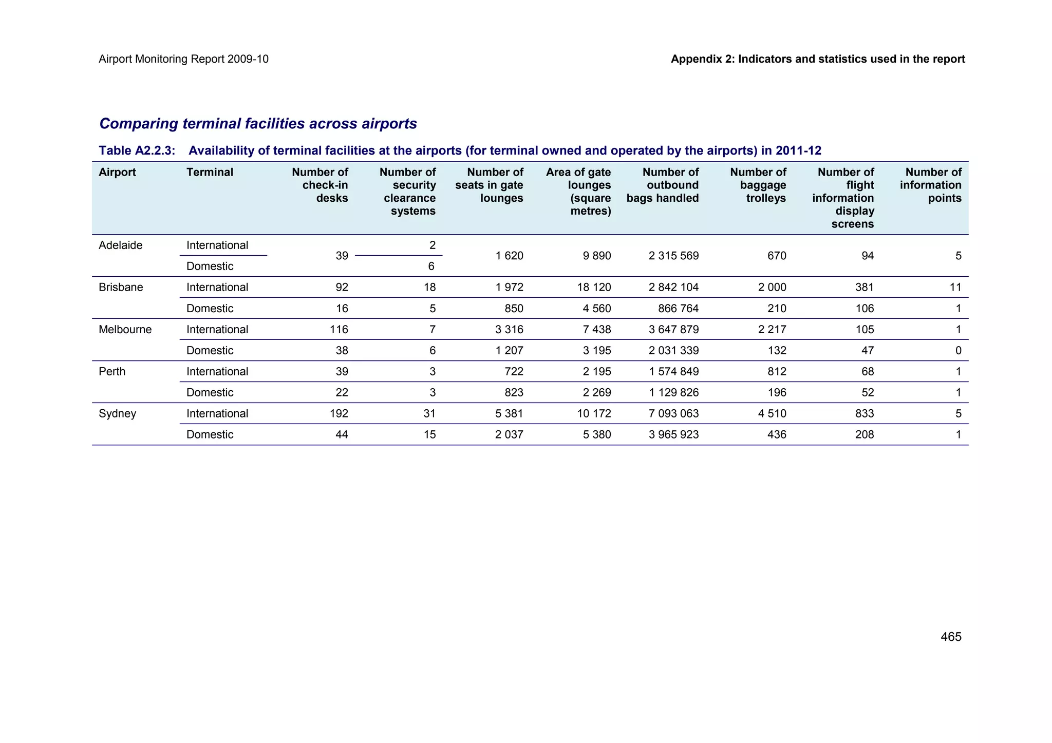
Downloaded 55 times
![Airport Monitoring Report 2011-12 Potential aeronautical capacity issues at airports
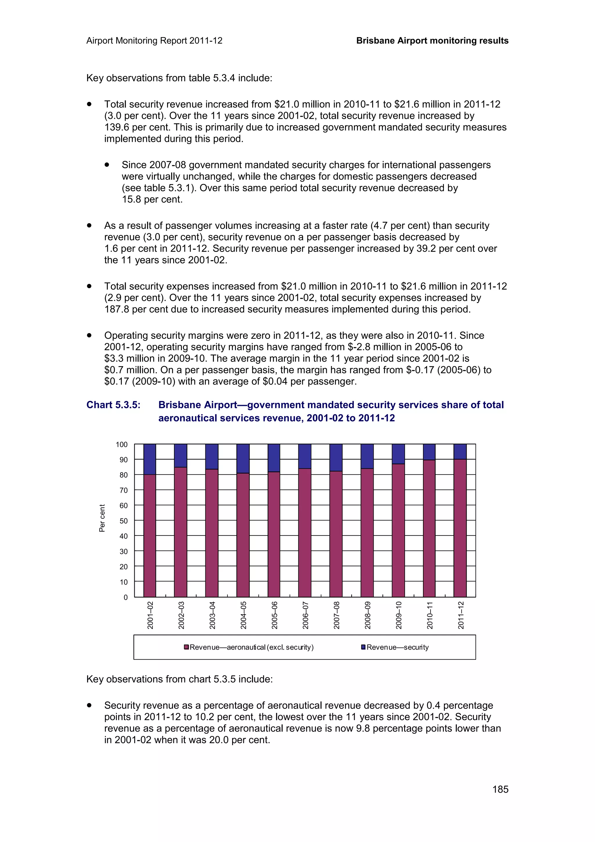
71
Competitive conditions may also impact the investment decision. The monitored airports do not
face close competition with other airports, and therefore are not necessarily sensitive to the
possibility that users might switch to an alternative supplier of aeronautical services if
investment is inadequate and service quality is below standard. However, there are a number
of secondary airports that may provide competitive pressures on major city airports in the
long term, for example, Avalon Airport in Victoria and Gold Coast Airport in Queensland.
Owners of airports who currently face little competition, but have potential for increased
competition in the future may, for example, favour pre-funding arrangements for significant new
investment. In this instance, an airport may seek to increase prices during a period when
competitive pressures are weak and earn a return on its investment before competition
increases.
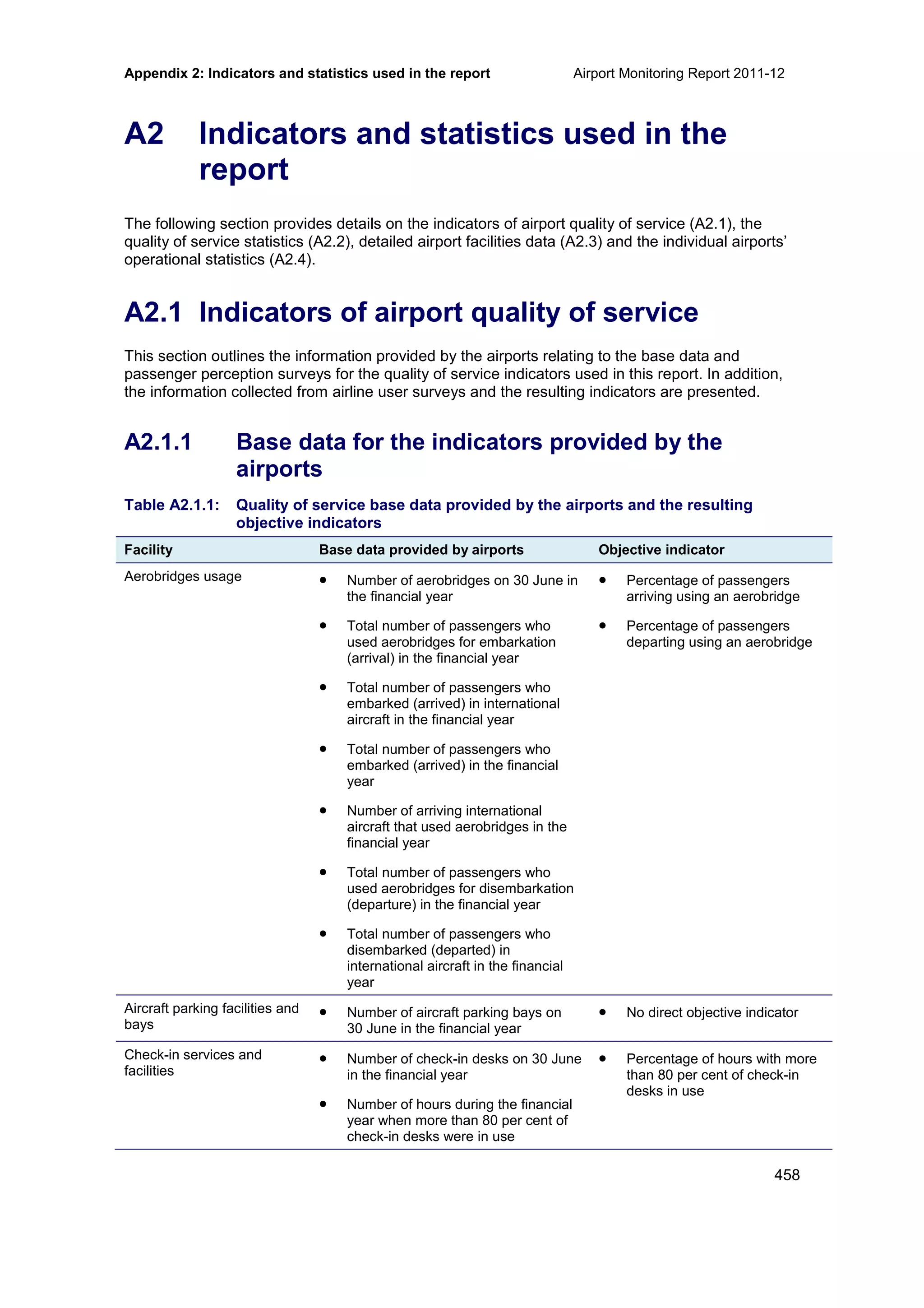
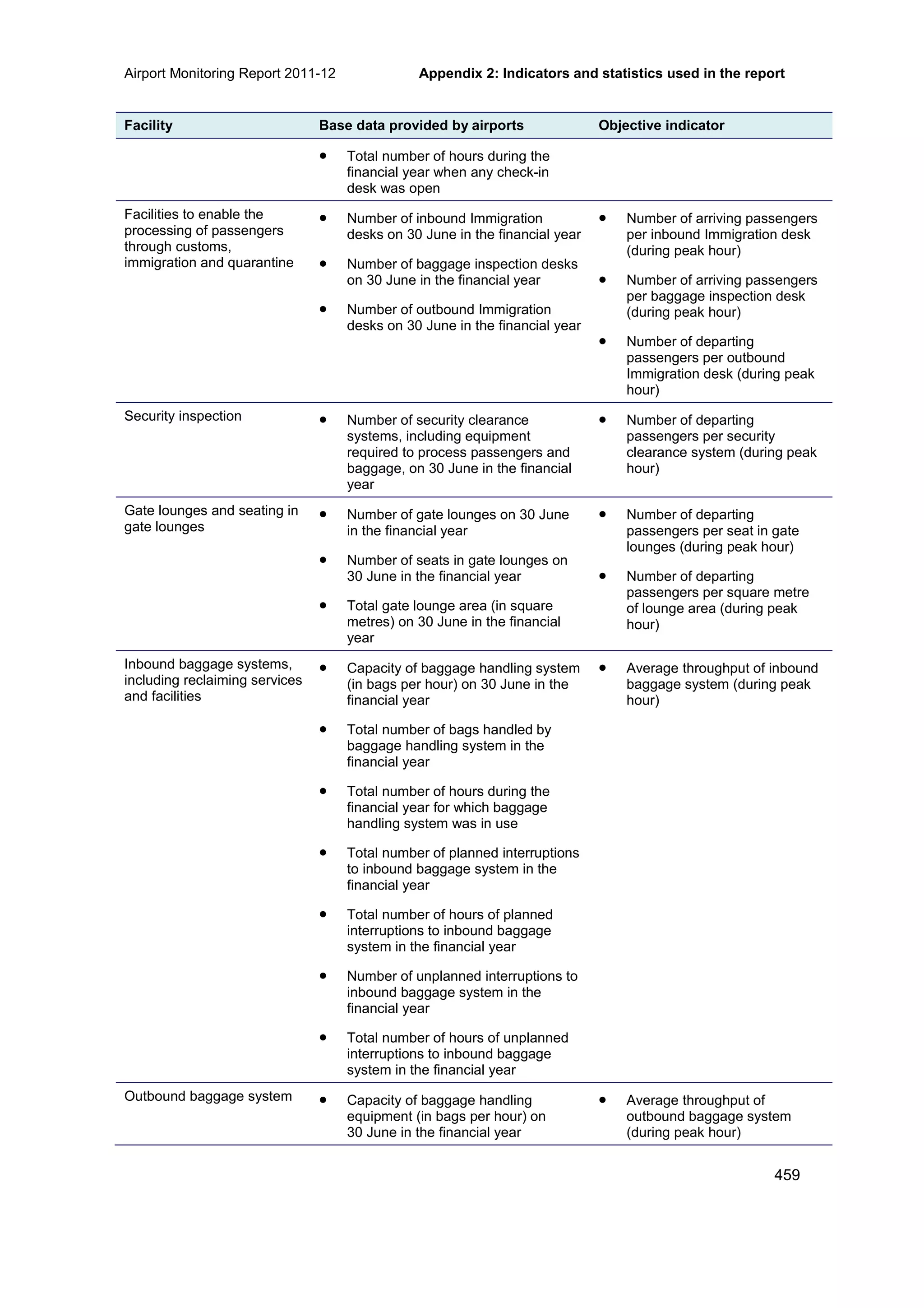
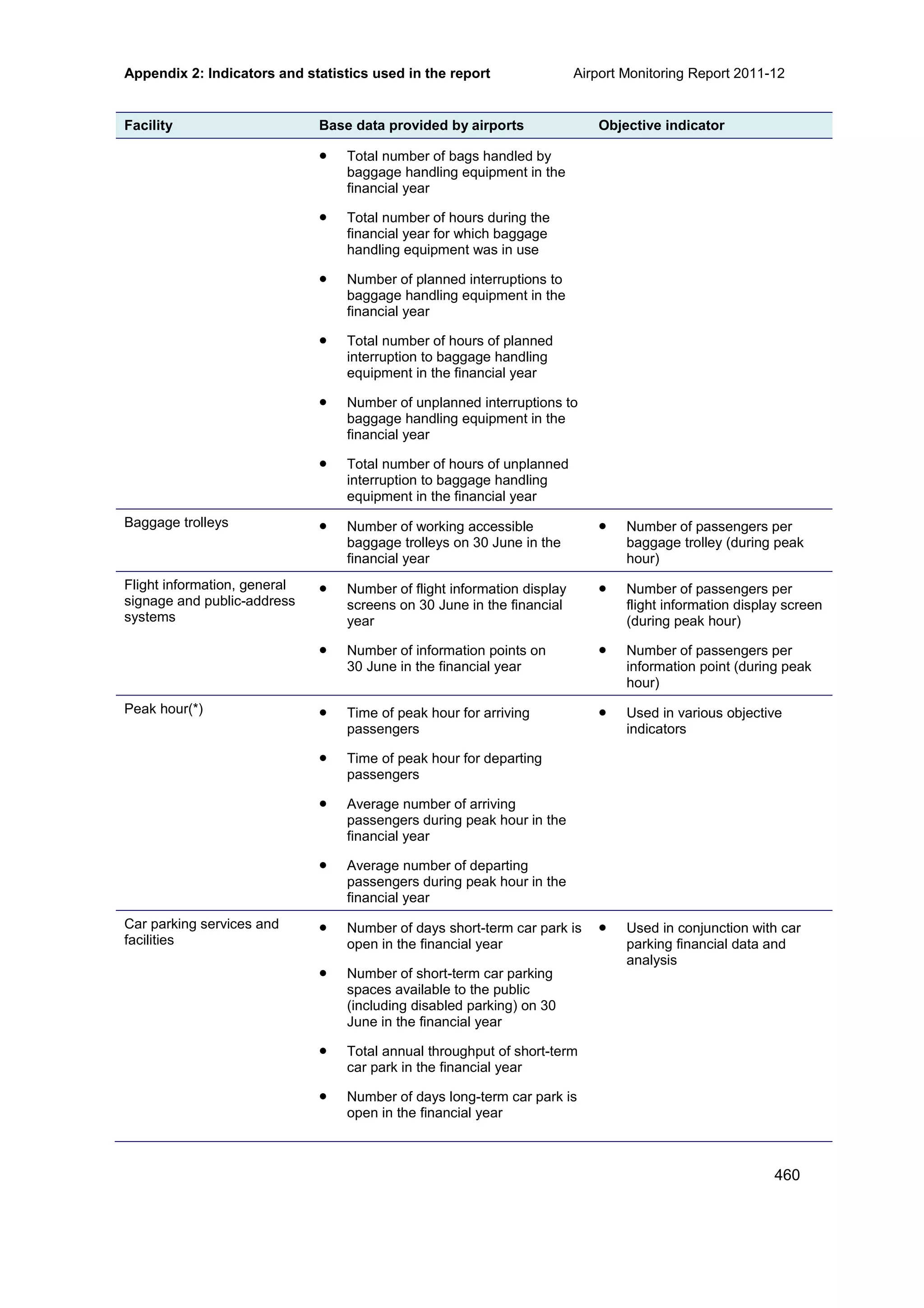
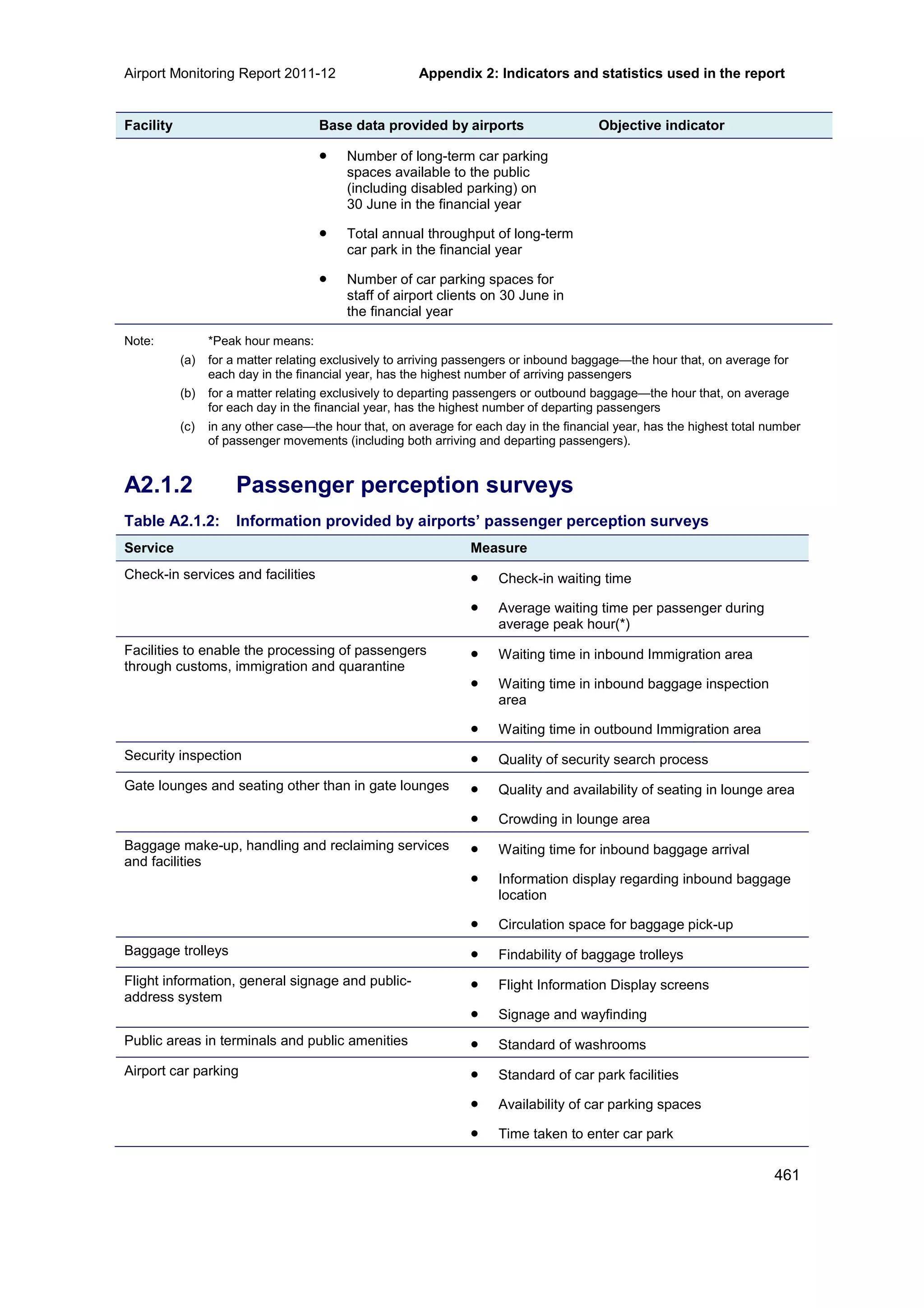
2.10 The impact of regulatory access arrangements
Currently, no airport service is subject to access regulation under the National Access Regime.
However, the September 2012 High Court decision which included an interpretation of criterion
(b) for declaration
94
under Part IIIA of the Competition and Consumer Act 2010 (CCA) in The
Pilbara Infrastructure Pty Ltd & Anor v Australian Competition Tribunal & Ors case may have
implications for monitored airports.
95
The PC is currently undertaking an inquiry into the National Access Regime. The PC will
provide an assessment of the performance of Part IIIA of the CCA in meeting its rationale and
objectives.
96
The ACCC has provided a submission to the PC review in which it argues that the
interpretation of criterion (b) in the recent High Court decision has the potential for adverse
effects in related industries.
97
Declaration criterion (b) asks whether it ‘would be uneconomical for anyone to develop another
facility to provide the service’. The majority of the High Court in The Pilbara Infrastructure Pty
Ltd & Anor v Australian Competition Tribunal & Ors case found that criterion (b) will only be
satisfied if it would be unprofitable for anyone to develop another facility to provide the service.
This is referred to as the privately profitable test. Prior to this decision, ‘uneconomical to
duplicate’ was generally interpreted as a natural monopoly or a net social benefit test.
98
In the High Court decision, the majority also found ‘[n]o reason is shown to read ‘anyone’ in
criterion (b) as limited in its application’. Rather, ‘anyone’ includes all ‘existing and possible
future market participants.’ Prior to this decision, ‘anyone’ was interpreted as anyone other than
the incumbent owner of the facility to which access was sought.
99
In particular, in 2000, the Australian Competition Tribunal observed in Review of Declaration of
Freight Handling Services at Sydney International Airport, that under a privately profitable test
the interpretation of ‘uneconomical’ would be ‘closely connected to the question of whether
‘anyone’ should include the owner of the facility providing the service to which access is
94
Declaration of an infrastructure service gives access seekers the right to negotiate access with an infrastructure
service provider—it does not provide an automatic right to use that service. Once an infrastructure service has been
declared, a provider and access seeker negotiate the terms and conditions of access. Failing agreement, the ACCC
can arbitrate and make an access determination. Source: Productivity Commission, Issues Paper: National Access
Regime, November 2012.
95
High Court of Australia, The Pilbara Infrastructure Pty Ltd v Australian Competition Tribunal [2012] HCA 36 (14
September 2012).
96
Productivity Commission, Issues Paper: National Access Regime, November 2012.
97
See: http://www.pc.gov.au/__data/assets/pdf_file/0008/121967/sub016-access-regime.pdf.
98
Ibid.
99
Ibid.](https://image.slidesharecdn.com/airportmonitoringreport2011-12-130506082238-phpapp01/75/Airport-Monitoring-Report-2011-12-96-2048.jpg)
![Potential aeronautical capacity issues at airports Airport Monitoring Report 2011-12
72
sought.’
100
The Tribunal was concerned that ‘economies of scope may allow an incumbent,
seeking to deny access to a potential entrant, to develop another facility while raising an
insuperable barrier to entry to new players (a defining feature of a bottleneck).
101
Because the monitored airports have natural monopoly characteristics, this decision may have
implications for the regulatory framework that potentially applies to them. The High Court’s
interpretation of criterion (b) for declaration under Part IIIA could alter future decisions on
whether aeronautical infrastructure will become declared services.
102
100
Australian Competition Tribunal, Re: Review of Declaration of Freight Handling Services at Sydney International
Airport (2000) ATPR, 41-754 [205].
101
Ibid.
102
Pilbara Infrastructure Pty Ltd v Australian Competition Tribunal [2011] FCAFC 58. [87] – the Court considered that
the ‘granting of access to override the otherwise legitimate interests of incumbent owners [should be] a distinctly
exceptional occurrence’.](https://image.slidesharecdn.com/airportmonitoringreport2011-12-130506082238-phpapp01/75/Airport-Monitoring-Report-2011-12-97-2048.jpg)
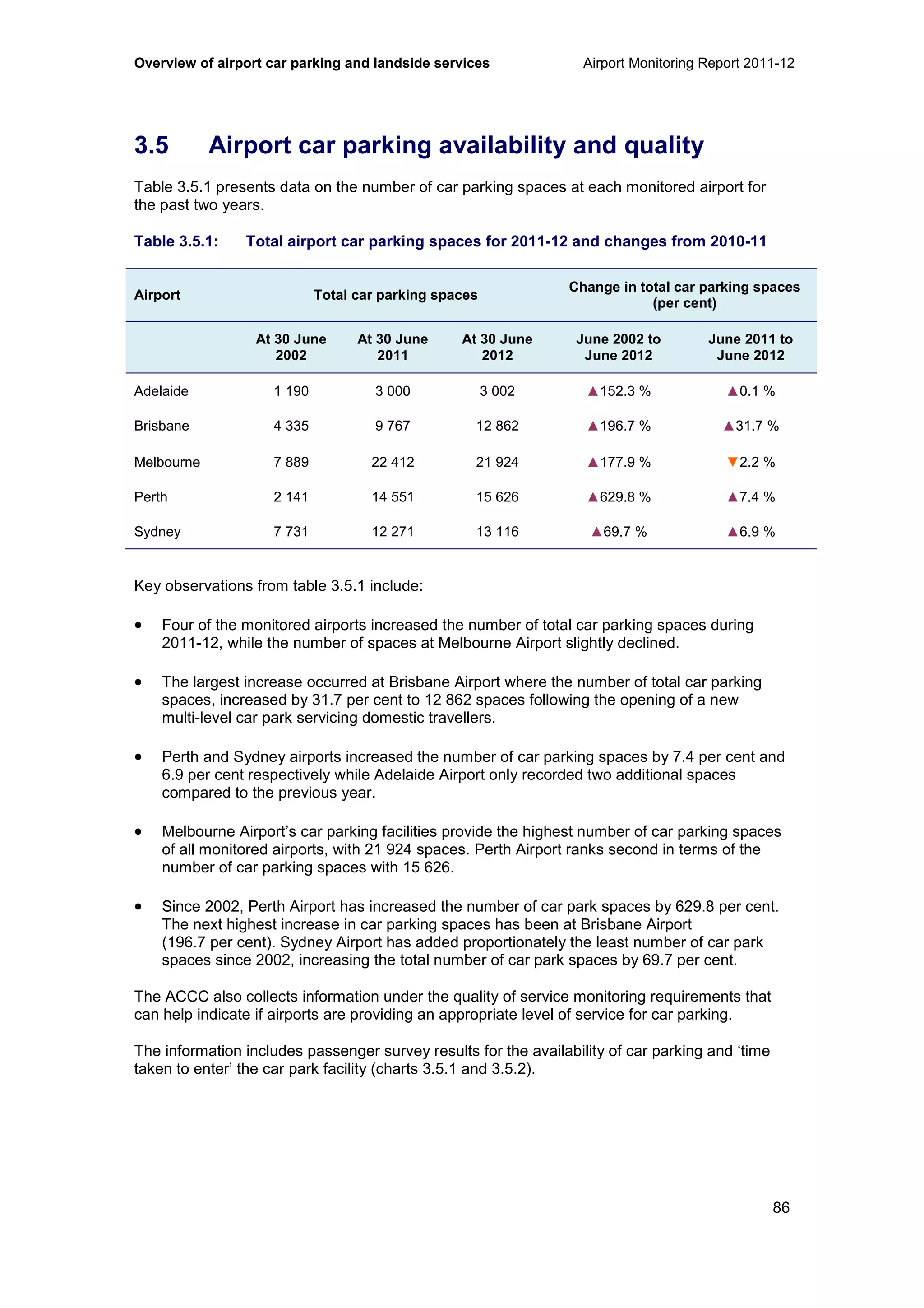

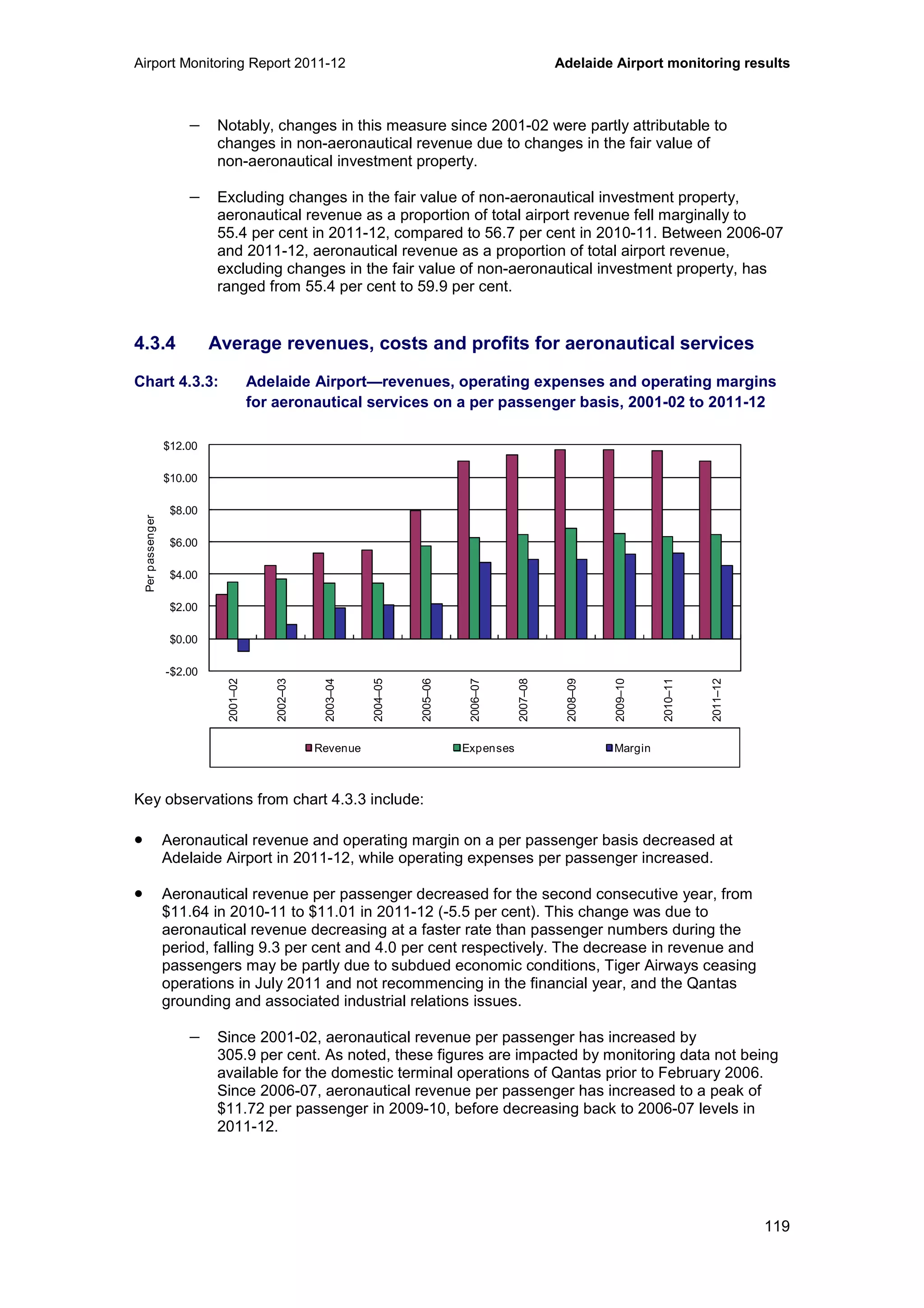
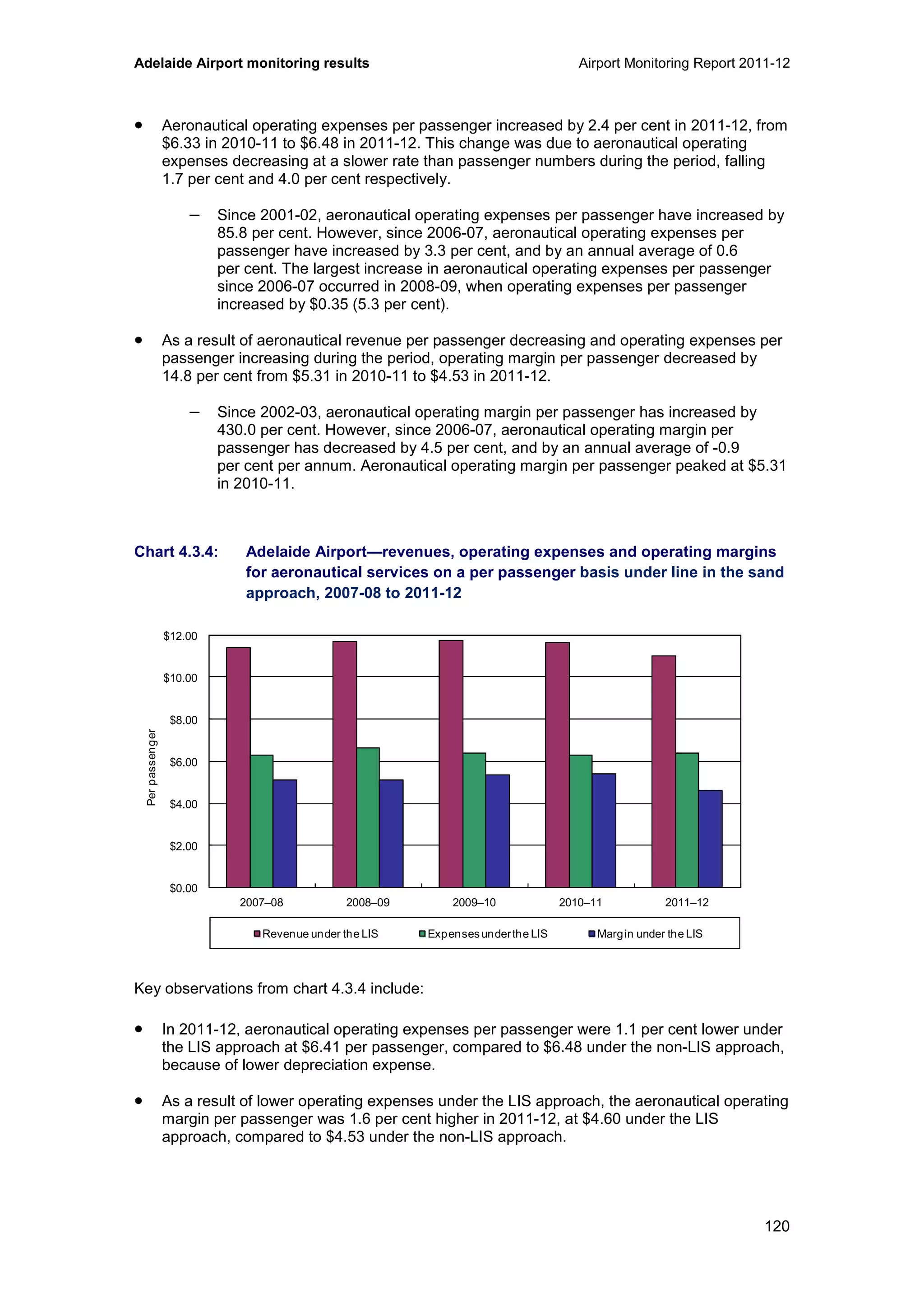

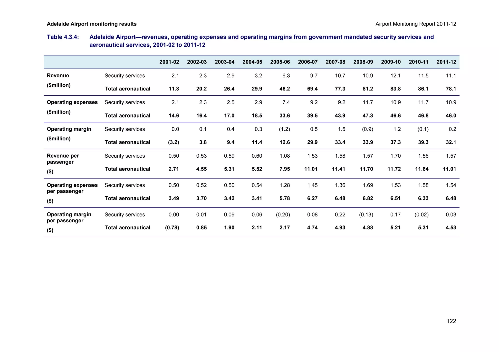


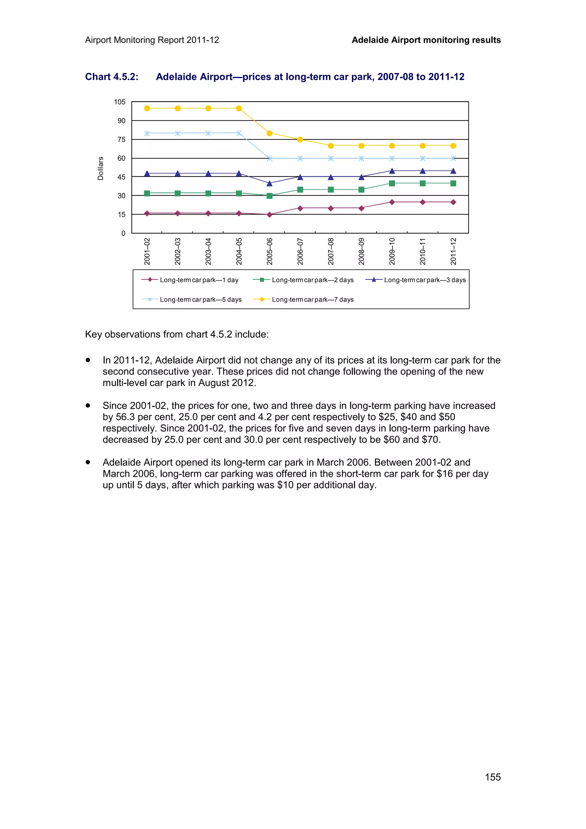
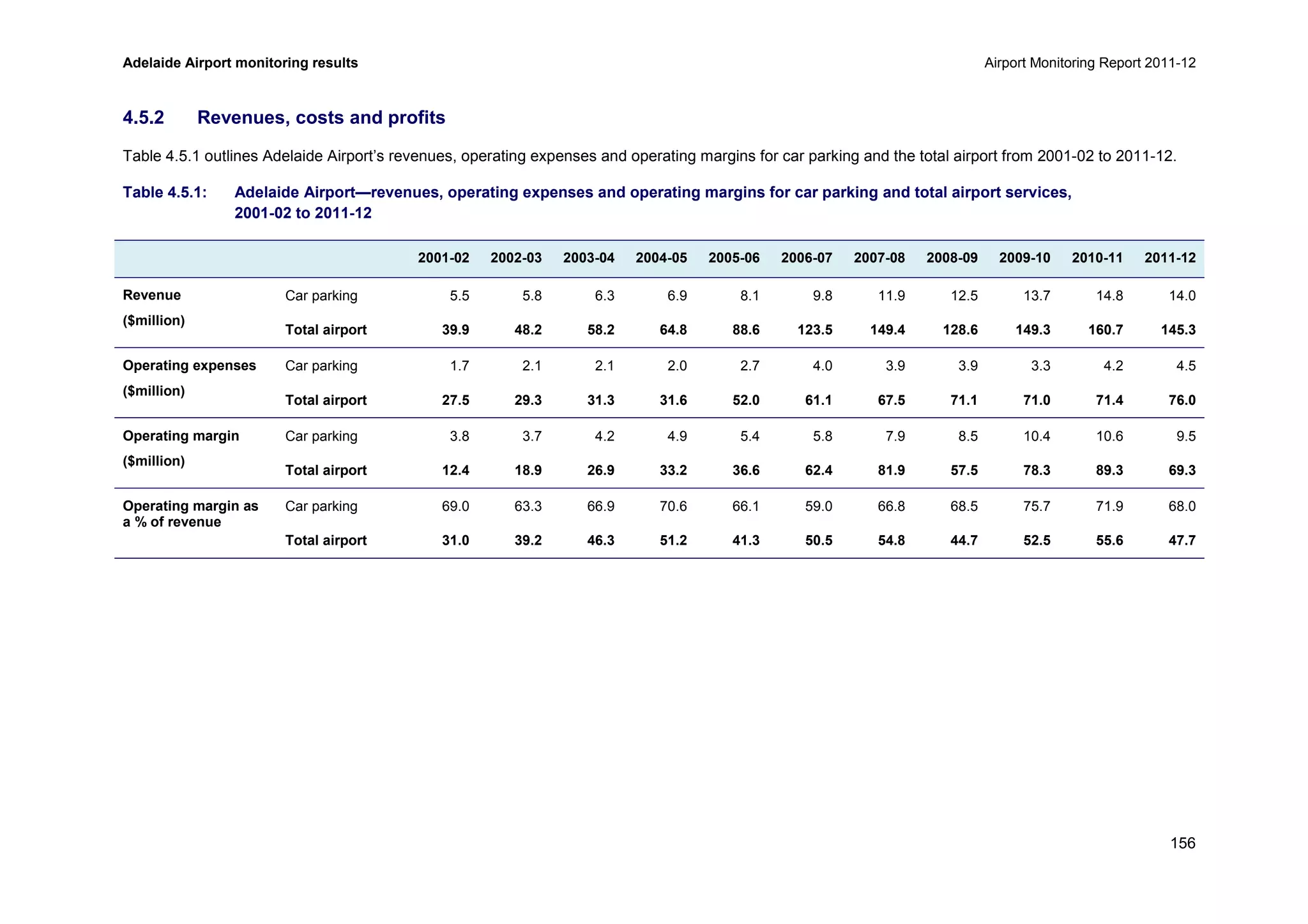
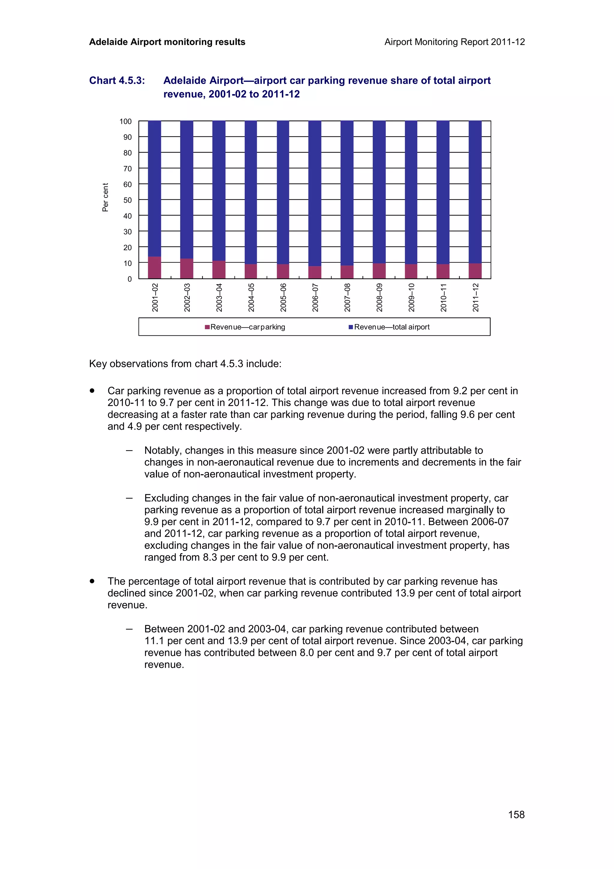


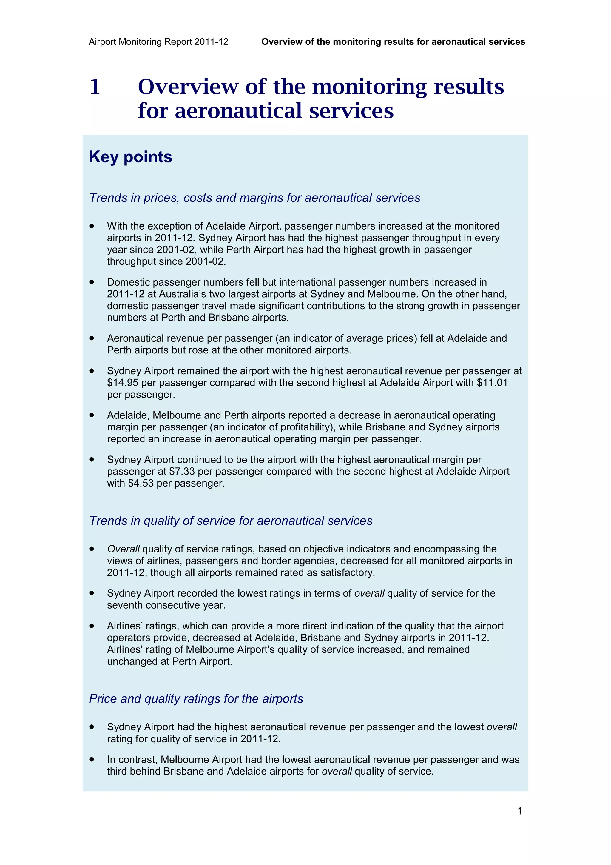
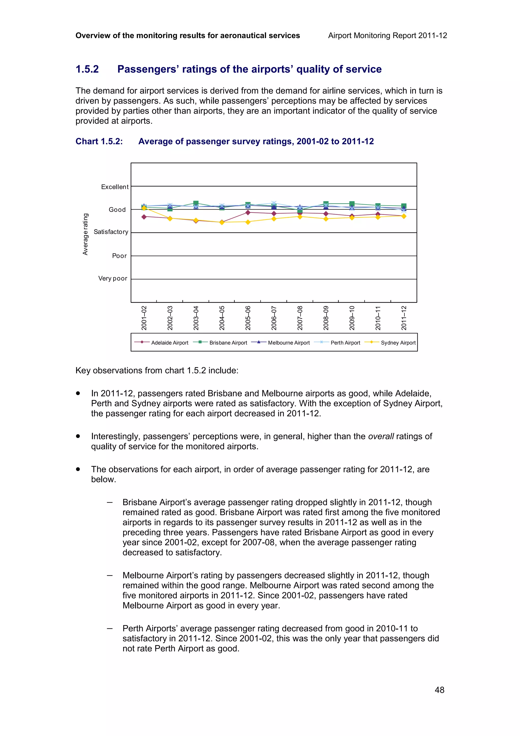
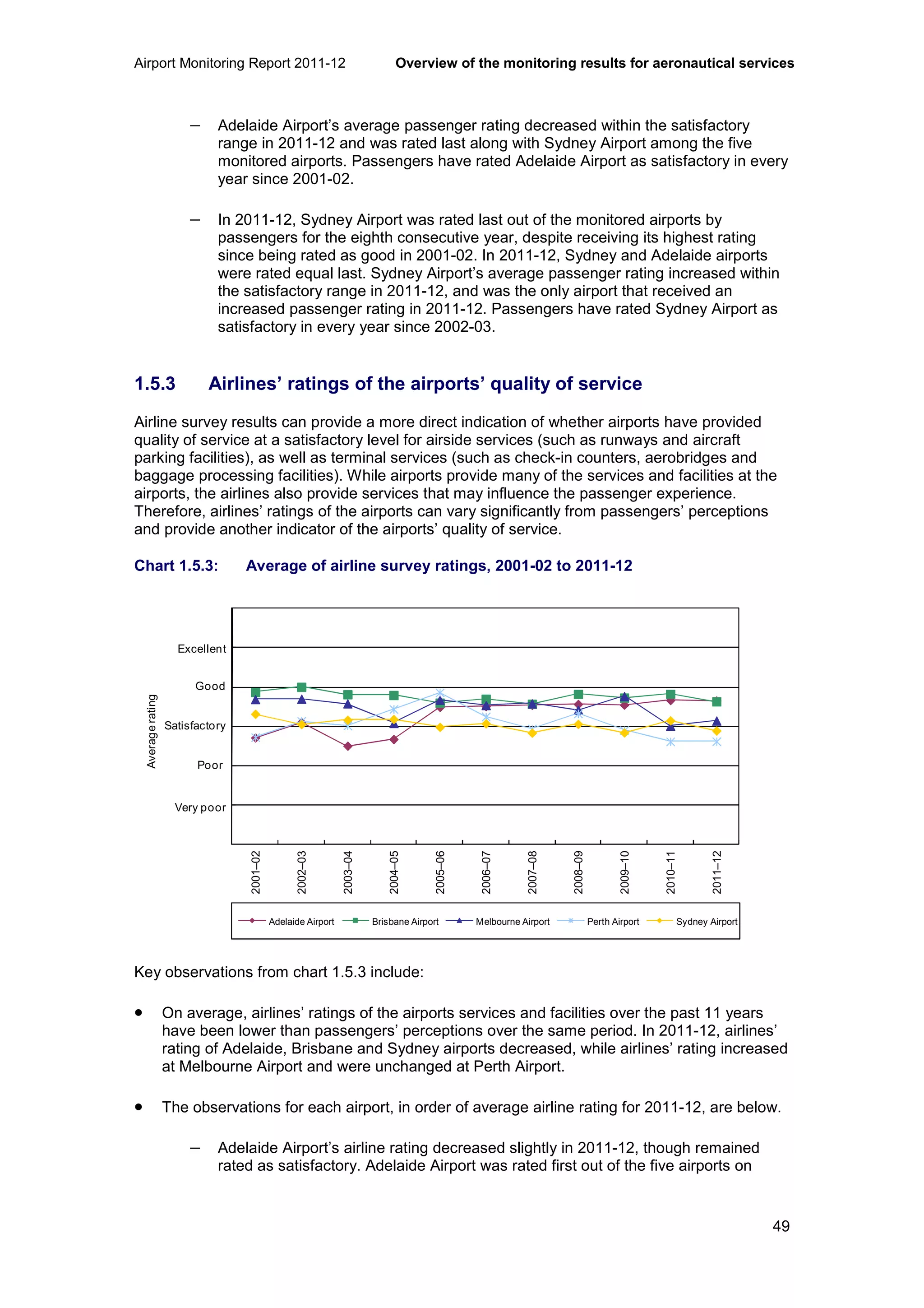
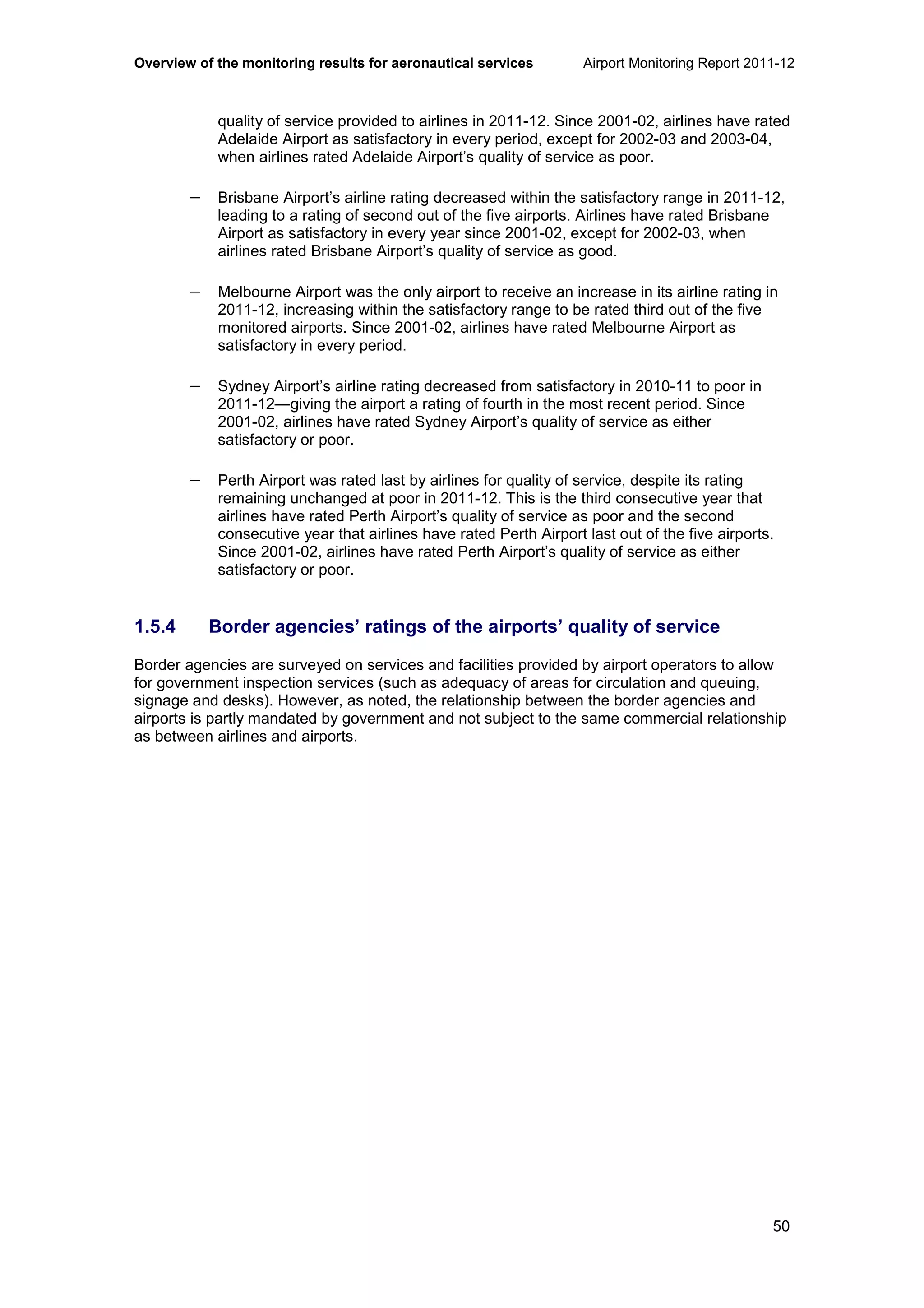
The Airport Monitoring Report 2011-12 by the ACCC assesses the performance and quality of aeronautical and car parking services at major Australian airports including Adelaide, Brisbane, Melbourne, Perth, and Sydney. Despite an increase in combined passenger numbers and aeronautical revenues, the overall quality of service diminished, highlighting emerging congestion challenges driven by increased demand for services. The report emphasizes the need for further investment to enhance capacity and addresses ongoing issues with service quality and operational congestion.


