Design Guidline and
UI Responsive
18 February 2023
“It always seems imposibble
until it's done”
Speakers
Arya Widya H.
// (C&D)
https://www.linkedin.com/in/arya-wh/
Letakkan foto
Agenda
1. Design Guidline
2. UI Responsive
Correlation Between Design System and Design Guidline
The Design Guideline is based
on actual implementation,
while the Design System is
based on needs during design
https://dribbble.com/shots/14797437-From-where-westart-
Design-Guideline
Correlation Between Design System and Design Guidline
“The Design Guideline is not the main benchmark
for the Design System, if there is no guide, you can
create your own version of the guide”
01
Design Guidline
● “Design guide based on real implementation,
used to find design ideas, design remains
consistent and can be implemented”
What is “Design Guidline” ?
And many more that you can develop, according to
your needs
Design Guide Used for :
1. Color
2. Icon
3. Button
4. Input Text
5. Table
6. Card
7. Dropdown
8. Menu
Color
Main Color
Accent Color
Background Color Text Color
• Tailwind
• Color Hunt
• Coolors
• Palettr
Color guides can be found at :
Font
You can use google default fonts (such as roboto, poppins
etc.) or use the fonts available in Figma
Icon
You can use Plug in "Iconify"
Icons8.com Feathericons.com Lordicon.com
Image Source
You can use Plug in “Unsplash"
Image Source
You can visit the website “Storyset.com” or “Manypixels.co/gallery”
Design Guidline
You can visit the website :
1. https://getbootstrap.com/
2. https://architectui.com/
3. https://material.io/
02
UI Responsive
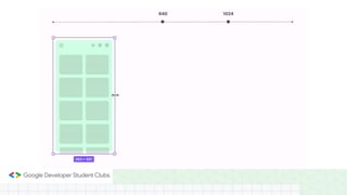
“Responsive UI is a UI display that can adapt to
different screen sizes and is consistent”
What is “UI Responsive” ?
Layout Grid
Application of Grid Layout
Layout Grid
Layout grids help us to align objects within a frame
Layout Grid
And can also use the "Rules" feature in Figma
Layout Grid in Figma
• Grid used to create a grid that is
plaid
• Columns used to create a vertical
grid
• Rows used to create a horizontal
grid
• Rules used to replace grid
Constraints
Initial Concept
Feature in Constraints
• Horizontal Align, used to make
responsive horizontally or flat or
right - left
• Vertical Align, used to make
responsive vertically or up-down
• Fix Scrolling, used to make an object
fixed when scrolled
Auto Layout
Initial Concept
Auto Layout
Auto Layout Implementation
Feature in Auto Layout
1. Direction
2. Spacing Between Items
3. Padding
4. Alignment
1
2
3
4
3
Spacing Between Items
Used to set the
distance between
content in Auto
Layout
Alignment
Adjust the position
of the content
according to what is
in the container
Absolute Position
In Auto Layout
everything is in an
orderly position, to
set content with a
free position you
can use Absolute
Position
Thank you

#5 Design Guidline & UI Responsive.pptx