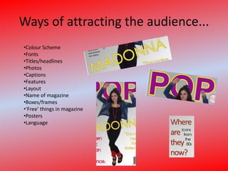
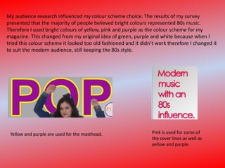
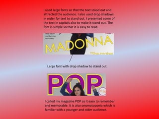
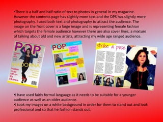
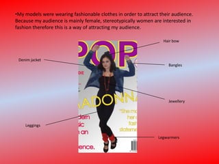
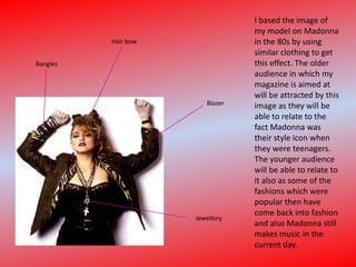
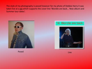
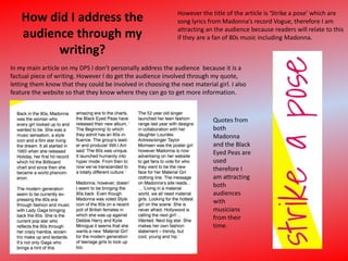
The document discusses ways the author addressed and attracted their intended audience through the design of their magazine focused on 1980s music. This included using bright colors inspired by audience research, large fonts for readability, memorable titles, a mix of photos and text, fashion photography targeting female readers, references to iconic 1980s artists like Madonna to appeal to older audiences familiar with that era as well as younger audiences interested in retro styles, and writing that references 1980s music in a way relatable to both younger and older readers.
Transforming Brand Perception and Boosting Profitabilityaaryangarg12
In today's digital era, the dynamics of brand perception, consumer behavior, and profitability have been profoundly reshaped by the synergy of branding, social media, and website design. This research paper investigates the transformative power of these elements in influencing how individuals perceive brands and products and how this transformation can be harnessed to drive sales and profitability for businesses.
Through an exploration of brand psychology and consumer behavior, this study sheds light on the intricate ways in which effective branding strategies, strategic social media engagement, and user-centric website design contribute to altering consumers' perceptions. We delve into the principles that underlie successful brand transformations, examining how visual identity, messaging, and storytelling can captivate and resonate with target audiences.
Methodologically, this research employs a comprehensive approach, combining qualitative and quantitative analyses. Real-world case studies illustrate the impact of branding, social media campaigns, and website redesigns on consumer perception, sales figures, and profitability. We assess the various metrics, including brand awareness, customer engagement, conversion rates, and revenue growth, to measure the effectiveness of these strategies.
The results underscore the pivotal role of cohesive branding, social media influence, and website usability in shaping positive brand perceptions, influencing consumer decisions, and ultimately bolstering sales and profitability. This paper provides actionable insights and strategic recommendations for businesses seeking to leverage branding, social media, and website design as potent tools to enhance their market position and financial success.
Book Formatting: Quality Control Checks for DesignersConfidence Ago
This presentation was made to help designers who work in publishing houses or format books for printing ensure quality.
Quality control is vital to every industry. This is why every department in a company need create a method they use in ensuring quality. This, perhaps, will not only improve the quality of products and bring errors to the barest minimum, but take it to a near perfect finish.
It is beyond a moot point that a good book will somewhat be judged by its cover, but the content of the book remains king. No matter how beautiful the cover, if the quality of writing or presentation is off, that will be a reason for readers not to come back to the book or recommend it.
So, this presentation points designers to some important things that may be missed by an editor that they could eventually discover and call the attention of the editor.
Between Filth and Fortune- Urban Cattle Foraging Realities by Devi S Nair, An...Mansi Shah
This study examines cattle rearing in urban and rural settings, focusing on milk production and consumption. By exploring a case in Ahmedabad, it highlights the challenges and processes in dairy farming across different environments, emphasising the need for sustainable practices and the essential role of milk in daily consumption.
You could be a professional graphic designer and still make mistakes. There is always the possibility of human error. On the other hand if you’re not a designer, the chances of making some common graphic design mistakes are even higher. Because you don’t know what you don’t know. That’s where this blog comes in. To make your job easier and help you create better designs, we have put together a list of common graphic design mistakes that you need to avoid.
Hello everyone! I am thrilled to present my latest portfolio on LinkedIn, marking the culmination of my architectural journey thus far. Over the span of five years, I've been fortunate to acquire a wealth of knowledge under the guidance of esteemed professors and industry mentors. From rigorous academic pursuits to practical engagements, each experience has contributed to my growth and refinement as an architecture student. This portfolio not only showcases my projects but also underscores my attention to detail and to innovative architecture as a profession.
White wonder, Work developed by Eva TschoppMansi Shah
White Wonder by Eva Tschopp
A tale about our culture around the use of fertilizers and pesticides visiting small farms around Ahmedabad in Matar and Shilaj.
Can AI do good? at 'offtheCanvas' India HCI preludeAlan Dix
Invited talk at 'offtheCanvas' IndiaHCI prelude, 29th June 2024.
https://www.alandix.com/academic/talks/offtheCanvas-IndiaHCI2024/
The world is being changed fundamentally by AI and we are constantly faced with newspaper headlines about its harmful effects. However, there is also the potential to both ameliorate theses harms and use the new abilities of AI to transform society for the good. Can you make the difference?
14. I used large fonts so that the text stood out and attracted the audience. I also used drop shadows in order for text to stand out. I presented some of the text in capitals also to make it stand out. The font is simple so that it is easy to read. Large font with drop shadow to stand out. I called my magazine POP as it easy to remember and memorable. It is also onomatopoeia which is familiar with a younger and older audience.
15.
16. I have used fairly formal language as it needs to be suitable for a younger audience as well as an older audience.
17.
18. I based the image of my model on Madonna in the 80s by using similar clothing to get this effect. The older audience in which my magazine is aimed at will be attracted by this image as they will be able to relate to the fact Madonna was their style icon when they were teenagers. The younger audience will be able to relate to it also as some of the fashions which were popular then have come back into fashion and also Madonna still makes music in the current day. Hair bow Bangles Blazer Jewellery
19. The style of my photography is posed however for my photo of Debbie Harry it was taken live at a gig which supports the cover line ‘Blondie are back... New album and Summer tour dates’. Posed Live
20. How did I address the audience through my writing? However the title of the article is ‘Strike a pose’ which are song lyrics from Madonna’s record Vogue, therefore I am attracting an the audience because readers will relate to this if they are a fan of 80s music including Madonna. In my main article on my DPS I don’t personally address the audience because it is a factual piece of writing. However I do get the audience involved through my quote, letting them know that they could be involved in choosing the next material girl. I also feature the website so that they know where they can go to get more information. Quotes from both Madonna and the Black Eyed Peas are used therefore I am attracting both audiences with musicians from their time.
21. This cover line on the front page of my magazine attracts the older target audience or young if they particularly like 80s music. It is done using a question suggesting to the audience that inside they will find out ‘where they are now.’ This attracts the audience and persuades them to buy the magazine. This cover line is aimed at the younger audience in which my magazine is aimed at as it is representing the new music which is influenced by the 80s. The contents page then goes on to show that Black Eyed Peas is an example of this.
22. In my article I used the word ‘record’ which is an older term for the word ‘song’ or ‘single’ however is still known by the modern generation. Mentions the audience in the text ‘modern generation’ which means it can related too and it makes the article more personal. The ‘charts’ is still around therefore both the younger and older target audience will be able to relate to it.