4 edited evaluation
•
0 likes•489 views

This document contains 4 evaluations of photographs taken in London. The first evaluation is of a nighttime photo of the London Eye, capturing its beauty and elegance in a sepia tone. The second is of Big Ben with the background burned out to make it stand alone. The photographer increased contrast and detail to improve a blurred shot. The third uses soft lighting and intensity around the skyline's edges to draw the viewer in and experience London's buildings. The fourth photographs red telephone boxes contrasted against a building, with their fronts blackened out and interiors vibrant to create a warmer atmosphere.

Recommended
More Related Content
Viewers also liked
Viewers also liked (20)
More from Sam Stratford
More from Sam Stratford (17)
4 edited evaluation
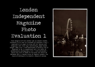
- 1. London Independent Magazine Photo Evaluation 1 This image is of the London Eye, an iconic London landmark, it is host to hundreds of visitors a day, I captured it at night to show off its’ beauty and elegance. With this high contrasting sepia toned image I feel that I have portrayed it exactly how it deserved to be. In comparison with the level of professional photography that I have witnessed I would say that it comes to the mark but could be bettered with a higher class of digital camera. The style of editing is to create a sense of solace.
- 2. London Independent Magazine Photo Evaluation 2 The Big Ben is full of history so I wanted to try and capture it without any background noise. I burn out and lower the brightness of the back- ground; to give the impression of a stand alone icon at the forefront of the photograph. The shot itself was originally slightly blurred, to recover it I increased the contrast and detail levels. This removed the blurred lines to an extent, but again with a higher level of digital camera the shot would have be much improved. If I was to take it again then I would definitely use a digital SLR.
- 3. London Independent Magazine Photo Evaluation 3 The photograph to the right has a strong element of nostalgia, I believe because of the softly lit skyline and intensity of the edges, this really leads the viewer into the image, I have applied the effects for this reason as I want the viewer to stand and admire the image for some time, looking across from side to side and really experiencing some of London’s most attractive buildings and monuments.
- 4. London Independent Magazine Photo Evaluation 4 The telephone box is one of London’s red icons; along with the post box and double decker bus. It truly screams London, and is part of the English heritage. I have chosen to blacken out the front of the boxes because it think that they contrast really nicely against the building that lays behind them, but bringing the vibrancy out inside them really adds to the colour pallet and also creates a much warmer atmosphere within the photograph.