Visual media can include photographs, videos, graphs and other visual representations of information. It is commonly used in education to help convey concepts and aid learning. There are several types of visual media such as print media, television news, and internet-based media. The characteristics of visual media include using new textures and representations to expand ideas between media and audiences. Some advantages include effectively communicating with illiterate people and helping executives make prompt decisions. Potential disadvantages include an inability to convey all information and higher production costs compared to text-based media. Overall, visual media's primary purpose is to gain attention, create meaning and facilitate retention of information.
Introduction to visual media addressing its definition, characteristics, communication, and usage in educational contexts, relevant for films, photography, and presentations.
Classification of visual media into print, newspaper records, broadcast media, television, radio, and internet, each explained with their significance and impact.
Different image formats such as JPEG, GIF, TIFF, PNG, and BMP, detailing their uses and characteristics in web and print graphics.
Discusses various sources of visual media including internet and print, emphasizing their traceability and citation.
Highlights benefits of visual media such as effectiveness, clarity, time-saving communication, prompt decision-making, and its complementarity with written communication.
Explores limitations like presentation challenges, brevity, efficiency needs, high costs, and potential for wrong decisions, but acknowledges thoughtful usage can mitigate issues.
States primary goals of visual information which include gaining attention, creating meaning, and enhancing memory retention.
Principles of designing visual messages emphasizing the importance of following design principles for effective communication.
Describes different design elements such as harmony, line, balance, hierarchy, scale, color, and texture that contribute to effective visual communication.List of sources referenced throughout the presentation to provide additional context and information on visual media.
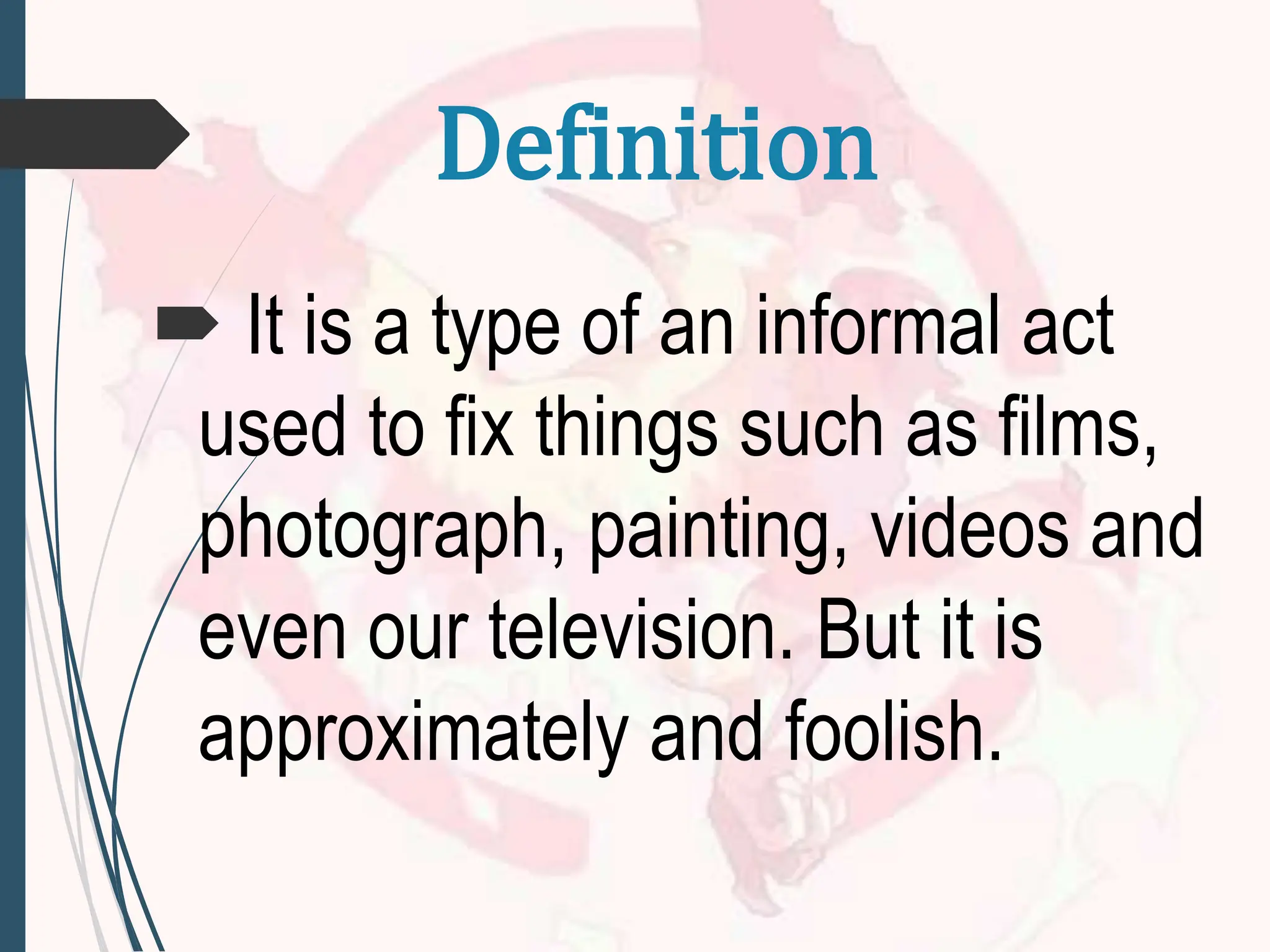
It isa type of an informal act
used to fix things such as films,
photograph, painting, videos and
even our television. But it is
approximately and foolish.
Definition
4.
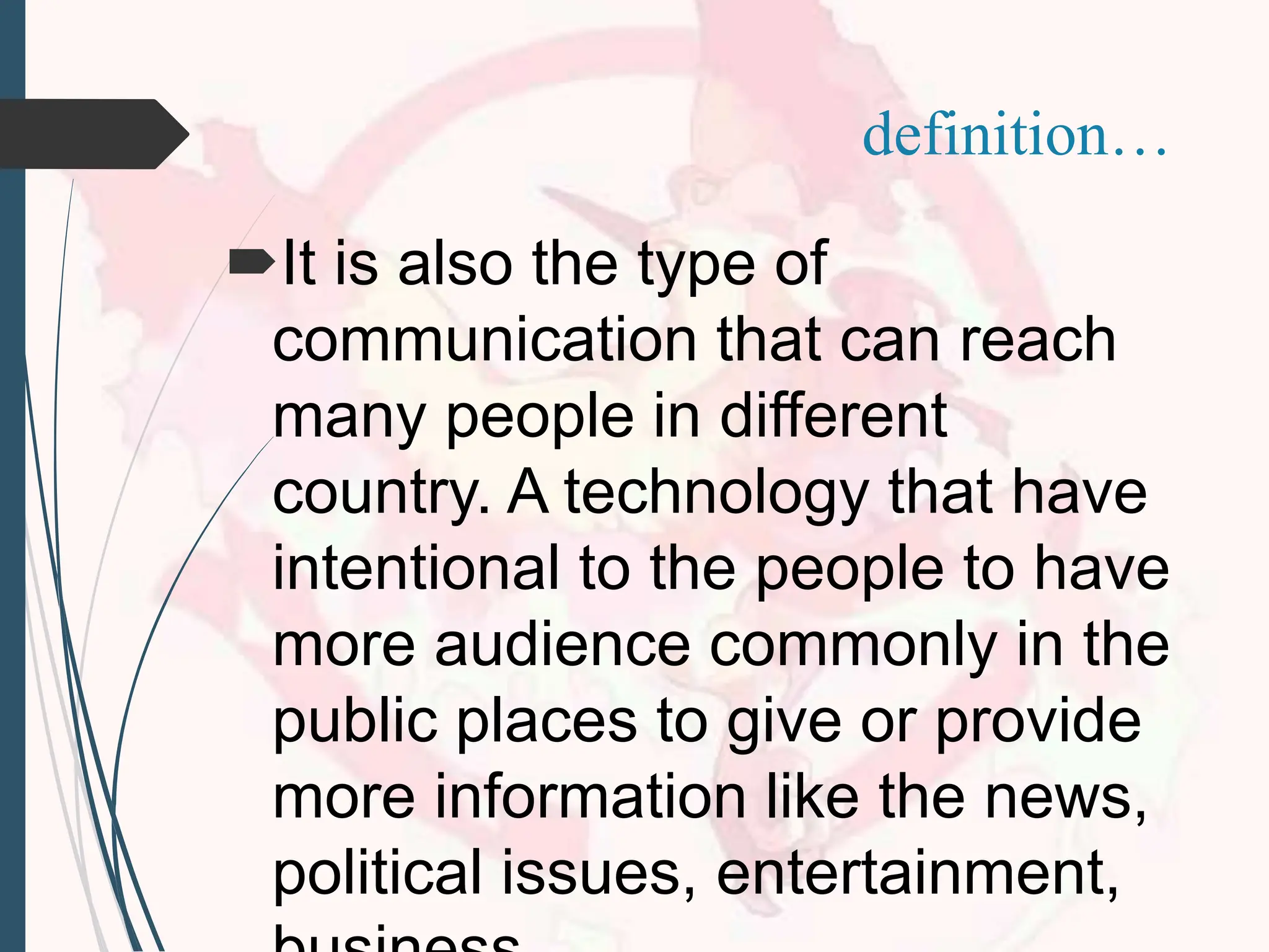
It is alsothe type of
communication that can reach
many people in different
country. A technology that have
intentional to the people to have
more audience commonly in the
public places to give or provide
more information like the news,
political issues, entertainment,
definition…
5.
definition…
It refers tothe materials, programs,
applications and the like that teachers
and students use to formulate new
information to aid learning through the
use, analysis, evaluation and
production of visual images.
6.
Visual media canbe used in any
subject matter especially presenting
texts through visuals such as data
presented through graphs, tables
and illustrations like pie chart and
project these through power point
presentations.
definition…
7.
CHARACTERISTICS
Have new moretextures
adventures
New kind of ways to represent
the world
To expand ideas between the
media, the audiences, and the
community
To have more concept in doing
8.
TYPES OF VISUAL
MEDIA
1.Print Media
Distribution of news in
newspapers, magazines,
journals, and etc.
9.
2. Newspaper Record
Gatheringof information in
one company and this can
be distributed in public if
they authorized the correct
information’s and it was
detailed.
TYPES OF VISUAL
MEDIA
10.
3. Broadcast Media
Thisis the easiest way to
transmit the information
worldwide because we are
now in the new technology
like computers, and
televisions.
TYPES OF VISUAL
MEDIA
11.
4. Television News
Newscastevery detailed
gathered information’s
and report the current
news we encounter
everyday.
TYPES OF VISUAL
MEDIA
TYPES OF VISUAL
MEDIA
6.Internet
Globally networking to
access different social
media, to get more
information’s, news, and
easily connected.
14.
VISUAL FORMATS
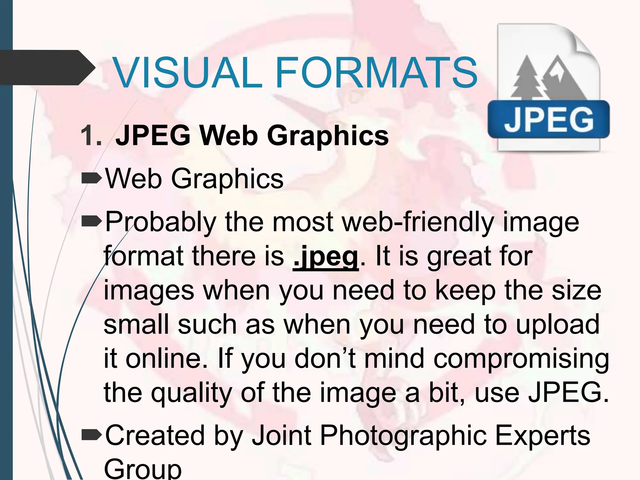
1. JPEGWeb Graphics
Web Graphics
Probably the most web-friendly image
format there is .jpeg. It is great for
images when you need to keep the size
small such as when you need to upload
it online. If you don’t mind compromising
the quality of the image a bit, use JPEG.
Created by Joint Photographic Experts
Group
15.
2. GIF (GraphicsInterchange
Format)
Web Graphics, Animation, and Clip
Art
It is a computer file that is used on
the Internet for sending
images, especially moving images.
16.
3. TIFF (TaggedImage File Format)
Print Graphics
It is the best and only choice for
professionals when images are
intended for print. Its ability to read
CMYK (and YcbCr color, plus its
ability to store such high pixel
intensity makes it the only choice for
designers, photographers and
17.
4. PNG (PortableNetwork
Graphics)
Web Graphics, Logos and Line Art
It is an extensible file format for the
lossless, portable, well-compressed
storage of raster images.
It is the most widely used lossless
18.
5. BMP
Print Graphics
Alsoknown as bitmap image
file or device independent bitmap (DIB)
file format or simply a bitmap
Is a raster graphics image file
format used to store bitmap digital
images, independently of the display
device (such as a graphics adapter),
especially on Microsoft
19.
SOURCES
Sources may behosted on the
internet, print publications,
displayed through broadcast
media, or otherwise
disseminated.
They are generally available or
at least citable as stable and
traceable future references.
20.
ADVANTAGES
1. Effectiveness
Person whois illiterate can
not be communicated using
written media. But graphs,
figures, pictures or chart can
be used to communicate
with such person.
21.
2. Importance
To makeanalytical and
technical subjects more clear
to the audience, visual
communication is second to
none.
e.g. An analysis of price of a
product and respective
demand can be explained in
22.
3. Less Time
Higherofficials or
executives have less time to
go through details. They can
be more familiar if they are
communicated in terms of
visual communication.
23.
4. Prompt Decision
Tomake decision quickly,
top management relies on
various tables, graphs,
charts, figures and maps. So,
timely decision is possible if
visual communication is
there.
24.
5. Complementary
In manysituation, visual
communication is used as a
complimentary tool to written
communication.
For example, analytical report,
technical report or feasibility
report are the best example
using written communication and
visual communication both.
25.
Actually, visual mattersor
subjects make a permanent
effect in the mind of an
audience. Therefore, visual
communication is widely
used for its added
advantages.
26.
DISADVANTAGES
1. Problem ofPresentation
All topics or subject matters can
not be presented through visual
communication.
Plan, policy, systems, rules,
order and recommendation of an
organization can not be
produced in terms of visual
communication.
27.
2. Brevity
A completeand detail
information can not be
displayed through such
communication. Therefore the
whole concept or idea may not
be understandable if
visual communication is used
extensively.
28.
3. Need forEfficiency
Drawing, graphs, charts or
symbols may not convey any
message to general people in
certain situation. Special
knowledge and efficiency are
required to deal with visual
communication.
29.
4. More CostInvolvement
To use graphs, pictures, charts,
drawing, cartoons and sketch
are not cheap. All these require
various tools and techniques
which are costly.
30.
5. Wrong Decision
Sometimesinformation
displayed in terms of graphs,
charts or table may be in wrong
order. Decision taken based on
such information may lead to
ineffective output or fruitless
result.
31.
Limitations or disadvantages
ofvisual communication do not
hamper the use and
application of visual
communication if the usage of
visual communication is done
thoughtfully and therefore it is
used by side by side with other
communication.
The collisionof the message is
not only written but it also
designs the message on it.
Design can be borrowed to
anyone because they can get
more ideas on how they will
perform their task or job. This
can help to analyze different
verbals. There are three
Visual design elementsand
principles describe
fundamental ideas about
the practice of good visual
design.
39.
The best designerssometimes
disregard the principles of
design. When they do so,
however, there is usually some
compensating merit attained at
the cost of the violation. Unless
you are certain of doing as well,
it is best to abide by the
principles.
40.
Design elements arethe
basic units of any visual
design which form its
structure and convey visual
messages.
41.
14 Types ofDesign and
Elements
THE HARMONY
The main goal of
having a graphic design.
42.
LINE
Describes a shapeor outline. It
can create texture and can be
thick or thin. Lines may be
actual, implied, vertical,
horizontal, diagonal, or contour
lines.
44.
METHODS USING
Have theability, senses,
elements and basic.
BALANCES
Have the quality and be
calm the equilibrium.
45.
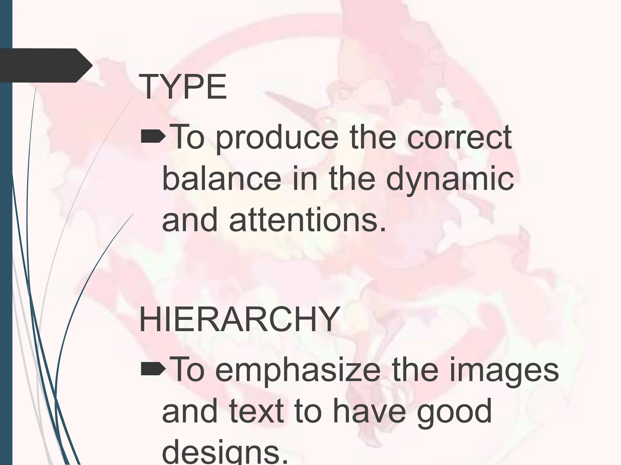
TYPE
To produce thecorrect
balance in the dynamic
and attentions.
HIERARCHY
To emphasize the images
and text to have good
designs.
46.
SCALE/PROPORTION
Using the correctrelative
size of the contents
DOMINANCE/EMPHASIS
To correct the colors, size,
text, images and position
on it.
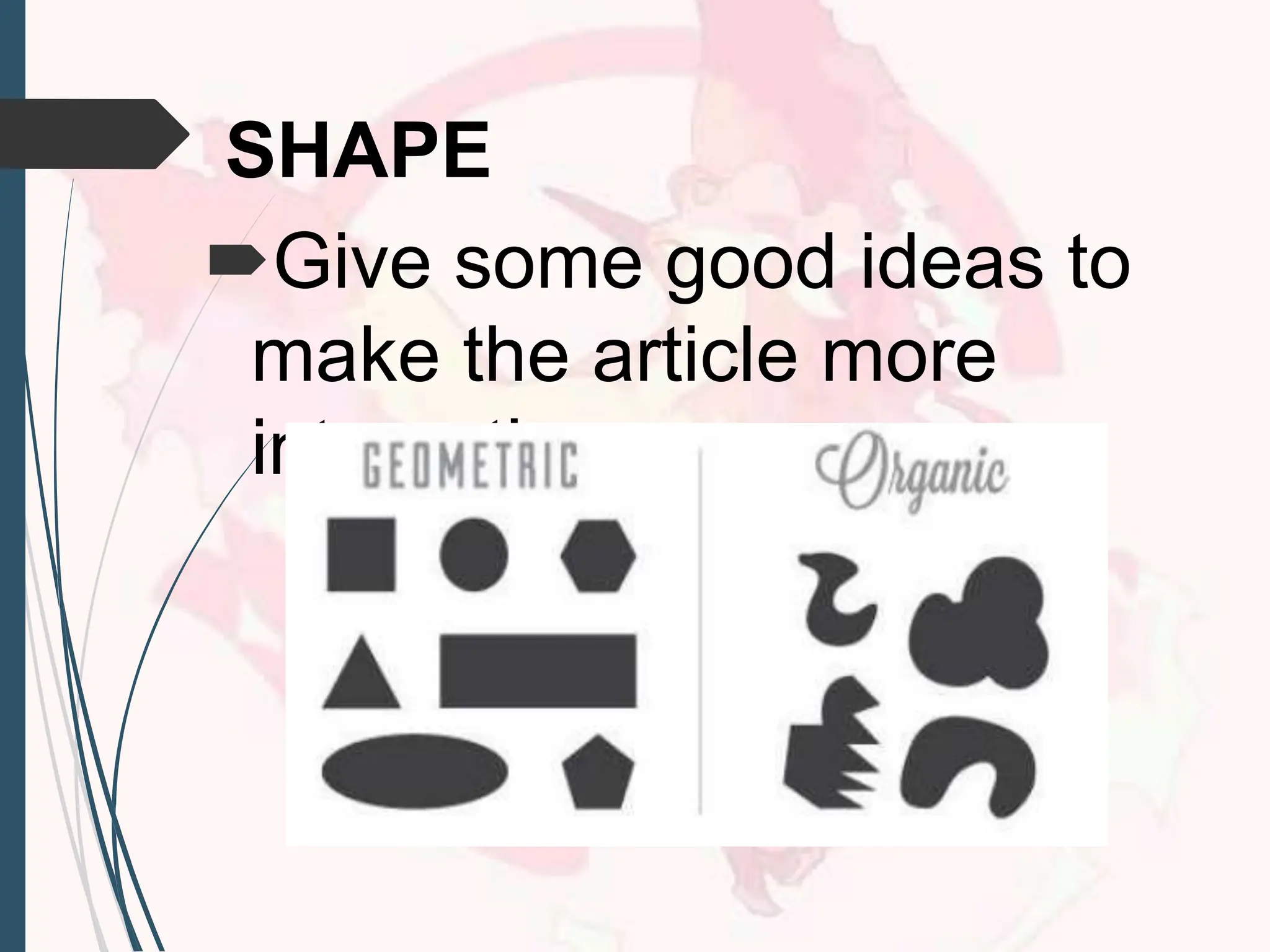
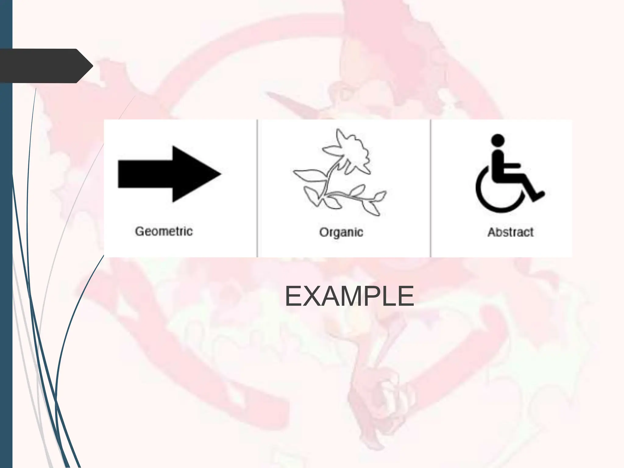
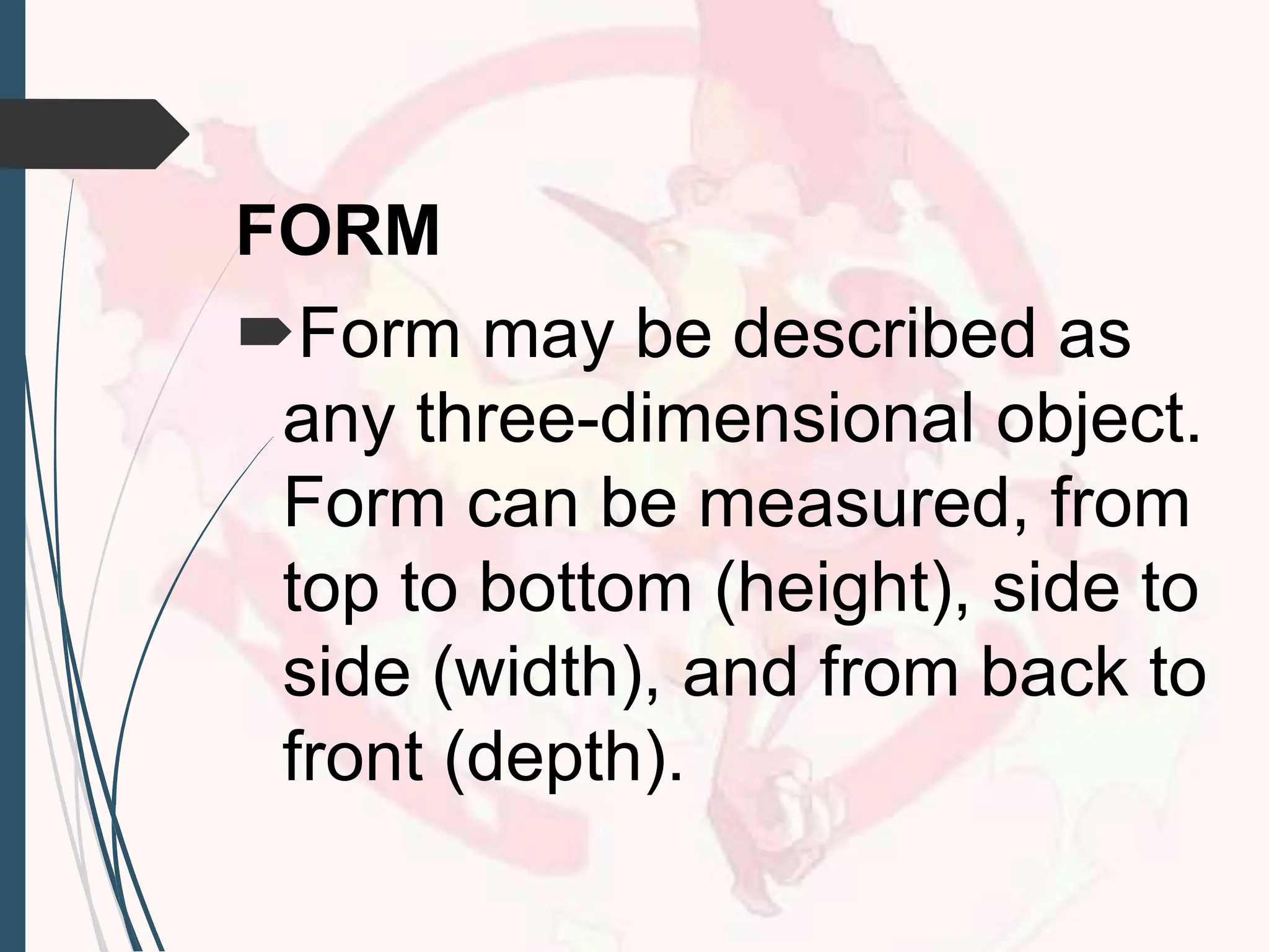
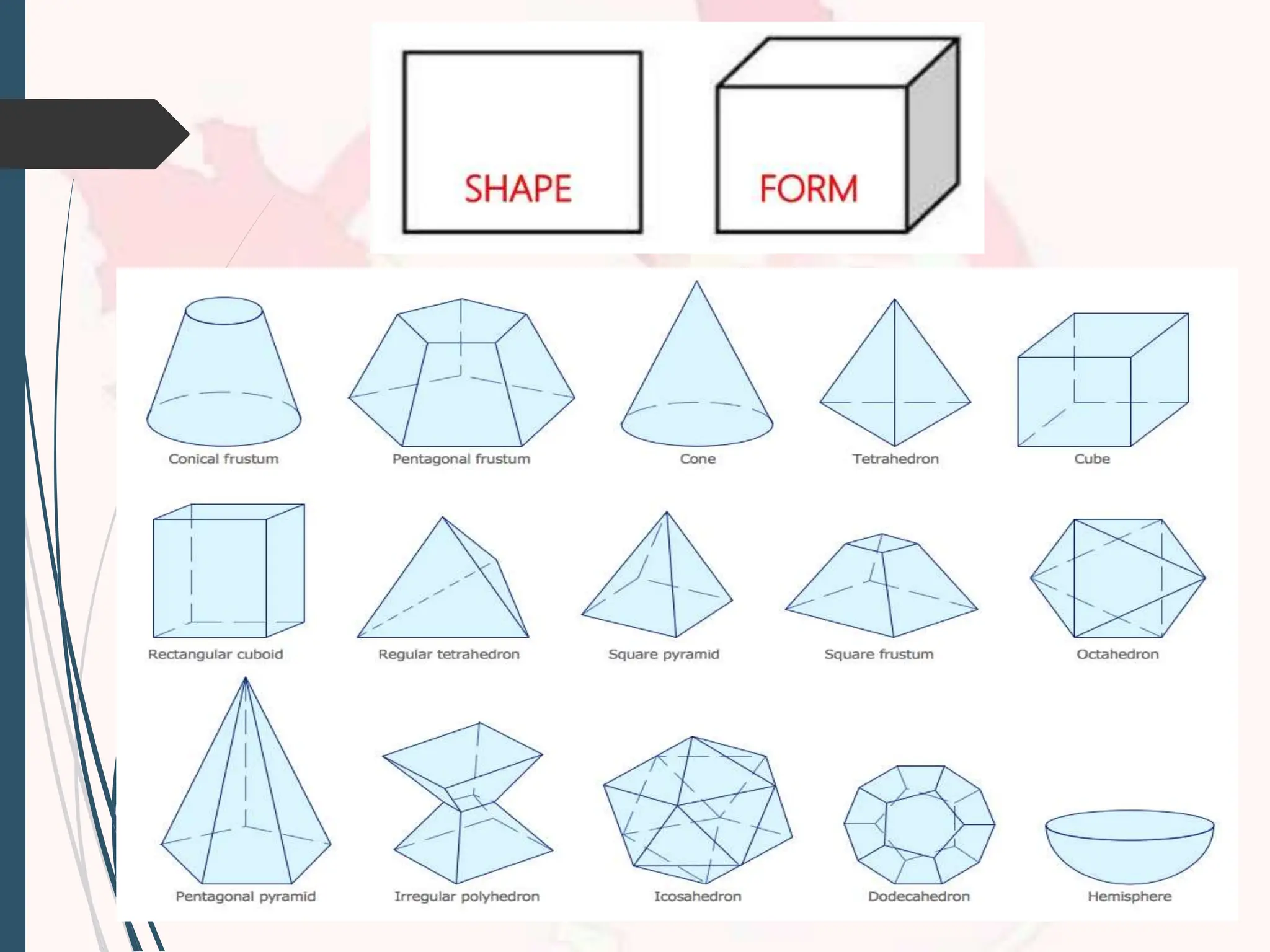
FORM
Form may bedescribed as
any three-dimensional object.
Form can be measured, from
top to bottom (height), side to
side (width), and from back to
front (depth).
53.
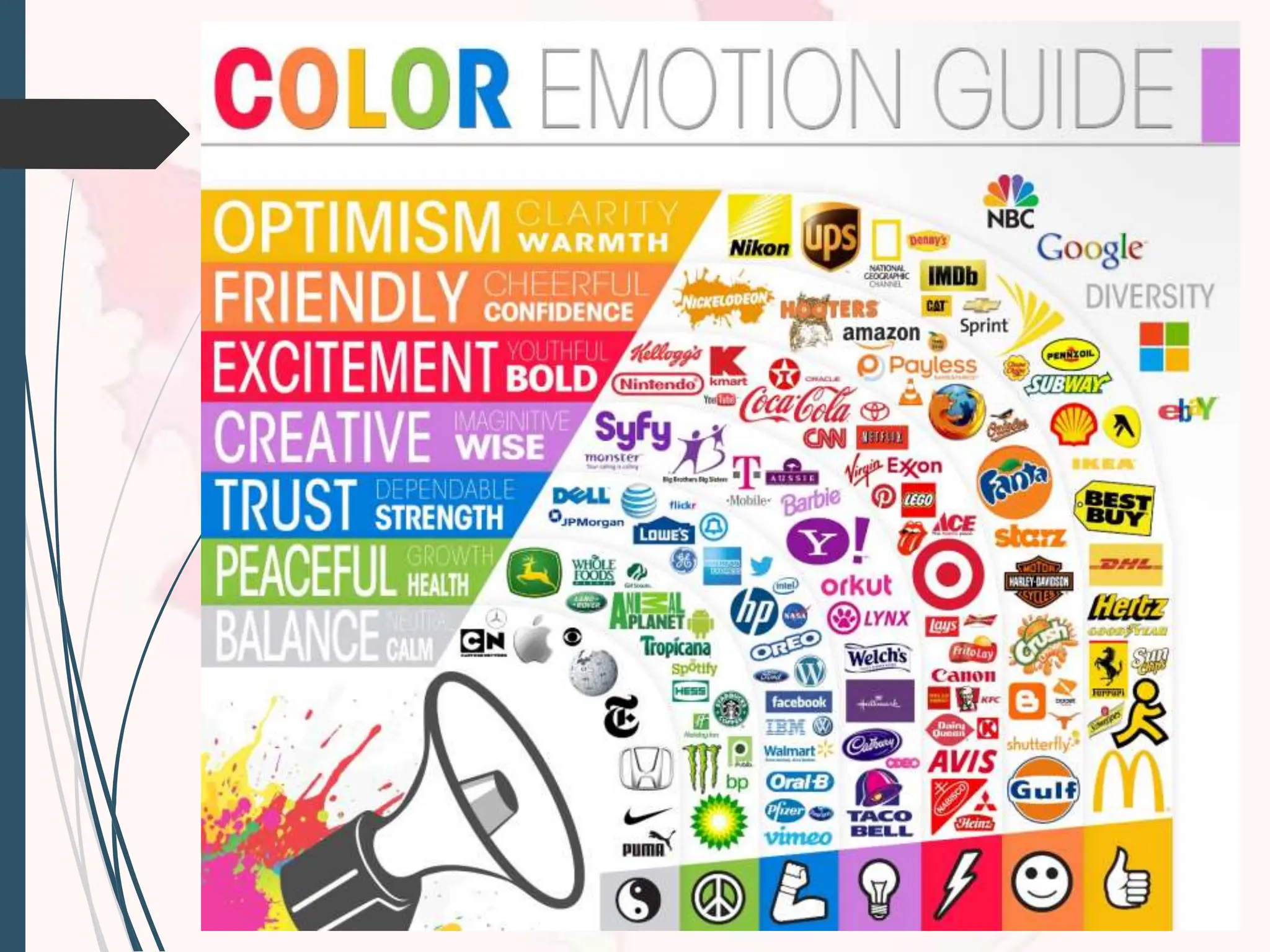
COLOR
Determined by itshue (name
of color), intensity (purity of the
hue), and value (lightness or
darkness of hue). Color and
color combination can play a
large role in the design.
Use to design the elements to
54.
It plays amajor role in our
visual perception, as it
influences our reactions
about the world around us.
56.
VALUE
The degree oflight and dark
in a design. It is the contrast
between black and white
and all the tones in between.
Value can be used with color
as well as black and white.
58.
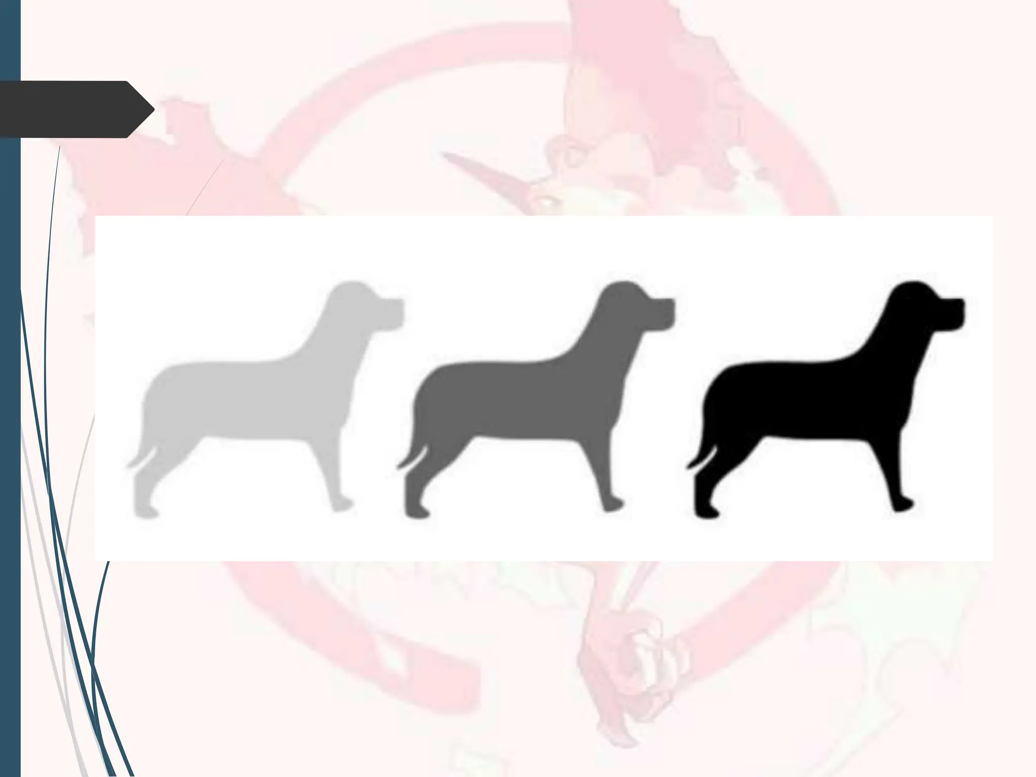
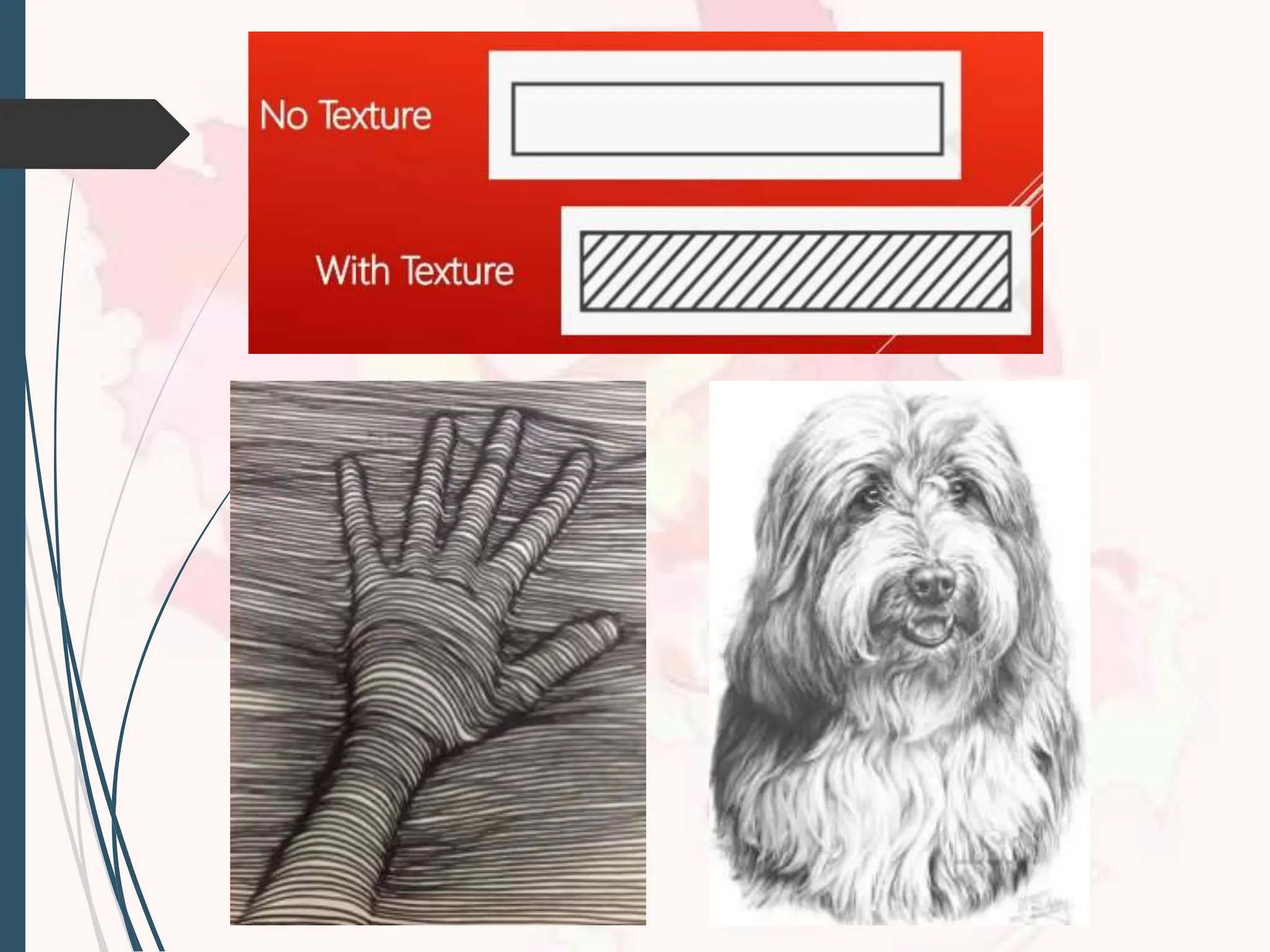
TEXTURES
Meaning the waya surface
feels or is perceived to feel.
To attract the people and
have meaningful meaning.


![[DSC Europe 25] Dragan Vucic - Building the Learning Organization - How AI Tr...](https://cdn.slidesharecdn.com/ss_thumbnails/8brigo2sbu6qur6gxrra-7-251205085715-6ae07d24-thumbnail.jpg?width=640&height=640&fit=bounds)
![[DSC Europe 25] Petar Zivanov - AI meets documents From chatbots to AI-powere...](https://cdn.slidesharecdn.com/ss_thumbnails/xer2bb6nrdc8pdpev0pc-8-251204082258-7c2fa4a1-thumbnail.jpg?width=640&height=640&fit=bounds)
![[DSC Europe 25] Bogdan Daniel Maruneac - AI - It starts with you.pptx](https://cdn.slidesharecdn.com/ss_thumbnails/odov3snhrcqs9hx5ny2n-4-251205085715-f1daacfe-thumbnail.jpg?width=640&height=640&fit=bounds)


![[DSC Europe 25] Marija Vlajkovic & Andrea Radonjanin - Integration of AI tool...](https://cdn.slidesharecdn.com/ss_thumbnails/qf1jrglttoc3bm8s3aop-final-integration-of-ai-tools-251208151905-394f3a6a-thumbnail.jpg?width=640&height=640&fit=bounds)

![[DSC Europe 25] Dusan Jovicic - AI Story: From on-prem to cloud and back agai...](https://cdn.slidesharecdn.com/ss_thumbnails/8kp49m6uq22ifnbwhfnk-2-251205085715-964d11a6-thumbnail.jpg?width=640&height=640&fit=bounds)


![[DSC Europe 25] Dragana Ilic - AI for Big Data in Astronomy.pptx](https://cdn.slidesharecdn.com/ss_thumbnails/8palya86qaatvjhva1ms-2-dragana-ilic-ai-ilic-251208151906-652b819c-thumbnail.jpg?width=640&height=640&fit=bounds)


