
Uploaded bySara
2nd draft design layout for identity page
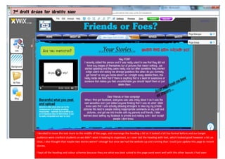
This document provides a 2nd draft design for an identity page. The text was moved more to the middle of the page and the heading was rearranged to look less formal as the target audience were students. Overlaying the heading with text looked good but was unclear. While two stories seemed insufficient, the page could later be updated to include recent stories once the website launched. The heading and color schemes were kept as they suited the page and matched other layouts.
More Related Content


![5G Explained! A High Level Overview [Introduction]](https://cdn.slidesharecdn.com/ss_thumbnails/5gexplainedahighleveloverview-260119165306-cc137a3e-thumbnail.jpg?width=640&height=640&fit=bounds)


2nd draft design layout for identity page
- 1. 2nd draft designfor identity page I decided to move the text more to the middle of the page, and rearrange the heading a bit as it looked a bit too formal before and our target audience were cranford students so we didn’t want it looking to organised, so i over laid the heading with text, which looked good however a bit un clear, i also thought that maybe two stories weren’t enough but once we had the website up and running that i could just update this page to recent stories. I kept all the heading and colour schemes because they are what was best suited to the page aand went well with the other layouts i had seen