This document provides an overview of the book "Development Economics" by Debraj Ray. It discusses the contents and structure of the book, which provides an introduction to development economics through 18 chapters. The book aims to make the large literature on development economics accessible to students with training in basic economic theory. It covers topics such as economic growth, inequality, poverty, population growth, structural transformation, rural and urban development, and international trade. The preface provides guidance on using the book for single-semester or year-long courses in development economics.


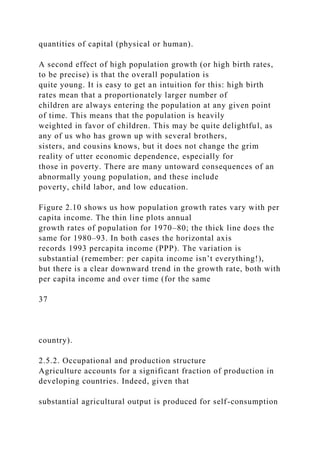
![Chapter 1
Introduction
I invite you to study what is surely the most important and
perhaps the most complex of all economic issues: the
economic transformation of those countries known as the
developing world. A definition of “developing countries”
is problematic and, after a point, irrelevant.1 The World
Development Report (World Bank [1996]) employs a
threshold of $9,000 per capita to distinguish between what it
calls high-income countries and low- and middle-
income countries: according to this classification, well over 4.5
billion of the 5.6 billion people in the world today
live in the developing world of “low- and middle-income
countries.” They earn, on average, around $1,000 per
capita, a figure that is worth contrasting with the yearly
earnings of the average North American or Japanese
resident, which are well above $25,000. Despite the many
caveats and qualifications that we later add to these
numbers, the ubiquitous fact of these astonishing disparities
remains.
There is economic inequality throughout the world, but much of
that is, we hope, changing. This book puts
together a way of thinking about both the disparities and the
changes.
There are two strands of thought that run through this text.
First, I move away from (although do not entirely
abandon) a long-held view that the problems of all developing
countries can be understood best with reference to
the international environment of which they are a part.2
According to this view, the problems of underdevelopment](https://image.slidesharecdn.com/1developmenteconomics-221224051007-11cbd63c/85/1Development-Economics-docx-21-320.jpg)


![international
organizations such as the World Bank. A composite index that
goes beyond per capita income is described in Human
Development Report
(United Nations Development Programme [1995]). There is
substantial agreement across all these classifications.
2 This view includes not only the notion that developing
countries are somehow hindered by their exposure to the
developed world,
18
epitomized in the teachings of dependencia theorists, but also
more mainstream concerns regarding the central role of
international
organizations and foreign assistance.
3 Case studies, which are referred to as boxes, will be set off
from the text by horizontal rules.
19
Chapter 2
Economic Development: Overview
By the problem of economic development I mean simply the
problem of accounting for the observed pattern, across countries
and
across time, in levels and rates of growth of per capita income.
This may seem too narrow a definition, and perhaps it is, but
thinking about income patterns will necessarily involve us in](https://image.slidesharecdn.com/1developmenteconomics-221224051007-11cbd63c/85/1Development-Economics-docx-27-320.jpg)
![thinking about many other aspects of societies too, so I would
suggest
that we withhold judgement on the scope of this definition until
we have a clearer idea of where it leads us.
—R. E. Lucas [1988]
[W]e should never lose sight of the ultimate purpose of the
exercise, to treat men and women as ends, to improve the human
condition, to enlarge people’s choices. . . . [A] unity of interests
would exist if there were rigid links between economic
production
(as measured by income per head) and human development
(reflected by human indicators such as life expectancy or
literacy, or
achievements such as self-respect, not easily measured). But
these two sets of indicators are not very closely related.
—P. P. Streeten [1994]
2.1. Introduction
Economic development is the primary objective of the majority
of the world’s nations. This truth is accepted almost
without controversy To raise the income, well-being, and
economic capabilities of peoples everywhere is easily the
most crucial social task facing us today. Every year, aid is
disbursed, investments are undertaken, policies are
framed, and elaborate plans are hatched so as to achieve this
goal, or at least to step closer to it. How do we identify
and keep track of the results of these efforts? What
characteristics do we use to evaluate the degree of
“development” a country has undergone or how “developed” or
“underdeveloped” a country is at any point in time?
In short, how do we measure development?
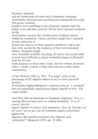
The issue is not easy to resolve. We all have intuitive notions of](https://image.slidesharecdn.com/1developmenteconomics-221224051007-11cbd63c/85/1Development-Economics-docx-28-320.jpg)


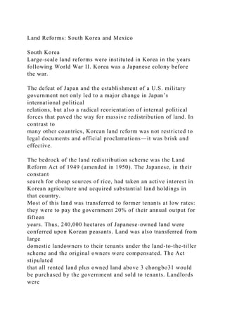
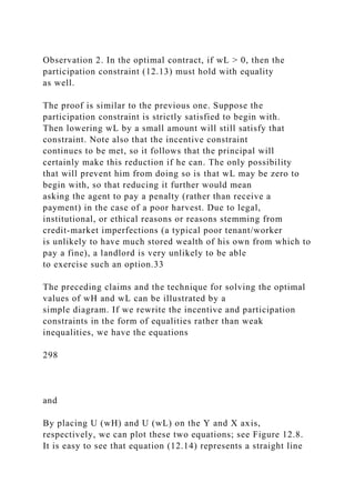
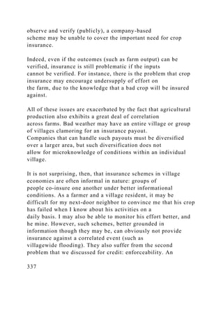
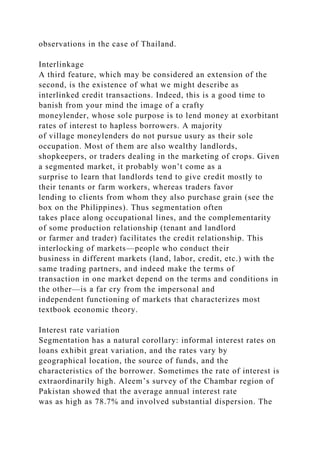
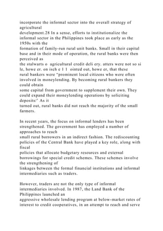
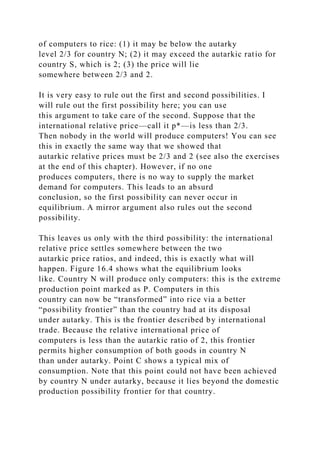
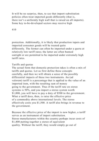
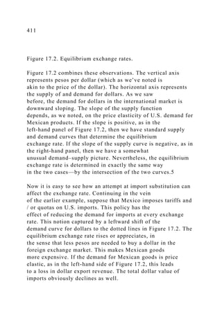
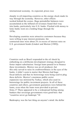
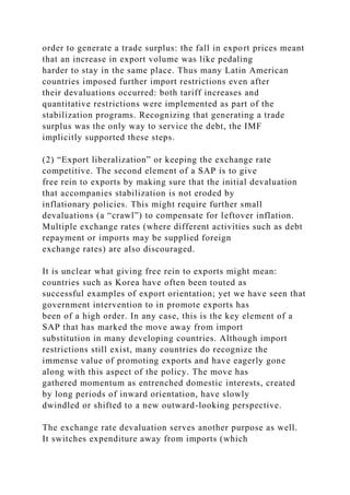
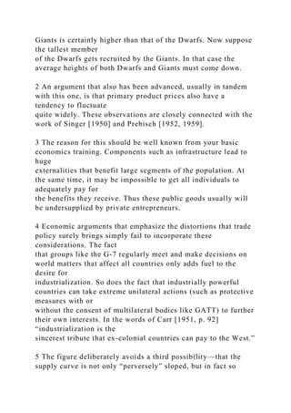
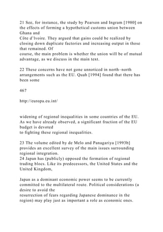
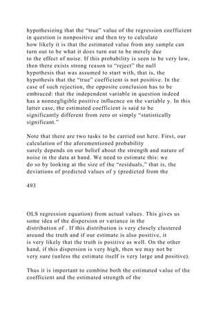
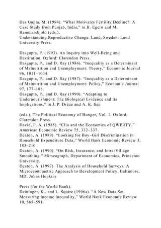
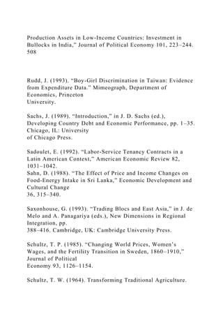
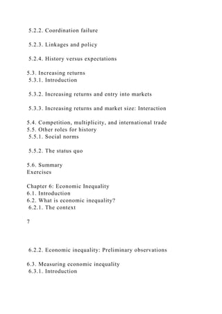
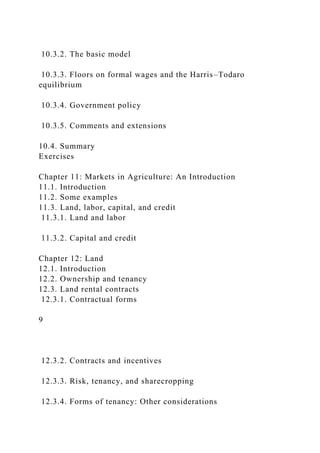
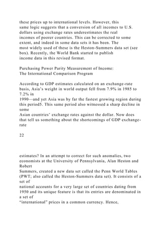
![Per capita incomes are, of course, expressed in takas, reales,
yuan, and in the many other world currencies. To
facilitate comparison, each country’s income (in local currency)
is converted into a common currency (typically
U.S. dollars) and divided by that country’s population to arrive
at a measure of per capita income. This conversion
scheme is called the exchange rate method, because it uses the
rates of exchange between the local and the common
currencies to express incomes in a common unit. The World
Development Report (see, e.g., World Bank [1996])
contains such estimates of GNP per capita by country. By this
yardstick, the world produced $24 trillion of output
in 1993. About 20% of this came from low- and middle-income
developing countries—a pittance when we see that
these countries housed 85% of the world’s population at that
time. Switzerland, the world’s richest country under
this system of measurement, enjoyed a per capita income close
to 400 times that of Tanzania, the world’s poorest.
21
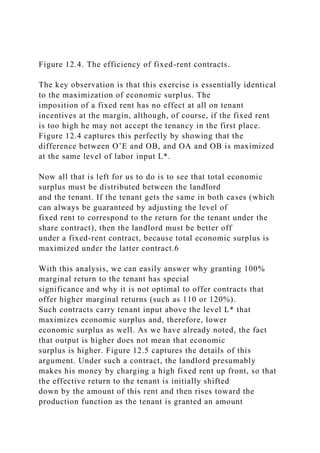
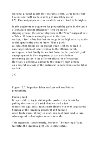
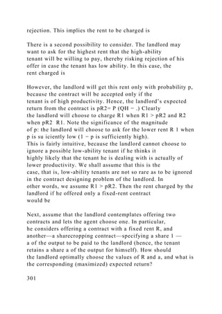
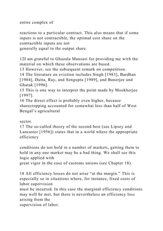
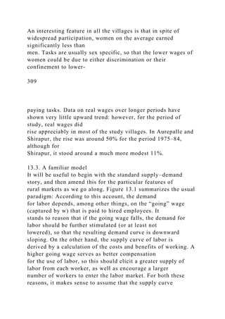
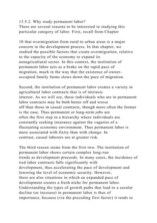
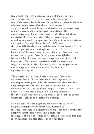
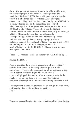
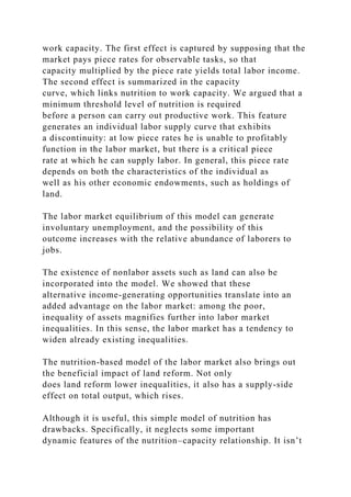
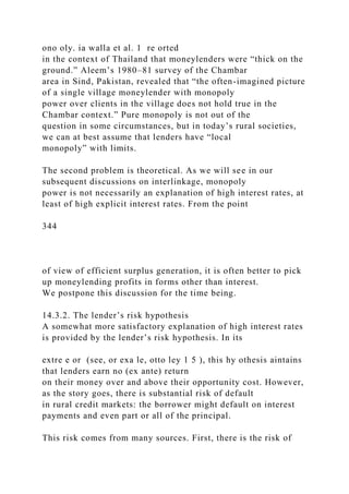
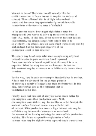
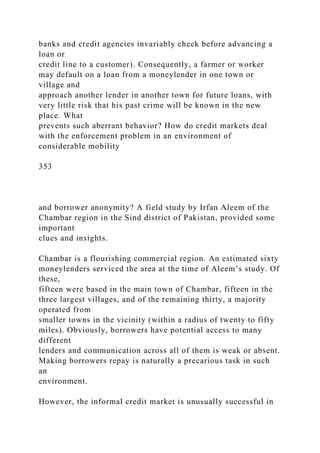
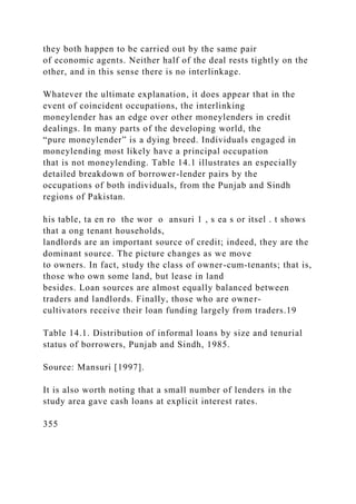
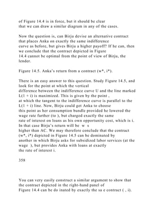
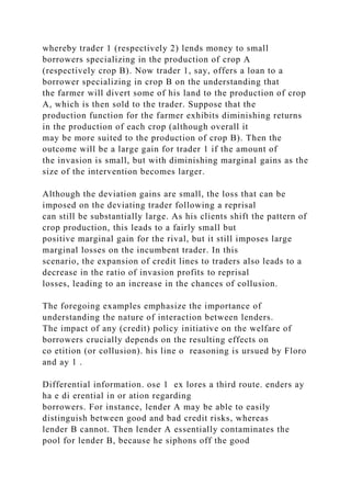
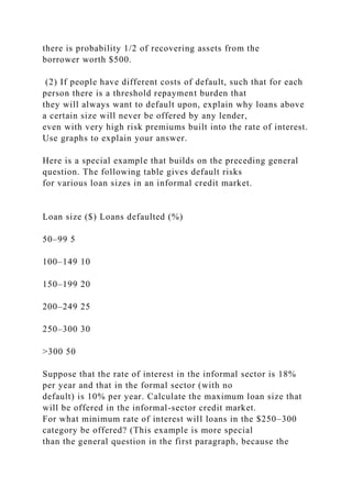
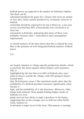
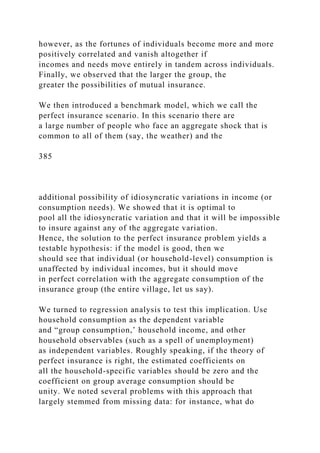
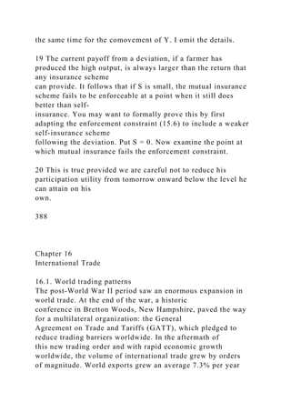
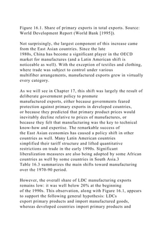
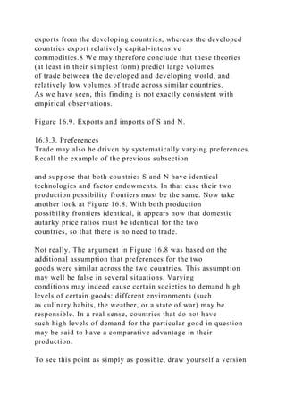
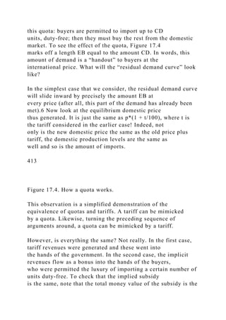
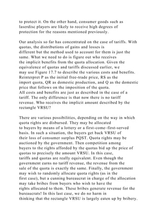
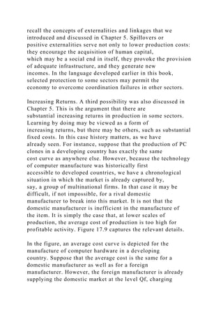
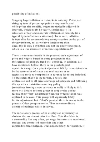
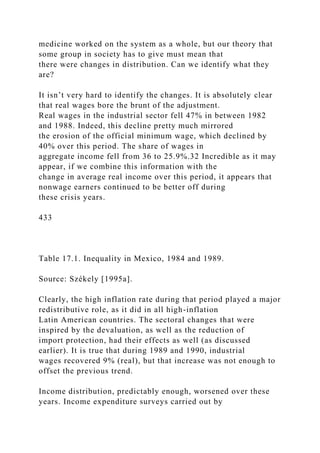
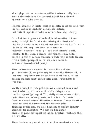
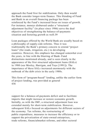
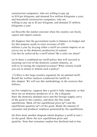
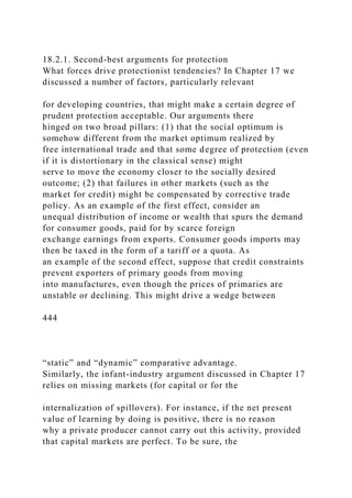
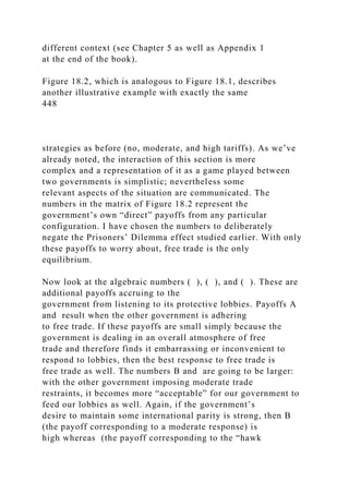
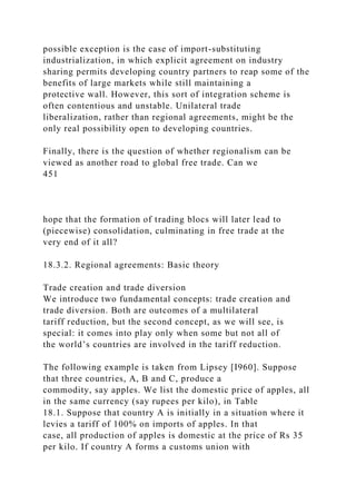
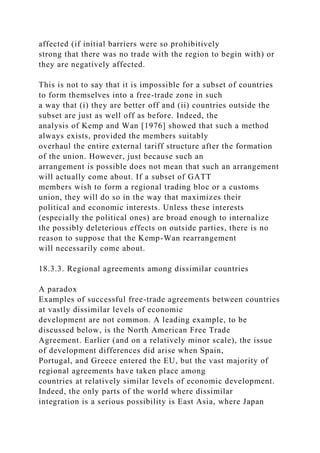
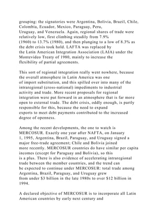
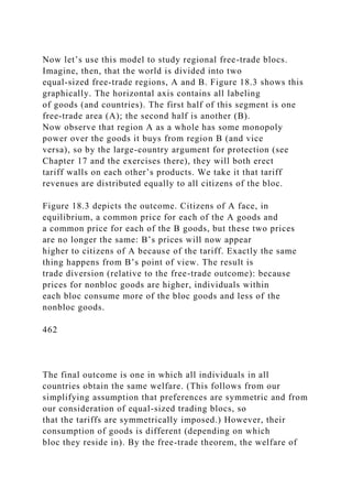
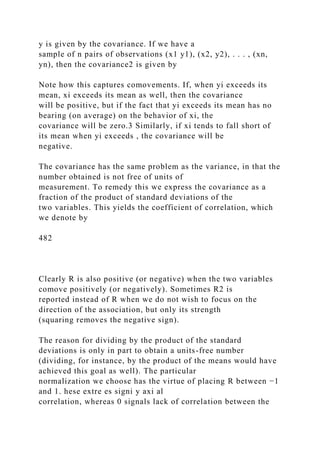
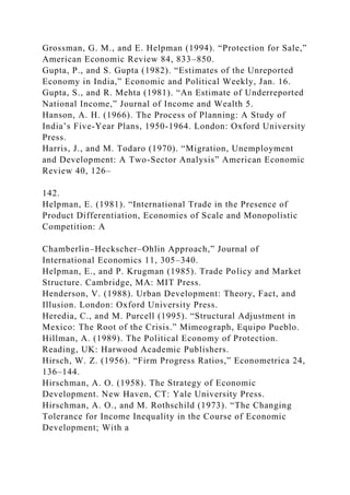
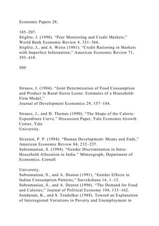
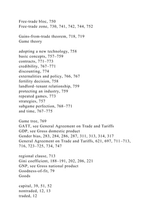
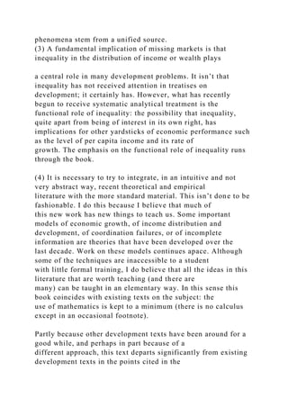
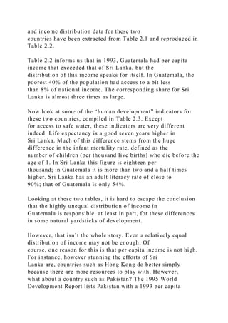
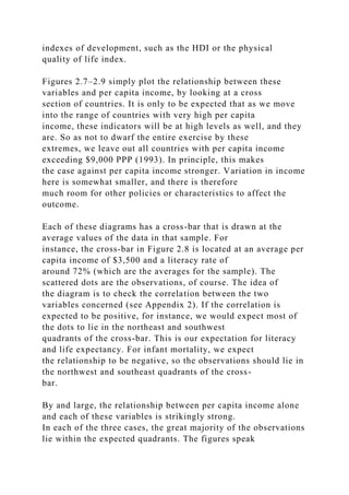
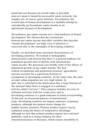
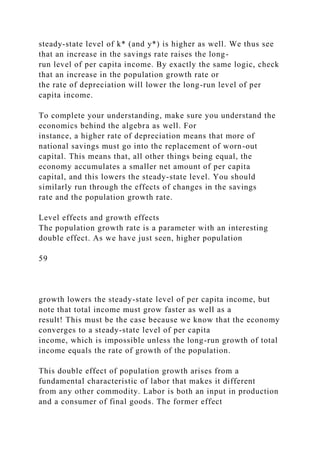
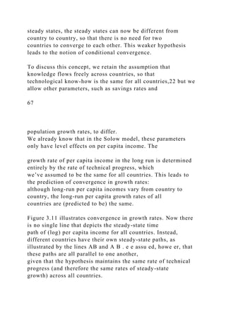
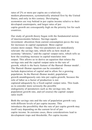
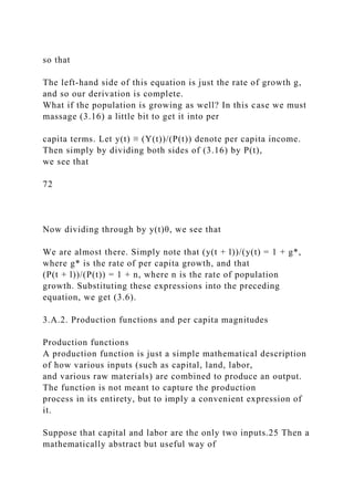
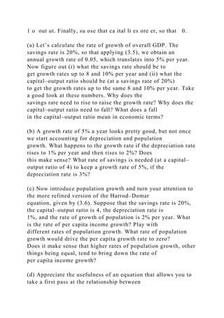
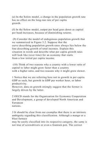
Figure 2.1. Per capita income and population for selected
countries.
Figure 2.1 displays per capita income figures for selected
countries. The figure contrasts per capita incomes in
different countries with the populations of these countries. No
comment is necessary.
The disparities are enormous, and no amount of fine-tuning in
measurement methods can get rid of the stark
inequalities that we live with. Nevertheless, both for a better
understanding of the degree of international variation
that we are talking about and for the sake of more reliable](https://image.slidesharecdn.com/1developmenteconomics-221224051007-11cbd63c/85/1Development-Economics-docx-33-320.jpg)
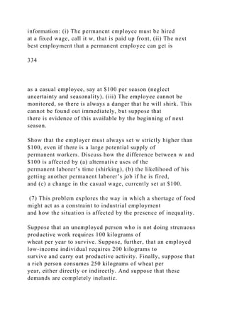
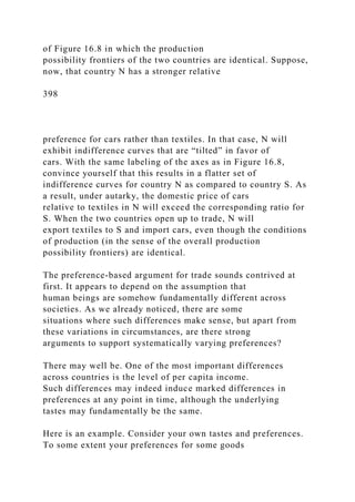
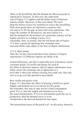
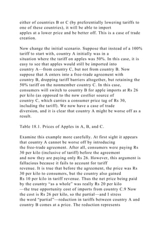
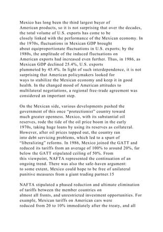
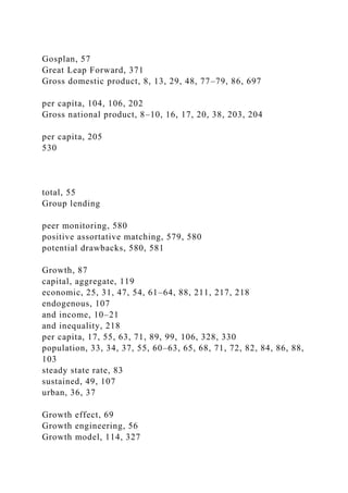
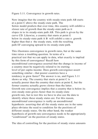
![Figure 2.2. The world’s eight largest economies: exchange rate
and PPP calculations. Source: World Development Report
(World Bank
[1995]).
Figure 2.2 shows how the eight largest economies change when
we move from exchange rates to PPP calculations.
Although the Summers-Heston data are useful for real
comparisons, remember that exchange rate-based data are the
appropriate ones
to use for international financial transactions and capital flows.
Briefly (see box for more details), international prices are
constructed for an enormous basket of goods and
services by averaging the prices (expressed, say, in dollars) for
each such good and service over all different
countries. National income for a country is then estimated by
valuing its outputs at these international prices. In this
way, what is maintained, in some average sense, is parity in the
purchasing power among different countries. Thus
we call such estimates PPP estimates, where PPP stands for
“purchasing power parity.”
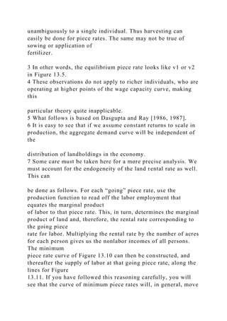
PPP estimates of per capita income go some way toward
reducing the astonishing disparities in the world
distribution of income, but certainly not all the way. For an
account of how the PPP estimates alter the distribution
of world income, consult Figure 2.3.
The direction of change is quite clear and, from the foregoing
discussion, only to be expected. Measured in PPP
dollars, developing countries do better relative to U.S. per
capita GNP, although the fractions are still small, to be
sure. This situation reflects the fact that domestic prices are not
captured adequately by using exchange-rate](https://image.slidesharecdn.com/1developmenteconomics-221224051007-11cbd63c/85/1Development-Economics-docx-39-320.jpg)
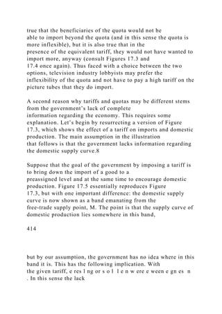
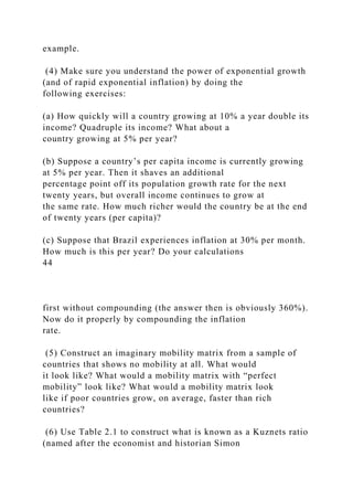
![conversions, which apply correctly only to a limited set of
traded goods.
(3) There are other subtle problems of measurement. GNP
measurement, even when it accounts for the
exchange-rate problem, uses market prices to compare apples
and oranges; that is, to convert highly disparate goods
into a common currency. The theoretical justification for this is
that market prices reflect people’s preferences as
well as relative scarcities. Therefore such prices represent the
appropriate conversion scale to use. There may be
several objections to this argument. Not all markets are
perfectly competitive; neither are all prices fully flexible.
24
We have monopolies, oligopolistic competition, and public
sector companies6 that sell at dictated prices. There is
expenditure by the government on bureaucracy, on the military,
or on space research, whose monetary value may
not reflect the true value of these services to the citizens.
Moreover, conventional measures of GNP ignore costs that
arise from externalities—the cost of associated pollution,
environmental damage, resource depletion, human
suffering due to displacement caused by “development projects”
such as dams and railways, and so forth. In all of
these cases, prevalent prices do not capture the true marginal
social value or cost of a good or a service.
Figure 2.3. PPP versus exchange rate measures of GDP for
ninety-four countries, 1993. Source: World Development Report
(World Bank
[1995]).](https://image.slidesharecdn.com/1developmenteconomics-221224051007-11cbd63c/85/1Development-Economics-docx-40-320.jpg)
![All these problems can be mended, in principle, and
sophisticated measures of GDP do so to a large extent.
Distortions in prices can be corrected for by imputing and using
appropriate “shadow prices” that capture true
marginal values and costs. There is a vast literature, both
theoretical and empirical, that deals with the concepts and
techniques needed to calculate shadow prices for commodities.
An estimated “cost of pollution” is often deducted in
some of the measures of net GDP, at least in industrialized
economies. Nevertheless, it is important to be aware of
these additional problems.
With this said, let us turn to a brief account of recent historical
experience.
2.2.2. Historical experience
Over the period 1960–85, the richest 5% of the world’s nations
averaged a per capita income that was about
twenty-nine times the corresponding figure for the poorest 5%.
As Parente and Prescott [1993] quite correctly
observed, interstate disparities within the United States do not
even come close to these international figures. In
1985, the richest state in the United States was Connecticut and
the poorest was Mississippi, and the ratio of per
capita incomes worked out at around 2!
Of course, the fact that the richest 5% of countries bear
approximately the same ratio of incomes (relative to the
poorest 5%) over this twenty-five year period suggests that the
entire distribution has remained stationary. Of
greatest interest, and continuing well into the nineties, is the
meteoric rise of the East Asian economies: Japan,
Korea, Taiwan, Singapore, Hong Kong, Thailand, Malaysia,
Indonesia, and, more recently, China. Over the period
1965–90, the per capita incomes of the aforementioned eight](https://image.slidesharecdn.com/1developmenteconomics-221224051007-11cbd63c/85/1Development-Economics-docx-41-320.jpg)
![East Asian economies (excluding China) increased at
an annual rate of 5.5%. Between 1980 and 1993, China’s per
capita income grew at an annual rate of 8.2%, which
is truly phenomenal. For the entire data set of 102 countries
studied by Parente and Prescott, per capita growth
averaged 1.9% per year over the period 1960–85.
In contrast, much of Latin America and sub-Saharan Africa
languished during the 1980s. After relatively high
25
rates of economic expansion in the two preceding decades,
growth slowed to a crawl, and in many cases there was
no growth at all. Morley’s [1995] study observed that in Latin
America, per capita income fell by 11% during the
1980s, and only Chile and Colombia had a higher per capita
income in 1990 than they did in 1980. It is certainly
true that such figures should be treated cautiously, given the
extreme problems of accurate GNP measurement in
high-inflation countries, but they illustrate the situation well
enough.
Similarly, much of Africa stagnated or declined during the
1980s. Countries such as Nigeria and Tanzania
experienced substantial declines of per capita income, whereas
countries such as Kenya and Uganda barely grew in
per capita terms.
Diverse growth experiences such as these can change the face of
the world in a couple of decades. One easy
way to see this is to study the “doubling time” implicit in a
given rate of growth; that is, the number of years it takes
for income to double if it is growing at some given rate. The](https://image.slidesharecdn.com/1developmenteconomics-221224051007-11cbd63c/85/1Development-Economics-docx-42-320.jpg)
![calculation in the footnote7 reveals that a good
approximation to the doubling time is seventy divided by the
annual rate of growth expressed in percentage terms.
Thus an East Asian country growing at 5% per year will double
its per capita income every fourteen years! In
contrast, a country growing at 1% per year will require seventy
years. Percentage growth figures look like small
numbers, but over time, they add up very fast indeed.
The diverse experiences of countries demand an explanation,
but this demand is ambitious. Probably no single
explanation can account for the variety of historical experience.
We know that in Latin America, the so-called debt
crisis (discussed more in Chapter 17) triggered enormous
economic hardship. In sub-Saharan Africa, low per capita
growth rates may be due, in large measure, to unstable
government and consequent infrastructural breakdown, as
well as to recent high rates of population increase (on this, see
Chapters 3 and 9). The heady successes of East Asia
are not fully understood, but a conjunction of farsighted
government intervention (Chapters 17), a relatively equal
domestic income distribution (Chapters 6 and 7), and a vigorous
entry into international markets played an
important role. As you may have noted from the occasional
parentheses in this paragraph, we will take up these
topics, and many others, in the chapters to come.
Thus it is quite possible for the world distribution of income to
stay fairly constant in relative terms, while at the
same time there is plenty of action within that distribution as
countries climb and descend the ladder of relative
economic achievement. Indeed, the few countries that we have
cited as examples are no exceptions. Figure 2.4
contains the same exercise as Chart 10 in Parente and Prescott
[1993]. It shows the number of countries that
experienced changes in income (relative to that of the United](https://image.slidesharecdn.com/1developmenteconomics-221224051007-11cbd63c/85/1Development-Economics-docx-43-320.jpg)
![States) of different magnitudes over the years 1960–
85.
Figure 2.4 indicates two things. First, a significant fraction
(well over half) of countries changed their position
relative to the United States by an average of one percentage
point or more per year, over the period 1960–85.
Second, the figure also indicates that there is a rough kind of
symmetry between changes upward and changes
downward, which partly accounts for the fact that you don’t see
much movement in the world distribution taken as a
whole. This observation is cause for much hope and some
trepidation: the former, because it tells us that there are
probably no traps to ultimate economic success, and the latter,
because it seems all too easy to slip and fall in the
process. Economic development is probably more like a
treacherous road, than a divided highway where only the
privileged minority is destined to ever drive the fast lane.
26
Figure 2.4. Annual percentage change in PPP income of
different countries relative to U.S. levels, 1960–85. Source:
Penn World Tables .
This last statement must be taken with some caution. Although
there appears to be no evidence that very poor
countries are doomed to eternal poverty, there is some
indication that low incomes are very sticky. Even though we
will have much more to say about the hypothesis of ultimate
convergence of all countries to a common standard of
living (see Chapters 3–5), an illustration may be useful at this
stage. Quah [1993] used per capita income data to
construct “mobility matrices” for countries. To understand how](https://image.slidesharecdn.com/1developmenteconomics-221224051007-11cbd63c/85/1Development-Economics-docx-44-320.jpg)

![particular category have a high probability of staying right
there. Conversely, a matrix that has the same numbers in every
entry (which must be 20 in our 5 × 5 case, given that
the numbers must sum to 100 along each row) shows an
extraordinarily high rate of mobility. Regardless of the
starting point in 1962, such a matrix will give you equal odds of
being in any of the categories in 1984.
27
Figure 2.5. The income mobility of countries, 1962–84. Source:
Quah [1993] .
With these observations in mind, continue to stare at Figure 2.5.
Notice that middle-income countries have far
greater mobility than either the poorest or the richest countries.
For instance, countries in category 1 (between half
the world average and the world average) in 1962 moved away
to “right” and “left”: less than half of them remained
where they were in 1962. In stark contrast to this, over three-
quarters of the poorest countries (category 1/4) in
1962 remained where they were, and none of them went above
the world average by 1984. Likewise, fully 95% of
the richest countries in 1962 stayed right where they were in
1984.8 This is interesting because it suggests that
although everything is possible (in principle), a history of
underdevelopment or extreme poverty puts countries at a
tremendous disadvantage.
This finding may seem trite. Poverty should feed on itself and
so should wealth, but on reflection you will see
that this is really not so. There are certainly many reasons to
think that historically low levels of income may be
advantageous to rapid growth. New technologies are available](https://image.slidesharecdn.com/1developmenteconomics-221224051007-11cbd63c/85/1Development-Economics-docx-46-320.jpg)

![inequality in those countries.
Figure 2.6 also plots tentative trends in these shares as we move
from poor to rich countries. There appears to be
a tendency for the share of the richest 20% to fall, rather
steeply in fact, as we cross the $8,000 per capita income
threshold (1993 PPP). However, there is also a distinct tendency
for this share to rise early on in the income scale
(mentally shut out the patch after $8,000 and look at the
diagram again). The overall tendency, then, is for the share
of the richest 20% to rise and then fall over the cross section of
incomes represented in the diagram. The share of
the poorest 40% displays the opposite relationship, although it
is somewhat less pronounced. At both extremes of
the income scale, the share is relatively high, and falls to a
minimum around the middle (in the cluster represented
by $4,000–9,000 of per capita income).
29
Figure 2.6. Income shares of poorest 40% and richest 20% for
fifty-seven countries arranged in order of increasing per capita
income (PPP).
Source: World Development Report (World Bank [1995]) and
Deininger and Squire [1996a].
The two trends together suggest, very tentatively indeed, that
inequality might rise and then fall as we move
from lower to higher incomes. This is the essence of a famous
hypothesis owing to Kuznets [1955] that is known as
the inverted U (referring to the shape traced by rising and then
falling inequality). We will take a closer look at this
relationship in Chapter 7. For now, nothing is really being said
about how inequality in a single country changes](https://image.slidesharecdn.com/1developmenteconomics-221224051007-11cbd63c/85/1Development-Economics-docx-50-320.jpg)
![higher levels of per capita income, economic gains tend to be
distributed more equally—the poorest quintiles now
gain in income share.
Table 2.1. Shares of poorest 40% and richest 20% for selected
countries.
30
Source: World Development Report (World Bank [1995]) and
Deininger and Squire [1996a].
It is worth noting (and we will say this again in Chapter 7) that
there is no inevitability about this process.
Countries that pursue policies of broad-based access to
infrastructure and resources, such as health services and
education, will in all likelihood find that economic growth is
distributed relatively equally among the various groups
in society. Countries that neglect these features will show a
greater tendency toward inequality. Indeed, matters are
actually more complicated than this. These policies may in turn
affect the overall rate of growth that a country can
sustain. Although many of us might want to believe that equity
and growth go hand in hand, this may well turn out
to be not true, at least in some situations. The need to discuss
this crucial interaction cannot be overemphasized.
The combination of low per capita incomes and the unequal
distribution of them means that in large parts of the
developing world, people might lack access to many basic
services: health, sanitation, education, and so on. The
collection of basic indicators that makes up the nebulous
concept of progress has been termed human development,
and this is what we turn to next.](https://image.slidesharecdn.com/1developmenteconomics-221224051007-11cbd63c/85/1Development-Economics-docx-52-320.jpg)
![GDP of $2,170. The poorest 40% of the population earn 21% of
the total income. These overall figures are similar
to those of Sri Lanka, but Pakistan has a life expectancy of only
62 and an infant mortality rate of ninety-one per
thousand, five times that of Sri Lanka. The literacy rate for
Pakistan was only 36% in 1992—significantly less than
half that of Sri Lanka. Clearly, government policies, such as
those concerning education and health, and the public
demand for such policies, play significant roles.
Table 2.2. Shares of poorest 40% and richest 20% for Sri Lanka
and Guatemala.
Source: World Development Report (World Bank [1995]) and
Deininger and Squire [1996].
Table 2.3. Indicators of “human development” for Sri Lanka and
Guatemala.
Source: Human Development Report (United Nations
Development Programme [1995]).
Note: All data are for 1992, except for access to safe water,
which is the 1988–93 average.
2.4.2. An index of human development
32
Many of the direct physical symptoms of underdevelopment are
easily observable and independently
measurable. Undernutrition, disease, illiteracy—these are
among the stark and fundamental ills that a nation would
like to remove through its development efforts. For quite some
time now, international agencies (like the World
Bank and the United Nations) and national statistical surveys](https://image.slidesharecdn.com/1developmenteconomics-221224051007-11cbd63c/85/1Development-Economics-docx-55-320.jpg)
![have been collecting data on the incidence of
malnutrition, life expectancy at birth, infant mortality rates,
literacy rates among men and women, and various other
direct indicators of the health, educational, and nutritional
status of different populations.
As we have seen, a country’s performance in terms of income
per capita might be significantly different from
the story told by these basic indicators. Some countries,
comfortably placed in the “middle-income” bracket,
nevertheless display literacy rates that barely exceed 50%,
infant mortality rates close to or exceeding one hundred
deaths per thousand, and undernourishment among a significant
proportion of the population. On the other hand,
there are instances of countries with low and modestly growing
incomes, that have shown dramatic improvements in
these basic indicators. In some categories, levels comparable to
those in the industrialized nations have been
reached.
The United Nations Development Programme (UNDP) has
published the Human Development Report since
1990. One objective of this Report is to coalesce some of the
indicators that we have been discussing into a single
index, which is known as the human development index (HDI).
This is not the first index that has tried to put
various socioeconomic indicators together. A forerunner is
Morris’ “physical quality of life index” (Morris [1979]),
which created a composite index from three indicators of
development: infant mortality, literacy, and life
expectancy conditional on reaching the age of 1.
The HDI has three components as well. The first is life
expectancy at birth (this will indirectly reflect infant and
child mortality).11 The second is a measure of educational
attainment of the society. This measure is itself a](https://image.slidesharecdn.com/1developmenteconomics-221224051007-11cbd63c/85/1Development-Economics-docx-56-320.jpg)
![for themselves to express the idea that per capita income is a
powerful correlate of development, no matter how
broadly we conceive of it. Thus we must begin, and we do so,
with a study of how per capita incomes evolve in
countries. This is the subject of the theory of economic
growth—a topic that we take up in detail in the chapters to
come.
34
Figure 2.7. Per capita income and life expectancy for
developing countries. Source: World Development Report
(World Bank [1995]) and
Human Development Report (United Nations Development
Programme [1995]).
A further point needs to be stressed. By looking at the actual
levels of achievement in each of these indicators,
rather than just the ranking across countries that they induce, I
have actually made life more difficult for the
argument in favor of per capita income. In an influential book,
Dasgupta [1993] showed that per capita income is
correlated even more highly with other indicators of
development if we consider ranks rather than cardinal
measures. In other words, if we rank countries according to
their per capita GDP levels and then compute similar
ranks based on some other index (such as adult literacy, child
mortality, etc.), then we find a high degree of
statistical correspondence between the two sets of ranks if the
set of countries is sufficiently large and wide ranging.
Because I have already carried out cardinal comparisons, I will
skip a detailed discussion of these matters and
simply refer you to Dasgupta’s study for a more thorough
reading.16](https://image.slidesharecdn.com/1developmenteconomics-221224051007-11cbd63c/85/1Development-Economics-docx-61-320.jpg)
![35
Figure 2.8. Per capita income and adult literacy rates for
developing countries. Source: World Development Report
(World Bank [1995]) and
Human Development Report (United Nations Development
Programme [1995]).
The point of this section is not to discredit human development,
but only to show that we must not necessarily
swing our opinions to the other extreme and disregard per capita
income altogether. To be more emphatic, we must
take per capita income very seriously, and it is in this spirit that
we can appreciate the seemingly narrow quotation
from Robert Lucas at the beginning of this chapter.
To complete this delicate balancing act, note finally that the
relationship between per capita income and the
other indicators is strong but far from perfect (otherwise the
data would all lie on some smooth curve linking the
two sets of variables). The imperfect nature of the relationship
is just a macroreflection of what we saw earlier with
countries such as Sri Lanka, Pakistan, and Guatemala. Inclusion
of the distribution of per capita income would add
to this fit, but even then matters would remain undecided: social
and cultural attitudes, government policy, and the
public demands for such policies, all would continue to play
their role in shaping the complex shell of economic
development. Thus it is only natural that we concentrate on
economic growth and then move on to other pressing
matters, such as the study of income distribution and the
operation of various markets and institutions.](https://image.slidesharecdn.com/1developmenteconomics-221224051007-11cbd63c/85/1Development-Economics-docx-62-320.jpg)
![36
Figure 2.9. Per capita income and infant mortality rates for
developing countries. Source: World Development Report
(World Bank [1995])
and Human Development Report (United Nations Development
Programme [1995]).
2.5. Some structural features
Our final objective in this chapter is to provide a quick idea of
the structural characteristics of developing countries.
We will examine these characteristics in detail later in the book.
2.5.1. Demographic characteristics
Very poor countries are characterized by both high birth rates
and high death rates. As development proceeds,
death rates plummet downward. Often, birth rates remain high,
before they finally follow the death rates on their
downward course. In the process, a gap opens up (albeit
temporarily) between the birth and death rates. This leads
to high population growth in developing countries. Chapter 9
discusses these issues in detail.
High population growth has two effects. It means that overall
income must grow faster to keep per capita growth
at reasonable levels. To be sure, the fact that population is
growing helps income to grow, because there is a greater
supply of productive labor. However, it is not clear who wins
this seesaw contest: the larger amount of production
or the larger population that makes it necessary to divide that
production among more people. The negative
population effect may well end up dominant, especially if the
economy in question is not endowed with large](https://image.slidesharecdn.com/1developmenteconomics-221224051007-11cbd63c/85/1Development-Economics-docx-63-320.jpg)
![and so may not be picked up in the data, the
proportion is probably higher than that revealed by the
published numbers. For the poorest forty-five countries for
which the World Bank publishes data, called the low-income
countries, the average proportion of output from
agriculture is close to 30%. Remember that the poorest forty-
five countries include India and China and therefore a
large fraction of the world’s population. Data for the so-called
middle-income countries, which are the next poorest
sixty-three countries and include most Latin American
economies, is somewhat sketchier, but the percentage
probably averages around 20%. This stands in sharp contrast to
the corresponding income shares accruing to
agriculture in the economically developed countries: around 1–
7%.
Figure 2.10. Population growth rates and per capita income.
Source: World Development Report (World Bank [1995, 1996]).
Even more striking are the shares of the labor force living in
rural sectors. For the aforementioned low-income
category, the share averaged 72% in 1993 and was as high as
60% for many middle-income countries. The contrast
with developed countries is again apparent, where close to 80%
of the labor force is urbanized. Even then, a large
fraction of this nonurban population is so classified because of
the “commuter effect”: they are really engaged in
nonagricultural activity although they live in areas classified as
rural. Although a similar effect is not absent for
developing countries, the percentage is probably significantly
lower.
Figure 2.11 displays the share of the labor force in agriculture
as we move over different countries indexed by
per capita income. The downward trend is unmistakable, but so
are the huge shares in agriculture for both low- and](https://image.slidesharecdn.com/1developmenteconomics-221224051007-11cbd63c/85/1Development-Economics-docx-65-320.jpg)
![middle-income countries.
38
Figure 2.11. Fractions of the labor force in agriculture. Source:
World Development Report (World Bank [1996]).
Clearly, agricultural activity forms a significant part of the lives
of people living in developing countries. We
therefore devote a good part of this book to agricultural
arrangements: the hiring of labor, the leasing of land, and
the operation of credit markets. The overall numbers for
production and occupational structure suggest that
agriculture often has lower productivity than other economic
activities. This is not surprising. In many developing
countries, capital intensity in agriculture is at a bare minimum,
and there is often intense pressure on the land. Add
to this the fact that agriculture, especially when not protected
by assured irrigation and ready availability of fertilizer
and pesticides, can be a singularly risky venture. Many farmers
bear enormous risks. These risks may not look very
high if you count them in U.S. dollars, but they often make the
difference between bare-bones subsistence (or
worse) and some modicum of comfort.
2.5.3. Rapid rural–urban migration
With the above-mentioned features, it is hardly surprising that
an enormous amount of labor moves from rural to
urban areas. Such enormous migrations deserve careful study.
They are an outcome of both the “push” from
agriculture, because of extreme poverty and growing
landlessness, and the perceived “pull” of the urban sector. The
pulls are reinforced by a variety of factors, ranging from the](https://image.slidesharecdn.com/1developmenteconomics-221224051007-11cbd63c/85/1Development-Economics-docx-66-320.jpg)
![to say in Chapter 10. This sector is the home of
last resort—the shelter for the millions of migrants who have
made their way to the cities from the rural sector.
People who shine shoes, petty retailers, and middlemen: they all
get lumped under the broad rubric of services
because there is no other appropriate category. It is fitting that
the World Bank Tables refer to this sector as
“Services, etc.” The large size of this sector in developing
countries is, in the main, a reflection of the inability of
industry in these countries to keep up with the extraordinary
pace of rural–urban migration.
Figure 2.12. Nonagricultural labor in services. Source: World
Development Report (World Bank [1996]).
2.5.4. International trade
By and large, all countries, rich and poor, are significantly
involved in international trade. A quick plot of the
ratio of exports and imports to GNP against per capita income,
does not reveal a significant trend. There are large
countries, such as India, the United States, and Mexico for
which these ratios are not very high—perhaps around
10% on average. Then again, there are countries such as
Singapore and Hong Kong for which these ratios attain
astronomical heights—well over 100%. The modal ratios of
exports and imports to GNP are probably around 20%.
Trade is an important component of the world economy.
Table 2.4. Percentage of the non-agricultural labor force in
services for selected countries.
40](https://image.slidesharecdn.com/1developmenteconomics-221224051007-11cbd63c/85/1Development-Economics-docx-69-320.jpg)
![Source: World Development Report (World Bank [1996]).
The differences between developing and developed countries
are more pronounced when we look at the
composition of trade. Developing countries are often exporters
of primary products. Raw materials, cash crops, and
sometimes food are major export items. Textiles and light
manufactured items also figure on the list. In contrast, the
bulk of exports from developed countries is in the category of
manufactured goods, ranging from capital goods to
consumer durables. Of course, there are many exceptions to
these broad generalizations, but the overall picture is
broadly accurate, as Figure 2.13 shows. This figure plots the
share of exports that comprise primary products
against per capita income. We have followed the now-familar
method of using cross-bars at the mean levels of per
capita income and primary share (unweighted by population) to
eyeball the degree of correlation. It is clear that, on
the whole, developing countries do rely on primary product
exports, whereas the opposite is true for the developed
countries.
Figure 2.13. Share of primary exports in total exports. Source:
World Development Report (World Bank [1995]).
41
Notice that there are some developing countries that have a low
ratio of primary exports. Countries such as
China, India, the Philippines, and Sri Lanka are among them.
These countries and many of their compatriots are
attempting to diversify their exports away from primary
products, for reasons that we indicate subsequently and
discuss at greater length later in the book. At the same time,](https://image.slidesharecdn.com/1developmenteconomics-221224051007-11cbd63c/85/1Development-Economics-docx-70-320.jpg)
![there are developed countries that export primaries to a
great degree. Australia, New Zealand, and Norway are among
them.
The traditional explanation for the structure of international
trade comes from the theory of comparative
advantage, which states that countries specialize in the export
of commodities in which they have a relative cost
advantage in production. These cost advantages might stem
from differences in technology, domestic consumption
profiles, or the endowment of inputs that are particularly
conducive to the production of certain commodities. We
review this theory in Chapter 16. Because developing countries
have a relative abundance of labor and a relative
abundance of unskilled labor within the labor category, the
theory indeed predicts that such countries will export
commodities that intensively use unskilled labor in production.
To a large extent, we can understand the
aforementioned trade patterns using this theory.
At the same time, the emphasis on primary exports may be
detrimental to the development of these countries for
a variety of reasons. It appears that primary products are
particularly subject to large fluctuations in world prices,
and this creates instability in export earnings. Over the longer
run, as primary products become less important in the
consumption basket of people the world over, a declining price
trend might be evident for such products as well.
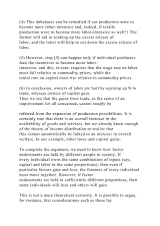
Figure 2.14. Changes in the terms of trade, 1980–93. Source:
World Development Report (World Bank [1995] ).
The definite existence of such a trend is open to debate. At the
same time, we can see some broad indication of it
by studying how the terms of trade for different countries have
changed over recent decades. The terms of trade for](https://image.slidesharecdn.com/1developmenteconomics-221224051007-11cbd63c/85/1Development-Economics-docx-71-320.jpg)
![a country represent a measure of the ratio of the price of its
exports to that of its imports. Thus an increase in the
terms of trade augers well for the trading prospects of that
country, whereas a decline suggests the opposite. Figure
2.14 plots changes in the terms of trade over the period 1980–93
against per capita income. There is some indication
that the relationship is positive, which suggests that poor
countries are more likely than richer ones to face a decline
in their terms of trade. Primary exports may underlie such a
phenomenon.
In general, then, activities that have comparative advantage
today might not be well suited for export earnings
tomorrow. The adjustment to a different mix of exports then
becomes a major concern. Finally, technology often is
assimilated through the act of production. If production and
exports are largely limited to primary products, the
flow of technology to developing countries may be affected. We
discuss these issues in Chapter 17.
42
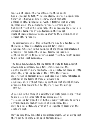
Figure 2.15. Share of primary imports in total imports. Source:
World Development Report (World Bank [1995]).
The import mix of developing countries is more similar to that
of developed countries. Exporters of primary
products often need to import primary products as well: thus
India might be a major importer of oil and Mexico a
major importer of cereals. Primary exports for each country are
often concentrated in a handful of products, and
there is no contradiction in the fact that primaries are both
exported and imported. A similar argument establishes
that although developed countries might export manufactured](https://image.slidesharecdn.com/1developmenteconomics-221224051007-11cbd63c/85/1Development-Economics-docx-72-320.jpg)
![Kuznets): the ratio of incomes earned by the richest 20% of the
population to the those earned by the poorest 40%
of the population. If incomes were distributed almost equally,
what value would you expect this ratio to assume?
What values do you see? In the sample represented by Table
2.1, do you see a trend as we move from poor to rich
countries?
(7) Think of various indicators of development that you would
like to see in your concept of “economic
development.” Think about why per capita income, as measured,
may or may not be a good proxy for these
indicators. Find a copy of the Human Development Report and
look at it to see how different indicators are
combined to get the HDI. Do you think that the method of
combination is reasonable? Can you suggest a better
combination? What do you think of the idea of presenting data
on each of the indicators separately, instead of
combining them? Think of the advantages and disadvantages of
such an approach.
(8) A cogent example in which per capita magnitudes may be
misleading if we do not have a good idea of
distribution comes from the study of modern famine. Why do
famines simply not make sense if we look at them
from the viewpoint of worldwide per capita availability of food
grain? Do they make better sense if we look at just
food-grain availability per capita in that country? After mulling
this over for a while, read the insightful book by
Sen [1981].
(9) (a) Why do you think population growth rates fall with
development? If people consume more goods, in
general, as they get richer and children are just another
consumption good (a source of pleasure to their parents),
then why don’t people in richer countries “consume” more](https://image.slidesharecdn.com/1developmenteconomics-221224051007-11cbd63c/85/1Development-Economics-docx-78-320.jpg)
![children?
(b) Why are countries with higher population growth rates
likely to have a greater proportion of individuals below
the age of 15?
(c) Are poorer countries more likely to be rural or is it that rural
countries are more likely to be poor? Which way
does the causality run, or does it run both ways?
(d) Why do you think the international price of sugar might
fluctuate more than, say, that of automobiles?
1 This is not to suggest at all that it is sufficient for every kind
of social advancement.
2 For most poor countries, this starting point was the period
immediately following World War II, when many such
countries, previously
under colonial rule, gained independence and formed national
governments.
3 Even the double emphasis on levels and distribution might not
be enough. For instance, the Human Development Report
(United Nations
Development Programme [1995]) informs us that “the purpose
of development is to enlarge all human choices, not just income.
The concept of
human development is much broader than the conventional
theories of economic development.” More specifically, Sen
[1983] writes:
“Supplementing data on GNP per capita by income
distributional information is quite inadequate to meet the
challenge of development
analysis.” There is much truth in these warnings, which are to
be put side by side with Streeten and certainly contrasted with](https://image.slidesharecdn.com/1developmenteconomics-221224051007-11cbd63c/85/1Development-Economics-docx-79-320.jpg)
![Lucas, but I hope
to convince you that an understanding of our “narrower” issues
will take us quite far.
4 For instance, in the case of India, Acharya et al. [1985]
estimated that 18–21% of total income in 1980–81 went
unrecorded in the national
accounts (see also Gupta and Mehta [1981]). For related work
on the “black” or “parallel” economy, see Chopra [1982] and
Gupta and Gupta
[1982].
5 See The Economist, May 15, 1993.
6 In many countries all over the Third World, sectors that are
important or require bulk investment, such as iron and steel,
cement, railways,
and petroleum, are often in the hands of public sector
enterprises.
7 A dollar invested at r% per year will grow to two dollars in T
years, where T solves the equation [l + (r/100)]T = 2. This
means that T
lne[l + (r/100)] = Ine 2. However, Ine 2 is approximately 0.7,
whereas for small values of x, lne(l + x) is approximately x.
Using this in the
equation gets you the result.
8 Of course, our categories are quite coarse and this is not
meant to suggest that there were no relative changes at all
among these countries.
The immobility being described is of a very broad kind, to be
sure.
9 One can imagine that the statistical problems here are even
more severe than those involved in measuring per capita](https://image.slidesharecdn.com/1developmenteconomics-221224051007-11cbd63c/85/1Development-Economics-docx-80-320.jpg)

![expressed as a
percentage. The adult literacy index is A ≡ a/100, where a is the
adult literacy rate, expressed as a percentage. Finally, the
income index is Y ≡
(y − 100)/(5,448 − 100), where y is “adjusted income” and
5,448 is the maximum level to which adjusted income is
permitted to climb [see the
Human Development Report (United Nations Development
Programme [1995, p. 134])]. Countries with per capita incomes
of $40,000 (1992
PPP) would be given an adjusted income of this maximum.
14 The emphasis in the quoted sentence (from p. 19 of the
Report) is mine. An earthquake of 8 on the Richter scale is not
“only” 14% more
powerful than one that measures 7 on the Richter scale.
15 For additional information on this debate and related
matters, see the contributions of Anand and Harris [1994],
Aturupane, Glewwe and
Isenman [1994], Desai [1991], Naqvi [1995], Srinivasan [1994],
and Streeten [1994].
16 There are several authors who have argued that higher per-
capita income is correlated with indicators of the quality of life;
see, for
example, Mauro [1993], Pritchett and Summers [1995], Boone
[1996] and Barro [1996]. However, with country fixed effects
properly
accounted for in panel data, the evidence is somewhat mixed:
see Easterly [1997]. Indeed, we do not claim that simple cross-
country studies
can settle the issue conclusively, and we certainly do not
propose that income is a complete determinant for all other
facets of development.](https://image.slidesharecdn.com/1developmenteconomics-221224051007-11cbd63c/85/1Development-Economics-docx-82-320.jpg)
![of India could take that would lead the Indian economy to grow
like Indonesia’s or Egypt’s? If so, what, exactly? If not, what is
it
about the “nature of India” that makes it so? The consequences
for human welfare involved in questions like these are simply
staggering: Once one starts to think about them, it is hard to
think about anything else.
I quote Lucas at length, because he captures, more keenly than
any other writer, the passion that drives the study
of economic growth. We sense here the big payoff, the
possibility of change with extraordinarily beneficial
consequences, if one only knew the exact combination of
circumstances that drives economic growth.
If only one knew . . . , but to expect that from a single theory
(or even a set of theories) about an incredibly
complicated economic universe would be unwise. As it turns
out, though, theories of economic growth take us quite
far in understanding the development process, at least at some
aggregate level. This is especially so if we
supplement the theories with what we know empirically. At the
very least, it teaches us to ask the right questions in
the more detailed investigations later in this book.
3.2. Modern economic growth: Basic features
Economic growth, as the title of Kuznets’ [1966] pioneering
book on the subject suggests, is a relatively “modern”
phenomenon. Today, we greet 2% annual rates of per capita
growth with approval but no great surprise. Remember,
however, that throughout most of human history, appreciable
growth in per capita gross domestic product (GDP)
was the exception rather than the rule. In fact it is not far from
the truth to say that modern economic growth was
born after the Industrial Revolution in Britain.](https://image.slidesharecdn.com/1developmenteconomics-221224051007-11cbd63c/85/1Development-Economics-docx-84-320.jpg)
![numbers are stunning. On average (see the last row of
the table), GDP per capita in 1913 was 1.8 times the figure for
1870; by 1978, this ratio climbed to 6.7! A nearly
sevenfold increase in real per capita GDP in the space of a
century cannot but transform societies completely. The
developing world, which is currently going through its own
transformation, will be no exception.
Table 3.1. Per capita GDP in selected OECD countries, 1870–
1978.
Source: Maddison [1979].
Indeed, in the broader sweep of historical time, the development
story has only just begun. The sustained growth
in the last century was not experienced the world over. In the
nineteenth and twentieth centuries, only a handful of
countries, mostly in Western Europe and North America, and
largely represented by the list in Table 3.1, could
manage the “takeoff into sustained growth,’ to use a well-known
term coined by the economic historian W. W.
Rostow. Throughout most of what is commonly known as the
Third World, the growth experience only began well
into this century; for many of them, probably not until the post-
World War II era, when colonialism ended.
Although detailed and reliable national income statistics for
most of these countries were not available until only a
few decades ago, the economically backward and stagnant
nature of these countries is amply revealed in less
quantitative historical accounts, and also by the fact that they
are way behind the industrialized nations of the world
today in per capita GDP levels. To see this, refer to Table 3.2.
What this table does is record the per capita incomes
of several developing countries relative to that of the United
States, for 1987–94. It also records the movements of
per capita income in these countries relative to the United](https://image.slidesharecdn.com/1developmenteconomics-221224051007-11cbd63c/85/1Development-Economics-docx-86-320.jpg)
![States over the same period.
Table 3.2. Per capita GDP in Selected Developing Countries
Relative to that of the United States, 1987–94.
48
Source: World Bank Development Report [1996].
There is, then, plenty of catching-up to do. Moreover, there is a
twist in the story that wasn’t present a century
ago. Then, the now-developed countries grew (although
certainly not in perfect unison) in an environment
uninhabited by nations of far greater economic strength. Today,
the story is completely different. The developing
nations not only need to grow, they must grow at rates that far
exceed historical experience. The developed world
already exists, and their access to economic resources is not
only far higher than that of the developing countries,
but the power afforded by this access is on display. The urgency
of the situation is further heightened by the
extraordinary flow of information in the world today. People are
increasingly and more quickly aware of new
products elsewhere and of changes and disparities in standards
of living the world over. Exponential growth at rates
of 2% may well have significant long-run effects, but they
cannot match the parallel growth of human aspirations,
and the increased perception of global inequalities. Perhaps no
one country, or group of countries, can be blamed
for the emergence of these inequalities, but they do exist, and
the need for sustained growth is all the more urgent as
a result.
3.3. Theories of economic growth](https://image.slidesharecdn.com/1developmenteconomics-221224051007-11cbd63c/85/1Development-Economics-docx-87-320.jpg)


![to produce a single unit of output in the economy, and it is
represented by the ratio K(t)/Y(t).
Combining (3.3) and (3.4), using these new concepts, and
moving terms around a bit (see the Appendix to this
chapter for the easy details), we arrive at a very influential
equation indeed:
where g is the overall rate of growth that is defined by the value
[Y(t 1) − Y(t)]/Y(t). This is the Harrod–Domar
equation, named after Roy Harrod and Evsey Domar, who wrote
well-known papers on the subject in 1939 and
1946, respectively.
It isn’t difficult to see why the Harrod–Domar equation was
influential. It has the air of a recipe. It firmly links
the growth rate of the economy to two fundamental variables:
the ability of the economy to save and the capital–
output ratio. By pushing up the rate of savings, it would be
possible to accelerate the rate of growth. Likewise, by
increasing the rate at which capital produces output (a lower θ),
growth would be enhanced. Central planning in
countries such as India and the erstwhile Soviet Union was
deeply influenced by the Harrod–Domar equation (see
boxes).
A small amendment to the Harrod–Domar model allows us to
incorporate the effects of population growth. It
should be clear that as the equation currently stands, it is a
statement regarding the rate of growth of total gross
national product (GNP), not GNP per capita. To talk about per
capita growth, we must net out the effects of
population growth. This is easy enough to do. If population (P)
grows at rate n, so that P(t + 1) = P(t)(1 + n) for all
t, we can convert our equations into per capita magnitudes. (The
chapter appendix records the simple algebra](https://image.slidesharecdn.com/1developmenteconomics-221224051007-11cbd63c/85/1Development-Economics-docx-94-320.jpg)
![Table 3.3. Targets and achievements of the first Soviet five
Year Plan (1928–29 to 1932–33).a
Source: Dobb [1966].
aAll figures are in 100 million 1926–27 rubles.
Toward the end of the 1920s, the need for a coordinated
approach to tackle the problem of industrialization on all fronts
was strongly
felt. Under the auspices of the State Economic Planning
Commission (called the Gosplan), a series of draft plans was
drawn up which
culminated in the first Soviet Five Year Plan (a predecessor to
many more), which covered the period from 1929 to 1933. At
the level of
objectives, the plan placed a strong emphasis on industrial
growth. The resulting need to step up the rate of investment was
reflected in the
plan target of increasing it from the existing level of 19.9% of
national income in 1927–28 to 33.6% by 1932–33. (Dobb [1966,
p. 236]).
How did the Soviet economy perform under the first Five Year
Plan? Table 3.3 shows some of the plan targets and actual
achievements, and what emerges is quite impressive. Within a
space of five years, real national income nearly doubled,
although it stayed
slightly below the plan target. Progress on the industrial front
was truly spectacular: gross industrial production increased
almost 2.5 times.
This was mainly due to rapid expansion in the machine
producing sector (where the increment was a factor of nearly 4,
far in excess of
even plan targets), which is understandable, given the enormous](https://image.slidesharecdn.com/1developmenteconomics-221224051007-11cbd63c/85/1Development-Economics-docx-97-320.jpg)


![this in the theory. We told a similar story with population
growth rates, which are just as capable of being
endogenous.
More important than the mere recognition of endogeneity is the
understanding that such features may
fundamentally alter the way we think about the economy and
about policy. We saw how this might happen in the
case of endogenous population growth, but the most startling
and influential example of all is the model that we
turn to now. Developed by Solow [1956], this model has had a
major impact on the way economists think about
economic growth. It relies on the possible endogeneity of yet
another parameter in the Harrod–Domar model: the
capital–output ratio.
3.3.3. The Solow model
Introduction
Solow’s twist on the Harrod–Domar story is based on the law of
diminishing returns to individual factors of
production. Capital and labor work together to produce output.
If there is plenty of labor relative to capital, a little
56
bit of capital will go a long way. Conversely, if there is a
shortage of labor, capital-intensive methods are used at
the margin and the incremental capital–output ratio rises. This
is exactly in line with our previous discussion:
according to the Solow thesis, the capital–output ratio θ is
endogenous. In particular, θ might depend on the
economywide relative endowments of capital and labor.8](https://image.slidesharecdn.com/1developmenteconomics-221224051007-11cbd63c/85/1Development-Economics-docx-107-320.jpg)
![The Solow equations
To understand the implications of this modification, it will help
to go through a set of derivations very similar to
those we used for the Harrod–Domar model. We may retain
equations (3.3) (savings equal investment) and (3.4)
(capital accumulation) without any difficulty. Retaining, too,
the assumption that total savings S(t) is a constant
fraction s of total income Y(t), we may combine (3.3) and (3.4)
to get
If we divide through by population (Pt) and assume that
population grows at a constant rate, so that P(t + 1) = (1 +
n)Pt, (3.8) changes to
where the lowercase ks and ys represent per capita magnitudes
(K/P and Y/P, respectively).
Before going on, make sure you understand the economic
intuition underlying the algebra of (3.9). It is really
ery si le. he right hand side has two arts, de reciated er ca ita ca
ital which is (1 − δ)k(t)] and current per
capita savings [which is sy(t)]. Added together, this should give
us the new per capita capital stock k(t + 1), except
for one complication: population is growing, which exerts a
downward drag on per capita capital stocks. This is
why the left-hand side of (3.9) has the rate of growth of
population (n) in it. Note that the larger the rate of
population growth, the lower is per capita capital stock in the
next period.
To complete our understanding of the Solow model, we must
relate per capita output at each date to the per
capita capital stock, using the production function. The
production function, as you know, represents the technical
knowledge of the economy. In this model, capital and labor
work together to produce total output. With constant](https://image.slidesharecdn.com/1developmenteconomics-221224051007-11cbd63c/85/1Development-Economics-docx-108-320.jpg)
![this way, the Solow model is a pointer to studying the
economics of technological progress, arguing that it is there
that one must look for the ultimate sources of growth. This is
not to say that such a claim is necessarily true, but it
is certainly provocative and very far from being obviously
wrong.
Second, the method of reasoning used in the basic Solow model
can be adapted easily to include technical
progress of this kind. Let’s take a few moments to go through
the adaptation, because the arguments are important
to our understanding of the theory of growth.
A simple way to understand technical progress is to envision
that such progress contributes to the efficiency, or
economic productivity, of labor. Indeed, as we will see later, it
is not only increased technical know-how, but other
advances (such as increased and better education) that
contribute to enhanced labor productivity. Thus although we
concentrate here on technical progress, our approach applies
equally to the increased productivity brought about by
higher education, and not necessarily newer technology.
Let’s begin by returning to equation (3.8), which describes the
accumulation of capital and remains perfectly
valid with or without technical progress. Now let’s make a
distinction between the working population P(t) and the
amount of labor in “efficiency units” [call it L(t)] used in
production—the effective population, if you like. This
61
distinction is necessary because in the extension of the model
that we now consider, the productivity of the working](https://image.slidesharecdn.com/1developmenteconomics-221224051007-11cbd63c/85/1Development-Economics-docx-118-320.jpg)

![the initial value of per capita income.
It is quite clear from our discussion that the hypothesis of
unconditional convergence takes us out on a limb. Not
only does it require the convergence of countries to their own
steady states, but it asserts that these steady states are
all the same! Let us see what the data have to say on this matter.
3.5.3. Unconditional convergence: Evidence or lack thereof
The first problem that arises when testing a hypothesis of this
sort is the issue of time horizons. The systematic
collection of data in the developing economies started only
recently, and it is hard to find examples of reliable data
that stretch back a century or more. There are, then, two
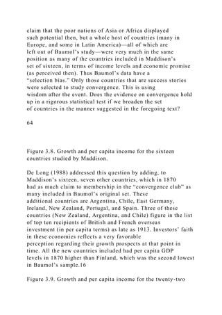
choices: cover a small number of countries over a large
period of time or cover a large number of countries over a short
period of time. We will look at examples of both
approaches.
A small set of countries over a long time horizon
Baumol [1986] examined the growth rates of sixteen countries
that are among the richest in the world today.
Thanks to the work of Maddison [1982, 1991], data on per
capita income are available for these countries for the
year 1870. Baumol’s idea was simple but powerful: plot 1870
per capita income for these sixteen countries on the
horizontal axis and plot the growth rate of per capita income
over the period 1870–1979 (measured by the difference
in the logs of per capita income over this time period) on the
vertical axis. Now examine whether the relationship
between the various observations fits the level convergence
hypothesis. As we discussed in the previous section, if
the hypothesis is correct, the observations should approximately
lie on a downward-sloping line.](https://image.slidesharecdn.com/1developmenteconomics-221224051007-11cbd63c/85/1Development-Economics-docx-123-320.jpg)
![Indeed, the exercise seems to pay off very well. Although the
countries in Maddison’s data set had comparable
per capita incomes in 1979, they had widely different levels of
per capita income in 1870. It appears, then, that
Baumol’s finding supports the unconditional convergence
hypothesis quite strongly.12 Figure 3.8, which is taken
from De Long [1988], carries out this exercise by plotting the
countries with the log of 1870 income on one axis
and their subsequent growth on the other. The countries, read
from poorest to richest in 1870, are Japan, Finland,
Sweden, Norway, Germany, Italy, Austria, France, Canada,
Denmark, the United States, the Netherlands,
Switzerland, Belgium, the United Kingdom, and Australia. The
figure shows the strong negative relationship in
Baumol’s study that is characteristic of unconditional
convergence.
Unfortunately, Baumol’s study provides a classic case of a
statistical pitfall. He only considered countries that
are rich ex post; that is, they had similar per capita GDP levels
in 1979. In 1870, with no knowledge of the future,
what criteria would tell us to choose these countries ex ante to
test convergence down the road? A good illustration
of the statistical error is the inclusion of Japan in the sample. It
is there precisely because of hindsight: Japan is rich
today, but in 1870, it was probably midway in the world’s
hierarchy of nations arranged by per capita income. If
Japan, why not Argentina or Chile or Portugal?13
Thus, it may be alleged that the “convergence” that Baumol
found is a result only of a statistical regularity
rather than any underlying tendency of convergence.14 A true
test of convergence would have to look at a set of
countries that, ex ante, seemed likely to converge to the high
per capita GDP levels that came to characterize the
richest nations several decades later.15 It would not be fair to](https://image.slidesharecdn.com/1developmenteconomics-221224051007-11cbd63c/85/1Development-Economics-docx-124-320.jpg)
![countries studied by De Long. New countries are shown as
squares; original
countries as diamonds. Source: De Long [1988].
Figure 3.9 shows the modified pictures after De Long’s
countries are added and Japan is dropped from the initial
sixteen. The earlier observations from Figure 3.8 appear as
unlabeled dots. Now matters don’t look so good for
convergence, and indeed, De Long’s statistical analysis
confirms this gloomier story. Baumol’s original regression
can now be repeated on this new data set: regress the log
difference in per capita income between 1870 and 1979 on
the logarithm of 1870 per capita income and a constant.17 The
slope coefficient of the regression is still appreciably
65
negative, but the “goodness-of-fit” is very bad, as indicated by
the fact that the residual disturbance term is very
large.
De Long also argued, and correctly so, that the 1870 data are
likely to contain large measurement errors (relative
to those in 1979), which make the various observations more
scattered than they actually should be and makes any
measurement of convergence more inflated than the case
actually merits.18 De Long repeated his regression
exercise, assuming a stipulated degree of measurement error in
the 1870 data and making necessary amendments to
his estimation technique to allow for this, and found that the
slope coefficient comes out to be very close to zero—
indicating that there is very little systematic relationship
between a country’s growth rate and its per capita GDP, at
least in the cross section of the twenty-two countries studied.](https://image.slidesharecdn.com/1developmenteconomics-221224051007-11cbd63c/85/1Development-Economics-docx-126-320.jpg)
![A large set of countries over a short time horizon
The second option is to include a very large set of countries to
test for unconditional convergence. This approach
has the advantage of “smoothing out” possible statistical
irregularities in looking at a small sample. The
disadvantage is that the time span of analysis must be shortened
to a few decades, which is the span over which
reliable data are available for a larger group of countries.
In Chapter 2, we used the Summers–Heston data set to say
something about the world distribution of income
over the period 1965–85. If you turn back to that chapter and
reread the discussion there, it should be clear that
unconditional convergence sounds like a pretty long shot. At the
very least, the gap between the richest and the
poorest countries does not seem to have appreciably narrowed.
With per capita GDP expressed as a fraction of the
U.S. level in the same year, a plot of the average for the five
richest and the five poorest nations over a twenty-six
year period (1960–85) displays a more or less constant relative
gap between them. This is not to say that the poorest
countries have not moved up in absolute terms: the average per
capita income of the poor countries [expressed as a
fraction of a fixed level (1985) of U.S. per capita GDP, as
opposed to contemporaneous U.S. levels] shows a clear
upward trend over the period. Nevertheless, the disparity in
relative incomes (let alone that in absolute incomes) has
stayed the same, because the poorest countries have grown at
more or less the same rate as the richest.
An objection at this point is that a good sample should be broad
based; that is, focused not merely on the richest
and the poorest in the sample. Indeed, we were careful to do
this in Chapter 2 as well, where we noted how diverse
the experiences of different countries have been over this](https://image.slidesharecdn.com/1developmenteconomics-221224051007-11cbd63c/85/1Development-Economics-docx-127-320.jpg)
![period. We noted, moreover, that if we group countries
into different clusters and then construct a mobility matrix to
track their movements from one cluster to another,
there is little tendency for countries to move toward a common
cluster.
A similar tendency is noted from a different kind of statistical
analysis. Parente and Prescott [1993] studied 102
countries over the period 1960–85. In this study, each country’s
per capita real GDP is expressed in relative terms:
as a fraction of U.S. per capita GDP for the same year. The
authors then calculated the standard deviation19 of these
values separately for each year. Whereas the convergence
hypothesis says that countries move closer to each other
in income levels, we expect the standard deviation of their
relative incomes to fall over time. In Parente and
Prescott’s study, however, it actually increased by 18.5% over
the twenty-six year period, and the increase was
fairly uniform from year to year. However, there is some
variation here if we look at geographical subgroupings.
The standard deviation in relative incomes for Western
European countries shows a clear decline. In fact this
decline persists through the period 1913–85. On the other hand,
the same measure applied to Asian countries
displays a significant and pronounced increase, and the
divergence in this region is consistent with data going all
the way back to 1900.
To put the data together in yet another way, suppose that we
regress average per capita growth between 1960
and 1985 on per capita GDP in 1960. Just as in the Baumol
study, the tendency toward level convergence would
show up in a negative relationship between these two
variables,20 but, in line with the discussion in the rest of this
section, there is no clear tendency at all. Barro [1991] observed
that the correlation between these two variables is](https://image.slidesharecdn.com/1developmenteconomics-221224051007-11cbd63c/85/1Development-Economics-docx-128-320.jpg)


![Therefore we enter the empirical study with the following
expectations:
(1) The coefficients on the term Ins are positive and the
coefficient on the term ln(n + π ) is negati e. his
captures the Solow prediction that savings has a positive (level)
effect on per capita income and population growth
has a negative (level) effect on per capita income.
(2) The estimated coefficients have the same approximate
magnitude, and this magnitude is around 0.5.
Mankiw, Romer, and Weil [1992] tested these predictions using
the Heston–Summers data set. They took π
to be approximately 0.05, or around 5% per year, and used the
average of investment–GDP ratios over the period
1965–85 to form an estimate of the savings rate. The variable y
is given by per capita GDP in the year 1985. The
resulting regression shows the following features:
(1) More than half the worldwide variation in per capita GDP in
1985 can be explained by the two variables s
and n. The correlation coefficient of the regression is 0.59. This
is a powerful finding indeed.
(2) As predicted by the Solow model, the coefficient of In s is
significant and positive, whereas that of ln(n + π
) is signi icant and negati e. n ualitati e ter s, as long as we do
not stic to the absurd assu tion o e ual
savings and population growth rates (and therefore the
prediction of unconditional convergence), the Solow model
predicts broad relationships that do show up in worldwide data.
However, there is a bug:](https://image.slidesharecdn.com/1developmenteconomics-221224051007-11cbd63c/85/1Development-Economics-docx-136-320.jpg)


![distinction is
between the flows of current and future consumption, and many
goods embody a little of each.
4 We assume that the economy is closed—that there are no net
flows of resources from or to the outside world. Moreover, we
ignore
government taxation and expenditures. All of these extensions
are easy enough to incorporate.
5 On the eve of the Revolution, Russia took a back seat among
European nations in extent of industrialization, despite a rich
endowment of
natural resources. According to the calculations of P. Bairoch,
based on the per capita consumption of essential industrial
inputs, namely, raw
cotton, pig iron, railway services, coal, and steam power, Russia
ranked last among nine major European nations in 1910, behind
even Spain
and Italy. See Nove [1969].
6 Of course, we argued in the previous section that this may not
be the case, but (and I have said this before) this is a way to
understand the
effects of different factors one by one.
7 There are several reasons why any model is simplistic, and we
should note them if we want to use models wisely. For instance,
there is no
reason why the population curve should ever cut the flat line
that depicts overall income growth. It is quite possible that
overall income growth
is good enough even for high rates of population growth. It is
easy to see that in such a case, our traps and thresholds would
disappear.
Nevertheless, as population growth peaks, the economy will](https://image.slidesharecdn.com/1developmenteconomics-221224051007-11cbd63c/85/1Development-Economics-docx-154-320.jpg)


![Long [1988].
15 This likelihood may be determined on the basis of the extent
of their existing integration into the world economy as well as
their per
capita income levels then.
16 The lowest is that of Japan and it is significantly below the
rest. De Long dropped the data on Japan in his analysis, because
its inclusion
would necessitate the inclusion of several other countries at
comparable income levels in 1870. But accurate 1870 data for
such countries do not
exist.
17 For a discussion of regression and associated concepts, see
Appendix 2.
18 Imagine that a set of families all have the same incomes in
1960 as well as in 1990. They are surveyed in both these years.
However, the
survey in 1960 is inaccurate, so there are errors of
measurement, whereas the survey in 1990 is accurate, showing
that they all have the same
income. Then these families will (statistically) appear to have
“converged” to the same income from different starting levels.
19 The standard deviation of a set of observations is a statistical
measure that indicates how closely bunched or how spread out
in value the
set of observations is. A higher measure of the standard
deviation means a higher “spread” or dispersion around the
average. See Chapter 6 and
Appendix 2 for more detail.
20 Note that in considering the entire data set, we avoid the ex](https://image.slidesharecdn.com/1developmenteconomics-221224051007-11cbd63c/85/1Development-Economics-docx-157-320.jpg)
![post bias discussed earlier.
21 For a definition of correlation, see Appendix 2.
22 Of course, this assumption (like every other assumption) can
be questioned as well, but not as easily as one might think. For
instance, we
could say that very different techniques are used in dairy
farming in India and in the United States, so it must be the case
that the technology is
different. This argument is wrong. The assumption that
technology is the same does not imply that the actual production
technique is the same
in two countries. The different techniques in dairy farming more
likely are due to the different relative availabilities of labor and
capital. In
India, where labor is plentiful and capital is scarce, it would be
absurd to adopt the capital-intensive methods of dairy farming
used in the
United States. This does not mean that Indians are unaware of
U.S. farming methods (or vice versa). The assumptions of an
identical
technology and an identical technique are distinct. For a
detailed analysis of technological diffusion across countries that
relies on patent data,
see Eaton and Kortum [1997].
23 The material in this section draws on the study by Mankiw,
Romer, and Weil [1992] and Mankiw [1995].
24 The Appendix to this chapter points out precisely the
assumptions required to apply this proxy.
25 The labor input in the production function can have different
meanings, depending on the context. Sometimes, labor merely
means
physical man-hours supplied, or if man-hours per worker is
understood to be fixed, merely the number of workers. In other](https://image.slidesharecdn.com/1developmenteconomics-221224051007-11cbd63c/85/1Development-Economics-docx-158-320.jpg)


![Thus an increase in physical savings is only an
increase in one of two ways of saving, whereas an increase in
the population growth rate diminishes both kinds of
savings. One can therefore predict that the coefficient on
population growth is likely to exceed the coefficient on
physical savings, and indeed, as we have already seen, it does.
Mankiw, Romer, and Weil [1992] provided a lucid
description of this effect, and you can consult their paper for
more details.
81
Figure 4.1. The opposing effects of skilled and unskilled labor
on the return to physical capital in the endogenous growth
model.
(4) The introduction of human capital also helps to explain why
rates of return to physical capital may not be as
high in poor countries as the simple Solow model predicts. The
fact that there is a shortage of unskilled labor in rich
countries tends to lower the rate of return to physical capital.
However, there is also a relative abundance of skilled
labor (or human capital), and this effect works in the opposite
direction, driving up the rate of return. The net effect
is one in which we do not expect large differences in the rate of
return to physical capital. Figure 4.1 provides a
diagrammatic exposition of this argument.
Moreover, the differences in the wages of unskilled labor
continue to be high. This might explain the great
pressures for immigration, while accounting at the same time
for the less energetic movements of capital from
developed to developing countries.6 The same argument
translates into the ambiguity of growth rates. Recall that in](https://image.slidesharecdn.com/1developmenteconomics-221224051007-11cbd63c/85/1Development-Economics-docx-166-320.jpg)
![level of per capita income, countries with more human capital
grow faster.
It is because countries that are rich have, on average, more
human capital that, on the whole, the model predicts
neutrality in the growth rates with respect to per capita income.
Effects (5a) and (5b) tend to nullify each other. Can
this be seen in the data? To some extent, it can.
82
4.3. Another look at conditional convergence
Recall from the study of Barro [1991] (discussed earlier) that a
plot of growth rates against per capita income from
the Summers–Heston data yields no evidence of unconditional
convergence.7 Barro then went on to see if this effect
persisted when conditioned for the different levels of human
capital in different countries. We summarize his
findings here.
As you might imagine, it is difficult to get a reliable and
accurate measure of human capital. Literacy rates,
primary and secondary school enrollments, the extent of
vocational training, and the presence of research
universities all count in one way or another, and it is impossible
to capture all these terms in a single analysis.
Using data from the United Nations, it is possible to obtain
measures of school enrollment at the primary and
secondary levels, and Barro used these as rough proxies for the
total stock of human capital.
Now run the following regression. As the dependent variable,
take the average growth in per capita real GDP
over the period 1965–1985. As independent variables, include](https://image.slidesharecdn.com/1developmenteconomics-221224051007-11cbd63c/85/1Development-Economics-docx-168-320.jpg)
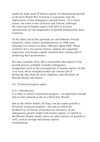

![or organization that carried out the original
innovation.
These two notions of technological advancement have very
different implications for behavior. We can think of
the first notion as capturing those aspects of technical progress
that can be internalized by the innovator for profit.
Without this component, we might still have our Edisons and
Einsteins, but innovation, in the sense of applying
scientific knowledge to the creation of more productive
technologies for the sake of economic profit, would largely
disappear from the face of the earth.
The second notion, that of diffusion, has more complicated
implications for technical progress. Its immediate
effect, of course, is to make a new innovation widely available,
thereby suggesting that a faster rate of diffusion is
conducive to technical progress. A second look suggests that the
story is more complicated. Such transfers, or
externalities, might slow down the rate of “deliberate” technical
progress. Certainly, firms that lobby for the
protection of intellectual property rights and the enforcement of
patent laws act as if they believe that this negative
effect is a necessary outcome of diffusion. Finally, there is a
third, more subtle component. The process of diffusion
(of knowledge) might itself spur more innovation, as
technological leaders struggle to stay abreast of the
competition from rivals who pick up slightly older technology.
4.4.3. A model of deliberate technical progress
Here is a first pass at constructing a simple model of deliberate
technological progress, along the lines of Romer
[1990].12 We assume that an economy has a given stock of
human capital, which we denote by H. Human capital
may be devoted to production (of final goods) or may be](https://image.slidesharecdn.com/1developmenteconomics-221224051007-11cbd63c/85/1Development-Economics-docx-173-320.jpg)


![function is assumed to be constant returns to scale in
capital and labor. On the other hand, the externalities created by
accumulation of capital yield a macroeconomic
production function that may exhibit increasing returns. The
easiest way to see this is to reconsider the production
function from the point of view of a benevolent planner. For
simplicity, assume that all firms are identical. Then
K(t) = K*(t) in (4.10) and the “social” production function is
Y = aKα+ P1−α,
which exhibits increasing returns to scale.
Why is the presence of increasing returns important? One
answer is that under such conditions, per capita
economic growth is not just positive, but tends to accelerate
over the long run. Romer [1986] is a proponent of this
point of view.
Complementarities
A particular type of externality, which can coexist with both
positive and negative effects, relates not to the level of
utility, or monetary reward, that others experience when an
action is taken, but to the ranking of the alternatives that
they have. This is the notion of complementarity, which is also
well illustrated by the growth model we have been
discussing. Indeed, let us use this model to introduce the
concept.
Imagine that an individual firm is making its decisions
regarding capital accumulation. To do this, it must
forecast its future productivity. Given equation (4.10), this
productivity depends on the future path of average
capital accumulation by all firms in the economy. If this path is
predicted by a firm to be swiftly climbing, the firm
will believe that its future productivity also will rise at a](https://image.slidesharecdn.com/1developmenteconomics-221224051007-11cbd63c/85/1Development-Economics-docx-181-320.jpg)


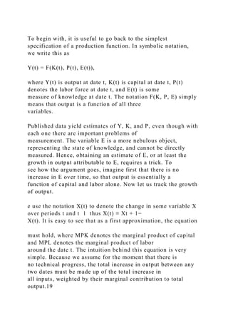
![rates are higher than average in the world economy
but not remarkably so, although private investment is
significantly higher. These countries are net exporters of
capital, in contrast to most other developing economies. Human
capital levels, by all indications, are very high
relative to per capita income levels. By 1965, Hong Kong,
Korea, and Singapore had already achieved universal
primary education, and soon secondary enrollment rates began
to climb. In 1987, Korea had a secondary education
enrollment rate of 88% (up from 35% in 1965), and that of
Indonesia was 46%, well above the average for
countries at that level of per capita income. (Thailand was
below the predicted average, however.) Real
90
expenditures per pupil have risen significantly as well.22
How about growth in TFP? Did this account for a significant
fraction of the phenomenal growth rates that we
observe? The East Asian Miracle, published by the World Bank,
argues that it did indeed. In fact, the study coined
the phrase “productivity-based catching up” for this rapid TFP
growth and pushed the notion that such growth was
largely the outcome of openness: specifically, openness to
international trade allowed the world’s technological
frontier to be rapidly absorbed by the East Asian economies.
Thus the prescription (see World Bank [1993]):
“Most explanations of the link between TFP growth and exports
emphasize such static factors as economies of scale and
capacity
utilization. While these may account for an initial surge of
productivity soon after the start of an export push, they are](https://image.slidesharecdn.com/1developmenteconomics-221224051007-11cbd63c/85/1Development-Economics-docx-189-320.jpg)
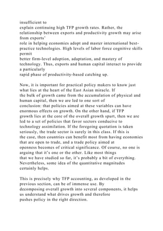
![According to the World Bank study that we have mentioned,
approximately two-thirds of the observed growth in
these economies can be attributed to the accumulation of
physical and human capital, and primary education is the
single largest contributor among these factors. The remaining
growth comes from TFP growth. This is particularly
held to be the case for Japan, Korea, Hong Kong, Thailand, and
Taiwan. Make no mistake: the study does not argue
that TFP growth is the dominant factor in growth, but relative to
other developing economies, the contribution of
productivity change appears to be very high indeed. Because of
this seeming anomaly, the World Bank study
devotes much thought to the sources of TFP growth. One of the
main conclusions is summarized in the foregoing
quotation.
Now, careful TFP accounting is needed to conclusively
establish that productivity growth has indeed been high
in these countries, so that we can then go on to evaluate the
export argument as a basis for technological catching-
up. Young [1995] does just this. His study is exemplary in that
it really makes an effort to control properly for all
changes in inputs of production. Recall the warnings of the
previous section: it is important to properly measure
input growth. This means that one has to account properly for
rising participation rates, transfers of labor between
agriculture and industry (if one is looking only at the
nonagricultural sector of the economy, where TFP growth was
supposedly concentrated), and certainly the changes in
education levels as well as the rapid pace of capital
accumulation. Remember that TFP growth is the residual after
these inputs have taken their crack at explaining
overall growth. Young’s careful study shows that “all of the
influences noted above. . . serve to chip away at the
productivity performance of [Hong Kong, Singapore, South
Korea, and Taiwan], drawing them from the top of](https://image.slidesharecdn.com/1developmenteconomics-221224051007-11cbd63c/85/1Development-Economics-docx-191-320.jpg)
![Mount Olympus down to the plains of Thessaly.” For the period
1966–90, it turns out that in manufacturing,
productivity growth varied from a low of negative 1.0% in
Singapore to a respectable, but not astronomically high,
3.0% in South Korea. Singapore was a particularly bad
performer (as far as TFP growth goes), and the other three
countries were respectable, but not strikingly above average.
Tables 4.1 and 4.2 detail Young’s findings and list
TFP growth in several other countries for the sake of
comparison.
Table 4.1. Average TFP growth, 1966-90.a
91
Source: Young [1995]. aNA denotes not available. bYears are
1970–90 for Singapore. cAgriculture excluded in the case of
Korea and
Taiwan.
Table 4.2. Comparative TFP growth in selected countries.
Source: Young [1995]. aManufacturing alone.
This sort of study is very useful indeed, because it tells us what
to focus on. It appears that the East Asian
countries have grown rapidly, but they have grown the old-
fashioned way, through an extraordinary process of
improvement of the labor force, as well as sustained capital
accumulation. In no way does this detract from their
success, but it does tell us that technological improvement may
not be the most important factor. It is not that the
World Bank single-mindedly focused on this issue, it is simply
a question of emphasis. In the rest of this section, let](https://image.slidesharecdn.com/1developmenteconomics-221224051007-11cbd63c/85/1Development-Economics-docx-192-320.jpg)
![us see how different factors can, and did, affect TFP growth
computations in this study.
Because technical progress is the residual term in all TFP
accounting, it is imperative to properly measure the
inputs of production and to keep accurate track of how quickly
they have grown. Recall the TFP equation from the
previous section:
The first question is, What is a good measure of P(t)? Certainly
not population, because the labor force grew much
faster than the population in the four countries that Young
studied. This growth resulted from increased labor force
participation. Over the period 1966-90, participation rates
climbed from 38 to 49% (Hong Kong), 27 to 50%
(Singapore), 27 to 36% (South Korea), and 28 to 37% (Taiwan)
(Young [1995, Table I]). If we use population
rather than the true labor force in (4.13), it is obvious that P(t)
will grow more slowly than the labor force really did.
This fact tends to artificially raise the estimate of TFP growth.
Correcting for this overestimation takes away a
significant amount of TFP growth: 1% per year from Hong
Kong, 1.2 and 1.3% per year from Korea and Taiwan,
and all of 2.6% per year from Singapore. (Young [1995, p.
644]).
Next, if one is interested in TFP growth in the nonagricultural
sector, and particularly in manufacturing, it is not
enough to simply take into account increased participation rates
in the economy as a whole. We have to account for
rural-urban migration, because this means that the rate of
growth of the nonagricultural labor force exceeded that of
the overall labor force. Making this correction lowers TFP
growth even further. These effects are particularly strong
for South Korea and Taiwan, where agricultural employment
declined rapidly as a fraction of total employment.](https://image.slidesharecdn.com/1developmenteconomics-221224051007-11cbd63c/85/1Development-Economics-docx-193-320.jpg)
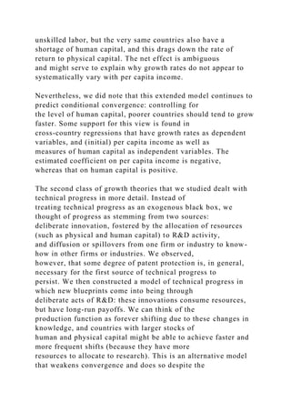
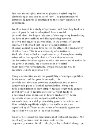
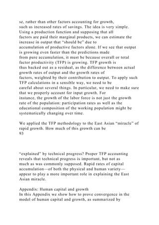


![2 For contributions to this literature, see, for example, Uzawa
[1965], Lucas [1988], Barro [1991], and Mankiw, Romer, and
Weil [1992].
3 The omission of unskilled labor is not an unimportant
simplifying assumption. It has consequences that we note
subsequently.
4 For instance, one can think of qy(t) as the quantity of physical
resources spent on education and training.
5 See also von Neumann [1945–1946].
6 At the same time, this cannot count as a fully satisfactory
explanation of the small-scale migration of physical capital
from developed to
developing countries, because this model then also would
predict that rates of return to human capital must be higher in
the developing
countries—an observation which is probably not borne out by
the facts. Thus a complete explanation of the low observed
flows must ultimately
rest on other factors, such as the fear of political instability or
capital confiscation in developing countries, or ignorance of
local conditions. This
issue ties in at a broader level with the observations of
Feldstein and Horioka [1980], who suggested that capital is
quite immobile
96
internationally (even across developed countries). See, for
instance, Gordon and Bovenberg [1996] and the references
therein.
7 See also the book by Barro and Sala-i-Martin [1995], which
takes up these issues in greater detail.
8 For details as well as a list of the other variables, see Barro](https://image.slidesharecdn.com/1developmenteconomics-221224051007-11cbd63c/85/1Development-Economics-docx-204-320.jpg)
![[1991].
9 Appendix 2 to this book contains a more detailed description
of how a multivariate regression achieves this goal.
10 To be more precise, the production function must exhibit
nondecreasing returns in all accumulable factors, at least
asymptotically as the
factors of production become large in quantity.
11 To some extent, the exact distinction is not worth taking
seriously. Even with diminishing returns, accumulable factors
can drive growth
rates for long periods of time, and the closer the model is to
constant returns, the more persistent is the role of accumulable
factors such as
physical and human capital. In this sense, the model of constant
returns is like a limiting case of the model with diminishing
returns. At one
level, it appears that there is a sharp discontinuity between the
two theories, if we look at the very long run. This discontinuity
disappears,
however, once we realize that the smaller is the impact of
diminishing returns, the more persistent is the effect of factors
that are accumulated.
12 Shell [1967] presented one of the earliest models of this
type.
13 This second interpretation, adopted by writers such as Romer
[1990], Grossman and Helpman [1991], and Ciccone and
Matsuyama
[1996], stems originally from the consideration of product
variety in consumer demand (see Dixit and Stiglitz [1977]). If
machines are
reinterpreted as commodities for final consumption and each
blueprint is interpreted as a different means of satisfying the](https://image.slidesharecdn.com/1developmenteconomics-221224051007-11cbd63c/85/1Development-Economics-docx-205-320.jpg)
![same basic want (so
that the postal service, the telephone, the fax machine, and
email all satisfy our need for communication), then this is
technical progress as well.
In Chapter 5 we return to this class of models.
14 One important implication is for the rate of depreciation.
With faster R&D under the first interpretation, we expect that
existing capital
goods will be discarded faster by firms.
15 This particular “growth effect” is sometimes
overemphasized, but should not be taken all that literally. It all
depends on the precise
specification of knowledge creation, and can vary from model to
model. The fact remains that there is an interaction between
human capital
and the pace of technical advance that is worth investigating.
16 See, for example, Romer [1990] or Grossman and Helpman
[1991]. The alternative is to assume that knowledge is publicly
provided by a
planner or a benevolent planner, which is the appropriate
interpretation of Shell [1967], cited earlier.
17 The model in this section is based on Romer [1986].
18 As usual, we neglect numerous other features for the sake of
expositional simplicity. Among these is the suppression of any
deliberate
investments in R&D, as in the model of the last section. This
allows us to see the externality issue with more clarity. In
addition, we can
interpret K as privately accumulated R&D, which has positive
benefits to other firms. This is the interpretation favored by
Romer [1986]. For a](https://image.slidesharecdn.com/1developmenteconomics-221224051007-11cbd63c/85/1Development-Economics-docx-206-320.jpg)
![similar externality in the context of human capital, see Lucas
[1988].
19 If you are wondering why this equation is only an
approximation, simply observe that, in general, the marginal
products of the capital
and labor inputs “continuously” vary as the economy grows.
Instead of tracking this total variation, we are simply using an
average of these
marginal products—hence our terminology in the text: marginal
product “around the date f”.
20 We might be tempted to include changes in the quality of the
labor force, brought about through education, in the overall
concept of
technical progress. This is, however, conceptually wrong. With
a different mix of educated labor, we are simply moving along
the same
production function. Of course, if the productivity of a person
at the same level of education happens to change, this ought to
be picked up in
the TFP calculations.
21 This is not to say that all is lost. Sometimes, adjustments are
possible in the accounting, to get upper and lower bounds in the
calculated
rate of technical progress. For instance, if there is increasing
returns to scale, we can tell the direction of the bias. With
increasing returns to
scale, observed factor shares underestimate the true productivity
of factors. We therefore end up attributing too much to the
residual terms,
which is another way of saying that we overestimate the rate of
technical progress.
22 This very brief account is taken from the World Bank study](https://image.slidesharecdn.com/1developmenteconomics-221224051007-11cbd63c/85/1Development-Economics-docx-207-320.jpg)
![on East Asia (World Bank [1993]).
97
Chapter 5
History, Expectations, and Development
5.1. Introduction
In the last chapter, we studied some of the classic theories of
economic growth and their implications. Some of
these implications, such as the predicted positive link between
investment rates and growth rates, are certainly
borne out by the data. Others do not appear to be. One of the
most important implications of the Solow model that
is not supported by the data is the prediction of convergence in
living standards across countries. To be sure, such
unconditional convergence is not predicted by any of these
models, which really embody if-then statements. Thus,
for instance, the Solow model states that if savings rates and if
population growth rates are the same for two
countries, and if the rate of technical progress flows in an
unimpeded way across the countries, then the two
countries will come together, over time, in terms of per capita
incomes. Such predictions were called conditional
convergence in the previous chapter.
Now, statements regarding conditional convergence are often
predicated on the similarity of parameters (such as
savings rates) that we provisionally consider to be exogenous,
and not on some deeper underlying characteristic,
which would presumably determine investment rates, or the
rates of technical progress, or even population growth
rates in a wider framework. What if such characteristics (such
as social attitudes or the expression of individual](https://image.slidesharecdn.com/1developmenteconomics-221224051007-11cbd63c/85/1Development-Economics-docx-208-320.jpg)

![question demands an answer.
The purpose of this chapter is to discuss some issues that are
important in understanding this question. We
concentrate on two features that have already come up in earlier
chapters: the role of history and the role of
expectations.
Both our history and our expectations change the way we
behave today and in the future. There are two key
ideas that we shall explore to understand why this is so. Once
you see how these ideas work, you will see their
presence in a variety of situations and will be able to use them
to understand and classify many different economic
phenomena.
History and expectations interact and work through two main
channels: complementarities and increasing
returns. The two main sections of this chapter are divided along
these channels.
5.2. Complementarities
98
5.2.1. Introduction: QWERTY
Look at the arrangement of keys on your computer or
typewriter. The top left row begins with the familiar
sequence q, w, e, r, t, y . . . . Have you ever wondered just how
this particular sequence came into being? David
[1985] offers a fascinating account of typewriter history,
observing that the QWERTY arrangement sprang largely
from a need to avoid typebar tangles. Have you ever seen one of](https://image.slidesharecdn.com/1developmenteconomics-221224051007-11cbd63c/85/1Development-Economics-docx-210-320.jpg)


![equilibrium trap,” while at the same time there is another, better
equilibrium, if only all agents could appropriately
coordinate their actions to reach it. This view of
underdevelopment has gained some popularity.4 Its genesis lies
in
a classic paper by Rosenstein-Rodan [1943], which went
unnoticed by mainstream economists for many decades.
According to this view, economic underdevelopment is the
outcome of a massive coordination failure, in which
several investments do not occur simply because other
complementary investments are not made, and these latter
investments are not forthcoming simply because the former are
missing! The argument sounds circular. It is and it
isn’t, as we will soon see. For now, observe that this concept
provides a potential explanation of why similar
economies behave very differently, depending on what has
happened in their history.
From Rosenstein-Rodan comes the parable of the shoe factory.
Imagine a region where there is potential for
investment in a number of different enterprises. Suppose,
moreover, that all the output of the enterprises must be
sold within the region.5 Now suppose that a giant shoe factory
is set up, which produces a million dollars worth of
shoes and thus creates a million dollars of income in wages,
rents, and profits. Can the enterprise survive? It can
only if all the income is spent on shoes, which is absurd. The
recipients of the new income will want to spend their
money on a variety of objects, which includes but is certainly
not limited to footwear! Thus the shoe factory on its
own cannot be viable.
Now consider a different thought experiment. Imagine that
enterprises are set up in the correct ratios in which](https://image.slidesharecdn.com/1developmenteconomics-221224051007-11cbd63c/85/1Development-Economics-docx-216-320.jpg)
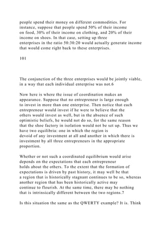

![Of particular interest is the structure of the various linkages that
connect different industries. Hirschman [1958]
distinguished between backward and forward linkages. Thus, in
Figure 5.3, the steel industry facilitates the
development of other industries, such as railways, by increasing
the availability of steel and/or lowering its price.
This is an example of a forward linkage—one that works by
affecting the ease of supply of another product. A
forward linkage is captured in this diagram by the direction of
the arrows. On the other hand, the steel industry
possesses a backward linkage to the coal industry: the
expansion of the former raises the demand for the latter.
Likewise, the shipping industry links forward to exports and
backward to railways: the former because it facilitates
the transportation of exports; the latter because it creates a
demand for freighting of products from the interior to the
ports. Typically, a backward linkage is created by reversing the
direction of the arrows in Figure 5.3. If industry A
facilitates production in industry B, then an expansion of
industry B (for some other reason) will generally create an
increase in demand for the product of industry A. Thus
backward linkages are like “pulls” and forward linkages are
like “pushes.”
102
Figure 5.3. Linkages and coordination.
The concept of linkages is important because linkages have a
bearing on policy. Suppose that an economy is in a
depressed equilibrium; how would a policy be framed so as to
take the economy to a better equilibrium?
Rosenstein-Rodan introduced the idea of a big push, a policy](https://image.slidesharecdn.com/1developmenteconomics-221224051007-11cbd63c/85/1Development-Economics-docx-219-320.jpg)


![(1955–56 to 1960–61) went a step further. One of the main
architects of the
plan was Professor P. C. Mahalanobis, an eminent statistician
and advisor to Prime Minister Nehru.
The Mahalanobis model, which served as the foundation of the
second plan, bore a close resemblance to a framework
enunciated by the
Soviet economist Feldman in 1928, on which Soviet planning in
the 1930s was largely based. Both models argued that to achieve
rapid
growth, careful attention was to be given not only to the size of
investment, but also to its composition. In particular, these
models stressed
the need to make substantial investments in the capital goods
sector so as to expand the industrial base and remove possible
future
bottlenecks in machine-producing capacity. One implication of
following this policy is that growth in consumer goods is
initially low, but
accelerates once the industrial base is sufficiently enlarged.
This emphasis on heavy industry in India’s second Five Year
Plan is
illustrated by the fact that 34.4% of planned investment was in
the investment goods sector, compared to only 18.2% in
consumer goods
104
and 17.2% in agriculture (Hanson [1966, p. 126]).
During the plan period, we note that national income grew by
4% per annum on average. Given the almost stagnant nature of
the Indian](https://image.slidesharecdn.com/1developmenteconomics-221224051007-11cbd63c/85/1Development-Economics-docx-225-320.jpg)
![economy in the preceding half century or even more, this was
pretty dramatic. Raj [1965] observed that “the percentage
increase in
national income in the last thirteen years has been higher than
the percentage increase realized in India over the entire
preceding half a
century.”10
Industry, given the greater share of investment it received, did
much better than the nationwide average. Overall industrial
production
grew at an average rate of 7% per annum over the period of the
first two plans. For the second plan period alone, the general
index of
industrial production grew by roughly 35% between 1955–56
and 1960–61, and that of machine production soared to 250% of
its starting
level in the meager space of five years (Hanson [1966. p. 169]).
However, there were some serious shortfalls in the
infrastructural sector:
power production missed its target of 6.9 million kilowatts by
1.2 million, and underinvestment in railways gave rise to
bottlenecks and
strain toward the end of the period (Hanson [1966]).
In conclusion, although the first two Five Year Plans set India
on a path of aggregative growth unprecedented in her history,
the
abysmally poor living conditions for the majority of the
populace at the outset of the plan programs coupled with the
increasing population
pressure over the period hardly left any room for complacence
at the beginning of the Third Plan period.
5.2.4. History versus expectations
So far we have discussed the idea of complementarities and](https://image.slidesharecdn.com/1developmenteconomics-221224051007-11cbd63c/85/1Development-Economics-docx-226-320.jpg)


![5.3.1. Introduction
A production activity displays increasing returns to scale if an
expansion in the scale lowers the unit costs of
operation. Equivalently, a proportionate increase in the variable
inputs of production leads to a greater-than-
proportionate increase in the output from the activity.
In theories of growth such as the Harrod–Domar or Solow
models, increasing returns did not play a traditionally
important role (but recall the endogenous growth models of
Chapter 4). One important exception stands out in the
early literature: the classic paper by Young [1928], which
emphasized the role of increasing returns in development.
The idea is simple, but very powerful. It has two parts to it.
First, the ability to realize the gains from increasing
returns depends on the size of the available market for the
product. If the market is small, a profitable product may
never make it into the market. Second, and more subtly, the size
of the market may itself depend on the ability to
exploit increasing returns, expand production, and pay out
income to employees. Consequently, it is possible for an
economy to be caught in a low-level trap, much like the one
described in the previous section, but arising from a
different source.16
5.3.2. Increasing returns and entry into markets
Consider an example. Suppose that a developing country has a
small domestic market for automobiles that is
currently serviced by imports from well-known international
auto manufacturers. Now imagine that a local
manufacturer designs a car that is particularly suitable for
domestic conditions. For instance, the design may be a
highly fuel-efficient car that has a low maximum speed. The](https://image.slidesharecdn.com/1developmenteconomics-221224051007-11cbd63c/85/1Development-Economics-docx-233-320.jpg)


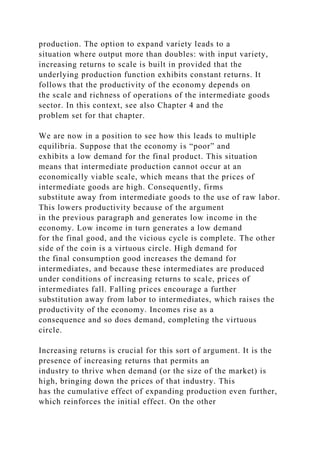


![underwater pretty soon may not be well defined, and
how does one estimate the income losses to a landless laborer in
that village? Likewise, it may be difficult to
estimate benefits, and if one accounts for positive externalities,
there is often just as much likelihood that costs as
well as the benefits will be underestimated. The issue of proper
valuation is compounded by strategic
considerations. Opponents will claim that the benefits, however
they are measured, are exaggerated and the costs
are underplayed. Proponents will claim immense benefits. Cost–
benefit analysis is a dangerous “science.”
(2) Gainers and Losers. The Narmada dam is a good example of
a project that has fairly well-defined sets of
gainers and losers, but for many projects, this may be a difficult
proposition. Consider a move to unequivocal free
trade. Will engineers in a country benefit? Will textile workers
or agricultural laborers benefit? The answers to such
questions are difficult and complex: they depend on how the
economy does postreform, on the sectors that will
succeed in the international market, and the sectors that die out.
Sometimes it is possible to form fairly precise
estimates of the consequences, but frequently this is very
difficult. Fernandez and Rodrik [1991] argued that in the
presence of such uncertainties, a reform policy that is
commonly known and agreed to be beneficial ex post may be
vetoed ex ante. Imagine submitting such a policy to a public
referendum. An individual voter may know that the
policy will benefit 60% of the population by $100 and hurt the
remaining 40% by $100, but is he, the voter, part of
the 60% or part of the 40%? He may not know the answer to
that particular question, and if he fears the risks, may
well vote against the policy.26
(3) Consistency. Points 1 and 2 are closely connected to,
although conceptually distinct from, the issue of](https://image.slidesharecdn.com/1developmenteconomics-221224051007-11cbd63c/85/1Development-Economics-docx-248-320.jpg)


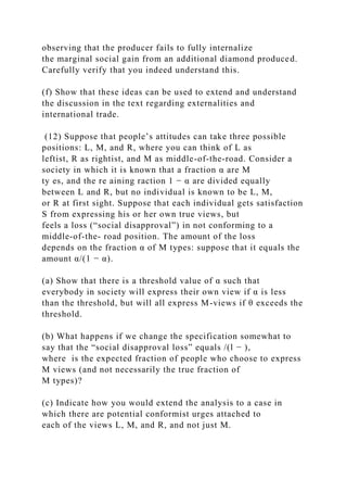
![1 We are considaring times that precede the growth of the
market for personal typewriters
2 Microsoft does support the Alpha with a native version of
Windows NT, but companies are wary of writing other software
on this platform
unless there are a large number of (home) buyers using the
Alpha. Conversely, the Alpha will not sell unless software is
written for it. At the
time of writing, it is unclear how this failure of coordination
will resolve itself.
3 This statement is a bit too strong. What one can show is that
multiple Pareto-comparable equilibria can only occur when
there are
complementarities. Moreover, we do not assert that historical
dependence and multiple equilibria must necessarily occur in all
cases where
there are complementarities.
117
4 See, for example, Murphy, Shleifer, and Vishny [1989a],
Matsuyama [1991], Krugman [1991a], Rodríguez-Clare [1996],
Ciccone and
Matsuyama [1996], and Baland and Francois [1996].
5 This is the important assumption of no trade, which we
discuss later.
6 Of course, the more varied and diverse is the range of
commodities on which people spend their income, the more
varied and diverse the
enterprises that are set up would need to be. The point should be](https://image.slidesharecdn.com/1developmenteconomics-221224051007-11cbd63c/85/1Development-Economics-docx-264-320.jpg)
![clear from the example.
7 This argument thus steps away from historical determinism, in
the sense that it allows for initial accidental occurrences to have
long-term
effects that are completely different, and yet allows for sudden
swings that are driven entirely by coordinated changes. We
return later to the
question of history versus expectations.
8 For a description of coordination games, see Appendix 1.
9 Investments in industry above a certain size required
procurement of licenses from the Indian government. By
controlling the number of
licenses issued, the government aimed to control the size of
various industries in accordance with its plans and policies.
10 However, population growth during the period exceeded
expectations and, more alarmingly, showed a rising trend,
mainly due to a fall in
the death rate caused by improvements in medical care.
Consequently, per capita national income grew by only 1.8%
per year, which, though
still creditable, is considerably less cheerful.
11 For detailed analysis of similar models, see, for example,
Krugman [1991a] and Matsuyama [1991].
12 There is also a third outcome in which the rates of return in
the two sectors are exactly equalized, but it is possible to rule
this out on the
grounds of “stability.”
13 See Adserà and Ray [1997] and, in a distinct but related
context, Chamley and Gale [1994].
14 On fashion cycles, see, for example, Pesendorfer [1995]. On](https://image.slidesharecdn.com/1developmenteconomics-221224051007-11cbd63c/85/1Development-Economics-docx-265-320.jpg)
![overoptimistic entrepreneurs, see Manove [1997].
15 On these matters, see Matsuyama [1991] and Krugman
[1991a].
16 Actually, the difference is not as great as it appears at first
glance. Complementarities are like a form of increasing returns
to scale, taking
place at the level of society rather than at the level of the
individual producer or consumer. What we are going to argue is
that history also
matters if increasing returns to scale do not manifest themselves
in the form of externalities, but are “internal” to the individual,
firm, or
organization.
17 Why capital markets might be missing is a subject of
discussion elsewhere (see, for instance, Chapters 7 and 14).
18 Our discussion is based on Ciccone and Matsuyama [1996].
But the general formulation has been used by many others: see,
for example,
Dixit and Stiglitz [1977], Grossman and Helpman [1991],
Romer [1990], and Rodríguez-Clare [1996].
19 One reason why it is absurd is that contingencies are not
verifiable, so that the required system of payments cannot
generally be
implemented.
20 These externalities are referred to as pecuniary or monetary
externalities, as opposed to the “nonpecuniary” or technological
externalities
of congestion, QWERTY, and the like. See Scitovsky [1954] for
a treatment. I am not going to emphasize this distinction too
strongly, because
there are conceptual difficulties in doing so.](https://image.slidesharecdn.com/1developmenteconomics-221224051007-11cbd63c/85/1Development-Economics-docx-266-320.jpg)
![21 One should interpret this statement with some caution. It is
possible that there are multiple equilibria even with competitive
markets. The
point is that these equilibria don’t have unambiguous welfare
comparisons with one another. Some individuals will be worse
off in one of the
equilibria, while others must be better off. In contrast the
multiple equilibria of a coordination failure have a stronger
property: typically, all
individuals are better off in one of the equilibria compared to
another. In other words, the equilibria can be ranked by the
Pareto criterion.
22 Thus Murphy, Shleifer and Vishny [1989] considered the
example of a coordination failure generated by the provision (or
lack thereof)
of a railroad system. Without the railroad, industry may not be
created in the interior of a country. Without the industry, there
is no financial
incentive to build the railroad. If railroad services could
somehow be imported (which is absurd), the failure of
coordination would not occur
and multiple Pareto-ranked equilibria would disappear.
23 Rodríguez-Clare [1996] provided a useful discussion of the
nontradability of intermediate inputs and the role of
nontradability in
sustaining multiple equilibria.
24 Agricultural conservatism is not only peculiar to developing
countries, although this story with its harvest festivals and
village elders
might suggest so. In Europe, North America, and in countries
such as Japan, few sectors are protected and subsidized as much
as agriculture.](https://image.slidesharecdn.com/1developmenteconomics-221224051007-11cbd63c/85/1Development-Economics-docx-267-320.jpg)
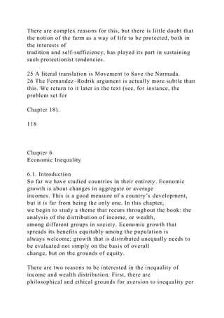


![work. Amartya Sen, in a closely related context, refers to this as
the problem of “recognition” or self-esteem (see
Sen [1975]):
“Employment can be a factor in self-esteem and indeed in
esteem by others. . . . If a person is forced by unemployment to
take a job
that he thinks is not appropriate for him, or not commensurate
with his training, he may continue to feel unfulfilled and indeed
may
not even regard himself as employed.”
Although there may not be much that we can do about this (so
far as a theory of measurement goes), we should
keep it in the back of our minds while we proceed to a final
judgment about inequality.3
Second, and possibly more important, functional distribution
tells us much about the relationship between
inequality and other features of development, such as growth.
Our understanding of how economic inequalities are
created in a society necessitates that we understand both how
factors are paid and how factors are owned.
The preceding discussion lays down a road map for our study of
inequality. We look at economic inequalities
from two angles. In this chapter, we put all sources of income
into a black box and concentrate on the evaluation of
income (or wealth or lifetime income) distributions. This part of
the story is normative. All of us might like to see
(other things being the same) an egalitarian society, but
“egalitarian” is only a word: what does it mean when we
are confronted with several alternative income distributions,
which we must evaluate? How do we rank or order
these distributions? This part of the chapter discusses how we
measure inequality, or equivalently, how we rank](https://image.slidesharecdn.com/1developmenteconomics-221224051007-11cbd63c/85/1Development-Economics-docx-274-320.jpg)
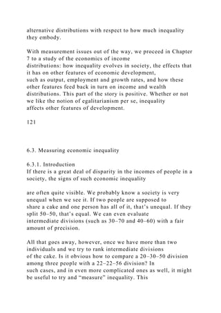
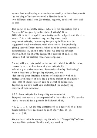
![shares.
(4) The Dalton principle. We are now in a position to state our
final criterion for evaluating inequality.
Formulated by Dalton [1920],7 the criterion is fundamental to
the construction of measures of inequality. Let (y1,
y2, . . . , yn) be an income distribution and consider two
incomes yi and yj with yi yj. A transfer of income from
the “not richer” individual to the “not poorer” individual will be
called a regressive transfer. The Dalton principle
states that if one income distribution can be achieved from
another by constructing a sequence of regressive
transfers, then the former distribution must be deemed more
unequal than the latter.
How far do these four criteria take us? Understanding this is the
task of the next section. Before we do this, let
us formally define an inequality measure. It is a rule that
assigns a degree of inequality to each possible distribution
of the national cake. In other words, it takes each income
distribution and assigns a value to it that can be thought
of as the inequality of that distribution. A higher value of the
measure signifies the presence of greater inequality.
Thus an inequality index can be interpreted as a function of the
form
I = I(y1, y2, . . . , yn)
defined over all conceivable distributions of income (y1, y2, . .
. , yn).
The requirement that the inequality measure satisfy the
anonymity principle can be stated formally as follows:
the function I is completely insensitive to all permutations of
the income distribution (y1, y2, . . . , yn) among the
individuals {1, 2, . . . , n}. Similarly, the requirement of the](https://image.slidesharecdn.com/1developmenteconomics-221224051007-11cbd63c/85/1Development-Economics-docx-280-320.jpg)
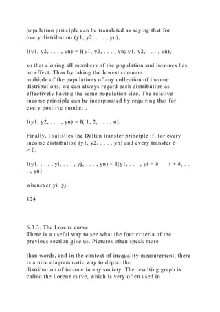


![country. Figure 6.8 provides several examples of Lorenz curves
for different countries. By looking at these figures,
you can get a sense of income inequalities in different parts of
the world, and with a little mental superimposition
of any two diagrams you can compare inequalities across two
countries.
6.3.4. Complete measures of inequality
Lorenz curves provide a pictorial representation of the degree of
inequality in a society There are two problems
with such a representation. First, policy makers and researchers
are often interested in summarizing inequality by a
number, something that is more concrete and quantifiable than a
picture. Second, when Lorenz curves cross, they
cannot provide useful inequality rankings. Thus an inequality
measure that spits out a number for every conceivable
income distribution can be thought of as a complete ranking of
income distributions. As we will see, this
completeness does not come free of charge: it means that in
some situations, inequality measures tend to disagree
with one another.
129
Figure 6.8. Lorenz curves for different countries. Source:
Deininger–Squire data base; see Deininger and Squire [1996a].
We now survey some commonly used inequality measures.10
We use the following notation. There are m
distinct incomes, and in each income class j, the number of
individuals earning that income is denoted by nj. Thus
the total number of people n is simply equal to , where the](https://image.slidesharecdn.com/1developmenteconomics-221224051007-11cbd63c/85/1Development-Economics-docx-289-320.jpg)

![features as a quick estimate and is therefore a bad measure of
inequality.
(4) The coefficient of variation. One way to avoid the
insensitivity of the mean absolute deviation is by giving
more weight to larger deviations from the mean. A familiar
statistical measure that does just this is the standard
deviation (see Appendix 2), which squares all deviations from
the mean. Because the square of a number rises more
than proportionately to the number itself, this is effectively the
same as attaching greater weight to larger deviations
from the mean. The coefficient of variation (C) is just the
standard deviation divided by the mean, so that only
relative incomes matter. Thus
The measure C, it turns out, has satisfactory properties. It
satisfies all four principles and so it is Lorenz-consistent.
In particular, it always satisfies the Dalton transfer principle.
Consider a transfer from j to k, where yj yk. This
implies a transfer from a smaller number [i.e., (yj − )] to a
larger one [i.e., (yk − )], which increases the square of
the larger number by more than it decreases the square of the
smaller number. The net effect is that C invariably
registers an increase when such a regressive transfer is made.
You should check by trying out various examples that
this is always the case.
(5) The Gini coefficient. We now come to a measure that is
widely used in empirical work: the Gini coefficient.
The Gini approach starts from a base that is fundamentally
different from measures such as M and C. Instead of
taking deviations from the mean income, it takes the difference
between all pairs of incomes and simply totals the
(absolute) differences. It is as if inequality is the sum of all
pairwise comparisons of “two-person inequalities” that
can conceivably be made. The Gini coefficient is normalized by](https://image.slidesharecdn.com/1developmenteconomics-221224051007-11cbd63c/85/1Development-Economics-docx-292-320.jpg)
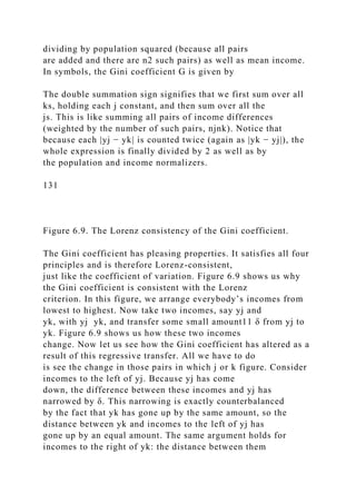

![probably not rely entirely on one particular measure of
inequality, but rely on a whole set of measures. It may be a
good idea to simply study the two Lorenz curves as well.
As a hypothetical example, consider two societies, each
consisting of only three persons. Let the distribution of
income in the two societies be (3, 12, 12) and (4, 9, 14),
respectively. You can easily check that for the first of our
hypothetical societies, the coefficient of variation is 0.27,
whereas it is 0.26 for the second. Using C as an index,
therefore, we reach the conclusion that the first society is more
unequal than the second. However, if we calculate
the Gini coefficient, the values come out to be 0.22 and 0.25,
respectively. On the basis of the latter measure,
therefore, inequality seems to be higher in the second society
compared to the first.13
To be sure, this isn’t just a hypothetical possibility. Such
contradictory movements of inequality indexes occur
in real life as well. Consider, for instance, the study by
Weisskoff [1970] on inequality variations in Puerto Rico,
Argentina, and Mexico during the 1950s. Table 6.1, put together
from Weisskoff’s study by Fields [1980],
illustrates the ambiguities that arise.
The table is remarkable in its varied movements of inequality
measures. In each of the three countries, there is
some ambiguity. In Puerto Rico, for instance, both the poorest
40% and the richest 5% of the population lost
income share, a clear sign that the Lorenz curve has crossed.
This doesn’t necessarily mean that the Gini coefficient
and the coefficient of variation disagree, but they do in fact. In
the case of Argentina, there is no evidence from the
income shares of the richest and poorest that the Lorenz curves
have crossed, but they must have, at least over the
period 1953–61. Do you see why? Finally, look at Mexico for](https://image.slidesharecdn.com/1developmenteconomics-221224051007-11cbd63c/85/1Development-Economics-docx-295-320.jpg)
![the period 1957–63. In this case, both the Gini
coefficient and the coefficient of variation agree, but it’s also
clear from the movement of income shares that the
Lorenz curves have crossed (check this). It should be
abundantly clear, therefore, that unless we have a clear case
where a Lorenz comparison can be made, we should consult a
variety of inequality measures before making a
judgment.
le nges n ne l n er o o rgen n n e o.
132
Source: Fields [1980]. Note: First arrow indicates a change in
inequality from the previous observation; the second arrow
indicates the
change in inequality from two observations ago.
Clearly we have a dilemma here: the result of our comparison is
sensitive to the choice of the index, but we have
no clear intuitive reason to prefer one over the other. There are
two ways out of this dilemma. The first, as we said
before, is to examine our notion of inequality more closely and
to come up with stricter criteria after such
introspection. The result, as was pointed out, will inevitably be
subjective and controversial. The second escape is to
realize that human thought and ideas abound with incomplete
orderings: everyone agrees that Shakespeare is a
greater writer than the Saturday columnist in the local
newspaper; however, you and I might disagree whether he is
greater than Tagore or Tolstoy, and even I may not be very sure
myself. Relative inequality, like relative literary
strength, may be perfectly discernible some of the time and
difficult to judge in other cases. We can learn to live](https://image.slidesharecdn.com/1developmenteconomics-221224051007-11cbd63c/85/1Development-Economics-docx-296-320.jpg)

![(b) (200, 400, 600, 800); (50, 25, 75, 25)
(c) (200, 400, 600, 800); (100, 50,150, 50)
(d) (200, 400, 600, 800); (125, 25,125, 50)
(e) (100, 200, 300, 400); (50,15, 95,15)
134
(f) (100, 200, 300, 400), (50, 35, 55, 35).
[Try to understand the implicit transfers that move you from
one income distribution to the other (except for the
first three, which should turn out to have the same inequality —
why?).]
(4) What are the ethical principles that we used in our
measurement of inequality? Show that these principles are
exactly summarized in the concept of the Lorenz curve. Argue
that if there are two income distributions for which
the Lorenz curves do not cross, then the Gini coefficient and the
coefficient of variation cannot disagree with each
other when measuring the inequality of these two distributions.
(5) In a world in which there are fixed minimum needs for
survival, show that an application of the relative
income principle runs into problems. How would you try and
modify the principle to circumvent this problem?
(6) Suppose that there are n people in society, arranged
(without loss of generality) in increasing order of income
earned. Let x = (x1, . . . , xn) and y = (y1, . . . , yn) be two
income distributions (with total incomes the same in the](https://image.slidesharecdn.com/1developmenteconomics-221224051007-11cbd63c/85/1Development-Economics-docx-301-320.jpg)
![two cases).
(a) Show that the Lorenz curve for x must lie inside the Lorenz
curve for y if (and only if)
for all k, with strict inequality for some k.
(b) (Extra credit.) Now suppose that the condition in part (a)
does hold. Show that y can be attained from x by a
sequence of regressive transfers. For details, see Fields and Fei
[1978].
(7) The Dalton transfer principle may not be a good way to
judge increases in polarization (for a definition, see
Esteban and Ray [1994] and Wolfson [1994]). To see this, begin
with a society in which incomes take all values in
$100 increments between $100 and $1000, and in which an
equal proportion of the population (1/10) occupies each
of these classes. Show this income distribution in a diagram
with incomes on the horizontal axis and population
proportions on the vertical axis. Now draw another diagram
with half the population at the income level $250, and
another half at income level $750. Intuitively rank these two
income distributions: which one has more scope for
social unrest, which one might display a greater awareness of
inequality, and so on.
Now show that the second distribution can be obtained by a
sequence of progressive Dalton transfers from the
first. Do you feel that your intuition is in line with the transfer
principle, in this example?
(8) The economy of Nintendo has ten people. Three of them
live in the modern sector of Nintendo and earn $2000
per month. The rest live in the traditional sector and earn only
$1000 per month. One day, two new modern sector](https://image.slidesharecdn.com/1developmenteconomics-221224051007-11cbd63c/85/1Development-Economics-docx-302-320.jpg)

![(f) If everybody’s income increases by a constant dollar
amount, inequality must fall.
1 I make this statement assuming that there is no fundamental
difference, such as the presence of a handicap or ailment, in the
need for two
people to have access to economic resources.
2 On these and related matters, read the insightful discussions
in Sen [1985].
3 Often, ingenious theories of measurement can go some way to
resolve difficulties of this sort. For instance, it might matter for
our
measurement of literacy rate whether an literate person has
access to other literate persons. On these matters, see Basu and
Foster [1997].
4 In this section, we refer to “income” as the crucial variable
whose inequality we wish to measure. You could replace this
with wealth,
lifetime income, and so on. Likewise, the recipient unit is called
an individual. You could replace this by “household” or any
other grouping
that you might be interested in.
5 Warning: Cloning only one segment of the population while
keeping the remainder unaltered may well affect our notions of
inequality.
Suppose that there are two incomes, $100 and $1,000. The
population principle says that all income distributions are
equally unequal provided
the same percentage of people earn $100. If the proportion of](https://image.slidesharecdn.com/1developmenteconomics-221224051007-11cbd63c/85/1Development-Economics-docx-304-320.jpg)
![people earning the low income changes, then inequality will, in
general, be
affected.
6 Is it as easy to buy the relative income principle as the
population principle? Not really What we are after, in some
sense, is the inequality
of “happiness” or utility, however that may be measured. As
matters stand, our presumption that inequality can be quantified
at all forces us to
make the assertion that the utilities of different individuals can
be compared. (On the analytical framework of interpersonal
comparability that
is required to make systematic egalitarian judgments, see, for
example, Sen [1970] and Roberts [1980].) However, the relative
income principle
needs more than that. It asserts that utilities are proportional to
incomes. This is a strong assumption. We make it nevertheless
because Chapter
8 will partially make amends by studying the effects of absolute
income shortfalls below some poverty line.
7 See also Pigou [1912], after whom the principle is also called
the Pigou–Dalton principle.
8 For a useful discussion of the history of this result, see the
survey by Foster [1985].
9 Shorrocks and Foster [1987] argued for a fifth principle,
which they call transfer sensitivity. This principle tries to
compare progressive
transfers at the lower end of the income distribution with
regressive transfers at the upper end, arguing that if both
involve the same size
transfer, then the former should be “ethically allowed” to
outweigh the latter: inequality should come down under the
composite transfer. This](https://image.slidesharecdn.com/1developmenteconomics-221224051007-11cbd63c/85/1Development-Economics-docx-305-320.jpg)
![principle further broadens the scope of comparison, but is still
not enough to rule out ambiguities.
10 See Sen [1997] for a discussion of these and other measures,
and for a comprehensive overall treatment of the subject of
economic
inequality.
11 We take δ small so as to preserve the ranking of individuals
in ascending order of income. The argument for larger values of
δ follows
by breaking up the transfer into smaller pieces and applying the
logic in the text.
12 Of course, other measures are in use as well. There is the use
of log variance as an inequality measure, which is just the
standard
deviation of the logarithm of incomes. Although it is easy to
compute and use, the log variance unfortunately disagrees with
the Dalton
principle in some cases. Another measure, introduced to
inequality evaluation by Henri Theil and known as the Theil
index, is derived from
entropy theory. Although it looks bizarre at first, it turns out to
be the only measure that satisfies the four principles and a
convenient
decomposability principle that permits us to separate overall
inequality into between-group and within-group components
(Foster [1983]). This
makes the Theil index uniquely useful in situations where we
want to decompose inequality into various categories, for
example, inequality
within and across ethnic, religious, caste, occupational, or
geographical lines.
13 Warning: There is no connection between a value of, say,](https://image.slidesharecdn.com/1developmenteconomics-221224051007-11cbd63c/85/1Development-Economics-docx-306-320.jpg)
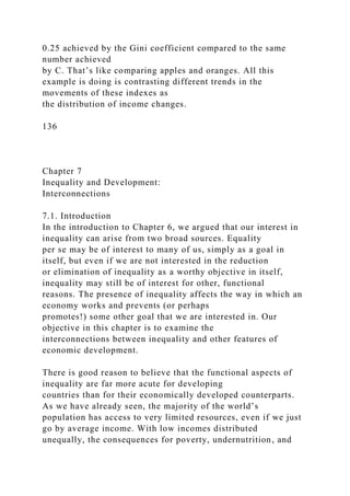

![inequality? If this is indeed the case, what is the process that
serves to eliminate historical advantages and
disadvantages? If this is not the case, how might inequalities
persist and, in doing so, what effects do they have on
the economic development of a country?
This sets the stage for the theories and empirical findings that
we will now discuss. These analyses take as
historically given an initial distribution of assets, but then ask
the question, Do these inequalities worsen over time
or narrow? How are aggregates, such as income, employment,
wealth, and growth rates affected by inequality? In
turn, how do these variables affect the evolution of inequality?
7.2. Inequality, income, and growth
7.2.1. The inverted-U hypothesis
Consider, first, the empirically observed patterns that connect
inequality to per capita income. We begin with the
pathbreaking work of Kuznets [1955], which is the earliest
attempt to correlate the presence of economic inequality
with other variables such as income. Because of data
limitations, Kuznets used the ratio of the income share of the
richest 20% of the population to that of the poorest 60% of the
population as a measure of inequality. The
comparison was carried out between a small set of developing
countries—India, Sri Lanka and Puerto Rico—and a
small set of developed countries—the United States and the
United Kingdom.
The ratios turned out to be 1.96 (India), 1.67 (Sri Lanka), and
2.33 (Puerto Rico), as opposed to the values of
1.29 (United States) and 1.25 (United Kingdom). These values](https://image.slidesharecdn.com/1developmenteconomics-221224051007-11cbd63c/85/1Development-Economics-docx-310-320.jpg)
![are indicative of the possibility that developing
countries, in general, tend to possess higher degrees of
inequality than their developed counterparts. A later study by
Kuznets [1963] provided further support for this possibility. In
this study, data were obtained from eighteen
countries; again, the sample had a mixture of developed and
developing countries. The study made very clear the
finding that the income shares of upper income groups in
developed countries were significantly lower than their
developing counterparts. The opposite comparison appeared to
be valid for the income shares of lower income
groups, although in this case the results were much less clear-
cut. These findings, though sketchy, were suggestive.
Even from these narrow and somewhat impressionistic
observations, it seems to be the case that economic
development is fundamentally a sequential and uneven process.
Instead of everybody benefiting at the same time,
the process appears to pull up certain groups first and leave the
other groups to catch up later. In the initial phase,
inequality widens. Later, as everybody else catches up,
inequality falls. This sort of reasoning (which we discuss
more later) drove Oshima [1962] and Kuznets [1955, 1963] to
suggest a broad hypothesis of development: that
economic progress, measured by per capita income, is initially
accompanied by rising inequality, but that these
disparities ultimately go away as the benefits of development
permeate more widely. Thus if you plot per capita
income on one axis and some measure of inequality on the
other, the hypothesis suggests a plot that looks like an
upside-down “U”: hence the name inverted-U hypothesis. The
inverted-U hypothesis spawned a great deal of
innovative and not-so-innovative thinking about the
development process. An example of the former kind is
described in the box on the Tunnel Effect.](https://image.slidesharecdn.com/1developmenteconomics-221224051007-11cbd63c/85/1Development-Economics-docx-311-320.jpg)
![The Tunnel Effect
You are driving through a two-lane tunnel, where both lanes are
in the same direction and, guess what, you get caught in a
serious
traffic jam. No car is moving in either lane as far as you can
see. You are in the left lane and your spirits are not exactly
high. After a
while, however, the cars in the right lane begin to move. Do you
feel better or worse? It depends on how long the right lane has
been
moving. At first, you know that the jam has cleared further
ahead and that your turn to move will come soon. Given this
imminent prospect
of movement, your spirits do lift considerably, even though you
haven’t yet moved. However, if the right lane keeps moving for
long
enough with no sign of things clearing up on the left lane, you
soon end up frustrated and maybe just gate crash into the right
lane yourself.
Of course, if there are many people gate-crashing, everything
will probably come to a halt anyway.
Hirschman and Rothschild [1973] used this example to discuss
an apparently very different issue: the tolerance for inequality
in
income distribution along the path toward economic
development.
It has been the experience of several developing economies that
the level of inequality in the distribution of income increases
over the
initial phases of development. The responses to such a rise in
inequality have been varied, both across economies as well as
within the
same economy at different points in time, and they have ranged](https://image.slidesharecdn.com/1developmenteconomics-221224051007-11cbd63c/85/1Development-Economics-docx-312-320.jpg)

![inequality across countries that are at different stages in the
development process. Such studies have their own
intrinsic limitations: countries differ widely and unless there is
a systematic way to control for intercountry
variation, the results must always be interpreted cautiously. At
the same time, cross-sectional studies of variations in
inequality have the great advantage that they mimic precisely
what is difficult to do for a single country; that is, data
can be obtained for (different countries at) widely different
stages of development. Unless we take the view that
absolutely nothing can be learned about one country from
studying another country, there is perhaps something to
be obtained from such an analysis.
Table 7.1. An inverted-U in the cross section?
Source: Paukert [1973].
139
One of the earliest examples of a cross-section analysis is that
of Paukert [1973]. Fifty-six countries were
classified into different income categories according to their per
capita GDP in 1965, in U.S. dollars. Inequality was
measured by the Gini coefficient. Table 7.1 presents some of
the Paukert findings: The table reveals two things.
First, there appears to be a relationship between inequality and
GDP of the kind predicted by Oshima and Kuznets.
At least, this is certainly the case once the data are aggregated
by income category, as we have done in the second
column of Table 7.1. This relationship suggests that the broad
tendencies described earlier in this section do work,
on average, across countries and over time in the development
of each country. However—and this is the second
feature—the variation within a particular category is certainly](https://image.slidesharecdn.com/1developmenteconomics-221224051007-11cbd63c/85/1Development-Economics-docx-316-320.jpg)
![far from negligible. The third column in Table 7.1
presents the highs and lows for the Gini coefficient among
countries in each category. A quick glance at this table
certainly dispels the notion that the inverted-U is inevitable in
the history of each country’s development.1
Figure 7.1. The inverted-U hypothesis seen in the data. Source:
Deininger and Squire [1996a].
The use of a larger data set corroborates the Paukert
observations. Consider, for instance, Figure 7.1 (which
reproduces Figure 2.6 in Chapter 2). This diagram uses cross-
sectional data2 to show the possibility of an inverted-
U. I have made no attempt to control for countries or even years
for which the data are available (which we discuss
more in the following text). This is a simple plot of the latest
years for which country-level data on inequality are
available. Note how the share of the richest 20% of the
population rises and then falls as we move over countries
with different per capita incomes. Exactly the opposite happens
with the income share of the poorest 40% of the
population. Thus at some very crude cross-sectional level, the
inverted-U hypothesis has some foundation.
Cross-sectional regressions appear to support the same pattern.
Consider, for instance, the study by Ahluwalia
[1976], which analyzed a sample of sixty countries: forty
developing, fourteen developed, and six socialist, with
GNP figures measured in U.S. dollars at 1970 prices. Quite
aware that summary measures of inequality might play
nasty tricks (such as those discussed at the end of Chapter 6),
Ahluwalia divided the population of each country in
the sample into five quintiles, running from the 20% of the
population with the lowest income share to the quintile
with the highest income share. This way it was possible to keep
track of the entire income distribution. For each](https://image.slidesharecdn.com/1developmenteconomics-221224051007-11cbd63c/85/1Development-Economics-docx-317-320.jpg)
![quintile, Ahluwalia ran the regression
Table 7.2. Test of the Kuznets inverted-U hypothesis.
140
Source: Ahluwalia [1976].
Note: Figures in parentheses denote t values.
where si is the income share of the ith quintile, y is the
logarithm of per capita GNP, D is a dummy variable that
takes the value 1 if the country in question is socialist, and 0
otherwise,3 and A, b, and c are coefficients to be
estimated from the regression.
Why do both y and y2 enter into the regression? The reason is
simple: by restricting the regression to include
only y as an explanatory variable, it is not possible to test for
the presence of a U shape, inverted or otherwise. A
linear regression is incapable of allowing for directional
changes. In contrast, the inclusion of the squared term
permits a fit that changes direction (e.g., permits inequality to
first rise and then fall as income increases). By
drawing several graphs, you can convince yourself that a U
shape can only occur if b and c are of different signs.
For instance, if b > 0 and c < 0, then the shape that results is
precisely a inverted-U. On the other hand, if b < 0 and
c > 0, the graph must take the form of an “upright-U.”
This tells us what to look for. Recall that the income share of
the lowest quintile is negatively related to
inequality. It follows, that if the Oshima-Kuznets hypothesis is
correct, the regressed curve for the lowest quintiles
should take the form of an upright-U; that is, the estimated b](https://image.slidesharecdn.com/1developmenteconomics-221224051007-11cbd63c/85/1Development-Economics-docx-318-320.jpg)
![should be negative and the estimated c should be
positive. On the other hand, exactly the opposite signs should
hold for the coefficients pertaining to the highest
quintile. Table 7.2 summarizes the findings.
Ahluwalia’s regressions get the expected results, as the
summary in Table 7.2 reveals. For all quintiles but the
highest, income share tends to fall initially with a rise in per
capita GNP and then rises beyond a certain point. This
statement is deduced from the fact that the estimated value of b
is negative in all these cases, whereas that of c is
positive. For the topmost quintile, the pattern is just the
opposite: with rising per capita income, income share first
rises and then starts to fall. In all cases, the regression
coefficients turn out to be statistically significant (see
Appendix 2 for a discussion of this concept).4 There seems to
be an inverted-U hidden in the cross section, or is
there?
Words of caution
The literature on the inverted-U hypothesis resembles, to some
extent, the search for the Holy Grail; that is, the
search for some evidence that supports an implacable law of
development.5 There is some evidence that an
inverted-U relationship is present in the cross section of the
world income distribution, but there are reasons to be
skeptical of these positive findings.
For one thing, the data exhibit too much variation to support
some ironclad law of economic change. We already
noted this in our discussion of Paukert’s [1973] study. Similar
variation can be seen by simply eyeballing the data
points arrayed in Figure 7.1. Per capita income alone can
“explain” some, but not all and not even half, the overall
observed variations in inequality from country to country. Of
course, this still does not rule out the possibility that,](https://image.slidesharecdn.com/1developmenteconomics-221224051007-11cbd63c/85/1Development-Economics-docx-319-320.jpg)
![left to itself, a country might follow the inverted-U, but there
are many other differences, such as those in
government policy, that get in the way. Hence, this sort of
criticism rules out the inevitability of the inverted-U, but
allows for the possibility of a bias in that direction.
Second, the inverted-U is, to some extent, an artifact of the
statistical methodology that is used in inequality
measurement. To see this, consider the following example
adapted from Fields [1980]. Suppose that a society is
composed of five individuals, who are divided between an
agricultural sector and an industrial sector. Income in the
agricultural sector is 100 and in the industrial sector it is 200.
Initially suppose that everybody is in the agricultural
sector, so that the income distribution is (100,100,100,100,100).
Now suppose that development proceeds by a
transfer of individuals from agriculture to industry. The income
distribution will progressively see the appearance of
141
more 200s [e.g., (100,100,100,200,200)], until everybody is in
the industrial sector.
This is a caricature of development, but not a bad one. As we
will see in Chapter 10, much of the growth of
developing countries can indeed be captured by shifts from low-
income sectors such as agriculture to relatively
high-income sectors such as industry. Now, if you did the
problems at the end of Chapter 6, you know that the
Lorenz curves cross all the way through this sectoral shift
(except right at the beginning and at the end, when there
is perfect equality), so we cannot say unambiguously that
inequality has gone up or down in the intermediate stages.](https://image.slidesharecdn.com/1developmenteconomics-221224051007-11cbd63c/85/1Development-Economics-docx-320-320.jpg)
![However, calculate the Gini coefficient of the various income
distributions or the coefficient of variation and you
will see that it rises and then falls. Yet for “most” of this
process we have Lorenz crossings.
Studies that rely on aggregate measures of inequality may
simply pick up these statistical effects; as far as “real
inequality” is concerned, whatever that might mean, there may
be very little to say. This reasoning is why a study
such as Ahluwalia’s, which distinguishes between the income
shares accruing to different groups, is very useful and
is not subject to this particular criticism (as the Paukert study
might be).
Third, a regression of the form described in equation (7.1) is
not the only functional form that can admit an
inverted-U shape. For instance, what about the alternative
specification
as adopted by Anand and Kanbur [1993a] or Deininger and
Squire [1996b]? This is where economic theory should
play an important role: by postulating a specific model that
links income to inequality, we should be able to derive a
regression equation from the model itself. Unfortunately, as we
will see subsequently, there are plenty of theoretical
reasons to expect connections between income and inequality,
and each reason precipitates a different sort of
relationship. Sorting out a functional form such as (7.1) from
the form in (7.2) may require a model that is far too
detailed and specific to be intuitively appealing or credible, yet
the choice of functional form can matter, as Anand
and Kanbur [1993a, b] correctly argued.
Time series
A deeper problem with cross-sectional studies is one we have
already noted: by pooling different countries and](https://image.slidesharecdn.com/1developmenteconomics-221224051007-11cbd63c/85/1Development-Economics-docx-321-320.jpg)
![running a regression, the implicit assumption is made that all
countries have the same inequality-income
relationship. That is, not only are they believed to follow the
same qualitative pattern (such as an inverted-U), but
the same quantitative pattern as well: the income-inequality
curve is the same curve for all.
This notion is hard to swallow. Countries do differ in their
structural parameters and some account should be
taken of this. At the same time it is unclear how much one can
do. The opposite extreme is to say that every country
is (a priori) completely different: one country might have one
sort of curve and the other might have another, and
there is no relationship between the two. This amounts to saying
that all countries should be studied separately and
nothing is gained by pooling the data. This is a good idea if we
have huge quantities of data for each country, but
we do not. Income distribution data are hard to get, and if we
try to go back a century or so as well, that leaves us
with very few countries indeed. For instance, Lin-dert and
Williamson [1985] put together some of what we know
regarding intertemporal inequality movements in countries over
fairly long horizons. They tracked inequality
movements in some European countries and in the United States
using data going back into the last century and
earlier. For England the upward surge in inequality during the
industrial revolution is clearly visible. Other countries
were picked up at a later stage (for lack of earlier data) and
show steadily declining inequality. The overall
availability of data is quite sparse, though.
There is middle ground here. We might agree that countries are
different, but that there is still some connection
between their inequality-income curves. For instance, amend
equation (7.2) to read](https://image.slidesharecdn.com/1developmenteconomics-221224051007-11cbd63c/85/1Development-Economics-docx-322-320.jpg)
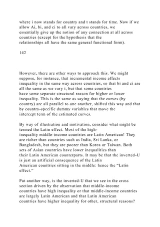
![There might be traditional inequities in the holdings
of land, little or no implementation of minimum wage laws
(often due to high inflation), and government policy that
is insensitive to considerations of inequality. With large
numbers, we might expect these effects to go away, but the
world is not that big a sample when each country counts as one
unit.
One sensible way to check whether this assertion makes sense is
to put in a dummy variable for Latin American
countries in the regression. The estimated coefficient on the
dummy can then be interpreted as the “importance” (as
far as inequality is concerned) of being Latin American per se.
Ahluwalia checked this in his 1976 study. However,
once we open the door to the inclusion of a Latin dummy, we
might as well try out dummies for each different
country in the sample.
This method gives us some flexibility to allow for structural
differences across countries. At the same time, it
allows us to make use of a combined data set or “panel” (which
can be used to estimate the common coefficients b
and c more precisely). To be sure, all this posturing is of little
use unless we have data for several countries over
several points of time. The data set compiled by Deininger and
Squire [1996a], which we’ve already used in part,
does have this property, as well as several others that make it
attractive.6 The data set contains an average of more
than six observations per country (at different points in time).
Indeed, it contains fifty-eight countries with four or
more observations each.
What happens if country-specific dummies are used for the
intercept terms Ai? Deininger and Squire [1996b]
found that the Kuznets inverted-U hypothesis largely vanishes.
The coefficients b and c in that regression are now](https://image.slidesharecdn.com/1developmenteconomics-221224051007-11cbd63c/85/1Development-Economics-docx-324-320.jpg)
![the wrong signs for an inverted-U, and indeed, the coefficients
are not significant. This suggests that structural
differences across countries or regions may create the illusion
of an inverted-U, when indeed there is no such
relationship in reality.
When countries are examined separately, there is some evidence
of a direct U-shaped relationship among
countries with a long series of data; this is true of the United
States, the United Kingdom, and India.7 For those nine
countries for which an inverted-U can be found, the findings
appear to be extremely sensitive to the use of outlier
data or recent structural changes: the authors observe that
Mexico, Trinidad, and the Philippines are probably the
only three countries that survive the inverted-U specification. In
80% of the sample, there is no significant
relationship between inequality and income levels, at least at
the 5% level (see Appendix 2).
Fields and Jakubson [1994] were the first to analyze the sort of
question that Deininger and Squire take up, but
their data set is somewhat more limited: there are only 35
countries, but many have several years of inequality data.
With country-specific dummies for the intercept term (country
fixed effects), they examined the data allowing for
parallel shifts across countries in the inequality-income
relationship. Their findings are very similar to those of
Deininger and Squire, and cast further doubt on the existence of
an inverted-U shape. In their view, if any average
conclusion can be drawn, it is that inequality falls over the
course of development, at least over the course of
twentieth-century development (Fields [1994]).
7.2.3. Income and inequality: Uneven and compensatory
changes](https://image.slidesharecdn.com/1developmenteconomics-221224051007-11cbd63c/85/1Development-Economics-docx-325-320.jpg)
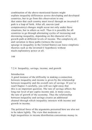
![itself, but we have discussed that already and this is not
what we are after in this section.] Observe that once the
Thompsons come into existence, they may be consuming
exactly the average of what Rohini and Paulo did, or more, or
less. What criteria should we use to predict the final
change?
Marginal savings rates
This discussion forces us to look a little deeper. We must study,
not the total savings generated by various
individuals, but their marginal savings behavior. Figure 7.2
illustrates this. The basic argument is no different from
the many different examples of reasoning you have already
encountered in economics courses, and there are more
to come in this book. Suppose that as income increases, the
marginal savings rate increases (consult Figure 7.2a). In
that case, if we were to transfer a dollar of income from a poor
person to a rich person, more of that dollar would
now be saved as a result of the transfer. Exactly the opposite
conclusion would obtain if less money is saved out of
the marginal dollar as income increases (Figure 7.2b). Just to
make sure we see this, let us apply the case of Figure
7.2b to Rohini, Paulo, and the Thompsons.
145
Figure 7.2. The savings function and marginal savings behavior.
Note that the average savings generated by Rohini and Paulo
may be found by connecting the points on the
graph that represent their individual savings-income
configuration, and then looking at the savings represented by
the halfway point on this line. Now, the income represented by
this halfway point is exactly $30,000, the income of](https://image.slidesharecdn.com/1developmenteconomics-221224051007-11cbd63c/85/1Development-Economics-docx-331-320.jpg)
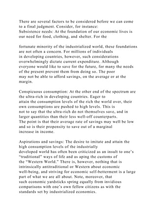
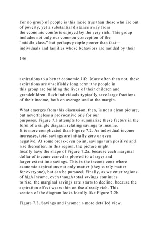
![148
technology or preferences, but in this case neither has
happened. In both cases we are dealing with exactly the same
groups of people, whose overall preference structure is no
different in the two scenarios, and nowhere in our
analysis did we rely on technological differences.
The idea that historical circumstances shape the structure and
course of a country’s development, without
recourse to explanations based on intrinsic differences (based
on technology or preferences), is one that we have
seen before. We will see it again, at various points in this book.
7.2.5. Inequality, political redistribution, and growth
In the previous section, we studied how inequality can affect
growth via changes in aggregate savings. We noted
that high inequalities can be harmful for growth if the middle
class has a higher marginal savings rate than the either
the rich or the poor.
A second connection between inequality and growth was
highlighted in the work of Alesina and Rodrik [1994],
Persson and Tabellini [1994], and others.10 High economic
inequality might retard economic growth by setting up
political demands for redistribution. Now redistributions might
take one of two broad forms. First, a policy might
aim to redistribute existing wealth among the broader
population. A good example of this is land reform. If land is
held very unequally, the government may have the option to
simply confiscate land from large landowners and
redistribute the confiscated land among smaller peasants or
landless laborers. Likewise, it is possible to have](https://image.slidesharecdn.com/1developmenteconomics-221224051007-11cbd63c/85/1Development-Economics-docx-338-320.jpg)

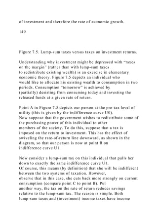
![Another proxy for wealth inequality is the inequality in some
(relatively) easy-to-observe asset, such as land.
Data on land inequality are easier to come by, although they are
plagued with problems of their own. Of these
problems, the most serious is the distortion created in countries
that are subject to a land reform measure through
the imposition of land ceilings. In such countries land belonging
to a single individual or household may be held
under a variety of names, thus creating the illusion of lower
inequality than there actually is. Aside from this
problem, land inequality can only be a good proxy for overall
inequality in wealth if agriculture is either
significantly important in the economy (for the beginning of the
time period under consideration), or at the very
least, has been of significant importance in the recent past.
Fortunately for our purposes, this is a condition that is
adequately satisfied by developing countries.
Alesina and Rodrik [1994] regressed per capita income growth
over the period 1960–85 on a variety of
independent variables, such as initial per capita income and a
measure of initial human capital. (We already
encountered this sort of exercise in Chapter 4, where we
discussed Barro’s [1991] study). Indeed, as far as these
variables are considered, Alesina and Rodrik used the same data
as Barro. In addition, they included data on initial
inequality of income and initial inequality of land.11
Table 7.3. Initial inequality and subsequent growth.
150
Source: Alesina and Rodrik [1994].
Note: Figures in parentheses denote t values.](https://image.slidesharecdn.com/1developmenteconomics-221224051007-11cbd63c/85/1Development-Economics-docx-342-320.jpg)
![The Alesina–Rodrik findings are confirmed with the use of a
more comprehensive data set in Deininger and
Squire [1996b]. Initial land inequality is more significant than
initial income inequality and stays that way even
under several variations on the basic regression exercise (such
as the use of regional dummies, which you recall,
wrecked the Kuznets inverted-U hypothesis).13 The
insignificance of the political system also holds up under the
Deininger–Squire investigation.
Viewed in this light, it is perhaps no surprise that East Asian
countries such as Korea and Taiwan have some of
the highest rates of investment in the world. Early land reforms
in these countries placed them among the lowest in
land inequalities, and surely must have promoted economic
inequality overall, given the importance of agriculture
in all developing countries around 1960. The Gini coefficients
for land distribution in Korea and Taiwan were 0.34
and 0.31 in 1960, and these numbers are very low even by
relatively moderate Asian standards. For instance, for
India and the Philippines, the corresponding numbers are well
over 0.5, and for Latin America, the Gini coefficient
skyrockets to well above 0.8 for countries such as Brazil and
Argentina.
There seems to be little doubt, then, that there is a strong and
negative relationship between initial wealth
inequality (as proxied by the distribution of land, anyway) and
subsequent economic growth. The question is, What
drives this relationship? Might it be that lower inequality
encourages savings and investment, leading to higher rates
of growth along the lines discussed in Section 7.2.4, or is it that
the political redistribution effect is at work?
It is hard to answer these questions at the level of existing data.
For instance, we might argue, as Deininger and](https://image.slidesharecdn.com/1developmenteconomics-221224051007-11cbd63c/85/1Development-Economics-docx-344-320.jpg)
![Squire [1996b] did, that the redistribution explanation is
unsupported by the regression because the democracy
dummy is insignificant. After all, the political demands for
redistribution should matter more in a democracy, but it
is unclear whether this is necessarily the case: dictators like to
remain in power just as much as democratic
governments do, and they might react to high inequality with
high taxes at the margin, just as a democratic
government might.
Thus we must be content (for now) with the intriguing
possibility that there might be a robust and negative
empirical relationship between inequality and subsequent
growth.14 What drives this relationship is still very much
151
an open question, but hopefully this whets our appetite to learn
some more about possible connections between
inequality and development. We turn now to some other aspects
of this relationship.15
7.2.7. Inequality and demand composition
It is a simple truth that income determines not only the level of
consumption, but also its pattern or composition.
Perhaps the most important example of this shifting composition
is the falling share of food items in consumption
as income rises. The needs for food, clothing, and shelter are
fundamental and, therefore, absolutely dominant at
low levels of income. As income changes, a host of new
consumption possibilities open up and the budget share of
these new commodities begins to rise.](https://image.slidesharecdn.com/1developmenteconomics-221224051007-11cbd63c/85/1Development-Economics-docx-345-320.jpg)

![of income distribution are taken into account.
Example 1. England and the United States presented an
interesting contrast during the nineteenth century.
Manufacturers in the United States were adept at mass
production of many goods and turned out fairly sturdy
versions of what, in England, was produced in high quality by
skilled artisans. In the United States, the demand for
such products was generated by a large middle class, which
lacked the economic resources (and perhaps, also, the
inclination) to generate demands for the skill-intensive, high
quality, and certainly more expensive versions
produced in England. The twist in the tale is that mass
production also possibly ensured the existence of a large
group of individuals—not so rich, not so poor—whose demands
sustained mass production. In England, on the
other hand, the production of skill-intensive artisan products
certainly did not generate a middle class, thereby
closing the circle.17
153
Example 2. As a leading example of how the internal dynamics
of our process can be affected, consider the role of
government. In the United States, government spending
increased significantly during the two world wars and the
Great Depression. Lindert and Williamson [1985] studied how
the increase in government spending affected the
demands for skilled vers usun-skilled labor in the economy.
They found that government services were significantly
intensive in unskilled labor, whereas the composition of
government purchases was not that different from the rest
of the economy in its effects on the demand for labor skills.
Indeed, an increase in the share of government](https://image.slidesharecdn.com/1developmenteconomics-221224051007-11cbd63c/85/1Development-Economics-docx-348-320.jpg)


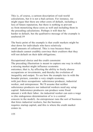


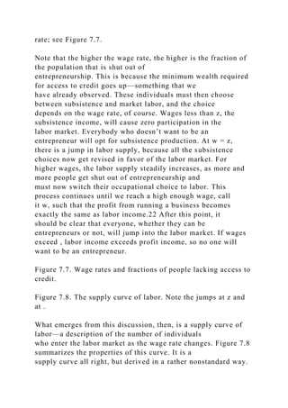
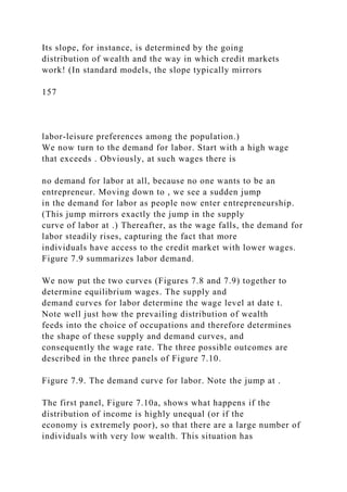
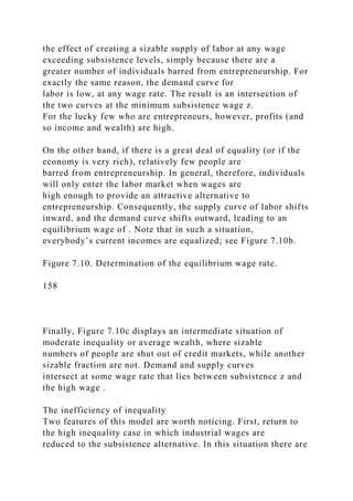

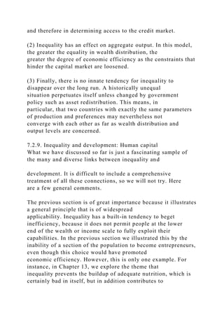
![difficult or impossible to enforce.
Thus high-inequality societies may be characterized by
advanced institutes of education and research that rank
among the best in the world. At the same time, the resources
devoted to primary education may be pathetically low.
There is no paradox in this, as long as we recognize the credit
market failure that is at the heart of this phenomenon.
To be sure, inequalities in education feed back and reinforce the
initial differences in inequality. This part of the
story is also analogous to the model of the previous section.
Multiple development paths can result: one
characterized by high inequality, low levels of primary
education, and inefficient market outcomes; the other
characterized by low inequality, widespread primary education,
and equalization of the rates of return to education
across various groups in society, which enhances efficiency. As
Loury [1981] puts it,
. . . Early childhood investments in nutrition or preschool
education are fundamentally income constrained. Nor should we
expect a
competitive loan market to completely eliminate the dispersion
in expected rates of return to training across families. . . .
Legally,
poor parents will not be able to constrain their children to honor
debts incurred on their behalf. Nor will the newly-matured
children of
wealthy families be able to attach the (human) assets of their
less well-off counterparts, should the latter decide for whatever
reasons
not to repay their loans. (Default has been a pervasive problem
with government guaranteed educational loan programs, which
would
not exist absent public underwriting.) . . . The absence of inter-](https://image.slidesharecdn.com/1developmenteconomics-221224051007-11cbd63c/85/1Development-Economics-docx-366-320.jpg)
![family loans in this model reflects an important feature of
reality, the
allocative implications of which deserve study.
Loury was writing about the U.S. economy, and so was Okun
[1975] when he judged the constrained accumulation
of human capital to be “one of the most serious inefficiencies of
the American economy today.” Consider the same
phenomenon magnified severalfold for developing countries.
7.3. Summary
In this chapter, we studied the functional aspects of inequality:
its connections with other features of development,
such as per capita income and rates of income growth.
We began with an empirical investigation of the inverted-U
hypothesis, due to Simon Kuznets, which states that
inequality rises at low levels of per capita income and then
falls. Early evidence suggests that developing countries
appear to have higher inequality, on average, than their
developed counterparts. More detailed investigation runs
into data problems. There are no sufficient data to
comprehensively investigate inequality in a single country over
time, so the majority of studies rely on analysis of inequality
over a cross section of countries.
The first cross-section study with evidence for the inverted-U
was that of Paukert. Even though his data set of
fifty-six countries displayed wide variation in inequality, there
appeared, on the whole, to be an inverted-U
relationship over the cross section. More recent (and more
comprehensive) data sets support this observation, and so
(at first glance) do more formal statistical methods such as
regression analysis. We discussed in this context the
study of Ahluwalia, whose regressions delivered additional
support for the inverted-U over a larger sample of](https://image.slidesharecdn.com/1developmenteconomics-221224051007-11cbd63c/85/1Development-Economics-docx-367-320.jpg)
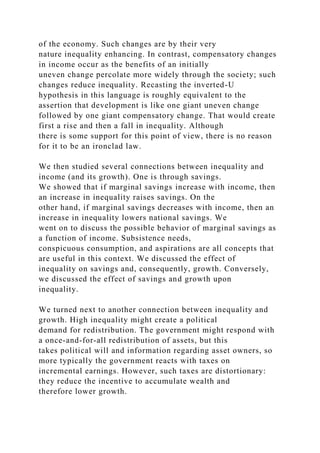
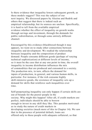

![Assumption 2. Being an entrepreneur when wages are at
subsistence levels is better than being a worker: (q − mz)
− (1 r)I > z.
Assumption 1 states that repeated subsistence cannot cause an
indefinite rise in wealth. Look at equation (7.5) to
understand just why this requires the algebraic inequality at the
end of that assumption. [Hint: Reverse the
inequality and see what happens to wealth over time as you
repeatedly apply (7.5).]
This assumption gets us away from complicated issues that
pertain to growth (recall our discussion in the text
about changing startup costs.) Don’t take the assumption
seriously, but think of it as a tractable way to study a long-
run wealth distribution (see the following text).
Assumption 2 already is implicit in the exposition of the text.
We want to study the steady-state distributions of wealth in this
model; that is, a distribution that precisely
replicates itself. Ask yourself, What is the long-run wealth of an
individual (or a sequence of generations,
depending on your interpretation) who earns the subsistence
wage z year after year? The long-run level of
“subsistence wealth” Ws will replicate itself: if W(t) = Ws, then
W(t 1) Ws as well. Using this information in
(7.5) [or (7.6), which is the same here because wages are at
subsistence], we see that
Ws = s(1 r)Ws sz,
and using this to solve for Ws tells us that
Now, to arrive at this wealth level, we presumed two things.](https://image.slidesharecdn.com/1developmenteconomics-221224051007-11cbd63c/85/1Development-Economics-docx-373-320.jpg)
![interest rate; the other is in the form of a ceiling on loans.
Discuss how these two phenomena may come about. In
particular, why is it that a higher interest rate cannot always
compensate for the possibility of default and that a
credit limit needs to be set? [See Chapter 14 for more on these
matters.]
(11) Explain carefully why greater inequality in wealth
distribution tends to shift the supply curve of labor to the
right and the demand curve to the left when there are imperfect
capital markets. In the process of doing this, explain
how the supply and demand curves for labor depend on the
wage rate, and take care to explain why the positions of
these curves depend on the overall distribution of wealth.
(12) Using the model studied in Section 7.2.8, explain why
better information regarding borrowers and their credit
histories is likely to reduce the adverse effects of inequality on
output.
1 The third column does not, of course, provide a precise sense
of the variation within income categories. However, a more
careful analysis
only strengthens our conclusions. For instance, Fields [1980, p.
69] regressed the Gini coefficient on per capita GDP (with
exactly the same
data set), with a squared entry on GDP as well, to capture the
nonlinearities of the inverted-U. In turns out that these entries
only “explain” 22%
of the total variation in the Gini coefficient.
2 For a description of this dataset, see Deininger and Squire
[1996a].
3 The use of a dummy variable for socialism is based on the
possibility that there might be systematic structural differences
between](https://image.slidesharecdn.com/1developmenteconomics-221224051007-11cbd63c/85/1Development-Economics-docx-380-320.jpg)
![socialist and nonsocialist countries, so inequality data from
these two sets of countries should not be unconditionally
pooled.
4 Although each of these regressions yields its own support for
the inverted-U, the “turning point” at which inequality reaches a
peak and
then declines varies from quintile to quintile. The richest group
appears to lose income share at relatively low levels of income.
On the other
hand, the poorest quintile does not start to gain until a high
level of per capita income is reached.
5 Other cross-section studies include Adelman and Morris
[1973], Ahluwalia, Carter, and Chenery [1979], Bacha [1979],
Papanek and Kyn
[1986], Bourguignon and Morrisson [1989, 1990], and Anand
and Kanbur [1993a, b].
6 The authors adopted three sets of requirements to admit
different surveys into their data set: observations must be based
on household
surveys (rather than national accounts), on comprehensive
coverage of the population, and on comprehensive coverage of
income sources. See
Deininger and Squire [1996a] for more details.
7 The observation that the United Kingdom shows a “positive
U” rather than an inverted one does not contradict the findings
of Lindert and
Williamson [1985], cited earlier. The data used in the
Deininger-Squire study are all “modern”: they began in the
1960s. The recent upsurge in
inequality in the United States and the United Kingdom is an
issue to which we briefly return when we discuss international](https://image.slidesharecdn.com/1developmenteconomics-221224051007-11cbd63c/85/1Development-Economics-docx-381-320.jpg)
![trade policy; see
Chapter 17.
8 Remember, though, that we are dealing with only one aspect
of an incredibly complicated scenario. There are many other
factors that
affect the evolution of economic inequality, and we will learn
more about them as we progress through this book. The
foregoing description is
not to be taken literally, but taken only as a way to capture the
effects of one (very important) set of factors.
9 Desired standards may well be different depending on existing
levels of income, but we avoid these complications here.
10 See, for example, Bertola [1993], Perotti [1992], and
Somanathan [1995].
11 The income inequality data are taken from Jain [1975] and
Fields [1989]. The land distribution data are drawn from Taylor
and Hudson
[1972].
12 The income inequality data present some problems, because
the earliest available data are for well after 1960, which creates
endogeneity
problems. Alesina and Rodrik corrected for this by
instrumenting for initial income inequality and by running
regressions for the shorter period
1970–85.
13 The problem with the Deininger–Squire regressions is that it
includes investment rates as an independent variable, which has
endogeneity problems. On the other hand, the Alesina–Rodrik
regressions do not have regional dummies.
14 Note that even this assertion requires more careful](https://image.slidesharecdn.com/1developmenteconomics-221224051007-11cbd63c/85/1Development-Economics-docx-382-320.jpg)
![investigation; for instance, by using regional dummies and
dropping investment from
the right-hand side of the Deininger–Squire regressions.
15 See also Chapter 13, where additional connections are
explored in the specific context of poor economies.
16 For a sample of the literature that studies inequality and
product composition, see de Janvry and Sadoulet [1983],
Murphy, Shleifer and
Vishny [1989b], Baland and Ray [1991], and Mani [1997].
17 Whether this circle was vicious or virtuous, I leave you to
judge! For a discussion of product composition in England and
the United
States, see Rosenberg [1972] and Murphy, Shleifer, and Vishny
[1989b].
18 The discussion that follows draws on ideas in Banerjee and
Newman [1993] and Galor and Zeira [1993].
166
19 Likewise, there are adjustments that can be made for innate
honesty, in case you find this example alarmingly cynical. As
described, I
have not allowed for any qualms of conscience on the
borrower’s part, but as long as individuals are moved to some
extent by the economic
considerations described here, a variant of this example can
easily be constructed to incorporate (a certain degree of)
honesty.
20 This calculation presumes for simplicity that all individual
economic occupations last only for one period. It is easy enough](https://image.slidesharecdn.com/1developmenteconomics-221224051007-11cbd63c/85/1Development-Economics-docx-383-320.jpg)
![to extend
this story by putting in many periods, but to make our main
points there is no need to do so.
21 This includes, of course, the probability of being caught at
all.
22 This critical wage is the solution to the equation (q − m ) −
(1 r)I = . Of course, we are assuming that the subsistence level
z is
less than ; otherwise there would be no industrial sector in the
model.
23 This follows from the fact that in the intermediate regime, w
< . Therefore, (q − mw) − (1 r)I > w.
24 Existing literature does not provide a satisfactory resolution
of this problem, though it is possible to build extended models
along the lines
to be suggested in the text. Banerjee and Newman [1993] and
Galor and Zeira [1993] both assumed that indefinite
accumulation of wealth was
not possible, so that the “credit trap” can persist over the long
run.
25 Thus further research on this topic will have to study the
composition of startup costs and how various components are
affected by the
development process.
26 If you are inquisitive about exactly how large this fraction
must be, look at this derivation: At the subsistence wage, the
demand for labor
is mn, where n is the number of people who are entrepreneurs,
and the supply is − n, where N is the total population. For
Figure 7.10a to be
applicable, the supply must exceed the demand at wage z, so](https://image.slidesharecdn.com/1developmenteconomics-221224051007-11cbd63c/85/1Development-Economics-docx-384-320.jpg)
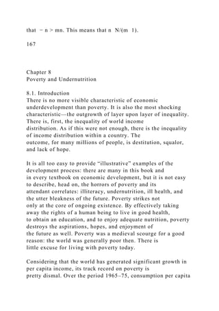
![8.2.1. Conceptual issues
At the heart of all discourses on poverty is the notion of a
poverty line: a critical threshold of income,
consumption, or, more generally, access to goods and services
below which individuals are declared to be poor.
The poverty line, then, represents a minimum level of
“acceptable” economic participation in a given society at a
given point in time. For instance, we could collect data on
minimum nutrient levels that make up an adequate diet,
on the prices of foodstuffs that contain such nutrients, and on
the costs of shelter and clothing, and then add up the
consumption expenditures needed to obtain these basic
requirements to obtain an estimate of the poverty line for a
particular society. We could use the prevailing legally decreed
minimum wage in a country as an estimate for the
poverty line of that country. Alternatively, we could fix some
other norm, say, 60% of the mean income of a
country, to arrive at an estimate of its poverty line.
168
Nutrition-based poverty lines are not uncommon. The poverty
line used in the United States is based on
Orshansky’s [1963, 1965] estimates, which scale by three a
minimum-budget estimate for food requirements (the
scaling proxies for other requirements such as rent and
clothing). Indian poverty lines have traditionally been drawn
by using estimates of expenditure necessary to guarantee a
minimum consumption of calories. Of course, such
poverty lines (and probably all poverty lines) should be
approached with some caution and scepticism: the poorer
the country, the better the nutrition- based approximation.](https://image.slidesharecdn.com/1developmenteconomics-221224051007-11cbd63c/85/1Development-Economics-docx-387-320.jpg)
![“acceptable levels of participation in society” can be given
absolute meaning, independent of the contours of the society
under consideration. In some societies, the ownership
of a television may be deemed socially necessary for living a
“full” life; in others it is not. Likewise, minimal
standards of leisure, access to scientific education, ownership of
private means of transportation, and so on, are all
concerns that must be evaluated relative to the prevailing
socioeconomic standards. These considerations quite
naturally give rise to the need for poverty lines that share
certain common components, but vary (perhaps widely)
from country to country.
Note carefully that although poverty lines should (and do)
incorporate relative notions of what constitutes
“necessity” or “basic needs,” we must still think of them as
fulfilling some absolute notion of the ability to function
in a society. The previous paragraph chooses our examples
carefully to make this point.3 For instance, it would be
foolish to define poverty by, say, the percentage of the
population earning less than half the average income of
society. Such a measure confuses poverty with inequality. For
instance, the measure would remain completely
unchanged if all incomes were scaled down by the same
proportion, plunging half the population into famine!
Temporary or chronic?
As we will see, people who live in (or close to) a state of
poverty, however that state is measured, often experience
significant fluctuations in their income and consumption. This
is especially true for the poor or near-poor in
developing countries, where a large fraction of the population
may depend on a quirky, weather-dependent
agriculture. Expressed as fractions of their average earned
income, these fluctuations are large. As Morduch [1994]
pointed out, notions of “structural” or chronic poverty must](https://image.slidesharecdn.com/1developmenteconomics-221224051007-11cbd63c/85/1Development-Economics-docx-389-320.jpg)
![therefore be complemented by a study of “temporary
poverty.” The latter occurs when, because of bad economic
shocks (such as poor rainfall or low prices for one’s
production), individuals temporarily enter a poverty sample.
The distinction is not just for the sake of a distinction:
the policies required to combat temporary as opposed to chronic
poverty may be very different.
The temporary versus chronic distinction is closely related to
Friedman’s [1957] famous distinction between
temporary and permanent income. Income in a given year may
be far from capturing the smoothed or “permanent”
stream of consumption that an individual or household enjoys
over time. For this reason, household or individual
169
expenditures are often thought of as a more reliable way to
assess chronic poverty.
Households or individuals?
Often household-level data on expenditure and income are all
that is available. It is tempting, then, to simply
express household consumption as individual averages (so that
household size can be accounted for), and then apply
one’s favorite measure of poverty. However, this neglects an
exceedingly important issue: that the allocation of
expenditures within the house-hold are often significantly
skewed. Among the potential victims are females and the
elderly. There is some evidence that such discrimination grows
sharper with the overall level of destitution of the
household. Macroestimates of poverty should therefore be
complemented by “microstudies” that study
intrahousehold allocation. We will study some examples in the](https://image.slidesharecdn.com/1developmenteconomics-221224051007-11cbd63c/85/1Development-Economics-docx-390-320.jpg)
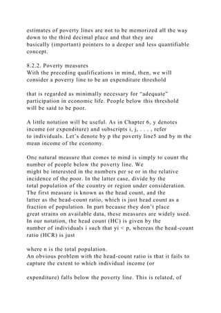

![important issue of relative deprivation among the poor.7
Relative deprivation is just another phrase for inequality among
the poor. The new phrase is used to capture the fact
that we are concerned only with the inequality among the
deprived, or poor. The main concern is captured by the
following example.
Example 3: Return to Example 1, where, as you will recall,
there are 200 people below the poverty line; half of
them have an income of 500 pah and the rest have an income of
900 pah.
(i) Suppose that each person who earns 500 pah gave 50 pah to
each person who earns 900 pah. The new
income levels are then 450 and 950 pah. What do you think
would happen to the intensity of poverty in this new
situation relative to the old? Now compute the HCR and PGR
(or IGR) in both situations. Compare what the
measures say with what you feel intuitively.
(ii) To make the point even more starkly, transfer 110 pah each
(instead of 50 pah) between the same groups and
redo the exercise.
Even if we were to take the head count and the gap-ratio
measures together, there are other aspects of poverty
that may be left out. This observation leads to more
sophisticated measures of poverty that have been proposed by
economists such as Sen [1976] and Foster, Greer, and
Thorbecke [1984]. With better data, these more demanding
measures can be easily applied. The Appendix to this chapter
contains a discussion of the Foster–Greer–Thorbecke
index.
8.3. Poverty: Empirical observations
We now turn to the data to get a sense of the extent of poverty](https://image.slidesharecdn.com/1developmenteconomics-221224051007-11cbd63c/85/1Development-Economics-docx-396-320.jpg)
![and the characteristics of the poor. We begin with a
universal poverty line to facilitate cross-country comparison. Be
aware that this is a tricky business. We already
discussed the fact that poverty has relative as well as absolute
components. The choice of some “universal” poverty
line creates overly high “real poverty” in some countries and
too little poverty in others. To partly circumvent this
problem, the World Development Report (World Bank [1990]),
which represents a landmark study on poverty in
developing countries, experimented with a choice of two
poverty lines: $275 and $370 per person per year,
expressed in 1985 PPP prices. The range was chosen to reflect
that fact that the poverty lines of some of the poorest
nations fall between these two limits.8
Table 8.1. Poverty in developing countries, 1985 and 1990,
using “universal” poverty lines.
Source: World Development Report (World Bank [1990, 1992]).
Note: Poverty lines are at 1985 PPP prices. The 1992 report
updates and changes head-count information for 1985 and
provides 1990 data.
The PGRs for 1985 are unaltered from the 1990 report.
Table 8.1 puts together poverty data from two World
Development Reports. Keeping in mind that these poverty
lines were chosen quite conservatively, the results are
staggering, to say the least. In 1990, well over one billion
individuals were estimated to earn less than $370 per year (or
$420 per year at 1990 PPP prices). The time trend
172
does not look very hopeful either. Except for East Asia, which](https://image.slidesharecdn.com/1developmenteconomics-221224051007-11cbd63c/85/1Development-Economics-docx-397-320.jpg)
![experienced very high rates of growth, the absolute
numbers of the poor rose significantly between 1985 and 1990.
The overall percentage of people in poverty (at the
$370 line) was roughly constant over this period at 30% of the
population of all developing countries.
Even if we were to use the extra-conservative poverty line of
$275 per year per person, we would see that in
1985, over 600 million people were poor even by these
unexacting standards. The overall figures for poverty would
be significantly higher were we to use country-specific poverty
lines.
We now turn to the characteristics of the poor.
8.3.1. Demographic features
It is not surprising that those households whose members fall
below the poverty line also tend to be large relative
to the average family. For Brazil, Fishlow [1972] reported that
29% of all families had a size of six or more
individuals, and over half of such families fell below the
poverty line. Similarly, for Malaysia, Anand [1977] noted
that the incidence of poverty rises with family size, ranging
from 24% in a household of one to 46% in households
with ten or more people. The World Development Report
(World Bank [1990]) observed that in Pakistan in 1984,
the poorest 10% of households had an average of 7.7 members;
the corresponding national average was 6.1.
Not surprisingly, these larger, poor families often have a high
ratio of dependent members, often children. In all
the examples cited, the number of children per family was
significantly correlated with their poverty. This is of
great concern, because it suggests that the burden of poverty
often falls disproportionately on the young. Given the](https://image.slidesharecdn.com/1developmenteconomics-221224051007-11cbd63c/85/1Development-Economics-docx-398-320.jpg)
![A natural characteristic of poverty is that it is correlated with
the lack of ownership of productive assets. As
usual, we must be careful not to establish a one-way causal
relationship between the lack of ownership of assets
and poverty. Just as the paucity of assets leads to poverty, a
condition of poverty leads to the sale of assets. In a
word, the scarcity of assets and poverty must be viewed as
closely related phenomena.
Given that poverty is so closely related with location in rural
areas, it is not surprising that the bulk of the poor
are found among the landless or near landless. Poverty and
small-scale agriculture are especially strongly correlated
in Africa: most of the poor in countries such as Botswana,
Ghana, Kenya, and Nigeria are small farmers or
pastoralists (World Development Report, World Bank [1990]).
Apart from southern Africa, where the rural poor hire
out their labor, the poor are largely self-employed. In contrast,
in South Asia, landless labor is more widely
represented among the poor. India, Pakistan, and Bangladesh all
display a mix of poverty that is borne as much by
landless labor as by small holders. Note, however, that after a
point, the distinction between small landowners and
landless laborers is blurred or meaningless: we are talking about
pitifully low quantities of land in any case.
Table 8.2. Rural and urban poverty in the 1980s.
Source: World Development Report (World Bank [1990]).
Nevertheless, it is true that there is a significant difference in
poverty once we move from negligible or near-
negligible holdings of land to more moderate holdings. Table
8.3 illustrates this difference.](https://image.slidesharecdn.com/1developmenteconomics-221224051007-11cbd63c/85/1Development-Economics-docx-401-320.jpg)
![Latin America shows the same concentration of poverty among
the landless or the near landless. In Costa Rica,
wage labor counts heavily among the poor, whereas Peru’s poor
are accounted for by small holders and herders.
The poor also participate in rural nonfarm employment, largely
cottage and traditional industries, the products of
which are destined for home consumption or local markets.
Table 8.3. Poverty and landholding in rural Bangladesh, 1978–
79.
174
Source: World Development Report (World Bank [1990]).
Urban poverty shows the same mix of self-employment and
wage labor. Most of the poor reside in the “informal
sector,” which we will study in more detail in Chapter 10. Self-
employment is common: as vendors, petty traders,
tea-stall owners, beggars, shoe-shine boys, garbage sifters, load
carriers, rickshaw pullers, roadside hawkers, and so
on. Wage employment is often on a casual basis and not subject
to minimum wage laws. Because of the chronic
lack of assets, the vulnerability of the poor, quite apart from the
low average levels of living, can be frightening.
Side by side with the scarcity of physical assets are the low
levels of human capital. The most important
determinant of the access to human capital is the ability to
temporarily remove oneself from the labor force and use
this period to acquire skills. This removal must be covered
financially, through either loans or the support of close
family and relatives. This kind of financial cover is the last
thing one can associate with the poor and, consequently,](https://image.slidesharecdn.com/1developmenteconomics-221224051007-11cbd63c/85/1Development-Economics-docx-402-320.jpg)
![it is far from surprising that the majority of poor have little or
no human capital. Illiteracy rates are very high
indeed, and among those who are not illiterate, there is little
evidence of schooling beyond primary levels.
8.3.4. Nutrition
There is an intimate connection between poverty and
undernutrition, especially in low-income countries. With
low income, it is difficult for individuals to acquire adequate
levels of food and nutrient consumption for
themselves and their families. “Adequacy,” as we shall see, is a
loaded word, because the notion depends
fundamentally on the kinds of activities in which an individual
is engaged, as well as the nutritional history of that
person. Nevertheless, it is not difficult to see the effects of
undernutrition. In children they are particularly severe:
muscle wastage, stunting, and increased susceptibility to illness
and infection. Undernutrition can also affect
cognitive skills. In adults, chronic undernutrition diminishes
muscular strength, immunity to disease, and the
capacity to do productive work. In the next section, we will see
how low nutrition can feed back on a person’s
capacity to do work, thus perpetuating the state of poverty in
which they find themselves.
In many countries, poverty and undernutrition are closely
related with each other, because the definition of the
poverty line often relies on the expenditure necessary to obtain
a certain minimum food or nutrient basket (plus
some margin for nonfood items). Examples include Malaysia
and India. Authors such as Lipton [1983] have argued
that using a calorie-based poverty line, or a food adequacy
standard, is an appropriate way to measure moderate or
extreme levels of poverty in developing countries.11 In such
examples it is not surprising that poverty and](https://image.slidesharecdn.com/1developmenteconomics-221224051007-11cbd63c/85/1Development-Economics-docx-403-320.jpg)


![pooling of data across the peak and lean seasons may confound
the elasticity estimates. Because food supply in the
peak or harvest season is more abundant, a change in the budget
does not translate into significantly higher nutrient
consumption. On the other hand, if food availability is low, as
in the slack season, and credit markets are imperfect
so that consumption cannot be fully smoothed over time (see
Chapter 14), an increase in household income in the
slack season is more adequately reflected in the demand for
nutrition. Both these points were made by Behrman,
Foster, and Rosenzweig [1994] (and by other authors as well).
Behrman, Foster, and Rosenzweig use a data set
from rural Pakistan, and found that a careful distinction
between slack and peak seasons pays dividends. Estimated
elasticities are high and significant in the slack. Moreover, they
are especially high for people who are landless or
near landless.
Later in this chapter, we turn to a converse relationship. What is
the relationship between nutrition and the
ability to generate income, or more broadly, on the ability to
perform economically productive work?
Nutrition and Income: A Case Study from South India
176
How do we go about estimating a relationship between nutrition
and income? Consider the demand for a basket of food items
consumed by households. The statistician’s choice of the basket
depends on the availability of data. Average estimates of the
nutrient
content of each food item (its calorie, protein, calcium, and
other contents) are available from nutrition data that record
such information.](https://image.slidesharecdn.com/1developmenteconomics-221224051007-11cbd63c/85/1Development-Economics-docx-407-320.jpg)
![Now suppose that household expenditure rises. Then the
demand for each of these food items will change, and we can
measure these
changes. If we multiply all these changes by the average
nutrient content (say, calories per gram or protein per liter) for
each food item and
add up, we obtain a measure of the change in nutrient
consumption as expenditure changes.
Table 8.4. Elasticities of calorie demand with respect to
household budget, arranged in ascending order.
Source: Behrman, Foster, and Rosenzweig [1994, Table 1].
aCalorie elasticity is estimated at the sample means.
bBudget was measured by household income.
cBudget was measured by household expenditure.
dThe first entry pertains to the lean season, the second to the
peak season when food is more abundant.
This method does take into account the change in the
composition of the food basket as expenditure rises, so that a
shift from more to
less nutritious foods can be captured as we move up the
expenditure scale. The problem is that the extent to which such
effects can be
captured depends on the richness of the data describing food
groupings. Often, this is inadequate. For instance, even if we
had data on
“rice” rather than “grain,” there are substitutions between short-
and long-grained varieties that cannot be picked up. With the
advent of
canned, processed, and packaged foods, the possibilities of
substitution are endless. Another way of stating the point is that
we cannot
assume that nutrient content stays constant within the food item
as we move from lower to higher levels of expenditure.](https://image.slidesharecdn.com/1developmenteconomics-221224051007-11cbd63c/85/1Development-Economics-docx-408-320.jpg)
![Typically and
unfortunately, the nutrient component seems to fall.
A study by Behrman and Deolalikar [1987] dramatically
displays this possibility. They used the foregoing method to
study six villages
in two states in the semi-arid region of India, known as the
ICRISAT villages.17 For the years 1976–77 and 1977–78,
special nutrition
surveys were carried out and nutrient intakes were recorded for
households. The nutrition surveys provided information on nine
nutrients:
177
calories, protein, calcium, iron, carotene, thiamine, riboflavin,
niacin, and ascorbic acid. This suggests a direct approach to the
problem:
simply relate consumption of these nutrients to the expenditure
by household.18 Contrast this with the food basket approach,
which the
authors discussed as well: they considered consumption changes
in six basic foods: sugar, pulses, vegetables, milk, meat, and
grains. Table
8.5 summarizes some of their results. Reported in this table are
the elasticities of expenditure on various items with respect to a
change in
the household budget. This is done first for the commodity
groups and then on the nutrients.19 Thus an entry of 0.57 for
sugar means that
if household expenditures were altered by 10%, the expenditure
on sugar would increase by 5.7%. An elasticity of 1 means that
expenditure on that item grows at the same rate as total
expenditure.](https://image.slidesharecdn.com/1developmenteconomics-221224051007-11cbd63c/85/1Development-Economics-docx-409-320.jpg)
![We see from Table 8.5 that elasticities for food items are large
and significant (the weighted average over food groups is 1.18),
whereas, apart from carotene, there is no strong nutrient effect
to speak of (all the estimated coefficients are insignificant at
the 5% level).
This raises a puzzle of some significance: Why don’t poor
individuals who are generally below the food adequacy standard
(and the
individuals in this sample were below the standard, on average)
significantly respond to budget increases by increasing their
nutritional
intake?
We have discussed this study in some detail because it presents
a counterintuitive position in a provocative way. Do not take
this to
mean that all subsequent studies find the same low relationship
between income (or expenditure) and nutrient intake. There are
significant
variations over countries, as well as over studies done at
different points in time on the same country, as the main text
illustrates.
Table 8.5. Elasticities of demand for food and nutrient groups.
Source: Behrman and Deolalikar [1987, Table 2].
Notes: An asterisk denotes that the variable was significantly
affected by household expenditure (see Appendix 2 for a
discussion of
“significance”). The elasticities were evaluated at the sample
means.
8.4. The functional impact of poverty
There is very little one can say to captures adequately the
degradation, the indignity, and the dehumanization of](https://image.slidesharecdn.com/1developmenteconomics-221224051007-11cbd63c/85/1Development-Economics-docx-410-320.jpg)
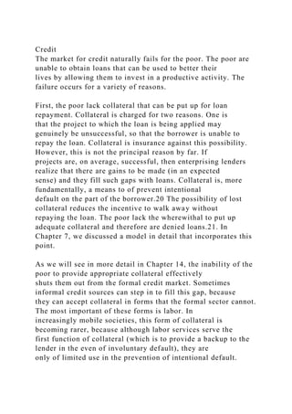


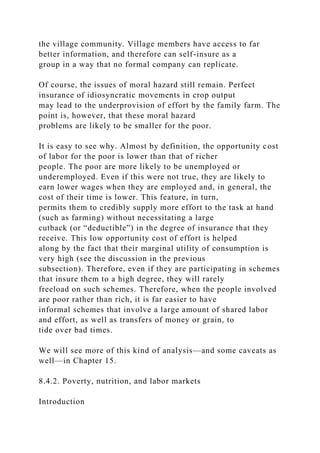
![human body. It has four main components.
1. Energy input. The periodic consumption of food is the main
source of energy input to the human body. It is
also the obvious point where nutrition meets economics. Access
to food, in most situations, is the same as access to
income. In the case of the poor, income chiefly represents
returns to labor supply and (to a lesser extent) to
nonlabor assets such as small quantities of land.
2. Resting metabolism. This is a significant proportion of the
body’s requirements. It represents the energy
required to maintain body temperature, sustain heart and
respiratory action, supply the minimum energy
requirements of resting tissues, and support ionic gradients
across cell membranes. For the “reference man” of the
Food and Agricultural Organization (FAO), who is a European
male and weighs 65 kg, this figure is around 1,700
kcal per day. Of course, the exact number varies significantly
with the characteristics of the individual and the
ambient environment in which he lives. An important
determinant, for instance, is body mass: a higher body mass
raises resting metabolism.
3. Energy required for work. The second significant component
is energy required to carry out physical labor.
The FAO’s 1973 estimate, applied to their reference man,
prescribed 400 kcal per day for “moderate activity.”
Unfortunately, as Clark and Haswell [1970, p. 11] pointed out,
the FAO reference man “appears to be a European
weighing 65 kg, and who spends most of his day in a manner
rather ambiguously defined, but apparently not
working very hard.” For the poor in less developed countries,
who are subject to hard labor of the most strenuous
kind, this may be a somewhat conservative estimate. Although](https://image.slidesharecdn.com/1developmenteconomics-221224051007-11cbd63c/85/1Development-Economics-docx-419-320.jpg)


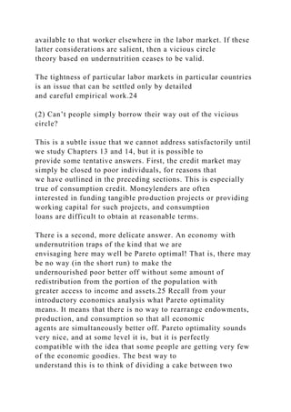

![up the wage rate for such an employee. This means essentially
that the employee will reap the entire benefit of the
employer-financed investment in the form of a higher wage. If
this is the case, then why undertake the investment
in the first place?
The problem can be overcome if the employee binds himself to
a contract that forbids him from working
elsewhere in the future even though the terms elsewhere are
better, but this has ethical connotations that make it
unenforceable by a court of law, and rightly so, from a moral
point of view.
(4) By the way, if such long-run relationships were somehow in
place for other reasons, would this have an
effect on nutritional status?
It might, but in a relationship where nutrition is used positively
by the employer to build up work capacity on
the part of her employee, there must be a separate factor, or set
of factors, that makes the relationship inflexible in
the sense that the employee is costly to replace. Consider three
quick examples.
The slave economy: Slavery is perhaps the most appropriate
example. Slaves were bought, and therefore each act of
replacement brought with it a large outlay, apart from the daily
costs involved in keeping slaves. Indeed, in the
American South, slave prices rose steeply in the decades before
the Civil War (Fogel and Engerman [1974, pp. 94–
102]). Thus an existing slave had great value to the
employer/owner. It turns out that slave diets were plentiful and
27
184](https://image.slidesharecdn.com/1developmenteconomics-221224051007-11cbd63c/85/1Development-Economics-docx-426-320.jpg)
![varied. The diet actually exceeded U.S. 1964 levels of
recommended daily allowances for all the chief nutrients.
Perhaps more to the point, the calorific value of the average
slave diet exceeded that of all “free men” in 1879 by
more than 10% (Fogel and Engerman [1974, p. 113]). In
addition, the maintenance of the health of slaves was
repeatedly emphasized in overseer manuals as a central
objective (Fogel and Engerman [1974, p. 117]).
Industry: The effect of adequate nutrition on the productivity of
workers has been emphasized repeatedly in
manuals. The monograph by Keyter [1962] on South Africa, for
example, contains many such references and a
closing section with fifty-four recipes. This book focuses on
industrial feeding, and in so doing squarely addresses
the obvious reasons for feeding in the workplace: by changing
the composition of wages in this manner, it forces the
worker to consume a greater proportion of his wage as food.28
Domestic servants: This is another good example of a labor
market that is likely to be inflexible. Servants are
associated with characteristics acquired on the job that make
them hard to replace. Not only is the loss of a servant
important, but the acquisition of a new servant with minimally
acceptable characteristics often results in an arduous
training process. We are interested in seeing studies of this
market in the Indian context; casual empiricism tells me
that such studies would prove quite supportive to our thesis.29
We refer the reader, instead, to an excellent
monograph on the subject by McBride [1976], which cites
various housekeeping manuals written for English and
French housewives in the nineteenth century. Although McBride
found the diet of servants to be generally
parsimonious (relative to that of master and mistress), more](https://image.slidesharecdn.com/1developmenteconomics-221224051007-11cbd63c/85/1Development-Economics-docx-427-320.jpg)
![than one manual explicitly suggests means to assure
servants a high level of energy. For instance, a popular French
manual of the early nineteenth century recommended
that servants be made to abandon the traditional Parisian
practice of café au lait in the morning and substitute a
breakfast of soup made from the meat left over from the
previous night, so that the servant would have enough
energy to work until 5 p.m. without stopping. Booth’s study of
life among London laborers concluded that “the
quality of food given to domestic servants . . . is usually very
good, and in all but very rare cases greatly superior to
that obtainable by members of the working-class families from
which servants are drawn” (Booth [1903, Vol. 8]).
8.4.3. Poverty and the household
The unequal sharing of poverty
One of the great tragedies of poverty is that the poor may not
afford to share their poverty equally. Unequal sharing
arises fundamentally from the fact that certain minimum
amounts of nutrition, care, and economic resources have to
be devoted to each person (including each child) in order for
that person’s life to be productive and healthy. In
situations of extreme poverty, equal division of household
resources might help no one, because the average
amounts are far too small. The potential merit of unequal
division is that it helps some individuals in the household
to be minimally productive under extreme circumstances. This
takes us right into the well-known problems of the
“lifeboat ethic”: a lifeboat can hold only two people and there
are three individuals to save. One person must die.
The capacity curve gives us a clear idea of how the nutritional
problem serves to promote unequal allocations.
Figure 8.3 displays the capacity curve, marked OAEB. The
straight line OAB is drawn from the origin so that the](https://image.slidesharecdn.com/1developmenteconomics-221224051007-11cbd63c/85/1Development-Economics-docx-428-320.jpg)

![systematically denied nourishment and medical care, so that
scarce resources can be better focused on some
remaining subset of family members.
The receiving end
Who are the individuals who are so denied? They are typically
females, both adults and children, and—the
presumed harmonies of the extended family notwithstanding—
the old and the infirm. Why the old should be so
treated is perhaps relatively easy to understand, especially in
the light of the preceding model: nutrition and medical
care serve a functional role apart from being ends in
themselves. They provide the foundation for income-earning
capabilities in the future. The old are in less of a position to
provide these capabilities. To the extent that income-
earning objectives are internalized in the social dynamics of the
family, the elderly will be discriminated against.
That is, no one individual needs to make these hard decisions,
but the discrimination will nevertheless manifest
186
itself in the actions of every family member—perhaps even the
elderly themselves.
Consider widows. Rahman, Foster, and Mencken [1992] studied
mortality rates for widows in rural Bangladesh,
and Chen and Drèze [1992] carried out a related study for
several villages in northern India. The loss of a husband
can be devastating in economic terms unless the widow owns
assets such as land, although here too matters are
complicated, because the possibility of land loss can in turn
depend on widowhood (Cain [1981]). As Chen and
Drèze [1992] observed, “the basic problem is not only that a](https://image.slidesharecdn.com/1developmenteconomics-221224051007-11cbd63c/85/1Development-Economics-docx-431-320.jpg)
![widow often depends on other household members to
survive, but also that these other household members typically
do not depend on her for anything essential” (Italics
added for emphasis).
Table 8.6. Age-specific death rates for widows in rural
Bangladesh.
Source: Rahman, Foster and Mencken [1992] and Chen and
Dreze [1992].
Table 8.6 shows how age-specific death rates vary with
widowhood in rural Bangladesh. The results are striking.
Overall death rates jump by a factor of close to 3 if a woman is
a widow, rather than currently married. In this
group, widows who are heads of households do relatively better
than the average for all widows. Widows living in
households that are not headed by themselves or by one of their
sons do particularly badly,32 and the explanation for
this cannot rest on the hypothesis that such households are, for
some reason, intrinsically poorer than other
households: there is no evidence that households with a widow
have lower per capita expenditures than households
without one (Drèze [1990]).
Observations such as these are not restricted to widows alone.
In the context of medical care, Kochar’s [1996]
study of extended families in South Asia found that medical
expenditures on the elderly vary systematically (and
inversely) with measures of their earnings ability, which implies
that the role of the household as a production unit
looms large when nutritional or health expenditure allocations
are made. This bias is reflected not only in smaller
allocations of medical expenditures to elders relative to the
expected incidence of illness in higher age groups, but
sometimes in absolute terms as well.33](https://image.slidesharecdn.com/1developmenteconomics-221224051007-11cbd63c/85/1Development-Economics-docx-432-320.jpg)
![Once we accept the argument that intrahousehold allocation has
functional as well as intrinsic motives, the
phenomenon of discrimination against the elderly is easy to
understand. It is somewhat more difficult to appreciate
how a similar burden falls on females, both adults and children.
Unless we believe that men are more fit than
women for tasks of various sorts, we cannot make the case for
discrimination against women on the basis of the
lifeboat argument alone. Intrahousehold discrimination against
females reflects the larger context of gender bias.
Suppose, for instance, that women provide household tasks
while men earn income. If household tasks are not
properly monetized in the psychology of household resource
allocation, then the lifeboat argument applies and we
would expect to see discrimination in resource allocation
against women. Likewise, even if women and men are
both engaged in monetary employment, but wages to women for
comparable work are lower, this will bias
resources away from women.
Table 8.7. Calorie intakes and requirements by sex in rural
Bangladesh (1975–76).
187
Source: Sen [1984, Table 15.3].
The issue is made more complex by the question of how to
measure nutritional deprivation. It may not be
enough to simply observe that women receive less nutrition than
men: the question is whether they receive less
nutrition relative to their requirements. The evidence on this
matter is not as clear-cut as you might expect. For](https://image.slidesharecdn.com/1developmenteconomics-221224051007-11cbd63c/85/1Development-Economics-docx-433-320.jpg)
![instance, the Institute of Nutrition and Food Science (INFS)
conducted a sample survey of nutritional intake by
household in rural Bangladesh.34 They also used notions of
“requirement,” namely, the age- and sex-specific
recommendations of the FAO/WHO Expert Committee (1973).
Table 8.7 summarizes some of the INFS
observations on calorie intake.
The table is interesting on two counts. First, the second and
fourth columns tell us that females receive
systematically lower nutrition in all the age groups surveyed
(and the age classification is pretty fine). The intake
shortfall varies from a minimum of 11% (in the youngest age
group) and rises to a high of 44% in the 70+ category
(in line with the observations on widows made earlier).
Second, and in contrast to the first observation, if the shortfall
is measured relative to stated requirements, this
discrepancy goes away. A deficit remains relative to
requirements at the two youngest age groups, but there is a
deficit for males as well. This raises the question of just what
requirements are and how they are measured. Apart
from considerations of body mass, do they presume different
sets of tasks performed by men and women? In
addition, how is it that the energy use of these tasks is
accurately estimated without pinning down a set of tasks
completely? As Sen [1984, p. 351] observed, “. . . there are
good reasons to dispute the assumptions about the
energy use of activities performed by women, which are not as
‘sedentary’ as calorie calculations tend to assume.
Also the extra nutrition requirements of the pregnant women
and lactating mothers require fuller
acknowledgement.” Measuring shortfalls relative to some
arbitrary notion of “requirement” can be dangerously
misleading.](https://image.slidesharecdn.com/1developmenteconomics-221224051007-11cbd63c/85/1Development-Economics-docx-434-320.jpg)
![Thus gender bias may or may not be directly manifested in
consumption-requirement ratios, as far as nutrition is
concerned. We may have to probe deeper. Very different sorts
of allocation decisions may be at work, even those
that do not have any direct opportunity costs. A female child
may not be taken to a clinic when she is ill even if
medical services are free. The cost of taking the child is not the
cost of medical care, but possibly the implied cost
of dowry if the child survives to maturity. A female child may
not be given education or her education may be
neglected simply because education of female children is not
expected to pay off in larger incomes for that
household (and it may not lower the cost of a dowry either). The
box on sibling rivalry in Ghana is an example of
research that looks for direct indicators such as these. Finally,
sex-based differences in infant mortality may take
care of a large amount of discrimination: the survivors may be
treated relatively equally, but in looking for this we
fail to count the dead.
These problems are magnified when we lack direct data on
intrahousehold allocation and have to make do with
indirect evidence. Deaton [1994] discussed one such method: to
look at household consumption of certain “adult
goods” (such as tobacco) and relate this to the proportion of
girls in the household (controlling for total number of
children). If there is consumption discrimination against girls,
this should be reflected in an overall increase in adult
consumption as the composition of children shifts in favor of
females. Deaton [1989], Subramanian and Deaton
[1991], Ahmad and Morduch [1993], and Rudd [1993], among
others, took this interesting methodology to the data.
No clear-cut findings were made, even in areas where other
indicators of discrimination (such as sex ratios) were
positive. Deaton [1994] observed that “it is certainly something
of a puzzle that the analysis of expenditure patterns](https://image.slidesharecdn.com/1developmenteconomics-221224051007-11cbd63c/85/1Development-Economics-docx-435-320.jpg)
![188
so consistently fails to show strong gender effects even when
they are known to exist.”
Sibling Rivalry: Evidence from Ghana
As in many other low-income economies, parents in Ghana
often invest less in the human capital of their daughters than
their sons.
Primary school enrollments are fairly even, but by secondary
school only 28% of females between age 16 and 23 attend
school, whereas
42% of boys are enrolled.
A study by Garg and Morduch [1997] explored how economic
constraints exacerbate gender differences in Ghana. The starting
point
for this study is that even if parents desire to invest a given
amount in their children’s human capital, they may lack the
personal resources
to do so, and even if expected returns are high, parents may find
it difficult to borrow for such long-term investments. Children
must then
compete with their siblings for the resources currently available
to parents. Boys have an advantage in this competition if
parents perceive
higher returns to this investment. If the total number of their
siblings is held constant, children with fewer brothers also may
get more
resources than they would otherwise.
The Garg–Morduch study supports this hypothesis in the case of](https://image.slidesharecdn.com/1developmenteconomics-221224051007-11cbd63c/85/1Development-Economics-docx-436-320.jpg)
![Ghana. For instance, the study shows that children aged 12–23
with
three siblings are over 50% more likely to attend middle or
secondary school when all three of their siblings are sisters than
when the three
are brothers. The effects are similar for boys and girls and for
other sibling groups. Similar results hold for health outcomes as
well. The
study is consistent with the idea of “sibling rivalry” caused by
parents’ difficulty in borrowing to make human capital
investments in their
children. The study illustrates the importance of considering
issues of gender within the context of markets and institutions
available to
households. The results suggest that improving financial
systems can have important indirect benefits for the health and
education of
children in Ghana.
What we have learned so far is that there are dimensions along
which females are discriminated against, but the
obvious indicator of discrimination—nutrition—does not hold
up well unless we have a precise notion of
requirements. There is the additional problem that direct
intrahousehold data are hard to obtain. Where they do exist
—as in the Ghana study described in the box—and where data
are collected on outcomes other than nutrition, such
as medical care and education, there is clear evidence of
discrimination against girls (see also Subramanian [1994]).
We must, therefore, seek to supplement this sort of research
with indicators of differential educational
attainment, direct anthropometric indicators of differential
nourishment, or indicators of differential mortality and
morbidity. These indicators are not without problems either,35
but they serve as another route to understanding the](https://image.slidesharecdn.com/1developmenteconomics-221224051007-11cbd63c/85/1Development-Economics-docx-437-320.jpg)
![relationship between poverty and intrahousehold allocation.
Consider educational attainment. The World Development
Report (World Bank [1996]) noted that for low-
income countries as a whole, there were almost twice as many
female illiterates as there were males in 1995 (the
illiteracy rates were 45% for females and 24% for males). This
disparity is echoed by enrollment figures: in low-
income countries taken together, male enrollment in primary
schools exceeded female enrollment by over 12%, and
the difference exceeded 30% for secondary schools.36 Note
well that these are averages for the countries as a whole.
To the extent that the relatively rich in these countries are free
of the resource constraints that lead to discrimination,
the corresponding figures for the poor in these countries must
be more dramatic still.37
Consider sex ratios: estimates of female-to-male population in
the developing world. In North America and
Europe, the life expectancy of women is somewhat longer than
for men. The roots of this difference are unclear:
they may be biological, but there are also possible social and
occupational factors at work. The average ratio of
female-to-male population in these countries is around 1.05;
that is, there are approximately 105 females for every
100 males. Figure 8.4 displays the corresponding sex ratios for
many developing countries. The first panel shows
the African data, the second shows the data for Asia, and the
last panel shows the data for Latin America. It is
evident that the problem of low female-to-male ratios is
predominantly an Asian problem. The figure for Asia is
peppered with data points in the range of the mid-90s, and there
are several instances that are lower still.
These differences imply enormous absolute discrepancies. If the
ratio of females to males is 93 (for every 100](https://image.slidesharecdn.com/1developmenteconomics-221224051007-11cbd63c/85/1Development-Economics-docx-438-320.jpg)
![males) in India, and India has approximately 440 million males
(United Nations [1993]), then about 30 million
women are unaccounted for in India alone.38 Thus sex ratios
around 95 or so represent prima facie evidence of
substantial discrimination, which might include neglect in
infancy or childhood (leading to death) or practices such
as sex-selective abortion.
189
Figure 8.4. Sex ratios (females per 100 males) in the developing
world. Source: United Nations Secretariat [1996].
The relative absence of skewed sex ratios in Africa makes an
interesting point. As we’ve noted before, poverty
alone cannot be responsible for the gender biases that we do see
in Asia, although poverty serves to reinforce these
biases. The overall social context of discrimination also plays a
role. Take, for instance, the institution of dowry.
Families might react to dowry by resorting to sex-selective
abortion, female infanticide, or discriminatory neglect
during the infancy of a girl (which amounts to infanticide).
Boys are preferred because they are a source of income
and support; girls are not because they impose costs.
Nevertheless, once a girl survives there may be less evidence
of discrimination in matters of nutrition and medical care. After
all, the costs, say, in terms of the potential for
marriage, are only enhanced in the absence of this care. Testing
for gender discrimination is therefore a complicated
issue, and it may be unevenly manifested through various
potential channels. There is no reason to expect that all
ways and forms of discrimination will be equally in evidence.
8.5. Summary](https://image.slidesharecdn.com/1developmenteconomics-221224051007-11cbd63c/85/1Development-Economics-docx-439-320.jpg)
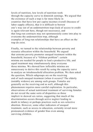
![Appendix: More on poverty measures
Poverty lines suggest that there is some sort of magic threshold
to poverty: people below the line are poor, whereas
people above the line are not. Quite apart from the serious
conceptual difficulties associated with this, there are
operational problems as well. Policy makers who have an
incentive to reduce poverty as measured by the head
count may not cater to the poorest, but rather only to those who
are easily nudged above the line. The poverty gap
measure gets around this to some extent, but problems remain.
Consider a natural application of the Pigou–Dalton
transfer principle to the measurement of poverty:39
Weak Transfers Principle. A transfer of income from any person
below the poverty line to anyone less poor, while
keeping the set of poor unchanged, must raise poverty.40
This sounds innocuous, but as we have seen in the text, both the
head-count ratio and the poverty gap (or the
income gap) fail to satisfy this criterion. Is this just nitpicking
or are there real-world phenomena that correspond to
191
these conceptual problems? The World Development Report
(World Bank [1990, Box 2.2]) discussed the effect of
an increase in rice prices on poverty in Java, Indonesia, in 1981.
Many poor households are farmers: they are net
producers of rice, so the price hike presumably helped them,
and indeed, the head-count index of poverty fell.
However, this masks another phenomenon: many of the poorest
people are not rice producers but landless laborers
or farmers with other sources of income. They are net
consumers of rice and they are adversely hit. Measures of](https://image.slidesharecdn.com/1developmenteconomics-221224051007-11cbd63c/85/1Development-Economics-docx-443-320.jpg)
![poverty that are “transfer sensitive” could pick up this change,
whereas traditional measures register a decline in
poverty.
The best known measures that address the distributional
underpinnings of poverty is the class proposed by
Foster, Greer, and Thorbecke [1984]. The idea is very simple.
Look at a variant of the poverty gap ratio in equation
(8.2), given by
which is just the sum of all individual poverty gaps, expressed
as a fraction of the poverty line, and then divided by
the total number of people in the society. Distributional
sensitivity is achieved by raising the poverty gaps to a
power, much as we did in our discussion of the coefficient of
variation as a measure of inequality. For any power α,
define a class of poverty measures, called the Foster–Greer–
Thorbecke (FGT) class, by
As we vary α over different values, we obtain interesting
implications. First note that for α = 0, the measure P0 is
just the head-count ratio. For α = 1, the measure P1 is the
poverty gap ratio in (8.4). As α rises beyond 1, larger
poverty gaps begin to acquire greater weight and the measure
becomes increasingly sensitive to these gaps and,
therefore, to questions of distribution, such as those raised by
the Java price hike.
The case α = 2 is of separate interest. With some manipulation,
we can show that
where HCR is the head-count ratio, IGR is the income gap ratio,
and Cp is just the coefficient of variation among
the set of poor people (see Chapter 6 for a definition). This is a
very useful way to see the FGT index for α = 2. It
tells us that when there is no inequality among the poor, poverty](https://image.slidesharecdn.com/1developmenteconomics-221224051007-11cbd63c/85/1Development-Economics-docx-444-320.jpg)
![can be captured by some simple function of the
head-count ratio and the income gap ratio alone, but the
presence of inequality raises poverty. To see this, imagine
that the Lorenz curve of incomes among the poor worsens,
while both the head-count ratio and the income gap
ratio are kept unchanged. Then, because the coefficient of
variation is Lorenz-consistent, Cp will rise and the FGT
index will rise as well.
There is another reason why the case α = 2 is of interest. It
marks the boundary between poverty measures that
not only satisfy the transfer principle, but satisfy what one
might call transfer sensitivity:
Principle of Transfer Sensitivity. A given regressive transfer
between two poor people must matter more if both
(starting) incomes of the persons involved are reduced equally.
It can be checked that the transfer-sensitivity principle is
satisfied if and only if α > 2. At α = 2 the FGT index is
just about insensitive to the principle.
The FGT family of poverty measures also satisfies a convenient
decomposability property. Suppose we are
interested in how much overall poverty in a country is
contributed by various subgroups: for instance, we may be
interested in looking at poverty across women and men or
across various ethnic groups.41 It would be useful if these
“subgroup poverty measures,” appropriately weighted by the
numerical strengths of the groups, summed to the total
poverty as measured by the same index. The FGT indices have
this property (see Foster, Greer and Thorbecke
[1984] for a more extended discussion).
Exercises
192](https://image.slidesharecdn.com/1developmenteconomics-221224051007-11cbd63c/85/1Development-Economics-docx-445-320.jpg)
![(1) Is poverty an absolute concept or a relative concept? There
are clearly some components (such as access to
food, clothing, and shelter) that we would consider necessary in
any society, but there are other components that are
clearly society–specific.
(a) Identify some components of “minimum needs” that you feel
are specific to one society but not another.
(b) Do you think these relative components are purely social (or
cultural) or are they apt to change with the per
capita income of a country?
(c) Because poverty has these relative components, consider the
following poverty measure: anybody who has less
than half (or some predetermined fraction) of the per capita
income of a society is poor. Why is this a bad approach
to poverty measurement?
(d) Try and identify some basic “capabilities” that you might
want any human being to have: for example, every
person should be capable of obtaining adequate nutrition, every
person should be capable of obtaining “adequate”
housing, means of transportation, and so on. Treat the right to
such capabilities as absolute. Now can you reconcile
the relative and absolute notions of poverty using these absolute
capabilities as a starting point? On these and
related matters, read Sen [1985].
(2) Read the 1990 World Bank Development Report to see how
international poverty calculations are carried out.
In the light of question (1), how would you evaluate such
calculations? Study the Report for a clear account of the](https://image.slidesharecdn.com/1developmenteconomics-221224051007-11cbd63c/85/1Development-Economics-docx-446-320.jpg)

![capacity curve. Assume that this family has access to a source
of nonlabor income, valued at $400. Assume
furthermore that each unit of capacity can fetch an income of 50
cents, and that all income is spent on nutrition. We
are going to examine the division of income among the family
members.
(a) Show that if all nonlabor income is divided equally among
the family members, then no one will be able to
sustain any work capacity so that labor income will be zero.
(b) Find allocations of the nonlabor income that give rise to
positive wage income. Compare and contrast these
allocations with the equal division allocation, using various
criteria (including Pareto-optimality).
1 See the World Development Report (World Bank [1990, Table
3.1]). The figures pertain to consumption in 1985 PPP prices.
2 On this, see, for example, Behrman and Deolalikar [1987] and
the box on nutrition and income in South India later in this
chapter.
3 For a detailed discussion of these matters, see Sen [1983].
4 There are conceptual questions regarding the construction of
such scales, although the existing practice of using per capita
expenditure (or
income) for a household can certainly be improved. For further
discussion, see Deaton [1997, Section 4.3].
5 This is taken to be denominated in the same units of currency
as income or expenditure. Thus, for instance, if the poverty line
is calorie-
based, p represents the amount of money that is required to
attain the acceptable calorie threshold.
6 Of course, this measure has the opposite problem: by ignoring](https://image.slidesharecdn.com/1developmenteconomics-221224051007-11cbd63c/85/1Development-Economics-docx-449-320.jpg)
![the overall wealth of the society, it tells us little about how
easily the
problem can be tackled, at least domestically.
7 For a more detailed treatment of this issue, see Sen [1976].
8 These are Bangladesh, Egypt, India, Indonesia, Kenya,
Morocco, and Tanzania. The lower limit, $275, coincides with a
poverty line used
for India.
9 Anand and Morduch [1996] used the Bangladesh Household
Expenditure Survey, 1988–89, to do this. Let x be aggregate
household
expenditure and m be household size. Then x/m is per capita
household expenditure. Now introduce a scaling factor α
between 0 and 1, and
think of mα as effective household size. Because 0 < α < 1, mα
rises slower than α, and this is a way of capturing returns to
scale. The smaller
the value of α, the higher the returns to scale. This procedure
captures some of the adult equivalence issues as well, because it
implies that the
larger the household, the greater the proportion of children, and
so effective household size (in adult equivalents) rises more
slowly Values of α
around 0.8 or lower are sufficient to overturn the observed
positive correlation between household size and poverty in the
Bangladesh data.
Whether this value of α represents “high” or “moderate” returns
to scale requires more careful investigation, however.
10 As Meesook [1975] and Fields [1980] observed, Thailand
appears to be an exception to this rule. Social custom there
provides greater
assistance to women who are without a principal male earner in](https://image.slidesharecdn.com/1developmenteconomics-221224051007-11cbd63c/85/1Development-Economics-docx-450-320.jpg)
![the household.
11 This is not to say that poverty should be identified with
undernutrition. For one thing, persons counted below the
poverty line in any one
year might be “temporarily poor” (recall our previous
discussion). For another, nutritional requirements vary from
person to person, whereas
the food adequacy standard used to measure poverty is an
overall average.
12 See, for example, the exercise conducted by Glewwe and van
der Gaag [1990] for Côte d’Ivoire, using data from the 1985
Côte d’Ivoire
Living Standards Survey. Côte d’Ivoire, however, did not
visibly suffer from an overall inadequacy of food supply in
1985. Children were
relatively well nourished even among the poor. This is not true
of countries where the overall nutritional base is much lower.
13 A classic application of linear programming is to the so-
called diet problem: find the lowest-cost bundle of foods that
will give you at
least so many calories, so much protein, certain minima of
various vitamins, and so on. The typical solutions to the diet
problem offer a very
low cost of attaining the required minima, but the foods will not
look very appetizing.
14 Pure wastage of food also may be an indicator of social
standing. It is unfortunate that very often the deliberate wastage
of a scarce
resource is a powerful way of signaling one’s social rank.
Viewed from this angle, the wastage of food is no more horrific
than the excessive
consumption of power, wood, paper, geographical space, and](https://image.slidesharecdn.com/1developmenteconomics-221224051007-11cbd63c/85/1Development-Economics-docx-451-320.jpg)
![many other resources in developed countries.
15 Other nutrients are of importance as well: see the case study
box on nutrition and income in South India.
16 The survey by Behrman [1993] discusses some of these
estimates.
17 For an introduction to the ICRISAT villages, see Chapter 10.
18 Of course, the nutrient intakes are themselves calculated
with respect to a basket of food items and are therefore
logically subject to the
same problem. However, direct observations on 120 foods were
made, and this is a very rich sample indeed, so it reduces, to a
large extent, the
compositional errors that we have discussed.
19 The figures that we report are estimates that control for
village and household fixed effects by the use of differencing.
The overall results
are similar without these controls, although the elasticity
estimates for particular items, noticeably milk, do change pretty
significantly. For
details, see Behrman and Deolalikar [1987].
20 Thus if the local pawnbroker accepts your
greatgrandmother’s watch, left to you as a family heirloom, as
collateral for a loan, it is not so
much that the watch will fetch a good price if you default on the
loan. The point is that the watch is valuable to you, so that if
you are
contemplating a default in a situation where you can afford to
pay, you will think twice about it.
21 For a more complete discussion of this issue, see Banerjee
and Newman [1994]
194](https://image.slidesharecdn.com/1developmenteconomics-221224051007-11cbd63c/85/1Development-Economics-docx-452-320.jpg)
![22 A classic example of moral hazard comes from health
insurance. The United States is a leading instance of the
problem. High levels of
insurance create an overuse of the medical system, because
patients run to their doctors on the slightest provocation and
receive treatments on a
scale unparalleled elsewhere in the world. Is this all for free?
Of course not. Over time, insurance premiums climb to
staggering heights, which
creates a situation that is very costly both at the personal and
the social level.
23 The material in this subsection draws on Dasgupta and Ray
[1986, 1987, 1990], Ray and Streufert [1993], and Ray [1993].
24 Take the case of the rural labor market in India, in which the
majority of India’s labor force participates. There seems to be
little doubt
that such markets are characterized by large and persistent
levels of unemployment, at least for significant fractions of the
year. The evidence
comes from a number of sources. For example, Krishnamurty
[1988] observed from National Sample Survey data that rural
unemployment
rates were high and increasing in the 1970s, although there was
significant interstate variation. Visaria [1981] and Sundaram
and Tendulkar
[1988] observed, moreover, that for agricultural households that
were primarily engaged in the rural labor market, these rates
were very high
indeed. Mukherjee’s thesis [1991] contains a careful review of
the relevant literature and, in addition, carries out a detailed
study of Palanpur](https://image.slidesharecdn.com/1developmenteconomics-221224051007-11cbd63c/85/1Development-Economics-docx-453-320.jpg)
![village, which reinforces the foregoing findings. High
unemployment is such an accepted feature for researchers
studying the Indian case that
theoretical analysis of labor markets is often driven by the
objective of explaining and understanding this one crucial
feature. The excellent
survey by Drèze and Mukherjee [1991] of theories of rural labor
markets illustrates this point well.
25 This is the argument made in Dasgupta and Ray [1986].
26 The cautious reader will notice that the argument is a bit
slippery here. There may be effects on relative prices that do
change
consumption allocations for the nonparticipants, but in the
simple one-commodity model that we consider in Chapter 13,
these claims are true.
27 Fogel and Engerman [1974, p. 111] pointed out that among
the “plantation products that slaves consumed were beef,
mutton, chickens,
milk, turnips, peas, squashes, sweet potatoes, apples, plums,
oranges, pumpkins and peaches,” in addition to corn and pork.
28 In this context, see also Rodgers’ [1975] study of some Bihar
villages, though in this study the reasons for on-the-job feeding
are
considerably more ambiguous.
29 Middle- and upper-class Indian households display an
extremely high degree of paternalistic concern regarding the
nutrition and medical
care available to their servants. Such concern seems particularly
out of line with the monetary wages paid to servants. Even
though this
paternalistic care has been molded by social custom to appear as](https://image.slidesharecdn.com/1developmenteconomics-221224051007-11cbd63c/85/1Development-Economics-docx-454-320.jpg)
![genuine caring, there is little doubt regarding the fundamental
motives behind
such behavior.
30 Of course these two extreme options represent an
exaggeration. Other intermediate divisions are obviously
possible, but we neglect them
for simplicity.
31 For more detailed analysis these lines, see Mirrless [1976]
and Stiglitz [1976].
32 To be sure, the fear of being without a son for support may
in turn impact on fertility decisions earlier on, and this may
account in part
for high fertility among groups known to discriminate against
widows (see Chapter 9 for more on this).
33 The problem is exacerbated in the presence of women and
children, who accentuate the trend in allocation away from the
elderly. The
analysis is complicated, however, by the puzzling observation
that savings are more likely to be run down for the treatment of
the elderly than
for young males, after controlling for the severity of the illness.
Kochar’s paper contains an insightful discussion of the possible
causes of this
seeming anomaly.
34 This discussion is drawn from Sen [1984, Chap. 15].
35 Kumar [1991], in his insightful study of Kerala, noted that
the incidence of illness in that state of India far exceeds the
national average.
This is especially true of diseases such as tuberculosis. Does
this prove that Kerala is the sickest state in India? It does not.](https://image.slidesharecdn.com/1developmenteconomics-221224051007-11cbd63c/85/1Development-Economics-docx-455-320.jpg)
![Data on morbidity,
or the incidence of illness, combine two features: the actual
incidence of illness, which is not observed by the researcher,
and its perception
(which includes reporting the illness). Kerala, with its higher
rates of education and literacy, may do very well on the latter,
thus raising
observed morbidity. The same ideas can be applied to the use of
morbidity as a test for discrimination between boys and girls. If
girls fall ill
more often but the illness goes unreported, morbidity rates
might look much lower for girls.
36 These figures are for 1993.
37 For middle-income countries these discrepancies begin to
fade, at least in the aggregate terms of measurement used by the
World Bank.
Nevertheless, male rates of illiteracy are consistently lower than
their female counterparts.
38 This is the case if we adopt the counterfactual scenario that
there “should be” 440 million males as well. There are two
reasons why the
number 30 million is probably an underestimate. First, there are
also males who died in infancy or childhood because of high
rates of child
mortality (of course, the additional female count so implied
would not all be attributable to discrimination). Second, the
counterfact assumes a
1:1 parity: if the European or North American figures are taken
as a benchmark, then the number of missing females would be
higher still. On
these and related matters, see, for example, Coale [1991], Coale
and Banister [1994], Klasen [1994], and Sen [1992].](https://image.slidesharecdn.com/1developmenteconomics-221224051007-11cbd63c/85/1Development-Economics-docx-456-320.jpg)
![39 This is the approach to poverty pioneered by Sen [1976]. A
discussion of the poverty index developed by him can be found
in Foster
[1984].
40 This is called the weak transfers principle because it restricts
consideration of transfers to those occurring between poor
people. For more
discussion on this matter, consult Foster [1984].
41 See, for example, Anand [1977].
195
Chapter 9
Population Growth and
Economic Development
9.1. Introduction
The world is populated today as it has never been before.
Although rates of population growth have fallen and will
continue to fall, we currently add about a million people every
four days to the world population, net of deaths.
According to projections carried out by the United Nations,
annual additions to the population are likely to remain
close to the ninety million mark until the year 2015.
It took 123 years for world population to increase from one
billion (1804) to two billion (1927). The next billion
took 33 years. The following two billions took 14 years and 13
years, respectively. The next billion is expected to
take only 11 years and will be achieved by 1998, at which time
we will arrive at the staggering figure of six billion.
Such is the power of exponential growth.](https://image.slidesharecdn.com/1developmenteconomics-221224051007-11cbd63c/85/1Development-Economics-docx-457-320.jpg)


![Source: World Development Report (World Bank [1995]) and
Human Development Report (United Nations Development
Programme
[1995]).
For instance, two countries with the same population growth
rates may have dramatically different age
structures. This is because one of the two countries (call it A)
may have a significantly higher birth rate and a
significantly higher death rate than the other country (B) (so
that the two cancel out in the comparison of net
population growth rates). At the same time, it is true that
country A is adding more young people to its population
than country B. Unless the higher death rates in country A are
entirely concentrated among the young, which is
198
unlikely, there will be more young people in A than in B. We
might then say that country A has a “younger age
distribution” than country B. As we will soon see, age
distribution plays an important role in determining overall
birth and death rates.
9.2.2. Age distributions
The age distribution of a population is given by a list of
proportions of that population in different age groups.
Table 9.2 gives us the age distribution of populations in
different parts of the world, as of 1995. It is apparent from
the table that the age distribution of developing countries is
significantly younger than in their developed
counterparts. I have never met a person who failed to be amazed](https://image.slidesharecdn.com/1developmenteconomics-221224051007-11cbd63c/85/1Development-Economics-docx-464-320.jpg)
![true even if age-specific death rates are high. It is worth
noticing that even though most developing countries have
higher death rates in each age group relative to their developed
counterparts, these differences are not adequately
reflected in the overall death rates, which lie far closer together.
Indeed, it is perfectly possible for country A to have
higher age-specific death rates at every age group than country
B, and yet have a lower death rate overall. This is
the effect of a young age distribution at work.
Table 9.2. Age distribution of the world population.
199
Source: Demographic Yearbook (United Nations [1995]).
Note: Individual figures may not add to total because of
rounding error.
Thus high rates of population growth lead to a younger
population, and then on to high birth rates and low death
rates. This creates an “echo effect” that keeps population
growth high.
One important consequence of this observation is that
population growth possesses an enormous degree of
inertia. Imagine that a country that has had high population
growth rates implements a policy to bring down total
fertility rates. The point is that even if this policy were to be
successful, population size would probably overshoot
the desired limits before settling down at an acceptable level.
The reason is simple. High population growth rates in
the past lead to a young age distribution. A relatively large
fraction of the population continues to be at the age
where they are just about to marry and have families. Even if](https://image.slidesharecdn.com/1developmenteconomics-221224051007-11cbd63c/85/1Development-Economics-docx-466-320.jpg)
![early death due to a myriad of causes. The advent of agriculture
changed all that, or much of that at any rate. With
an increase in the carrying capacity of Mother Earth came an
increase in population, but net growth was still
minimal, because death rates were high and persistent. Famine
continued to be commonplace, as were episodes of
plague, pestilence, and war. As late as in the eighteenth century
Malthus [1798] wrote of God’s checks and balances
to the sexual energies of women and men. A spontaneously high
rate of reproduction was countered with all manner
of disasters, such as regular outbreaks of plague, pestilence, and
famine. So although birth rates were high, death
rates were sufficiently high to keep growth rates down to a
crawl. We may think of this as the first phase of
demographic history.
A major change, however, was taking place, possibly even as
Malthus was recording the grim retributions of
Nature. With the advent of sanitation methods and increases in
agricultural productivity, death rates began to fall
around 1700, and the rise in industrial productivity sent Europe
into a veritable population explosion. Table 9.3
gives you some idea of this.
The population explosion would not have taken place, of course,
had birth rates simply followed death rates on
their downward course without any time lag. However, this did
not happen, and for two reasons. First, the very
forces that caused death rates to decline also caused economic
productivity to increase. For instance, the rise in
agricultural productivity meant not only that there was a lower
incidence of famine (thus bringing down death
rates), but also that the overall carrying capacity of the
economy in normal times increased. With room for a larger
population, the Malthusian restraints were loosened and the
urgency to bring down the birth rate therefore](https://image.slidesharecdn.com/1developmenteconomics-221224051007-11cbd63c/85/1Development-Economics-docx-468-320.jpg)

![but also relative to the peoples of those regions we know today
as the developing world. To see this shift in
population, it is useful to take a long-term view. Table 9.3 is
taken from a revised estimate of the world population
over the last few centuries (Carr-Saunders [1936]). We append
to this table the 1995 estimates from the United
Nations Demographic Yearbook. The results are very
interesting.
Table 9.3. Geographical distribution of the world population.
201
Source: Carr-Saunders [1936, Fig. 8] and Demographic
Yearbook (United Nations [1995]).
The table is constructed to emphasize the earlier centuries.
Neglect the last column for the moment. What we
have then is an array of population percentages running all the
way from 1650 to 1933. Note the decline of Africa,
in significant part due to outmigration, and the rise of North
America, in large part due to immigration. At the same
time, despite outmigration from Europe, her share of the
world’s population rose steadily over this period. Focus on
the first column and the second to last column (both in boldface
type) to see how the situation altered over the
period 1650–1933. What we see here is the period when Europe
began its demographic transition, while large parts
of the present developing world still lay dormant in the first
phase of demographic history.1 In 1650, the population
of Europe was about 100 million. In 1933, even allowing for
emigration (which was large), it had swelled to over
500 million.](https://image.slidesharecdn.com/1developmenteconomics-221224051007-11cbd63c/85/1Development-Economics-docx-470-320.jpg)


![now and in the future. Because slavery is banned (and socially
unacceptable anyway), it is generally not possible
(though unfortunately, not impossible) to market them for cash.
At the same time, when children grow up they can
convert their labor power into income, both for themselves and
their parents. Little wonder, then, that individuals
who lack insurance and old-age security, choose to invest in the
future in the form of children. This is the
background against which we investigate theories of fertility
choice.
Mortality and fertility
Consider the probability that a child will grow up to look after
its parents. This probability is given by several
factors. The child may die young; infancy is the biggest hurdle.
As we know from Chapter 2, infant mortality may
be close to 150 or 200 per 1,000 in several developing
countries, which translates into a 15% probability of death
by the end of the first year of existence. After this barrier, there
are still the diseases of childhood, which are still a
significant killer in many developing countries up to the age of
five or so.
Third, there is the possibility that the child may not be an
adequate income earner. The poorer the economy, the
greater this fear.
Fourth, a child may not look after its parents in their old age.
This is an interesting social factor that may cut in
either direction. In societies where the norm of looking after
one’s parents has practically vanished or is relatively
nonexistent to start with, the mental calculations that we are
going to talk about may have no relevance at all for
fertility decisions. For instance, economic historians such as
Williamson [1985] have argued that fertility reductions
in nineteenth century United Kingdom can be explained by the](https://image.slidesharecdn.com/1developmenteconomics-221224051007-11cbd63c/85/1Development-Economics-docx-480-320.jpg)


![For instance, if p = 1/2, if q = 9/10, and if the couple desire
support from a male child in their offspring, then
that couple will have, on average, eight children, all for the
sake of ensuring just one son!
In many societies, the provision of old-age support is thought to
be exclusively the task of male offspring.
Although support (especially in nonmonetary form) from female
children is just as valuable, there may be a stigma
associated with receiving support from daughters as opposed to
sons. This bias is, of course, a source of
discrimination in favor of male children.
To be sure, this argument does not explain the rationale behind
such a bias, and there may be many reasons. For
instance, Cain’s [1981, 1983] study of Bangladesh illustrates
the importance of sons as support for widows: the
ability of widows to hold on to land depends on whether they
have able-bodied sons. This will be especially true in
situations where property rights are either not well-defined or
difficult to enforce by the law.
Information, income, and fertility
Let us summarize the discussion so far. Individuals choose the
number of their offspring with the intention of
receiving support in their old age. This support may not be
forthcoming from a child for several reasons: (1) the
child may die, as an infant or later in life, (2) the child may not
earn enough income to support the parents, and (3)
the child may break parental ties and deliberately not support its
parents, even though it has the economic capability
to do so. The probability of these uncertain events taken
together we denoted by p.
The uncertainty described in the preceding paragraph has to be
compared with the tolerance threshold of the](https://image.slidesharecdn.com/1developmenteconomics-221224051007-11cbd63c/85/1Development-Economics-docx-483-320.jpg)
![parents, which is the minimum probability that they need old-
age support, and this threshold changes with the
degree of risk aversion of the parents. The degree of risk
aversion, in turn, depends in part on the economic security
of the parents. A higher level of security generally implies a
lower degree of aversion to risk.
These factors help us to uncover, to some extent, the reasons
behind a sticky fertility rate in the face of rapidly
falling death rates. The first element is information. How is the
social phenomenon of a falling death rate translated
to the level of individual decision making? We have already
commented on the rapidity of the decline in death rates
in developing countries. For twenty-one developing countries
during the period from just before World War II until
1950, the death rate dropped on average by seven per thousand
population every ten years (Coale and Hoover [1958,
p. 14]). For a historical demographer and indeed for any social
scientist, this is a remarkable change indeed and is
unparalleled in history for its rapidity. As Coale and Hoover
[1958, p. 14] observed, “this rate of improvement
surpasses anything from the records of areas inhabited by
northern and western Europeans.” Yet it would be
wondrous indeed if these changes made the newspapers at the
time! The fact of the matter is that individuals must
often go by their own experience, by which I mean their vision
of the experiences of their parents and the siblings
and friends of their parents. It is the preceding generation that
provides the only direct experience that is relevant in
this context.
Thus the fall of death rates may not instantly translate into a
revised estimate of mortality (see box, Three
Generations).
Three Generations4](https://image.slidesharecdn.com/1developmenteconomics-221224051007-11cbd63c/85/1Development-Economics-docx-484-320.jpg)
![The village of Rampur in India was surveyed by Lewis [1952]
and then resurveyed by Das Gupta [1994]. The story of Umed
Singh
comes from them. Umed Singh’s father was Siri Chand, who
was born around 1900. Epidemics of plague and cholera
decimated his
family including his father and mother. Siri Chand was brought
up by his uncle. As a farmer, he faced the kind of uncertainty
that is
difficult for us to even contemplate: consecutive crop failures,
famine, the occasional bumper crop, the loss of six out of nine
live births:
two girls and one boy survived to adulthood. The life of the
boy, Umed Singh (who was born around 1935), stands in sharp
contrast to
that of his father.
Umed Singh completed secondary school and became a
policeman. He earned a regular salary and also received income
from his land
(left to him by his father). However, the uncertainties of his
father’s life never ceased to haunt him. He was the sole
surviving son in a
family that had given birth to nine children. With no objective
reasoning to back his insecurity, Umed Singh worried and then
worried
some more. His first two children were girls. Because he wanted
a boy, he insisted on having more children. He had three more
children,
206
and two of them were boys, but he continued to worry that his](https://image.slidesharecdn.com/1developmenteconomics-221224051007-11cbd63c/85/1Development-Economics-docx-485-320.jpg)


![In societies where this opportunity cost is low, fertility rates
tend to be high. Gender bias plays a role in this as
well. In many societies (including many developed countries), it
is presumed that women must allocate the bulk of
their time to the upbringing of children. In such societies wages
for women’s work are low as well. This brings
down the opportunity cost of having children and keeps birth
rates high.
Similarly, if there are high rates of unemployment, the
opportunity costs of children comes down. Again, this
can push fertility upward.
This cost–benefit approach to fertility choice is natural to
economists. Becker [1960] introduced this approach to
other social scientists. Often, the methodology is not very
useful: simply stating that parents have children up to the
point where marginal benefit equals marginal cost may be an
impressive piece of jargon, but does not convey much
information. To make the cost–benefit approach useful, we must
either discuss benefits, or costs, or both in a way
that is relevant to the situation at hand. This is what we have
done so far with the notion of benefits. Instead of
stating that parents derive “utility” out of children, we describe
it specifically as old-age support, and this
description allows us to draw the specific conclusions that we
have arrived at so far. So it is with costs. We need to
understand how different kinds of costs have different sorts of
demographic implications. In the discussion that
follows, we illustrate this point by considering a specific case:
the effect of income improvements on fertility.
Figure 9.1 considers the preferences of a couple over the](https://image.slidesharecdn.com/1developmenteconomics-221224051007-11cbd63c/85/1Development-Economics-docx-489-320.jpg)

![the direct costs per child.
The exercise that we now conduct has to do with an increase in
family income. To fix ideas, suppose first that
the source of income increase is not wage income. For instance,
the individual in question may be a landowner who
receives all income from leasing land to tenants. Rents have
gone up. In this case, the budget line will undergo a
parallel shift, moving to the position CD [see panel (a)]. What
effect does this have on fertility? Well, if children
are “normal goods,” the income effect must raise the demand
for children, so that fertility rates go up as a result of
208
the income increase.
Contrast this change with a change in wage income. In this case,
the budget line will not only shift outward, it
will swivel as well. This is because the opportunity cost of
children has gone up. In Figure 9.1(b), we show this by
shifting the budget line out and rotating around the point B at
the same time, so that we have the new budget line
EB. Potential income has gone up, but at the same time the
opportunity cost of children has gone up as well. This
creates a substitution effect away from children as well as an
income effect. The substitution effect lowers fertility;
the income effect raises it. The net effect is ambiguous.
Despite the ambiguity, one thing is clear from Figure 9.1:
fertility certainly does not rise by as much as in the
case where the income increase can be traced to “nonearned”
sources. The intuition is straightforward. Wage
income imposes an opportunity cost of having an extra child,](https://image.slidesharecdn.com/1developmenteconomics-221224051007-11cbd63c/85/1Development-Economics-docx-491-320.jpg)
![whereas rental income does not. Thus wage income
increases have a stronger impact on fertility reductions than
rental income. This illustrates the usefulness of the
cost–benefit approach, at least up to a certain point.
We can easily extend this argument to the case of gender bias.
Suppose that only women look after children.
Then an increase in rental income has the same effect as an
increase in male wages: both lead to a parallel shift of
the budget line, as in the move from AB to CD. Male wages
impose no opportunity cost on childbearing if men play
no part in raising children. In contrast, the swiveling of the
budget line is characteristic of an increase in female
wages. The opportunity cost of having children will go up. It
follows that a society with gender bias is more likely
to exhibit a reduction in fertility when female wages go up, as
opposed to the case in which male wages rise. This
argument was examined in a paper by Galor and Weil [1996]
and by many others (see also the following box).
Women’s Wages and Fertility Decline: A Study of Sweden
Over the last century or more, there has been an increase in the
wages of women relative to men. This is certainly the case in
currently
developed countries. Along with this increase, we see a
concurrent reduction of fertility. Is this clear evidence of a
causal relationship
between women’s wages and fertility? It may not be. It is
conceivable, for instance, that a reduction in fertility occurred
for some other
reason, and this reduction was associated with larger
investments by women in education, which raised their wages.
In this hypothetical
situation, fertility and female wages are correlated, but no
evidence of causality is established. What we need is separate](https://image.slidesharecdn.com/1developmenteconomics-221224051007-11cbd63c/85/1Development-Economics-docx-492-320.jpg)
![evidence, quite
apart from actions that may have been taken by women
themselves “on the supply side,” that female employment is
more in demand. Then
we can relate this piece of evidence to the fertility decline.
Schultz [1985] raised precisely this question and addressed it in
an interesting way using Sweden as an example. In the second
half of
the nineteenth century, the world grain market went through a
declining phase of major proportions. The exports of Swedish
grain
collapsed. Faced with this decline in grain demand, there was a
substantial reallocation of resources in agriculture. Animal
husbandry was
the benefactor. Swedish exports of butter soared.
Now, dairying and the processing of milk employed a larger
fraction of women than did grain farming. As a result of this
reallocation,
the demand for female labor went up significantly and so did
the wages paid to women.
The usefulness of focusing on the butter boom is that it
effectively captures a pure demand effect on female wages,
rather than an
effect that could have been created by supply decisions. Did
fertility drop in response to the butter boom?
It did. Schultz shows that in regions where the price of butter
relative to rye (the basic food grain in Sweden) is high, the ratio
of female
to male wages was high as well and fertility rates were lower.
Indeed, following up on the link between butter prices and
female wages,
Schultz estimated that about a quarter of the decline in the](https://image.slidesharecdn.com/1developmenteconomics-221224051007-11cbd63c/85/1Development-Economics-docx-493-320.jpg)


![Jolting such a society into a “new equilibrium” is not easy. It
requires coordinated change. An example of such
a change is one in which ancestor worship is permitted through
adopted children. If everybody thinks this is
acceptable, then it’s acceptable. It is in this sense that programs
such as family-planning programs play a very
important role. Quite apart from spreading important
information regarding the cost, availability and effectiveness
of different methods of contraception, these programs serve as a
form of social legitimization. Consider the family-
planning experiment known as the Matlab project in
Bangladesh, in which seventy “treatment villages” were served
by a birth control/family-planning program in 1977, while
another seventy-nine “control villages” offered no such
service. Contraceptive use in the treatment villages jumped
from 7 to 33% in eighteen months. By 1980, the fertility
rate in the treatment villages had declined to two-thirds that of
the control villages.
What does the Matlab experiment teach us? One answer is that
contraception was an unknown concept. People
wanted to have two-thirds the number of children they were
having, but could not do so. Perhaps, but at face value,
this is unlikely. It is far more likely that the programs sent a
strong signal that a lower desired fertility rate is
actually a good thing: it is tolerated and indeed encouraged by
society at large. People responded to this by adopting
contraceptive devices to lower fertility. Thus it is possible that
the program served two functions simultaneously:
first, contraceptives were made widely available; second, and
perhaps more important, the program signaled the
advent of a new social norm in which lower fertility is actually
a “good thing.” Thus Phillips et al. [1988] wrote of
the Matlab experiment, “An intensive service program can
compensate for weak or ambivalent reproductive motives](https://image.slidesharecdn.com/1developmenteconomics-221224051007-11cbd63c/85/1Development-Economics-docx-503-320.jpg)


![so doing increases the dependency ratio in
families. Because children consume more than they produce,
this tends to lower savings rates as well. This is one of
the effects emphasized by demographers Coale and Hoover
[1958] in their classic work on the subject.
The savings effect works in very much the same way as the
direct population growth rate effects. In the Harrod-
Domar model, it exacerbates the reduction in growth rates
[allow s to fall as well in equation (9.2)]. In the Solow
model, there continue to be no growth effects, but the long-run
time trajectory of per capita income is shifted down.
Population, inequality, and poverty
A high rate of population growth will exacerbate the poverty
problem, if the arguments in the previous section are
valid. It will also worsen inequality if population growth among
the poor is disproportionately larger.
Do the poor have more children? From the discussion in the
previous sections of this chapter, that would appear
to be the case, although the connections are not unambiguous by
any means. It is more likely that the poor need
children for old-age support. It is more likely that infant
mortality rates are higher for the poor, so having a larger
number of children to compensate is more likely to occur for the
poor. We already know that this will translate into
a higher expected number of surviving children (because risk-
averse couples generally overcompensate for these
risks).
It is somewhat harder to compare the relative costs of child
bearing. Poor families are likely to have a higher
degree of labor force participation by females, simply because
additional income is of greater importance. This
raises the opportunity costs of having children. However, it is](https://image.slidesharecdn.com/1developmenteconomics-221224051007-11cbd63c/85/1Development-Economics-docx-513-320.jpg)
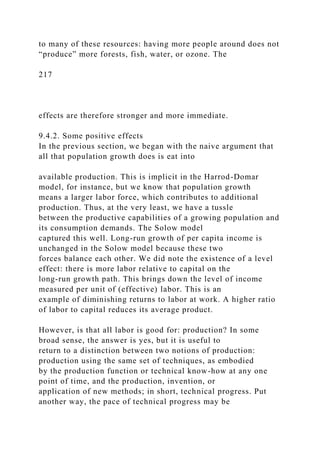
![endogenous in the sense that it is affected by population size.
Although we have discussed the endogeneity of
technical progress before (see Chapter 4), the demographic
effect on population growth merits additional attention.
The effect of population growth on technical progress can in
turn be divided into two parts. First, population
growth may spur technical progress out of the pressures created
by high population density. This is the “demand-
driven” view explored by Boserup [1981]. Second, population
growth creates a larger pool of potential innovators
and therefore a larger stock of ideas and innovations that can be
put to economic use. This is the “supply-driven”
view taken by Simon [1977] and Kuznets [I960].14
Population, necessity, and innovation
Necessity is the mother of invention, and population pressure
has historically created necessity. Nowhere is this
more true than in agriculture, where increasing populations have
historically placed tremendous pressure on the
supply of food. It is certainly the case that such pressure was
often relieved by the Malthusian weapons of famine
and disease that wiped out large sections of the population.
However, it is also true that scarcity drove man to
innovate, to create, or to apply methods of production that
accommodated the increased population by a quantum
jump in food output.
Several indicators permit us to see evidence of this even in
today’s world. Boserup [1981] classified countries
into different grades by population density: very sparse,
between 0 and 4 people per square kilometer; sparse,
between 4 and 16 people per square kilometer; medium,
between 16 and 64 persons per square kilometer; dense,
between 64 and 256 persons per square kilometer; and very
dense, 256 persons per square kilometer and upwards.15](https://image.slidesharecdn.com/1developmenteconomics-221224051007-11cbd63c/85/1Development-Economics-docx-516-320.jpg)

![218
Dense nnual cro ing with intensi e ani al husbandry.
Very dense ulticro ing
Agriculture is a leading example of how population growth stirs
up technical progress, but it is not the only
example. Here is Boserup again [1981, p. 102]:
The increasing population density in Europe facilitated
development of specialized crafts and manufactured goods. In
areas of dense
population, a large number of customers lived within a
relatively small territory. Direct contact with customers was
possible and
transport costs for products could be kept at a minimum.
Manufacturing industries. . . required skilled workers and
traders as well as
the financial services and administrative skills which were
concentrated in urbanized areas. Therefore, the areas in Europe
which first
developed manufacturing industries were those with the highest
population densities—Tuscany and the Low Countries. . . . Such
concentration occurred only later in France and England.
The argument thus far is quite clear, but what is unclear is how
we evaluate it. The first major problem is that
much of what is attributed to population growth can also be
attributed to increased per capita income. Income
creates demand just as population might, and it is a combination
of the two that is likely to drive innovation, or at
least the sort of innovation that is motivated by the desire to
make economic profit. Put another way, an increased](https://image.slidesharecdn.com/1developmenteconomics-221224051007-11cbd63c/85/1Development-Economics-docx-518-320.jpg)
![Is there any empirical truth to this assertion? Figure 9.7, which
is taken from Kremer [1993], puts together
various estimates of world population and the implied annual
growth rates from 1 million B.C. to 1990. Observed
population growth rates are plotted against the baseline values
of population. Clearly for much of recorded history,
population growth rates appear to be increasing with population
size. The trend reversed itself only after population
passed the three billion mark, which is circa 1960.
Thus the simple model of “supply-driven” innovation works
surprisingly well. It does predict the same
qualitative shape that we observe in the data, but we need to be
careful about taking this model too literally. For
instance, as set out now it also predicts that countries with large
populations should exhibit a high rate of technical
progress. That is, the time-series prediction passes over into a
cross-section prediction, which is far more dubious,
to put it mildly However, a simple extension of the model can
be used to account for this seeming discrepancy:
simply allow technical progress to be a function not just of
population size, but also of the per capita income of the
society. After all, it takes brains coupled with economic
resources to carry out useful scientific research. With this
modification in place it is evident that the strong (but wrong)
cross-section prediction disappears, but the time-series
prediction survives unscathed. After all, if per capita income
increases over time (as we argued that it will in this
model), then this extension cannot overturn the qualitative
features discussed earlier.
220](https://image.slidesharecdn.com/1developmenteconomics-221224051007-11cbd63c/85/1Development-Economics-docx-522-320.jpg)
![Figure 9.7. Population growth in world history. Source: Kremer
[1993, Table 1 and Fig. 1].
9.5. Summary
In this chapter, we studied population growth and its interaction
with economic development. Our goals were as
follows:
1. To describe and understand the observed patterns of
population growth in different countries; in particular,
the phenomenon of the demographic transition;
2. To analyze the social and economic factors that affect
fertility decisions at the level of the household;
3. To take note of possible features that create a systematic bias
between levels of fertility that are privately
optimal for the household, as opposed to those levels that are
socially optimal; and
4. To understand the impact of population growth on economic
development.
We began with terminology—the concepts of birth rates and
death rates—and took a look at data on these rates
for various countries. In the poorest of countries, both birth and
death rates appear to be relatively high. Then death
rates fall, while birth rates still remain high. Finally, countries
that have higher per capita income or have made
systematic efforts to control population growth exhibit birth
rates that are also low. Thus population growth rates,
which are just the difference between birth rates and death
rates, seem to rise and then fall over the course of
development.
We observed that the concept of an age distribution is important](https://image.slidesharecdn.com/1developmenteconomics-221224051007-11cbd63c/85/1Development-Economics-docx-523-320.jpg)
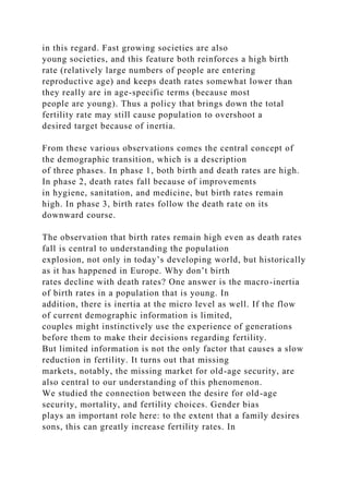


![(11) Studies for many countries have shown that labor force
participation by women tends to have a U-shaped
pattern with respect to growth in per capita income. Explain
why this contrasts with your findings in exercise 10
above. Discuss reasons why such a U-shaped curve of female
labor force participation may occur. The use of
income and substitution effects will help you to formulate your
answer.
(12) Evaluate the validity of the following statements.
(a) A developing country is likely to have an overall death rate
that is lower than that of a developed country.
(b) The populations of Europe and North America grew at a
combined rate between 1750 and 1900 that
significantly exceeded the population growth rates of
developing countries at that time.
(c) If country A has a population growth rate that is lower than
country B, then the average woman in country A has
less children than her counterpart in country B.
(d) Birth rates may be high even when death rates may be
falling.
(e) If total mortality among children remained constant, but the
incidence of that mortality shifted from late
childhood to early childhood, fertility rates should decline.
(13) Review the data on the demographic transitions for one
developed and one less developed country. For
instance, you could study the demographic transitions of
England and Sri Lanka (see Gillis, Perkins, Roemer, and
Snodgrass [1997, Chapter 7]) and make sure that you understand
the main trends in birth rates, death rates, and net](https://image.slidesharecdn.com/1developmenteconomics-221224051007-11cbd63c/85/1Development-Economics-docx-529-320.jpg)
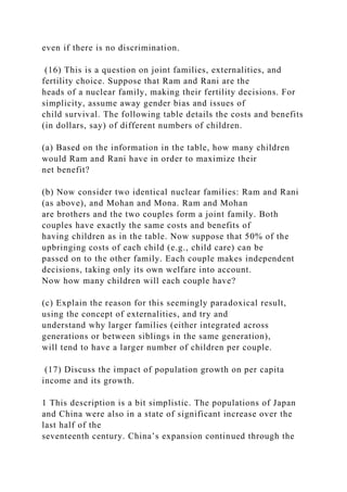
![eighteenth century. The demographic rise of Europe is even
more impressive
against this moving background.
2 On these and related matters, see Teitelbaum and Winter
[1985].
3 The account here relies heavily on a report of the Secretary
General of the United Nations, presented to the 28th session of
the Population
Commission, 1995.
4 This box is based on Das Gupta [1994].
5 There is a fourth as well, which is that families (especially
illiterate and poor families) do not know what is best for them.
In particular,
they procreate without thinking or being aware of effective
contraceptive methods. According to this view, an expansion in
the supply of
contraceptive devices and a good lecture will take care of the
problem. I do not discuss this viewpoint here, but see the
subsection on social
norms at the end of Section 9.3.
6 Even the ex ante choices may be suboptimal, because there are
missing markets. Specifically, in the absence of a missing
market for
insurance, in general, and old-age security, in particular,
families tend to overinvest in children. If these options were
provided, the number of
children per poor family would surely decline. The point is,
however, that the choices are ex ante optimal given that the
markets are missing.
7 It is even possible to extend this sort of argument to
externalities created at the level of the couple. To the extent](https://image.slidesharecdn.com/1developmenteconomics-221224051007-11cbd63c/85/1Development-Economics-docx-532-320.jpg)
![that men and women are
disproportionately engaged in child rearing, one of the parties
(typically the man) may ignore these costs and not take
adequate steps to reduce
fertility or the risks of pregnancy.
8 As an interesting twist on this argument, note that pronatalist
policies may themselves be self-defeating at the world level, to
the extent
that they inflict negative externalities on other countries. The
analysis of this second layer of externalities can proceed exactly
in the same way
as the negative externalities discussed in the text.
9 The desire for this sort of conformity can have surprising
consequences. At first glance, we might think that at the margin
there will be
some movement away from accepted practice, as people trade
off their desire to conform with the desire to do what is best for
them, but even
such marginal movements may be blocked in conformist
equilibria (on this point, see Bernheim [1994]).
10 This account summarizes material made available by the
United Nations Population Division, Department for Economic
and Social
224
Information and Policy Analysis, at
http://www.undp.org/popin/.
11 To be more precise, this is true if per capita income is a good
proxy for other features of development. On these matters, see
the](https://image.slidesharecdn.com/1developmenteconomics-221224051007-11cbd63c/85/1Development-Economics-docx-533-320.jpg)
![discussion in Chapter 2.
12 The cost, of course, is expressed by the marginal rate of
substitution between the two inputs of production and is
captured by the degree
of curvature of the production isoquants.
13 These last two statements are perfectly consistent, as Figure
9.5 shows.
14 The demand-driven story was studied in the context of a
formal model by Lee [1988]. The supply-driven story was
similarly explored by
Kremer [1993].
15 This scale, which is actually a coarsening of a finer division
used by Boserup, is logarithmic, like the Richter scale for
earthquake
intensities. Each higher category used by Boserup has twice the
density of the category immediately preceding it.
16 More detailed and careful analysis of this theme must correct
for the simultaneity of population and technique observations: it
is possible,
though unlikely that some other set of forces (such as
exogenous invention) first drove the adoption of certain
methods of farming, which then
increased the carrying capacity of that society. This alternative
cannot be logically ruled out in the way in which Boserup
presents the data.
17 The discussion here follows Kremer [1993].
18 This is because we are on the upward part of the curve in
Figure 9.6.
19 This does not rule out the possibility that there might be an
initial phase in which per capita income can actually fall, but
this phase must](https://image.slidesharecdn.com/1developmenteconomics-221224051007-11cbd63c/85/1Development-Economics-docx-534-320.jpg)
![be temporary: see Kremer [1993] for a rigorous analysis.
225
http://www.undp.org/popin/
Chapter 10
Rural and Urban
10.1. Overview
10.1.1. The structural viewpoint
The literature on economic growth, a good part of which we
studied in Chapters 3 and 4, might tempt you to
view economic development (or economic growth anyway) as a
process that transforms all incomes and all sectors
of the economy in some harmonious and even fashion. But our
study of inequality, poverty, and population growth
in later chapters does alert us to the possibility of uneven
growth—growth that first proceeds by benefiting some
groups in society. The same is often true of various sectors of
the economy. More often than not, economic
development entails the rapid growth of some parts of the
economy, while other parts are left behind to stagnate or
even shrink. The structural transformation that inevitably
accompanies change is an integral part of the development
process, and to study it we must look at economies in more
disaggregated form.
By far the most important structural feature of developing
countries is the distinction between the rural and the
urban sector. As we saw in Chapter 2, a significant fraction of
the population of a typical developing country lives](https://image.slidesharecdn.com/1developmenteconomics-221224051007-11cbd63c/85/1Development-Economics-docx-535-320.jpg)


![owner–cultivated plots in Shirapur had an average plot
value of Rs 29.68 per acre, whereas the corresponding figure for
Kalman was Rs 17.55 (Shaban [1987]).
Rainfall and cropping patterns
Although the villages are in reasonably close proximity, rainfall
patterns differ widely across them, and this is also
true of a single village across years. Farmers react sharply to
these differences: they can adopt very different
cropping strategies across villages and also respond to changing
climatic conditions. For example, in the villages in
Mahbubnagar and Akola districts, more than 90% of the area
cultivated is planted during the kharif or rainy season
because these villages receive more copious and less variable
rainfall, and are marked by shallower soils, with less
moisture retention capacity.
The Sholapur villages, on the other hand, have (relatively) deep
and rich soils that can hold moisture for longer
periods. Rainfall is relatively low and far more erratic in terms
of arrival time. Farmers in these villages, therefore,
wait until the end of the monsoon and rely more heavily on rabi
or post-monsoon season planting. Planting on dry
soil at the onset of the monsoon surely would have increased the
risk of crop failure in these villages, because of the
uncertain arrival time of the rains.
At the same time, in Sholapur, the relative importance of
monsoon and postmonsoon season cropping can vary
considerably from year to year. During “normal” years of
rainfall, rainy season crops account for about 40% of
gross cropped area, whereas during an unusually dry season
(e.g., in 1977–78), this share may drop below 10%.
Sometimes, farmers also react to adverse weather conditions by
altering the crop planted. An instance of this
occurred in Aurepalle in 1976–77, when the southeast monsoon](https://image.slidesharecdn.com/1developmenteconomics-221224051007-11cbd63c/85/1Development-Economics-docx-543-320.jpg)


![10.2. Rural–urban interaction
10.2.1. Two fundamental resource flows
The most important of many rural–urban interactions is the
synergistic role that agriculture plays in the
development of the nonagricultural sector. From agriculture
comes the supply of labor to industry and the surplus of
food that allows a nonagricultural labor force to survive. These
are the two fundamental resource flows from
agriculture, and they lie at the heart of the structural
transformation that occurs in most developing countries.
There are other connections as well. Industry supplies inputs to
agriculture: tractors, pump sets, chemicals of
various kinds, and so on. With a large population in the rural
sector, agriculture is often a major source of demand
for the products of industry, which include not just durables,
but final consumption goods as well. Agrarian exports
can serve as the source of vital foreign exchange, which permits
the import of inputs to industrial production. While
these links are important, the flow of labor from agriculture to
industry and the parallel flow of agricultural surplus
to nurture workers in industry are often basic to the
development process.6
10.2.2. The Lewis model
The dual economy
Lewis [1954] outlined a view of development that was based on
the foregoing fundamental resource flows. This
approach, which views economic development as the
progressive transformation of a “traditional” sector into a
“modern” sector, goes beyond the narrower picture of
agriculture-to-industry transformation, but essentially builds](https://image.slidesharecdn.com/1developmenteconomics-221224051007-11cbd63c/85/1Development-Economics-docx-548-320.jpg)

![if we cannot furnish a perfectly logical distinction between the
two concepts, they have general usefulness and help
us to organize our thoughts.
Essentially, the dual economy consists of two sectors that can
be characterized in a number of ways; each way
has suggestive advantages, but each carries with it the
possibilities of error as well. We label the two sectors
“agriculture” and “industry,” but recognize that these are
provisional labels and subject to change when the
particular issue under discussion needs a more precise
description. For instance, it may be useful in some cases to
view the urban informal sector as part of the “traditional”
sector.
Surplus labor
Arthur Lewis proposed a framework of economic development
that put the movement of labor from traditional to
modern sectors on the center stage. The traditional sector, in
this theory, is viewed as a supplier of labor, whereas
the role of the modern sector is to soak up this supply. Why
isn’t all the supply immediately absorbed? The answer
is that the scale of the modern sector is limited by the supply of
capital. Thus capital accumulation in the modern
sector becomes the engine of development. The fundamental
assumption, then, is that labor is virtually unlimited in
supply, being drawn from a vast traditional sector, whereas the
rate of savings and investment limits the pace of
development. In this latter sense Lewis is in agreement with the
Harrod–Domar view of economic growth (see
Lewis [1954]):
The central problem in the theory of economic development is
to understand the process by which a community which was
previously
investing and saving 4 or 5 per cent of its national income or](https://image.slidesharecdn.com/1developmenteconomics-221224051007-11cbd63c/85/1Development-Economics-docx-550-320.jpg)

![The production function is drawn so that after a certain level of
labor input, there is no significant effect on
output. After all, there is only so much intensity at which a
given plot of land can be cultivated, and after a point
additional inputs of labor may have no effect at all. Thus the
marginal product of labor at points such as A is zero or
close to zero.
Now consider a reduction in the amount of labor from A to B.
Because the marginal product of labor is assumed
to be close to zero, total output practically stays constant when
the reduction occurs. Because the family farm has so
much labor relative to land, labor is in surplus.
When might such a situation occur? First, it might occur in
economies where there is high population pressure,
so that there are large numbers of people per acre of arable
land. According to Lewis [1954]:
“[This state of affairs] is obviously not true of the United
Kingdom, or of Northwest Europe. It is not true either of some
of the
countries usually lumped together as underdeveloped; for
example there is an acute shortage of male labour in some parts
of Africa
and of Latin America. On the other hand it is obviously the
relevant assumption for the economies of Egypt, of India, or of
Jamaica . . . an unlimited supply of labour may be said to exist
in those countries where population is so large relatively to
capital and
natural resources, that there are large sectors of the economy
where the marginal productivity of labour is negligible, zero, or
even
negative.”
But the phenomenon is not just limited to agriculture. Again,](https://image.slidesharecdn.com/1developmenteconomics-221224051007-11cbd63c/85/1Development-Economics-docx-552-320.jpg)
![Lewis [1954] puts it best:
“Another large sector to which it applies is the whole range of
casual jobs—the workers on the docks, the young men who rush
forward asking to carry your bag as you appear, the jobbing
gardener, and the like. These occupations usually have a
multiple of the
number they need, each of them earning very small sums from
occasional employment; frequently their number could be
halved
without reducing output in this sector. Petty retail trading is
also exactly of this type; it is enormously expanded in
overpopulated
economies . . .”
If you remember our statistical description of the proportion of
the labor force in “services” (see Chapter 2), this
account will strike a responsive chord.
Third, a simplistic aggregate view of population density might
miss the point in many instances. Latin America
has a relatively large per capita endowment of land, but at the
same time land is very unequally distributed, so there
are a large number of family farms in the state described by
Figure 10.1. In such a case we might ask why the extra
labor is not hired out to those with a surfeit of land. This is
indeed possible and it does happen, but at the same time
it might also be the case that the large haciendas use capital-
intensive methods of production and do not hire labor
in proportion to their size. In a word, agriculture itself may be
dualistic. We will have more to say on this and
related phenomena in Chapter 12.
Income sharing and surplus labor
232](https://image.slidesharecdn.com/1developmenteconomics-221224051007-11cbd63c/85/1Development-Economics-docx-553-320.jpg)


![agricultural sectors of eastern and southeastern Europe and in
the Soviet Union. Rosenstein-Rodan [1943] and Nurkse [1953]
were among those who held this view.10 These
writers realized that the presence of redundant labor in the
agricultural sector meant that the population surplus
could be transferred out of the agricultural sector with no loss
in agricultural output. Surplus labor is, therefore, a
supply of labor that, given the preponderance of the agricultural
sector in less developed economies, is likely to be
of major quantitative importance in the development process of
less developed economies. This is the classical
tradition that Lewis inherited.
Surplus Labor: A Natural Experiment
Economic development with unlimited supplies of labora–
Arthur Lewis’s phrase was provocative enough to instigate a
flood of
research on the existence of disguised unemployment in
agriculture. We have seen that disguised unemployment refers
to a situation where
marginal product is less than the going wage. However, Lewis
had something stronger in mind: the possibility that “there are
large sectors
of the economy where the marginal productivity of labour is
negligible, zero, or even negative.” Although this assertion is
not strictly
necessary for the Lewis framework, it suggests the existence of
a free resource in agriculture: labor.
One of the most interesting early studies on surplus labor was
that of Schultz [1964], who studied the effect of the influenza
pandemic
in India (1918–19). The epidemic was sudden; the death rate
reached a peak within weeks and then diminished rapidly There
were a large](https://image.slidesharecdn.com/1developmenteconomics-221224051007-11cbd63c/85/1Development-Economics-docx-556-320.jpg)
![number of deaths. Schultz chose two years, one before 1916–17
and one after 1919–20, when weather conditions were
approximately
equal. He then estimated the existence of surplus labor by
comparing the reduction in acreage sown with the reduction in
the labor force.
His findings were that, as a result of the epidemic, the
agricultural population fell by 8.3% over these two years. He
made the following
observation [1964, p. 67]:
The area sown in 1919–20 was, however, 10 million acres
below, or 3.8% less than that of the base year 1916–17. In
general, the
provinces of India that had the highest death rates attributed to
the epidemic also had the largest percentage decline in acreage
sown
to crops. It would be hard to find any support in these data for
the doctrine that a part of the labor force in agriculture in India
at the
233
time of the epidemic had a marginal product of zero.
According to Schultz, therefore, surplus labor did not exist in
India at the time of the epidemic.
This study is interesting in its use of a “natural experiment” to
address an economic question. However, was the experiment
“natural”
enough? Consider the pattern of population decrease. Influenza
epidemics attack entire households and the epidemic of 1918–19](https://image.slidesharecdn.com/1developmenteconomics-221224051007-11cbd63c/85/1Development-Economics-docx-557-320.jpg)
![was no
exception. Thus entire plots of land were left uncultivated
during this period of time. As Sen [1967] pointed out in his
comment on the
Schultz study, if land is not redistributed following the labor
removal, it is not surprising that the sown acreage decreases. In
this short span
of time, this redistribution could not have taken place. Contrast
this with the view implicit in the theories of Lewis and others:
that is, in
each family unit there is a surplus of labor. The pattern of labor
removal from agriculture critically affects the fate of agrarian
output.
Two extensions of the surplus labor concept.
Two extensions of the surplus labor concept are of some
interest. First, note that surplus labor as defined in the
previous section is purely a technological concept: there is
simply too much labor relative to land, or more
generally, too many people relative to other inputs of
production, so that individuals are in surplus relative to
production possibilities: remove them to other activities and
output will not change because the additional labor
power is of no use at all: the marginal product of labor is
literally zero.
The inability of labor to add anything to output was criticized
by several economists as an unrealistic
phenomenon (see, for example, the box on the influenza
epidemic in India). For instance, Viner [1957] writes:
I find it impossible to conceive a farm of any kind on which,
other factors of production being held constant in quantity, and
even in
form as well, it would not be possible, by known methods, to
obtain some addition to the crop by using additional labor in](https://image.slidesharecdn.com/1developmenteconomics-221224051007-11cbd63c/85/1Development-Economics-docx-558-320.jpg)

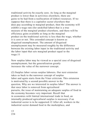
![if such food isn’t forthcoming, the resulting inflationary spiral
can destroy the prospects of industrialization.
So in this view, the question of maintaining agricultural output
(or at least not letting it fall by too much) is of
independent interest, quite apart from the efficiency calculus
that underlies marginal product comparisons.14
This raises a new point. We remove laborers, not labor. The
meaning of this cryptic sentence is that the
remaining laborers in the traditional activity typically adjust
their labor input once some laborers are removed (say,
through rural–urban migration). If there is an increase in work
effort on the part of the remaining laborers, total
output may not fall even though the marginal product of labor is
zero. This argument was originally made by Sen
[1966] (see also Takagi [1978]).
Why would the members of a family farm raise their work hours
to compensate for the departure of some of
their compatriots? The answer depends on the alternative uses
of labor applied to the farm. Such uses may involve
leisure or working elsewhere part time. If the marginal product
of such alternatives (which is exactly the marginal
cost of working on the farm) rises as more and more labor is
drawn away, then indeed there will not be full
compensation for the lost workers, but there will be some. In
the extreme case where the marginal cost of labor is
constant, there will be full compensation for the lost workers.
Even though the marginal product of labor is not zero,
the farm will exhibit a surplus of laborers, in the sense that as
laborers are removed from the farm, output will not
fall.15](https://image.slidesharecdn.com/1developmenteconomics-221224051007-11cbd63c/85/1Development-Economics-docx-561-320.jpg)
![The reason for all this is very simple. Efficient resource
allocation on the family farm requires that the value of
marginal product of effort be equal to marginal cost. The first
panel of Figure 10.2 shows how this familiar
calculation yields a total labor input for the family. Now the
point is just this: if the marginal cost of family labor is
constant, then the total cost is just a straight line as shown in
the figure, and total family input is determined
independently of family size! This is just another way of saying
that the removal of some members has no effect on
total output (but note that the marginal product of labor is
positive). The insight is that the removal of family labor
has no effect on marginal cost if the marginal cost of labor for
each family member is constant (and identical across
members).
Figure 10.2. Surplus labor and surplus laborers.
Of course this state of affairs is altered if marginal cost
increases with effort. The second panel of Figure 10.2
shows this scenario. Then the total cost curve of the family is
shifted upward as laborers are removed (provision of
the same level of family effort as before now involves a higher
marginal cost). Output will fall, but even so, the
distinction between labor effort and the number of laborers is a
point that is worth appreciating.
Economic development and the agricultural surplus
Armed with these forgoing concepts, we can describe the
interplay between rural and urban sectors as envisaged by
Lewis and later extended by Ranis and Fei [1961].
In the traditional agricultural sector there is disguised
unemployment, perhaps even a core of surplus labor, and
the wage rate is given by income sharing. The industrial sector
is capitalistic. Economic development proceeds by](https://image.slidesharecdn.com/1developmenteconomics-221224051007-11cbd63c/85/1Development-Economics-docx-562-320.jpg)
![the transfer of labor from agriculture to industry and the
simultaneous transfer of surplus food-grain production,
which sustains that part of the labor force engaged in
nonagricultural activity.
Figure 10.3, which is based on Ranis and Fei [1961], provides a
schematic description of how the labor force
and the corresponding agricultural surplus is transferred in the
process of development. In each panel of the
235
diagram, the industrial labor force is read from left to right,
whereas the agricultural labor force is read from right to
left. Assume for simplicity that the total labor force is divided
between agriculture and industry. Then the width of
the panels corresponds to the entire labor force in the economy.
Figure 10.3. The Lewis–Ranis–Fei model .
It is best to read this figure from the bottom up. In the lowest
panel, we have drawn a typical agricultural
production function, except that it is drawn from right to left to
reflect the way we read agricultural labor on the
panels. The production function levels off just as in Figure
10.1, and there is a phase of surplus labor provided that
the entire labor force is in agriculture. This is shown by the
segment AB on the diagram. Moreover, if “wages” in
this sector are decided by income sharing, then the average
wage is just , which is proportional to the angle shown
in this panel. This turns out to be the wage in the nascent
industrial sector, as we will presently see. Thus the
segment BC has no surplus labor, but does exhibit disguised
unemployment, because the marginal product of labor](https://image.slidesharecdn.com/1developmenteconomics-221224051007-11cbd63c/85/1Development-Economics-docx-563-320.jpg)
![in agriculture is less than the wage for labor inputs in this
segment. To the right of C, the phase of disguised
unemployment ends.
What we will do in the next few paragraphs is carry out a
thought experiment. Starting with a situation where
the entire labor force is in agriculture, we will trace the
consequences of transferring labor to the industrial sector. In
particular, we will describe the minimum cost of hiring
transferred labor in industry. This will give us something
like a “supply curve” of labor to industry.16 The topmost panel
of Figure 10.3 shows this supply curve.
Begin with the entire labor force in agriculture. Suppose we
decrease this by a small amount, so that we are still
in the surplus labor phase. Then the total wage bill in
agriculture falls along the diagonal straight line in the lowest
panel, provided that the wage in agriculture does not rise. At the
same time output does not fall, because we are in
236
the surplus labor phase. An agricultural surplus therefore opens
up; this is given by the vertical gap between the
production function and the wage bill line. If we divide this
surplus by the number of transferred workers, then we
obtain the average agricultural surplus, where we are taking the
average or per capita surplus amount relative to the
transferred workers. It is easy to see that the average
agricultural surplus in the surplus labor phase must be exactly
. In the imagery of Nurkse [1953], it is as if each laborer simply
moved out of agriculture with his food parcel on
his back.](https://image.slidesharecdn.com/1developmenteconomics-221224051007-11cbd63c/85/1Development-Economics-docx-564-320.jpg)
![Now what is the minimum wage in industry? Well, if the wage
is still w* as before, transferred workers will not
be able to compensate themselves for the move, because it is
physically not possible for each of them to buy units
of food. This is because the average agricultural surplus has
fallen below . The immediate effect of this is that
food prices start to rise: the terms of trade between rural and
urban sectors begin to move against industry. To
compensate for this price effect, the industrial wage must rise.
However, rising wages that cannot solve the problem. No matter
how much the industrial wage rises, it is not
possible for workers to buy their old food parcel back, because
there simply is not enough to go around. The only
way that compensation can be achieved, then, is for industrial
workers to consume a mix of agricultural and
industrial products, the latter compensating them for the loss of
the former.
Is such compensation possible? It depends on how close the
traditional wage is to minimum subsistence. The
closer is to the minimum subsistence level, the larger is the
compensation required and the steeper is the increase
in the required industrial wage. Conversely, the easier it is to
substitute industrial consumption for agricultural
consumption, the softer is the necessary increase in the
compensatory industrial wage.
Ranis and Fei [1961] referred to this phase, where the supply
wage of labor tilts upward, as the “first turning
point.”
Continue the transfer of labor until we reach the point C, where
the disguised unemployment phase comes to an
end. At this point, the marginal product of labor begins to
exceed the traditionally given wage rate. It then becomes](https://image.slidesharecdn.com/1developmenteconomics-221224051007-11cbd63c/85/1Development-Economics-docx-566-320.jpg)

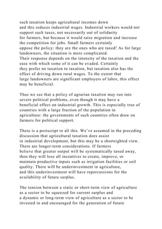
![surplus, represents an economic issue of great importance.
Walking this tightrope is no easy task and can have
enormous political connotations.
238
Agriculture versus Industry in the New Soviet Union
Of the newly created Soviet Union of the 1920s, Dobb [1966, p.
208] wrote: “The rate at which agricultural production could
expand
and afford a growing supply of raw materials for industry and
foodstuffs for industrial workers appeared as the crucial
question in
economic discussion in the second half of the decade: an issue
upon which all other hopes and possibilities rested” (Italics
added for
emphasis). It wasn’t that agricultural investment was
nonexistent: large imports of tractors occurred in the 1920s, the
majority of these
going to the collective or state farms. However, the marketed
surplus of food grain continued to be abysmally low: in 1925–
26, while the
total agricultural land area under cultivation was close to that of
pre-war sown acreage, the surplus on the market was only
around 70% of
the pre-war amount. With the land reform of 1917, land was
now more equally distributed and it was clear that the newly
endowed
peasantry were eating more and selling less.
There was no end of fretting and fuming about the problem of
agriculture. Oddly enough, some intellectual hardliners centered
around](https://image.slidesharecdn.com/1developmenteconomics-221224051007-11cbd63c/85/1Development-Economics-docx-571-320.jpg)
![Trotsky in the mid-1920s continued to view “further
development as only possible in the existing situation in Russia
if industry were to
expand at the expense of the peasantry” (Dobb [1966, p. 183]).
This view contrasted with the relatively moderate earlier views
of Lenin,
who regarded agriculture as a sector to be (at least
provisionally) treated as complementary to the development
process, creating and
retaining a smytchka, or bond, between the peasant and the
industrial worker. In the mid-1920s the government embarked
on a program of
food price stabilization that limited competition among
purchasers of grain and required all private traders to register
with the government.
State collecting organizations, which set price limits on
purchases, came to occupy a larger share of the grain trade. The
policy of price
stabilization was successful: food prices rose only by 2%
between October 1926 and March 1927, but grain purchases
collapsed. Thus
grain to the towns was sharply limited, as were grain exports in
exchange for needed imports of industrial inputs.
In 1928, Stalin described the situation thus17:
On January 1st of this year there was a deficit of 128 million
poods of grain as compared with last year . . . . What was to be
done
to make up the lost ground? It was necessary first of all to
strike hard at the kulaks (rich peasants) and the
speculators . . . . Secondly, it was necessary to pour the
maximum amount of goods into the grain regions . . . the
measures taken
were effective, and by the end of March we had collected 275
million poods of grain . . . . [But] from April to June we were](https://image.slidesharecdn.com/1developmenteconomics-221224051007-11cbd63c/85/1Development-Economics-docx-572-320.jpg)
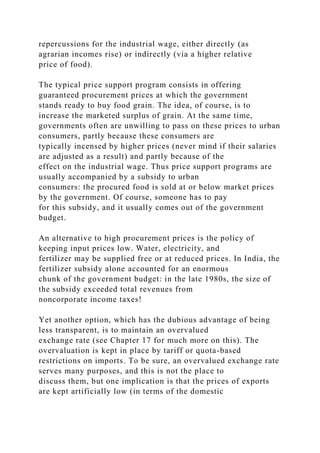
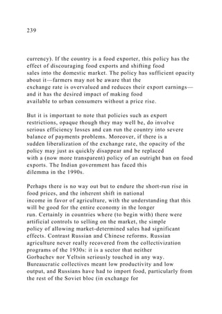
![armaments and other heavy-industry products). The collapse of
the Soviet bloc, the lowered demand for armaments,
and the need to now pay in hard currency all led to a food
shortage and high inflation.
China stands in sharp contrast. They began post-1978 reforms
with agriculture. Land was given to farmers (on
long leases) under the new “household responsibility system”
and collective farms were disbanded. Farmers were
allowed to sell on the market and market prices were
unregulated. This plan actually implied two conceptual
departures from earlier policy: the introduction of price
incentives and the abandonment of a regional self-
sufficiency-in-grain program, which had been in place since the
Great Leap Forward in 1958. This policy actually
required that each region plant crops for self-sufficiency,
regardless of whether or not they were suited to grow
those crops.
The resulting gain in agricultural productivity (and output) was
impressive. In the 1970s, TFP in agriculture was
20–30% lower than in 1952, the year before collectivization.
Just a few years after the reforms, TFP was back to the
1952 level and continued to grow steadily through the 1980s
(Wen [1993]). Agricultural output expanded by over
40% between 1978 and 1984 (see McMillan, Whalley, and Zhu
[1989]).
How much of the productivity growth can be traced to the new
surge in price incentives and how much to the
abandonment of the self-sufficiency policy? It appears that the
former accounts for almost all of the productivity
gains according to a decomposition analysis carried out by Lin
and Wen [1995]. The self-sufficiency policy,
macabre though it was, apparently was not the main culprit in
the earlier productivity stagnation.](https://image.slidesharecdn.com/1developmenteconomics-221224051007-11cbd63c/85/1Development-Economics-docx-576-320.jpg)
![Thus the initial price increase promoted much of the output
gains. In the longer run, this meant that China was
able to avoid the problem of continuously rising food prices or
food shortages, which in turn kept industrial wages
competitive and fuelled industrial growth.
The question is whether the initial rise in food prices that comes
from a pro-farmer pricing policy can be
politically tolerated. In the case of China led by Deng Xiao
Ping, the base of the Chinese Communist party was
formed by the farmers (who supported the party through the
Tiananmen episode).
However, there are limits to where price policy can take us
unless we start from an unusually repressed base.
Although Lipton’s [1968] point that there is often “urban bias in
rural planning” is certainly well taken, over-
inflated food prices can only retard industrial development.
There are other gaps to fill: as we shall see in the
chapters to come, agricultural growth is often limited by access
barriers to capital and credit, as well as intrinsic
disincentives that arise from agrarian contracts (which occur
primarily because such contracts need to play the
double role of assuring some incentives and some insurance).
Land reform, credit expansion, and infrastructural
investment all go a long way to assuring agricultural and
industrial growth. There would be no need to do this if the
markets to ensure such developments functioned smoothly, but
as we will see, they do not. A fuller consideration of
these issues is postponed to Chapters 12–15.
10.3. Rural–urban migration
10.3.1. Introduction
The Lewis model tells us that agricultural surpluses and labor](https://image.slidesharecdn.com/1developmenteconomics-221224051007-11cbd63c/85/1Development-Economics-docx-577-320.jpg)
![must be transferred in tandem for industrial
development to begin. But as we have already noted, labor
moves from one sector to another in obedience to its
240
own wishes and objectives. To the extent that these objectives
may be out of line with social goals or policies, we
might have over- or undermigration to the cities. The purpose of
this section is to discuss patterns of rural–urban
migration.
The classic theory of rural–urban migration is based on Harris
and Todaro [1970]. We start by talking about the
basic theory, and then extend the framework in a number of
different directions.
The main idea of the Harris–Todaro model is that the formal
urban sector pays a high wage to workers and it is
this high wage that creates urban unemployment (the mechanism
will be examined in what follows). Many reasons
might be provided for the phenomenon of an overly high urban
wage. The sector may be unionized and subject to
collective bargaining over wages, whereas other sectors of the
economy are not remotely as organized, so that
wages are more flexible in those sectors. In addition, the urban
formal sector is often treated as the showcase of
government policy, so that minimum wage laws, pension
schemes, unemployment benefits, day care, and other
facilities may be required by law. These provisions may not
raise the wage directly, but amounts to the same thing,
because such forms of compensation raise worker utility.](https://image.slidesharecdn.com/1developmenteconomics-221224051007-11cbd63c/85/1Development-Economics-docx-578-320.jpg)
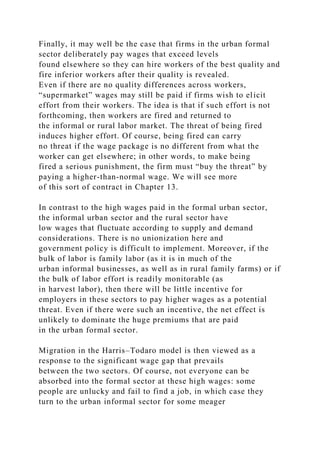

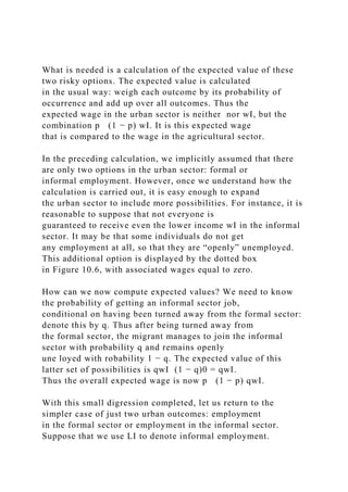
![Then we can see that the ratio
captures the probability of getting a job in the formal sector.
The number of employed people LF tells us how many
jobs there are, whereas the number LF + LI is the measure of
the total number of potential job seekers. The ratio of
the two thus gives us the chances that an urban dweller will get
a job in the formal or informal sector.20
Now we can work toward the important equilibrium concept
first introduced by Harris and Todaro [1970].
Migration from the rural sector may be thought of as an
irreversible decision, at least for the proximate future.
Because the fate of a potential migrant is not known, we must
consider the expected income from migration and
compare it with the actual income received in agriculture. Thus
we may conclude that if
we are at an equilibrium where no person wishes to migrate
from one sector to the other. This is the Harris–Todaro
equilibrium condition.
Some remarks are in order. First, the equilibrium condition
represents a situation where ex ante people are
indifferent between migrating and not migrating; ex post, they
will not be indifferent. The lucky subgroup who land
a job in the formal sector will be very pleased that they did
migrate, whereas those who seek solace in the informal
sector will regret that they made the move.
Second, observe that the equilibrium concept implies a
particular allocation of labor between the three sectors of
the economy. This is because it is the allocation of labor that
affects the perceived probabilities of getting a job. If it
is known, for instance, that the formal sector accounts for a
smaller proportion of total urban employment,](https://image.slidesharecdn.com/1developmenteconomics-221224051007-11cbd63c/85/1Development-Economics-docx-585-320.jpg)
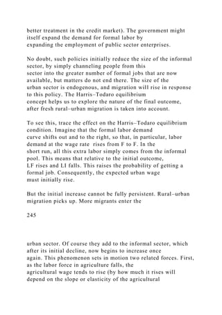
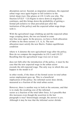
![as a fraction of the urban labor force, it is also true that the size
of the urban labor force has expanded. If the latter
effect dominates the former, the informal sector may well
expand—an implication of a policy that was directly
aimed at reducing the size of that sector!
To see this, imagine that the agricultural sector is in the
surplus-labor phase of Lewis, so that the wage in the
agricultural sector adjusts very little or not at all as fresh
migrants move out of agriculture. In that case, the share of
the informal sector in the total urban sector is practically
unaltered [simply look at (10.1) and (10.2), and use the
fact that w A is very close to wA], At the same time, it is
certainly the case that the entire urban sector has grown
from the first equilibrium to the second. This must mean that
the informal sector has expanded as well.
What accounts for this seeming paradox? How is it that a policy
designed to absorb people from the informal
sector ends up enlarging its size? As a matter of fact, there is no
paradox at all, but an observation that we see
repeated in one developing country after another. Attempts to
increase the demand for labor in the formal sector
may enlarge the size of the informal sector, as migrants respond
to the better job conditions that are available. The
migration effect may dominate the initial “soak-up effect.”
This observation is not limited to cases in which the demand for
formal- sector labor is increased. A similar
application can be carried out with regard to urban congestion,
pollution, or the provision of health facilities. In
each of these cases, policies aimed at directly reducing urban
congestion (say, by building more roads), reducing
pollution (say, by building a subway), or increasing the
provision of health (say, by building new public hospitals)
might all have the paradoxical effect of finally worsening these](https://image.slidesharecdn.com/1developmenteconomics-221224051007-11cbd63c/85/1Development-Economics-docx-590-320.jpg)

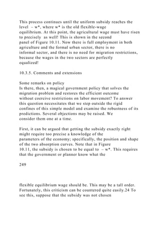


![migration decisions. Recall that the original Harris–Todaro
equilibrium condition [see equation (10.1)] equated the
expected wage in the urban sector to the wage in agriculture.
Thus we implicitly assumed that all individuals were risk-
neutral. The fact that their expected income might be
coming from an intrinsically uncertain lottery was of no
consequence to them. Expected income from a lottery is the
same as a guaranteed income, as long as the two have the same
value. We now see that if individuals are risk-
averse, this equivalence fails to hold.
Let us try to understand what a risk-averse potential migrant
would feel if the Harris–Todaro equilibrium
condition (10.1) were to hold economy wide. If you have read
and absorbed the discussion in the previous
subsection, the answer should be very easy. The potential
migrant will not migrate. The reason is that he is
comparing a certain wage in agriculture to an uncertain prospect
in the urban sector, both of which have the same
expected value. However, expected value alone is not good
enough for the risk-averse person. He craves insurance
as well. Because the urban sector is risky, he will need an
expected wage that is strictly higher than the wage he
receives in agriculture in order to be induced to migrate.
Consider Figure 10.13 once again. Note that the risky
prospect has the same expected value as the safe prospect, but
the expected utility of the risky prospect is lower.
Now let us see what effect this has on the allocation of
employment across the sectors. Clearly, an economy of
risk-averse individuals will exhibit less migration than an
economy of risk-neutral agents, so in such an economy,
the urban informal sector will be somewhat smaller and the
agricultural sector will be somewhat larger than that
predicted by the Harris–Todaro model. In this equilibrium, the
expected wage in the urban sector will exceed that in](https://image.slidesharecdn.com/1developmenteconomics-221224051007-11cbd63c/85/1Development-Economics-docx-604-320.jpg)
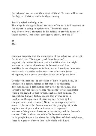

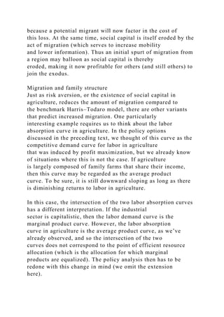


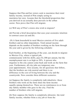

![district of Maharashtra state), Shirapur, line Kalman (in the
Sholapur district of
Maharashtra), Kanzara, Kinkheda (in the Akola district of
Andhra Pradesh), Boriya, and Rampura.
3 This material is largely based on Walker and Ryan [1990].
4 Sorghum is used as both food and fodder and is cultivated
throughout the semi-arid tropics. Sorghum originated in the
northeastern
quadrant of Africa and was distributed along trade and shipping
routes throughout Africa, and through the Middle East to India
at least 3,000
years ago. Sorghum is now widely found in the drier areas of
Africa, Asia, the Americas, and Australia. The ICRISAT home
page at
http://www.cgiar.org/icrisat/, from which this account is drawn,
contains more on sorghum.
5 Probably the world’s hardiest crop, pearl millet is a food
staple in the semi-arid tropics. Pearl millet has been used as a
cereal for
258
http://www.cgiar.org/icrisat/
thousands of years in Africa and parts of the Near East, and is
cultivated for both forage and grain. It is grown today in many
African countries
and in some Asian countries, particularly India. See ICRISAT’s
home page at http://www.cgiar.org/icrisat/ for more
information.
6 There are exceptions to every rule, of course. In some](https://image.slidesharecdn.com/1developmenteconomics-221224051007-11cbd63c/85/1Development-Economics-docx-620-320.jpg)
![countries, the creation of an agricultural surplus was not
fundamental to economic
development. These countries relied on the export of
manufactures to fund their import of food items. With
international trade in food grain, it
is possible in principle to have nobody in the agricultural
sector. A country can rely entirely on imported food. Such
countries do not follow the
general rule that we have outlined, but why are such situations
the exception rather than the rule? The answer to this question
must ultimately
lie with the notion of self-sufficiency in food: food is so basic
and so much the foundation of all activity that most
governments cannot bear to
think of a contingency in which their nations must depend on
others for this most basic of wants. Such attitudes go some way
in explaining why
agriculture enjoys extraordinary protection in many developed
countries, such as the United States, Japan, or in the European
Union.
7 See also Nurkse [1953], Jorgenson [1961], Ranis and Fei
[1961], Sen [1966], Dixit [1970], Amano [1980], and Rakshit
[1982].
8 On the so-called peasant mode of production, based on the
notion of traditionally organized family farms, see Georgescu-
Roegen [1960]
and Chayanov [1991].
9 Equal sharing is only a simplifying assumption and may not
hold in all situations. For instance, in Chapter 8 we studied the
possibility of
unequal division of output among family members in very poor
family farms, because of nutritional considerations.
10 See the survey by Kao, Anschel, and Eicher [1964].](https://image.slidesharecdn.com/1developmenteconomics-221224051007-11cbd63c/85/1Development-Economics-docx-621-320.jpg)
![11 This is actually an overestimate. As labor is released from
traditional activities and put to work elsewhere, the marginal
product in these
other activities typically falls. But as a micro estimate for one
particular farm, this measure isn’t a bad one.
12 I reiterate that the assumption of limited food-grain trade,
although realistic, is crucial to the argument. Without it only
the efficiency
argument that we just examined makes any sense.
13 For theories of development traps and inflationary spirals
based on a limited surplus, see Rao [1952], Kalecki [1976], and
Rakshit [1982].
14 Of course, simply maintaining output isn’t enough. The
excess also must be released to the market for consumption by
nonagricultural
workers. We return to this issue after a discussion of the Lewis–
Ranis–Fei model.
15 To be sure, this cannot happen if many family members are
removed, because the few that are left will have to put in
immense effort to
compensate and the marginal cost of such effort will surely be
higher than before.
16 It is not exactly a supply curve in the traditional sense
because in its construction we account for movements in the
relative price of
agricultural to industrial output, as well as for changes in the
agricultural wage rate induced by the transfer. See the
description that follows for
details.
17 Stalin’s speech was made to the Leningrad organization of](https://image.slidesharecdn.com/1developmenteconomics-221224051007-11cbd63c/85/1Development-Economics-docx-622-320.jpg)
![the Party and is quoted in Dobb [1966].
18 We neglect here the costs of migration, which can easily be
incorporated into the model.
19 To be sure, this is a simplification. Agriculture may have its
own variability of wages, depending the form of the contract
and the nature
of employment, but for simplicity, we ignore this variability
here.
20 The careful reader will see that this statement is only correct
if there is a rapid enough rate of turnover in the formal sector,
so that the
current level of employment can roughly be equated to the
number of available vacancies. With a smaller rate of turnover,
the number of
vacancies is not LF, but some number less than that, and
likewise, the number of job seekers is smaller than LF + LI. The
mode of analysis is
very similar.
21 The main problem is that the informal sector cannot be
depicted explicitly on this diagram.
22 This phenomenon is often referred to as the Todaro paradox.
23 Bhagwati and srinisavan [1974] discussed the uniform
subsidy that we study in this text.
24 On this point and its resolution, see Basu [1980].
25 This is not to say that such a scheme is entirely foolproof.
26 Alough the expositon here is unashamedly biased toward
simplicity, it must be noted that the postulate of a utility
function for money is
a bit misleading. What the literature does is begin with
preferences of individuals over various risky gambles, which is
just an extension of the
usual preferences in consumer theory over goods and services.](https://image.slidesharecdn.com/1developmenteconomics-221224051007-11cbd63c/85/1Development-Economics-docx-623-320.jpg)
![The well-developed theory of decision making under
uncertainty then shows
that these preferences can be represented (under some
conditions) by a utility function for money and the behavioral
postulate that an individual
acts to maximize the expected value of this utility. See Arrow
[1971] for an exposition of this theory.
27 This is often captured by assuming that individuals have
decreasing absolute risk aversion, where the qualifier
“absolute” refers to the
fact that we are talking about the same gamble against the
background of alternative incomes or wealth. However, matters
are more complicated
when we refer to a gamble whose amounts bear some given
proportion to wealth or income. For instance, we could consider
a variation on
Nazim’s story: he stands to gain an amount that equals his
wealth if he “wins” and amount equal to that of one-fifth of his
wealth if he “loses.”
Now we are not talking about the same gamble (as wealth
changes), but about the same relative amount of risk. Whether
relative risk aversion
increases or decreases in wealth is a subtle issue. An
assumption of constant relative risk aversion is certainly not out
of place.
28 On these matters, see Das Gupta [1987]. For a model of
rural–urban migration that includes these features, see Banerjee
and Newman
[1997].
259
http://www.cgiar.org/icrisat/](https://image.slidesharecdn.com/1developmenteconomics-221224051007-11cbd63c/85/1Development-Economics-docx-624-320.jpg)


![to the members’ families in turn and can also be hired by
outsiders for a fee. The donkpe also provides invaluable
services in the provision
of public utilities, such as the construction of roads.
Groupings of workers are not a uniquely African product, to be
sure. Large armies of slaves were organized into similar “work
gangs”
on the farms of the southern United States before the Civil War.
Members of a gang were divided into subgroups, and to each
subgroup
was assigned a specific task, for example, plowing, harrowing,
or raking. These tasks followed a natural sequence, and thus the
job done
by one group built up a momentum and created a pressure on the
next, leading to an intense rhythmic pace of work similar to that
induced
by the modern assembly line. A worker or group that performed
relatively slowly would soon disrupt a chain process and would
be
detected, rebuked, and punished. Such specialization and
interdependence possible in large work groups made the larger
plantations,
working with slave armies, much more productive than the
smaller ones, which relied on independent, isolated workers.
Fogel and
Engerman, [1974] described the process as follows:
The intensity of the pace of these gangs was maintained in three
ways:
First, by choosing as the ploughmen and harrowers who led off
the planting operation the strongest and ablest hands.
Second, by the interdependence of each type of hand on the
other . . . this interdependence generated a pressure on all those
who
worked in the gang to keep up with the pace of the leaders.](https://image.slidesharecdn.com/1developmenteconomics-221224051007-11cbd63c/85/1Development-Economics-docx-632-320.jpg)


![2 See Houantchekon [1994], from which much of the material
for this box is drawn.
3 With constant returns to scale, we can use per-acre production
functions. Once the wage rate is known, the marginal product of
labor is
determined and so is the marginal product of land, which must
be the (shadow) rental rate.
4 This is an inefficiency that could have been avoided if
insurance markets were perfect, so that the uncertainty, in
effect, is taken away.
The imperfection of insurance markets is central to this story.
266
Chapter 12
Land
12.1. Introduction
As explained in Chapter 11, an economy can react to an unequal
distribution of land in a variety of ways. The land
market can open up, with plots rented out or sold from
landowners to those with a relative abundance of labor or
other inputs of production (including access to credit markets).
Alternatively, the labor market can become active,
with hired labor working on the larger plots of land. We have
already discussed how different considerations dictate
the relative levels of activity in these two markets. In this
chapter, we concentrate on the market for land.
A proper functioning of the land market is very important for
the overall development of the economy. If land is
held unequally and many individuals fail to obtain access to it,](https://image.slidesharecdn.com/1developmenteconomics-221224051007-11cbd63c/85/1Development-Economics-docx-644-320.jpg)
![fraction of the population who own very large quantities of
land. Look at the Gini coefficients of land distribution,
for example. They are very high compared to corresponding
estimates of the inequality in income distributions (see
Chapter 6).
Although there is substantial inequality in Asia, land
inequalities in Latin America are higher by an order of
magnitude. But it is also true that average landholdings are
smaller in Asia and the rural population density is very
much higher, which perhaps explains, to some extent, why there
are limits to inequality. After all, there is some
lower bound to the smallest farm size that can be profitably
used in cultivation. Latin American levels of inequality
in Asia would surely drive the smallest plots to sizes that are
just not feasible to cultivate. In this sense, a high
population density places limits on inequality.
Using somewhat more recent data, Figure 12.1 plots Lorenz
curves for land inequality in two Asian countries
(India and Thailand) and two Latin American countries
(Honduras and Colombia). The differences in the two sets
of Lorenz curves are fairly evident.
Table 12.1. Ownership distribution of farms and farmland in
Asia and Latin America in the early 1970s.
267
Source: Otsuka, Chuma, and Hayami [1992, Table 2].
Figure 12.1. Lorenz curves for land holdings in two Asian and
two Latin American countries. Source: Agricultural Censuses of
Colombia](https://image.slidesharecdn.com/1developmenteconomics-221224051007-11cbd63c/85/1Development-Economics-docx-646-320.jpg)
![[1988], Honduras [1993], India [1986], and Thailand [1988].
The low per capita holdings of land in Asia and the high
inequality of landholdings in Latin America have a
similar effect: a significant fraction of the farms are owner
operated and cultivated. In Asia this fraction is
particularly high, standing at around 86% (see Otsuka, Chuma,
and Hayami [1992]). The Latin American fraction is
lower and also includes a significant fraction of very large
farms that are cultivated with the use of hired labor.
Table 12.2 shows the percentage of owner-cultivated farms in
different parts of the world.
The African countries are somewhat of an outlier in this respect.
Much of the land is held under forms of group
or communal tenure, and individual claims on such plots are
weak. Thus we see that a small proportion of land is
under owner cultivation simply because property rights are not
well defined. The reported data are probably an
understatement for all practical purposes, which reflects the
ambiguity of property rights (use rights from plot to
plot are better defined).
Table 12.2. Distribution of farms and farmland by land tenure
status in the 1970 World Census of Agriculture.
268
Source: Otsuka, Chuma, and Hayami [1992, Table 1].
Also note that several countries provide for ownership or use
rights to tenants who have worked the land for
some prespecified number of years. This legal stipulation often
lowers the amount of tenancy, and in the case of](https://image.slidesharecdn.com/1developmenteconomics-221224051007-11cbd63c/85/1Development-Economics-docx-647-320.jpg)
![Asia there may be a substantial amount of informal tenancy that
goes unrecorded in the data. Several countries in
Latin America also uphold as a basic principle that the land
belongs to those who farm it and have legalized this
principle by regarding tenancy as a basis for granting use rights
or ownership. This is true, for instance, in countries
such as Mexico or Brazil. Such legislation has not always had a
potent effect in turning land over to the tiller.
Often, the reaction in Latin America has been in the direction of
tenant eviction, followed by large-scale
mechanized farming.
In India, for instance, the percentage of pure owner-cultivated
land is almost certainly smaller than the data
suggest. See the box on tenancy in the ICRISAT villages, where
a higher prevalence of tenancy than that recorded
in the national data is suggested. In the words of Jodha [1981]:
. . . in India, prior to independence, tenancy was largely viewed
as an instrument of exploitation of the weak. Regulation of
tenancy,
therefore, became a key feature of post-independence India . . .
[Thus] efforts directed to study tenancy per se usually have not
succeeded. Because of the great capacity of farmers to hide it,
agricultural tenancy simply disappears once one starts
investigating it
through the usual one or two round surveys.
At the same time, the preponderance of owner–cultivators in
Asian countries such as Korea and Taiwan is not
surprising at all. These countries exhibit a relatively low degree
of inequality in landholdings, so there is less need
to bring land into alignment with labor.
Whereas tenancy exists all over the world, there are variations
in the form of the tenancy arrangement. Latin](https://image.slidesharecdn.com/1developmenteconomics-221224051007-11cbd63c/85/1Development-Economics-docx-648-320.jpg)
![American tenancy is largely of the fixed-rent variety: the tenant
pays a fixed sum of money to the landlord in return
for the right to cultivate the land. In contrast, Asian tenancy is
characterized by a high incidence of sharecropping,
in which the tenant yields to the landlord an agreed-upon share
of the crop. Asian fractions of tenanted land under
share tenancy range from around 30% (Thailand), through 50%
(India) or 60% (Indonesia), all the way up to 90%
in Bangladesh. In contrast, the corresponding percentages in
Latin America are much lower (under 10% in countries
such as Costa Rica or Uruguay and negligible in Peru, although
relatively high at 50% in Colombia) (see Otsuka,
Chuma, and Hayami [1992]).
Why is the form of the tenancy contract of any interest? The
answer to this question must be postponed until we
have examined these alternative tenancy forms in greater detail,
but a preliminary observation or two is not out of
line at this stage. Typically, richer tenants engage in fixed-rent
tenancy, because the landlord is relieved of all risk:
the rent is the same whether the crop does well or not. Thus in
this sense, fixed-rent tenancy requires that the tenant
be willing and able to bear the risks of agricultural production.
This is generally so if the tenant has substantial
wealth of his own. This is (admittedly indirect) evidence for the
assertion that Latin American tenancies are held by
large farmers, and perhaps even evidence for the conjecture that
many tenancies flow from relatively poor farmers
to relatively rich farmers.
This concept is consistent with our discussion in the previous
chapter. In a country with large landholdings,
269](https://image.slidesharecdn.com/1developmenteconomics-221224051007-11cbd63c/85/1Development-Economics-docx-649-320.jpg)

![pronounced
trend toward greater equality. Households with large
landholdings seem to have shed some land over the decades,
whereas many formerly
landless families have gained some land. In the sample, 20% of
the village population consists of people who were landless in
1950, but
owned plots of their own in 1982. The proportion of formerly
landed families who had lost all their land by 1982 is only 4%.
In sum,
whereas only 62% of the population owned land in 1950, that
fraction grew to 82% in 1982. It appears that such (nontenancy)
land
transfers mostly took place through sales rather than through
land reform measures that empower long-standing tenants with
ownership
rights. Over the three decades, the amount of land bought and
sold annually, expressed as a percentage of total land
endowment for the
sample households, varied between 1% for Kalman to 4% for
Dokur. These are not negligible figures.
We have to be very careful in the interpretation of such data.
Faced with land ceiling acts that restrict the maximum amount
of land a
landlord can hold, it is possible (although unlikely) that land
transfers through tenancy are declared to be transfers of
ownership, wherein a
tenant is required to report that he owns excess-of-ceiling land
when he in fact does not.2 This suspicion received some support
from an
earlier study of Jodha [1981], which was based on the same
survey area but on older data collected over a two year period
beginning May
1975. In line with his view that tenancy is largely concealed,](https://image.slidesharecdn.com/1developmenteconomics-221224051007-11cbd63c/85/1Development-Economics-docx-652-320.jpg)

![households who have some land under fixed-rent tenancy. It is
interesting to note
that 80% of all tenants cultivate some land that they own
(Shaban [1987]).
Table 12.3. Tenancy in ICRISAT villages by household.
Source: Shaban [1987, Table 1 (adapted)].
Clearly, the land-lease market is fairly active (even if we
neglect possible underreporting). It is also of interest to see
that, overall,
sharecropping is dominant as a mode of tenancy. This will yield
a puzzle once we consider the Marshallian argument for the
inefficiency
of sharecropping (see the next section). Fifteen percent of all
plots are sharecropped, whereas under two percent are in the
form of fixed-
rent tenancy. But there is variation across the villages. Fixed-
rent tenancy is dominant in the village of Aurapalle, for
instance.
Table 12.4 provides estimates of tenancy by area. The
percentages of land that come under different forms of tenancy
are quite similar
to the corresponding percentages by household. The table brings
out additional features of some interest that have to do with plot
sizes and
values. 4 Note that plot values are higher for owner- occupied
plots than for tenanted plots. It is not surprising that the best
quality plots
are retained for owner cultivation.
Table 12.4. Tenancy in ICRISAT villages by plots.
Source: Shaban [1987, Table 2].](https://image.slidesharecdn.com/1developmenteconomics-221224051007-11cbd63c/85/1Development-Economics-docx-654-320.jpg)
![Now look at plot area in Table 12.4. In several cases, area is
significantly higher on tenanted land than on owned land. This
suggests
that although tenants lease land from those who are more
endowed than they are, they are certainly getting fairly sizable
chunks of it.
Indeed, this observation also indicates that “reverse leasing”—
the leasing of land from relatively small to relatively large
farmers—may be
present in the data.
Reverse tenancy—the apparently perverse phenomenon of small
landowners leasing out their land to larger ones—has been
observed
in many places and has attracted some (but not sufficient)
research attention. It is certainly not rare in the ICRISAT data.
On average, in
tenancy relationships, 47% of the partners came from the same
farm size group, 32% of leasings were reverse (small to large
farmers), and
22% of the land was leased by large farmers to smaller ones.
However, in Dokur, as many as 55% of the leases were reverse.
Jodha [1981]
271
and Shaban [1991] discussed this in more detail. In any event,
we should treat the high incidence of reverse leasing with some
caution: as
previously discussed, leases from large to small farmers may be
severely underreported.
Most leases covered in the study had a brief duration—](https://image.slidesharecdn.com/1developmenteconomics-221224051007-11cbd63c/85/1Development-Economics-docx-655-320.jpg)