Call Girls in Greater Kailash Delhi 💯Call Us 🔝8264348440🔝
Deconstruction
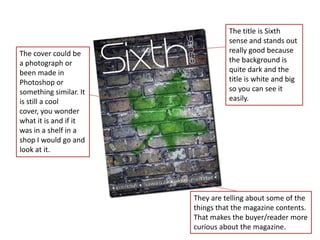
1. The title is Sixth
sense and stands out
The cover could be really good because
a photograph or the background is
been made in quite dark and the
Photoshop or title is white and big
something similar. It so you can see it
is still a cool easily.
cover, you wonder
what it is and if it
was in a shelf in a
shop I would go and
look at it.
They are telling about some of the
things that the magazine contents.
That makes the buyer/reader more
curious about the magazine.
2. The title is bold and
Good that they black and stands out a
putting the month lot that is a good thing.
and year. If you It is a very simple font
have a library with that can be a good and
the student a bad thing.
magazines, it will
be easier to find They are telling you
which year and quite concrete about
month for the some of the things in
magazine you are the magazine contents
looking for. that makes the reader
more curious so they
I didn’t like that want to open and read
they used a black the article.
colour for this
The background is a
information. It is a
simple photo of students
bit hard to read
standing into the wall.
because some of
Because there are so
the cover
more than one person and
barckground is
you see the road and the
dark.
wall in the picture it gets a
bit messy.