
Recommended
More Related Content
What's hot
What's hot (19)
Viewers also liked
Viewers also liked (18)
Similar to Double page spread analysis
Similar to Double page spread analysis (20)
More from simpleplanfan
More from simpleplanfan (17)
Recently uploaded
Recently uploaded (20)
Double page spread analysis
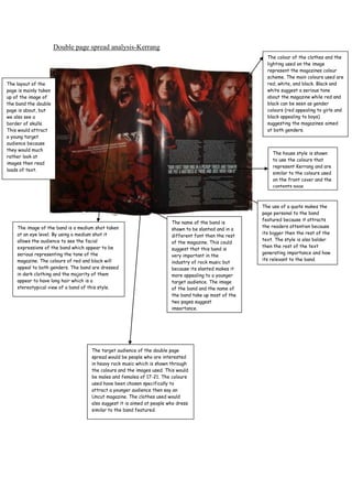
- 1. Double page spread analysis-Kerrang The colour of the clothes and the lighting used on the image represent the magazines colour scheme. The main colours used are The layout of the red, white, and black. Black and page is mainly taken white suggest a serious tone up of the image of about the magazine while red and the band the double black can be seen as gender page is about, but colours (red appealing to girls and we also see a black appealing to boys) border of skulls. suggesting the magazines aimed This would attract at both genders. a young target audience because they would much The house style is shown rather look at to use the colours that images then read represent Kerrang and are loads of text. similar to the colours used on the front cover and the contents page. The use of a quote makes the page personal to the band featured because it attracts The name of the band is The image of the band is a medium shot taken the readers attention because shown to be slanted and in a at an eye level. By using a medium shot it its bigger then the rest of the different font then the rest allows the audience to see the facial text. The style is also bolder of the magazine. This could expressions of the band which appear to be then the rest of the text suggest that this band is serious representing the tone of the generating importance and how very important in the magazine. The colours of red and black will its relevant to the band. industry of rock music but appeal to both genders. The band are dressed because its slanted makes it in dark clothing and the majority of them more appealing to a younger appear to have long hair which is a target audience. The image stereotypical view of a band of this style. of the band and the name of the band take up most of the two pages suggest importance. The target audience of the double page spread would be people who are interested in heavy rock music which is shown through the colours and the images used. This would be males and females of 17-21. The colours used have been chosen specifically to attract a younger audience then say an Uncut magazine. The clothes used would also suggest it is aimed at people who dress similar to the band featured.
- 2. The image used is the central image and has a page of its Double page spread analysis-Uncut magazine own suggest importance of the artist but it also shows that the article is on this one person. The clothes the The title is very clear artists wearing are suggests and stands out against he’s a classical rock artist the white background through the use of the showing this is the blazer. The back ground is name of the featured very basic and pushes the artist and it also readers attention towards shows importance. him. This is a use of a dropcap. This makes the text This is a use of a kicker look more which helps start the article attractive and of and helps the reader usually used in decide if they want to read magazines aimed on or not which I think is at an older useful towards to the reader. audience. The article is written in columns which makes reflects how the magazine is very Like Kerrang Uncut also uses a quote organised just like making the double page spread The colours used are similar to the the contents page. personal. The quote suggest that its ones used in Kerrang. Red white and It also suggest that important towards the artists and it black are all featured in this double the magazine is usually attracts the reader before page spread and reflect the rest of aimed at an older they begin reading an article. I think the Uncut magazine. They are also audience because this is strength and because of this colours that appeal to both genders of its house style I will be using one for my double red appealing to girls and black and the lack of page spread. appealing to boys. The colours also images used. create a serious tone which make the audience take the article seriously.