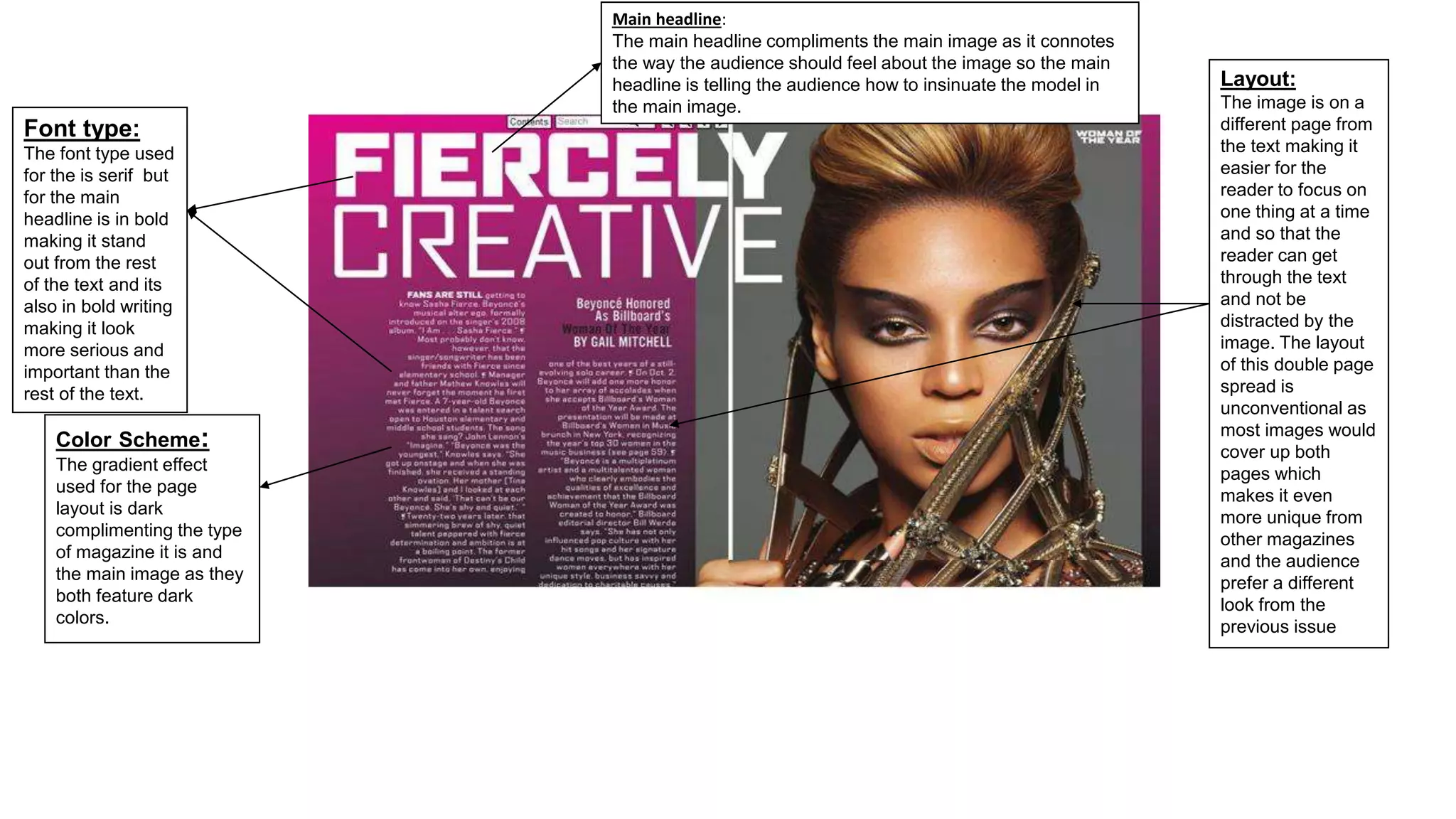
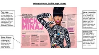
Font type:
The font type used
for the is serif but
for the main
headline is in bold
making it stand
out from the rest
of the text and its
also in bold writing
making it look
more serious and
important than the
rest of the text.
Color Scheme:
The gradient effect
used for the page
layout is dark
complimenting the type
of magazine it is and
the main image as they
both feature dark
colors.
Layout:
The image is on a
different page from
the text making it
easier for the
reader to focus on
one thing at a time
and so that the
reader can get
through the text
and not be
distracted by the
image. The layout
of this double page
spread is
unconventional as
most images would
cover up both
pages which
makes it even
more unique from
other magazines
and the audience
prefer a different
look from the
previous issue
Main headline:
The main headline compliments the main image as it connotes
the way the audience should feel about the image so the main
headline is telling the audience how to insinuate the model in
the main image.
Facial Expression:
The facial expression
of the model in the
main image is a bit
psychotic making the
audience intrigued in
the text even more
because they’ll be
curious about what is
being said as to her
facial expression.
Camera shot:
The main image is a
mid shot and this is
because they need the
audience to see the
crazy, unique clothing
the model has on
making her differ from
any one else they’ve
come a cross.
Colour Scheme:
The colour scheme
of the page has a
gradient effect to
contradict the main
image which is
associated with a
variety of colours.
Font type:
The font type used for
the main headline is
Serif to make the main
headline stand out and
look more elegant than
to attract an audience
that’s interest in the
type of lifestyle this
magazine is promoting.

Double page spread analysis

  • 1.
    Font type: The fonttype used for the is serif but for the main headline is in bold making it stand out from the rest of the text and its also in bold writing making it look more serious and important than the rest of the text. Color Scheme: The gradient effect used for the page layout is dark complimenting the type of magazine it is and the main image as they both feature dark colors. Layout: The image is on a different page from the text making it easier for the reader to focus on one thing at a time and so that the reader can get through the text and not be distracted by the image. The layout of this double page spread is unconventional as most images would cover up both pages which makes it even more unique from other magazines and the audience prefer a different look from the previous issue Main headline: The main headline compliments the main image as it connotes the way the audience should feel about the image so the main headline is telling the audience how to insinuate the model in the main image.
  • 2.
    Facial Expression: The facialexpression of the model in the main image is a bit psychotic making the audience intrigued in the text even more because they’ll be curious about what is being said as to her facial expression. Camera shot: The main image is a mid shot and this is because they need the audience to see the crazy, unique clothing the model has on making her differ from any one else they’ve come a cross. Colour Scheme: The colour scheme of the page has a gradient effect to contradict the main image which is associated with a variety of colours. Font type: The font type used for the main headline is Serif to make the main headline stand out and look more elegant than to attract an audience that’s interest in the type of lifestyle this magazine is promoting.