
Recommended
More Related Content
What's hot
What's hot (20)
Viewers also liked
Similar to Gradient effect for ie 7
Similar to Gradient effect for ie 7 (20)
Recently uploaded
Recently uploaded (20)
Gradient effect for ie 7
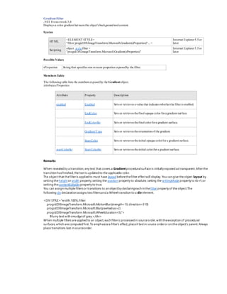
- 1. GradientFilter .NET Framework 3.0 Displays a color gradient betweenthe object's backgroundandcontent. Syntax HTML <ELEMENT STYLE= "filter:progid:DXImageTransform.Microsoft.Gradient(sProperties)"... > Internet Explorer5.5or later Scripting object .style.filter = "progid:DXImageTransform.Microsoft.Gradient(sProperties)" Internet Explorer5.5or later Possible Values sProperties Stringthat specifies one ormore properties exposedby the filter. Members Table The followingtable lists the members exposedby the Gradientobject. Attributes/Properties Attribute Property Description enabled Enabled Sets or retrieves a value that indicates whetherthe filteris enabled. EndColor Sets or retrieves thefinal opaque color for a gradient surface. EndColorStr Sets or retrieves thefinal colorfora gradient surface. GradientType Sets or retrieves theorientationof the gradient. StartColor Sets or retrieves theinitial opaque colorfora gradient surface. startColorStr StartColorStr Sets or retrieves theinitial color for a gradient surface. Remarks When revealedby a transition, any text that covers a Gradient proceduralsurface is initially exposedas transparent.Afterthe transition hasfinished, the textis updatedto the applicable color. The object that thefilteris appliedto must have layout beforethefilter effectwill display. You can give the object layout by settingtheheightor width property,setting the position property to absolute, setting the writingMode property to tb-rl,or settingthecontentEditableproperty to true. You can assign multiplefiltersor transitions to an objectby declaringeach in the filter property of the object.The following div declaration assigns twofiltersanda Wheel transition to a div element. <DIV STYLE="width:100%;filter: progid:DXImageTransform.Microsoft.MotionBlur(strength=13,direction=310) progid:DXImageTransform.Microsoft.Blur(pixelradius=2) progid:DXImageTransform.Microsoft.Wheel(duration=3);"> Blurry text with smudge of gray.</div> When multiple filters are appliedto an object,each filteris processedin sourceorder,with theexception of procedural surfaces,which arecomputedfirst. To emphasizea filter's effect,placeit lastin source orderor on the object's parent. Always place transitions last in sourceorder.
- 2. <SCRIPT> <!-- Toggle the Enabled property to toggle the gradient. --> function fnToggle(oObj) { if (oDiv.filters(0).enabled){ oDiv.filters(0).enabled='false'; oObj.innerText='Add Gradient';} else { oDiv.filters(0).enabled='true'; oObj.innerText='Make Normal';} } </SCRIPT> <font size="+5"> <DIV ID="oDiv" STYLE="height:120px; color:green; filter: progid:DXImageTransform.Microsoft.gradient(enabled='false', startColorstr=#550000FF, endColorstr=#55FFFF00)" > A simple gradient </DIV> </font> <P> <BUTTON onclick="fnToggle(this)">Add Gradient</BUTTON><BR/> Color your background with 7 gradients ... Here is how you can put different colors in each screen corner + in the center + from top to bottom Just make sure your document has <HTML><BODY> start and end elements and insert these functions: //- set_background_corner(color, opacity, corner) -> set color in a corner (0 to 1 = top to bottom) (= 2 to 5) or in center (= 6); opacity is number from 1 to 100 // Set background colors function set_background_corner(color, opacity, corner) { if (corner >= 0 && corner <= 6) { if (!color) { insert_bg_styles(undefined, 'bg_styles_' + corner); } else insert_bg_styles('background-color: ' + color + '; FILTER: Alpha(style='+ (corner==6?2:1) + ',opacity=' + opacity + ',finishOpacity=0' + (corner==0?',startX=50,finishX=50,startY=0,finishY=77); z-index: -998;' : // top (corner==1?',startX=50,finishX=50,startY=100,finishY=23); z-index: -999;' : // bottom (corner==2?',startX=0,finishX=23,startY=0,finishY=47); z-index: -995;' : // upper left (corner==3?',startX=100,finishX=77,startY=0,finishY=47); z-index: -994;' : // upper right (corner==4?',startX=100,finishX=77,startY=100,finishY=53); z-index: -997;' : (corner==5?',startX=0,finishX=23,startY=100,finishY=53); z-index: -996;' : '); z-index: -993;')))))), 'bg_styles_' + corner); // center } } // Set background colors function insert_bg_styles(styles, id) { var divObj = document.getElementById(id); if (styles) { styles += ' position: absolute; top: 0px; left:0px; width: 100%; height:100%;'; // Replace colors if (!divObj) { var newDivObj = document.createElement("DIV"); newDivObj.id = id; newDivObj.style.cssText = styles; document.body.appendChild(newDivObj); } else divObj.style.cssText = styles; } // Remove element else if (divObj) divObj.parentNode.removeChild(divObj); } // AND finally here is some example of use: set_background_corner('mistyrose', 100, 2); set_background_corner('white', 100, 6); set_background_corner('gold', 90, 3); set_background_corner('moccasin', 100, 0); set_background_corner('powderblue', 100, 1); set_background_corner('palegreen', 100, 4); set_background_corner('lavender', 100, 5);