
Recommended
Recommended
More Related Content
Similar to Dealing with the forest field study data Finding the data .docx
Similar to Dealing with the forest field study data Finding the data .docx (19)
More from randyburney60861
More from randyburney60861 (20)
Recently uploaded
Recently uploaded (20)
Dealing with the forest field study data Finding the data .docx
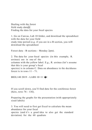
- 1. Dealing with the forest field study data Finding the data for your focal species 1. Go on Canvas, Lab 10 folder, and download the spreadsheet with the data for your field study time period (e.g. if you are in a B section, you will download the spreadsheet Forest data - B sections - Monday 2pm). 2. The data for your focal species (in this example, R. ursinus) are in one of the columns with the yellow label. E.g., R. ursinus (let’s assume that this is your group’s focal species) is in column C. Data on abundance in the deciduous forest is in rows 11 - 71. BIOL140 2019 - LABS 10+11 �1 If you scroll down, you’ll find data for the coniferous forest (here, rows 76 - 136). Preparing the graphs for the presentation (with appropriately sized labels) 3. You will need to first get Excel to calculate the mean abundance for your focal species (and it’s a good idea to also get the standard deviation) for the 60 quadrats
- 2. sampled. To do so, below quadrat #60 add a row for the mean and one for the SD. In the appropriate cells (in your focal species column) have Excel calculate the mean and the SD. 4. Do the same for the coniferous forest data (your mean and SD will be just below the data in the last quadrat). 5. Find a clear space on the spreadsheet and set up a little ‘table’, similar to the one shown in the figure below, where you’ll record the mean abundance for each of the two sites and where you’ll have Excel calculate the standard deviation BIOL140 2019- LABS 10+11 �2 6. To make your graph, proceed as you did for your Lab experiment results, but this time we will use a ‘bar graph’ (known in Excel as ‘Column’ ‘Clustered column’. The error bars should be the standard deviation. A few things to remember (that many groups missed in their oral presentation: ❖ no title for the graphs (Excel will likely include a ‘Chart Title’; remove it) ❖ no ‘Excel legend’ (this is different from a figure legend…check the Conventions) ❖ yes proper axes labels! (If you have selected a graph style that does not give you
- 3. labels, you can add them in when you copy-paste your graph into your presentation ❖ A figure legend is optional. BIOL140 2019 - LABS 10+11 �3 7. To format your graph such that it is suitable for the presentation, copy and paste it into PowerPoint, ‘stretch it’ (to make it as large as possible), and don’t forget to make the font size larger too! (It does not automatically get bigger as you ‘stretch’ the graph). 8. To change the font size you need to work in PowerPoint and: ❖ click on an axis label ❖ go to font>size and change the size to what you want it to be (recommended is 24, if this looks really to big go with 20 — smaller fonts are very difficult to see from the back of the room with the lighting available in the labs!) ❖ repeat with each axis label and with each axis. It is also suggested that you change the colour of the bar graph to something very visible that however does not mask the error bars (e.g. dark grey, etc.). Note that the example below is a work in progress. BIOL140 2019- LABS 10+11 �4
- 4. Performing the t-test and reporting t- and p-values 1. Go to: http://www.physics.csbsju.edu/stats/t-test.html and click on Click here to perform Student's t-test via copy and paste. 2. From the Excel spreadsheet, copy the deciduous forest data for your focal species (in this example, cells C11 to C71) into the ‘Data for Group A’ box, and the coniferous forest data (in this example, cells C76 to C136) into the ‘Data for Group B’ box. 3. Click on the Calculate now button. The program should return a page similar to the image below. 4. Identify the t-value and the p-value for your statistical test and report them on the slide where you have your graph with the means and 95% CI. Alternatively, you can use the t-test tool on GraphPad, as for your lab experiment. BIOL140 2019 - LABS 10+11 �5 This is the p-value! p<0.0001t-value =8.22 http://www.physics.csbsju.edu/stats/t-test.html http://www.physics.csbsju.edu/stats/t-test_bulk_form.html Sheet1Terrestrial field study data March 2019understory species = percent cover per m2trees = number of trees per 100m2 Scroll down for data from the Coniferous Forest, scroll to the right for
- 5. data on abiotic factors and tree abundanceThe complete names of all plant species can be found at the bottom of this sheet Deciduous ForestDeciduous ForestReplicatePolystichumR. ursinusR. spectabilisGaultheriaVacciniumMahoniaDryopterisMossIlexHed eraR. discolorAir temp. oCLight intensity LuxReplicatePseudotsugaThuja plicataTsguaAlnus A. circinatumA. macrophyllumPopulus bal.Prunus emargin.Laburnum1030000000000191756010305002102016300 00000091915000201070002033018600001000214060030101101 10140150000010012182260040101500000528050000100021350 00602719000032000198000701400000000018560008192024001 30000361826000903000000000020439010027000004000185190 11070000000001916480120400000000019309001304123000040 00212800014121600000200020150001502027000000001847900 16361700000000018229001700000005000184210018000000012 40018100001901710000003200018153002009521000000001851 10021032300000002215934022041500000000175390230273500 17020000222860024001000000000216050025000002401000174 05002661000034040001846900279000000230002552200280000 02700000197400290000086000001925700303035001706000222 57003110100009000001642003207000501500141923100330900 04200000185250034000007200000123620035001100210000021 25000360320923800000213940037080008000012203800038000 00300001420360003903000240000019317004000150030000001 84100041000009000002181097042020000000000155600043719 02401800000205000044015000540000142030000450622004000 00165000046000001000000155000047000002100000173950048 01400056000001756000Coniferous ForestConiferous ForestReplicatePolystichumR. ursinusR. spectabilisGaultheriaVacciniumMahoniaDryopterisMossIlexHed eraR. discolorAir temp. oCLight intensity LuxReplicatePseudotsugaThuja plicataTsguaAlnusA. circinatumA. macrophyllumPopulus bal.Prunus emargin.Laburnum1100000000200218381012430400002000012 00900916348022420160000300200003500154203401080000445
- 6. 24000060260015890041600020600500000011701018620603400 00127700163307320801101270001563083901200713814001591 09105200007810017373105800000000001642111020000001300 17338124702200036120017444133008023000000167321400000 00171600205100150014000013290014170016000000082500135 74017036000000000171501802600040200001742519470000901 10001647820000001000000016347210000000200015818022000 00000000151930023210000003900015339240000000300015159 25000020005000165532610040010581162900270001100040001 59002818400000860001545029000000022000163663000030000 00015553319600190000000148343200001001000144223300002 60000001237034150047000800013108035001620000900157223 60200330000001465637000200250000138003802000010000137 00039000040000000143300401200400000001430004100024000 50001665842000700280001462043000180000500131100044800 02303000013300045000140060008132004636000180000001230 0470120290001800013685048000000027000158150Understory PlantsTreesPolystichum munitum (sword fern)Pseudotsuga menzeisii (Douglas fir)Rubus ursinus (trailing blackberry)Thuja plicata (Western red cedar)Rubus spectabilis (salmonberry)Tsuga heterophylla (Western hemlock)Gaultheria shallon (salal)Alnus rubra (Red alder)Vaccinium parvifolium (red huckleberry)Acer circinatum (Vine maple) Mahonia nervosa (dull Oregon-grape)Acer macrophyllum (Big leaf maple) Symphoricarpos albus (snowberry)Populus balsamifera (Black cotton wood)Dryopteris expansa (spiny wood fern)Prunus emarginata (Bitter cherry) Ilex aquifolium (English Holly)Laburnum watereri (Golden chain tree)Hedera helix (English Ivy)Rubus discolor (Himalayan blackberry)Prunus laurocerasus (Laurel)Sorbus sp. (Mountain ash) Revised Field Study Assignment Instructions This assignment is optional. If you decide not to complete this assignment, your overall course grade will be calculated based on your grades up to and including your grade for the Discussion assignment. If you submit this assignment, it
- 7. automatically means that you want your mark for this assignment to be included in the calculation of your overall course mark. If you decide to submit this assignment, see instructions below. Options: (1) To complete with original group members; or (2) to complete individually; marking criteria will be the same (see revised requirements and marking rubric below). Weight: 15% of your final Biology 140 mark Word count:5 pages maximum (excluding reference list). No list of passages is needed. Assignment should be typed, size 12 font, double-spaced. (Note: template slides posted earlier are no longer useful as full sentences have to be used instead of bullet points.) Due date: Two weeks from the date posted on Canvas (April 1, 2020, 9 pm). Email your file to your Instructor. In the subject line of your email, indicate your lab section, plant species and group members’ names that contributed to this assignment. Please include the attached rubric. The goal of this activity is for your group to present the field study findings for your assigned plant species: · clearly graph the results for your focal plant species (from a previous year), describe and interpret these results. · provide a scientific explanation for differences (or lack thereof) in abundance of your focal plant species between the two forest sites. · design a future experiment that you could perform to test your explanation of the differences (or lack thereof) in abundance of your species between the two sites. Given that you were not able to visit the two sampling areas in Pacific Spirit Park, there is a new slide show on Canvas > Revised Field Study Assignment module, which shows your plant species in both the deciduous and coniferous forest sites. SPECIFIC CONTENT REQUIREMENTS
- 8. Results section (5 marks): · Include a figure that shows the mean abundance in % cover (± standard deviation) of your focal plant species in each forest site. · Follow the Figure (Graph) Formatting Conventions in the Scientific Conventions pages of your workbook. · Conduct a t-test to determine if there is a significant difference in the abundance of your focal plant species between sites, and report the p-values. · Describe the results. Consider feedback that your Instructor shared with you on your Results Assignment. Plausible Scientific Explanation (5 marks): · What abiotic factor could explain the differences (or lack thereof) in the abundance of your focal species between the two forest sites? · Use the scientific explanation format (claim, evidence, reasoning) to answer this question. · Incorporate at least two pieces of credible evidence to support your claim. This evidence could be data from the field study (see the next 2 bullet points) and evidence from the literature (e.g. government documents, field study guides, books, journal articles). Properly cite and reference the literature that you use using the Biol 140/CSE style. · Remember that you have data on light intensity and temperature for both forest sites, which would count as a piece of evidence. You also have data on the dominant tree species, which can affect the properties of the soil (including pH). · Note: if you use differences in light intensity or temperature as evidence, be sure that there is a significant different in the factor between sites (i.e. you should graph the data, perform a t- test and report the p-value).
- 9. Future Research (10 marks): Design an experiment to test your explanation (i.e. your scientific hypothesis). · State your research question. · Describe, in detail, a hypothesis-testing experiment you could perform to test your explanation of any differences (or lack thereof) in your plant’s abundance. You can design a lab study or a field study. · Use the same abiotic factor that you used in your explanation. · Specify the response that you will measure. · Describe what your experimental protocol would be. Be very specific, taking into consideration the research design concepts that you have learned in the course. · It is okay to use point form for this section. · Predict what results you would expect if your explanation is correct. Modified Field Study Marking Rubric Lab Section: _________ Plant Species: __________________________ Name(s):_____________________________________________ ___________________________________ Category: Specific Content: Marks /25 Results · Figure clear, complete, and correctly formatted · Figure caption is complete · Description of abundance (means ± SD) complete · Significant difference or not and reason for your conclusion
- 10. · Figure referred to in text /5 Explanation · Claim: one abiotic factor that could explain the difference (or lack thereof) in the abundance of your focal plant species in the two forest sites. · Evidence to support claim (2) · Logical reasoning (2) /5 Proposed study · Research question (1) · Methodology (10) · Predicted results (1) /12 Citations, references and writing style · Proper formatting of citations (1) and references (1) · No mistakes in spelling, grammar or scientific nomenclature /3 Name of group member Respective contributions to this assignment