Hosewife Bangalore Just VIP Btm Layout 100% Genuine at your Door Step
Front Page
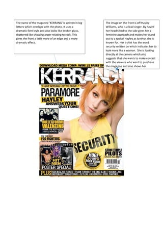
1. The name of the magazine ‘KERRANG’ is written in big
letters which overlaps with the photo. It uses a
dramatic font style and also looks like broken glass,
shattered like showing anger relating to rock. This
gives the front a little more of an edge and a more
dramatic effect.
The image on the front is off Hayley
Williams, who is a lead singer. By havinf
her head tilted to the side gives her a
feminine approach and makes her stand
out to a typical Hayley as to what she is
known for. Her t-shirt has the word
security written on which indicates her to
look more like a woman. She is looking
directly at the camera which also
suggests that she wants to make contact
with the viewers who want to purchase
the magazine and also shows her
2. The background of the magazine is plain and
has juts a white back drop to all the audience
to just stare and put most of their attention
on Hayley and the main cover. This can also
give an impression on how woman can be
either neat and tidy in whatever they would
be doing.
The magazine uses only 3 main colours
throughout and gives it more style. The
colours white, black and yellow gives a
message that it is new and original even
though still adapting the idea of a rock theme.
Yellow shows and targets the audience.