
Recommended
Recommended
More Related Content
Similar to data Sreening.doc
Similar to data Sreening.doc (20)
Recently uploaded
Recently uploaded (20)
data Sreening.doc
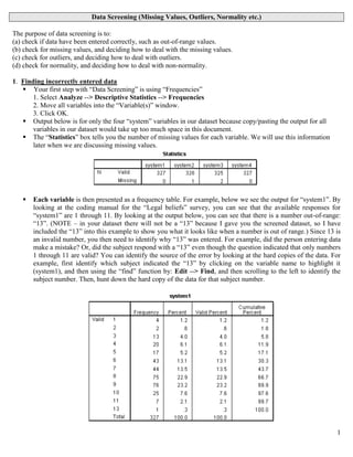
- 1. 1 Data Screening (Missing Values, Outliers, Normality etc.) The purpose of data screening is to: (a) check if data have been entered correctly, such as out-of-range values. (b) check for missing values, and deciding how to deal with the missing values. (c) check for outliers, and deciding how to deal with outliers. (d) check for normality, and deciding how to deal with non-normality. 1. Finding incorrectly entered data Your first step with “Data Screening” is using “Frequencies” 1. Select Analyze --> Descriptive Statistics --> Frequencies 2. Move all variables into the “Variable(s)” window. 3. Click OK. Output below is for only the four “system” variables in our dataset because copy/pasting the output for all variables in our dataset would take up too much space in this document. The “Statistics” box tells you the number of missing values for each variable. We will use this information later when we are discussing missing values. Each variable is then presented as a frequency table. For example, below we see the output for “system1”. By looking at the coding manual for the “Legal beliefs” survey, you can see that the available responses for “system1” are 1 through 11. By looking at the output below, you can see that there is a number out-of-range: “13”. (NOTE – in your dataset there will not be a “13” because I gave you the screened dataset, so I have included the “13” into this example to show you what it looks like when a number is out of range.) Since 13 is an invalid number, you then need to identify why “13” was entered. For example, did the person entering data make a mistake? Or, did the subject respond with a “13” even though the question indicated that only numbers 1 through 11 are valid? You can identify the source of the error by looking at the hard copies of the data. For example, first identify which subject indicated the “13” by clicking on the variable name to highlight it (system1), and then using the “find” function by: Edit --> Find, and then scrolling to the left to identify the subject number. Then, hunt down the hard copy of the data for that subject number.
- 2. 2 2. Missing Values Why do missing values occur? Missing values are either random or non-random. Random missing values may occur because the subject inadvertently did not answer some questions. For example, the study may be overly complex and/or long, or the subject may be tired and/or not paying attention, and miss the question. Random missing values may also occur through data entry mistakes. Non-random missing values may occur because the subject purposefully did not answer some questions. For example, the question may be confusing, so many subjects do not answer the question. Also, the question may not provide appropriate answer choices, such as “no opinion” or “not applicable”, so the subject chooses not to answer the question. Also, subjects may be reluctant to answer some questions because of social desirability concerns about the content of the question, such as questions about sensitive topics like past crimes, sexual history, prejudice or bias toward certain groups, and etc. Why is missing data a problem? Missing values means reduced sample size and loss of data. You conduct research to measure empirical reality so missing values thwart the purpose of research. Missing values may also indicate bias in the data. If the missing values are non-random, then the study is not accurately measuring the intended constructs. The results of your study may have been different if the missing data was not missing. How do I identify missing values? 1. Select Analyze --> Descriptive Statistics --> Frequencies 2. Move all variables into the “Variable(s)” window. 3. Click OK. Output below is for only the four “system” variables in our dataset because copy/pasting the output for all variables in our dataset would take up too much space in this document. The “Statistics” box tells you the number of missing values for each variable. How do I deal with missing values? Irrespective of whether the missing values are random or non-random, you have three options when dealing with missing values. Option 1 is to do nothing. Leave the data as is, with the missing values in place. This is the most frequent approach, for a few reasons. First, missing values are typically small. Second, missing values are typically non-random. Third, even if there are a few missing values on individual items, you typically create composites of the items by averaging them together into one new variable, and this composite variable will not have missing values because it is an average of the existing data. However, if you chose this option, you must keep in mind how SPSS will treat the missing values. SPSS will either use “listwise deletion” or “pairwise deletion” of the missing values. You can elect either one when conducting each test in SPSS. a. Listwise deletion – SPSS will not include cases (subjects) that have missing values on the variable(s) under analysis. If you are only analyzing one variable, then listwise deletion is simply analyzing the existing data. If you are analyzing multiple variables, then listwise deletion removes cases (subjects) if there is a missing value on any of the variables. The disadvantage is a loss of data because you are removing all data from subjects who may have answered some of the questions, but not others (e.g., the missing data). b. Pairwise deletion – SPSS will include all available data. Unlike listwise deletion which removes cases (subjects) that have missing values on any of the variables under analysis, pairwise deletion only removes the specific missing values from the analysis (not the entire case). In other words, all available data is included. For example, if you are conducting a correlation on multiple variables, then SPSS will conduct the bivariate correlation between all available data point, and ignore only those missing values if they exist on some variables. In this case, pairwise deletion will result in different sample sizes for each correlation. Pairwise deletion is useful when sample size is small or missing values are large because there are not many values to begin with, so why omit even more with listwise deletion.
- 3. 3 c. In other to better understand how listwise deletion versus pairwise deletion influences your results, try conducting the same test using both deletion methods. Does the outcome change? . Option 2 is to delete cases with missing values. For example, for every missing value in the dataset, you can delete the subjects with the missing values. Thus, you are left with complete data for all subjects. The disadvantage to this approach is you reduce the sample size of your data. If you have a large dataset, then it may not be a big disadvantage because you have enough subjects even after you delete the cases with missing values. Another disadvantage to this approach is that the subjects with missing values may be different than the subjects without missing values (e.g., missing values that are non-random), so you have a non- representative sample after removing the cases with missing values. Once situation in which I use Option 2 is when particular subjects have not answered an entire scale or page of the study. Option 3 is to replace the missing values, called imputation. There is little agreement about whether or not to conduct imputation. There is some agreement, however, in which type of imputation to conduct. For example, you typically do NOT conduct Mean substitution or Regression substitution. Mean substitution is replacing the missing value with the mean of the variable. Regression substitution uses regression analysis to replace the missing value. Regression analysis is designed to predict one variable based upon another variable, so it can be used to predict the missing value based upon the subject’s answer to another variable. Both Mean substitution and Regression substitution can be found using: Transform --> Replace Missing Cases. The favored type of imputation is replacing the missing values using different estimation methods. The “Missing Values Analysis” add-on contains the estimation methods, but versions of SPSS without the add-on module do not. The estimation methods be found by using: Transform --> Replace Missing Cases. 3. Outliers – What are outliers? Outliers are extreme values as compared to the rest of the data. The determination of values as “outliers” is subjective. While there are a few benchmarks for determining whether a value is an “outlier”, those benchmarks are arbitrarily chosen, similar to how “p<.05” is also arbitrarily chosen. Should I check for outliers? Outliers can render your data non-normal. Since normality is one of the assumptions for many of the statistical tests you will conduct, finding and eliminating the influence of outliers may render your data normal, and thus render your data appropriate for analysis using those statistical tests. However, I know no one who checks for outliers. For example, just because a value is extreme compared to the rest of the data does not necessarily mean it is somehow an anomaly, or invalid, or should be removed. The subject chose to respond with that value, so removing that value is arbitrarily throwing away data simply because it does not fit this “assumption” that data should be “normal”. Conducting research is about discovering empirical reality. If the subject chose to respond with that value, then that data is a reflection of reality, so removing the “outlier” is the antithesis of why you conduct research. There is one more (less theoretical, and more practical) reason why I know no one who conducts outlier analysis. It is common practice to use multiple questions to measure constructs because it increases the power of your statistical analysis. You typically create a “composite” score (average of all the questions) when analyzing your data. For example, in a study about happiness, you may use an established happiness scale, or create your own happiness questions that measure all the facets of the happiness construct. When analyzing your data, you average together all the happiness questions into 1 happiness composite measure. While there may be some outliers in each individual question, averaged the items together reduces the probability of outliers due to the increased amount of data composited into the variable. Checking outliers: 1. Select Analyze --> Descriptive Statistics --> Explore 2. Move all variables into the “Variable(s)” window. 3. Click “Statistics”, and click “Outliers” 4. Click “Plots”, and unclick “Stem-and-leaf” 5. Click OK. Output on next page is for “system1”
- 4. 4 “Descriptives” box tells you descriptive statistics about the variable, including the value of Skewness and Kurtosis, with accompanying standard error for each. This information will be useful later when we talk about “normality”. The “5% Trimmed Mean” indicates the mean value after removing the top and bottom 5% of scores. By comparing this “5% Trimmed Mean” to the “mean”, you can identify if extreme scores (such as outliers that would be removed when trimming the top and bottom 5%) are having an influence on the variable. “Extreme Values” and the Boxplot relate to each other. The boxplot is a graphical display of the data that shows: (1) median, which is the middle black line, (2) middle 50% of scores, which is the shaded region, (3) top and bottom 25% of scores, which are the lines extending out of the shaded region, (4) the smallest and largest (non-outlier) scores, which are the horizontal lines at the top/bottom of the boxplot, and (5) outliers. The boxplot shows both “mild” outliers and “extreme” outliers. Mild outliers are any score more than 1.5*IQR from the rest of the scores, and are indicated by open dots. IQR stands for “Interquartile range”, and is the middle 50% of the scores. Extreme outliers are any score more than 3*IQR from the rest of the scores, and are indicated by stars. However, keep in mind that these benchmarks are arbitrarily chosen, similar to how p<.05 is arbitrarily chosen. For “system1”, there is an open dot. Notice that the dot says “42”, but, by looking at “Extreme Values box”, there are actually FOUR lowest scores of “1”, one of which is case 42. Since all four scores of “1” overlap each other, the boxplot can only display one case. In summary, this output tells us there are four outliers, each with a value of “1”.
- 5. 5 4. Outliers Another way to look for univariate outliers is to do outlier analysis within different groups in your study. For example, imagine a study that manipulated the presence or absence of a weapon during a crime, and the Dependent Variable was measuring the level of emotional reaction to the crime. In addition to looking for univariate outliers for your DV, you may want to also look for univariate outliers within each condition. In our dataset about “Legal Beliefs”, let’s treat gender as the grouping variable. 1. Select Analyze --> Descriptive Statistics --> Explore 2. Move all variables into the “Variable(s)” window. Move “sex” into the “Factor List” 3. Click “Statistics”, and click “Outliers” 4. Click “Plots”, and unclick “Stem-and-leaf” 5. Click OK. Output below is for “system1” “Descriptives” box tells you descriptive statistics about the variable. Notice that information for “males” and “females” is displayed separately. “Extreme Values” and the Boxplot relate to each other. Notice the difference between males and females.
- 6. 6 5. Outliers – dealing with outliers First, we need to identify why the outlier(s) exist. It is possible the outlier is due to a data entry mistake, so you should first conduct the test described above as “1. Finding incorrectly entered data” to ensure that any outlier you find is not due to data entry errors. It is also possible that the subjects responded with the “outlier” value for a reason. For example, maybe the question is poorly worded or constructed. Or, maybe the question is adequately constructed but the subjects who responded with the outlier values are different than the subjects who did not respond with the extreme scores. You can create a new variable that categorizes all the subjects as either “outlier subjects” or “non-outlier subjects”, and then re-examine the data to see if there is a difference between these two types of subjects. Also, you may find the same subjects are responsible for outliers in many questions in the survey by looking at the subject numbers for the outliers displayed in all the boxplots. Remember, however, that just because a value is extreme compared to the rest of the data does not necessarily mean it is somehow an anomaly, or invalid, or should be removed. Second, if you want to reduce the influence of the outliers, you have four options. Option 1 is to delete the value. If you have only a few outliers, you may simply delete those values, so they become blank or missing values. Option 2 is to delete the variable. If you feel the question was poorly constructed, or if there are too many outliers in that variable, or if you do not need that variable, you can simply delete the variable. Also, if transforming the value or variable (e.g., Options #3 and #4) does not eliminate the problem, you may want to simply delete the variable. Option 3 is to transform the value. You have a few options for transforming the value. You can change the value to the next highest/lowest (non-outlier) number. For example, if you have a 100 point scale, and you have two outliers (95 and 96), and the next highest (non-outlier) number is 89, then you could simply change the 95 and 96 to 89s. Alternatively, if the two outliers were 5 and 6, and the next lowest (non-outlier) number was 11, then the 5 and 6 would change to 11s. Another option is to change the value to the next highest/lowest (non-outlier) number PLUS one unit increment higher/lower. For example, the 95 and 96 numbers would change to 90s (e.g., 89 plus 1 unit higher). The 5 and 6 numbers change to 10s (e.g., 11 minus 1 unit lower). Option 4 is to transform the variable. Instead of changing the individual outliers (as in Option #3), we are now talking about transforming the entire variable. Transformation creates normal distributions, as described in the next section below about “Normality”. Since outliers are one cause of non-normality, see the next section to learn how to transform variables, and thus reduce the influence of outliers. Third, after dealing with the outlier, you re-run the outlier analysis to determine if any new outliers emerge or if the data are outlier free. If new outliers emerge, and you want to reduce the influence of the outliers, you choose one the four options again. Then, re-run the outlier analysis to determine if any new outliers emerge or if the data are outlier free, and repeat again. 7. Normality Below, I describe five steps for determining and dealing with normality. However, the bottom line is that almost no one checks their data for normality; instead they assume normality, and use the statistical tests that are based upon assumptions of normality that have more power (ability to find significant results in the data). First, what is normality? A normal distribution is a symmetric bell-shaped curve defined by two things: the mean (average) and variance (variability). Second, why is normality important? The central idea behind statistical inference is that as sample size increases, distributions will approximate normal. Most statistical tests rely upon the assumption that your data is “normal”. Tests that rely upon the assumption or normality are called parametric tests. If your data is not normal, then you would use statistical tests that do not rely upon the assumption of normality, call non- parametric tests. Non-parametric tests are less powerful than parametric tests, which means the non-parametric tests have less ability to detect real differences or variability in your data. In other words, you want to conduct parametric tests because you want to increase your chances of finding significant results.
- 7. 7 Third, how do you determine whether data are “normal”? There are three interrelated approaches to determine normality, and all three should be conducted. First, look at a histogram with the normal curve superimposed. A histogram provides useful graphical representation of the data. SPSS can also superimpose the theoretical “normal” distribution onto the histogram of your data so that you can compare your data to the normal curve. To obtain a histogram with the superimposed normal curve: 1. Select Analyze --> Descriptive Statistics --> Frequencies. 2. Move all variables into the “Variable(s)” window. 3. Click “Charts”, and click “Histogram, with normal curve”. 4. Click OK. Output below is for “system1”. Notice the bell-shaped black line superimposed on the distribution. All samples deviate somewhat from normal, so the question is how much deviation from the black line indicates “non-normality”? Unfortunately, graphical representations like histogram provide no hard-and-fast rules. After you have viewed many (many!) histograms, over time you will get a sense for the normality of data. In my view, the histogram for “system1” shows a fairly normal distribution. Second, look at the values of Skewness and Kurtosis. Skewness involves the symmetry of the distribution. Skewness that is normal involves a perfectly symmetric distribution. A positively skewed distribution has scores clustered to the left, with the tail extending to the right. A negatively skewed distribution has scores clustered to the right, with the tail extending to the left. Kurtosis involves the peakedness of the distribution. Kurtosis that is normal involves a distribution that is bell-shaped and not too peaked or flat. Positive kurtosis is indicated by a peak. Negative kurtosis is indicated by a flat distribution. Descriptive statistics about skewness and kurtosis can be found by using either the Frequencies, Descriptives, or Explore commands. I like to use the “Explore” command because it provides other useful information about normality, so
- 8. 8 1. Select Analyze --> Descriptive Statistics --> Explore. 2. Move all variables into the “Variable(s)” window. 3. Click “Plots”, and unclick “Stem-and-leaf” 4. Click OK. Descriptives box tells you descriptive statistics about the variable, including the value of Skewness and Kurtosis, with accompanying standard error for each. Both Skewness and Kurtosis are 0 in a normal distribution, so the farther away from 0, the more non-normal the distribution. The question is “how much” skew or kurtosis render the data non-normal? This is an arbitrary determination, and sometimes difficult to interpret using the values of Skewness and Kurtosis. Luckily, there are more objective tests of normality, described next. Third, the descriptive statistics for Skewness and Kurtosis are not as informative as established tests for normality that take into account both Skewness and Kurtosis simultaneously. The Kolmogorov-Smirnov test (K-S) and Shapiro-Wilk (S-W) test are designed to test normality by comparing your data to a normal distribution with the same mean and standard deviation of your sample: 1. Select Analyze --> Descriptive Statistics --> Explore. 2. Move all variables into the “Variable(s)” window. 3. Click “Plots”, and unclick “Stem-and-leaf”, and click “Normality plots with tests”. 4. Click OK. “Test of Normality” box gives the K-S and S-W test results. If the test is NOT significant, then the data are normal, so any value above .05 indicates normality. If the test is significant (less than .05), then the data are non-normal. In this case, both tests indicate the data are non-normal. However, one limitation of the normality tests is that the larger the sample size, the more likely to get significant results. Thus, you may get significant results with only slight deviations from normality. In this case, our sample size is large (n=327) so the significance of the K-S and S-W tests may only indicate slight deviations from normality. You need to eyeball your data (using histograms) to determine for yourself if the data rise to the level of non-normal. “Normal Q-Q Plot” provides a graphical way to determine the level of normality. The black line indicates the values your sample should adhere to if the distribution was normal. The dots are your actual data. If the dots fall exactly on the black line, then your data are normal. If they deviate from the black line, your data are non- normal. In this case, you can see substantial deviation from the straight black line.
- 9. 9 Fourth, if your data are non-normal, what are your options to deal with non-normality? You have four basic options. a. Option 1 is to leave your data non-normal, and conduct the parametric tests that rely upon the assumptions of normality. Just because your data are non-normal, does not instantly invalidate the parametric tests. Normality (versus non-normality) is a matter of degrees, not a strict cut-off point. Slight deviations from normality may render the parametric tests only slightly inaccurate. The issue is the degree to which the data are non-normal. b. Option 2 is to leave your data non-normal, and conduct the non-parametric tests designed for non- normal data. c. Option 4 is to transform the data. Transforming your data involving using mathematical formulas to modify the data into normality.