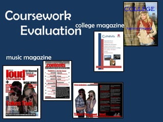
1. Coursework
college magazine
Evaluation
music magazine
2. In what ways does your media product use, develop or
challenge forms and conventions of real media products?
For my college magazine I looked at magazines of a
range of genres. I wanted my layout to be simple
and easy to read. I wanted it to appeal as
something a student or parent could quickly pick up
and read without it being too taxing. I noticed
magazines such as ‘Heat’ cram full the front page
will sell lines and I wanted mine to be the opposite
but not look empty at the same time
Simple sell lines listed. Makes the
image the main feature. Have copied
this layout on my piece
3. In what ways does your media product use, develop or
challenge forms and conventions of real media products
continued….
For my music magazine I wanted to appeal to a vast audience and
therefore used a main music event to base my magazine on. I got this
inspiration from looking at ‘Q’ covers and noticed that for special
events they used collectable covers. I noticed a lot of music magazines
contents pages are normally full of pictures and small text featuring a
range of articles. For mine however I felt including the articles was
more important and didn’t want to fill the page with pictures as well.
This challenges normal forms of music magazines contents pages as I
noticed in my research the page is normally filled with a large image
and then a list of text whereas mine is mostly text. My double page
spread I have completely split into two separate pages, one filled with
text and the other the image. This is a format that is used recurrently
used through music magazines
Regular layout
used throughout
music magazines
4. How does your media product represent particular social
groups?
My college magazine is meant to represent
college life and college students. I have
made this clearest through the sell lines I
have included on the front cover. Also the
image I have used on the front cover is of a
student so it automatically shows that the
magazine is about them. I wanted to make
this magazine appeal to all so didn’t want to
make it biased to a certain gender. I used
the main colours of blue and maroon and
then white for the text. I felt these colours
complemented each other well and This colour scheme works better with
main image
wouldn’t be more appealing to certain
people. This was the colour scheme I was
always going to use but after adding the
main image onto the page my original sell I wanted my contents page to carry through
lines, which were maroon, had to change the simplistic theme I used on the front cover.
colour as they didn’t stand out from the Again using this theme I felt that the magazine
image well enough to be read. would represent the whole of college not just a
certain group of people. The articles I featured
on this page would appeal to all college
students and were not aimed at certain people
on certain courses. I wanted to make sure my
magazine did this as to not limit its audience.
Throughout college there are a range of
courses and I didn’t want to isolate certain
groups.
5. How does your media product represent particular social
groups continued…
Within my double page spread
article I used simple and informal
language so it appealed to
younger people and wasn’t
I wanted this magazine to apply to a larger audience strenuous to read. I did this
than my college magazine. I did this by basing the because the social groups who
issue around a main music event. ‘V festival’ takes would read my magazines would
place every year and appeals to most people who be reading it for the latest music
enjoy mainstream, chart music. I wanted my magazine news and this language would be
to apply to a young audience and I could easily get easier to read. I laid it out in
feedback on my designs throughout the process from conversation format so it was
students within my class. easier to understand as well
I used inspiration from ‘Q magazine’ for the colour scheme. I noticed they used red
and black throughout and I thought this worked well as the colours complimented
each other well and would appeal to most people. I have featured articles from recent
artists and included information that would apply to the younger generation, such as
gigs and latest reviews.
Similar colour schemes
6. What kind of media institution might distribute your
media product and why?
It could also be possible to release my
For this coursework I made magazines so these would be magazines as E-readers. These are
distributed by the print industry to go on to sell in magazines available to read on iPads,
newsagents and supermarkets. Distributing it this way iPhones etc. Releasing my magazine in this
makes it available to everyone and can to available in large format would make it more available to
numbers. As my magazine has a large target audience I feel other people who don’t generally go to the
it would be distributed within many different shops. Some shop to buy a physical magazine.
supermarkets only stock around two maybe three
magazines for each genre. Whereas going to a specialist
newsagents where they are likely to stock all types of
magazines on a genre. As my magazine is aimed at most
people I feel this could be found in most shops such as
‘Tesco’ as well as ‘WHS Smith’ rather than specialised
newsagents
On the front cover of my music magazine I have
included Twitter and Facebook symbols. I have
used these to show that parts of the magazines
could be available online. Most people are
involved in some kind of social networking so this
link can keep consumers up to date with the
magazine if they cannot buy it
7. Who would be the main audience for your media
product?/ How did you attract/address your audience??
The main audience for my college magazine would be college
students, parents and people considering the college to
further their education. To attract this audience I included
articles and sell lines which would appeal to this group of
people. I also kept to using simple language without a large
range in the vocabulary.
As this was meant to be a free magazine for
all students I wanted to keep it simple and
include things that would appeal to all. I did
this by including articles on the contents page
not just about college but also things outside
of college.
8. Who would be the main audience for your media
product/ How did you attract/address your audience
continued…
The main audience for my music magazine are those interested in the
type of music and artists featured within the magazine. I felt the main
way to attract the audience would be mainly through the front page. I
used complimenting colours that would attract to most and included
artists that are very popular at the moment.
People will only buy the magazine if it features their favourite artist
or artists they like. I thought the easiest way to put across the
artists featured was some kind of list featured on the cover. When
designing my front cover I found that making long lists filled a lot of
the page. I included sell lines about other articles so I wanted to put
across that there was more on these acts. I did this by titling this list
with ‘plus’ when doing this however it covered too much of the
main image so I changed it to a ‘+’ sign.
9. Who would be the main audience for your media
product/ How did you attract/address your audience
continued…
Previously I have mentioned using a chatty tone within my
double page spread interview. I did this to address the
audience in a friendly manner and therefore making it
understandable to anyone as any class or social status can
be interested in the type of music my magazine features.
As my music magazine was aimed at
all of those interested in music, this
could cover all ages, social classes
and professions. I wanted to make
my magazine appeal to most and
therefore gave it a cheap price of
£2.30. I felt this was affordable to
most. I wanted my college magazine
to appeal to everyone within the
college so made this a free
magazine. I also felt it was just
simple and included important
information and personally I
wouldn’t have wanted to pay for it
10. What have you learnt about technologies from the
process of constructing this product?
The main program I have learnt to use
more in depth is Photoshop. I have used
this in my music magazine to cut out
backgrounds of pictures and design fonts
on. I already knew how to make font
designs and change text style but I have
learnt the best way to change pictures
within the program.
While editing out the background of my images I
had trouble making them not look like they had
been cut from a background. I wanted the
images to look like they had been taken in front
of a white screen. I wasn’t totally happy with
the overall outcome of the images but as they
are partly covered by text I thought they looked
okay as not all attention was on the image.
11. Looking back at your preliminary task, what do you feel
you have learnt in the progression from it to the full
product?
Throughout this task I have learnt a range of things in designing a product to print and that will appeal to many.
When comparing my two magazine
front covers the thing I have learnt
most when designing them is how to
use the page more efficiently. My
college magazine doesn’t feature many
sell lines and the page isn’t filled as well
as it could be. With my music magazine
I featured more sell lines and made
them stand out more.
While designing my music magazine I also
learnt how much of an impact certain fonts
are. My masthead and the sell lines I have
designed using a font which I designed in
Photoshop.
12. Looking back at your preliminary task, what do you feel
you have learnt in the progression from it to the full
product continued…
Again looking back at my college contents page compared to my music
one I think I have used the space available on the page better and
linked the contents to the cover more. In my college magazine the only
link I used was the fonts and simple layout. Within my music magazine
however I use the recurring themes and layouts. This kept continuity
throughout and it could be easily seen they were all from the same
magazine.
Continuing layout,
colours and fonts
13. Looking back at your preliminary task, what do you feel
you have learnt in the progression from it to the full
product continued…
I also learnt which colours look best together
and what stands out most on a page. On my
college magazine I used a white and blue colour
scheme on the cover and now looking back at it
I decided these wouldn’t stand out enough
against other magazines. Also when reviewing
my college magazine after completion I found
that the picture I initially used didn’t suit the
page enough. I changed this to a mid-shot as I
thought using an image more close up would be
more appropriate.
The image I used on my final design on my magazine
was also not my original picture I was going to use.
The first image I was going to use, didn’t look right
behind the main layout I had already designed and
again made the page seem to empty. Using the close
up image, which I kept with, meant the sell lines
fitted around it and they didn’t cover most of the
image.
14. My thoughts on my media products…
I used a basic Microsoft Publisher document to design my
magazines on. I feel that to make my music magazine more
professional I could have used a more advanced program such
as Quark or involved Photoshop techniques more within my
magazine. I think I managed my time well over this product. If
I re done it I would have taken my photos earlier and before I
started designing my magazine overall as after designing the
main layout I then had to change this to make the best picture
look right placed behind the sell lines etc. If I had more time
to make my music magazine within I could have found actual
bands and got a real interview with them. If I got the chance
to design my college magazine again I would use more
professional fonts that would stand out more and better
colours as after reviewing it I found the sell lines, which I had
coloured white didn’t stand out against the picture. Overall I
am happy with my outcomes and comparing the two can
easily notice what I have learnt during this process, about
colour, text, layout and the use of pictures.