Michael Schmidt                               Posters for Academic Purposes                                                              Poster Series
                                                                                                                                         No. 1 of 2
Centre for Academic Success
                                                     How to develop suitable content

  1. Introduction                                                            2. Background
 • A poster is a static, visual medium                                          • You do not have much space so include only the things that
                                                                                  are really important in your project.
   used to communicate your
   message/ideas                                                                • Try to think what elements of your work will be most
 • Difference between Poster and Oral                                             interesting to your audience.
   presentations is that you let your poster                                    • This will be the piece of work which will encapsulate the whole
   do the ‘talking’                                                               of your project; so present yourself and your poster in the
 • Material presented should convey the                                           best possible way.
   essence of your message!
 • A poster session is a common term in
   conferences. It enables people to
   present their academic work without
   having to make a formal presentation.


  3. Audience & Assessment                                                   4. Structure
  In general: prepare your poster for an audience of                         • The diagram to the right                        Title of Project
  non experts: use clear language                                              illustrates examples of headings
                                                                               in an academic poster.                           Introduction
  Assessment: some points to consider                                        • However you can adapt the
                                                                               heading as you see fit.
  1.        The main purpose of the assessment is not                        • As a rule of thumb: a poster                  Aims & Objectives
            to judge the beauty of the posters.                                provides space for 6 normal A 4
  2.        The assessors want to see how well you are                         PowerPoint slides                                  Results
            able to summarise the major features and                         • Planning before hand speeds up
            achievements of your project in a very tightly                     future conversion of content into
            constrained way.                                                                                           Conclusion & Recommendation
                                                                               a meaningful poster.
  3.        They also want to see how well you can
            describe what you have done.
                                                                                                                                 References


  5. Planning - What’s, How’s, Why’s                                          6. Power of Pictures
                   What is the aim of my project?

                    Why did I follow this route?
                                                                                  • A picture can say more than 1000
                                                                                    words
                   What assumptions did I make
                  and what were my justifications?
                                                                                  • People remember visual stimuli
                        What problems did I
                                                                                    longer than just text.
                           encounter?
                         What results did I
                             obtain?
                            What have I
                            found out?                                            Transfer facts and figures into
                                                                                  graphs and tables.


                                                                                  Transform text using SmartArt
  7. Conclusion
                                                                                  Use suitable pictures from the
  Keep the material simple                                                        Internet and reference them.

       • Be concise and DO NOT WAFFLE

       • Do not cram the poster full of info - messy

       • A picture can say more than 1000 words

       • Be selective

  Give yourself enough time to be successful
                                                                                                                                     (Fevre, 2012)


 8. References & Bibliography                                                       Contact Details:
Further information                                                                                                 Michael Schmidt
http://lorien.ncl.ac.uk/ming/Dept/Tips/present/posters.htm                                                          Academic Skills Development Tutor
                                                                                                                    Centre for Academic Success
http://www.gcu.ac.uk/student/coursework/presentations/posterpresentations/                                          Michael.Schmidt@bcu.ac.uk
Garry Lunn
CICT Integration & Development                                            Posters for Academic Purposes                                                                                                       Poster Series
                                                                                                                                                                                                              No. 2 of 2
Michael Schmidt
Centre for Academic Success                                          How to develop a poster using PowerPoint

1. Create the Poster Format
                                                                                                                           2. Font Styles
 For PowerPoint 2010:
 1. Click on the Layout button and                                                                                                                               • Headings:- Use BOLD AND
     select a Blank layout                                                                                                                                         CAPITALS or Bold And Title
 2. Specify the size and orientation                                                                                            Do not use more                    Case
     (portrait or landscape                                                                                                    than 2 font styles.               • Body Text:- Fonts must be at
 3. The example given here is A1 in                                                                                                                                least 20pts high (better 24pts)
     portrait format
 4. Go to the Design menu tab.                                                                                                     Font Styles:
 5. Go to Page Setup and use                                                                                                                                     • Arial – Verdana - Tahoma
                                                                                                                                  recommended
     Custom
                                                                                                                                                                 • Times New Roman
                                                                                                                                                                 • “WordArt” as some effects can
                                                                                                                                         Avoid:                    be unreadable
                                                                                                                                                                 • Don’t use unusual fonts, they
                                                                           AI          Portrait: 59.4 x 84.1cm                                                     may not print at University

                                                                           AI                                                   Add emphasis to                  • italics or bold; save underline for
                                                                                       Landscape: 84.1 x 59.4 cm                important points:                  web links.


  3. Graphics and Pictures                                                                                           4. Colour: General Tips
  1. Diagrams and graphs showing technical
     information should be large enough to read
     (72dpi).
  2. Balance your poster by using images of the
     same size. Reference where appropriate.
  3. Don’t forget to include any Titles and Legends
                                                                                                                     Analogue Colours-                 Complementary Colours –             Split Complementary Colours –
     that are needed to understand your graphs.                                                                      lie on either side of any given   are directly opposite from one      are directly opposite from one
                                                                                                                     colour.                           another on the colour wheel.        another on the colour wheel.
                                                                                                                     The most widely used              Complementary colours are           Split complementary colours give

                                                                
                                                                                                                     analogous colour scheme is -      good for having a lively but        your design a high degree of
                                                                                                                     red, orange and yellow.           balanced design.                    contrast and greater harmony than
                                                                                                                                                                                           complementary.
     Forecast UK Expenditure on IT Security Services
                    (£m), 2004-2008

                                                                                                                                                                                © 1997 - 2010 Suzanne Cooper
                                647
       1,911                             848
                                                       2004
                                                       2005
                                                       2006                                                                    • Choose 2 or 3 colours that contrast or complement each other and
                                                       2007

               1,452
                                        1,108          2008
                                                                                                                                 stick to them.
                                                                                                                               • Keep it simple and use outlines and drop-shadows sparingly. Use
                                                                                                                                 colour to show relationships and create groups.


 5. Colour: Examples                                                                                                        6. Print & Save
  The middle colour sits between the blue and green on the colour wheel

   A
  Objective
                          BStrategies
                                                                         C
                                                                         Sub-Strategies
                                                                                                                                                                   You can save your
    Short                     First key point                             Sub-strategy 1
                                                                                                                                                                      poster as a:
    sentence to                    Description of the first key           Description of the strategy and approach
    describe                       point and how it would work
    key                       Second key point
    objective                      Description of the Second                                                                                               PowerPoint                          Pdf                    Jpeg
                                   key point and how it would
                                   work                                   Sub-strategy 2                                                                    file .pptx                  • If you want to       • if you want to
                                                                          Description of the strategy and approach
                                                                                                                                                          • This can be                   email an               use as an
                                                                                                                                                            altered                       original that          image (e.g.
   • If you use tables to display information determine the                                                                                                                               cannot be              show as a
                                                                                                                                                                                          changed.               picture on
   most important relationships and group them
                                                                                                                                                                                        • The format             Mahara)
   •The Units Sold section is seen as a group because of                                                                                                                                  might be
   its common colour                                                                                                                                                                      preferred in
                                                                                                                                                                                          a print room
   •Use colour just in the content area, not in the titles.
                           Manchester                             Birmingham                      Total
                        Outlet 1                              Outlet 1                   Outlet 1
                        Outlet 2                              Outlet 2                   Outlet 2
  Units Sold            Outlet 3                              Outlet 3                   Outlet 3
                        Outlet 4                              Outlet 4                   Outlet 4

                        Outlet 1                              Outlet 1                   Outlet 1

    Profit
                        Outlet 2
                        Outlet 3
                                                              Outlet 2
                                                              Outlet 3
                                                                                         Outlet 2
                                                                                         Outlet 3
                                                                                                                                  How to contact us:
                        Outlet 4                              Outlet 4                   Outlet 4

                                                                                                                                                                                   Garry Lunn
                                                                                                                                                                                   Web Developer
   7. References & Bibliography                                                                                                                                                    CICT Integration and Development
                                                                                                                                                                                   Garry.Lunn@bcu.ac.uk

                                                                                                                                                                                   Michael Schmidt
http://www.suzannecooper.com/classroom/colortheory.html
                                                                                                                                                                                   Academic Skills Development Tutor
                                                                                                                                                                                   Centre for Academic Success
http://www.gcu.ac.uk/student/coursework/presentations/posterpresentations/
                                                                                                                                                                                   Michael.Schmidt@bcu.ac.uk

Poster how to create a Poster

  • 1.
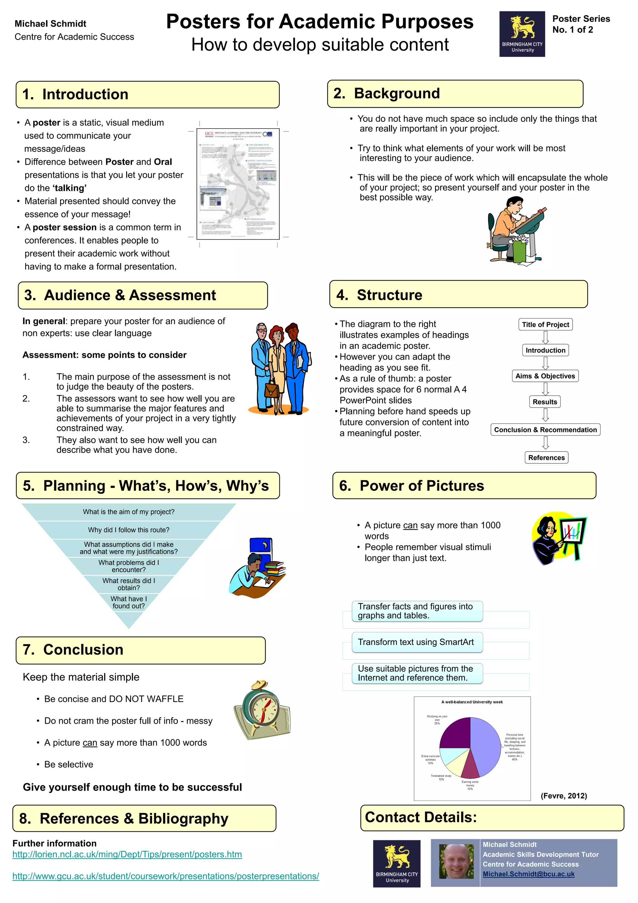
    Michael Schmidt Posters for Academic Purposes Poster Series No. 1 of 2 Centre for Academic Success How to develop suitable content 1. Introduction 2. Background • A poster is a static, visual medium • You do not have much space so include only the things that are really important in your project. used to communicate your message/ideas • Try to think what elements of your work will be most • Difference between Poster and Oral interesting to your audience. presentations is that you let your poster • This will be the piece of work which will encapsulate the whole do the ‘talking’ of your project; so present yourself and your poster in the • Material presented should convey the best possible way. essence of your message! • A poster session is a common term in conferences. It enables people to present their academic work without having to make a formal presentation. 3. Audience & Assessment 4. Structure In general: prepare your poster for an audience of • The diagram to the right Title of Project non experts: use clear language illustrates examples of headings in an academic poster. Introduction Assessment: some points to consider • However you can adapt the heading as you see fit. 1. The main purpose of the assessment is not • As a rule of thumb: a poster Aims & Objectives to judge the beauty of the posters. provides space for 6 normal A 4 2. The assessors want to see how well you are PowerPoint slides Results able to summarise the major features and • Planning before hand speeds up achievements of your project in a very tightly future conversion of content into constrained way. Conclusion & Recommendation a meaningful poster. 3. They also want to see how well you can describe what you have done. References 5. Planning - What’s, How’s, Why’s 6. Power of Pictures What is the aim of my project? Why did I follow this route? • A picture can say more than 1000 words What assumptions did I make and what were my justifications? • People remember visual stimuli What problems did I longer than just text. encounter? What results did I obtain? What have I found out? Transfer facts and figures into graphs and tables. Transform text using SmartArt 7. Conclusion Use suitable pictures from the Keep the material simple Internet and reference them. • Be concise and DO NOT WAFFLE • Do not cram the poster full of info - messy • A picture can say more than 1000 words • Be selective Give yourself enough time to be successful (Fevre, 2012) 8. References & Bibliography Contact Details: Further information Michael Schmidt http://lorien.ncl.ac.uk/ming/Dept/Tips/present/posters.htm Academic Skills Development Tutor Centre for Academic Success http://www.gcu.ac.uk/student/coursework/presentations/posterpresentations/ Michael.Schmidt@bcu.ac.uk
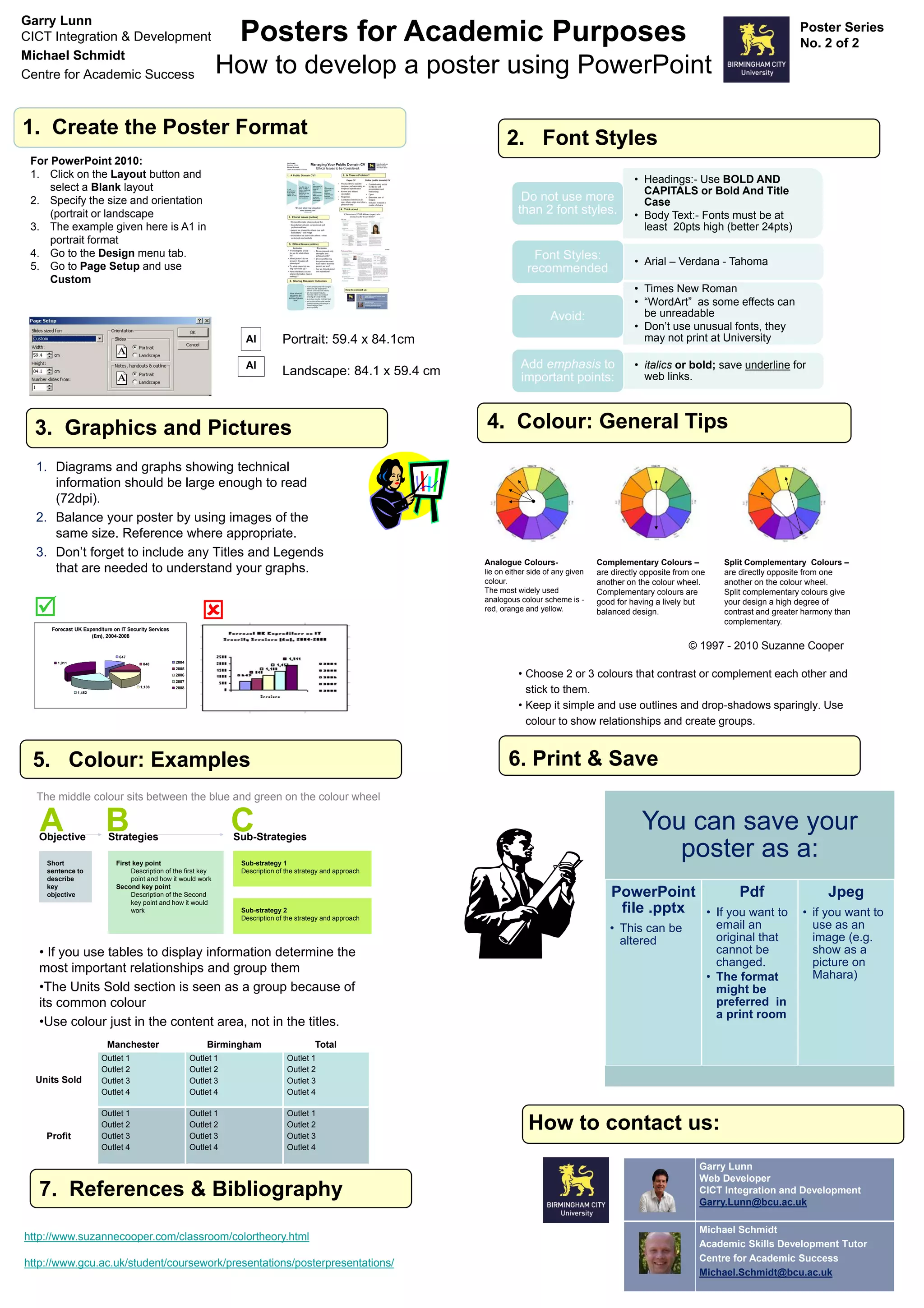
  • 2.
    Garry Lunn CICT Integration& Development Posters for Academic Purposes Poster Series No. 2 of 2 Michael Schmidt Centre for Academic Success How to develop a poster using PowerPoint 1. Create the Poster Format 2. Font Styles For PowerPoint 2010: 1. Click on the Layout button and • Headings:- Use BOLD AND select a Blank layout CAPITALS or Bold And Title 2. Specify the size and orientation Do not use more Case (portrait or landscape than 2 font styles. • Body Text:- Fonts must be at 3. The example given here is A1 in least 20pts high (better 24pts) portrait format 4. Go to the Design menu tab. Font Styles: 5. Go to Page Setup and use • Arial – Verdana - Tahoma recommended Custom • Times New Roman • “WordArt” as some effects can Avoid: be unreadable • Don’t use unusual fonts, they AI Portrait: 59.4 x 84.1cm may not print at University AI Add emphasis to • italics or bold; save underline for Landscape: 84.1 x 59.4 cm important points: web links. 3. Graphics and Pictures 4. Colour: General Tips 1. Diagrams and graphs showing technical information should be large enough to read (72dpi). 2. Balance your poster by using images of the same size. Reference where appropriate. 3. Don’t forget to include any Titles and Legends Analogue Colours- Complementary Colours – Split Complementary Colours – that are needed to understand your graphs. lie on either side of any given are directly opposite from one are directly opposite from one colour. another on the colour wheel. another on the colour wheel. The most widely used Complementary colours are Split complementary colours give   analogous colour scheme is - good for having a lively but your design a high degree of red, orange and yellow. balanced design. contrast and greater harmony than complementary. Forecast UK Expenditure on IT Security Services (£m), 2004-2008 © 1997 - 2010 Suzanne Cooper 647 1,911 848 2004 2005 2006 • Choose 2 or 3 colours that contrast or complement each other and 2007 1,452 1,108 2008 stick to them. • Keep it simple and use outlines and drop-shadows sparingly. Use colour to show relationships and create groups. 5. Colour: Examples 6. Print & Save The middle colour sits between the blue and green on the colour wheel A Objective BStrategies C Sub-Strategies You can save your Short First key point Sub-strategy 1 poster as a: sentence to Description of the first key Description of the strategy and approach describe point and how it would work key Second key point objective Description of the Second PowerPoint Pdf Jpeg key point and how it would work Sub-strategy 2 file .pptx • If you want to • if you want to Description of the strategy and approach • This can be email an use as an altered original that image (e.g. • If you use tables to display information determine the cannot be show as a changed. picture on most important relationships and group them • The format Mahara) •The Units Sold section is seen as a group because of might be its common colour preferred in a print room •Use colour just in the content area, not in the titles. Manchester Birmingham Total Outlet 1 Outlet 1 Outlet 1 Outlet 2 Outlet 2 Outlet 2 Units Sold Outlet 3 Outlet 3 Outlet 3 Outlet 4 Outlet 4 Outlet 4 Outlet 1 Outlet 1 Outlet 1 Profit Outlet 2 Outlet 3 Outlet 2 Outlet 3 Outlet 2 Outlet 3 How to contact us: Outlet 4 Outlet 4 Outlet 4 Garry Lunn Web Developer 7. References & Bibliography CICT Integration and Development Garry.Lunn@bcu.ac.uk Michael Schmidt http://www.suzannecooper.com/classroom/colortheory.html Academic Skills Development Tutor Centre for Academic Success http://www.gcu.ac.uk/student/coursework/presentations/posterpresentations/ Michael.Schmidt@bcu.ac.uk