
Recommended
More Related Content
Recently uploaded
Recently uploaded (20)
Featured
Featured (20)
Mastheads
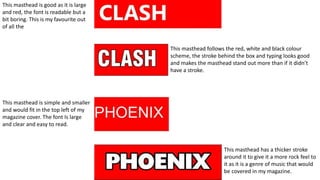
- 1. This masthead is good as it is large and red, the font is readable but a bit boring. This is my favourite out of all the This masthead follows the red, white and black colour scheme, the stroke behind the box and typing looks good and makes the masthead stand out more than if it didn’t have a stroke. This masthead is simple and smaller and would fit in the top left of my magazine cover. The font Is large and clear and easy to read. This masthead has a thicker stroke around it to give it a more rock feel to it as it is a genre of music that would be covered in my magazine.