
Recommended
More Related Content
What's hot
What's hot (19)
Viewers also liked
Similar to Total Film Magazine Cover
Similar to Total Film Magazine Cover (20)
Total Film Magazine Cover
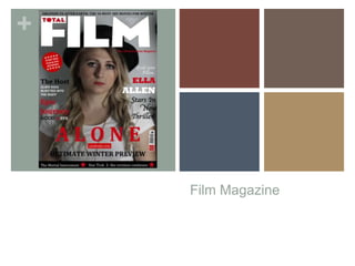
- 1. + Film Magazine
- 2. + Magazine Title- Total Film The reason I chose to use an existing magazine to distribute and advertise my film trailer is because it is a well known British film magazine. It is more likely to be noticed and bought than a magazine that has never been heard of. The logo of Total film will stand out to all British people who buy the magazine regularly or have heard of it. One of the reason’s I chose this magazine is because it releases a new magazine every month, this would be good as it would have less competition to make the front page than if it was a yearly magazine.
- 3. + Magazine Font’s and Colours When starting my magazine cover I had to consider the conventions and genre of the film trailer as well as the magazine. I wanted to link the two so that they had similarities enough to know they were advertising the same thing. I chose the same font for 50% of the writing which was Cambria, this font stood out and looked effective when bold. The other fonts I used were to contrast the others and make the magazine fit it’s conventions. Not all magazine use the same font for all the writing. I used Calibri, Rock well extra bold and Apple chancery. These fonts were different from one another as one was thin, one was italic and the other was bold. The next thing I had to consider was the colours, on my first draft I chose white, black, red, gold, purple and crème. Usually magazines would use basic colours and then have a few different. After audience feedback the contrasting colours (purple, gold and crème) did not work well with the basics (white, red and black). So I simply stuck to my colour scheme of the trailer and left the magazine consisting of white, red and black. CALIBRI CAMBRIA APPLE CHANCERY ROCK WELL EXTRA BOLD
- 4. + Image
- 5. + Image On my first draft of the magazine cover I wanted to have a image of the same girl I used on the poster. The reason for this was because she was potentially the main character in the film. So I stuck the picture of the little girl in her pajama's carrying her teddy running away. I played around with the fonts and headings but something different look right. I did some more research on magazine covers and not one had a character younger than 15 which went against the conventions. After realizing this I decided that I would use another character that features in the trailer that is older and would appeal to the audience more. I took a picture of the oldest girl in character, already after placing the picture on the cover it looked ten times better. Having somebody ‘Famous’ on the cover would attract the audience more than a really young ‘famous’ person. I printed both images and asked my class to vote which one looked better, my class range from 17-18 which is my target audience. 7 out of 8 people chose the second picture of the younger girl so I took there advice and used that one. Conventionally actors are seen in character or in character in an action shot, I decided just to take a shot of her in character as it did not give much away but attracted the audience by the recognition of the actress.
- 6. + Layout
- 7. + Layout The layout of the magazine is really important and there were many things I had to include such as the magazine name, barcode, issue date, price and subheadings. I knew that the magazine cover would not just be about my film so I had to include titles referring to other films and other actors. When I completed my first draft I had a huge subheading saying ‘Ultimate Winter Previews’ and under that I had four film titles. To the left hand side I had two film titles and a sentence describing them. Above that I had a red ball that said ‘Every new film and DVD reviewed’. On the right hand side I had a block of writing based around my film ‘Grab your pillow…Ella Allen stars in new thriller!’. I then had the price and date in the middle of the M and ‘Oblivion to after earth: The 50 must see movies for winter’ above the TOTAL FILM title. I was very happy where everything was until I added the image and everything looked very crowded. So I decided to leave the image and move around the writing and change size, font and colour. I removed the stars above the title as they looked tacky and over used. I made ultimate winter preview much smaller and on one line, I then used two films instead of four and placed them on a black strip so that they stood out. I made the title of my film much bigger so that the audience were attracted to that first. I Shortened the sentences under the film titles to fit the conventions of a magazine (They use very few words). All these decisions were made after playing around for hours, I am happy with the overall layout.