1. TYPOGRAPHY
Noun
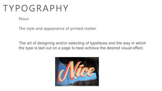
The style and appearance of printed matter.
The art of designing and/or selecting of typefaces and the way in which
the type is laid out on a page to best achieve the desired visual effect.
2. Letterpress printing was the normal
form of printing text from its invention
by Johannes Gutenberg in the mid-
15th century until the 19th century.
It remained in wide use for books and
other uses until the second half of the
20th century.
3.
4. Typefaces vs. Fonts
A typeface, also known as a font family, is a
set of fonts. A typeface contains all of the
different variations of a given font such as
bold, light, italic, condensed, etc.
A font is a specific variation of the font family,
such as Helvetica Light.
5. Serif vs. Sans-Serif
Serifs are extensions at the ends of
letter strokes.
Sans-serif fonts do not have serifs.
11. Leading
Used to describe the
vertical spacing
between lines.
Increasing leading is
often used to help
improve legibility.
12. Tracking
Used to describe the
spacing between letters
Increasing tracking is
often used to help
improve legibility.
Tracking
Tracking
Tracking
13.
14. Kerning
Used to describe the spacing
between letter pairs
Increasing tracking is often
used for aesthetic reasons
Professional typefaces
contain automatic kerning
for a range of character pairs.
20. T H E T Y P O G R A P H Y
S H O U L D R E F L R C T Y O U R
B R A N D I D E N T I T Y /
T H E M E / M E S S A G E –
WHAT DO YOU
WANT TO
COMMUNICATE
WITH THE VIE WER?