1. Conventions of a digipak and Poster
The digipak and Poster are part of a campaign to promote the
artist. These are the things which a campaign will usually
include.
• A recognisable font used across the campaign E.g. Album,
posters, Digipak
• The colour theme would stereotypically be simple and
used through out the campaign with little or no change.
• Usually they’re will also be symbolic objects, pictures,
ect. Things that link to the artist or the video and give the
audience a slight hint and arouse interest.
Here are some examples and an analytic view of covers
within the same genre of our artist, MazeyBoi
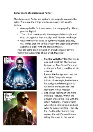
1. Starting with the Title: The title is
nice and simplistic. The font are
key part of Tinie Temph’s brand
as the same font is used for all his
artwork.
2. look at the background: we see
that Tinie Tempah is always
infront of a triangle, furthermore
his background seems galactic
with stars and swooshes that
represent him as magical.
3. and lastly: looking at the more
symbolic features. Within the
artwork we see the Tinie with the
city in his hands. This represent
where he is coming from and and
what he is representing – the city
life. On the other hand it may
convey the artist’s ambition on
taking his music to the world.
2. so to conclude, digipak, Cd covers, poster are all made to
reinforce the band’s image and also to promote their
product at that moment.
Other artwork to look at: