Download as PDF, PPTX


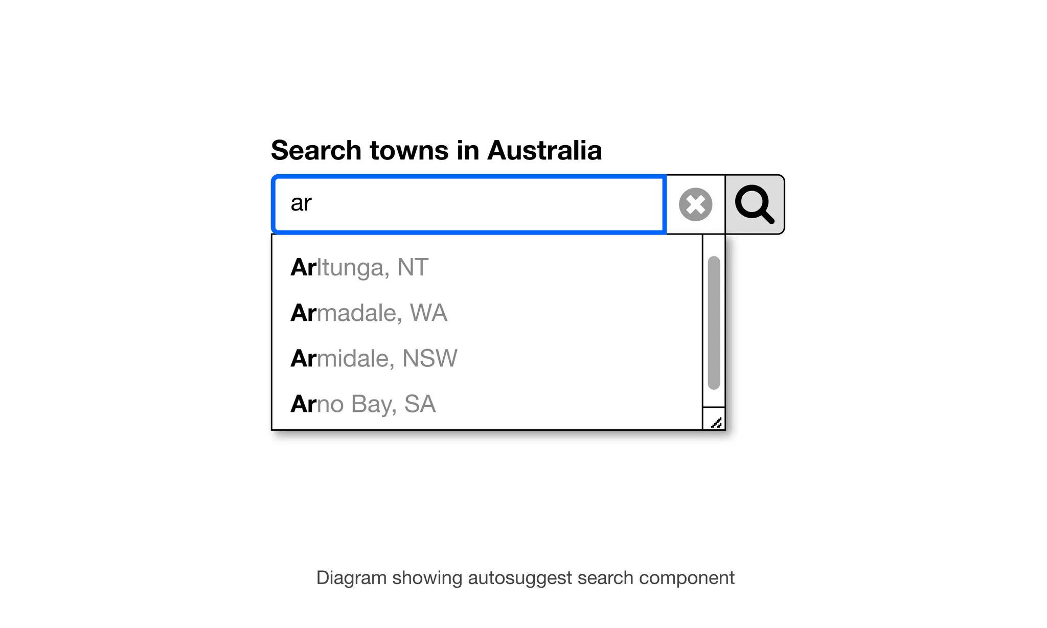


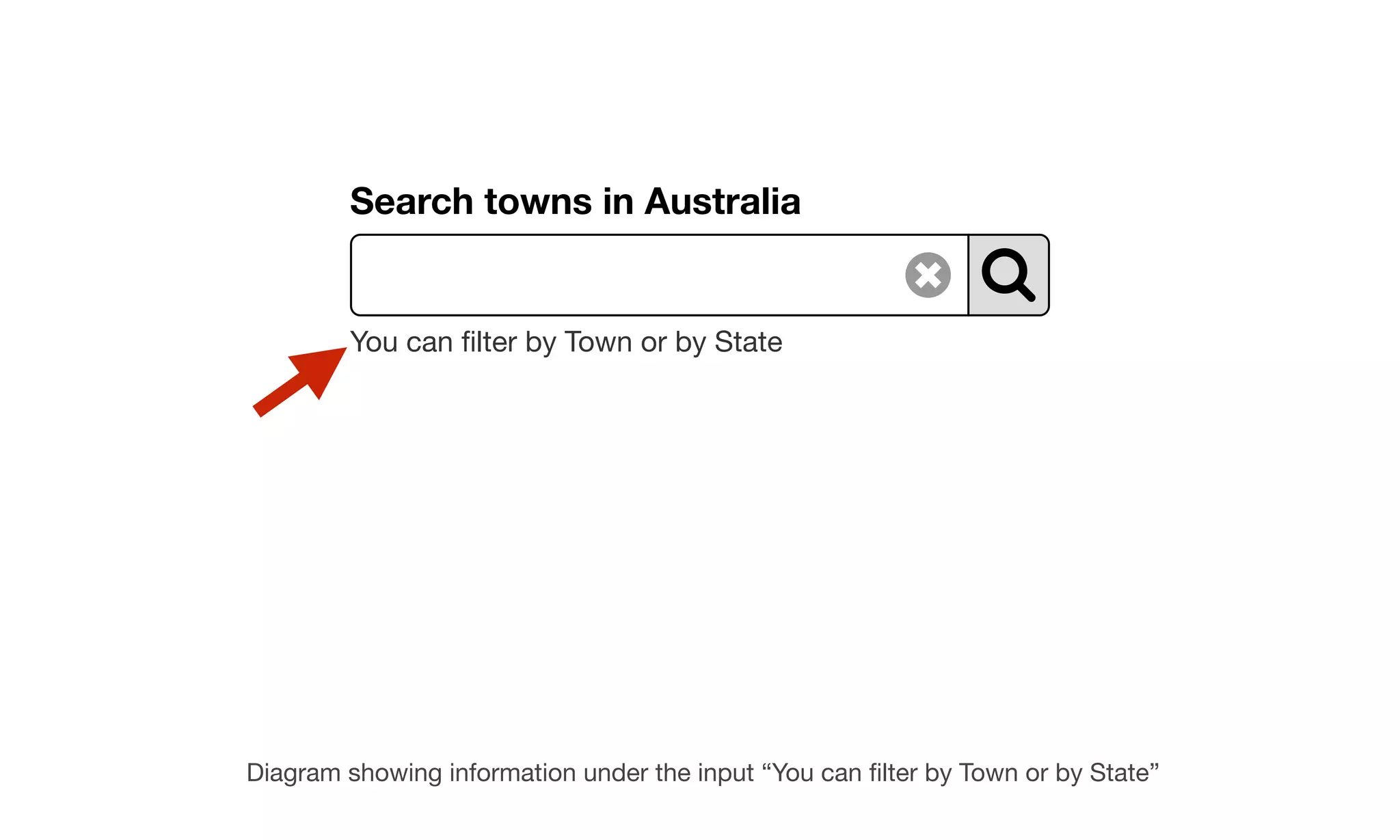

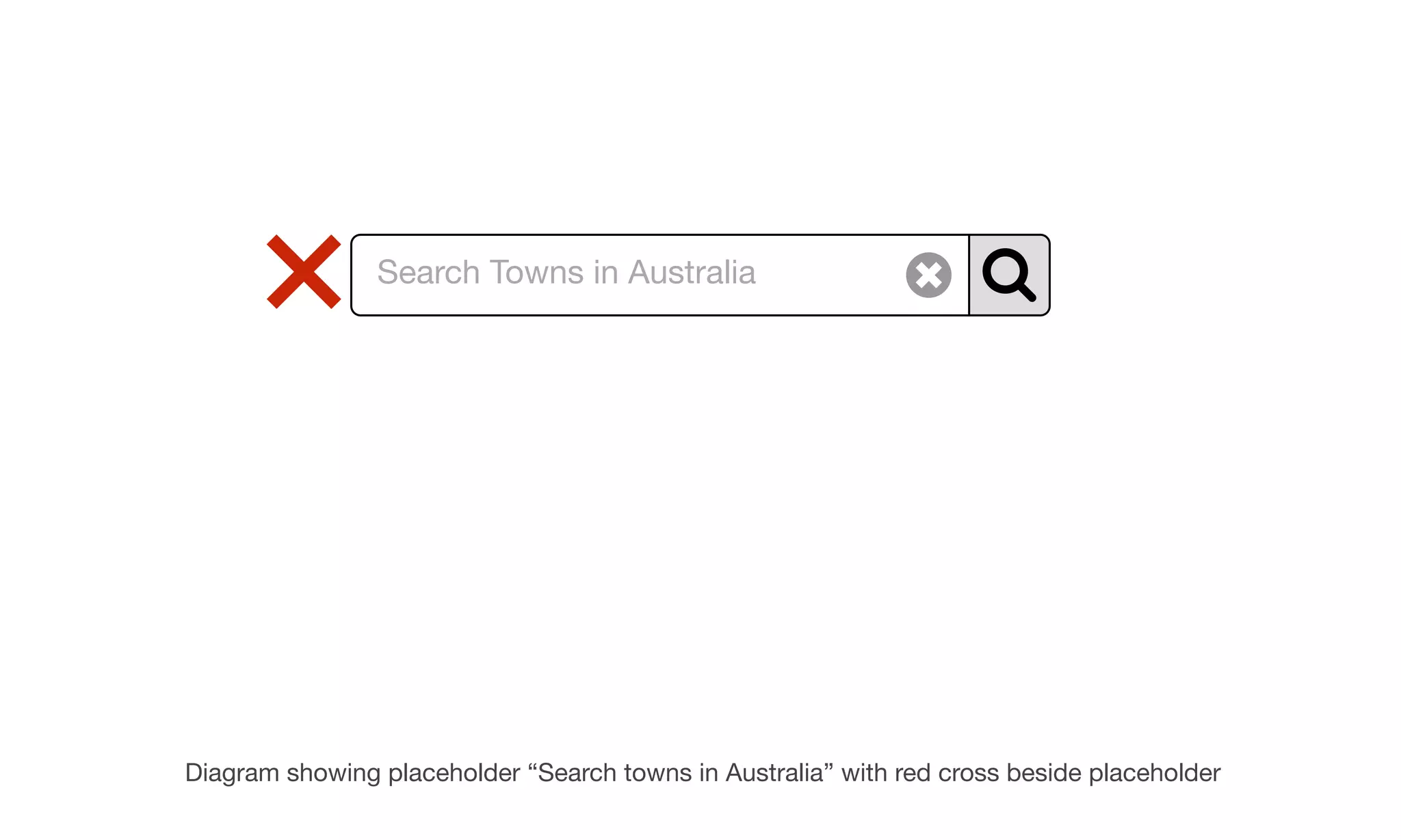
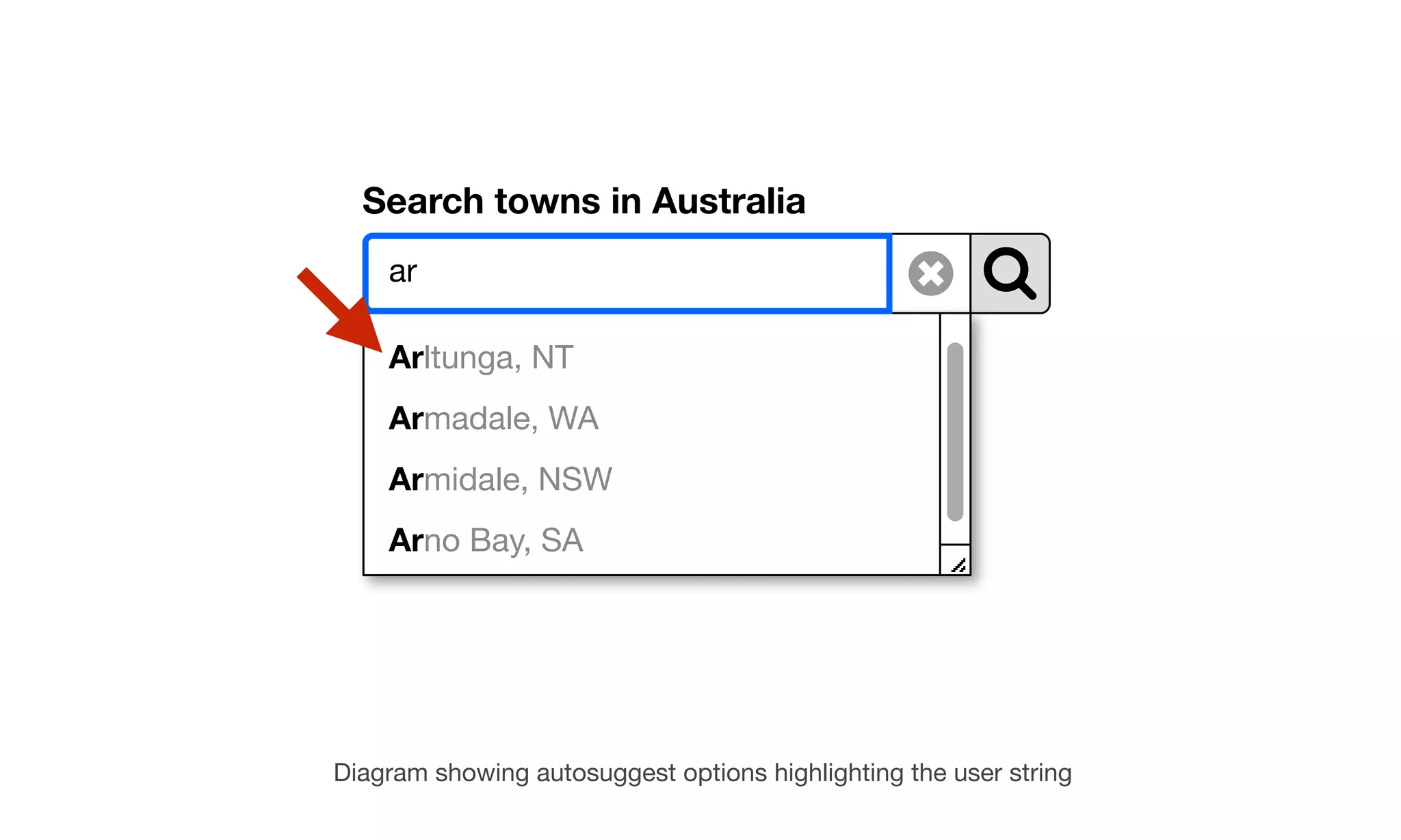

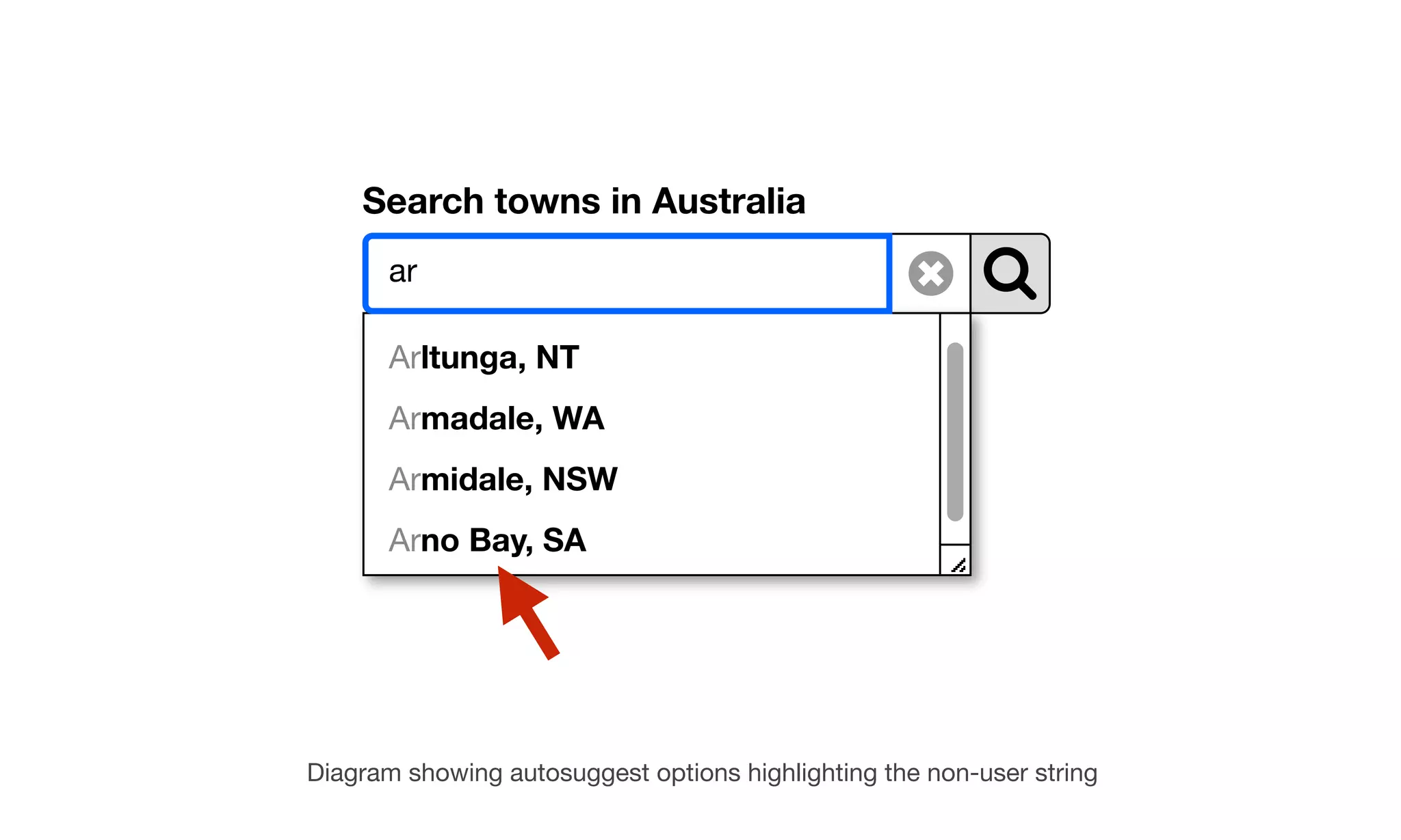


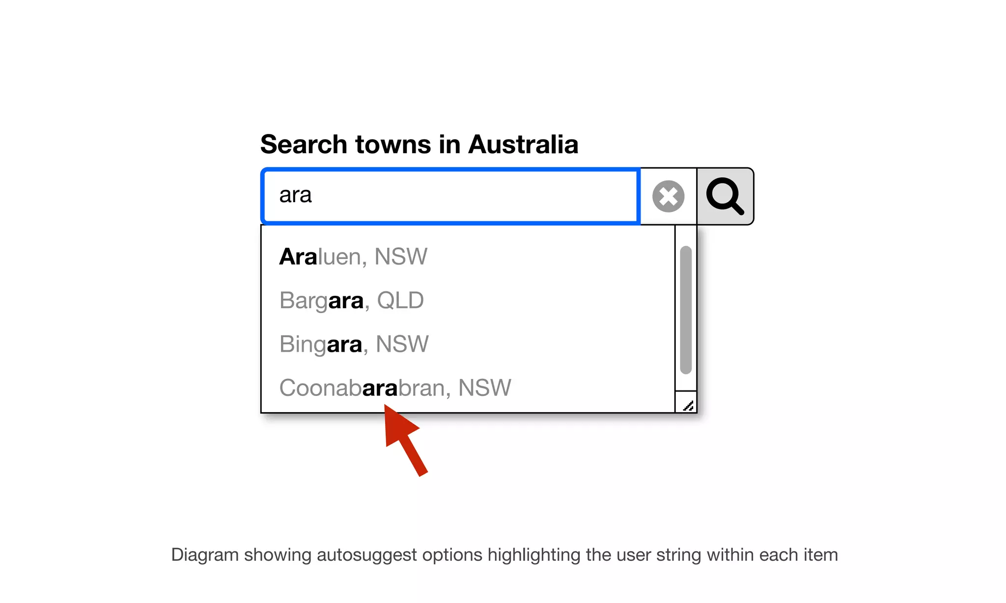


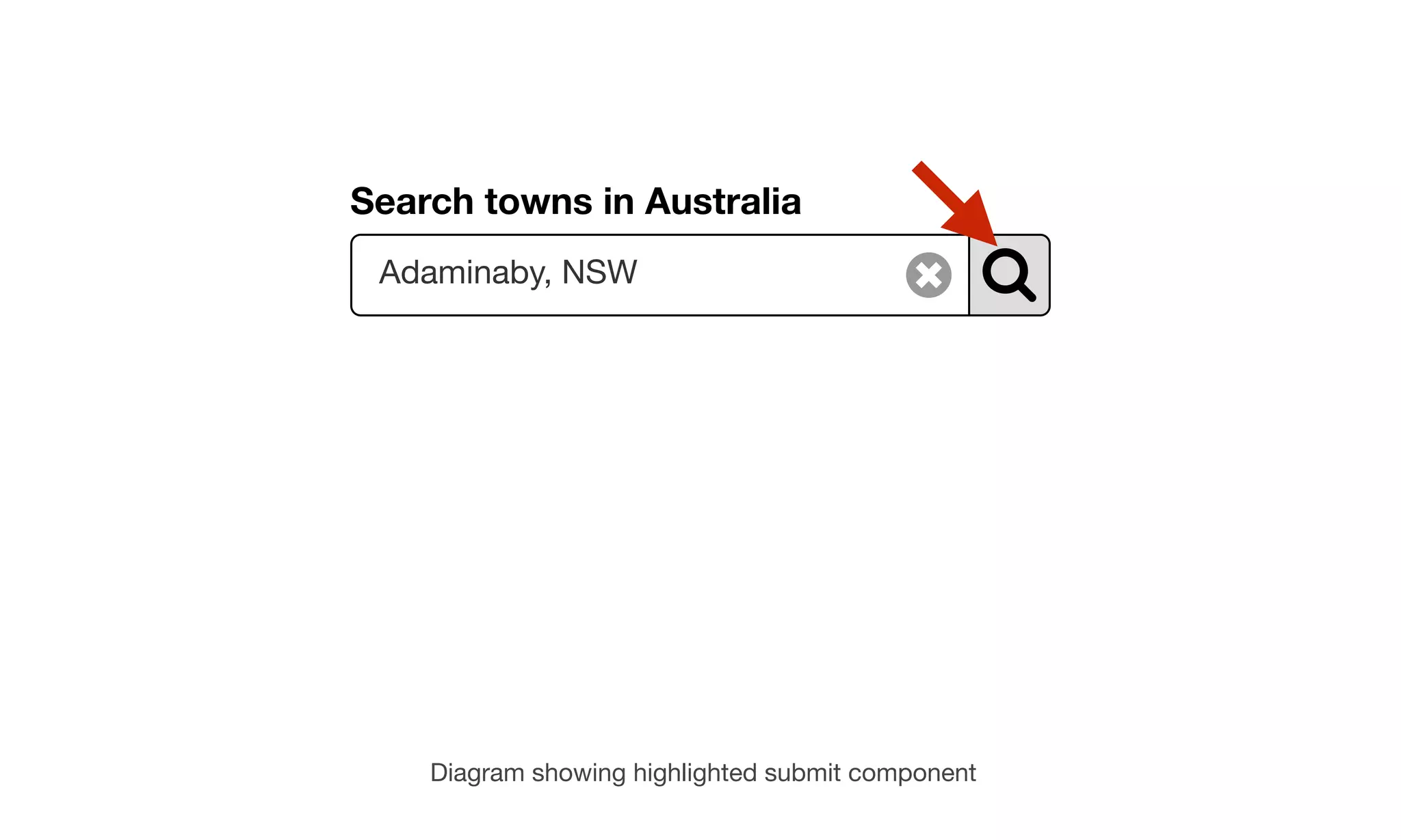


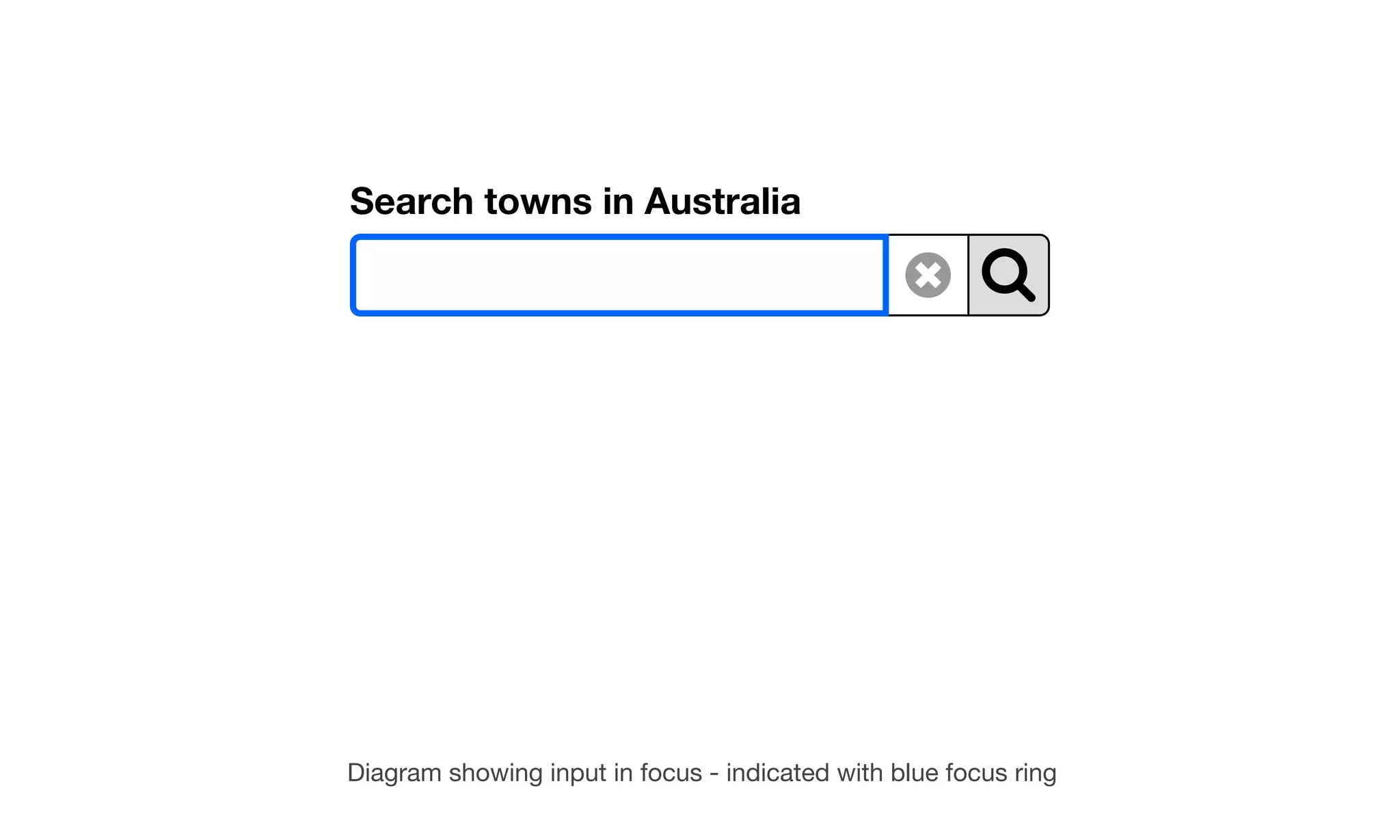

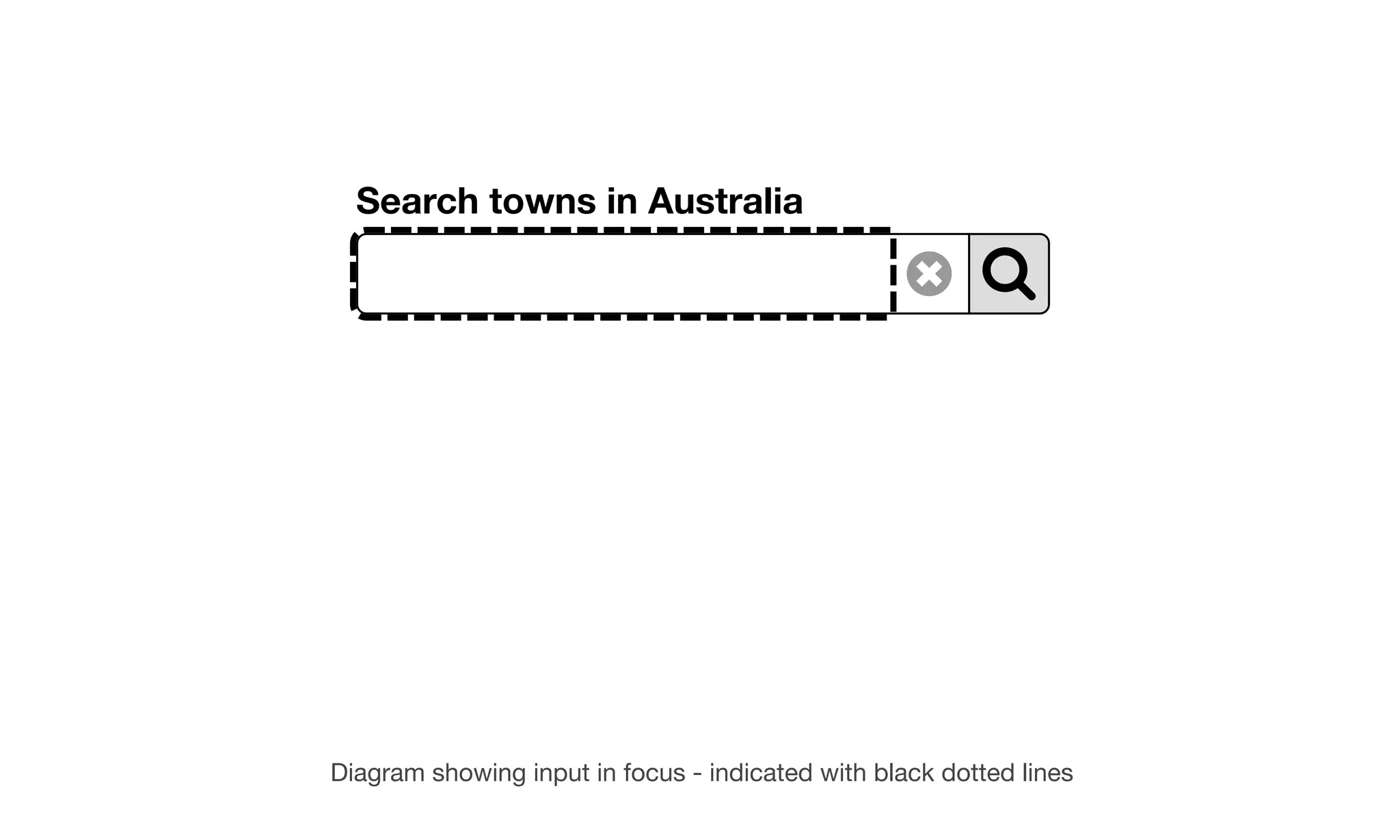
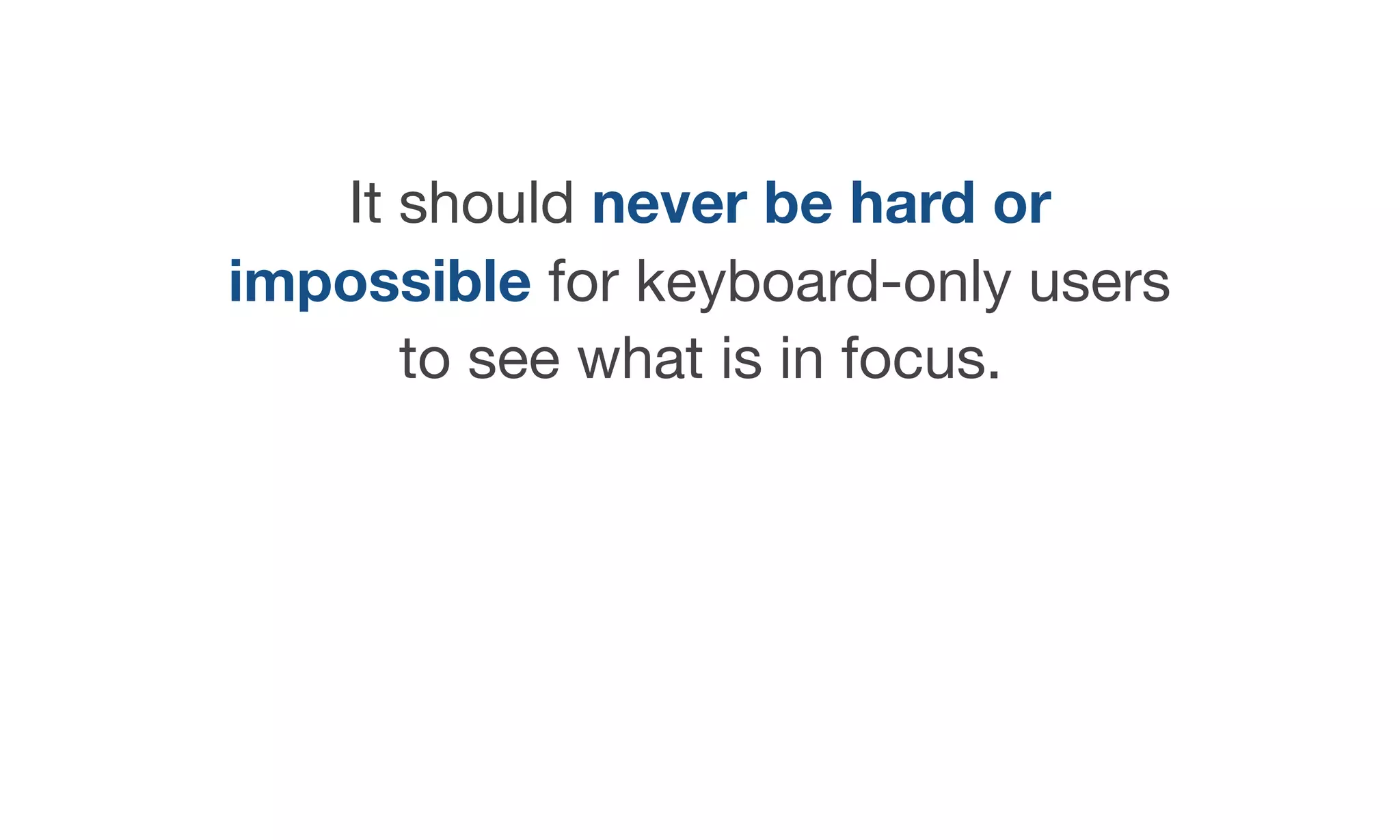


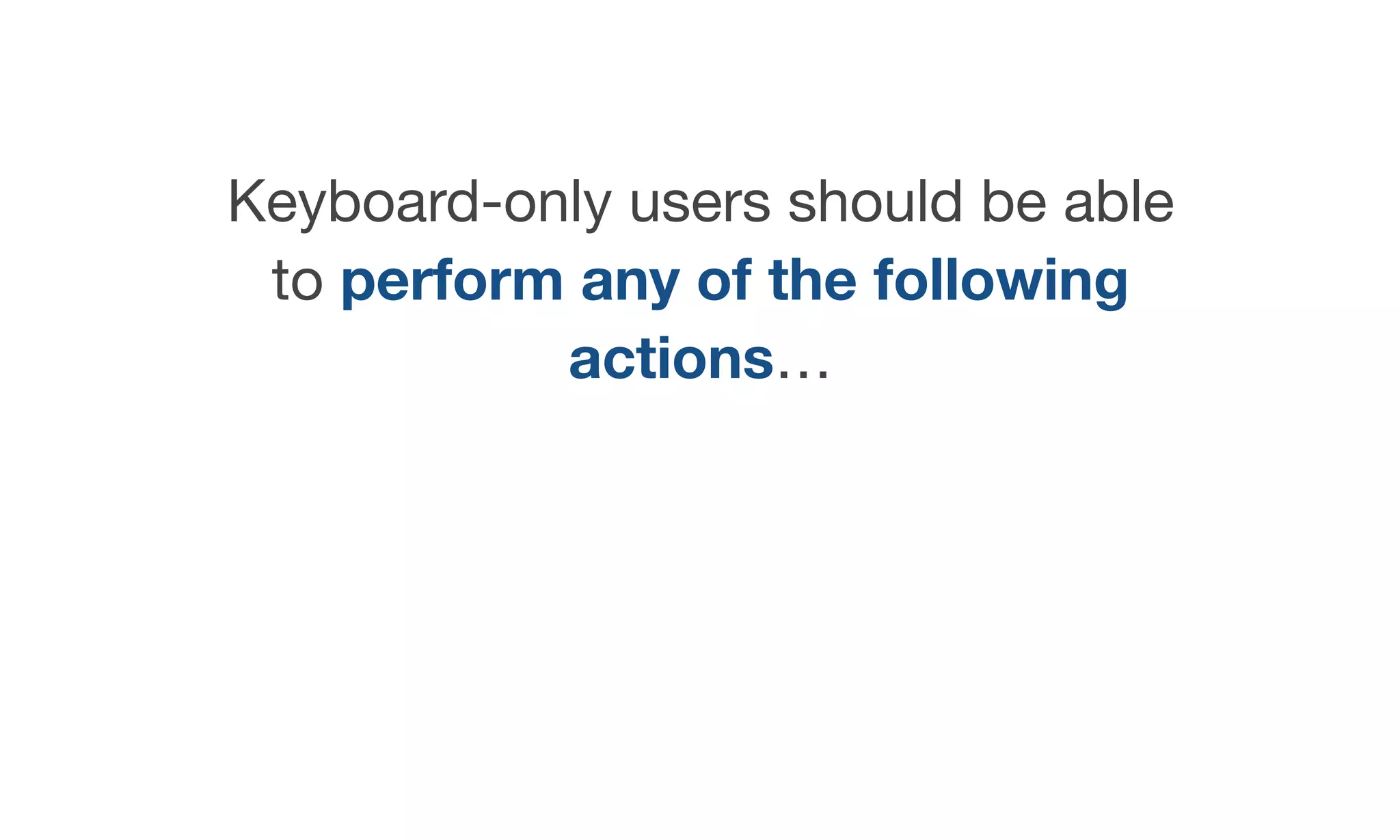
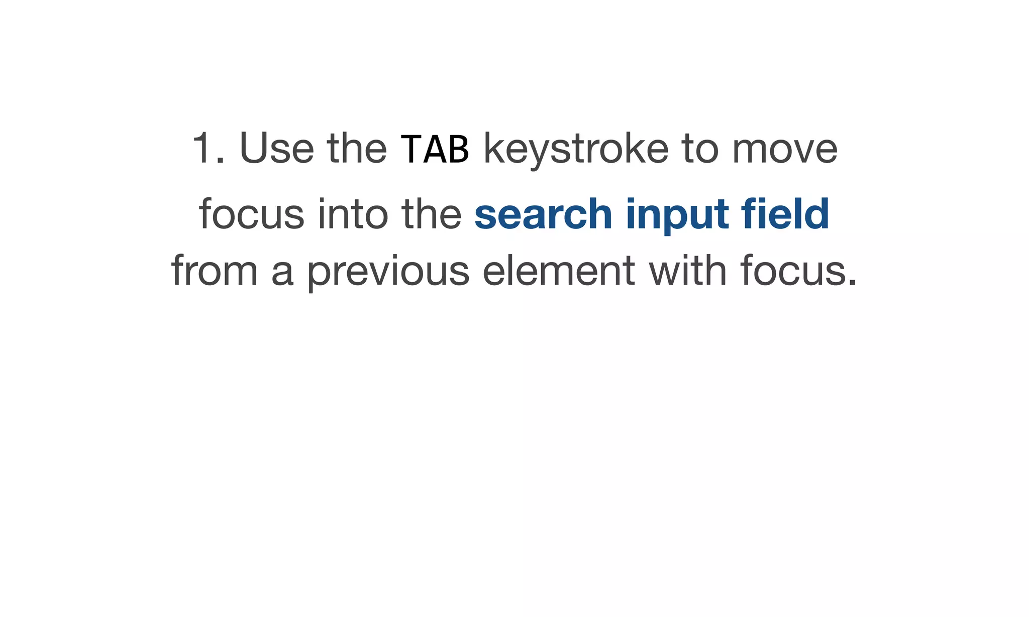
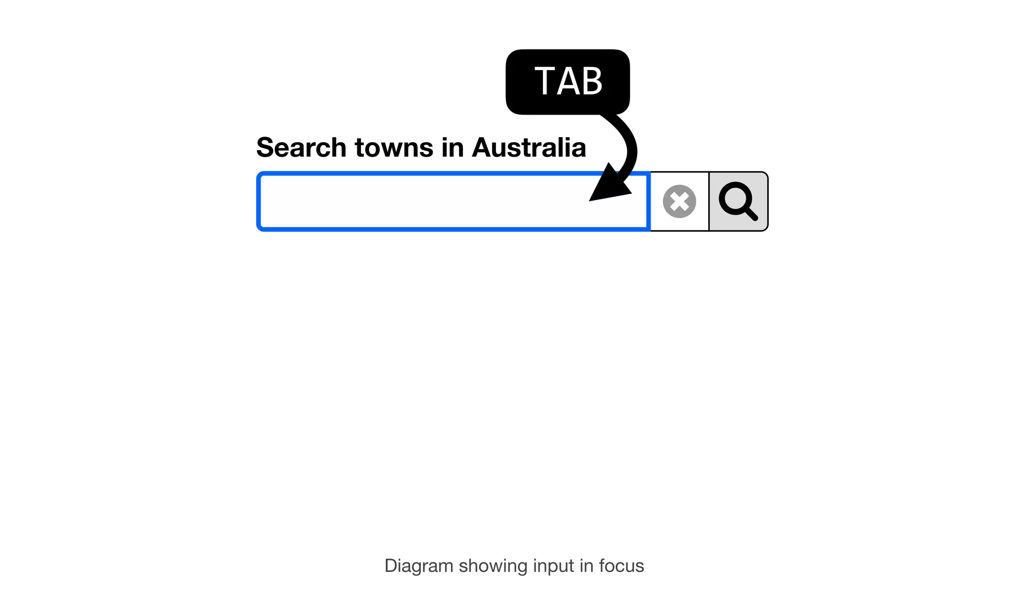


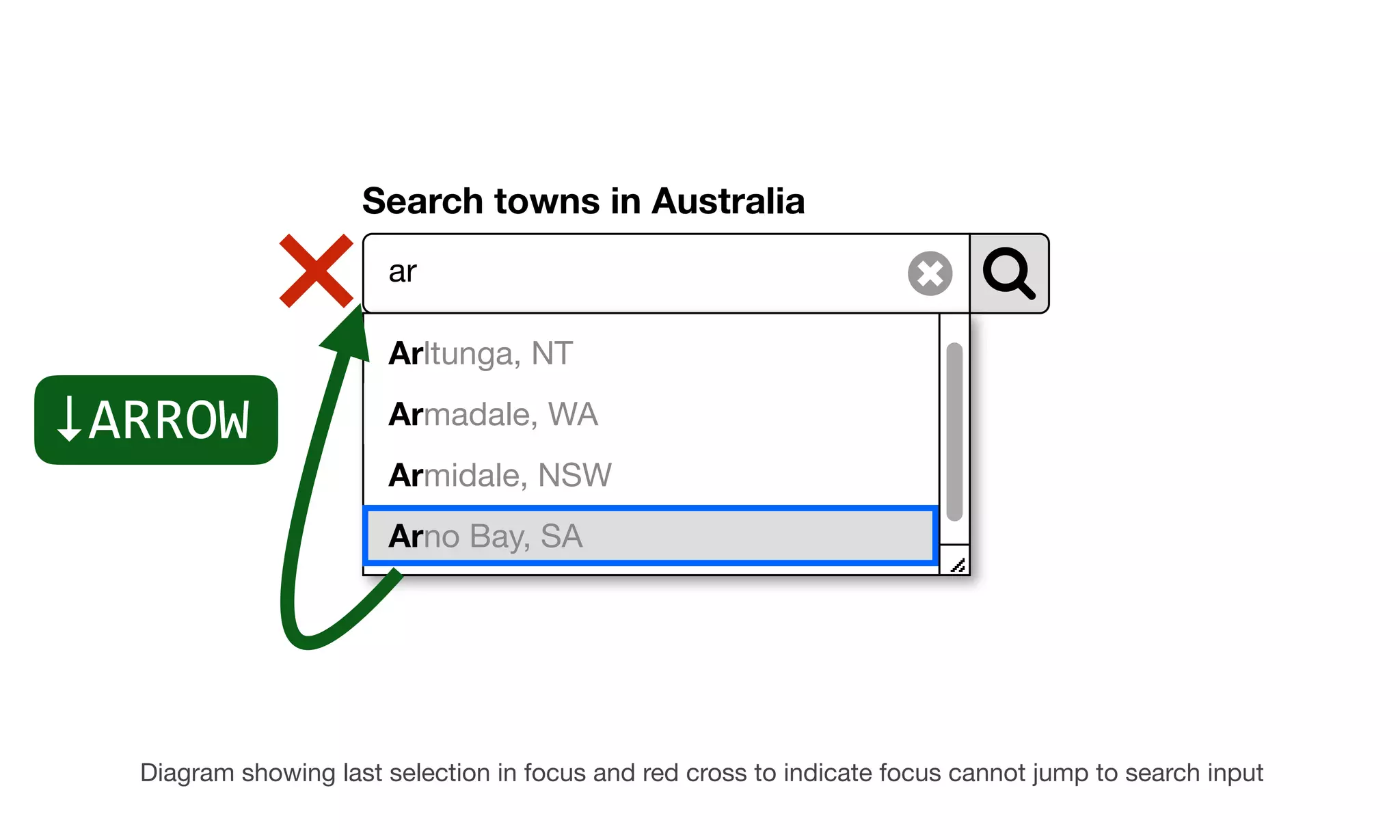


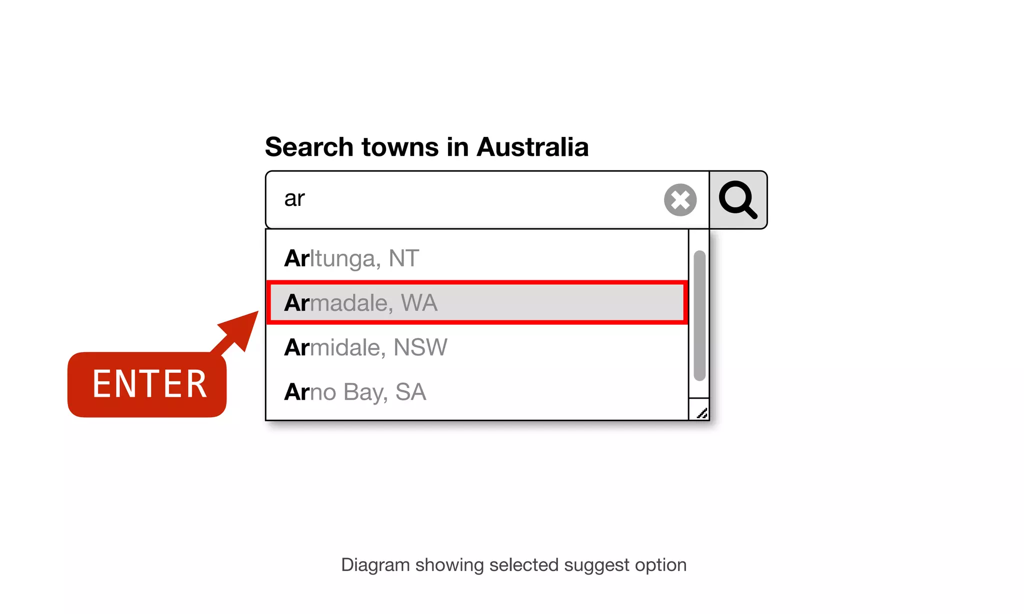
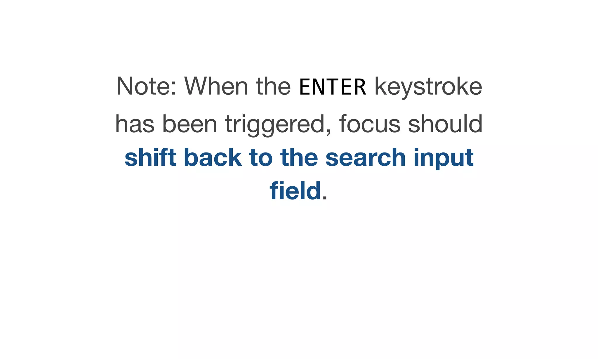
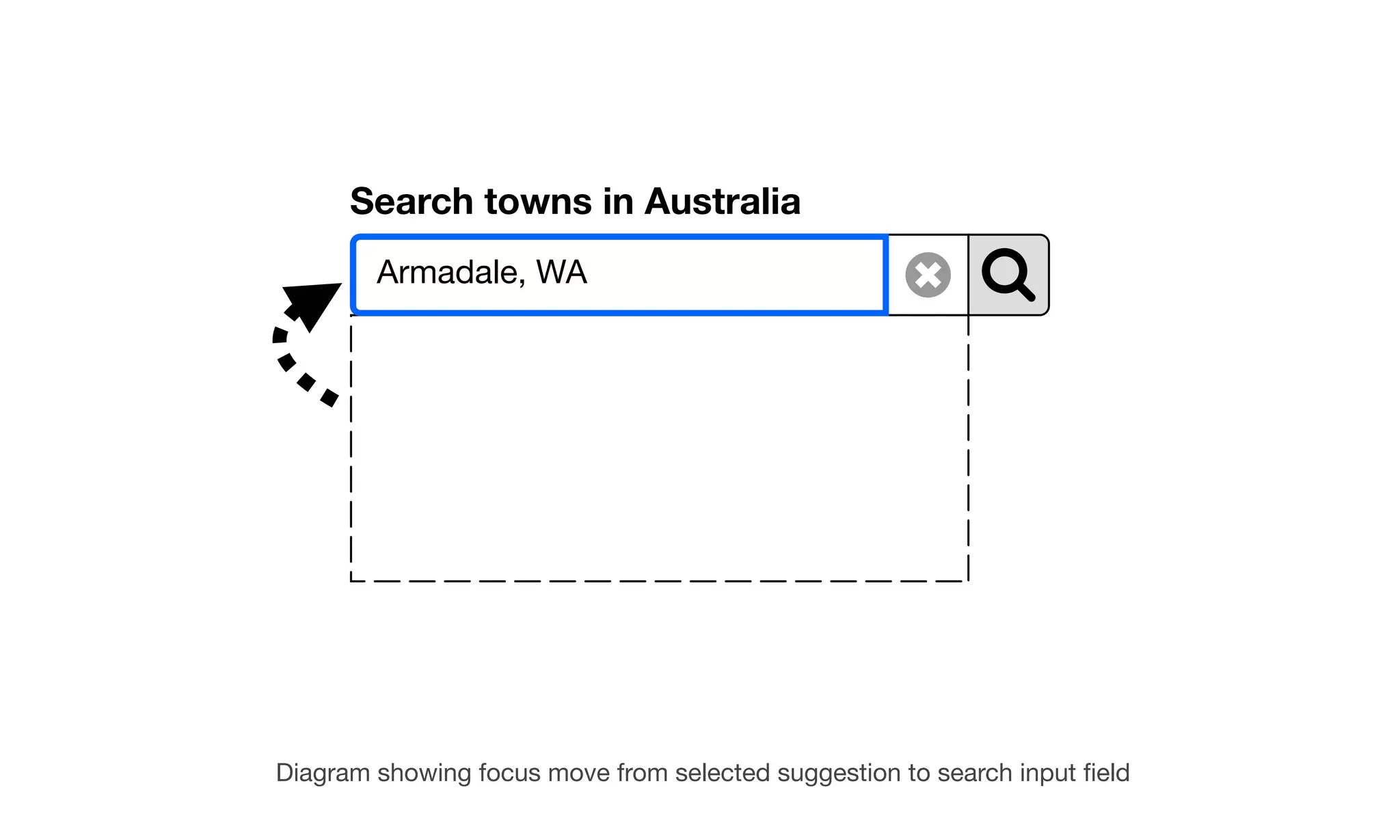


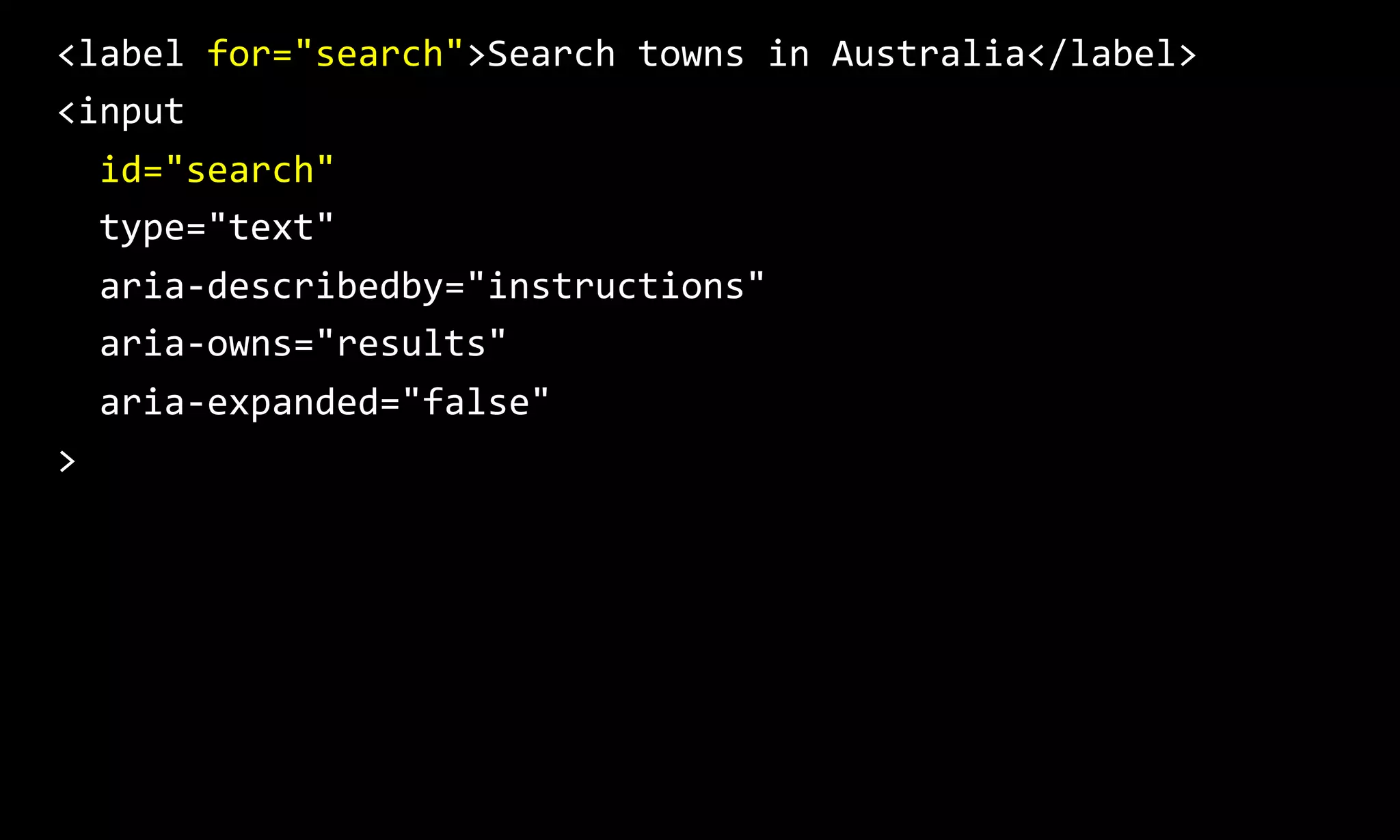


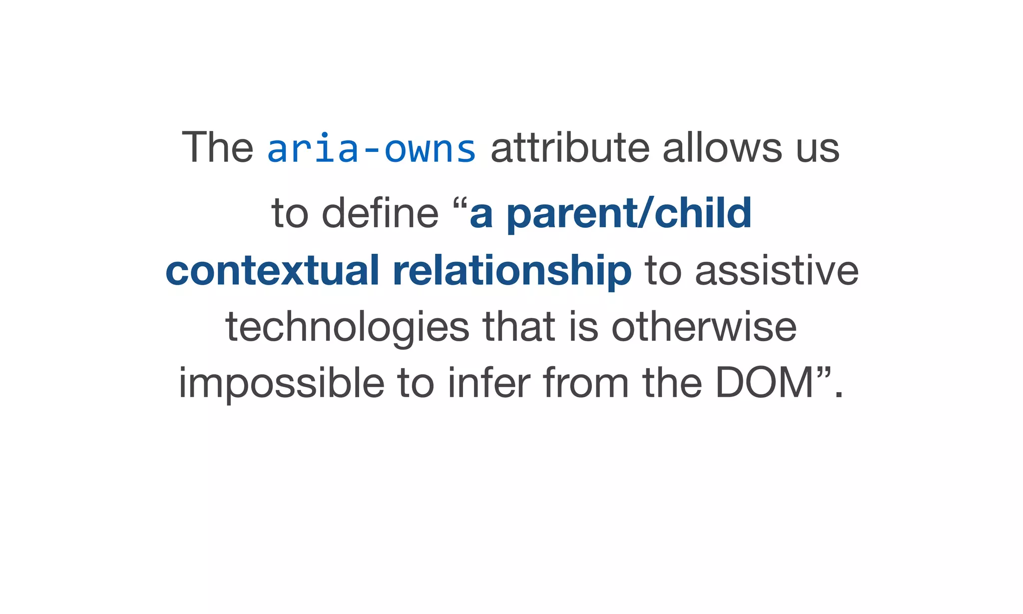
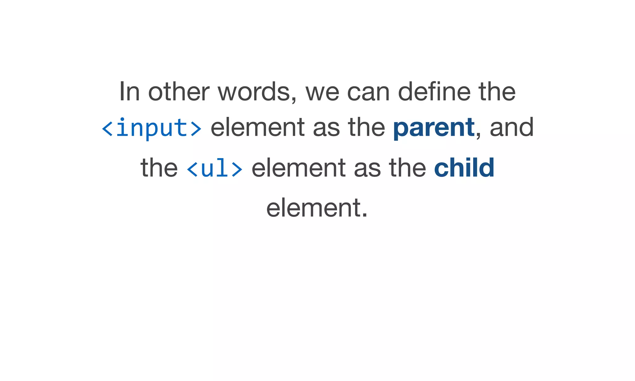


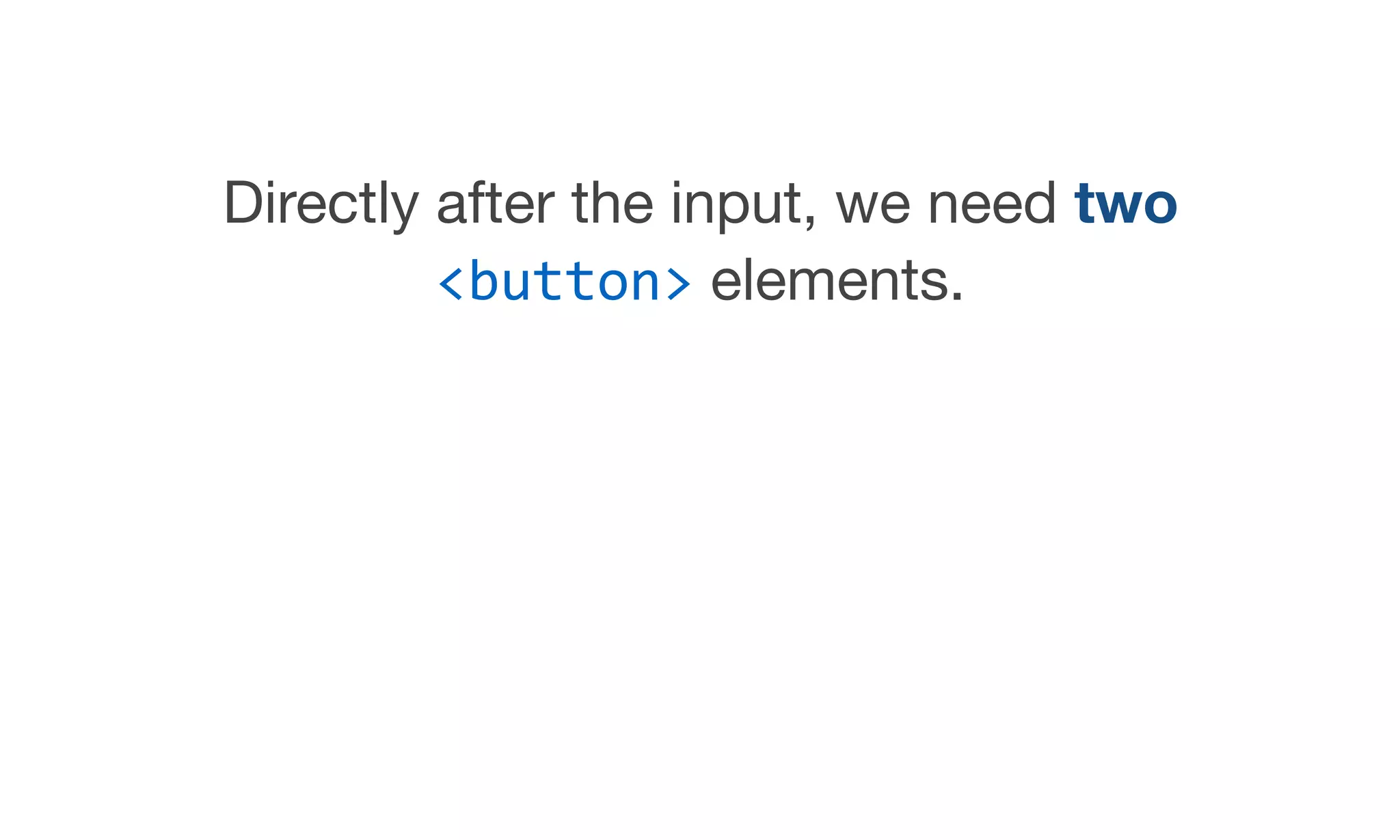
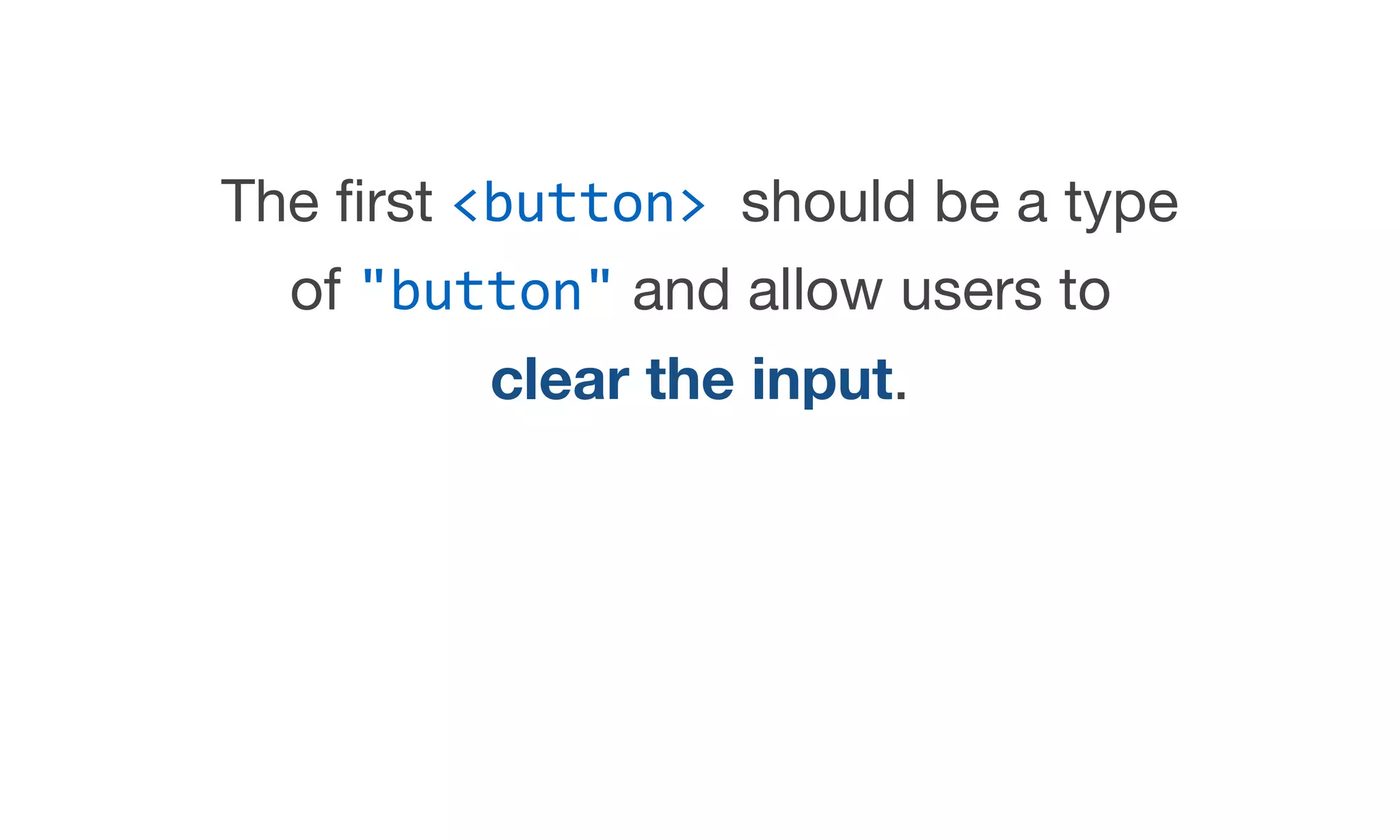
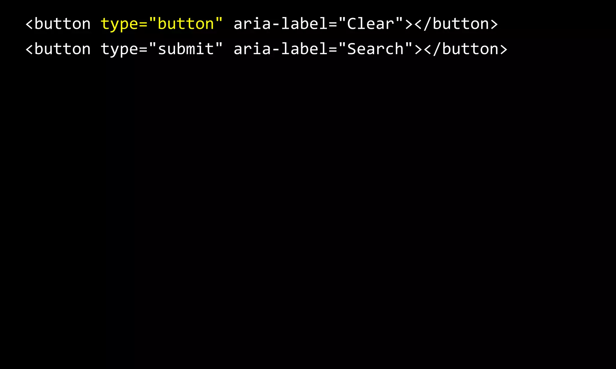

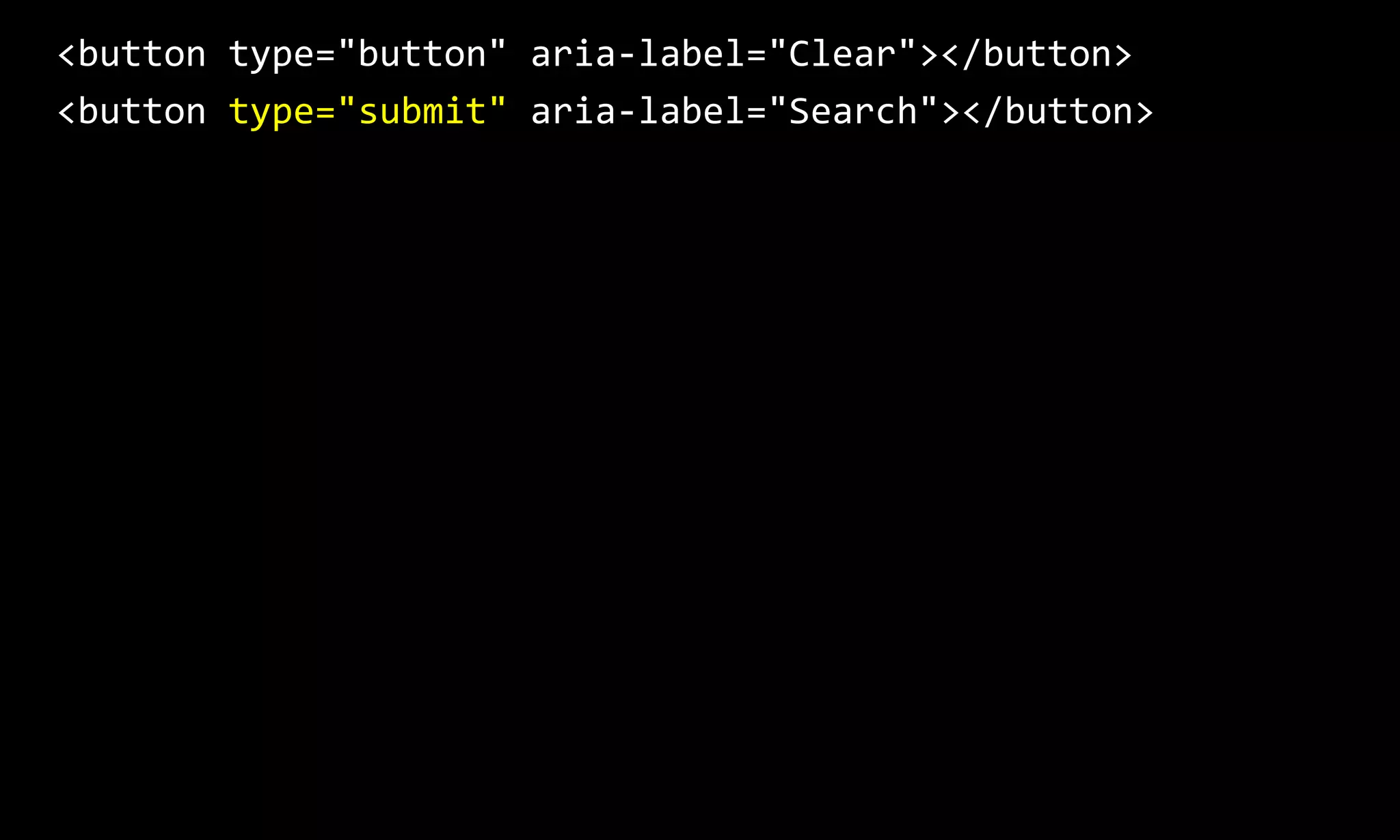

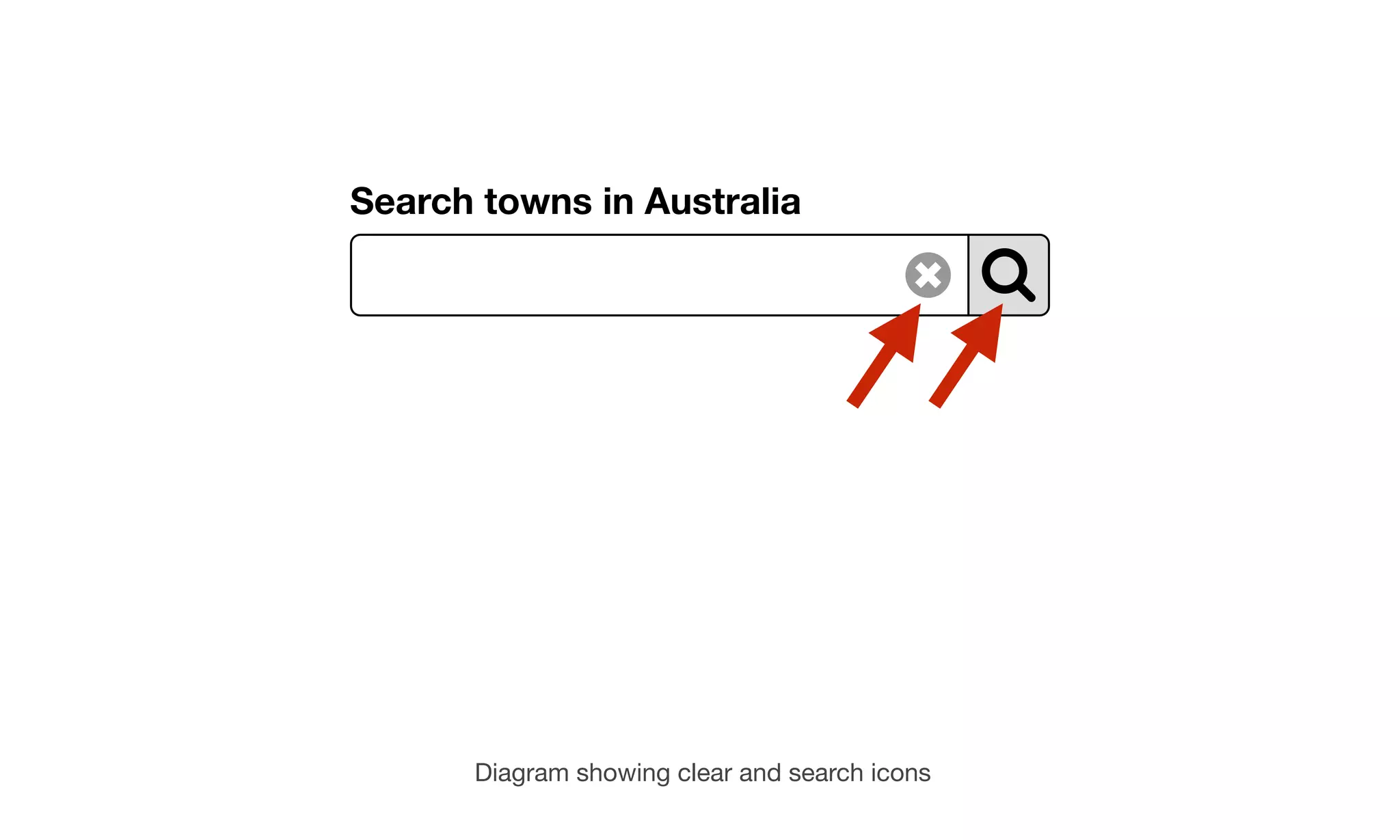
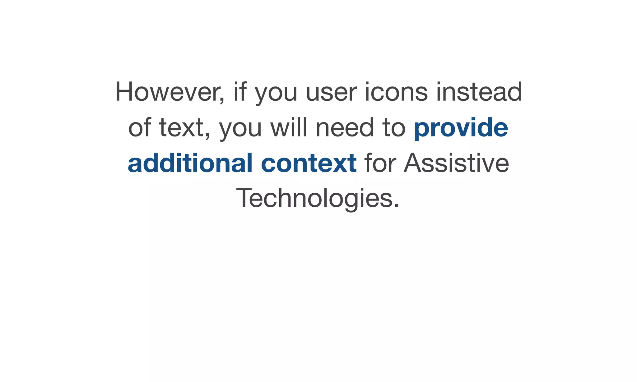

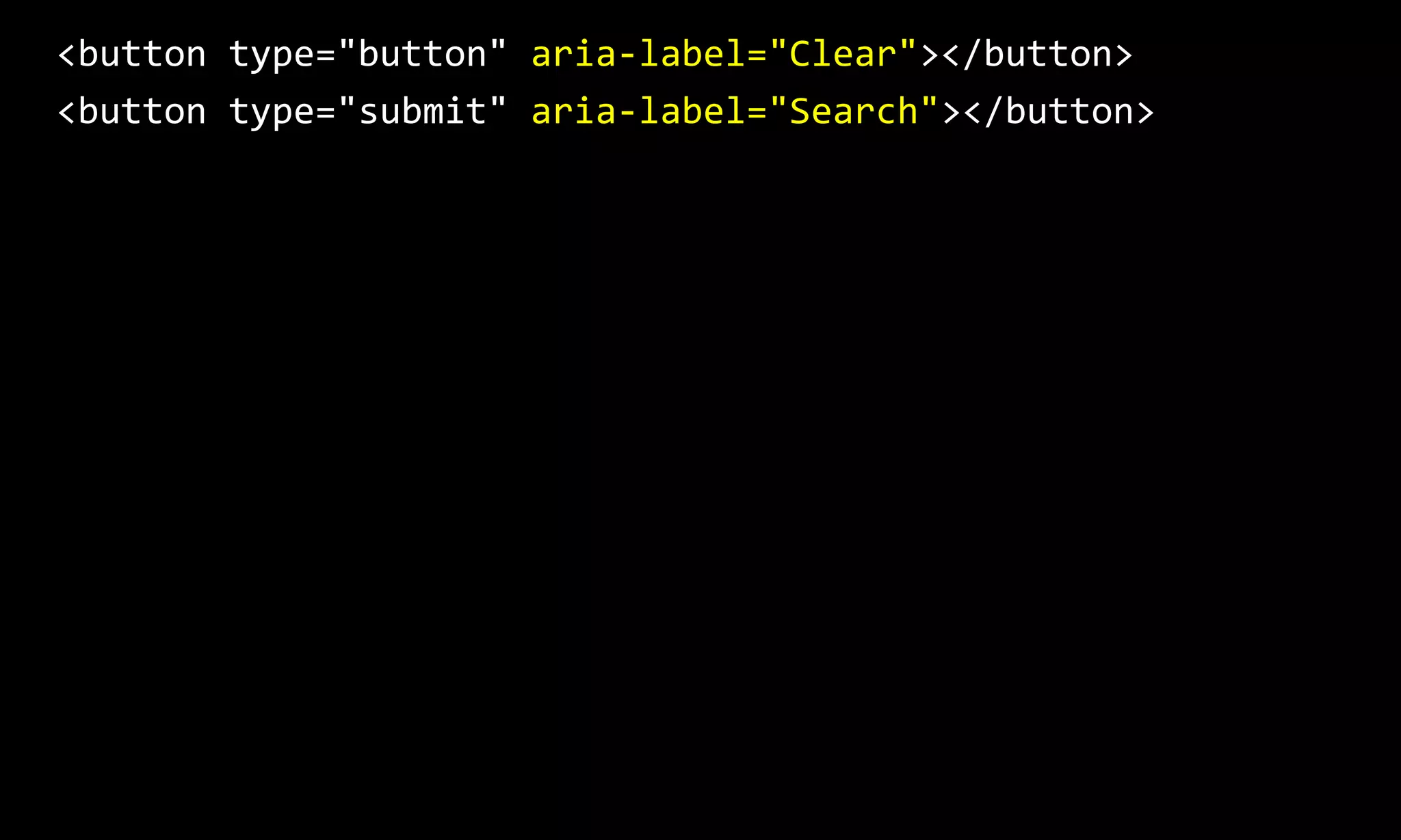

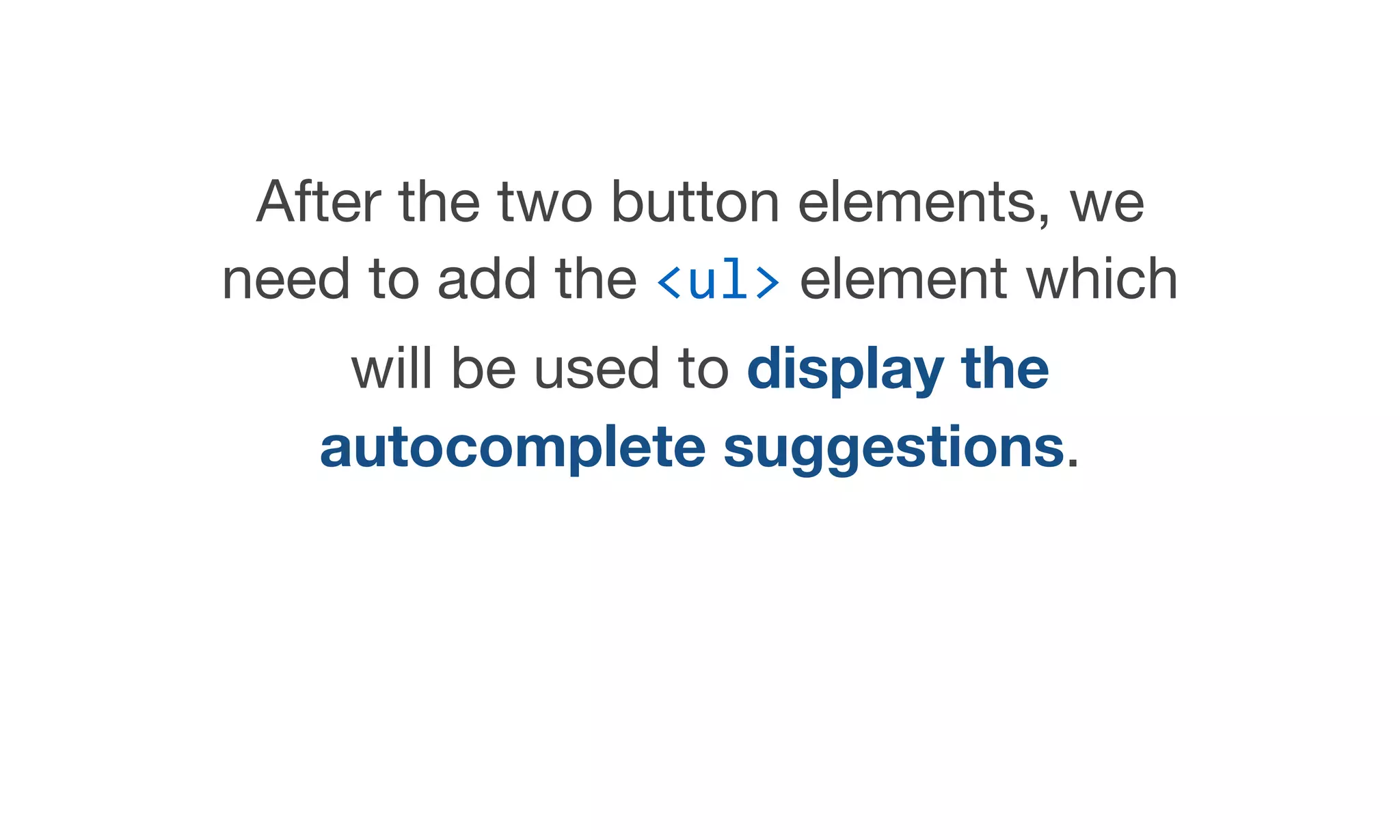
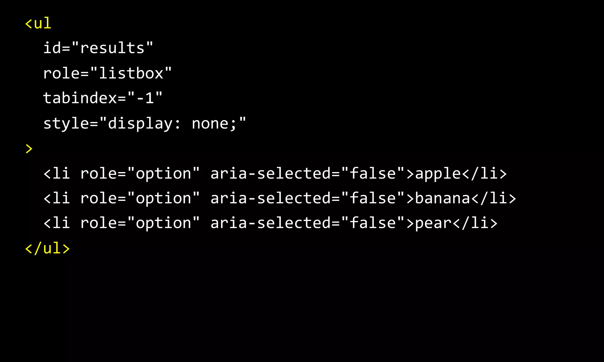

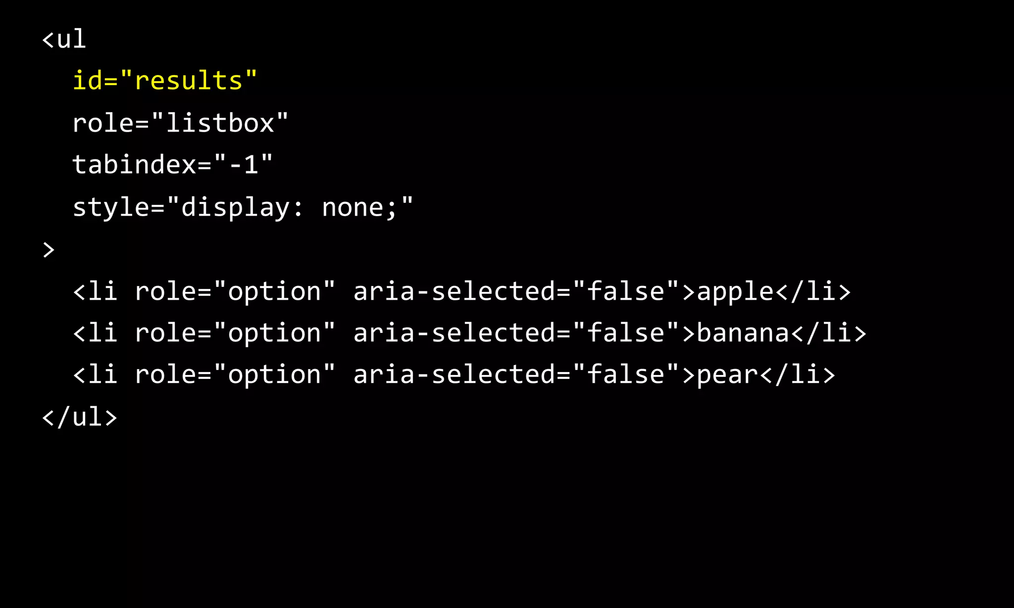
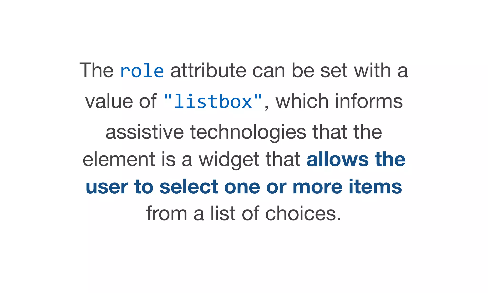

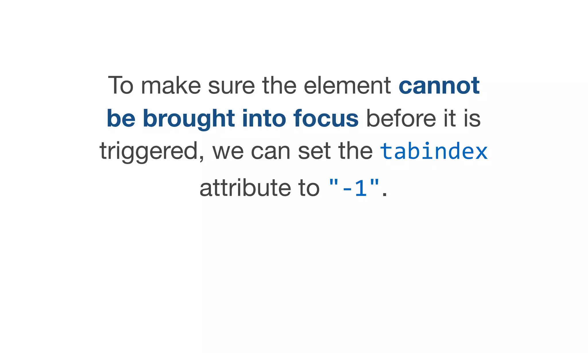
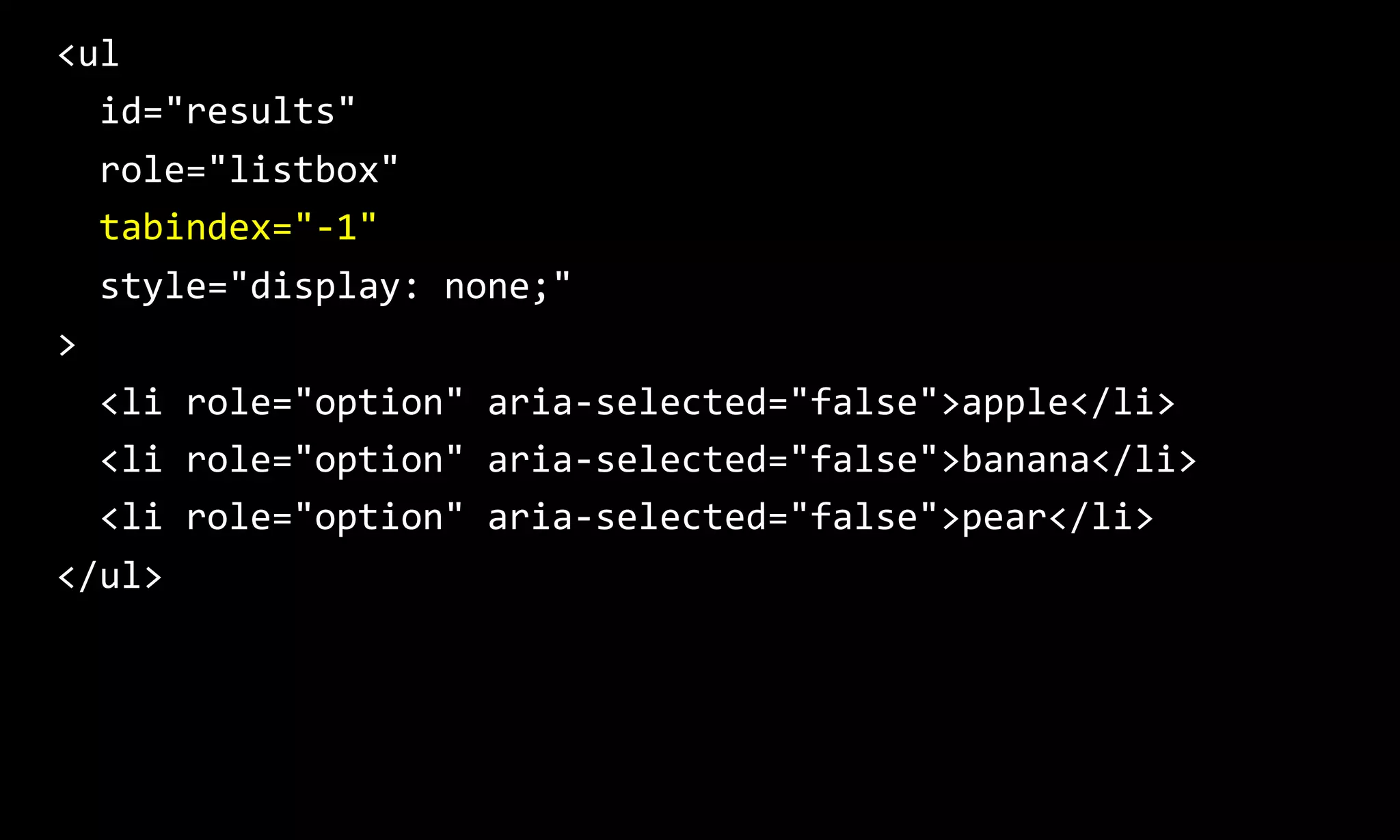
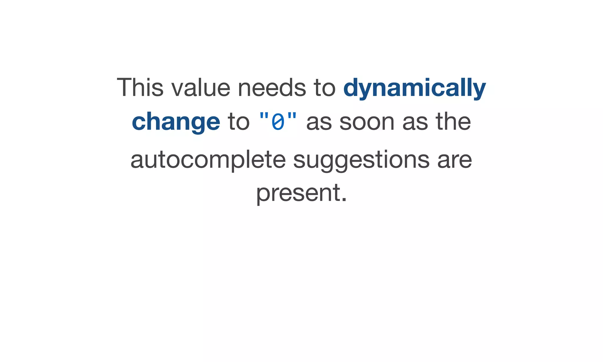
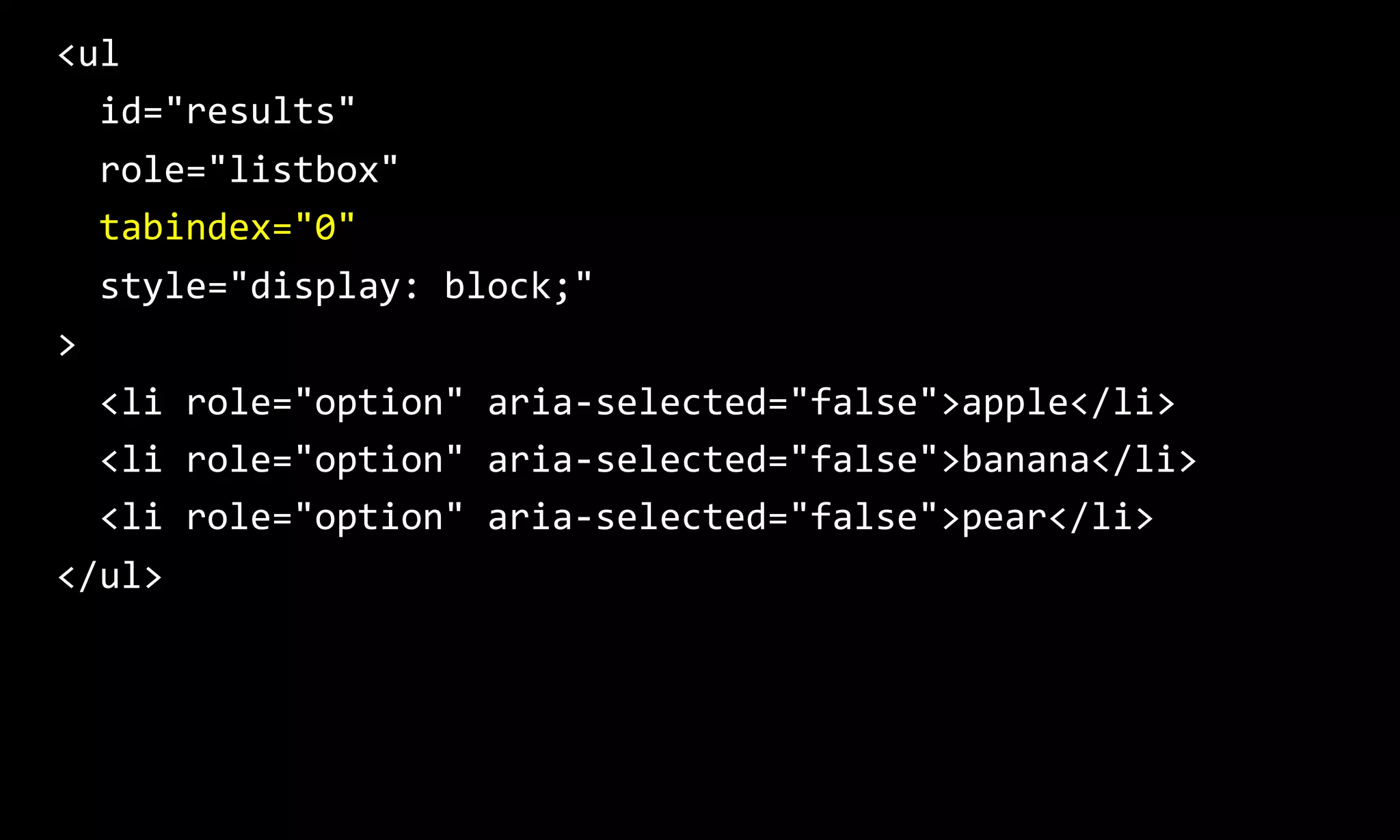

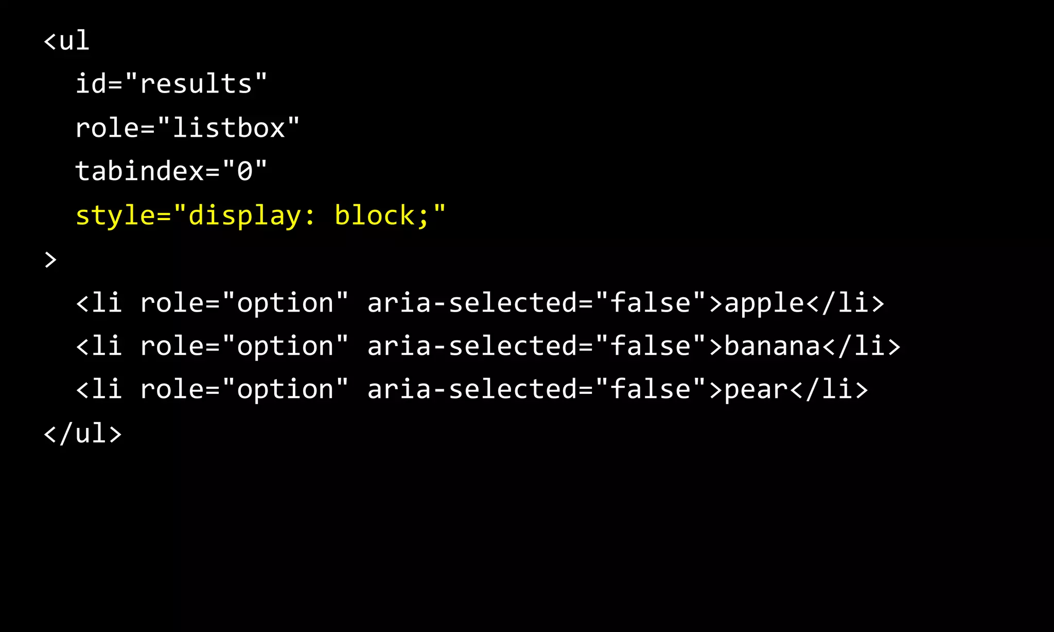

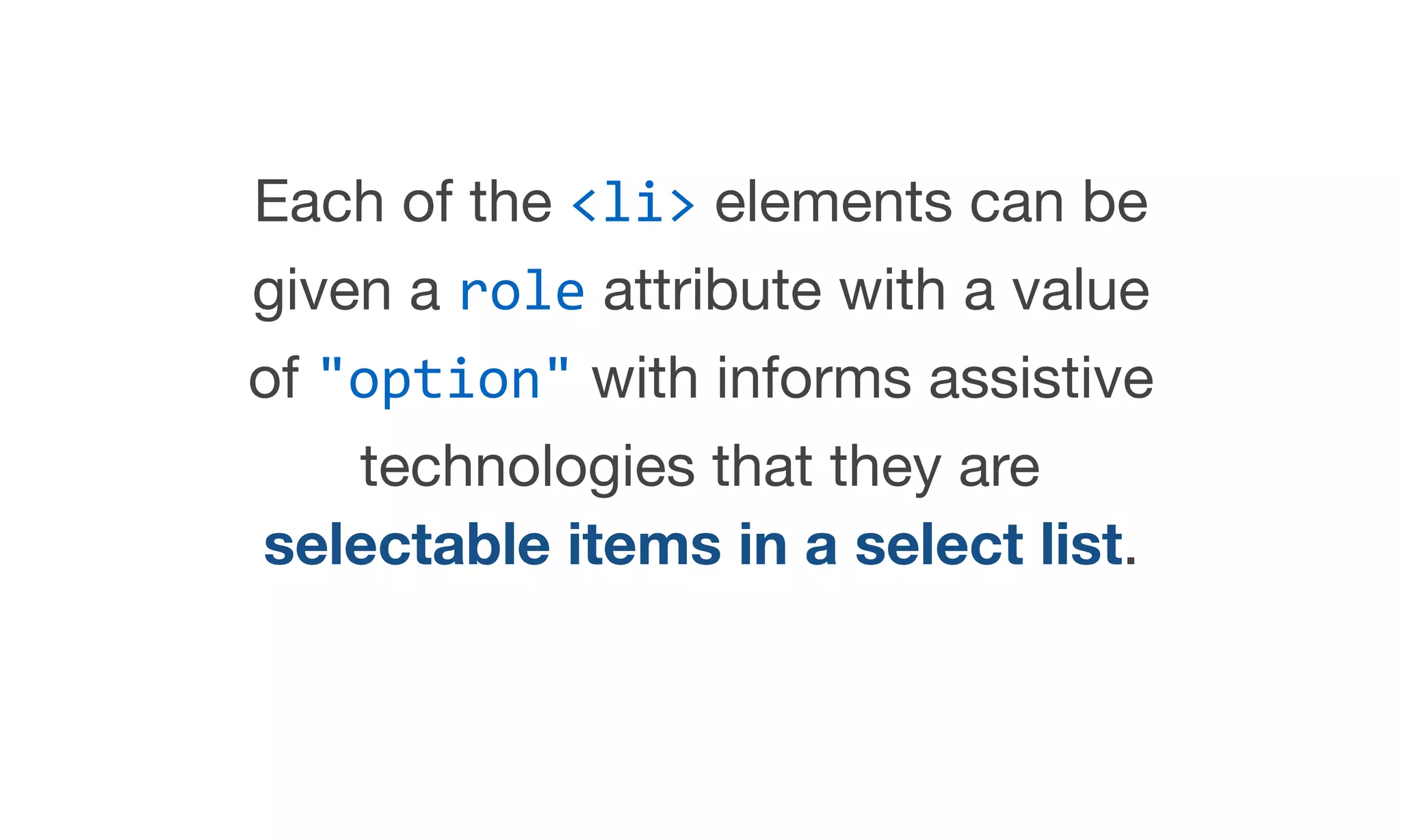
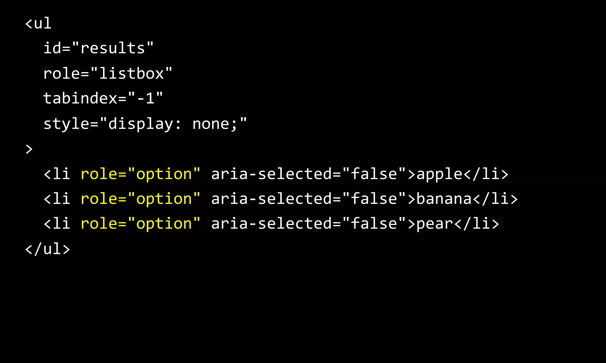
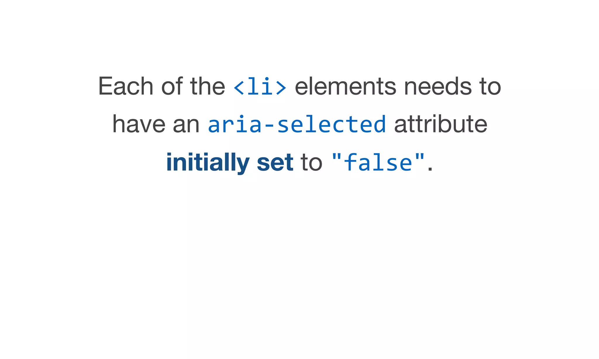

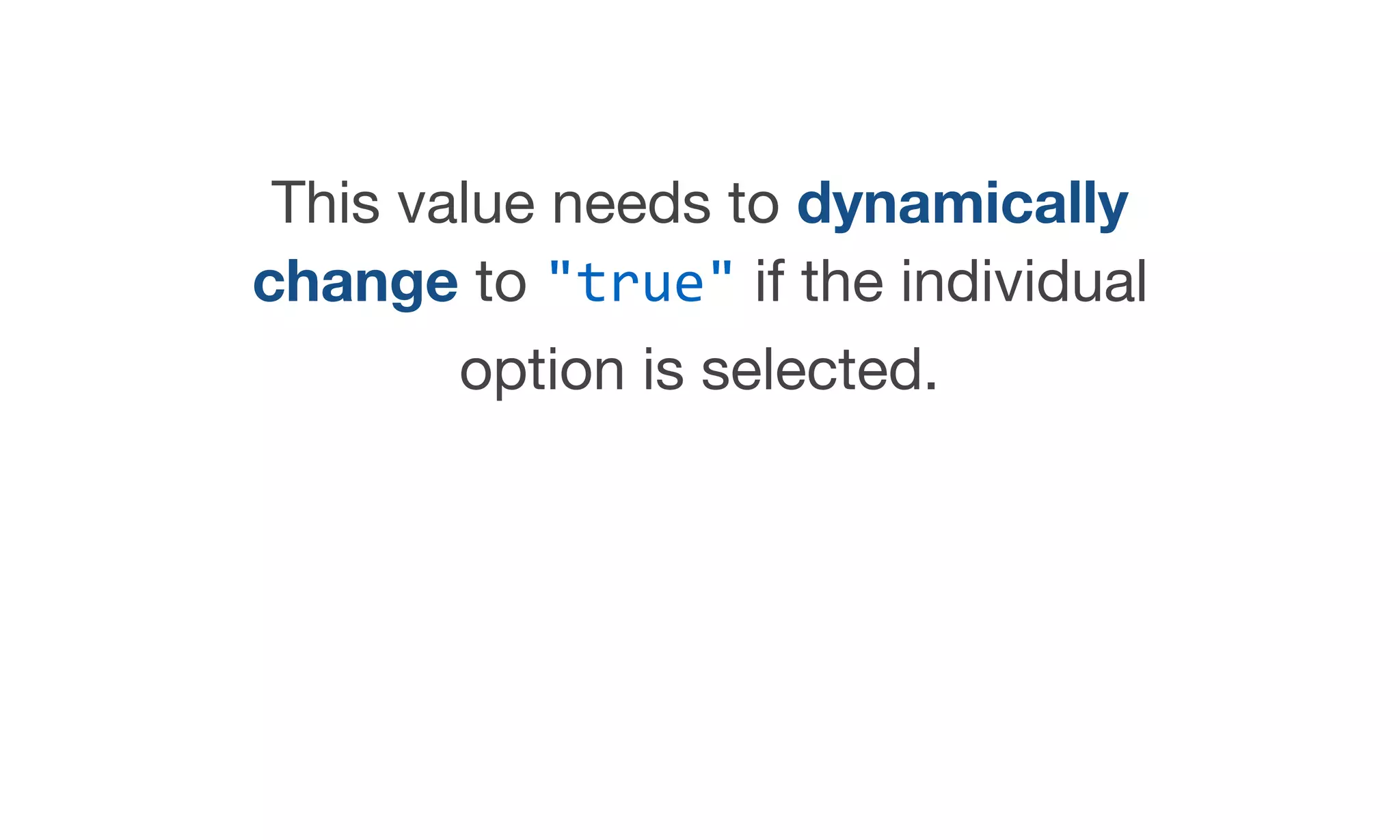

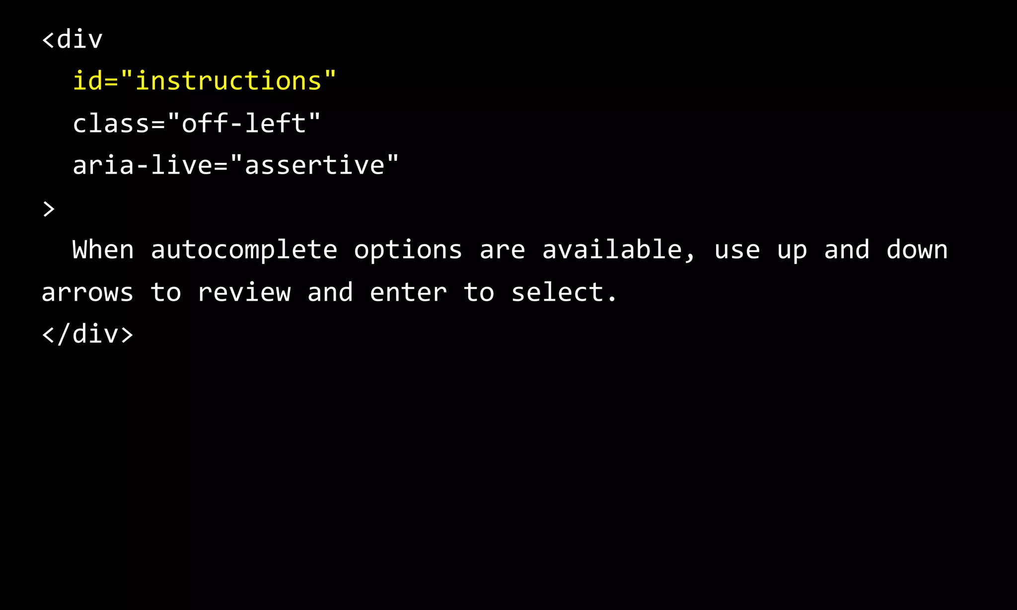
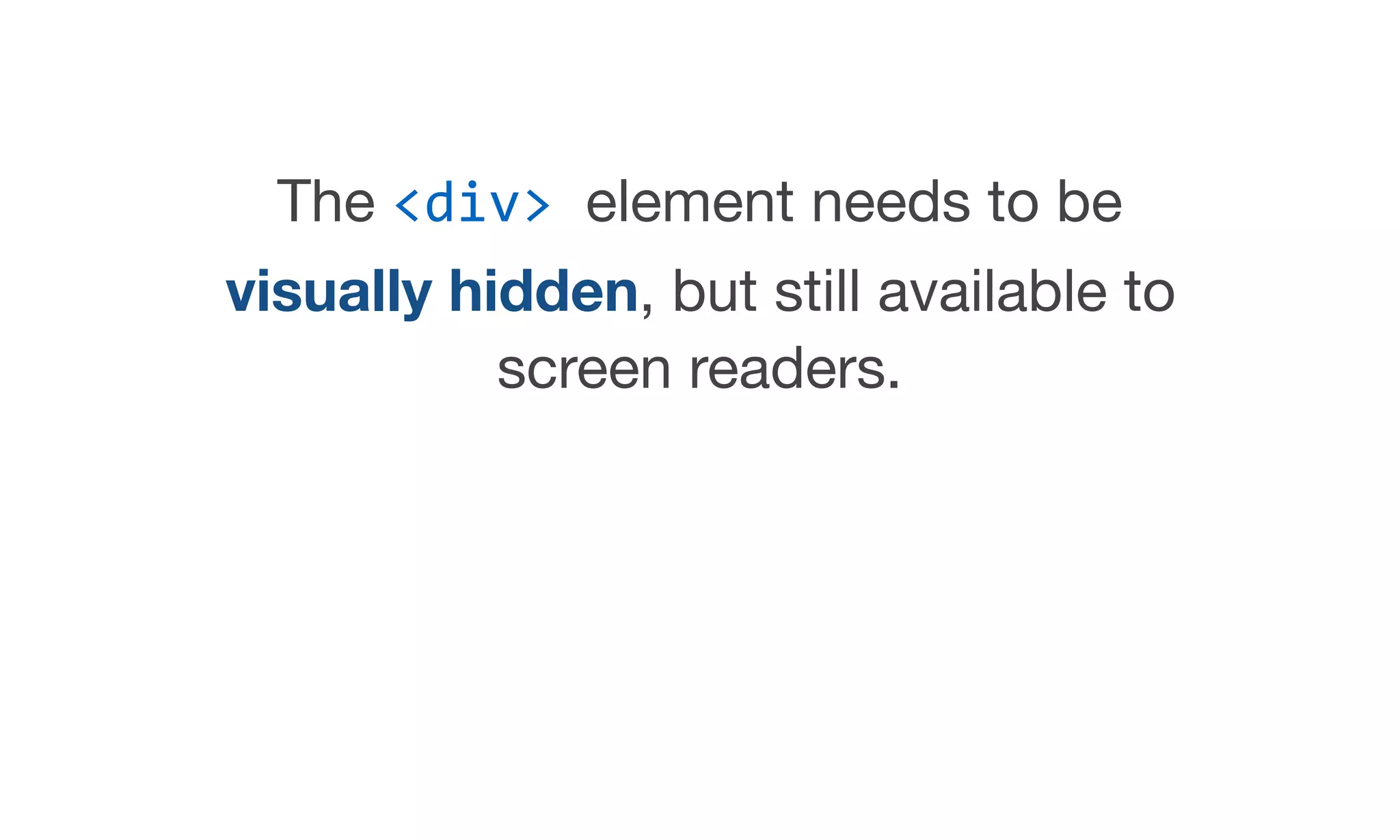


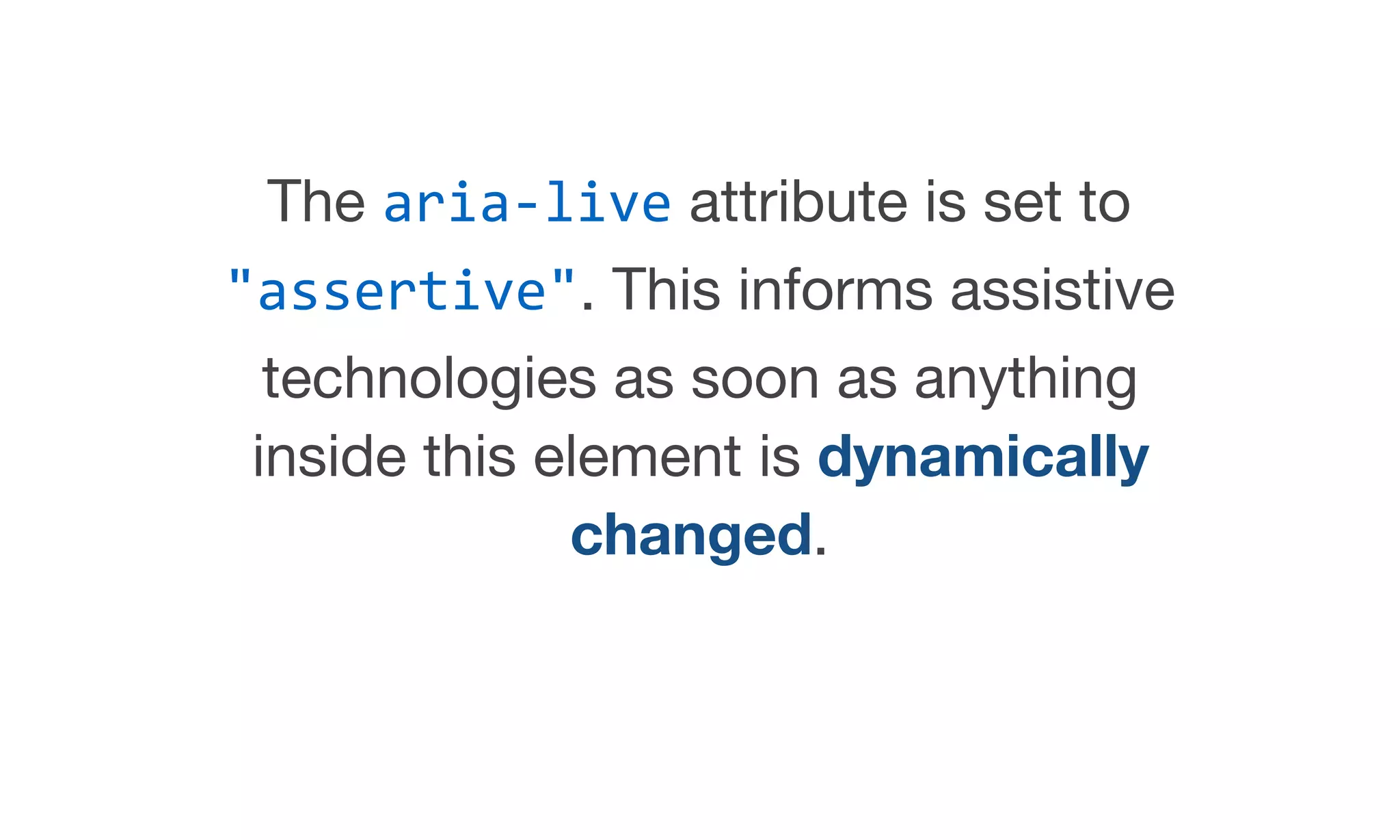
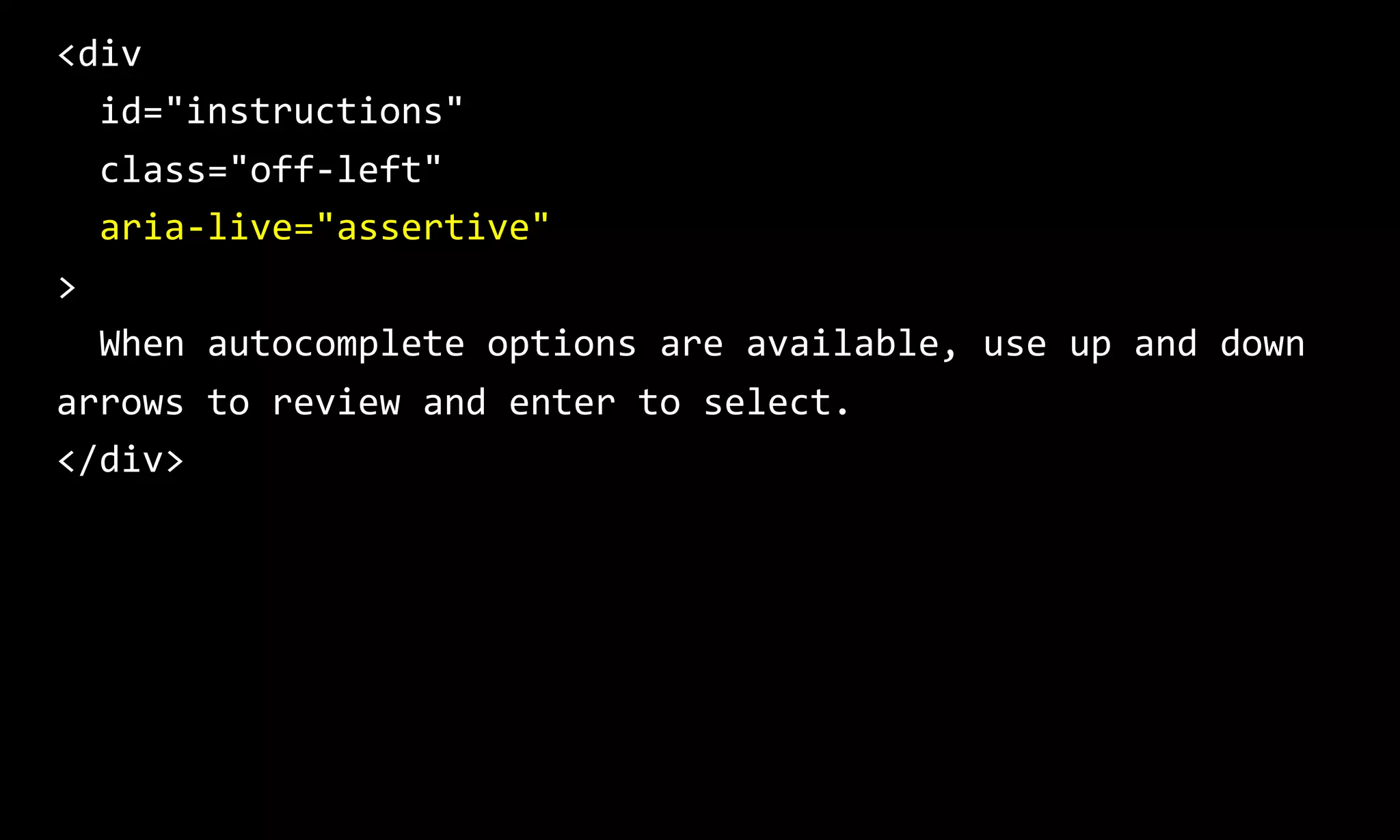
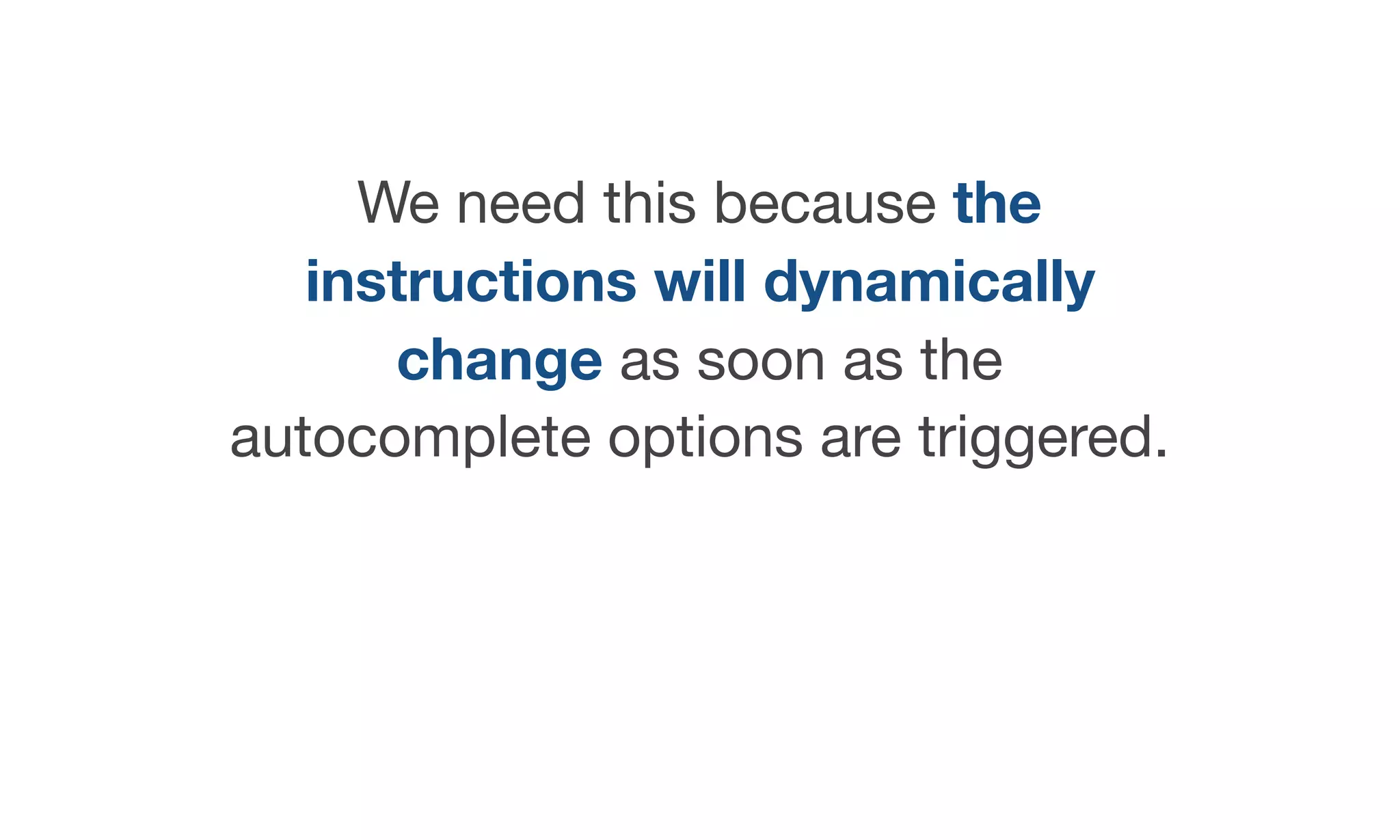


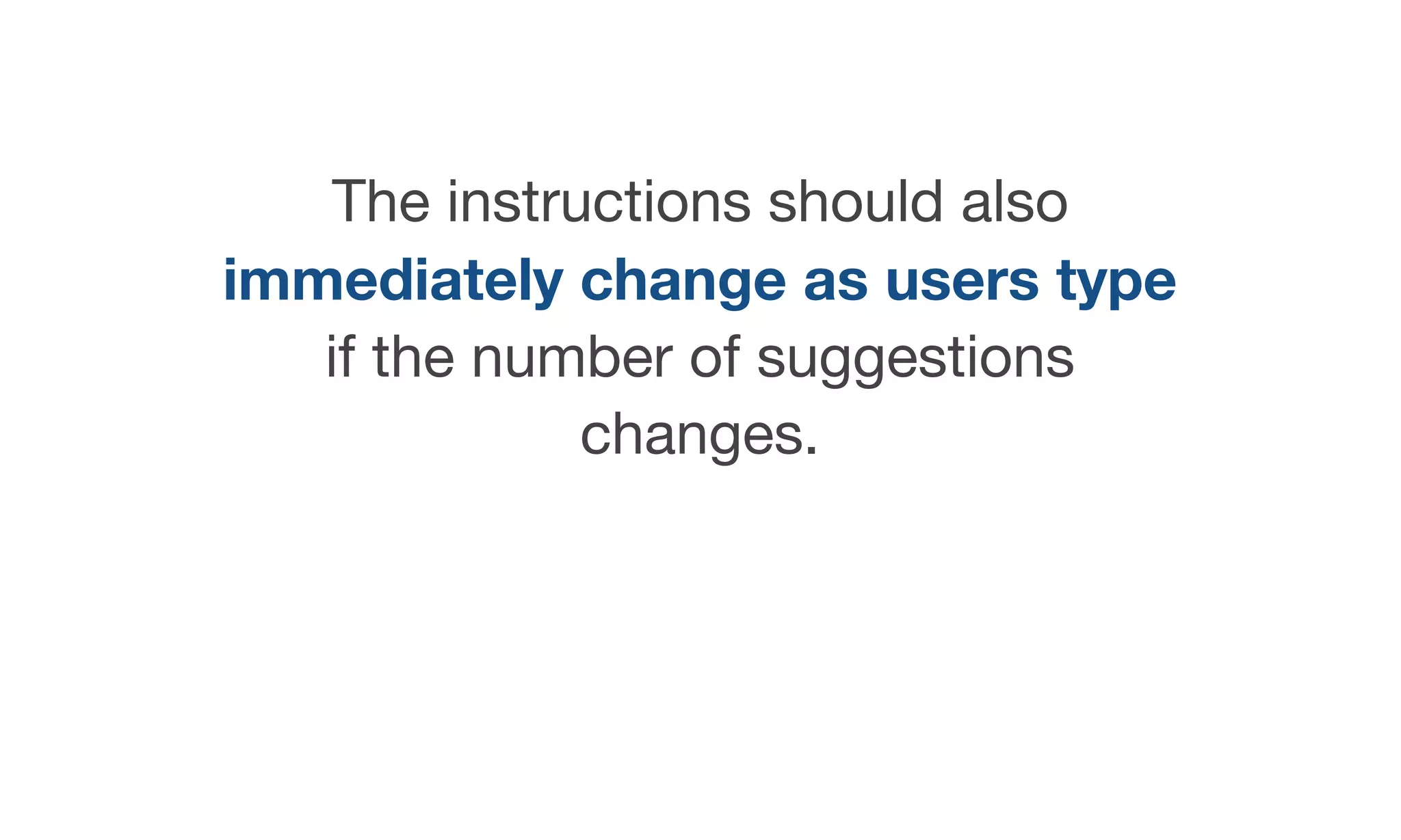
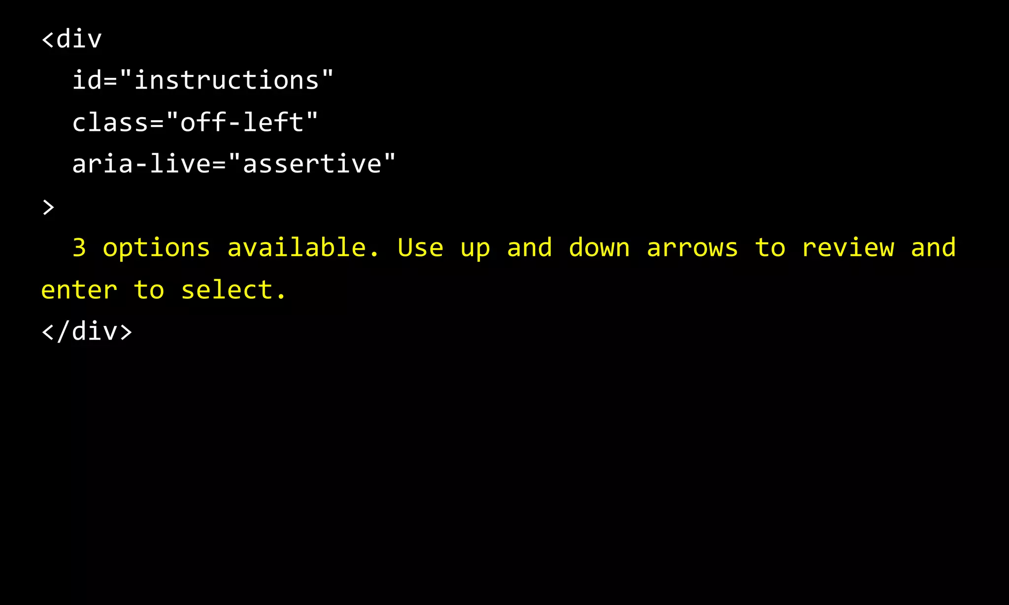


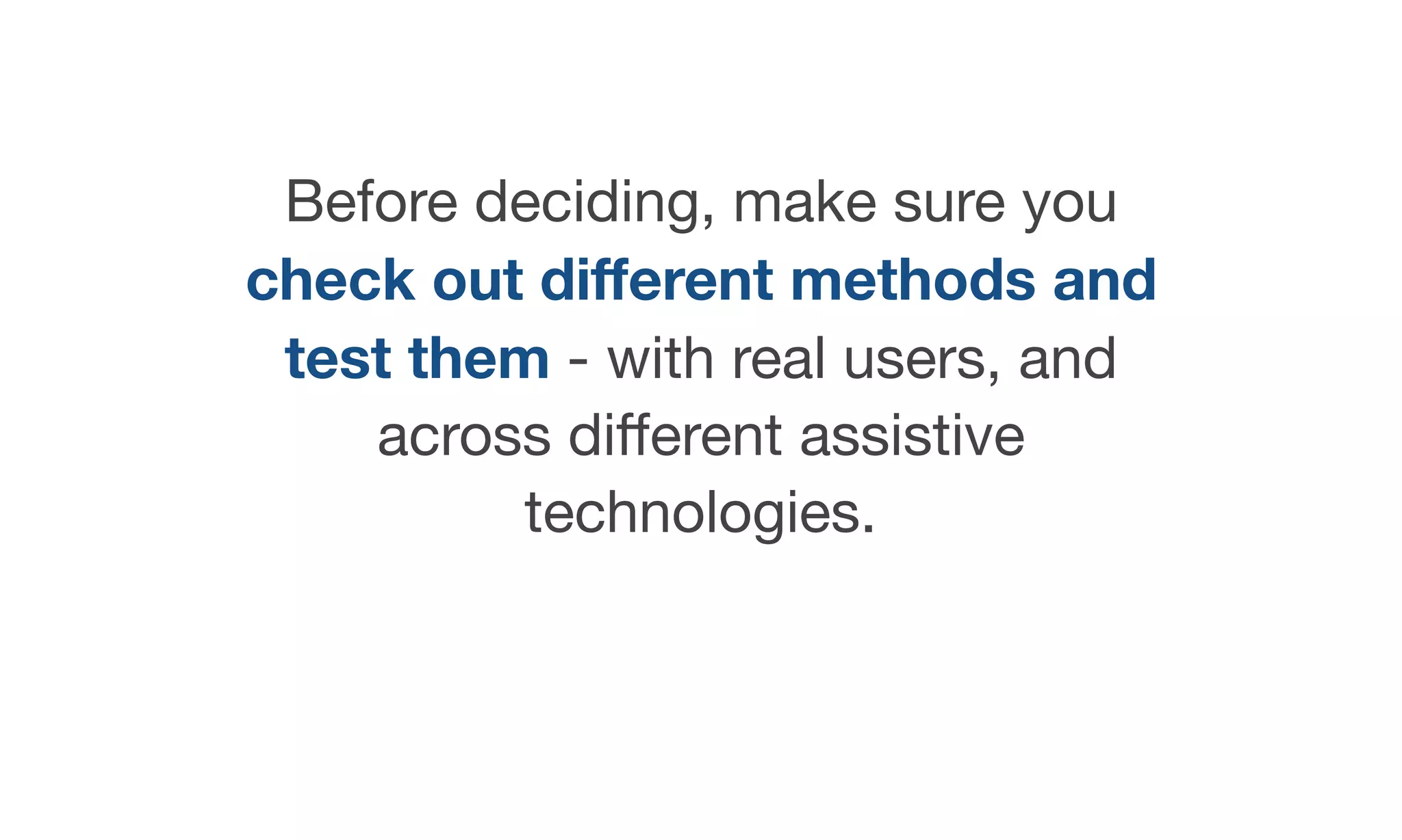


The document discusses best practices for creating accessible autocomplete search functionality, focusing on user experience and keyboard navigation. It highlights key design elements such as clear labeling, focus indicators, and accurate suggestions, while providing detailed guidance for HTML markup to enhance accessibility for screen readers. Additionally, it emphasizes the importance of ensuring the interface supports keyboard-only users in navigating and interacting with the autocomplete feature.