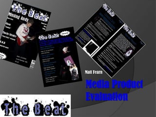
Matt Fearn's media product evaluation
•Download as PPTX, PDF•
0 likes•140 views

this is my evaluation for my media task.

Recommended
More Related Content
What's hot
What's hot (19)
Viewers also liked
Similar to Matt Fearn's media product evaluation
Similar to Matt Fearn's media product evaluation (20)
Recently uploaded
Recently uploaded (20)
Matt Fearn's media product evaluation
- 1. Matt Fearn Media Product Evaluation
- 2. My media product using conventions of real media products My finished front cover. The title of the main story is bigger than the other leads. The masthead is very stereotypical of this genre of music. The target audience will like this. The main lead is also bigger than the rest of the leads, showing that that is the main lead and it is linked to the image. I have also used a barcode, so that it can also be sold in shops. The strap line of the magazine is “Tomorrow's music today” as shown below the masthead. This is done in a lot of magazines not just music magazine.
- 3. My media product using conventions of real media products My final contents page. The contents are in a list down the left hand side like many other contents pages in the media. Also, the text is in two different colours so it is easy to differentiate between the different stories. The title is very easy to read which is key in any magazine. There is a very large variation in the different pictures; there are no pictures of the same type. They are all doing different things.
- 4. My media product using conventions of real media products My final double page spread. Again it uses two different colours so you can tell the difference between the headings and the main text. Also, the articles are not full of pictures, there is only a few because the main focus is the article. The description of the article is in a different colour to show that it is not an actual part of the article.
- 5. My media product developing conventions of real media products My front cover. It develops conventions of front covers because my masthead uses paint to give it an extra effect making it stand off of the background and giving the front cover an extra layer. Most music magazine front covers that only have one person on them normally have the person looking at the camera (they know that it is there) whereas my front cover uses one person, but he is actually unaware that the camera is there.
- 6. My media product developing conventions of real media products My contents page. Some music magazines will only have the issue number on the front cover; whereas i also have it on the contents page. I have also used a different font for the title “contents” to give the magazine a bit of variation. This is the same with the list of contents. I have used a different font to the rest of the magazine because it makes the magazine feel as if all the things inside are different compared to all of the other magazines like this one.
- 7. My media product developing conventions of real media products My finished double page spread. Like on my contents page, I have used the same fonts. This clearly shows the difference between the titles, and the articles.
- 8. My media product challenging conventions of real media products My front cover. It challenges the conventions of typical media products because most main leads are a different colour and stand out against the other leads. In my front cover, it is just bigger. This makes it more pleasing to the eye and keeps the number of colours low so it keeps the front cover basic.
- 9. My media product challenging conventions of real media products My contents page. Normal magazines say that you must use the same font throughout the whole magazine – in my magazine this is not the case. I have used two different fonts in my contents page as well. It gives the magazine variance as the list of contents are in a completely different font.
- 10. My media product challenging conventions of real media products My double page spread. Again, the double page spread uses two different fonts so you can clearly distinguish between the headings and the body of the text.
- 11. How does your media product represent social groups? My media product is aimed at people that like the R&B, Hip-Hop, drum & bass type genres. The people that like this type of genre are likely to be happy with the magazine because of many features. For example, the masthead of my magazine uses a spray-paint-type of font that would appeal to the target audience. Another font that I have used is for my headings on the double page spread would also appeal to the audience because it is the type of font that would appeal to him.
- 12. What kind of media institution might distribute your media product and why? I believe that the suitable media institution to distribute and sell my media product would be IPC Media. This is because they are a massive magazine publishing company, and they have a gap in their range of magazines for a music magazine of this genre. On their website (www.ipcmedia.com) is a list of all of their magazines. This company would be good to use because it publishes other music magazines such as NME. It has a lot of experience with publishing more than 60 iconic brands using them. It also publishes other bug name brands such as NME, Nuts and Look. Its services also include websites. Overall, IPC Media reaches nearly 26 million UK adults, just by using print. With their websites they also reach a further 14 million UK adults.
- 13. The audience My media product will mainly be aimed at young people aged from 16-26. They will have little income from a job if they have one, or no income personally at all and just getting money from their parents/guardians if they are only teenagers. They will be interested in a rebellious-style of R&B, Drum & Bass, Hip-Hop genre magazine. I have designed the magazine with this in mind and I think that they will like a lot of the small features I have used such as the masthead.
- 14. Attracting my audience My main way of attracting my desired target audience was handing out questionnaires at schools, colleges and in popular shops that I knew the target audience would be using such as Republic on the weekend. The questionnaire used mostly closed questions so I got the answers I wanted every time. Although I did use some open questions to get the opinions of the people I was surveying. I put up posters of the front cover around the school and put along the bottom whether or not they would consider buying it. I also produced a potential advertising poster and put that up around the school to see if it got any intersest.
- 15. What I have learnt about various technologies I used basic applications such as Microsoft Office Publisher and Paint whilst I made this media product, which I knew a lot about before from previous assignments. However, I learnt how to add pages into a publisher document and I used different file types on paint. On the other hand, this project also allowed me to discover new applications and even new hardware. I used a smartphone to take my pictures for the magazine; this allowed me to get to grips with a lot of the functions that I had not previously used before such as the various effects, brightness and contrast. I also used a completely new (to me) application called Adobe photo shop. It took some time getting used to, but in the end I got used to it. Unfortunately I did not get to use any of these edited images I had created in the final product.
- 16. A look back… Preliminary Main
- 17. What I have learnt from this project: I fell I have learnt that keeping it simple is best – a plain background is better because you can easily read one colour of text, and the text stands out a lot more. Also, using small amounts of text - like in the bottom picture – is good because it makes the magazine look tidier – not as busy as in the first one. Also, white is not as good as a colour because it is boring and goes too well when it is a secondary colour on black. Different is good (in small doses) – if you can stand out on shelves you are almost always going to do well (unless it is different in a bad way) You must appeal to your whole target market – not just some of it – if you are aiming a magazine like the second one for a specific age, it must appeal to all of them; for instance, not just males, females as well if they are in your target market.
- 18. Thank you for your time.