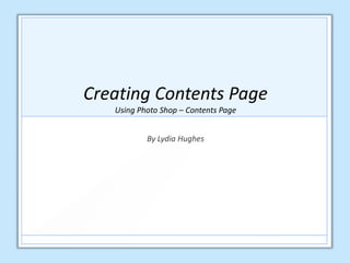
2. In order to begin creating my contents page, I first had to
open a new document in photo shop. Since I am creating
my contents page, I had to name my contents page
‘Contents Page’, preset it as ‘International Paper’ and
change the size to A4. As a result of this, my new, plain
document was created (as depicted on the right).
3. I now had to open the main feature image that I
decided to include on my contents page. Once I
had allocated my file in my documents, I opened
the image and dragged it onto my plain document
in photo shop (as shown in the print screens
below):
4. Now that I had dragged my image onto my
document, my image now became ‘Layer 1’.
5. I decided to use the Quick Selection Tool to remove the
model on the left, as well as the background. I did this
because I felt my contents page should be the page in
which viewers receive informative information into why
they should buy the magazine, due to the content
present within (acknowledged on the contents page). On
that account, I decided to remove the model on the left,
as the content list would fit perfectly in this location
(where the model is currently standing). For that reason,
removing the model allowed me to incorporate a typical
convention onto my contents page (content list).
6. The result of removing the background and model,
using the Magic Wand Tool.
7. I then wanted to add a coloured background onto
my contents page. On that account, using my
toolbar I selected ‘Edit’, ‘Fill’ and then chose the
colour grey since this colour will allow my house
style colours to stand out (black, white and red), as
well as my image present.
8. As expressed on my first draft contents page, I desired
a small advertisement at the bottom of my page, which
promotes my magazine to viewers directly. Here, I will
make viewers aware on how they can subscribe to
receive 'Vinyl Revival' much earlier than other
consumers. For that reason, using the Rectangle Tool in
my toolbar, I drew a box at the bottom of my page. I
filled this box in red and then completed this action a
second time – creating a second box which I filled in
white. Here, I can write in black as it will stand out on
the white background (retaining a clear house style).
9. I then inserted the images that I chose to include as my
smaller feature images (cover lines) on my contents
page. I did this by following the same action for my
main feature image on slide two. Once I had allocated
each file in my documents, I opened each image and
dragged it onto my document in photo shop. I centred
each image in a row near the top of the page, leaving
enough space for a headline above and a content list
below.
10. In addition to the previous slide, on my small
advertisement I will display an image of the front cover
of my magazine, so that viewers recognise what they
will receive each month by subscribing.
11. Second Draft
As displayed in the image on the right, I
incorporated content onto my contents page, as
well as comprising a clear house style (black, white
and red). However, now that I have created my
second draft I feel my subheadings should stand
out in comparison to the features described below
each heading. For that reason, I would like to
change the colour of each subheading font into red,
allowing viewers to recognize what type of features
the magazine includes. As well as this, on each
image present I would like to include a page
number on each image so that viewers
acknowledge where they can find each
feature/article in the magazine.
12.
13. A explained on the previous slide, I incorporated text onto
my contents page (a key element for any contents page).
As shown in the image on the right, I included the same
text that I used for my masthead on my front cover as the
headline on my contents page, clearly stating ‘Contents’.
As a result of this, my magazine retained an evident house
style (use of same fonts and colours). As explained on my
first contents page draft, I decided to include a 'NO1 Chart
List', which comprises the biggest hits at the moment
(since my magazine also targets current music fans).
Furthermore, I listed each article that is present in my
magazine underneath the appropriate subheading.
NO.1 Font (Black) Page Numbers (White/Black):
Contents Font (Red&White):
Sub-Headings: Pop, R&B, Special Features, Upcoming
Concerts (Red):
Contents List, Subscription Info and Hit List (Black):
14. Final Contents Page
As you can see, my final contents page
incorporates key conventions that typical music
magazines retain. Unlike my front cover, I decided
to give my viewers a clear insight into what my
music magazine obtains. For that reason, I
displayed smaller featured images (cover lines)
into what Vinyl Revival obtains inside. On top of
each image, I displayed a page number so that
viewers recognise where they can find this
article/feature in my magazine efficiently.
Additionally, I placed a NO.1 Chart List that
updates current music fans on the biggest hits at
the moment. Furthermore, I also included an
advertisement at the bottom of my contents page,
which informs readers on how they can subscribe
to the magazine earlier than others for a set
amount of £4 (cheaper than original magazine
price of £4.99). Overall, I believe I have
incorporated enough conventions onto my
magazine, which gives viewers a great insight into
what Vinyl Revival obtains. Moreover, I have
retained an evident house style that continues on
from my front cover (fonts and colour theme:
black, white and red).