
Recommended
More Related Content
What's hot
What's hot (20)
Similar to Question 1c
Similar to Question 1c (20)
Recently uploaded
Recently uploaded (20)
Question 1c
- 1. Question 1c: How did your print productions use, develop or challenge conventions of media language and genre?
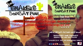
- 2. Media language used in the digipakI used many languages and methods that appear in the mass media within my print productions. This section of media language is split into 3 factors, these are ‘photography’, ‘visual styles and aesthetics’ and ‘fonts and texts’. Firstly I used a range of photographic methods in my digipak. The shots that appear in my digipak production is taken from my music video, the images are taken at a high quality so it can create an effective and clear piece of creative work. These shots use aesthetically pleasing locations and camerawork which can contribute to the aesthetics within my print productions. I reuse the location of the beach and the seafront as seen in the main section of my visual production. This type of location can convey ideas of freedom, tranquillity and youth. The sea can act as a visual metaphor for the many possibilities and directions that life can go. In my digipak the reoccurring themes and locations of the sea can hint these representations and also stays relevant to my video. The type of shot that the digipak uses are ‘mid-shots’ and ‘close-ups’. The front, back, disc and third inside panels use this shot, most of these panels can present the togetherness that the boy’s kindle and protect. We are placed with the boys which can add to contribution to their activities and also convey that they are the main focus, they are also main focus characters who appear in the video also. The close ups of the boys can also hint they are separate due to their differences which can contribute to the reoccurring theme of the video showing their differences and how they overcame this at the end. The front panel of the digipak places consumers in eye level with the boys and while using an over the shoulder shot, this once again places us with the boys and presenting what they see ahead of them which is a large open space, used possibly to present their freedom to roam and have fun. The use of a range of shots and perspectives can project my knowledge in different shot types and also creates more variety in my print productions to interest possible consumers. I used an ‘odd’ and ‘dreamlike’ visual style to present the idea that they can be within a dream world and that according to teenagers that freedom is fantasy. Firstly, the bright aesthetic achieved through the colouring of the digipak (front and back panels) can create the sense that the landscape is artificial. This can be an image used to present that freedom is ‘fantasy’, in reality according to teenagers like these boys in the video, freedom is non existent due to elders being in control, in this new free reality the boys can free roam and live a life that they want to take on. Brighter colours can also catch the consumers attention as it may stand out compared to other albums that may be in shops and online. This can create an modern and upmarket production as links such as these listed above are used. The rest of the digipak (inside panels) use a black and white filter, the use of a ‘b+w’ filter can be used to connote an olden type of memory, this could link back to the video especially referring to the epilogue where the video reverts to a black and white filter, the picture of the boys can be seen on a desk meaning that the memory will always be present. This can create a sense that this took place in the past and will be remembered, an orange box is also used to make the artwork stand out and also appear eye-catching towards consumers. A ‘Dadaist’ visual style can also be identified in the front panel of the digipak, this can support the idea of the digipak taking a fantasy like design, this can also make the boys seem out of place as they are stuck between fantasy and reality. This makes the situation seem to resemble a vivid dream, this is reinforced by the colouring and the sign that can be seen in the middle of the front panel, this can be seen over the boys shoulders which can mean that life can go either way and that the possibilities are endless and can be decided by individuals. The artwork uses an indirect mode of address as they look away from the camera, this can hint that they are looking at their future and seeing the opportunities that they are within and can be facing. In the second inside panel of the digipak it appears to resemble a polaroid image on a cork board, this can refer back to the boy’s relationship being a memory and it being a permanent one. I also used a sans serif font named ‘just marker’. This font resembles a highlighter marker. This can represent that the event is a memory and has happened in the past, this can refer to people writing on the back of photographs, they usually write what happened and the date that it happened which can be a reference to their meet up from the video being a memorable event to occur. This usage of the marker font can reinforce a youthful and modern design and meaning as the titles are scribbled, which appears amateur and conveys memories being important and permanent. The bands logo also includes the reoccurring theme of nature and exoticness through the use of the cactus, this symbol appeared on the band’s original cover for the single, this was reused in my digipak and print productions in order to continue the band’s aesthetic and fans of the band can recognise the symbol and generate interest. The logo also has a slanted top hat, this is used to contribute to the quirkiness from the video and the print production designs, it can also catch consumers and creates a creative and quirky status for the band therefore expanding their current status of a British band to a potential well known name.
- 3. Media language used in the magazine advertisement The visual style and aesthetic of the magazine advertisement is identical to the front and back panels of the digipak. This is reused in my magazine advertisement in order to generate continuity and replicate the fantasy and dreamlike themes that are evident in my digipak. The use of a marker type font returns to create a youthful and amateur design. As mentioned previously the marker font can create a sense that this is a memory as this type of font can be seen on the back of photos which can indicate that this is a nostalgic and bold memory. However this appears to take a different type of artwork, the digipak used a Dadaist approach due to the boys being cut out and placed in an artificial location. This appears to resemble a normal photograph similarly to the video, the boys are facing each other meaning that they are one and seem to possess a good friendship. In order to create an effective magazine advert, reviews from well-known newspapers are added to create a higher level of legitimacy. I have also referenced the target groups also which are youths and fans of general indie rock bands. The use of reviews and the stars below these reviews can also be used to promote the band further and to widen their popularity throughout the UK. General media conventions of magazine adverts use the inclusion of tracks and release date, this uses these conventions and common themes to create a sense that this would really appear in a magazine. This bold highlighting of release dates and tracks included can indicate that fans need to purchase this when it is released, the usage of tracks can also interest fans and consumers as their favourite tracks appear on the album which can (in real life situations) interest consumers therefore increasing sales and popularity. Social media symbols and links can also promote the band further and others exterior from the UK can listen to the band and then extend their fan base.
- 4. Genre conventions that appear in the digipakI have taken many influences from other artists in order to shape the way that my digipak appears as it is in my final production. I ‘borrowed’ conventions from many similar artists and genres in order to support me create the digipak. I was firstly influenced by Taylor Swift’s ‘1989’, the cover appears to use a bleached and old type filter, which is similar to my video and digipak, the use of bolder and bright colours used in both productions can indicate an artificial design and atmosphere. The marker pen font used in ‘1989’ was also an influence to my digipak, this was used to project the artist name and the album name, Swift’s design resembles a polaroid photograph and the writing is below it. This font can be used to convey the idea that the picture is a photo and to also refer to the video when the boys have a photo taken. The colour in both productions seem to appear similarly to an ‘instagram’ filter meaning that modern technology could affect everyone and appear in life during childhood, and promotes the importance of technology and how popular it is today. I was also influenced by Nirvana’s ‘Nevermind’ cover art due to its usage of strange and bizarre imagery. My digipak uses an artificial and non-reality like atmosphere and art style. Nirvana also uses the theme of water and tranquillity and uses an odd image of a baby swimming chasing a dollar bill on a fish hook, this appears quirky indeed similarly to my digipak as it appears artificial and aesthetically weird due to the colour schemes and the way that the boys are cut and placed into an image. It was not just music related media that I referred to, I also borrowed conventions and art designs from the 1996 Danny Boyle film ‘Trainspotting’, the narratives also match the video as the boy is given multiple decisions on how to behave and live life. The inside panels use a black and white colour scheme, then adding an orange rectangular box with a white bold sans serif font basing on quotes from the film such as ‘choose life’ or in this case in my digipak ‘choose living’. These quotes were produced by myself but use the convention from Trainspotting about how to choose a way on living life and reusing the idea of choosing a direction on how to behave and act towards life. The quotes are also based upon the characters and themes that appear in my video, the “choose work” quote (left panel) focuses on the main focus character of my video as he originally followed the rules and was within a working area and life, the right panel is then based upon the character ‘ben’ as he is more the rebellious and modern character who despises work and prefers to be free and to do whatever he wants, the quote that he is associated to is simply “choose freedom” as he conveys the idea of skipping work to have fun instead and escaping from the normal life of work and labour. The other inside panels are then based upon the themes of the video and also the film Trainspotting, including the idea to “choose freedom” then finally the quote based upon the film to “choose living”. By using a range of genre conventions the print productions are able to widen the range of target audiences, this means that ‘different audiences could be identified and catered to’ (Gledhill) meaning that I am able to identify my target audience and broaden targets also, with this knowledge from both my target audience in my video and the band’s fan base in reality I am able to cater to their needs and likes. I also weaved in references that may interest the target audience such as well known movies and similarities to other musical works. I was able to ‘exploit genre conventions’ (Abercrombie) which allowed me to follow other band / artist work and help me create an original piece of work.
- 5. Genre conventions that appear in the magazine advertisement Similarly to my digipak, I reused the marker font inspired from Taylor Swift’s ‘1989’. This previously created a design similarly to an old polaroid photograph (see previous slide). This was also used to convey and create continuity throughout my print productions. Current and well known magazine adverts tend to promote brands. This is achieved through promoting through social media and the world wide web. This was achieved through the use of social media icons and links to promote the band and use it to create more followers and increase the level of popularity for the band also. Many artists release their musical productions on a range of platforms, these consist of: Physical (CD / Vinyl) and Digital (iTunes / Apple Music / Google Play / Soundcloud) etc. This can highlight the many platforms of the track being released on and to (in a real situation) target a wider range of audiences due to their situation of how to consume music, by targeting all methods of the consummation of music I was able to support the band by targeting all of these and reach out to all people worldwide. By using similar art style compared to my digipak and also visual production I was able to use genre as a tool for ‘helping any mass medium (medium = myself) to produce consistently and efficiently and to relate its productions to the expectations of its customers’ (McQuail). This repeat of art style and tone creates a sense of ‘consistency’ and it allows consumers to understand its meanings and conventions easily therefore being able to ‘predict audience expectations’ (Gledhill) as they may have already seen the video or seen the album on shelves.