Evaluation of Final Product - L.Davenport, R.Clark, L.Clewarth and L.Davis
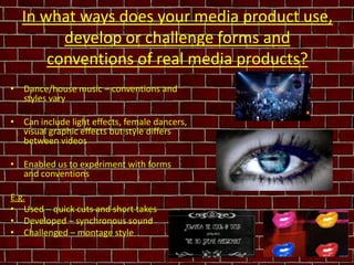
1. In what ways does your media product use, develop or challenge forms and conventions of real media products? Dance/house music – conventions and styles vary Can include light effects, female dancers, visual graphic effects but style differs between videos Enabled us to experiment with forms and conventions E.g. Used – quick cuts and short takes Developed – synchronous sound Challenged – montage style
7. All the images used i.e lips, danger sign, hand prints are photos taken by us and edited in photo shop. We cut images off t-shirts, jeans, posters around college to create more interesting looking images for our poster.
8.
9.
10. What have you learnt from your audience feedback? Strengths: “Good lip syncing with ‘Barbra Streisand’ lyrics” “Uses lots of colour to fit to genre” “Drumming sequence is well-timed” Weaknesses: “Some parts out of sync like when the Rubik's cubes go off screen” “Could have included more filter effects”
11. How did you use new media technologies in the construction and research, planning and evaluation stages? Web 2.0 sites e.g. YouTube integrated with SlideShare to display on blog Adobe Photoshop CS3 Dafont.com Adobe Premiere Pro CS3 Adobe After Effects CS3
12. How did you use new media technologies in the construction and research, planning and evaluation stages? continued... Crop tool Grid guidelines Colour Replace tool Multiple Video Layers
Editor's Notes
-Our music video and chosen soundtrack can be considered to follow the genre of either dance, electro or house music.-This genre doesn’t always have a strict, rigid style and so conventions aren’t as easy to recognise or define as genre such as Hip Hop or Rock etc.- Can include ................ (list written on slide) but varies between videos-This has allowed us to be experimental in our project by using conventions we’ve seen, developing/building on conventions we’ve seen and challenging/breaking expectations.-Conventions we’ve used include the quick cuts and short takes seen in our research of Swedish House Mafia’s dance track ‘One’.- Also used ideas from Rihanna’s ‘Rude boy’ video for example the lips, mouthing lyrics using lip sync and bright colours.-Conventions we’ve developed involve the use of synchronous sound which we developed to not only match the action but also match the soundtrack to make it diegetic in parts (i.e the ‘Barbara Streisand’ lip sync)An example of conventions we’ve challenged is the form of a video narrative. In our product research most music video’s told a story by progressing through a narrative (e.g. We No Speak Americano by DCUP ft. Yolanda Be Cool). However, we broke this convention by following a montage style that layered contrasting clips rather than following an ordered storyline structure.
Main ProductWe have made use of camera, editing, sound and mise-en-scene features and techniques in order to produce an effective video product. (PLAY VIDEO AND PAUSE AT SCENES WE’VE MENTIONED BELOW)Camera - extreme close ups, when lyrics say ‘Barbra Streisand’ we have an extreme close up of the lips, which are synchronous to the lyrics.High angle shots used in headlines scene and opening scene of the record player.Editing - split screens, colour effects, fast motion, reverse speed, and glow effects were used in the editing process on premiere to create a video that would fit the genre of dance/house music by being lively and fast paced.Also we found more technical effects that weren’t available on premiere adobe after effects, for example the time blend effect on the dancing sequences.Sound - we fit the dance/house genre of the sound track to the content in the video, such as dancing scenes and bright colours. The sound in parts is synchronous for example when the lyrics say ‘Barbra Streisand’ lip sync is used.Mise-en-scene - bright colours are used to fit the lively style of the music genre. Costume is varied as the music genre doesn’t tend to have a specific fashion style associated with it. We used a Rubik's cube as a prop to add a retro feel as it is an iconic retro toy. We thought this fit the genre of the music and the pastiche style of the video. The Rubik’s cube also matched our colour theme and house style – these colours were used as a basis for the Rubik’s cube sequence in the video that featured a split screen grid with contrasting colour filters that replicated the colour and shape of a Rubik’s cube. Record player – Brimful of Asha – Cornershop Lips saying ‘Barbra Streisand’ – various videos, Rihanna – Rude boy this emphasises the name as it is the only lyrics throughout the song. ‘Barbra Streisand’ is an iconic singer/actress from the 60’s however using her name as the name of the single and song and being the only lyrics in the film is ironic as the song is modern and the genre of song is something completely different to what ‘Barbra Streisand’ used to sing. Breaks conventions of the typical ‘title matches song’.Print WorkWe have also created print work which mirrors elements of the music video to maintain continuity and a house style. (ANNOTATED PRINT WORK ON SLIDE)
The images we used on this album cover are all taken from photos we took. (next slide)
These images were featured on our album cover (previous slide) and, as the comparisons show, were all original images taken by us and then edited in Adobe Photoshop to fit the album cover. We made use of Photoshop’s image manipulation tools such as brightness and contrast (used on the lips), polygon crop tool (used to cut out the handprint and warning sign) and colour replacement (used to extract the black of the jumper and change the white text to black). This editing helped us to create more professional-looking images that were specifically stylised to fit our album cover. Moreover, it helped us to achieve professional print work that supported our main product, the music video.
Our audience was involved throughout our project especially in the research and planning stages. However they were also involved in the post-production evaluation stage. Once our video had been finalised we screened it in front of the same sample of 50 males and females aged 17-24 that we’d used for our audience questionnaire earlier in the project. This screening allowed us to get feedback on what our target audience thought of our final product. This feedback gave us ideas on the strengths and weaknesses of our music video therefore we learnt what had proved successful, and how we could improve the product in the future.Strengths:Our editing proved successful in terms of the lip syncing with the soundtrack’s lyrics. Several members of our audience agreed that it was synced correctly and therefore worked effectivelyOur audience also agreed that the varied use of colour throughout our music video fit well and conformed to the house/dance genre of music.Another comment made during audience feedback was that the drumming sequence within the music video was well-timed, meaning the action on screen matched the soundtrack. This shows our editing was precise, and that our efforts to ensure the visuals remained in time with the sound were successful.Weaknesses:-Our audience noticed that the Rubik's cube sequence towards the end of the music video became out of sync. This is something we would work on to improve the product in the future. What we noticed was that at this particular point in the video there was a change in the tempo of the soundtrack. We believe this is what we struggled to sync the sequence with. In future we would ensure all sequences remained in time with the soundtrack, especially where the sound changes. As our audience praised earlier parts of the video as being well-synchronised with the sound (strength no.1), we know it is possible to achieve synchronicity consistently throughout the film as long as we ensure the entire editing process is precise and focused on the soundtrack as well as the visuals.-The other weakness our audience picked up on was that filter effects were only included once (for the Rubik’s cube sequence). This became a weakness as it seemed incongruous to the rest of the film’s colour effects. Also (even though the actual colours were repeated throughout) it meant that the overall house style lacked consistency. In future we would ensure more scenes within the music video made use of filter effects in order to create similarities between shots, therefore linking each part of the video. This would make our final product more complete and definite in its style.
We have made use of Web 2.0 sites such as YouTube. From YouTube we researched existing music videos to give us ideas when planning our own product. We have integrated the use of YouTube videos with media technologies such as SlideShare in order to display them on our blog. For our print work we used the software Adobe Photoshop CS3 to construct a promotional poster and album cover. Using this software allowed us to add graphic effects such as shadows around the text and images. Also, during the evaluation stage we used Jpeg technology to convert our print work to a digital image format. Our print work also made use of the online font website www.dafont.com – from here we found the typeface we used for our poster and album cover. For the actual main music video product we used Adobe Premiere Pro CS3. This film editing software enabled us to add video effects to our product. These effects include colour replacements, blue screen technology, graphic effects, colour filters, fragmented screens using the crop tool, and speed adjustments. Along the construction process we struggled to find certain effects. However, we overcame this by using Adobe After Effects which offered more sophisticated and complex graphic effects. For instance, the ‘CC Time Blend’ effect on the dancing bodies sequences.
- An example of how we used these technologies is the dancing fingers sequence that we edited in Adobe Premiere. As the screenshot shows, we have made use of the crop tool to resize each shot so it could be replicated several times within the same scene. We made use of video layers which allowed us to layer up the copies of the same shot in order to create a fragmented grid-like screen. During the construction of this sequence we struggled to fit the shots into a grid whilst ensuring they were identically sized. We overcame this difficulty by using grid guidelines (shown in purple) to make planning and measuring the layout of the shot easier. Finally, the colour replace tool has been used to re-colour the background to each shot.
![How effective is the combination of your main product and ancillary texts? Promotional Poster ,[object Object]](data:image/gif;base64,R0lGODlhAQABAIAAAAAAAP///yH5BAEAAAAALAAAAAABAAEAAAIBRAA7)