Fun Call Girls In Goa 7028418221 Call Girl Service In Panaji Escorts
Double page spread analysis
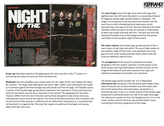
1. The main image covers the right hand side of the page and
slightly covers the left hand side which is a conventional feature
of magazine double page spreads known as ‘bleeding’. The
ntA
image is of a long shot as we see each band member and the
main focus is their intimidating facial expressions which
represent the music genre of rock. Also the clothing of the band
members reflect the genre as they are dressed in mainly black
of which we usually associate with this. The dark and scary like
setting of the photo acts as the background from the spread
and relates to the storyline ‘night of the hunters’.
The colour scheme: the double page spread consists of the 3
main colour of red, black and white. The use of black relates to
the headline ‘night of the hunter’ and represents the music
genre of rock as we usually associate these colours with the
loud and rebellious style of music.
The arrangement of the spread’s conventions has been
designed in that the readers’ attention is firstly drawn to the
bold and eye catching title/headline and then to focus on the
image of the featured band who represent the angry and
Drops cap have been placed at the beginning of the story and also in the 3rd column in a rebellious stereotypes of members of a rock band.
contrasting red colour to stand out from the white text.
The double page spread includes the ‘A-Z of Mastodon’
Masthead: the story headline uses a white colour for the ‘night of the’ and a faded red colour
information box acting like a fact file which gives readers facts
for ‘hunters’. The large, bold lettering for the word ‘night’ makes it eye catching for the reader
about the band such as band members and information that
as it contrasts against the black background and stands out from the page. The headline covers
fans of the band will be interested about, presented in a
a quarter of the double page spread which emphasises the importance of this and leaves less
entertaining style. It acts as a unique feature of the double page
room for text which may not be as important in this spread. The typography for the word
spread and is positioned down the side of the right hand page.
‘Hunters’ differs from the rest of the text and has been designed to look artistic and scary,
reflecting the serious tone of the feature. The name of the featured band is also included in the The side banner stands out from the background as it is in a red
top left corner of the spread in a different font to reflect their importance as a rock band that colour, similar used for the drop caps and the band’s name,
are featured in a magazine like ‘Kerrang’ that targets an audience of teenagers and young contrasting to the dark background of the image
adults who like rock music.
2. It is unusual for the title to go off the page and makes it an
interesting design feature for the double page spread. Readers are
left wondering what the rest of the title actually says. The layout
of the spread has been designed so that the central focus is on the
photo of the artist and the text rather than the title of the article.
A smaller headline has been included beneath the title which
mentions the artist’s name and gives the reader a small insight
into what the article will include.
The clear layout of spread makes everything fit into place and
whilst there are 2 large blocks of texts, the main image covering
the entire left page balances the ratio of text to picture and this
makes the page attractive to readers who will find the article to
look interesting and encourage them to read further.
The block columns of text reflect the magazines expectation of
readers to sit down and read this large amount of information,
linking back to the magazine’s audience of older mature readers.
In contrast, younger readers prefer articles with less text and
more images. Neither the headline nor main picture cross the
centreline of this double page spread which is unusual of this
double page spread as it is a conventional feature of most DPS.
The picture text ratio is kept the same as one page is portraying
the artist whilst the other talks about artist. We’d expect the
mode of address for this article to be of a formal one to reflect
The main photo covers the whole left hand side of the spread. The artist is wearing the the target audience of the magazine and what they expect from
same outfit that she wore for the front cover image to show design synergy through the the magazine.
magazine. She is also looking directly at the camera to engage the readers into the
article. The same outfit has been used again to attract the male audience who will look Colour scheme of the double page spread is black and white. This
at this photo through the ‘male gaze’ as she portrays the image of a sex symbol. may have been a decision by the artist rather than the designer,
However her positioning reflects masculine characters –androgynous of which we see who wanted her article to portray a certain message. The colour
her standing in a boxing type pose to suggest that is not afraid of anyone and will fight scheme reflects the target audience of older and mature readers.
back from anything anyone may say. This represents the artist as a strong willed and The lack of bright colours means all focus is on the article content
independent woman who will not be messed around with and any female readers will itself unlike gossip magazines that use bold colours and busy
look at this and take inspiration from her. The initial of the artist’s name is placed in the layouts to attract readers to read their magazines.
background of the image to emphasise her importance as an artist.
3. There is no clear title to the double spread and only includes the
artist name which intrigues the reader as they will have to
continue to read the article in order to gain an insight to what
this exclusive article has about Lady Gaga. The artist’s name is
included on the right hand corner of the page to emphasise that
the magazine spread is dedicated to the artist, reflecting her
importance as an artist and as a feature of the magazine.
Therefore this may act as the spread’s headline
The double page spread is of a unique design because the layout is
unconventional compared to other double page spreads and there is
special feature which appears on this design. The letter ‘L’ is clearly
designed for the artist Lady Gaga and takes over the columns of text,
although the readers can still read over this as the letter is in a
transparent colour. The ‘L’ also acts like a banner for the spread as it
is the thing we notice when we look at the article and stands out
from the page. It is in a serif font to connote the idea of the article
being formal. The red colour connotes sex and passion and relates to
the context of the main image of which we see the artist positioned
in a sexy and seductive way to attract the male audience. The colour
could have been chosen to the fit the ongoing colour scheme of red,
Main image: the main image of this spread is pop artist Lady Gaga. She appears to be wearing white and black that the magazine is known for which emphasises
no clothing but not fully exposing herself by covering her breasts and the chain necklace she is the importance of design synergy for ‘Q’
wearing distracts attention away. The image denotes a tasteful and sophisticated look as she
isn’t fully exposing her body and the use of black and white makes it look artistic, although
from first viewing it could be seen as quite controversial. The image sees the artist posing in a The text is in 3 columns and this is conventional of a magazine like Q
sexual and seductive way to attract the male audience known as the male gaze. They will ‘look’ which appeals to the older audience who are more mature and will
at her and see her as a sex object whilst women may aspire to be like as she portrays the want to read this much information as opposed to a younger audience
representation of a confident woman who is comfortable in her own skin. who will prefer more images than large chunks of texts. Fans of the
artist will also want to read about their idol in depth detail. The block
Colour scheme: the main colours used are black, white and red to create a simplistic and columns of text also reflect the magazines expectation of readers of
clean look for the spread as everything is noticeable and clear for the reader. The use of reading this amount of text. The font used is a serif which makes the
these 3 colours is a common design feature of the magazine which is commonly used in article look factual and formal which again relates to the target
most of their issues and readers are familiar with this. audience. The overall layout of the spread conveys a minimalist,
sophisticated and stylish look which reflects the audience of Q
The page number of the magazine has been placed at the bottom of the page as it is a magazine who are older and more grown up readers.
common convention of a magazine double page spread. The logo of the magazine has also
been included to reinforce the brand image of the company to the reader.