1. NME is famous for their yellow and back writing at
the top of the magazine this makes it stands out
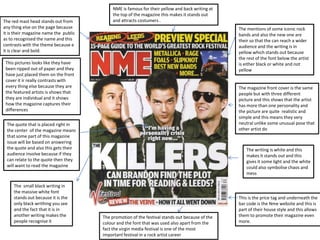
The red mast head stands out from and attracts costumers .
any thing else on the page because The mentions of some iconic rock
it is their magazine name the public bands and also the new one are
as to recognised the name and this their so that the can reach a wider
contrasts with the theme because e audience and the writing is in
it is clear and bold. yellow which stands out because
the rest of the font below the artist
This pictures looks like they have is either black or white and not
been ripped out of paper and they yellow
have just placed them on the front
cover it ir really contrasts with
every thing else because they are The magazine front cover is the same
the featured artists is shows that people but with three different
they are individual and it shows picture and this shows that the artist
how the magazine captures their has more than one personality and
differences the picture are quite realistic and
simple and this means they very
The quote that is placed right in neutral unlike some unusual pose that
the center of the magazine means other artist do
that some part of this magazine
issue will be based on answering
the quote and also this gets their The writing is white and this
audience involve because if they makes it stands out and this
can relate to the quote then they gives it some light and the white
will want to read the magazine could also symbolise chaos and
mess
The small black writing in
the massive white font
stands out because it is the This is the price tag and underneath the
only black writhing you see bar code is the Nme website and this is
and the fact that it is in part of their house style and this allows
another writing makes the The promotion of the festival stands out because of the them to promote their magazine even
people recognise it colour and the font that was used also apart from the more.
fact the virgin media festival is one of the most
important festival in a rock artist career
2. The main news that they think will interest a lot of people they
put that at the top and because it is white writing and red
The Masthead stands out from any background it grabs people attention.
thing else on the page and
because it is in background it does
not blend in and also the style of
the font is different and it seems
like an onomatopoeia and the They put different
magazine is vey famous for their pictures of the different
masthead font.
artists from other band
that are in the magazine
The artist in the middle stands out issue and also the gold
because he looks like he is pledging
to his fan that he will do something
colour continues and all
and also the way they are all dress in the image Is placed on
the magazine looks kind of similar the gold background
and this shows that there is not
really that much originality in the they put the Blink 182 on
group. top because they might
have a lot of audience
The Gold bold writing in stands out that like that band and
very much because against the red they might want their
and black checkers background and
the ‘30’ is bigger than any other
audience to see that they
writing on the page and this shows have old, young, new and
us that maybe they are new or they old band in their
are trying something different for a
change. magazine so none of the
audience will feel like
they are missing out.
“the making of modern
masterpiece” suggest that they
are new to the music industry
and maybe that is why each In the corner the barcode and Kerrang went
artist in the band looks sort of the extra mile by putting the date, price and
In the bottom of the magazine they have other famous
similar to each other because price in another country and also they
band that are feature in the magazine and this helps
they do not have that continue using their house style by putting
kerrang to expand their audience and also allows them
experience. their magazine website there as well
to make a lot of money.
3. It tells you how famous
it is and what is the The Masthead is big and
main story inside. bold and it catches your
attention, also the font is in
capital letters and the
design makes it seem like
This struck a when I saw an onomatopoeia.
it because it says 0 of 9
meaning there is a
sequence and this is not
the end of this edition
The background
contrasts with the
This was the Halloween whole image and theme
theme magazine and the because the background
image is very striking and is dull and it makes the
scary because it looks like it make the image and
the person is made of metal the font stand out.
and the look like a
psychopath.
These are like the
name of other bands
The name of the person or
and the names are
the group is there and the
kind of frightening and
font is vey intimidating also
this also link to the
the little writing at the
Halloween genre
bottom and I quote
“somebody’s gonna get
killed” paints an image in This line paints a very scary
your mind that this person
image in someone’s mind if
is meant to be scary and this
link to the Halloween theme they read it because it breaks
that they are trying to the rules and now its just
portray. trying to scare people, also
even adult will not want to be
Freebie in a room with a man with a
for the scary mask saying someone is
going to get killed.
public