Cyberworx Brand identity

Concept After reading the questionnaire and browsing the competitor’s website, it is understood that we are not talking about ordinary computers. These are custom-made powerful machines built depending on the client’s specific needs. The esthetic aspect is important but what makes these computers unique are the internal components, processor, memory, motherboard, etc. in other words, “THE FIRE IS INSIDE” Shape An illustration of a flame of fire could result in an overused idea with a cheap appearance. We found the right solution to communicate this idea by using the initials of the brand’s name. We placed the letter C under de letter W turned 90 grades. The final result is a simple shape where the negative space represents a flame. This concept supports the tagline “THE FIRE IS INSIDE” Typography We are using a sans serif font on the name and the icon. This is the perfect style to communicate the client’s values: Bold, exciting modern pure energy, and fun Color The colors selected were orange and black. Orange to represent the fire and the black to achieve a better definition of the shape

Recommended
More Related Content
What's hot
What's hot (15)
Similar to Cyberworx Brand identity
Similar to Cyberworx Brand identity (20)
Recently uploaded
Recently uploaded (20)
Cyberworx Brand identity
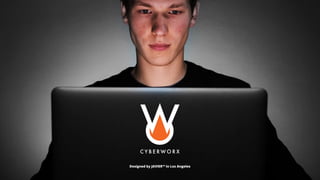
- 1. Designed by JAVIER™ in Los Angeles
- 2. Brand conceptualization Concept After reading the questionnaire and browsing the competitor’s website, it is understood that we are not talking about ordinary computers. These are custom-made powerful machines built depending on the client’s specific needs. The esthetic aspect is important but what makes these computers unique are the internal components, processor, memory, motherboard, etc. in other words, “THE FIRE IS INSIDE” Shape An illustration of a flame of fire could result in an overused idea with a cheap appearance. We found the right solution to communicate this idea by using the initials of the brand’s name. We placed the letter C under de letter W turned 90 grades. The final result is a simple shape where the negative space represents a flame. This concept supports the tagline “THE FIRE IS INSIDE” Typography We are using a sans serif font on the name and the icon. This is the perfect style to communicate the client’s values: Bold, exciting modern pure energy, and fun Color The colors selected were orange and black. Orange to represent the fire and the black to achieve a better definition of the shape Icon for applications and social media profiles
- 3. Proportions test using color The logo should be easy to recognize in different sizes when used in color
- 4. Proportions test using black The logo must maintain its identity and clarity when used in black
- 5. CYBERWORX Incorrect usage To achieve brand positioning, the logo must remain intact. It is recommended to avoid these basic mistakes: Never change proportions Never change original colors Never change typography Never add or delete elements
- 6. Social media profiles and icons
- 7. Color spaces of #000000 Black RGB 0 0 0 HSL 0.00 0.00 0.00 HSV 0° 0° 0° CMYK 0.00 0.00 0.00 1.00 XYZ 0.0000 0.0000 0.0000 Yxy 0.0000 0.0000 0.0000 Hunter Lab 0.0000 0.0000 0.0000 CIE-Lab 0.0000 0.0000 0.0000 Color spaces of #f26622 RGB 242 102 34 HSL 0.05 0.89 0.54 HSV 20° 86° 95° CMYK 0.00 0.58 0.86 0.05 XYZ 41.6581 28.4955 4.8179 Yxy 28.4955 0.5557 0.3801 Hunter Lab 53.3812 45.8824 32.0156 CIE-Lab 60.3338 50.7769 60.8704 Color values These color values must be used to maintain the consistency of color when applying the brand identity. RGB values should be used in digital formats. CMYK values should be used in printed material. The additional values may be required for other uses. Primary color Secundary color
- 8. Typography Paragraphs style Font Open Sans Left alignment Letter size 1 em Letter case: Normal Leading or space between lines: 1.5 Tracking or space between letters: 0 Subtitles style Font Futura Alineación izquierda Tamaño de letra es 1.5 em Letter case: All capitals Leading or space between lines: 1.0 Tracking or space between letters: 100 Titles style Font: Futura Alignment: Left Letter size: 2 em Letter case: All capitals Leading or space between lines: 1.0 Tracking or space between letters: 100 A B C D E F G H I J K L M N O P Q R S T U V W X Y Z 1 2 3 4 5 6 7 8 9 0 A B C D E F G H I J K L M N O P Q R S T U V W X Y Z 1 2 3 4 5 6 7 8 9 0 Regular font style A B C D E F G H I J K L M N O P Q R S T U V W X Y Z a b c d e f g h i j k l m n o p q r s t u v w x y z 1 2 3 4 5 6 7 8 9 0 Italic font regular style A B C D E F G H I J K L M N O P Q R S T U V W X Y Z a b c d e f g h i j k l m n o p q r s t u v w x y z 1 2 3 4 5 6 7 8 9 0 Bold font style A B C D E F G H I J K L M N O P Q R S T U V W X Y Z a b c d e f g h i j k l m n o p q r s t u v w x y z 1 2 3 4 5 6 7 8 9 0
- 9. Paragraphs style TITLES WILL HAVE THIS FORMAT Paragraphs will have this format Typography is the art and technique of arranging type to make written language legible, readable, and appealing when displayed. The arrangement of type involves selecting typefaces, point size, line length, line-spacing (leading), letter-spacing (tracking), and adjusting the space within letter pairs (kerning) SUBTITLES WILL HAVE THIS FORMAT Typography is the art and technique of arranging type to make written language legible. TITLES WILL HAVE THIS FORMAT Paragraphs will have this format Typography is the art and technique of arranging type to make written language legible, readable, and appealing when displayed. The arrangement of type involves selecting typefaces, point size, line length, line-spacing (leading), letter-spacing (tracking), and adjusting the space within letter pairs (kerning) SUBTITLES WILL HAVE THIS FORMAT Typography is the art and technique of arranging type to make written language legible. TITLES WILL HAVE THIS FORMAT Paragraphs will have this format Typography is the art and technique of arranging type to make written language legible, readable, and appealing when displayed. The arrangement of type involves selecting typefaces, point size, line length, line-spacing (leading), letter-spacing (tracking), and adjusting the space within letter pairs (kerning) SUBTITLES WILL HAVE THIS FORMAT Typography is the art and technique of arranging type to make written language legible. TITLES WILL HAVE THIS FORMAT Paragraphs will have this format Typography is the art and technique of arranging type to make written language legible, readable, and appealing when displayed. The arrangement of type involves selecting typefaces, point size, line length, line-spacing (leading), letter-spacing (tracking), and adjusting the space within letter pairs (kerning) SUBTITLES WILL HAVE THIS FORMAT Typography is the art and technique of arranging type to make written language legible. Use black text on white background Use white text over the primary color Use white text over secondary color Never use a different color combination
- 10. Usage samples
- 13. This is a sample showing the bran’s appearance on Facebook. This is a sample showing the bran’s appearance on Facebook. Contact 12 comments 22 shares 4.4K Like Comment Share News Feed Friends Watch Notifications Menu Cyberworkx Cyberworkx Leave your thoughts here... Post @ This is a sample showing the bran’s appearance on LInkedIn. 2 Likes 1 Comment 34 Following 93 Followers Tweets Tweets & replies Media Likes This is a sample showing the brand’s appearance on Twitter. 444 276 3,0987 Cyberworkx Cyberworkx Cyberworkx Social media post style This is a sample showing the bran’s appearance on Facebook. This is a sample showing the bran’s appearance on Facebook. This is a sample showing the bran’s appearance on Facebook. Search What’s on your mind? 11,234 Likes This is a sample showing the bran’s appearance on Instagram. This is a sample showing the bran’s appearance on Instagram. This is a sample showing the brand’s appearance on Twitter. This is a sample showing the brand’s appearance on Twitter. This is a sample showing the bran’s appearance on LInkedIn. This is a sample showing the bran’s appearance on LInkedIn.
- 14. Tshirts
- 18. Exteriors
- 19. Designed by in Los Angeles