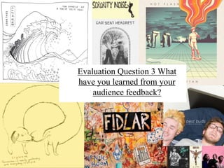
2. Video thoughts and feed back.
During our creation process of all 3 media products we amassed feed back
from our peers this was essential and helped us developed our original ideas
that where based off secondary research (UK tribes) we did online, we found
that primary research is very effective and can yield good information, we
are thankful to our peers for their advice and positive. After the idea process
our group and I amalgamated all our useable ideas and theme and we all
agreed on the type of narrative we wanted, at this point we created a
animated clip which portrayed our themes and a class pitch which specified
some of our details this was posted on our blogs and our peers where able to
comment there opinions this was helpful since although not all of our peers
where exactly our demographic they where the right age and also had a good
eye for media products since they are on the same course. This was helpful
at this point since we didn't finalize anything by then, however following
the theory of coding by Stuart Hall, the viewers opinion on the
piece and the symbols they pick up on are purely subjective
and can change person to person. So it was helpful that all
the comments where positive, showing our idea wasn't to
deeply coded
3.
4. As this was only our first idea pitch these comments are only about our first
thoughts about such things like style, inspiration, location, costumes and
lighting. I expressed this through mood boards and short bits of information, we
also presented a short video we made using Animoto, we summed up our loose
narrative since at that point we where freshly inspired by the thought of ennui
and reverting to simpler times, we also had a loose idea on mise en scene sine
we all like October and the natural outdoors vibe we had a few thoughts about
near by location and what we would use to represent the autumn season, thus
the joke about fake leaves. As all there comments where from people of the
same age group and from the same area (Leicestershire), it may some what be
bias, since as the theory of situated culture states, different societies have
different upbringings and therefore different views and symbolism, possibly
meaning that these comments are only positive because they are written by
people of the same culture, and other viewers from outside of this may not
understand the concept as much.
However this still proved to be helpful because we could receive insightful
feedback from our peers whose comments would influence our ideas, since they
are from the right age group and are part of demographic E much like our target
audience.
5. As you can see in the previous slides our peers liked our autumnal theme and
setting, this was good since me and my group also really liked this idea and was
pleased to see that our target age demographic would also like it, however this
gave us weather and lighting constraints and we would have to finish all the out
door scenes by the end of November.
Our other feed back was mainly about our narrative, which was the main thing
our group wanted to get right. The comment that helped us the most is the one
which states we are taking a ‘unique approach’ , this was a sigh of relief for our
group since we didn't want our narrative to be to main stream so that it would
fit in with our alternative ‘Scenesters’ demographic.
These comments where really helpful, in the fact they didn't make us want to
change our idea but reassured us that we made the right choices, and it stopped
us second guessing our selves when it came to finalizing a narrative and filming
locations.
Bulmer and Katz’s theory suggested that people use the media to satisfy their
needs, and it is more than just a diversion, so we wanted a joyful video which
wasn't too ‘deep’ but was evolved enough so that it in gauged the audience and
satisfied their needs, causing it to be successful.
6. Our teacher gave us the feedback on a Word document, this feed back was based on our very
poor first draft, we already knew a few obvious points where we needed to improve yet their
insight was very helpful. Although our teacher was not our audience we followed Mihaly
Csikszentmihalyi theory about creativity being based on 3 steps, the final step being “a field
of experts who recognise and validate the innovation”, our teachers served as these judges.
He pointed out:
.Camera work is a bit too shaky consider using a tripod .
.The pan on the first shot is very jerky and should be smoother .
.The band performance isn’t convincing.
.Singular performances aren’t convincing.
.Shot framing on band needs to be tighter.
.Lip syncing lacks intensity and doesn’t match the song.
Clearly, there were plenty of areas that we needed to improve upon in our future reshoots,
We had infact used a tripod for our first draft, but we did agree hat the footage was too
shaky, this was improved in our final video by using a sturdier tripod, and not touching the
camera. Our band performance was awful since we didn’t have any instruments, instead we
poorly mimed our instruments. I think we improved this massively since we bough a drum
kit and most of us had guitar to use, so even by adding these props the verisimilitude greatly
improved, we also practiced the taming of our movements. In our final music video,
everyone is playing instruments and so the overall band performance. In terms of lip
syncing, Fin the ‘singer’, and the whole group was not constable to lose their inhibitions,
which is perhaps why his lip synching was not convincing, after we got use to filming in
public and we practised our lines and movements, this became easier.
7. The other helpful criticism we received was that we used too many long shots, this was
not appealing since the camera didn't pick up all the detail in the back ground, plus the
band member it focused on appeared to small, the long shots also looked slower and
made the visuals no longer patch the pace of the video. This was a goal our group
wanted to achieve since Andrew Goodwin states that having the visuals on screen
correlating with the beat of the music or lyrics is a good convention, and there fore
would not only make our video more appealing to audience it will also have a deeper
meaning. Coinciding with this they also pointed out that our shot framing needed to be
tighter, so that the strong composition on the subject, we also discussed making our
placement more symmetrical, after reviewing this, we took in this feedback and noticed
that these small adjustments caused the second draft to be much more refined and
advanced, and we used many of these shots in our final product.
8. DigiPak and Poster/Advert
I did an initial target market questionnaire I structured the
questions off of my secondary research on UK tribes, I used UK
tribes since the audience I wanted to appeal to is young people
between 14 and 20 since this group is one of the largest
consumer groups in the music industry and I wanted to find the
specific name of the clique that would most lightly listen to the
music we are featuring in our music video since it is quite a
specific niche sound, it turned out that many ‘tribes’ fitted the
certain factors such as ‘Hardcore’ or ‘Young Alt’, yet I thought it
would be best to only focus on one, the ‘Scenesters’ ,this
combined with my previous audience profile survey on 4 lightly
listeners Ethan, Fin, Emily and Rosie, I found that my
demographics based on income and occupation would group E
since my main group of listeners would be unemployed students,
however these youths would be from families that would be in
category C1, this research then allowed me to have a solid idea
on what I wanted, The results from that questionnaire informed
me on what my audience wanted most on a album cover and
magazine advert to help me improve my
design. The results are on the next slide.
9.
10. From this I gained an accurate insight into what my audience wanted, I then used this
information to sketch out some draft lay outs on paper, I then converted theses to some ‘bare
bone’ layouts on photoshop. This process aloud me to taylor my deign to my audience. The
questions I asked where not overly specific so that I still had room to be creative; eg ‘should
I have light or dark images’ for the poster, 66% said dark so I used a very dark photo which
had very bright spot colours to draw the attention, since I didn't set parameters about spot
colours, just the over all there, this photo is of a busy street through a frosted window with a
slow shutter speed. This gave it a urban modern theme, which my demographic would
identify with. During my poster design I was going to add the logos for streaming websites
like Soundcloud or Spotify as this is what my demographic would use to listen to music,
however as the fake band would not make any money of these platforms, I instead only put
Band camp and apple music, since they are just as popular and would give the band revenue.
During the process of the DigiPak I listened to my feedback and included large text of the
band name, this font is double layered to make it seem even larger. I love this font, and
paired with the strong primary colour it makes it seem cartoony, much like our intertextual
references to the Simpsons in our band name and album name, this matches our young
demographic. The red and white gives it an American theme, this colour scheme matched
with the disc which looks like a ‘Chuck Taylor all star’ patch (an American shoe company)
or a base ball, this gives it a very American aesthetic. The disc is also made to emulate the
record label which is based in LA California, since most ‘Emo’ bands come from the
west/midwest of America this genera is some times called ‘Midwest Emocore’, so it was
fitting for my album to have a American aesthetic and record company.