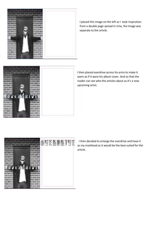
1. I placed this image on the left as I took inspiration
from a double page spread in nme, the image was
separate to the article.
I then placed overdrive across his arms to make it
seem as if it were his album cover. And so that the
reader can see who the articles about as it’s a new
upcoming artist.
I then decided to enlarge the overdrive and have it
as my masthead as it would be the best suited for the
article.
2. I then decided to add a advertorial for the
album to make it seem more realistic and
professional I also added a pull quote to draw
the reader in to reading the text.
This is my final double page spread and I
decided to use the rule of 3 and add 3 pull
quotes to make it more effective and look
more professional. And use it as a way to try
draw in and interest the reader to read the
text.