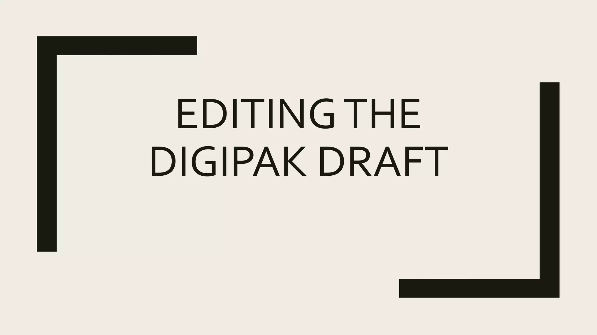
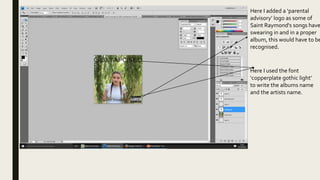
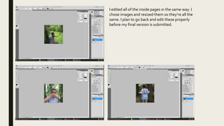
EDITINGTHE
DIGIPAK DRAFT
Here I added a ‘parental
advisory’ logo as some of
Saint Raymond's songs have
swearing in and in a proper
album, this would have to be
recognised.
Here I used the font
‘copperplate gothic light’
to write the albums name
and the artists name.
I edited all of the inside pages in the same way. I
chose images and resized them so they’re all the
same. I plan to go back and edit these properly
before my final version is submitted.
Here I added a barcode- like
would be seen on any back
cover of an album.
Here I added my company
logo ‘magnolia records’ but
I need to go back and make
this properly for the final
version.
Here I have used song titles
off Saint Raymond's album
‘young blood’. I used the
font ‘copperplate gothic
light’ to match the front
cover and this makes it look
more sleek and
professional.
Extra comments
■ Overall I am pleased with this digipak as a draft but it definitely needs improvement.
■ I will need to reshoot my photos as a girl as the face of the album doesn’t really make
sense as it should be a boy to represent the artist.The photos will however be in this
sort of style with this sort of location.
■ The boy who will be the face of the album and magazine advert will be the one lip
syncing in our music video so there will be a link between the video and the album.

Editing the digipak draft

  • 1.
  • 2.
    Here I addeda ‘parental advisory’ logo as some of Saint Raymond's songs have swearing in and in a proper album, this would have to be recognised. Here I used the font ‘copperplate gothic light’ to write the albums name and the artists name.
  • 3.
    I edited allof the inside pages in the same way. I chose images and resized them so they’re all the same. I plan to go back and edit these properly before my final version is submitted.
  • 4.
    Here I addeda barcode- like would be seen on any back cover of an album. Here I added my company logo ‘magnolia records’ but I need to go back and make this properly for the final version. Here I have used song titles off Saint Raymond's album ‘young blood’. I used the font ‘copperplate gothic light’ to match the front cover and this makes it look more sleek and professional.
  • 5.
    Extra comments ■ OverallI am pleased with this digipak as a draft but it definitely needs improvement. ■ I will need to reshoot my photos as a girl as the face of the album doesn’t really make sense as it should be a boy to represent the artist.The photos will however be in this sort of style with this sort of location. ■ The boy who will be the face of the album and magazine advert will be the one lip syncing in our music video so there will be a link between the video and the album.