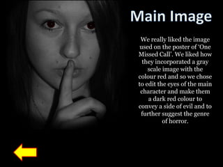
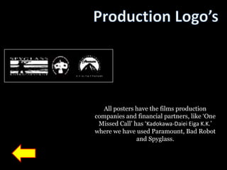
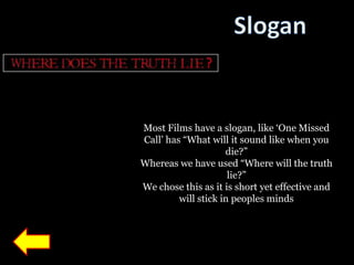
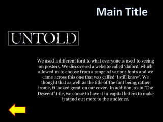
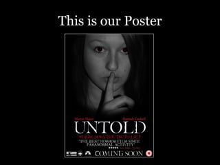
On the next slide, there is an image of
the “One Missed Call” poster which we
have used as inspiration when creating
                our poster.
Clicking on the words will navigate you
      to a different page giving an
explanation of the typical conventions
 we have used for that specific section
of the poster. On each individual slide,
 click on the arrow to take you back to
      the slide with the poster on.
Slogan
Main Image


                       Main Title


                     Click the arrow
 Production Logo’s   to see our DVD
                          cover
We really liked the image
 used on the poster of „One
Missed Call‟. We liked how
  they incorporated a gray
    scale image with the
colour red and so we chose
to edit the eyes of the main
 character and make them
    a dark red colour to
convey a side of evil and to
 further suggest the genre
          of horror.
All posters have the films production
companies and financial partners, like „One
 Missed Call‟ has „Kadokawa-Daiei Eiga K.K.‟
where we have used Paramount, Bad Robot
               and Spyglass.
Most Films have a slogan, like „One Missed
Call‟ has “What will it sound like when you
                     die?”
Whereas we have used “Where will the truth
                      lie?”
We chose this as it is short yet effective and
         will stick in peoples minds
We used a different font to what everyone is used to seeing
on posters. We discovered a website called „dafont‟ which
allowed us to choose from a range of various fonts and we
   came across this one that was called „I still know‟. We
  thought that as well as the title of the font being rather
ironic, it looked great on our cover. In addition, as in „The
Descent‟ title, we chose to have it in capital letters to make
              it stand out more to the audience.
This is our Poster

Media poster analysis

  • 2.
    On the nextslide, there is an image of the “One Missed Call” poster which we have used as inspiration when creating our poster. Clicking on the words will navigate you to a different page giving an explanation of the typical conventions we have used for that specific section of the poster. On each individual slide, click on the arrow to take you back to the slide with the poster on.
  • 3.
    Slogan Main Image Main Title Click the arrow Production Logo’s to see our DVD cover
  • 4.
    We really likedthe image used on the poster of „One Missed Call‟. We liked how they incorporated a gray scale image with the colour red and so we chose to edit the eyes of the main character and make them a dark red colour to convey a side of evil and to further suggest the genre of horror.
  • 5.
    All posters havethe films production companies and financial partners, like „One Missed Call‟ has „Kadokawa-Daiei Eiga K.K.‟ where we have used Paramount, Bad Robot and Spyglass.
  • 6.
    Most Films havea slogan, like „One Missed Call‟ has “What will it sound like when you die?” Whereas we have used “Where will the truth lie?” We chose this as it is short yet effective and will stick in peoples minds
  • 7.
    We used adifferent font to what everyone is used to seeing on posters. We discovered a website called „dafont‟ which allowed us to choose from a range of various fonts and we came across this one that was called „I still know‟. We thought that as well as the title of the font being rather ironic, it looked great on our cover. In addition, as in „The Descent‟ title, we chose to have it in capital letters to make it stand out more to the audience.
  • 8.