
Recommended
More Related Content
What's hot
What's hot (20)
Similar to Color pp
Similar to Color pp (20)
Recently uploaded
Recently uploaded (20)
Color pp
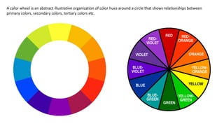
- 1. A color wheel is an abstract illustrative organization of color hues around a circle that shows relationships between primary colors, secondary colors, tertiary colors etc.
- 2. The typical artists' paint or pigment color wheel includes the blue, red, and yellow primary colors. The corresponding secondary colors are green, orange, and violet or purple. The tertiary colors are red– orange, red–violet, yellow– orange, yellow–green, blue– violet and blue–green.
- 3. In theory, the Primary Colors are the root of every other hue imaginable. The primary pigments used in the manufacture of paint come from the pure source element of that Hue. There are no other pigments blended in to alter the formula. Think of the three Primaries as the Parents in the family of colors. In paint pigments, pure Yellow, pure Red, and pure Blue are the only hues that can’t be created by mixing any other colors together.
- 4. When you combine any two of the Pure Primary Hues, you get three new mixtures called Secondary Colors. Think of the three Secondaries as the Children in the family of colors. Yellow + Red = ORANGE Red + Blue = VIOLET or PURPLE Blue + Yellow = GREEN
- 5. When you mix a Primary and its nearest Secondary on the Basic Color Wheel you create six new mixtures called Tertiary colors. Think of the six Tertiary Colors as the Grandchildren in the family of colors, since their genetic makeup combines a Primary and Secondary color. Yellow + Orange = YELLOW- ORANGE Red + Orange = RED-ORANGE Red + Violet = RED-VIOLET Blue + Violet = BLUE-VIOLET Blue + Green = BLUE-GREEN Yellow + Green = YELLOW-GREEN
- 6. A color scheme based on analogous colors Analogous colors are any three colors which are side by side on a 12 part color wheel, such as yellow-green, yellow, and yellow- orange. Usually one of the three colors predominates.
- 7. A color scheme based on complementary colors Complementary colors are any two colors which are directly opposite each other, such as red and green and red-purple and yellow-green. In the illustration above, there are several variations of yellow-green in the leaves and several variations of red-purple in the orchid. These opposing colors create maximum contrast and maximum stability.
- 8. A triadic color scheme uses colors that are evenly spaced around the color wheel. Triadic color harmonies tend to be quite vibrant, even if you use pale or unsaturated versions of your hues. To use a triadic harmony successfully, the colors should be carefully balanced - let one color dominate and use the two others for accent.
- 9. The split-complementary color scheme is a variation of the complementary color scheme. In addition to the base color, it uses the two colors adjacent to its complement. This color scheme has the same strong visual contrast as the complementary color scheme, but has less tension.