Download as PDF, PPTX

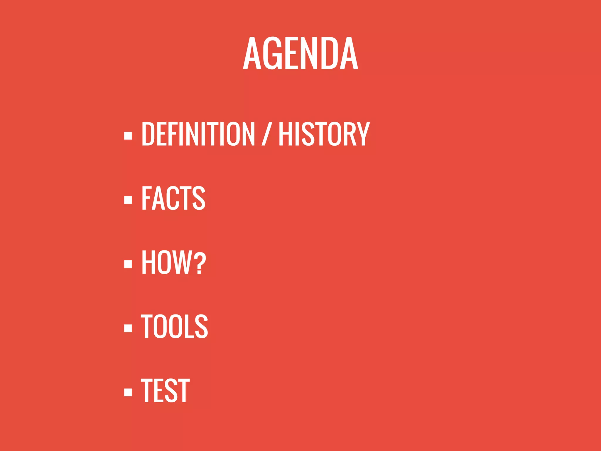
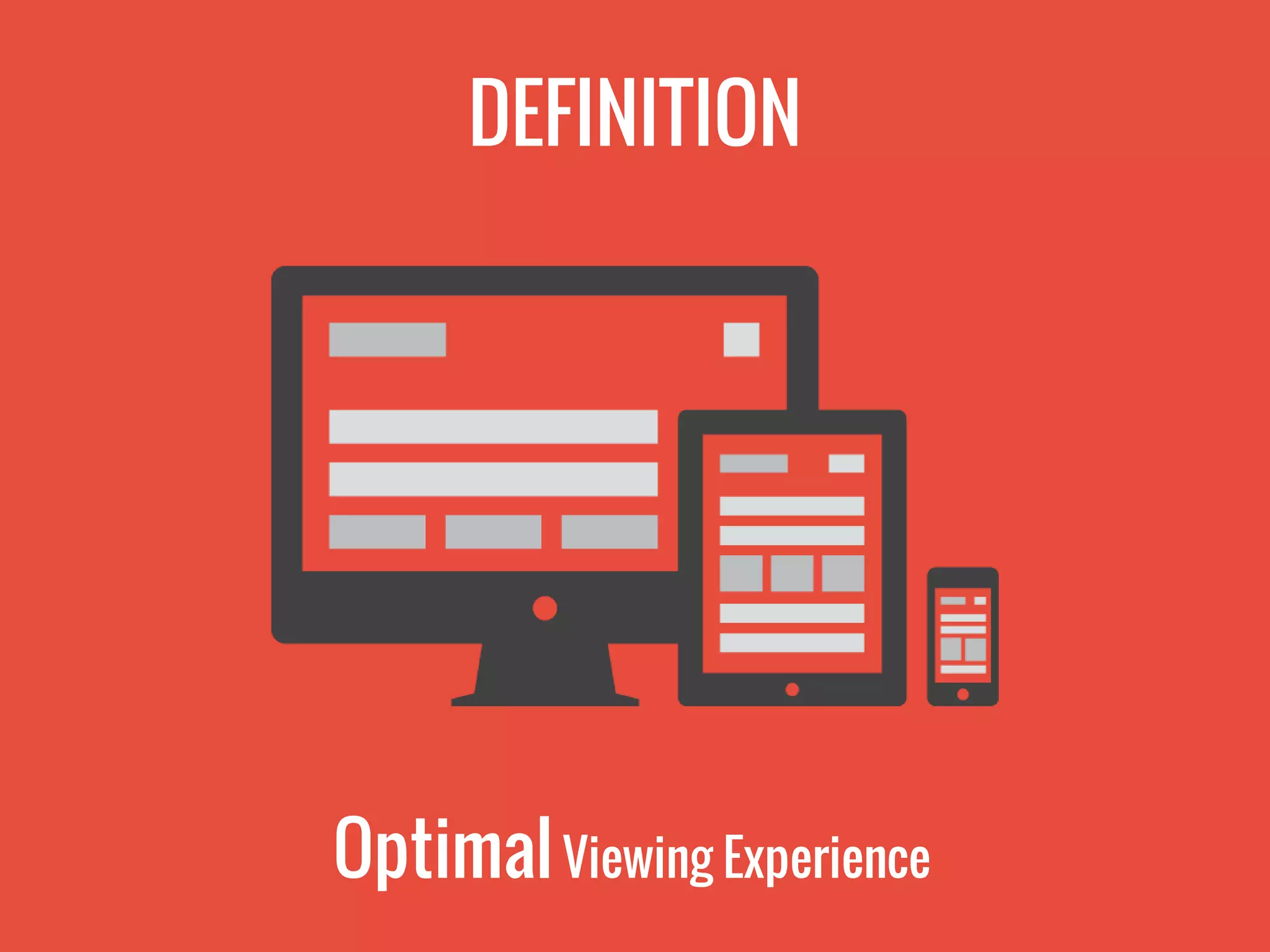
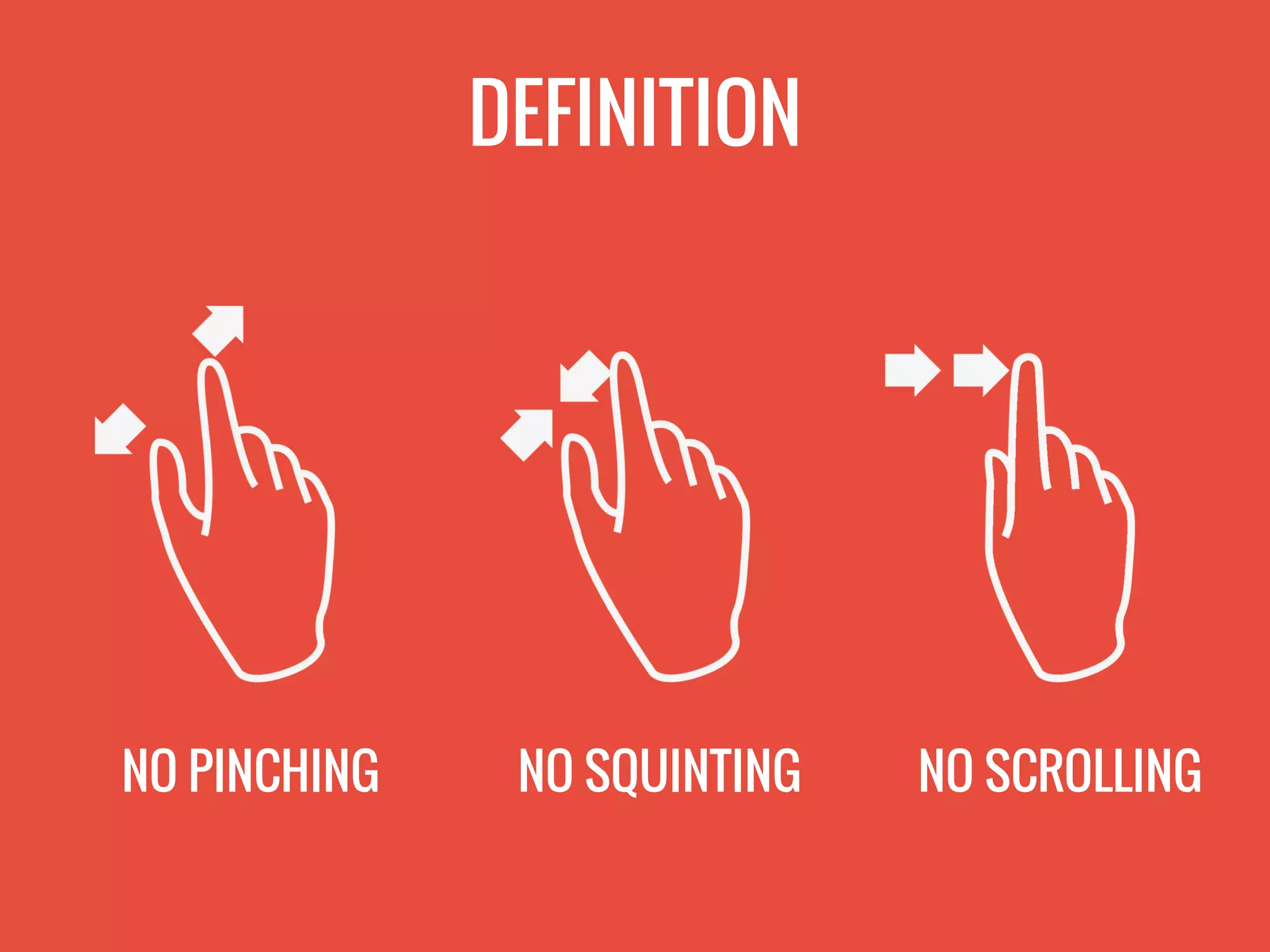
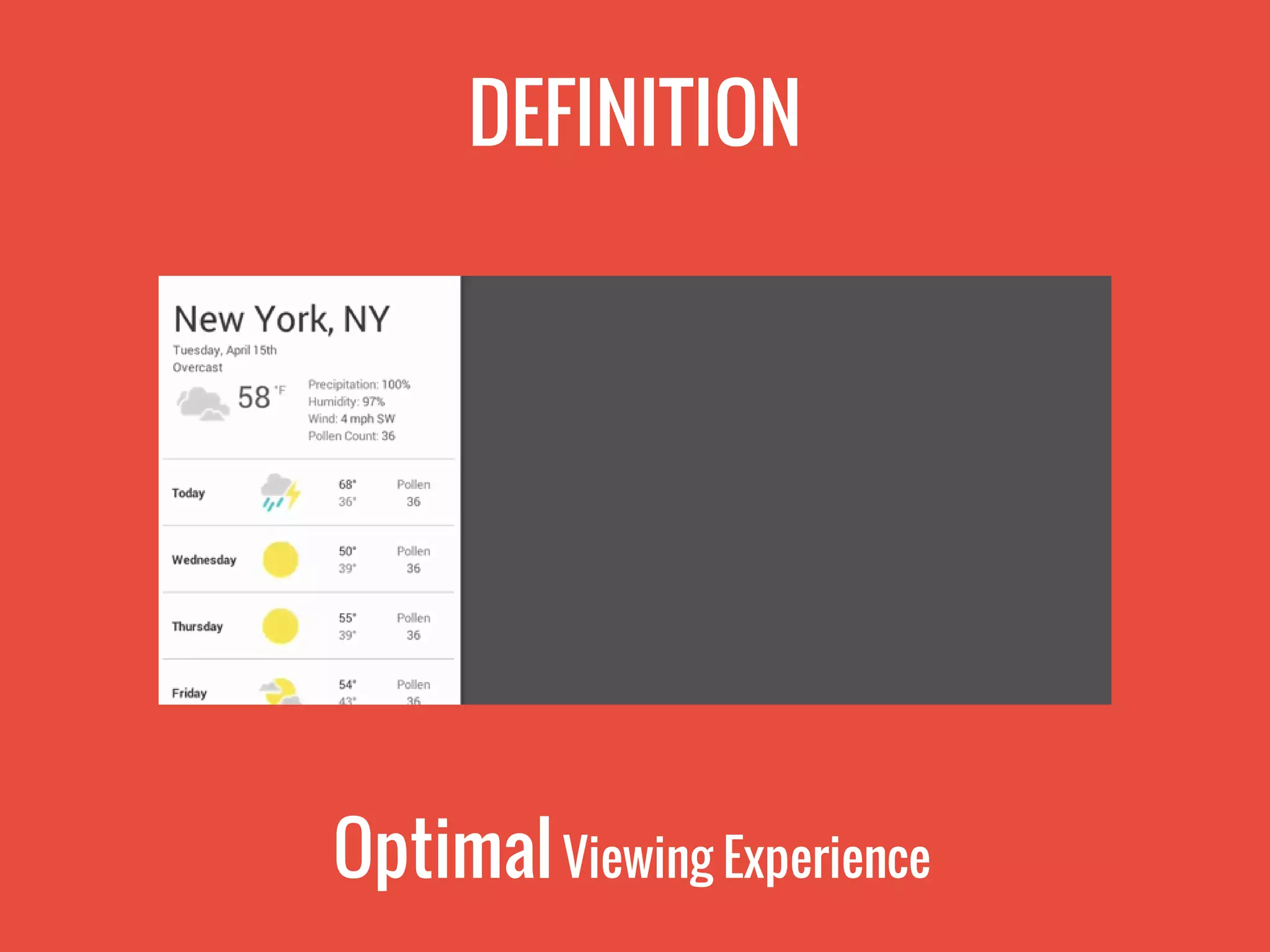
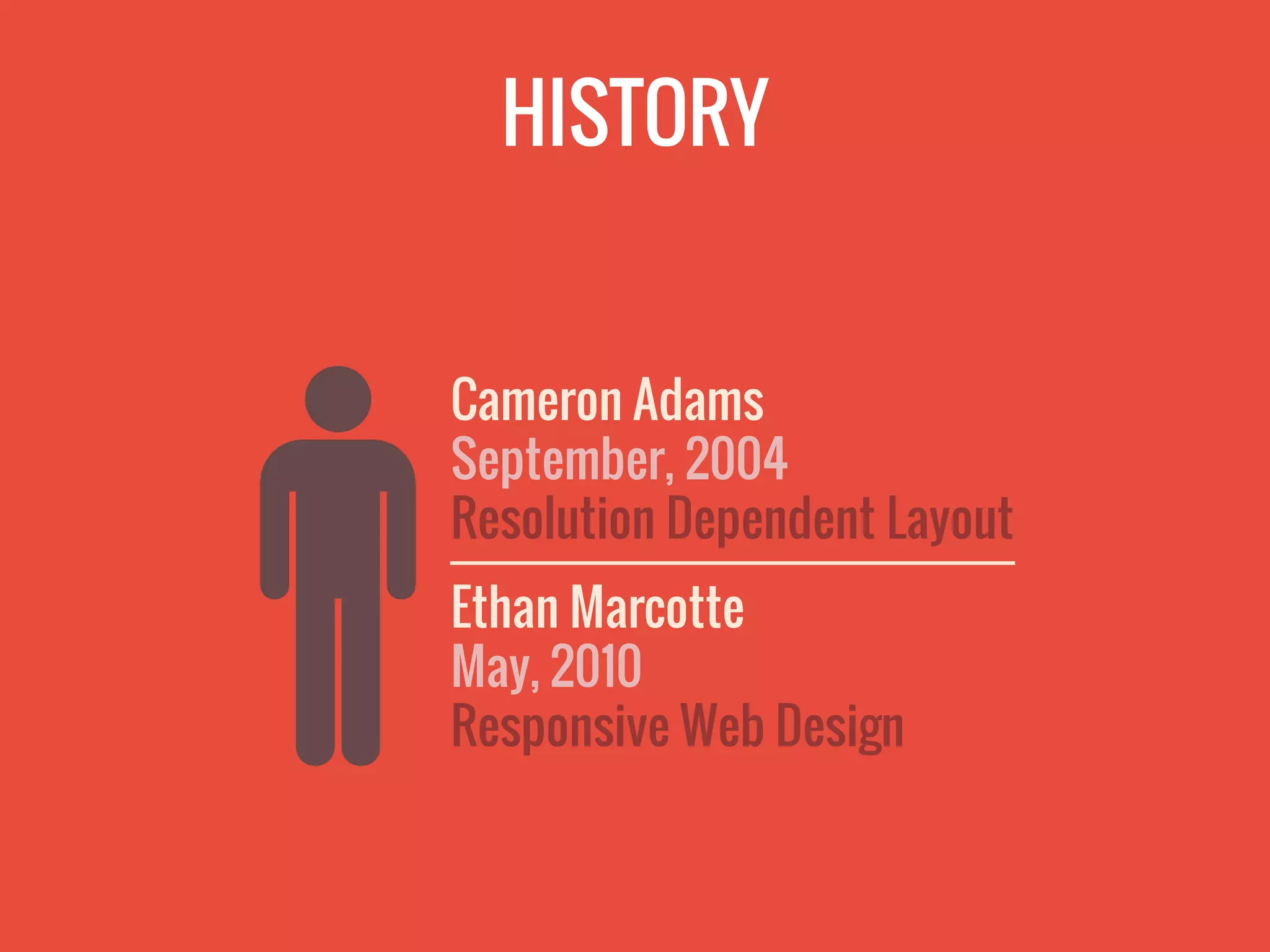


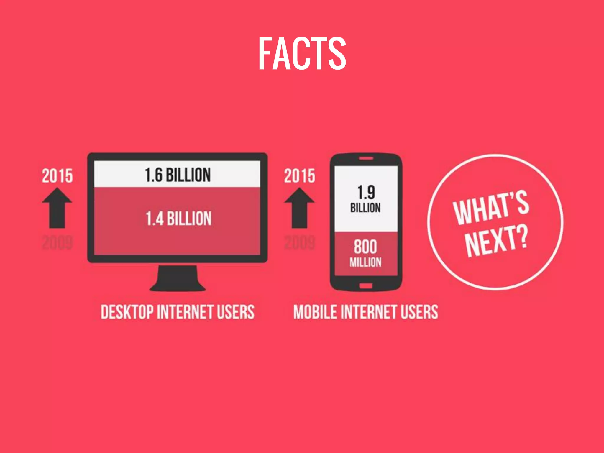
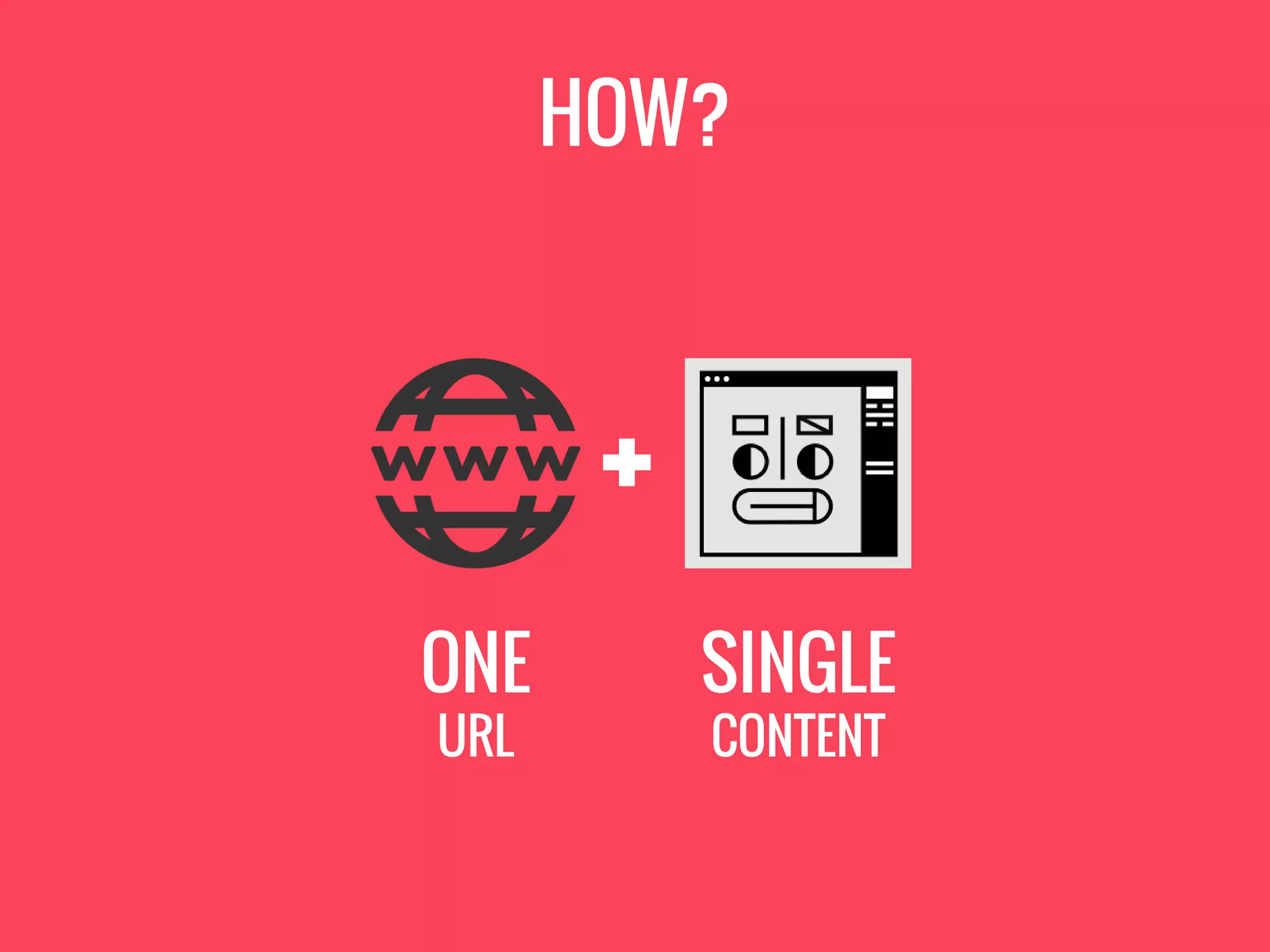
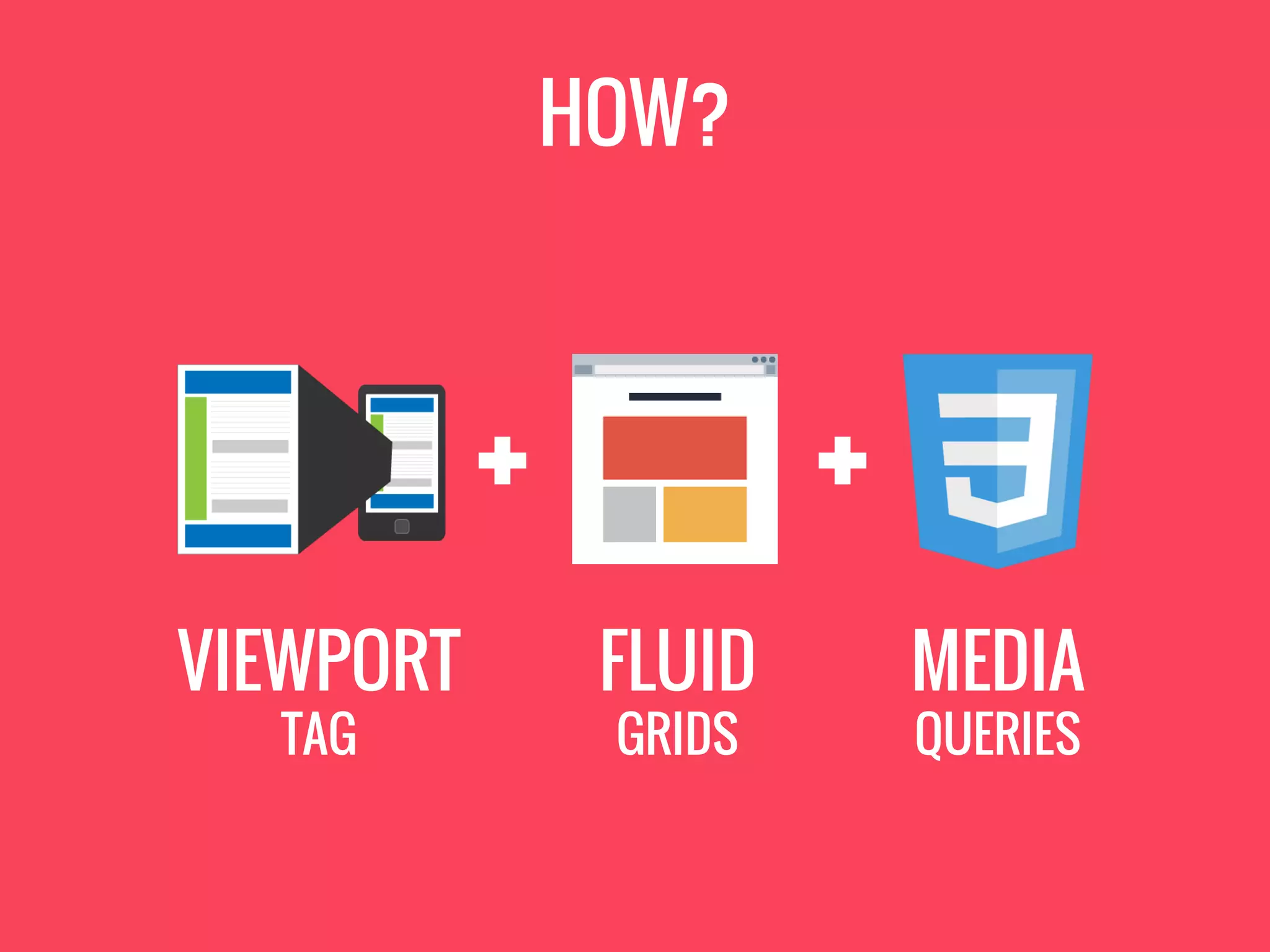

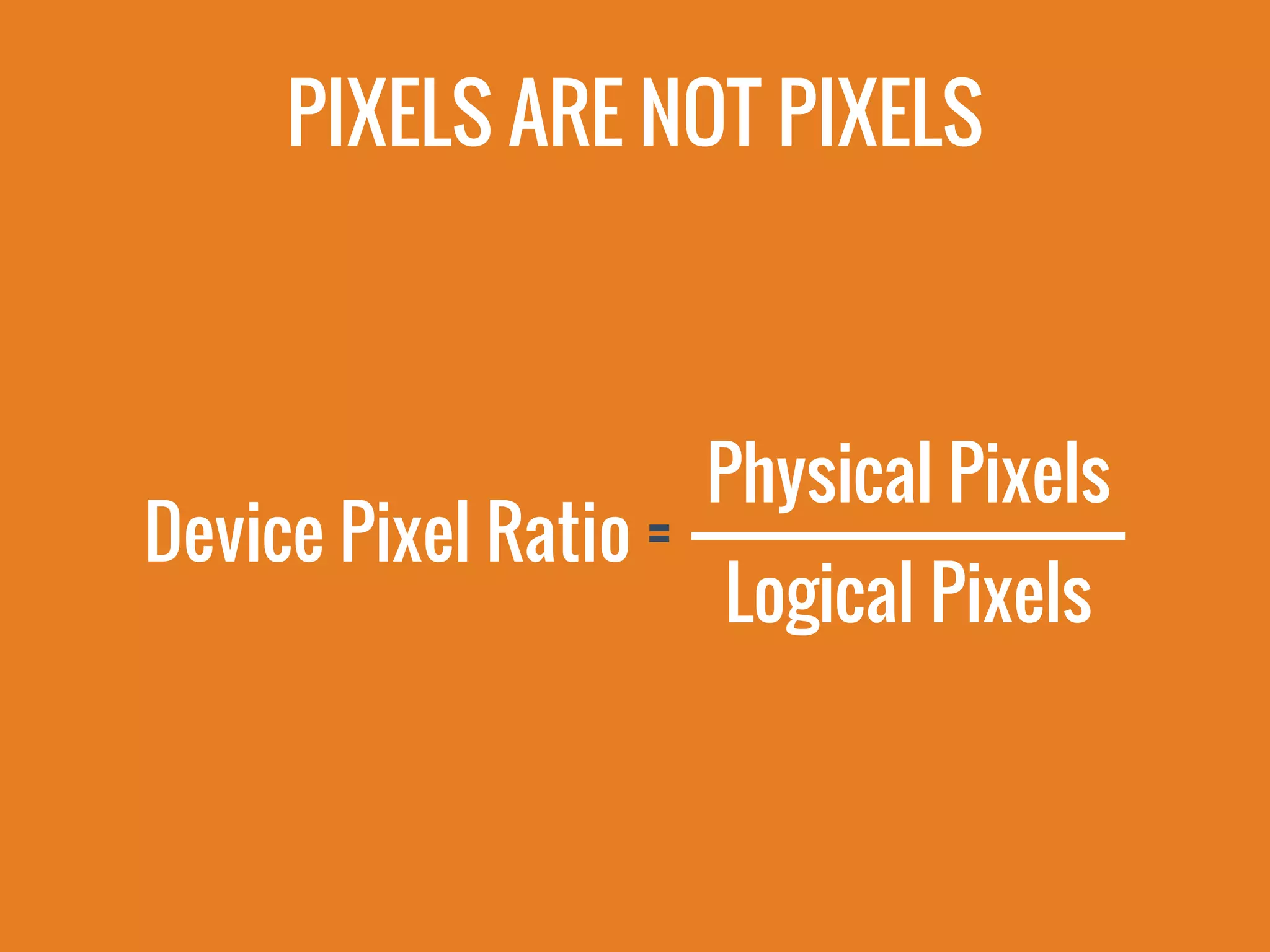
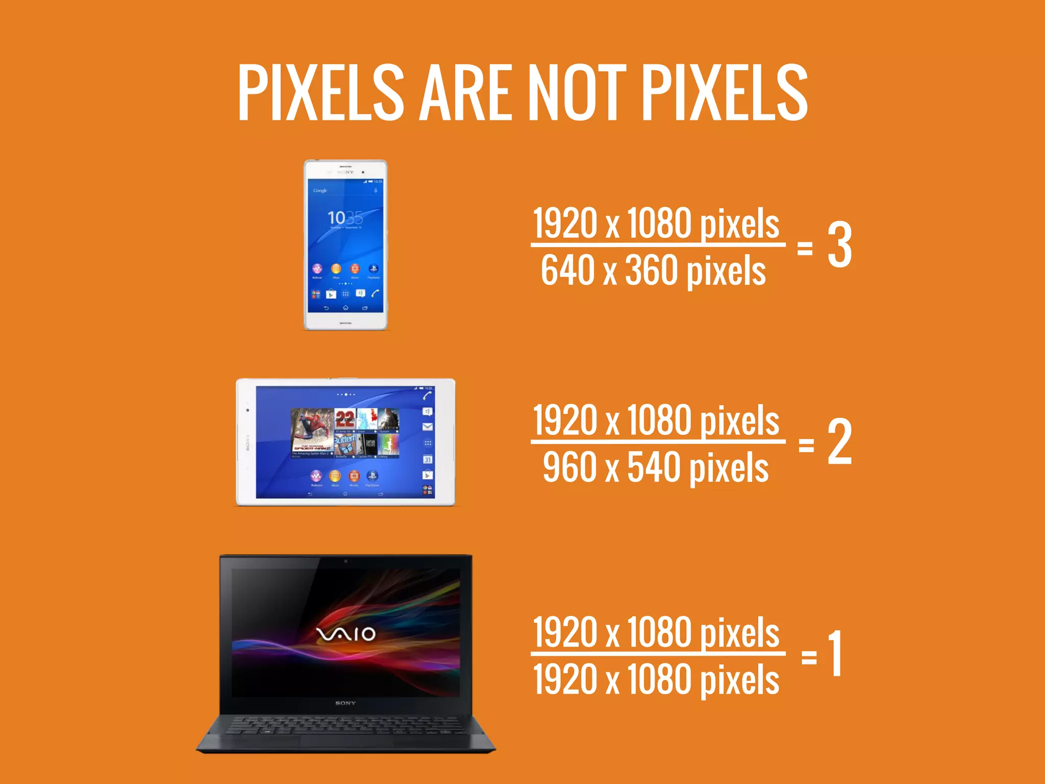
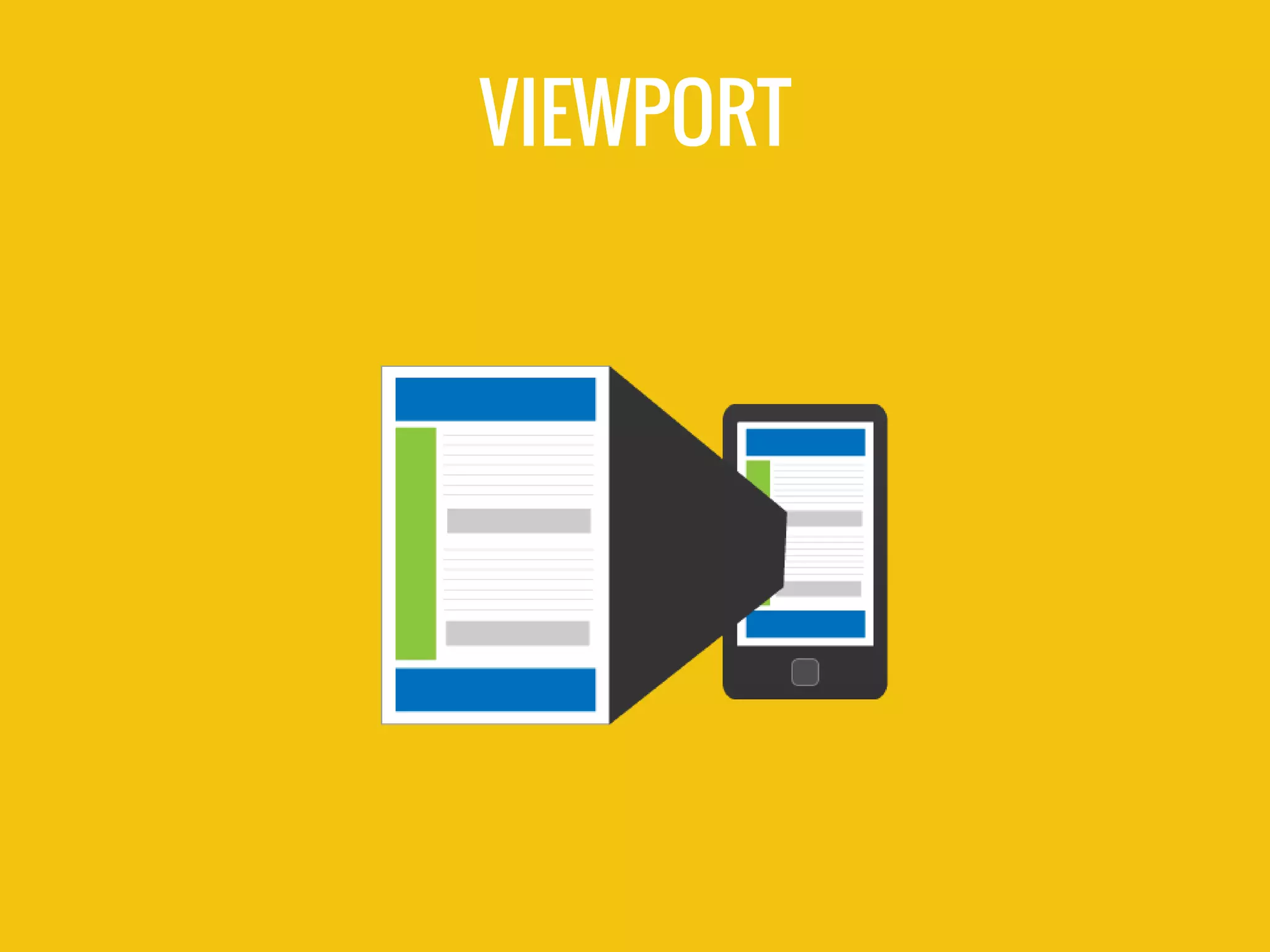
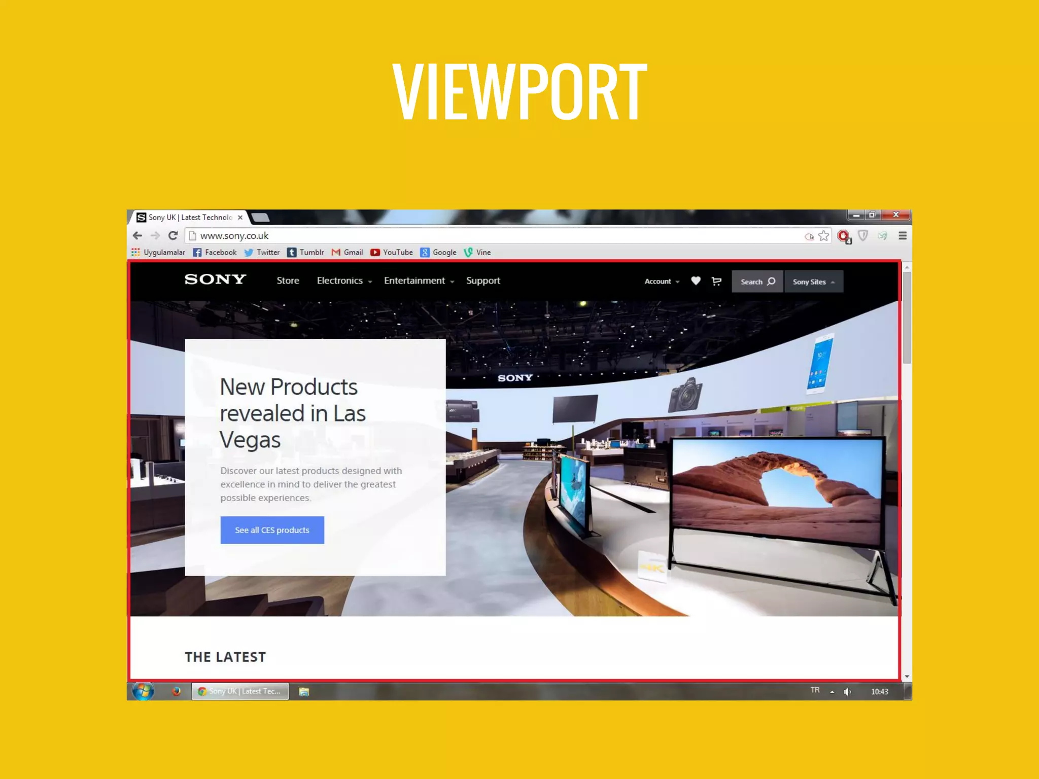

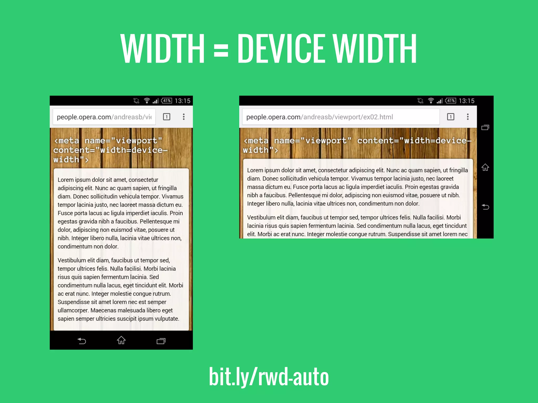
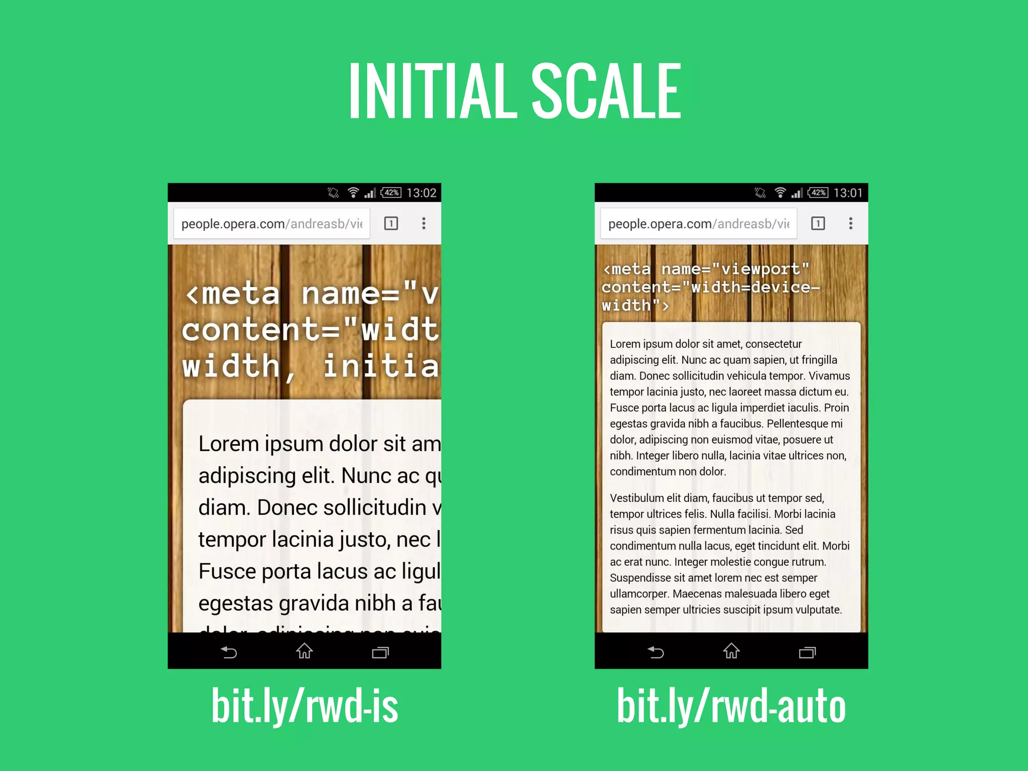
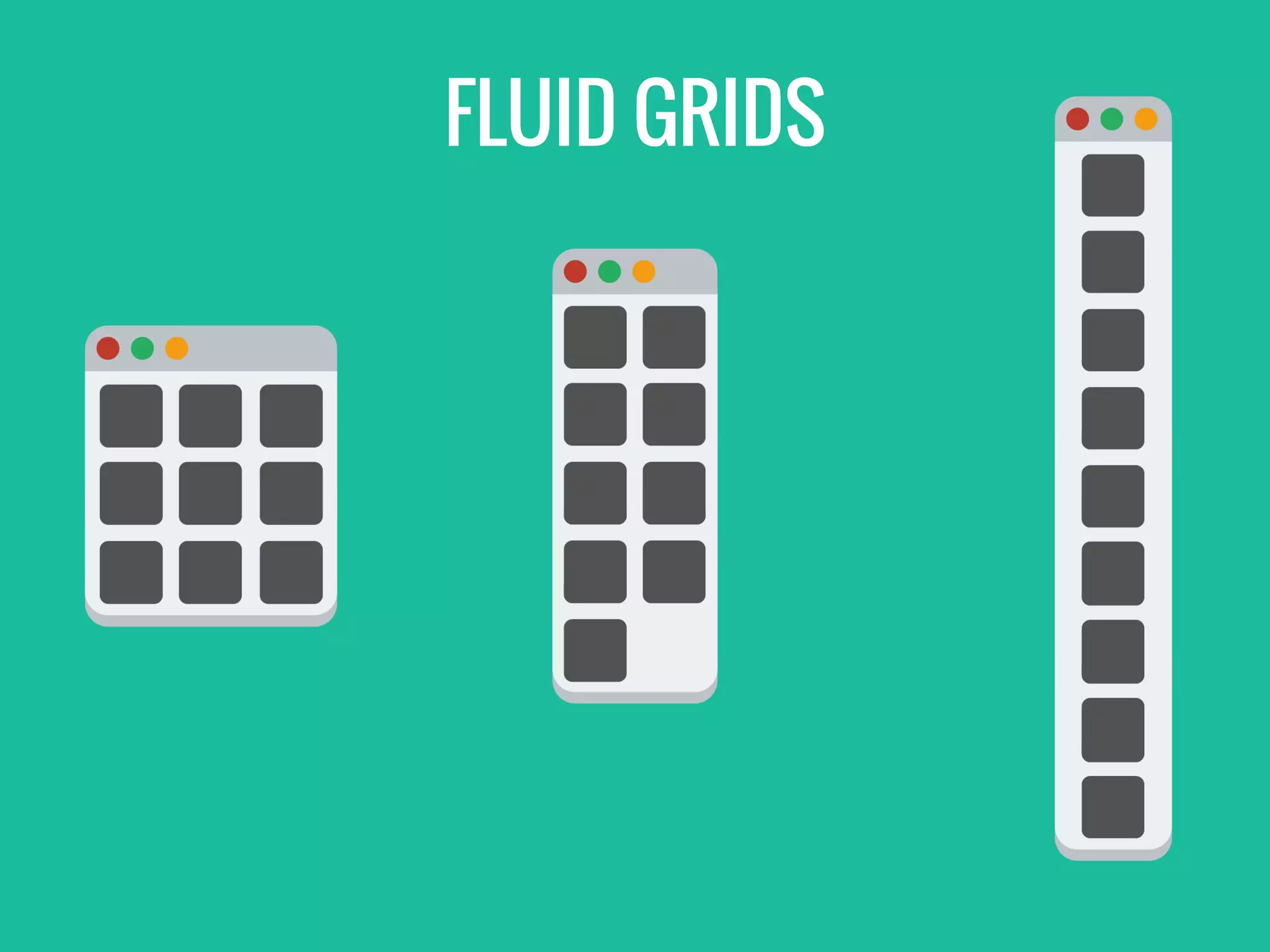
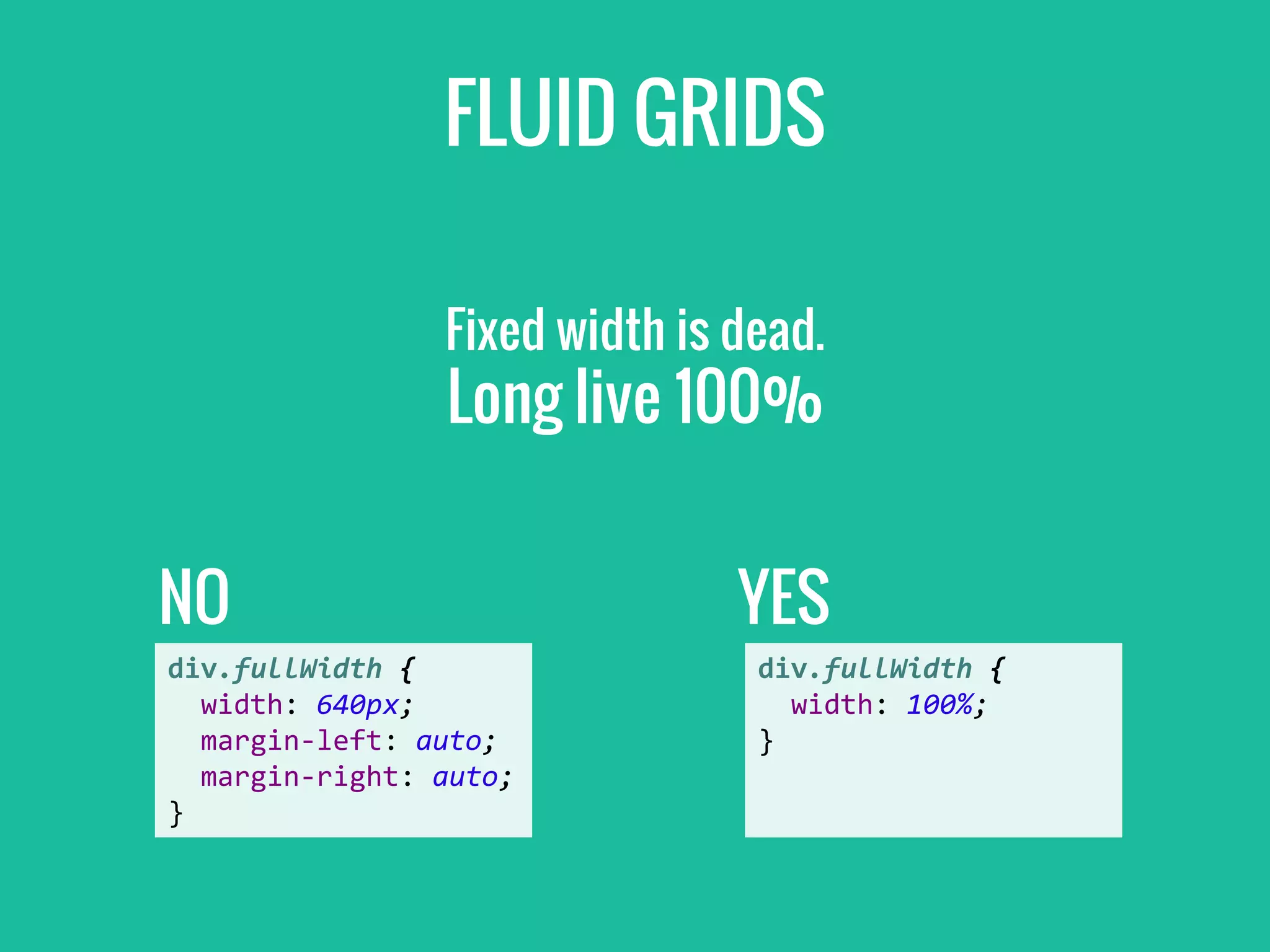

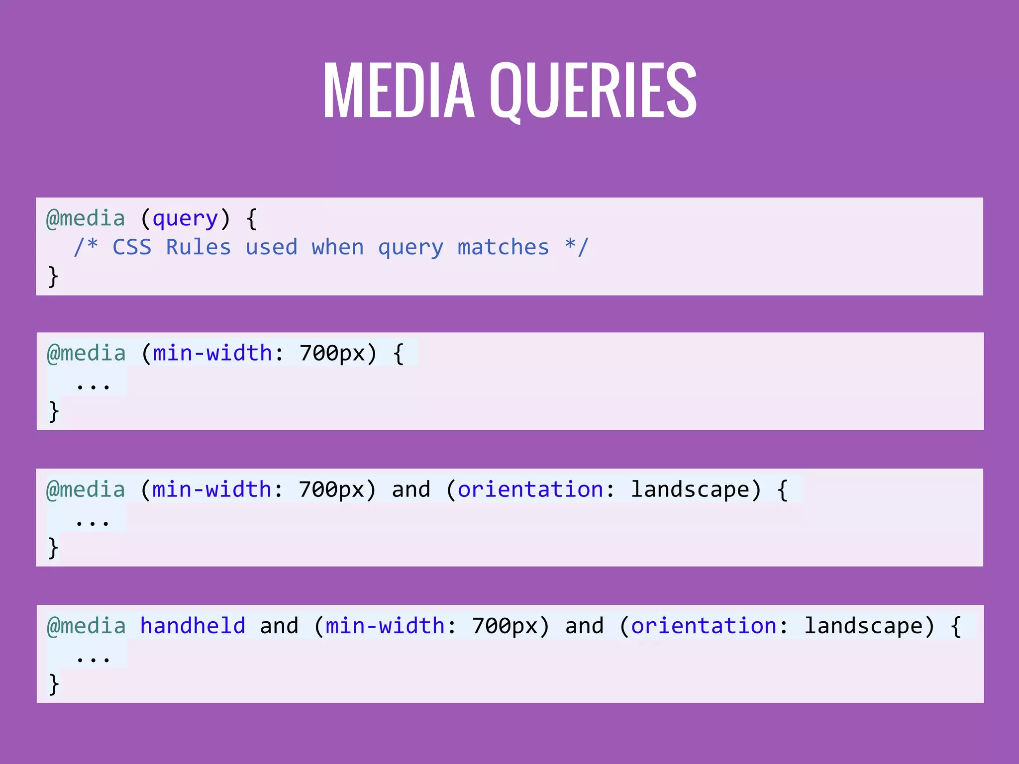
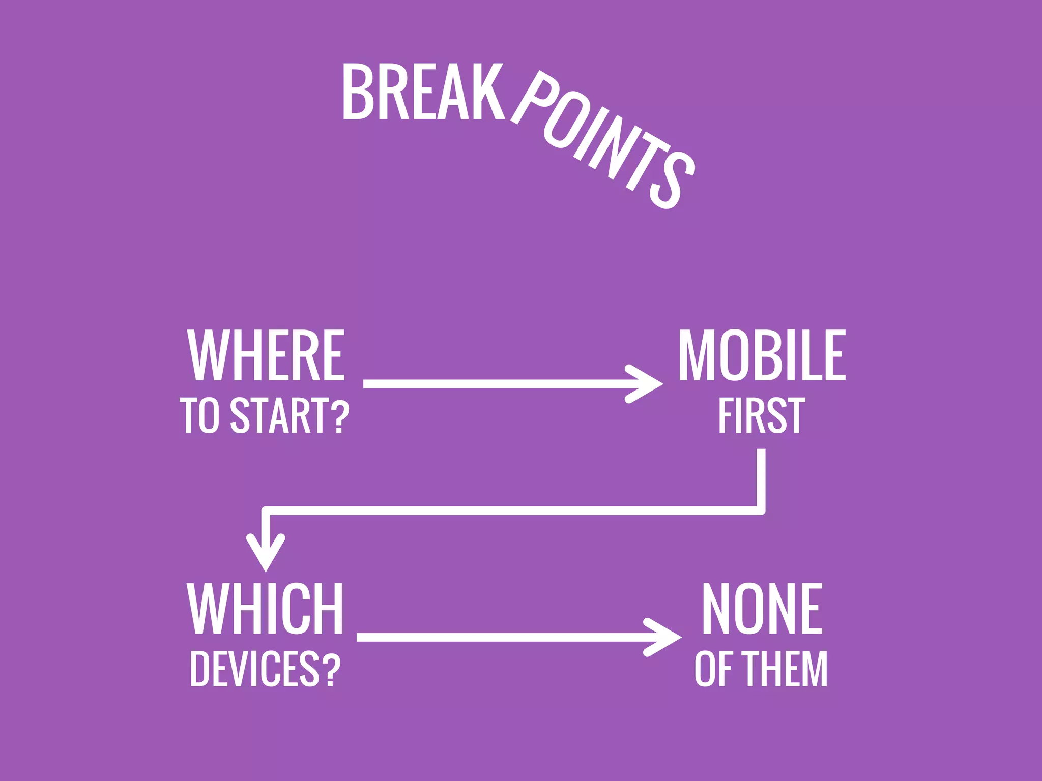
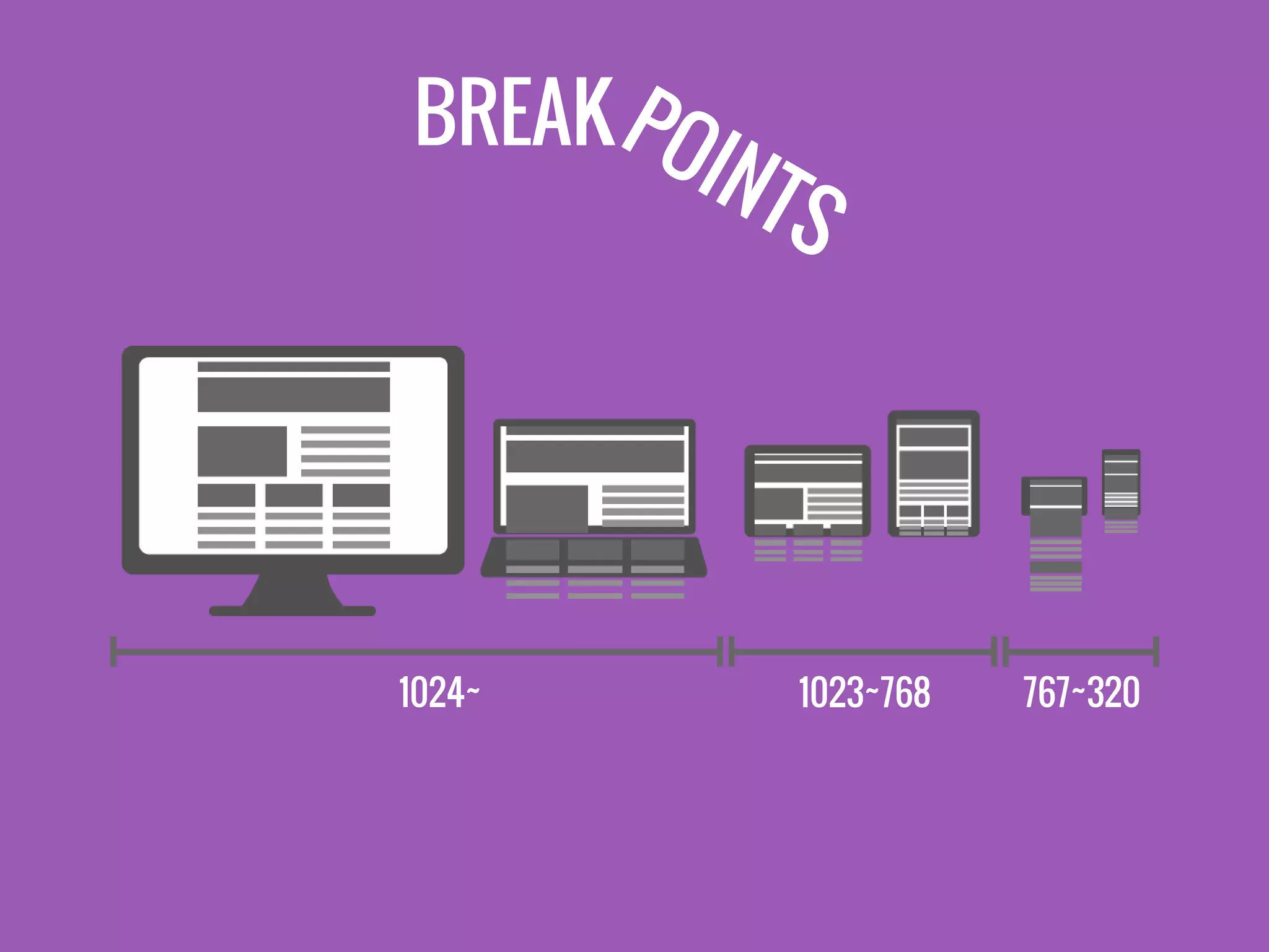
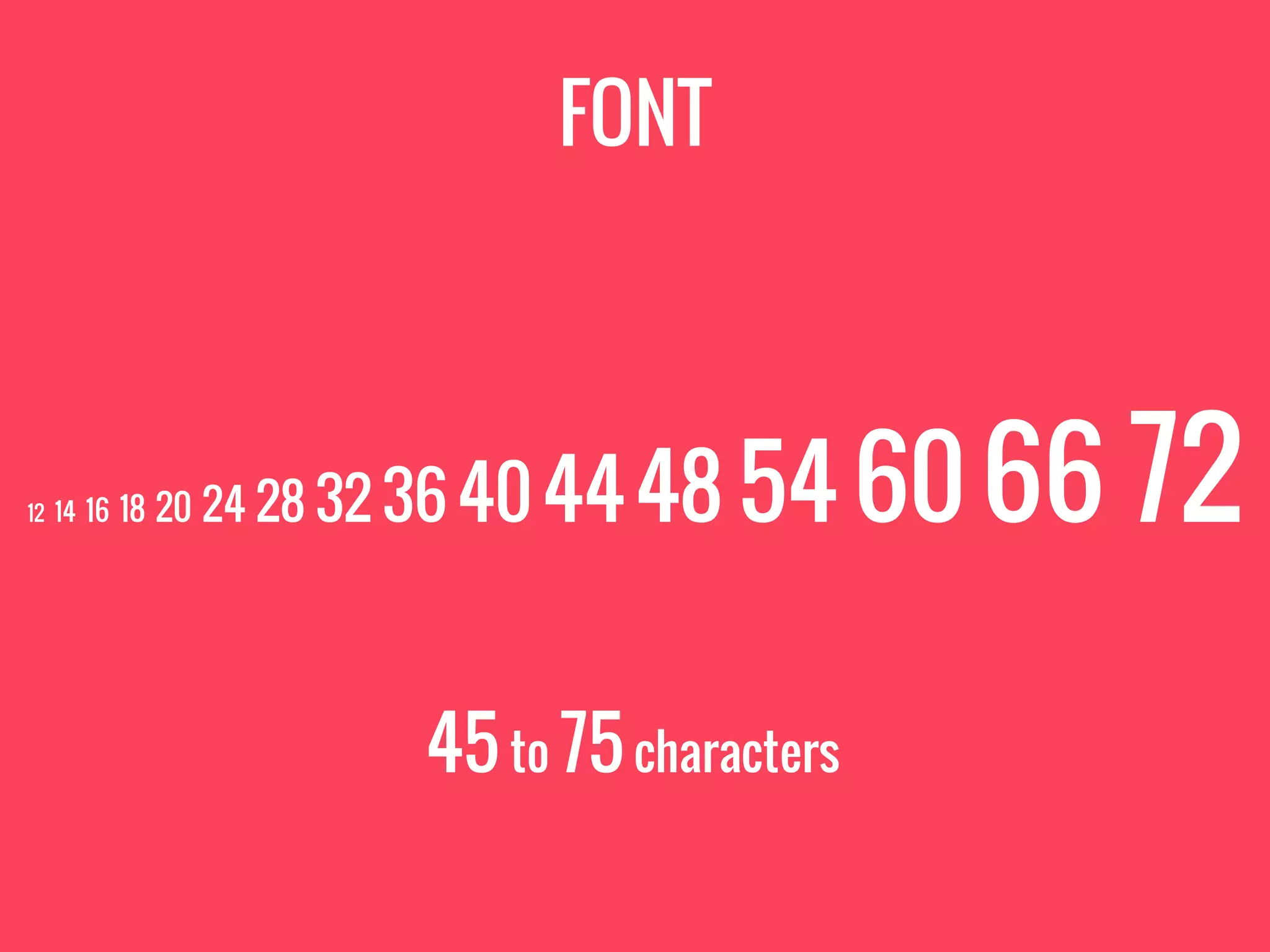
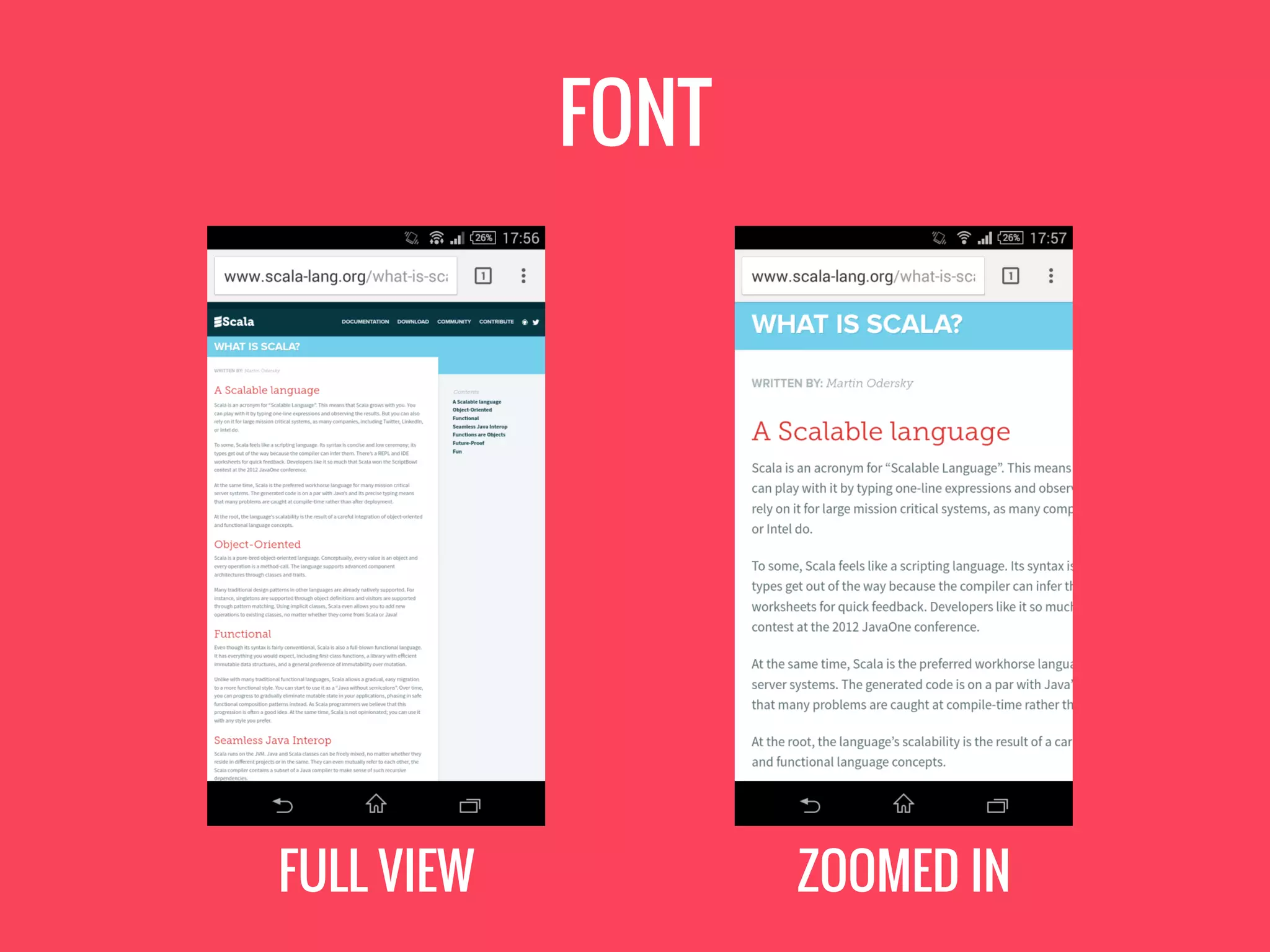
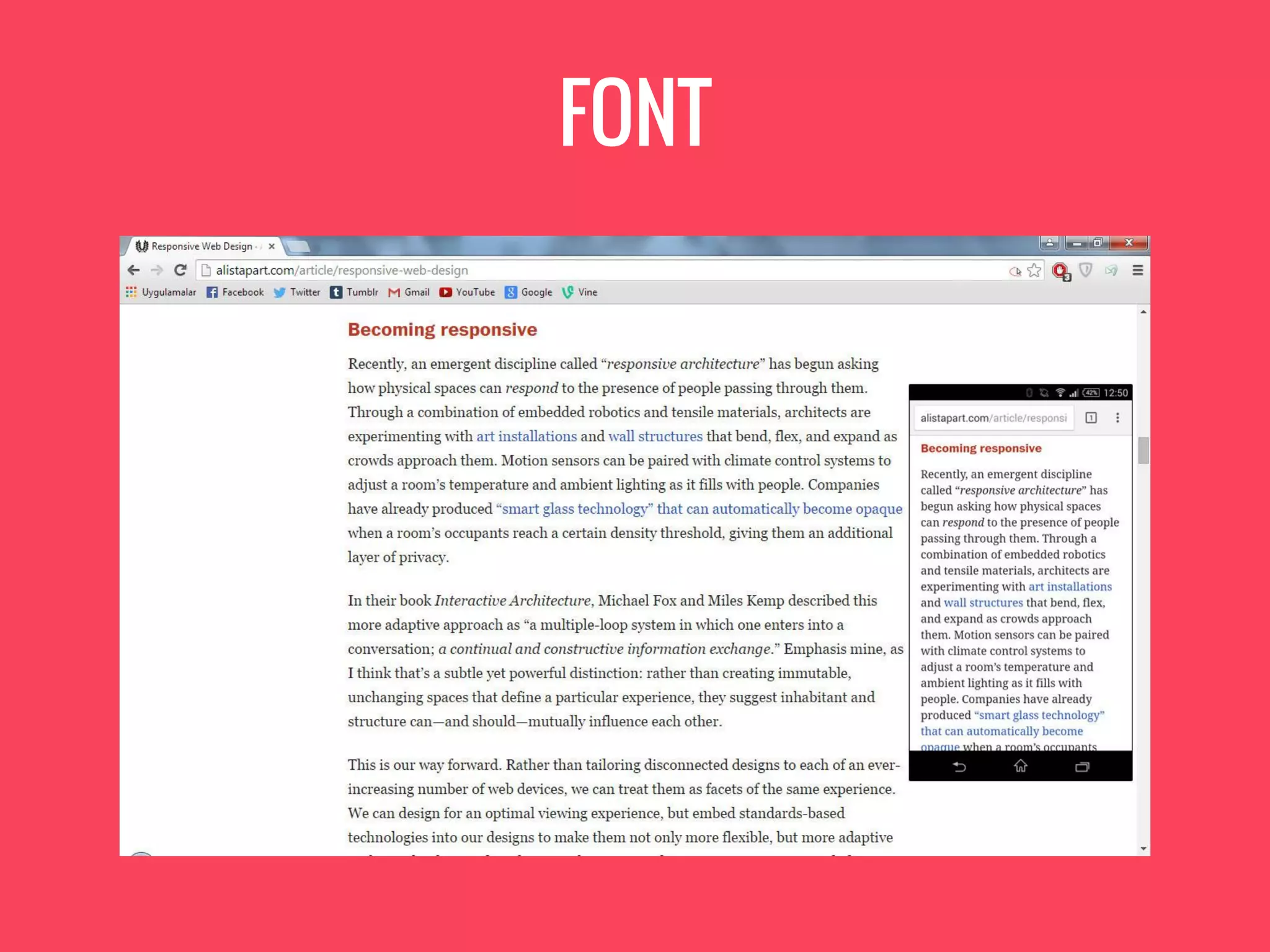
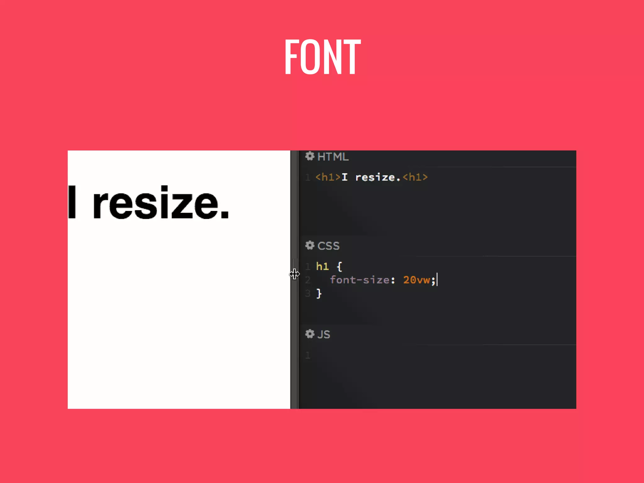

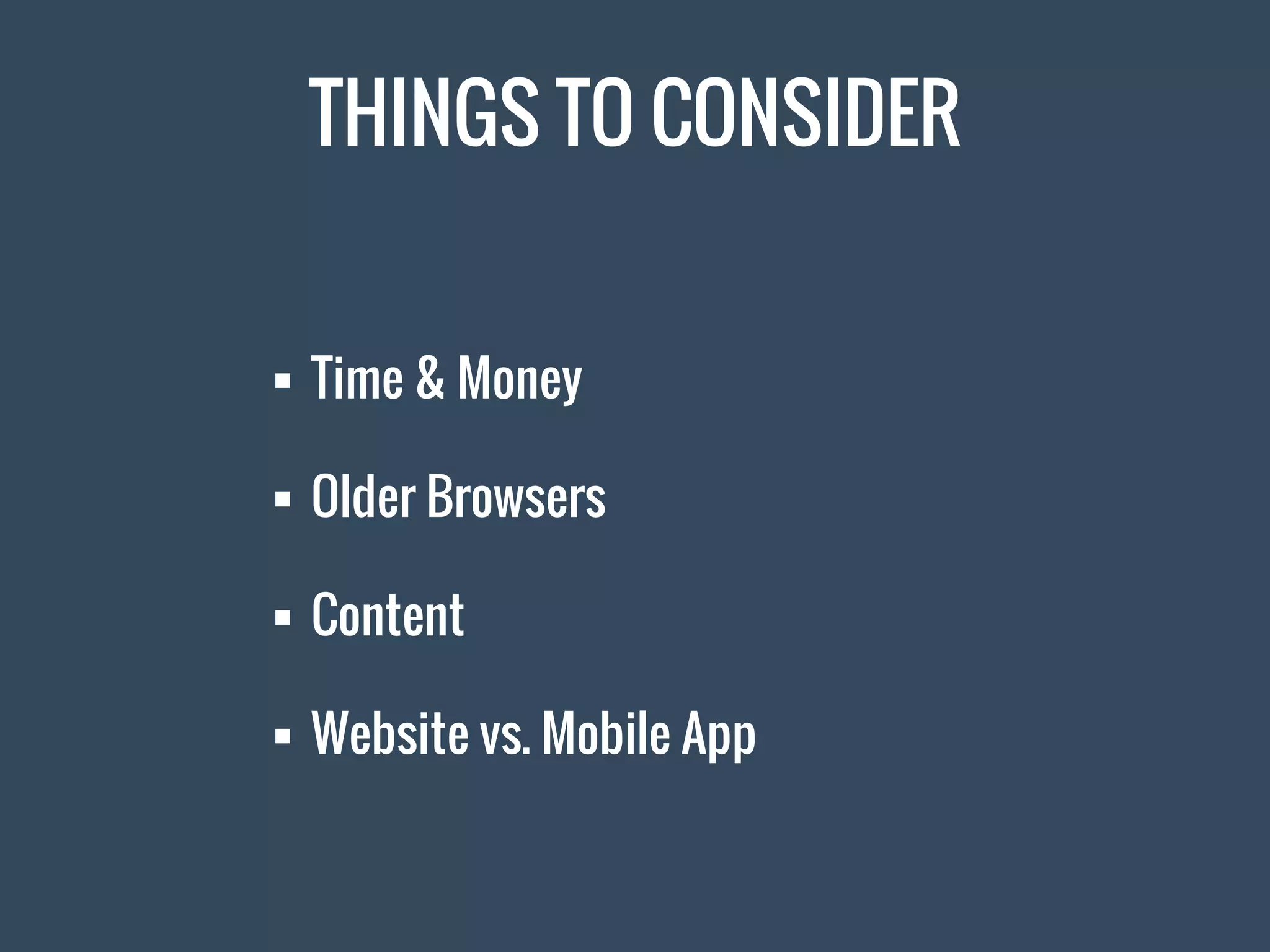

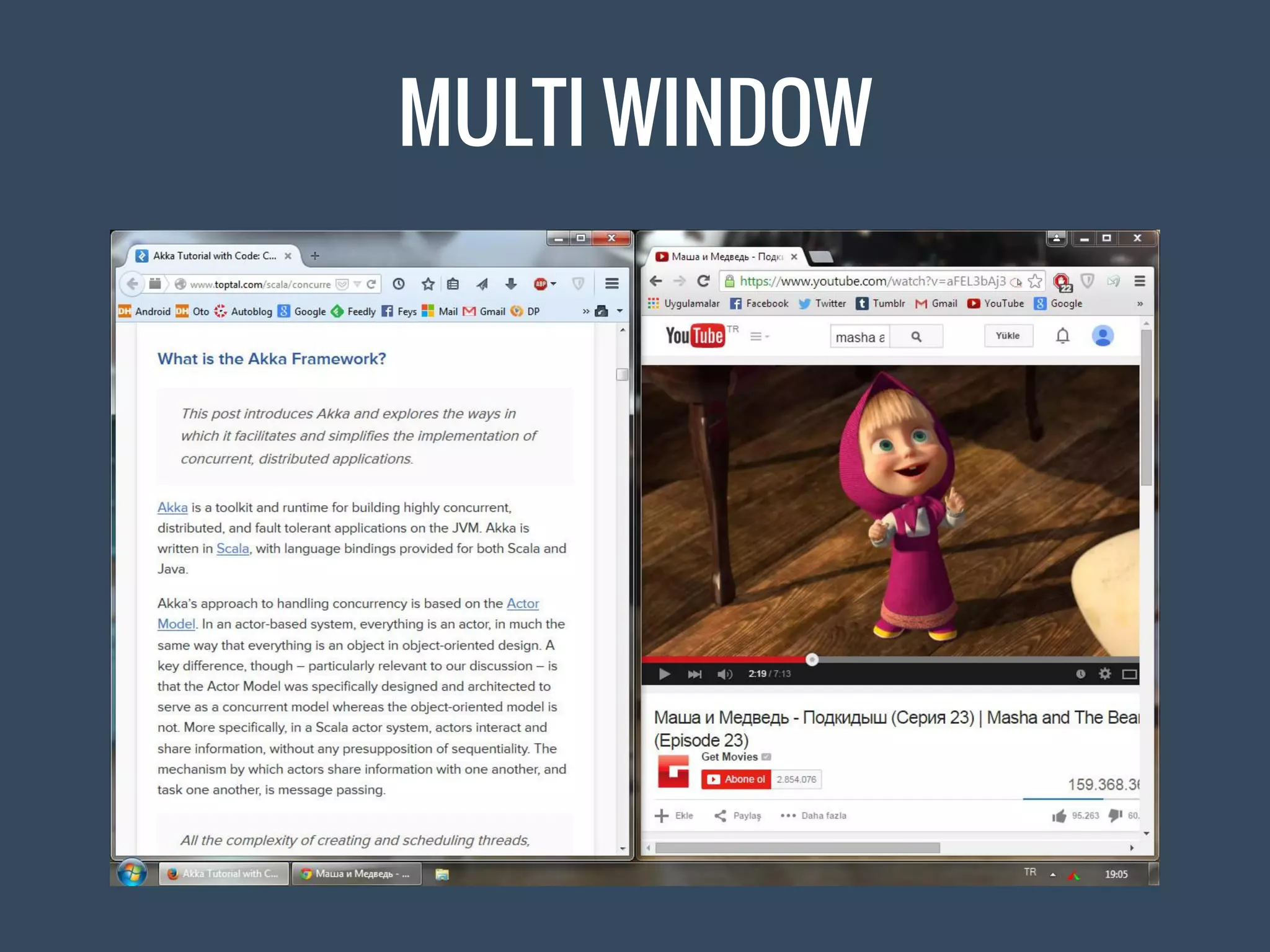
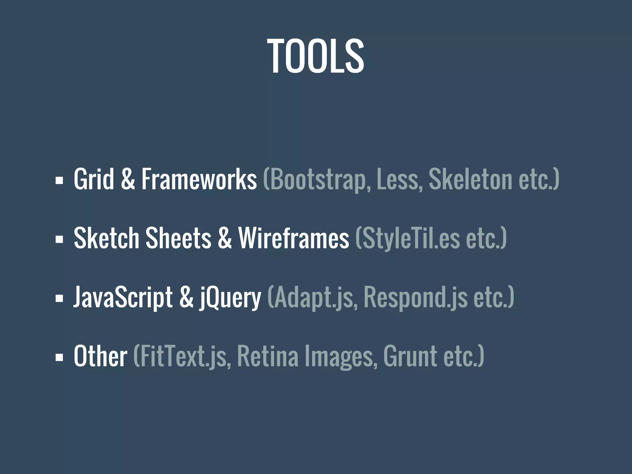
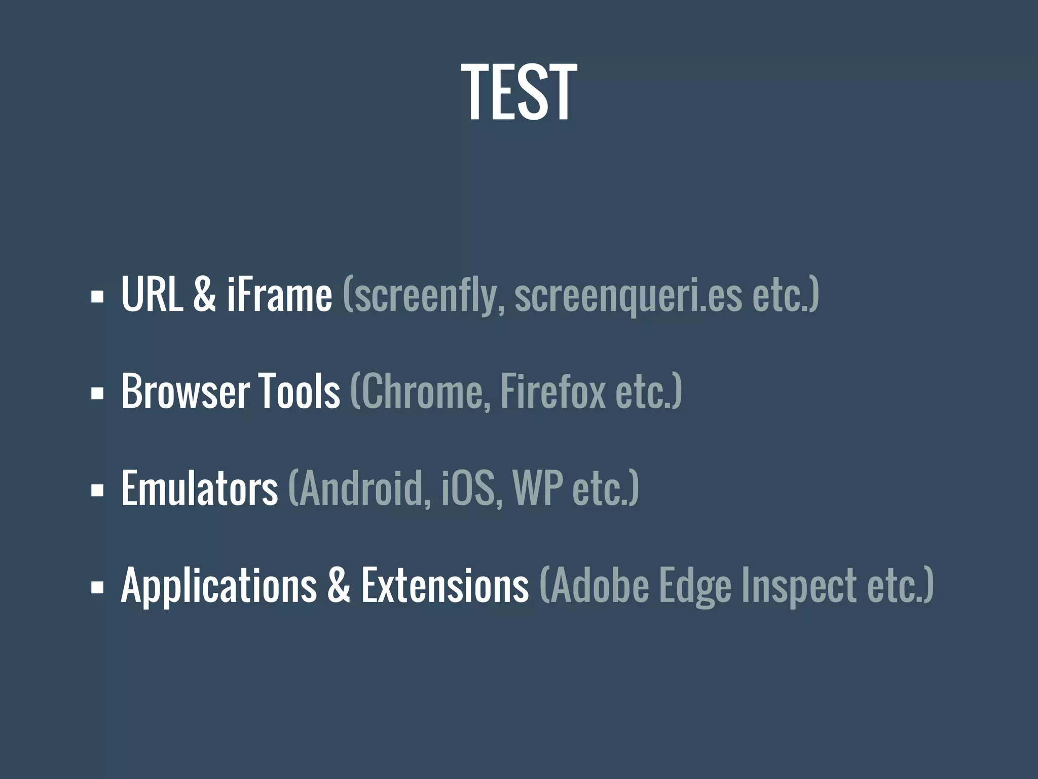


The document discusses responsive design, highlighting its definition, history, and essential tools for creating optimal viewing experiences across devices. It emphasizes the importance of fluid grids, media queries, and the use of viewport settings for effective design, alongside facts about user engagement with mobile devices. Additionally, it provides practical tools and methods for testing and implementing responsive design strategies.


![CleanMyMac X v5.2.8 Crack for MacOS Full Version [Latest] pptx](https://cdn.slidesharecdn.com/ss_thumbnails/softwareoverview-251207194121-a81f0142-thumbnail.jpg?width=640&height=640&fit=bounds)
![WinRAR Crack 7.13 Final Mac Keygen 2026 Download [Latest] Software.pptx](https://cdn.slidesharecdn.com/ss_thumbnails/software-251207185858-eb450678-thumbnail.jpg?width=640&height=640&fit=bounds)


![Soundtoys Mac v5.5.5.0 Crack for MacOS Full Version [Latest] pptx](https://cdn.slidesharecdn.com/ss_thumbnails/softwareoverview-251207193711-91d8ae6b-thumbnail.jpg?width=640&height=640&fit=bounds)