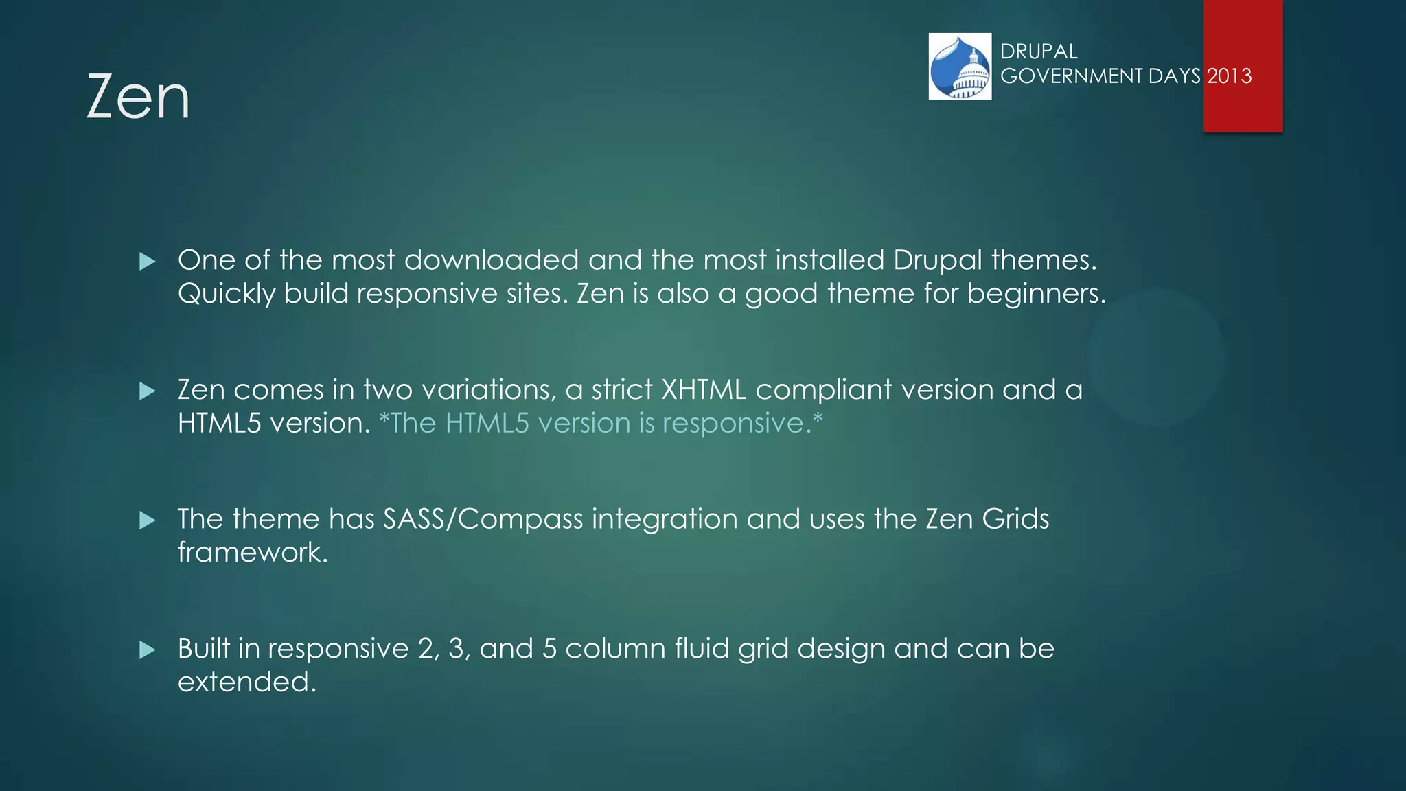
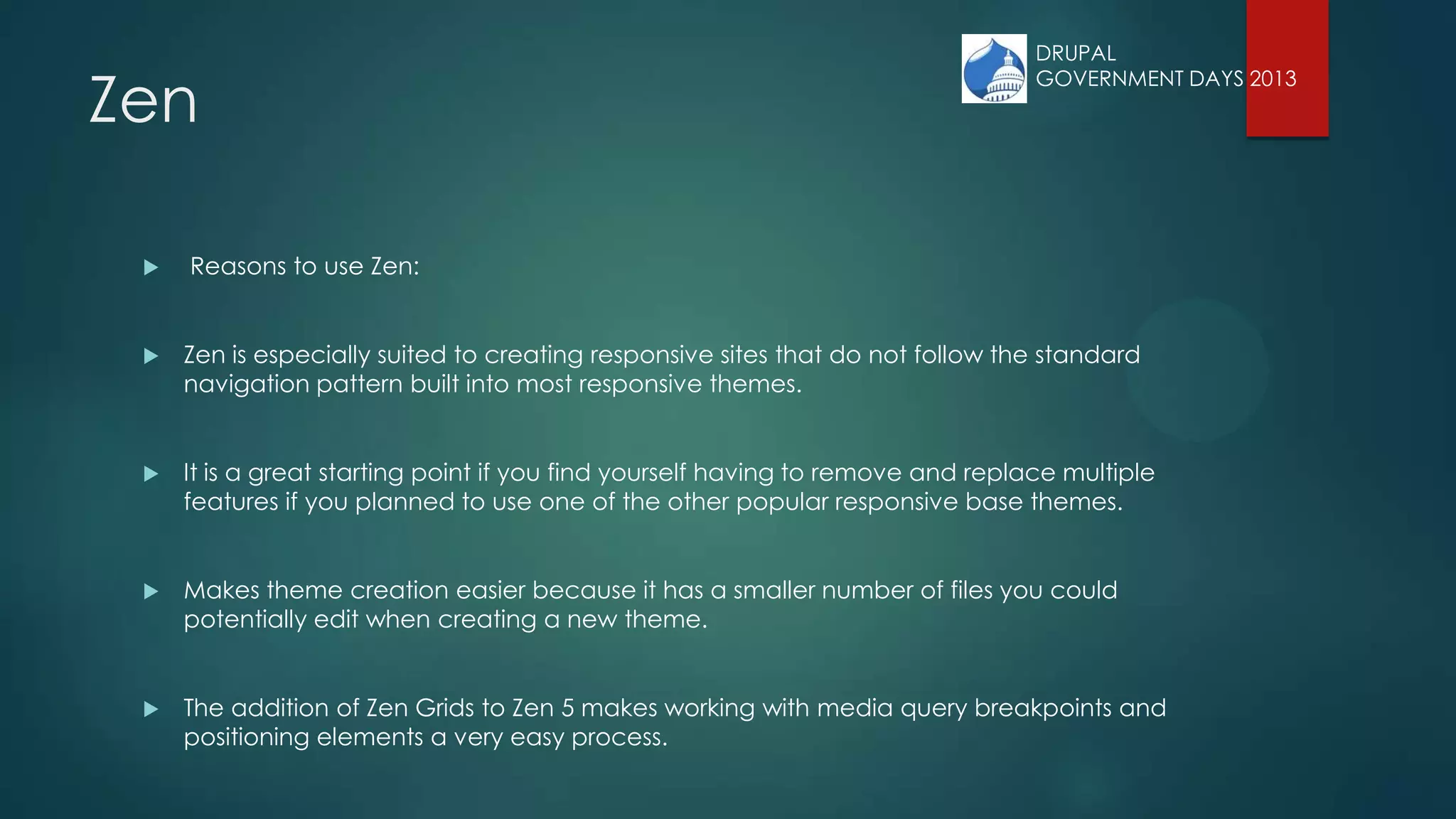
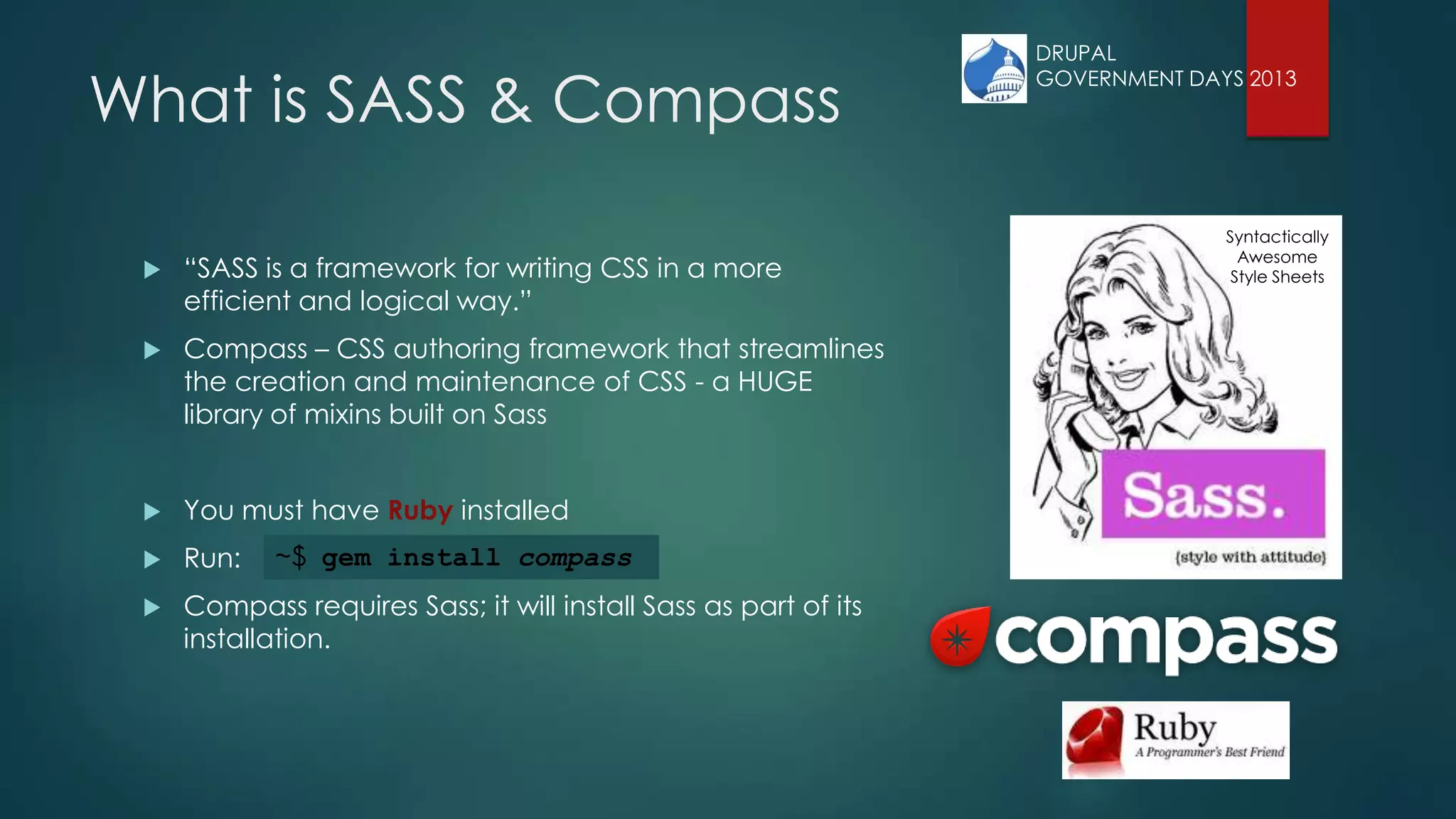
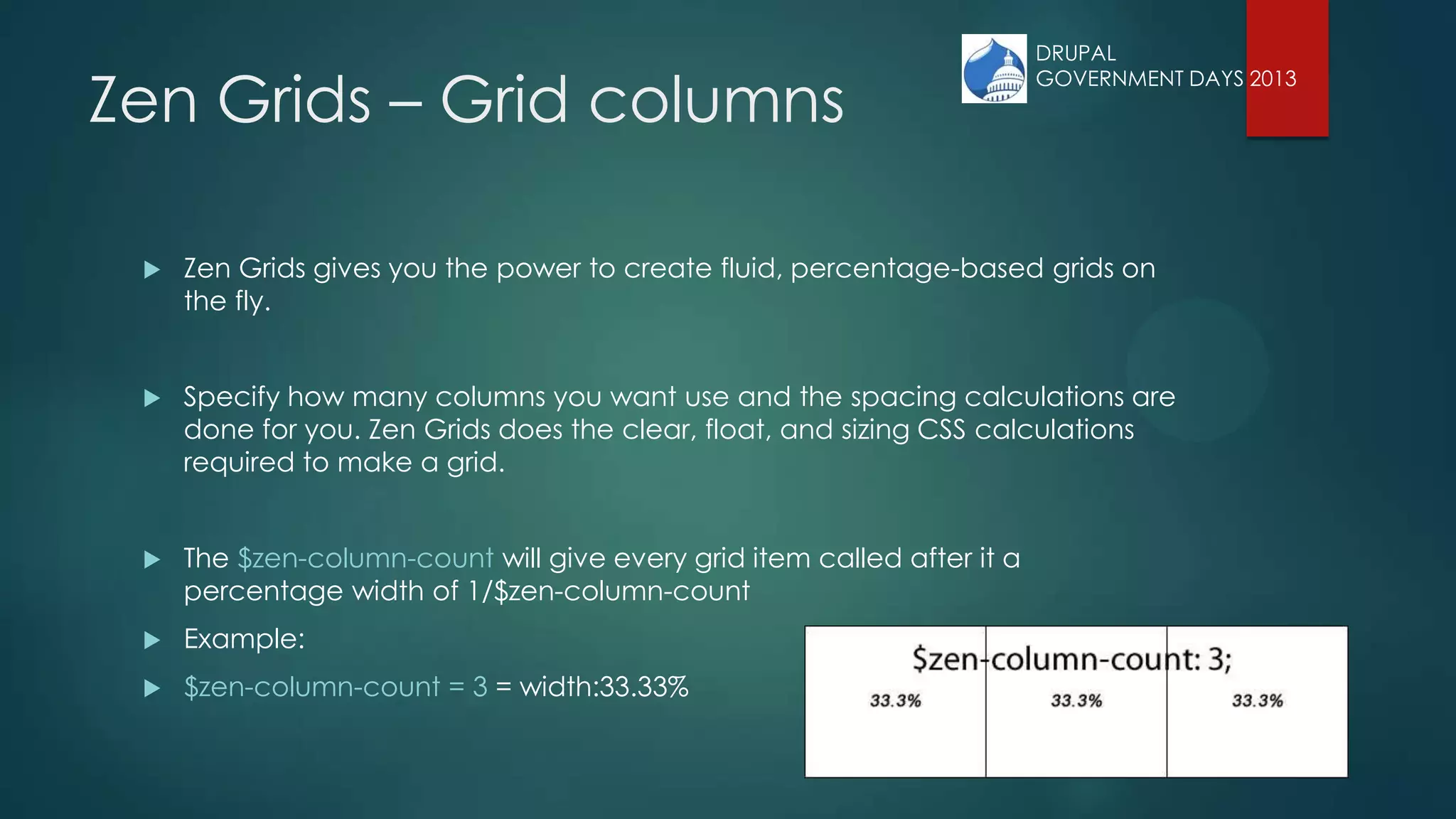
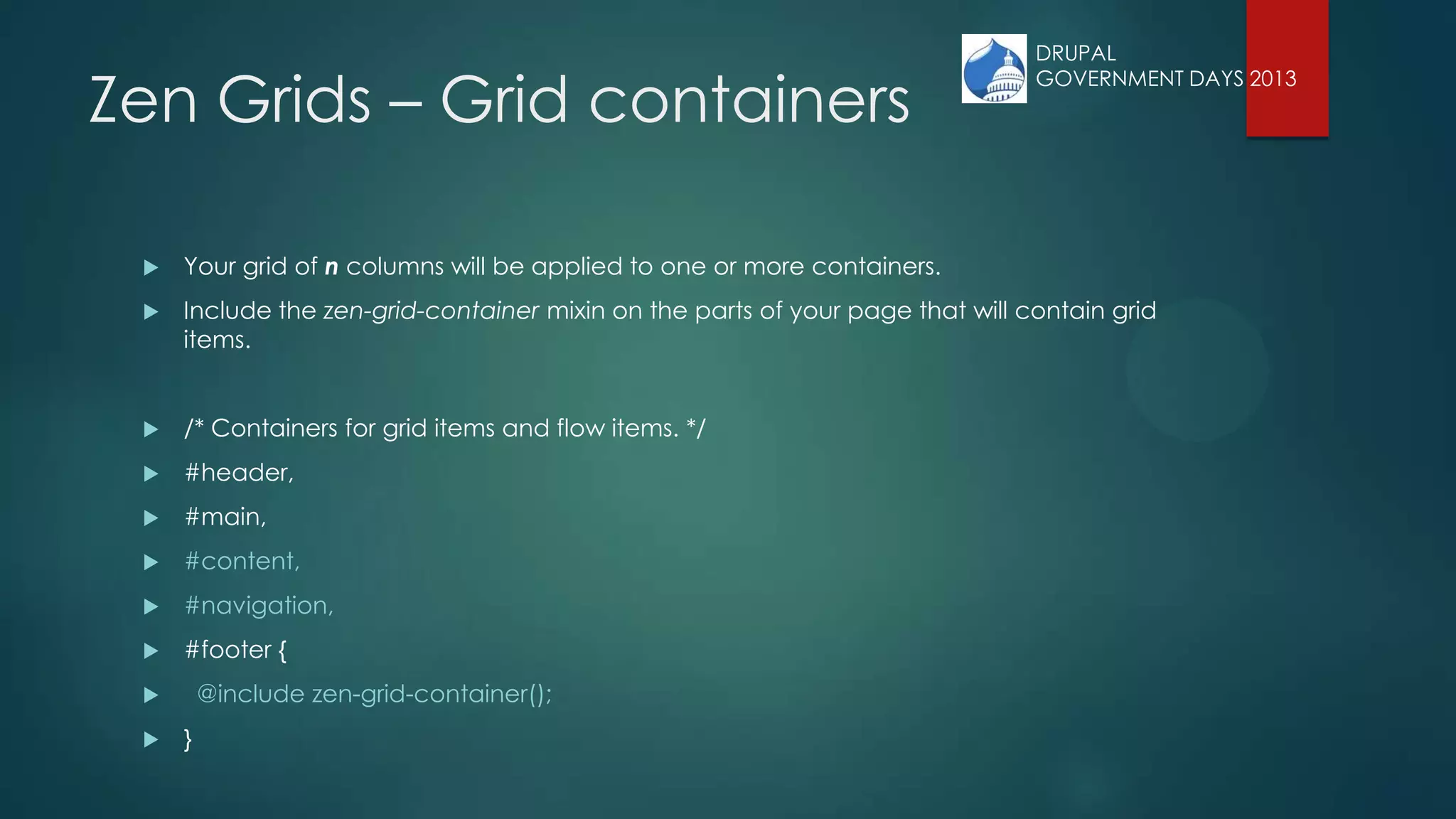
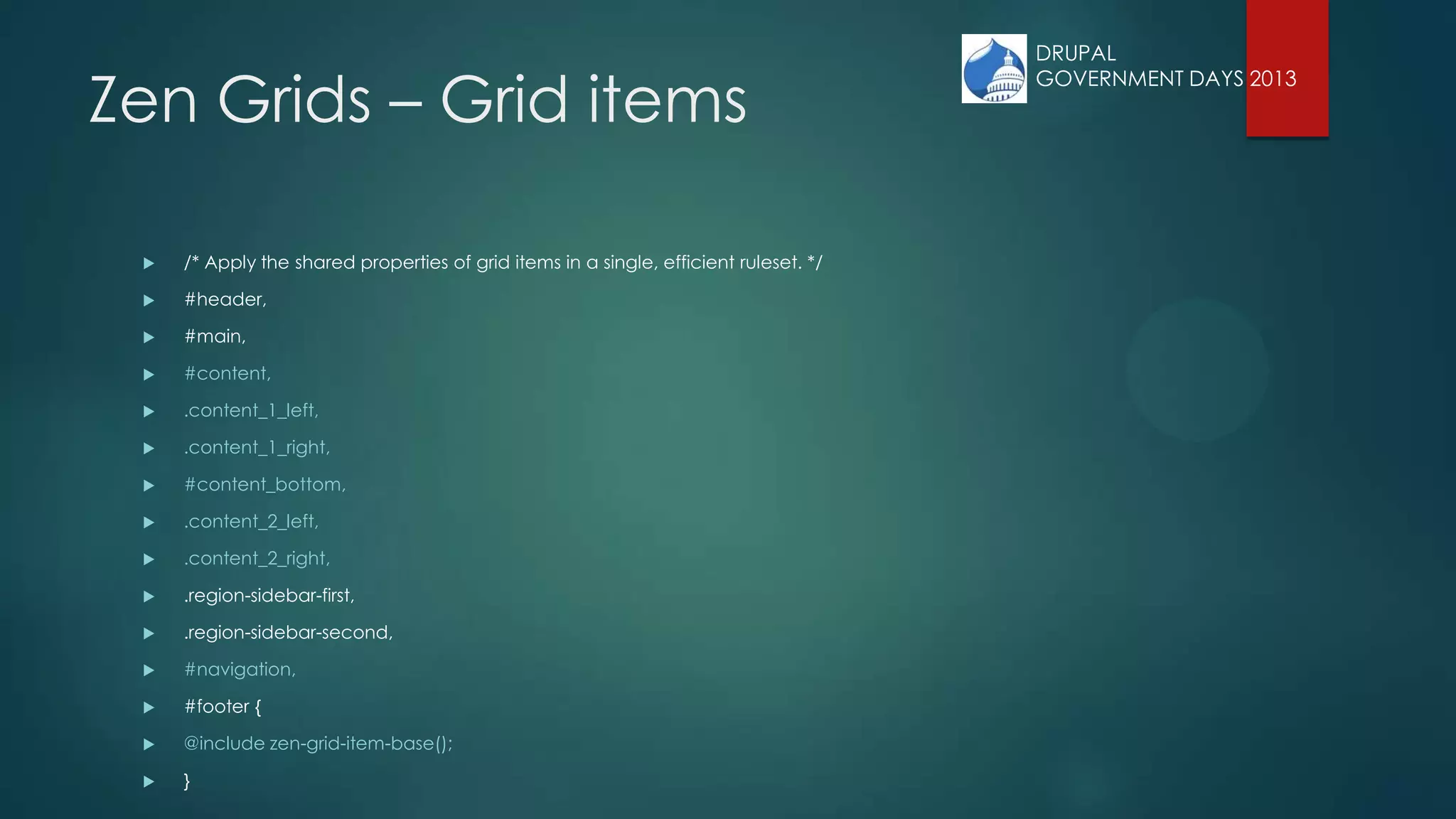
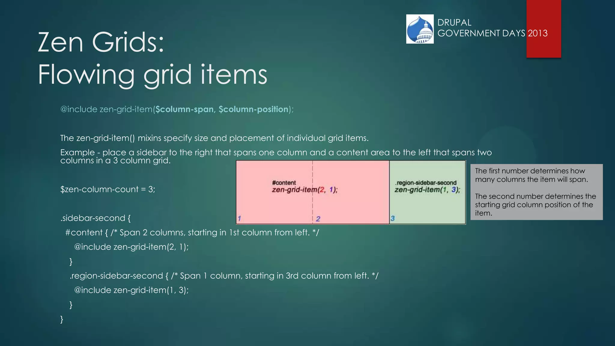
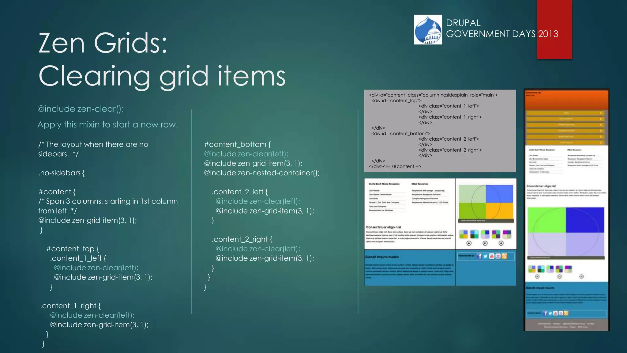
The document outlines the creation of a responsive website using Drupal's Zen 5 theme and Zen grids, emphasizing the benefits and steps for using these tools. It provides detailed instructions on setting up a Zen sub-theme, including file configurations and layout customizations necessary for responsive design. The Zen framework is highlighted as a flexible solution for building responsive sites, particularly suitable for developers looking to customize themes without the limitations of other base themes.


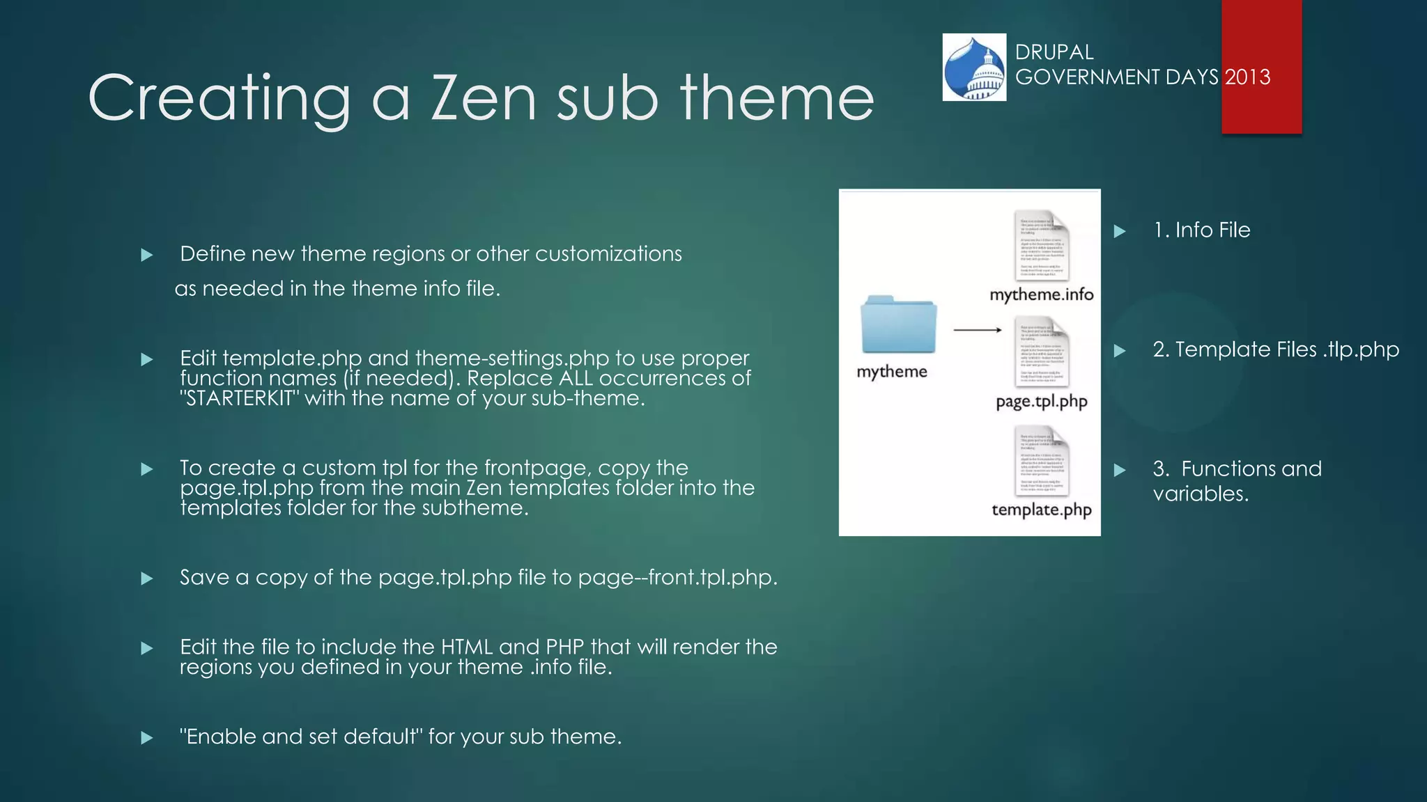
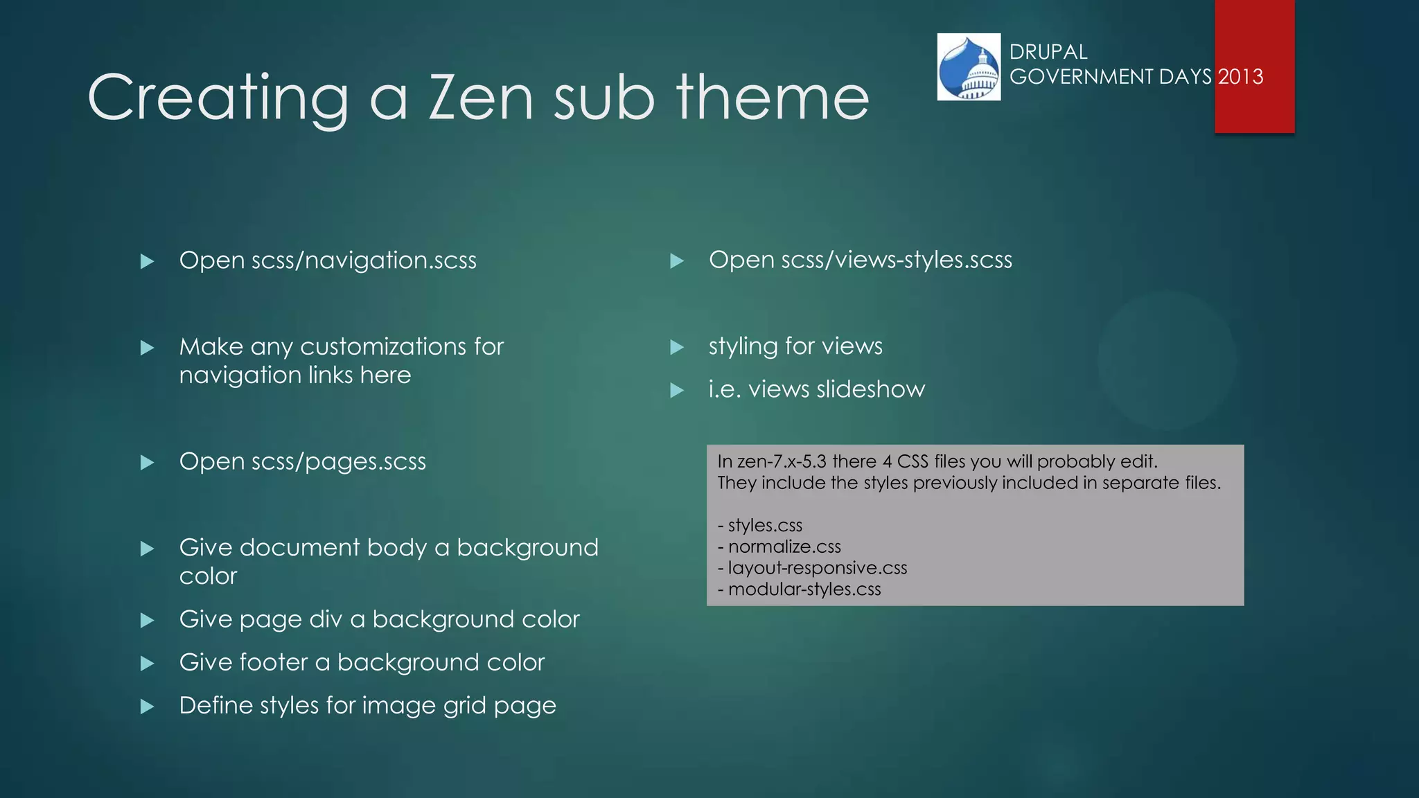
![Creating a Zen sub theme
Download Zen 5
Copy STARTERKIT folder in the Zen theme folder
[sites/all/themes/zen] to main themes folder
[sites/all/themes]
Rename the folder to the name of your new sub-theme
Go into the folder, rename the STARTERKIT.info.txt file to
name_of_theme.info
STARTERKIT.info.txt -> demo.info
Edit the theme info file, look for a line that has the name
and description
Give your theme a name and optionally edit the description
DRUPAL
GOVERNMENT DAYS 2013](https://image.slidesharecdn.com/responsivezenv3-130814202928-phpapp02/75/Responsive-Zen-8-2048.jpg)
![Defined Regions
regions[header] = Header
regions[navigation] = Navigation bar
regions[content] = Content
regions[container_1_left] = Container 1 left
regions[container_1_right] = Container 1 right
regions[container_2_left] = Container 2 left
regions[container_2_right] = Container 2 right
regions[sidebar_first] = First sidebar
regions[sidebar_second] = Second sidebar
regions[footer] = Footer
DRUPAL
GOVERNMENT DAYS 2013](https://image.slidesharecdn.com/responsivezenv3-130814202928-phpapp02/75/Responsive-Zen-14-2048.jpg)

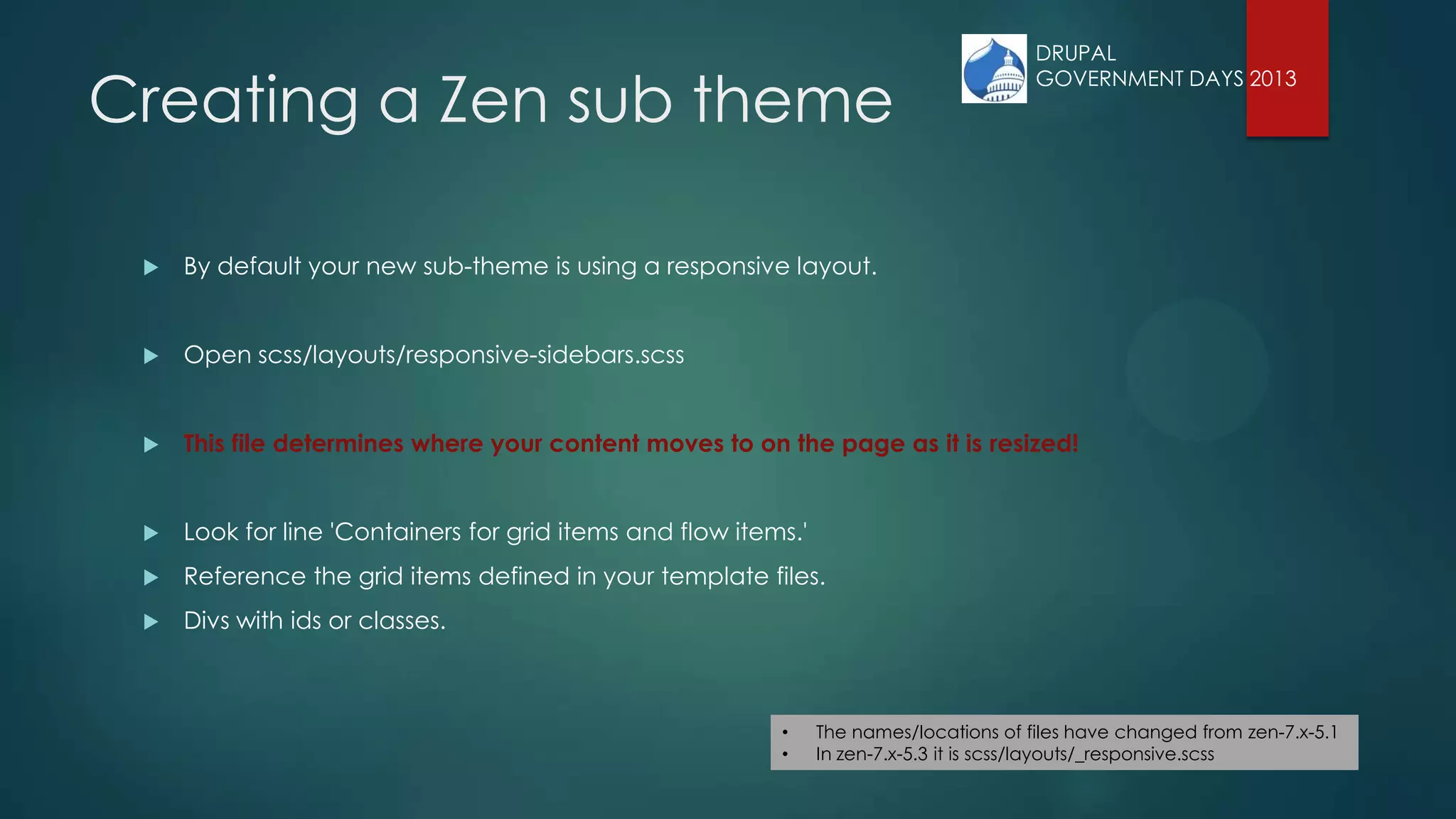
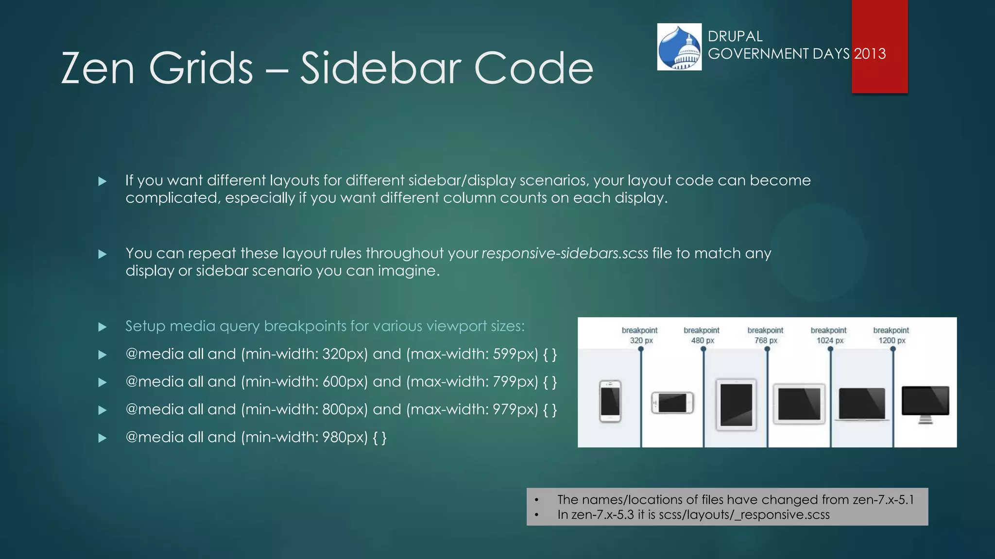
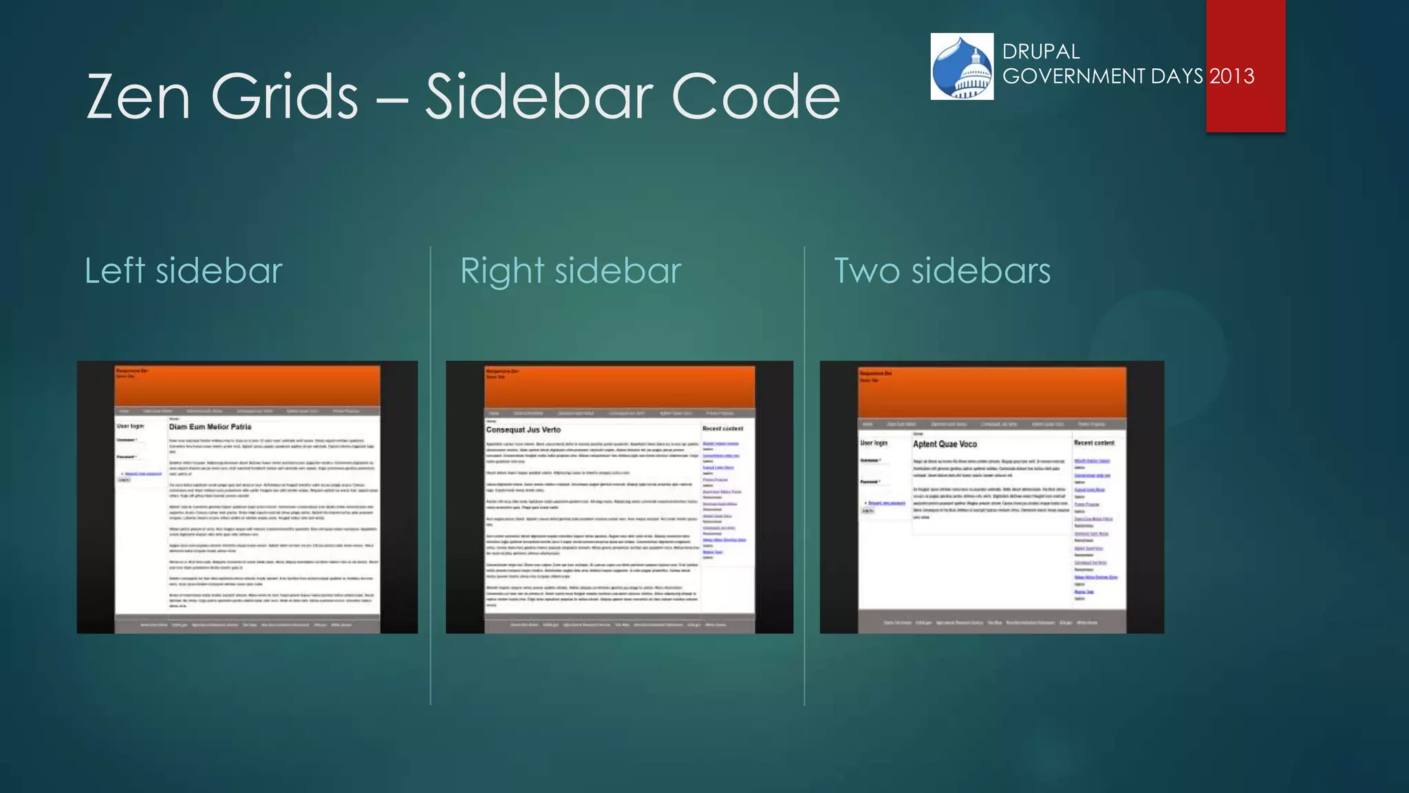
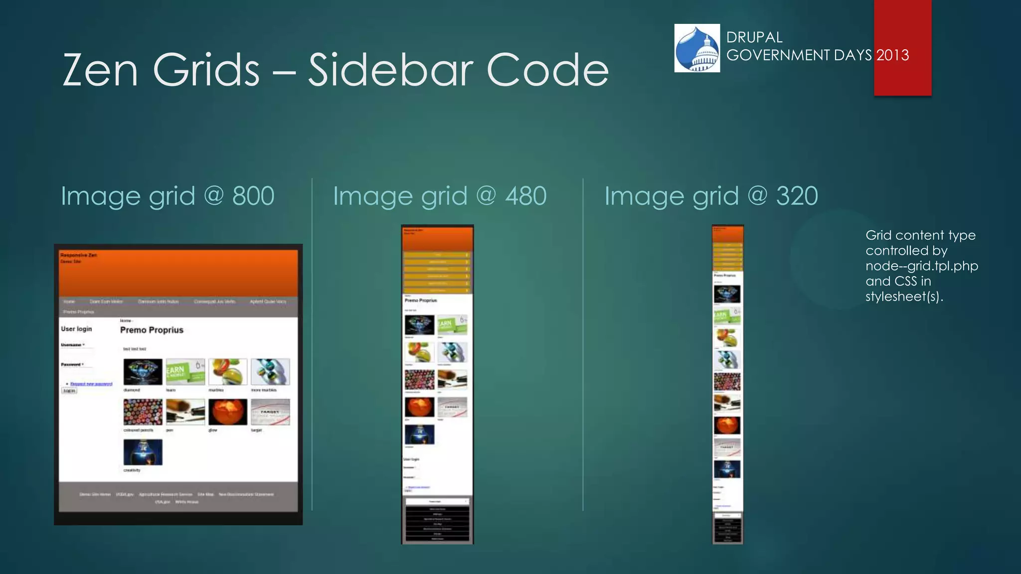
![Zen Grids – Sidebar Code
All layout code is located in the layout/responsive-sidebars.scss file within your sub-theme. The sidebar
code in responsive-sidebars.scss allows you to have different layouts for different sidebar scenarios. Zen
gives the <div> that surrounds your content and sidebar(s) a class.
<div class=”DYNAMIC-CLASS”>
[First Sidebar Div] [Content Div] [Second Sidebar Div]
</div>
If the first column exists, Zen generates a „sidebar-first‟ class. If the second column exist Zen generates a
„sidebar-second‟ class, if BOTH columns exist Zen generates a „sidebar-both‟ class. If no sidebars are
present, Zen generates a „no-sidebars‟ class.
.sidebar-first { LAYOUT-CODE }
.sidebar-second { LAYOUT-CODE }
.two-sidebars { LAYOUT-CODE }
.no-sidebars { LAYOUT-CODE }
• The names/locations of files have changed from zen-7.x-5.1
• In zen-7.x-5.3 it is scss/layouts/_responsive.scss
DRUPAL
GOVERNMENT DAYS 2013](https://image.slidesharecdn.com/responsivezenv3-130814202928-phpapp02/75/Responsive-Zen-22-2048.jpg)


![iStat Menus 7.20 Crack for MacOS 2026 Full Version [Latest] pptx](https://cdn.slidesharecdn.com/ss_thumbnails/softwareoverview-251207191544-22b737dc-thumbnail.jpg?width=640&height=640&fit=bounds)
![Soundtoys Mac v5.5.5.0 Crack for MacOS Full Version [Latest] pptx](https://cdn.slidesharecdn.com/ss_thumbnails/softwareoverview-251207193711-91d8ae6b-thumbnail.jpg?width=640&height=640&fit=bounds)
![AnyTrans for iOS 8.9.14.20251127 With Crack for MacOS [Latest] pptx](https://cdn.slidesharecdn.com/ss_thumbnails/softwareoverview-251207190907-2316965f-thumbnail.jpg?width=640&height=640&fit=bounds)


