
Recommended
More Related Content
What's hot
What's hot (20)
Viewers also liked
Viewers also liked (17)
Similar to Valentine's Comedy Promotion
Similar to Valentine's Comedy Promotion (20)
Valentine's Comedy Promotion
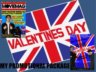
- 2. Large heading to catch peoples attention Our hero Valentine taking himself too seriously as per usual Offering give-aways to attract buyers Small snippets of information from the interview to attract buyers Info about what else is in the magazine, i.e. articles on other films I decided I would use my poster as well as a classmate's as this adds extra synergy price/issue/date etc. Bar code adds realism Subheading contains both actor's real name and character name MAGAZINE COVER DECONSTRUCTION
- 3. Title of the film, big bold letters Reviews from critics/magazines - realism Actors names – always needed in a real film poster Release date I made valentine bigger to show that he is the main good guy Bright colours indicate that this will be a light hearted film The comedic tag line again shows the genre of the film This text has appears in most film posters, and it gives the poster a more real feel Lesser protagonist made smaller POSTER DECONSTRUCTION
- 4. SIMILARITIES BETWEEN ANCILARY TASKS AND TRAILER Still from the trailer Section of the poster I thought it would be best to use a line similar to what is in our trailer because it is then instantly recognisable that the two texts go together
- 5. Still from the trailer My poster As you can see I took the Valentine's Day logo from our trailer and edited it for my poster. I extended it on all sides and made the colours brighter, so as to indicate it is a comedy film.
- 6. Section of my magazine Section of my poster To make my promotional package even more real I decided that I would use both the protagonist's actor's names as relationships between stars are often publicised in Hollywood.