The document discusses several font options for a Halloween magazine, analyzing each one based on how eye-catching and unique it is. Fonts like "You murderer BB" and "Carolingia (bigfoot)" are highlighted for their spooky styles that have not been seen in other magazines. Other simpler fonts like "Attack of the cucumbers" and "Mostly mono" are mentioned as being effective through their understated designs.
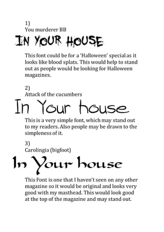
1. 1)
You murderer BB
This font could be for a ‘Halloween’ specialas it
looks like blood splats. This would help to stand
out as people would be looking for Halloween
magazines.
2)
Attack of the cucumbers
This is a very simple font, which may stand out
to my readers. Also people may be drawn to the
simpleness of it.
3)
Carolingia (bigfoot)
This Font is one that I haven’t seen on any other
magazine so it would be original and looks very
good with my masthead. This would look good
at the top of the magazine and may stand out.
2. 4) Mostly mono
This again is very simple and I think this is
effective as the writingis thin and looks like it
has been written.
5)Vtkss distress
This is a masthead and font that looks rough and
sketchy which would stand out to people as
most other magazine fonts are very neat.
6) My Turtle
This font is unusual and may stand out because
of this. The middle of the letters could be filled
with a different colour each week if this were
my font.
7) Peixe Frito