
Recommended
Recommended
More Related Content
What's hot
What's hot (20)
Viewers also liked
Viewers also liked (16)
Similar to Art Business Today: Modern British Art - Haute couture framing
Similar to Art Business Today: Modern British Art - Haute couture framing (20)
Recently uploaded
Recently uploaded (20)
Art Business Today: Modern British Art - Haute couture framing
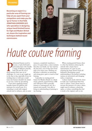
- 1. 50 June 2014 ART BUSINESS TODAY P rofessional framers need to become a ‘jack-of-all-trades’, particularly those who handle a range of different artworks, both 2D and 3D, all of which present their own set of challenges. It is easy to get caught up in the day to day, especially if you are working alone or with just a small team, but framers shouldn’t be afraid to cut out a niche by specialising. I have been supplying unique bespoke frames for galleries and museums for several years. It is rewarding to work with original artwork and to enhance, and, in some instances, completely transform a piece. It is great when a client exclaims that they can finally ‘see’ the work for the first time, even if they have lived with it for many years. Nothing can kill what is otherwise an interesting and strong piece quite so much as bad framing. I specialise in creating period frames for Modern British art, which means artwork created between 1900 and 1970 (post-1970 is generally termed as contemporary art). As a trained artist myself, I am able to bring an understanding of painting to my framing. When creating period frames, there is a fine line between enhancing the artwork with a frame that is representative of a past era and ensuring the frame doesn’t look old fashioned. Developing a good understanding of the period, including various art movements and changing styles, is important. I always work closely with the client to make sure I understand what they want to achieve. Some clients want to increase the presence of a piece, others might want to enhance a particular aspect, or reduce something they feel is weak in the original, such as one Becoming an expert in a particular area of framing can help set you apart from your competitors and make you the ‘go to’ framer in that field. JONATHAN GOODERS GCF, who specialises in designing unique hand-finished frames for high-end Modern British art, shares the inspiration and techniques behind recent commissions FRAMING Haute couture framing
- 2. June 2014 51ART BUSINESS TODAY over-riding colour. All this can be achieved by the use of shape, finish and subtle colouration. It is important to make sure you create the right ‘weight’ of frame. Too big and it will swamp the picture, too small and it will not achieve the necessary effect. Some small paintings, for example, can actually carry quite a heavy frame – it depends on the composition. Do not be afraid to put different mouldings together; turn them on their sides, flip them over, cut into them, or re-engineer the shapes. Let your creativity run wild. Experiment and have fun. First World War battle I was recently commissioned to frame two original works by CRW Nevinson, one of the key artists of the First World War. The first piece was an aerial battle that contained a lot of very strong blue, which, if not handled carefully, could have made the whole painting feel very cold. It was originally framed in a thin frame, which did not give the painting the gravitas it deserved. I created a FRAMING Opposite page: Jonathan Gooders GCF with a framed wartime etching by Paul Nash, and examples of his frame finishing techniques This page: The distressed frame Jonathan made for a painting by CRW Nevinson » Frame Design Annabelle Ruston Frame Design by Annabelle Ruston is £12 from the Guild Bookshop (£10 to members), plus p+p Order at fineart.co.uk or contact Moira Sanders on 020 7381 6616 or moira@fineart.co.uk
- 3. 52 June 2014 ART BUSINESS TODAY profile by stacking several different mouldings to produce the right shape. The frame was built up at the back to provide the necessary depth to accommodate the canvas. I added further elements on the outer side, to add visual interest and bridge the joins between the mouldings. Once I was happy with the shape, the frame was sanded, filled and treated with rabbit skin size to seal the wood. Layers of different concentrations of gesso were applied to build up the surface (on this frame, about 12 coats were applied). The gesso was sanded to provide a ‘blank canvas’ on which to start distressing. The amount and style of distressing you apply completely depends on the painting and the eventual finish you want to achieve. On this particular piece I wanted to convey a feel of the wood, canvas and metal of the bi-planes in the picture. I wanted the frame to feel that it had been through the wars. When distressing you can employ many interesting techniques (and it’s a good way of releasing stress!) For this frame, I used a combination of denting using different sized hammers, dragging with nails, chipping away with a chisel and ‘roughing up’ with wire brushes. I also used a specially created implement - a piece of wood with various sized screws in it - to create ‘worm holes’. The effect needs to be random; if it is too considered it will look manufactured and artificial. The finish was built up with a series of coloured washes, each knocked back and sponged to create depth. Around 25 layers were applied. More distressing was then carried out, which was rubbed back to reveal glimpses of the build up. In order to express a sense of age, I applied an artificial rust and verdigris effect, which helped bring the planes ‘forward’ in the composition. The whole thing was then built up further with a series of waxes, to convey the idea that the frame had been handled over many years. Finally it was brushed with rottenstone, to create ‘dust’ in the corners and crevasses. A hand-finished slip completed the piece. The frame helps convey the idea that the viewer is part of the convoy, almost sat in a plane following the others, being drawn into the composition. Wartime landscape The second painting, by the same artist, is a wartime landscape, which employs strong Vorticist shapes. I wanted to emulate these shapes in the frame, which would provide a sense of period. I constructed a frame with strong angles positioned at different levels, which lead the eye into the painting and work with the perspective. This was achieved by adapting existing mouldings, then marrying them with specially created elements. The treatment of the frame in terms of build up was the same as the previous frame, however. This smaller painting has a strong stylised look, so the distressing had to be toned down and subtle, otherwise the frame would have been distracting and taken attention away from the painting. Never forget that the artwork is always the most important element of the whole. Good framing is like a good soundtrack to a film; it should enhance without being distracting, if you notice it, it is not doing its job. For the finish, I took colours from the composition and used them to enhance the perspective, which led the viewer away from the top of the painting. The artwork needed to be contained, but at the same time the frame had to work with the artist’s intent of conveying endless destruction. I introduced gold leaf on the inner edge, which was heavily burnished, to pick out some of the highlights in the picture and provide movement. The outer edge was waxed, but to give contrast, I left the inner ‘gully’ matt. Further light distressing was applied and brushed with rottenstone to convey age and create ‘dust’. Woodcut This small Edward Wadsworth woodcut needed a different approach, despite being from the same period. It is a small intimate piece, only 4x3”, with clean lines and minimal colour (just black, brown and olive green). The artist was interested in structure and composition. This is a work on paper, so had to » FRAMING The frame for the wartime landscape by Nevinson
- 4. June 2014 53ART BUSINESS TODAY be treated accordingly. The piece was hinged with reversible Hayaku museum hinging paper onto cotton museum board, so it could be easily removed without damaging the artwork. Because the print is made from very thin paper it was important to find an undermount of the right colour, which would elevate the work without changing the colours. Too dark and the paper would feel dirty; too light and it would have been too bright, throwing the balance. Working with the strong angles in the image, I decided to combine a deep bevel with cotton museum board in the same colour, so there was no obvious jump to distract the eye. An embossed line was added to introduce interest and ease the eye into the composition. The frame is clean and simple, made from a single deep angled moulding. This was built up using gesso, but instead of distressing, it was sanded very smooth to provide an almost glass-like surface. The inner angle of the frame was painted with a light tone of the olive green in the composition, while the top and outer edges were finished in dark charcoal. The whole frame was waxed and buffed to provide a slight gloss. Finally, I gave the inner top edge the lightest of sandings, to reveal a tiny amount of paint, which conveys a sense of age and wear. Museum glass was used to give protection and clarity. I Jonathan Gooders GCF owns Framers in south west London. framers.co.uk FRAMING The glazed frame for the Wadsworth woodcut