Downloaded 15 times


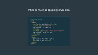
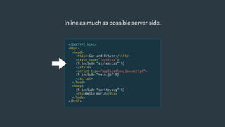
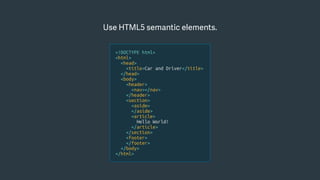
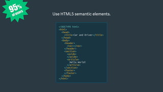
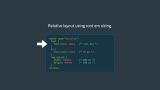
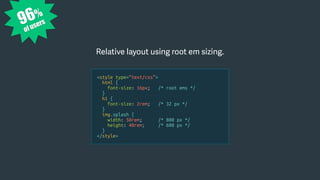
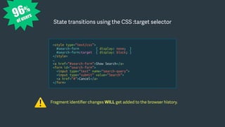


![Taking the next steps…
• Repeat the process with other pages.
• Run a 1% test in the wild.
• Build a performance budget.
• Run Sitespeed (or similar) regularly.
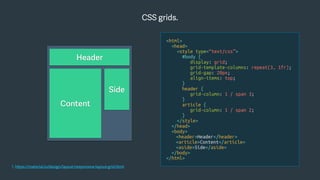
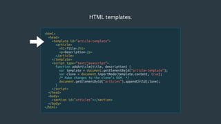
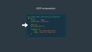
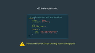
{
"browsertime.pageSummary": [{
"metric": "statistics.timings.firstPaint.median",
"max": 1500
}],
"pagexray.pageSummary": [{
"metric": "transferSize",
"max": 1000000
}, {
"metric": "requests",
"max": 45
}
}
1. https://www.sitespeed.io/documentation/sitespeed.io/performance-budget/](https://image.slidesharecdn.com/hyperlightwebsites-chriszacharias-181004124237/85/Hyper-Lightweight-Websites-62-320.jpg)

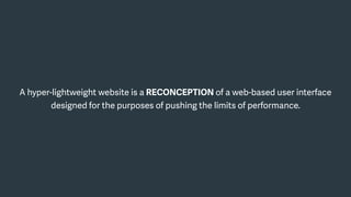
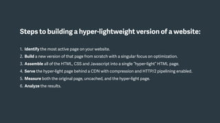
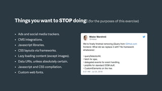
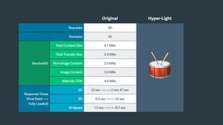
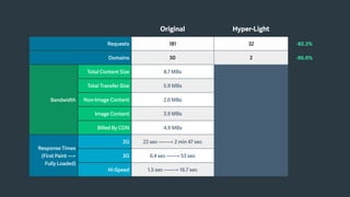
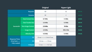
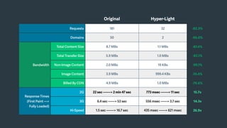
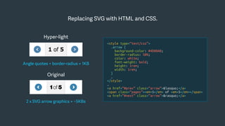
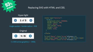
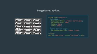
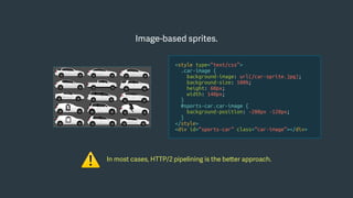
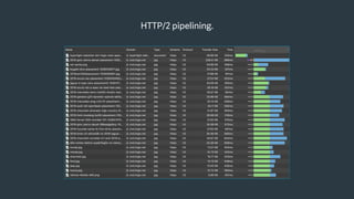
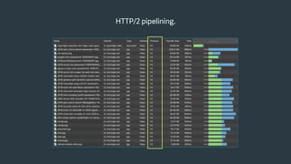
The document discusses the concept of hyper-lightweight websites, aimed at optimizing web performance by minimizing page size and load times while maintaining user experience. It outlines a step-by-step approach to building such websites, including techniques like inline assets, semantic HTML, responsive design, and usage of HTTP/2 pipelining. An example highlights significant performance improvements achieved by reducing content size and requests, demonstrating the potential for enhancing user experience in high-latency environments.


![Caching the Uncacheable [Long Version]](https://cdn.slidesharecdn.com/ss_thumbnails/surge2014-cachingtheuncacheable-140929110542-phpapp01-thumbnail.jpg?width=640&height=640&fit=bounds)