The magazine uses consistent house styles to keep its target audience engaged. This includes always placing the masthead in the same location at the top of the magazine cover, using blue and white colors, and including the club's lion crest next to page numbers. Headings and subheadings are written in capital letters to make important information stand out. Fonts are generally the same throughout but sometimes change to draw attention to certain content. These house styles provide continuity and help attract readers by making the magazine immediately recognizable.
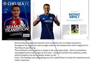
1. All the Chelsea magazines have the same masthead, this is to keep consistency
throughout the magazines and its target audience will always know which magazine it is
that they are purchasing.
The masthead in this magazine is always in the same place (top) .Also it is sometimes
overlapped by the main images on the cover . Doing this attracts the audience as they
will be tempted in by the footballer shown on the
Cover. The headings and subheadings are all in capital letters to show the importance and
make it stand out.
2. Blue and White are the colours always represented
in this magazine, which shows consistency.
3. Same fonts are used throughout with different
fonts used in certain places that make the
information stand out.
Another House Style this magazine uses is the fact
that they also include the Lion from the clubs crest
next to the page number on each page, this shows
continuity