The document provides an analysis of the design elements on the front cover of a student magazine called TNS. It describes in detail the masthead logo positioned in the top right corner using the colors black, yellow, and gray. It notes that the magazine breaks conventions by not including a dateline with price and date. The main image featuring Jessica Ennis is centered to draw attention and convey a message of success after university. A variety of bright colors including white, yellow, and pink are used in the design to attract readers and draw attention to different sections. The color scheme is continued throughout the magazine to create continuity and theme.
1. Task 1Grid Sheet 1
Before you decide on the content of your magazine it would be beneficial for you to research into
existing student magazines. Individually, look at the front cover of TNS magazine and fill in the grid
sheet in your student booklet. You must ensure that you describe what you see. (P1 M1 D1
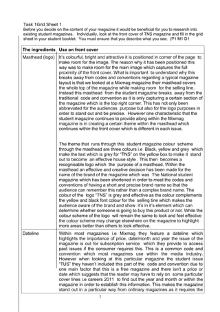
The ingredients Use on front cover
Masthead (logo) It’s colourful, bright and attractive it is positioned in corner of the page to
make room for the image. The reason why it has been positioned this
way was to make room for the main image which captures the full
proximity of the front cover. What is important to understand why this
breaks away from codes and conventions regarding a typical magazine
layout is that we looked at a Mixmag magazine their masthead covers
the whole top of the magazine while making room for the selling line.
Instead this masthead from the student magazine breaks away from the
traditional code and convention as it is only capturing a certain section of
the magazine which is the top right corner. This has not only been
abbreviated for the audiences purpose but also for the logo purposes in
order to stand out and be precise. However one characteristic that the
student magazine continues to provide along within the Mixmag
magazine is in creating a certain theme within the masthead which
continues within the front cover which is different in each issue.
The theme that runs through this student magazine colour scheme
through the masthead are three colours i.e Black, yellow and grey which
make the text which is grey for “TNS” on the yellow box to make it stand
out to become an effective house style . This then becomes a
recognisable logo which the purpose of a masthead. Within the
masthead an effective and creative decision has been made for the
name of the brand of the magazine which was The National student
magazine which has been shortened in order to meet the codes and
conventions of having a short and precise brand name so that the
audience can remember this rather than a complex brand name. The
colour of the logo “TNS” is grey and effective as the colour complements
the yellow and black font colour for the selling tine which makes the
audience aware of the brand and show it’s in it’s element which can
determine whether someone is going to buy this product or not. While the
colour scheme of the logo will remain the same to look and feel effective
the colour scheme may change elsewhere on the magazine to highlight
more areas better than others to look effective.
Dateline Within most magazines i.e Mixmag they feature a dateline which
highlights the importance of price, date/month and year the issue of the
magazine is out for subscription service which they provide to access
past issues if the consumer requires this. This is a common code and
convention which most magazines use within the media industry.
However when looking at this particular magazine the student issue
“TUS” they haven’t included this part of the code and convention due to
one main factor that this is a free magazine and there isn’t a price or
date which suggests that the reader may have to rely on some particular
cover lines i.e careers 2011 to find out the year and month or within the
magazine in order to establish this information. This makes the magazine
stand out in a particular way from ordinary magazines as it requires the
1
2. audience to find out this information such as from their website which is
highlighted within the masthead. This is effective as it alerts the audience
to another way of contacting the magazine to find out about other
important information regarding stories and obtain previous issues.
Main image The main image placed within the student magazine is in the centre of
the magazine again this another code and convention that is
implemented within various print publications I.e the Mixmag magazine.
The purpose of the image within the centre of the magazine is that it
allows full exposure of the main subject to the audience to empathise a
hidden message of the main subject in this case it is Jessica Ennis. What
message is conveyed within Jessica Ennis is that she is a successful
person who went to university and has achieved many things after
university such as winning medals in 2011 when competing in her
sporting career . What is important to understand this message would
have changed and conveyed at greater meaning in 2012 as she won a
lot of prestigious medals at the London Olympics which has raised her
profile and importance as she has become a top celebrity . Whereas, the
original 2011 edition shows her in a different light and not so well
known.. So this means she would have a greater impact on inspiring
people and the target audience of this magazine to pick up the magazine
to read it and be inspired by her story and the content within the
magazine.
Again this continues on the code and conventions used within the
magazine publication industry in which i.e Mixmag and the student
magazine to create a theme through the main image in order to create
continuity which is effective and what the audience looks for in a
magazine to be hooked in order to read this product or purchase this
item. The theme that continues within the student magazine is that the
colour scheme of what Jessica is wearing i.e. the blue top transpires to
the colour scheme of the cover lines and the masthead which is effective
as it reiterates her presence and theme within the front cover which is
needed to make the magazine stand out and look attractive.
Colour Scheme The colour scheme is a significant code and convention when making a
magazine that has to be effective as it has to stand out and look eye
catching i.e. Mixmag are known as an effective magazine that takes full
advantage of the colour scheme to make an effective front cover which
attracts the audience to buy the magazine. Within the student magazine
the colour scheme is bright and vibrant which is important as this attracts
the audience’s attention through the choice of colours white and yellow.
This will make the cover lines standout and highlight the importance of
the subjects being discussed. The colour scheme changes with a bold
pink colour for one of the promotional banners which is pink that adds
another level that empathises on the career guide 2011 to bring
attention and an urgency to the audience to that particular section of
the magazine that effects them as if their future is in the balance. The
colour scheme of pink for the banner is attractive and effective as it can
be seen to reflect a certain tone of the specific audience which could be
transferred to a female audience due to the colour being very feminine ,
whereas there is another continuity tool which the colour scheme which
is interpreted through the clothes of the main image which is blue and
aimed at an masculine audience which if you combine the two colour
2