Magazine analysis
•Download as DOCX, PDF•
0 likes•227 views

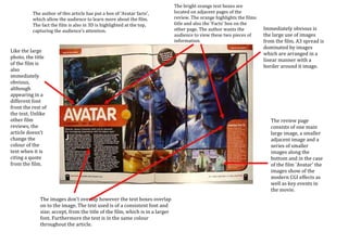
The review uses bright orange text boxes and highlights to draw attention to facts about the film Avatar. Images from the film dominate multiple pages and are arranged linearly with borders. Unlike some reviews, the text does not change color when quoting the film but maintains a consistent font, size, and color throughout the article.

Recommended
More Related Content
What's hot
Viewers also liked
Viewers also liked (13)
Similar to Magazine analysis
Similar to Magazine analysis (20)
Magazine analysis
- 1. The bright orange text boxes are The author of this article has put a box of ‘Avatar facts’, located on adjacent pages of the which allow the audience to learn more about the film. review. The orange highlights the films The fact the film is also in 3D is highlighted at the top, title and also the ‘Facts’ box on the capturing the audience’s attention. other page. The author wants the Immediately obvious is audience to view these two pieces of the large use of images information. from the film. A3 spread is dominated by images Like the large which are arranged in a photo, the title linear manner with a of the film is border around it image. also immediately obvious, although appearing in a different font front the rest of the text. Unlike other film The review page reviews, the consists of one main article doesn’t large image, a smaller change the adjacent image and a colour of the series of smaller text when it is images along the citing a quote bottom and in the case from the film. of the film 'Avatar' the images show of the modern CGI effects as well as key events in the movie. The images don't overlap however the text boxes overlap on to the image. The text used is of a consistent font and size; accept, from the title of the film, which is in a larger font. Furthermore the text is in the same colour throughout the article. The only acceptation to this rule is the text under the title however this fits with the layout and design of the page.