How to sell watches better?
•Download as PPTX, PDF•
0 likes•251 views

from my blog www.thinkingbots.com

Recommended
Recommended
More Related Content
Similar to How to sell watches better?
More from Jianfa Ben Tsai
More from Jianfa Ben Tsai (20)
How to sell watches better?
- 1. How to sell watches better?
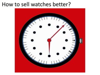
- 2. How to sell watches better? Ever noticed how the minute hands and hour hands of some watch brands never touch the edge of the indicator lines, leaving a space/gap in between? It would be more ergonomic and less strenuous to the eyes if the hands and indicator lines are aligned. Looking at the 2 pictures of Rolex and Seiko watches below, i would prefer to buy those watches if only theminute hands does not cover the "date" indicator. With reference to the Rolex watch, there are 15 waking hours a day, which means there would be 15 times the minute hands would reach the 15 minute indicator line; which block the "date" indicator. Are there any distinctive color contrast between the "minute and hour hands" and the watch face/background? I would go a step further to customise my own watch with the above points taken into consideration, all needed feature and function of the watch must be available to me at a single glance.
- 3. How to sell watches better? Whether the watch could be used for swimming or rinsing of hands aside, another point i would consider is as a watch dealer i would like to sell as many watches as possible, but being a new brand to a market, its hard to fight for market share with the big boys. Having the brand name printed on the face of the watch may have the opposite effect. Instead of advertising my watch and showing off to my friends (given a branded watch), i would feel negative if the watch shows a brand which is not known. Thus i would print the watch brand at the back of the watch, making it a "brandless" watch on the face of the watchat first glance. This could potentially spark conversation topics between my friends and ladies should they be curious about the design of the watch rather than the brand name.
- 4. How to sell watches better?
- 5. How to sell watches better?