#Supermarket's product category-signage confuses me
•Download as PPT, PDF•
0 likes•259 views

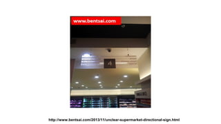
This document discusses an unclear directional sign in a supermarket that is difficult to read from certain angles due to its height and one-sided design. The sign lacks proper color contrast and would frustrate customers trying to locate different food sections from a particular direction using only this sign for guidance. The document suggests improvements could be made to the signage for better visibility and customer navigation around the store.

Recommended
More Related Content
More from Jianfa Ben Tsai
More from Jianfa Ben Tsai (20)
Recently uploaded
Recently uploaded (20)
#Supermarket's product category-signage confuses me
- 2. Unclear Sign that does not work when viewed from the front and back angles. Color contrast is also poor. As i am coming from this direction, how easy would it be for me to find the respective food item sections given the height and one sided view of the sign? Answer: It would be difficult for me and i would be frustrated. #food., #MySuggestionForImprovements., #Singapore., #supermarket.