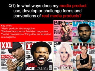
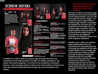
Q1) In what ways does my media product
use, develop or challenge forms and
conventions of real media products?
Key terms:
*Media product= Your magazine
*Real media products= Published magazines
*Fonts+ conventions= Things that are expected
in a magazine
Q) In what ways does your media product use, develop or challenge forms and conventions
of real media products (actual established magazines)?
The ways in which my Front cover
challenges conventions of a real
magazine....

One way in which my media product challenges the
conventions of real media products is exposed through
the uncommon format of the cover stars (models).
Instead of portraying the conventional convention of a
close up of one celebrity within real media products
such as, Vibe and Billboard, my front cover consists of a
middle shot of two main cover stars instead. A middle
shot of two cover stars is used within my front cover
instead of one to, add a greater variety of role models
for my target audience to choose from and to also
signify the poses and the costumes of my main cover
stars more.
Another way in which my front cover challenges forms
and conventions of real media products is through the
various use of cover lines. Generally, within music
magazines such as, XXL very few cover lines are shown
to signify the cover star more however, I have added
several cover lines to indicate and influence the readers
into thinking that the magazine they are buying is
worth the cost as, the front cover already displays
sufficient amount of information.
Ways in which my Front cover follows the conventions of real media
products
Similar to the Billboard
publication, my front
cover uses the convention
of a direct model address
to instantly catch the
readers attention as, the
use of the direct model
address makes it appear
as if the cover stars are
facing straightforwardly
towards you.

My Front cover uses
the convention of a
masthead alike to real
media products such
as, XXL and Billboard
to make my magazine
appear more
professional and
realistic.

My front cover additionally
uses the convention of
models and similar to the
Billboard, Q and XXL
magazines to reinforce who
the prime subject of
attention are within my
whole magazine. Without
the convention of a model
or models, my target
audience would be unaware
of how my main cover stars
look like therefore, the use
of models are very
important.

In addition to, my
Front cover uses the
convention of a
barcode alike to the
XXL magazine to
highlight the price of
my magazine and
make my magazine
appear less substandard.

Furthermore, my front
cover uses the
convention of offers
similar to the
Billboard magazine
and XXL to engage
with the audience’s
awareness more so
that, they would be
greatly interested in
purchasing my
magazine.
The ways in which my contents
page challenges forms and
conventions of real media
products?
One way in which my Contents page
develops the forms and conventions
of real media products such as, XXL
is through the use of a slogan. It is
unusual to view a slogan within a
contents page however, I replicated
the slogan from my front cover: ‘Its
all about the music baby’ into my
contents page in order to, make my
target audience of young adults 16+
to memorize the slogan more; to
insinuate that, my magazine
institution of ‘Cloud9’ is different
from other magazine publishers.

In addition to, a way in which my contents page challenges the forms and
conventions of real media products is through, not adding competitions and
quizzes. My contents page does not consist of any competitions and quizzes
because, I want my target audience to focus more on the context in relation to my
cover stars instead of being distracted through the use of competitions and
quizzes.

Another way in which my contents
page develops the forms and
conventions of real media products
is through the repetition of the same
models. Within 2 of my images, the
same models are shown to enable
my target audience to familiarize
themselves with the new R&B
artists; to further connote that they
are the main subjects to my
contents page. As you can see on
the left hand side, their is only one
image of Zak and this is done imply
that, Zak is not the main centre of
attention.
Ways in which my contents page follows the conventions of real media products
Moreover, likewise to the Q
magazine my contents page
additionally uses the
convention of features to
indicate a story written in a
different format.

In a similar way to the Q
magazine, my contents page
additionally uses the
convention of subheadings to
summarise what each topic is
about which further helps to
develop the readers’
understanding.

Likewise to Q magazine my contents page uses
the convention of page numbers in order to,
direct the audience to a specific topic and
prevent my contents page from appearing
disorganised towards my target audience.

Alike to the Q
magazine, my
contents page uses
the convention of
images to create a
visual imagery in
association with
each topic or issue.
The ways in which my DPS (Double page spread) challenges/ develops the
forms and conventions of real media products...
One way in which my double page spread challenges the forms and conventions of real media products is
through, the minimal use of subheadings. Barely any subheadings are represented within my double page
spread and this is done because, my Double page spread mainly consists of Q&A (Questions and answers)
therefore, it would be inconvenient to add several subheadings.
Another way in which my Double
Page spread develops the forms and
Conventions of real media products
Is through, the addition of a faint,
Soft edged photo positioned below
Within the left side of my main image.
This is done to represent that, the
‘Scissor Sisters’ are still the main centre
Of attention ; that the Q&A on the right
Hand side will be mostly related to them
As new ‘R&B artists’.
Moreover, another way in which
My double page spread challenges
The forms and conventions of real
Media products is through, the use
Of two colour schemes for my main
Title. I situated a touch of red within my main
Cover title of the: ‘Sizzling Scissor sisters’ as the colour red
connotes a fierce , cool and resilient impression of the Scissor Sisters in association with the word ‘Sizzling’.
To include, similar to the Vibe
magazine my double page
spread uses the convention of
the colour schemes of, red,
white and black because, the
text colour of white stands out
against my black background.
This further makes my content
more engaging to read.

My double page spread also
follows the conventions and
forms of the Vibe magazine
through using the convention of
page numbers to, reinforce to
the audience the kind of
contents they are viewing. The
use of the convention of page
numbers also helps my double
page spread from appearing
disordered.

My double page
spread follows the
Similar to the Vibe
magazine, my double conventions and
forms of the Vibe
page spread consists
of the convention of a magazine through
Q&A form to supply
using the convention
the audience with a
of, a pull quote to
deeper insight to the
highlight the most
cover stars preference
to music, lifestyle and appealing quote
made within my
personalities.
magazine.
Overall conclusion?
My publication generally challenges the forms and conventions of real media
products and although, people might not retrieve of this and approve of it as
right, I have done this to make my magazine appear peculiar and distinctive from
other magazines so that, my target audience can be more fascinated and willing
to purchase my magazine.

By Anita Ofori

DRAFT: MEDIA EVALUATION

  • 1.
    Q1) In whatways does my media product use, develop or challenge forms and conventions of real media products? Key terms: *Media product= Your magazine *Real media products= Published magazines *Fonts+ conventions= Things that are expected in a magazine
  • 2.
    Q) In whatways does your media product use, develop or challenge forms and conventions of real media products (actual established magazines)? The ways in which my Front cover challenges conventions of a real magazine.... One way in which my media product challenges the conventions of real media products is exposed through the uncommon format of the cover stars (models). Instead of portraying the conventional convention of a close up of one celebrity within real media products such as, Vibe and Billboard, my front cover consists of a middle shot of two main cover stars instead. A middle shot of two cover stars is used within my front cover instead of one to, add a greater variety of role models for my target audience to choose from and to also signify the poses and the costumes of my main cover stars more. Another way in which my front cover challenges forms and conventions of real media products is through the various use of cover lines. Generally, within music magazines such as, XXL very few cover lines are shown to signify the cover star more however, I have added several cover lines to indicate and influence the readers into thinking that the magazine they are buying is worth the cost as, the front cover already displays sufficient amount of information.
  • 3.
    Ways in whichmy Front cover follows the conventions of real media products Similar to the Billboard publication, my front cover uses the convention of a direct model address to instantly catch the readers attention as, the use of the direct model address makes it appear as if the cover stars are facing straightforwardly towards you. My Front cover uses the convention of a masthead alike to real media products such as, XXL and Billboard to make my magazine appear more professional and realistic. My front cover additionally uses the convention of models and similar to the Billboard, Q and XXL magazines to reinforce who the prime subject of attention are within my whole magazine. Without the convention of a model or models, my target audience would be unaware of how my main cover stars look like therefore, the use of models are very important. In addition to, my Front cover uses the convention of a barcode alike to the XXL magazine to highlight the price of my magazine and make my magazine appear less substandard. Furthermore, my front cover uses the convention of offers similar to the Billboard magazine and XXL to engage with the audience’s awareness more so that, they would be greatly interested in purchasing my magazine.
  • 4.
    The ways inwhich my contents page challenges forms and conventions of real media products? One way in which my Contents page develops the forms and conventions of real media products such as, XXL is through the use of a slogan. It is unusual to view a slogan within a contents page however, I replicated the slogan from my front cover: ‘Its all about the music baby’ into my contents page in order to, make my target audience of young adults 16+ to memorize the slogan more; to insinuate that, my magazine institution of ‘Cloud9’ is different from other magazine publishers. In addition to, a way in which my contents page challenges the forms and conventions of real media products is through, not adding competitions and quizzes. My contents page does not consist of any competitions and quizzes because, I want my target audience to focus more on the context in relation to my cover stars instead of being distracted through the use of competitions and quizzes. Another way in which my contents page develops the forms and conventions of real media products is through the repetition of the same models. Within 2 of my images, the same models are shown to enable my target audience to familiarize themselves with the new R&B artists; to further connote that they are the main subjects to my contents page. As you can see on the left hand side, their is only one image of Zak and this is done imply that, Zak is not the main centre of attention.
  • 5.
    Ways in whichmy contents page follows the conventions of real media products Moreover, likewise to the Q magazine my contents page additionally uses the convention of features to indicate a story written in a different format. In a similar way to the Q magazine, my contents page additionally uses the convention of subheadings to summarise what each topic is about which further helps to develop the readers’ understanding. Likewise to Q magazine my contents page uses the convention of page numbers in order to, direct the audience to a specific topic and prevent my contents page from appearing disorganised towards my target audience. Alike to the Q magazine, my contents page uses the convention of images to create a visual imagery in association with each topic or issue.
  • 7.
    The ways inwhich my DPS (Double page spread) challenges/ develops the forms and conventions of real media products... One way in which my double page spread challenges the forms and conventions of real media products is through, the minimal use of subheadings. Barely any subheadings are represented within my double page spread and this is done because, my Double page spread mainly consists of Q&A (Questions and answers) therefore, it would be inconvenient to add several subheadings. Another way in which my Double Page spread develops the forms and Conventions of real media products Is through, the addition of a faint, Soft edged photo positioned below Within the left side of my main image. This is done to represent that, the ‘Scissor Sisters’ are still the main centre Of attention ; that the Q&A on the right Hand side will be mostly related to them As new ‘R&B artists’. Moreover, another way in which My double page spread challenges The forms and conventions of real Media products is through, the use Of two colour schemes for my main Title. I situated a touch of red within my main Cover title of the: ‘Sizzling Scissor sisters’ as the colour red connotes a fierce , cool and resilient impression of the Scissor Sisters in association with the word ‘Sizzling’.
  • 8.
    To include, similarto the Vibe magazine my double page spread uses the convention of the colour schemes of, red, white and black because, the text colour of white stands out against my black background. This further makes my content more engaging to read. My double page spread also follows the conventions and forms of the Vibe magazine through using the convention of page numbers to, reinforce to the audience the kind of contents they are viewing. The use of the convention of page numbers also helps my double page spread from appearing disordered. My double page spread follows the Similar to the Vibe magazine, my double conventions and forms of the Vibe page spread consists of the convention of a magazine through Q&A form to supply using the convention the audience with a of, a pull quote to deeper insight to the highlight the most cover stars preference to music, lifestyle and appealing quote made within my personalities. magazine.
  • 9.
    Overall conclusion? My publicationgenerally challenges the forms and conventions of real media products and although, people might not retrieve of this and approve of it as right, I have done this to make my magazine appear peculiar and distinctive from other magazines so that, my target audience can be more fascinated and willing to purchase my magazine. By Anita Ofori