Making communications land - Are they received and understood as intended? we...
School magazine 1
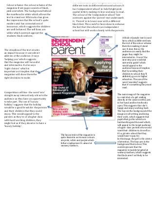
1. The
main
image
of
the
magazine
is
a
mid
shot
of
a
girl
smiling
directly
at
the
camera
with
a
pen
in
her
hand
and
her
textbooks
open.
This
suggests
that
she’s
happy
and
enjoy
working
hard.
The
boys
in
the
background
of
the
image
are
all
writing
and
doing
their
work,
which
suggests
that
pupils
that
go
the
school
are
hardworking
and
focused
which,
will
appeal
to
the
target
audience
of
upper
class
parents
who
would
want
their
children
to
do
well
as
it’s
a
private
school
that
they
would
have
to
pay
for.
In
this
image,
the
girl
is
the
centre
of
attention.
The
boys
are
in
the
background
blurred
out.
This
could
represent
that
the
magazine
is
mainly
targeted
at
women/mothers,
which
suggests
that
Dads
aren’t
as
likely
to
be
interested.
Colour
scheme-‐
the
colour
scheme
of
the
magazine
front
page
consists
of
black,
pink
and
white.
The
background
behind
the
masthead
is
white
which
allows
the
text
to
stand
out.
White
also
has
gives
the
impression
that
the
school’s
quite
modern
and
has
connotations
of
innocence,
which
suggests
the
children
are
well
behaved.
The
sell
lines
are
white
which
contrast
against
the
students
black
uniform.
The
strapline
of
the
text
creates
an
impact
because
it
uses
direct
address
at
the
audience.
It
says
‘helping
you’
which
suggests
that
the
magazine
will
be
useful
and
informative.
It
also
says
‘right
choices’
which
is
important
as
it
implies
that
the
magazine
will
show
them
the
right
decisions
to
make.
The
masthead
is
quite
complex
as
it
uses
two
different
texts
in
different
fonts
and
colours.
It
has
‘independent
school’
in
bold
bright
pink
capital
letters
making
it
clear
and
easy
to
read.
The
colour
of
the
‘independent
school’
font
contrasts
against
the
‘parent’
text
underneath
it.
‘Parent’
is
in
lower
case
with
a
different
black
font.
This
could’ve
been
done
to
enhance
the
fact
that
the
school
is
an
independent
school
but
still
works
closely
with
the
parents.
Competition
sell
line-‐
the
word
‘win’
straight
away
interactively
attracts
the
audience
as
they
have
an
opportunity
to
take
part.
The
use
of
‘luxury
holiday’
suggests
that
the
holiday
would
be
a
good
break
for
the
parents
and
their
children
that
they
could
enjoy.
This
would
appeal
to
the
parents
as
they’re
of
a
higher
class
with
hard
working
children,
they
might
feel
as
if
they
deserve
to
have
a
‘luxury
holiday’.
A
block
of
purple
text
is
used
here,
which
is
different
from
the
rest
of
the
colour
scheme
therefore
making
it
stand
out.
It
does
this
so
the
audience
can
easily
find
the
pages
they
might
be
interested
in.
It
says
‘the
next
step
your
essential
university
guide’
which
would
appeal
to
the
audience
because
it
implies
that
by
sending
their
children
to
school
they’ll
definitely
go
on
to
higher
education.
The
use
of
the
word
‘essential’
suggests
that
it’s
something
they
must
read.
The
house
style
of
the
magazine
is
quite
feminine
as
its
main
colours
are
pink,
white
and
purple
which
father
emphasises
it’s
aimed
at
women/mothers.